感谢 External Reference 予gooood分享以下内容。更多关于:External Reference on gooood。
Appreciation towards External Reference for providing the following description. More: External Reference on gooood.
2026年10月,巴塞罗那。External Reference呈现了Sando位于苏黎世Niederdorfstrasse 60的新旗舰餐厅。项目从零开始打造品牌的视觉识别与室内设计。这家汉堡连锁品牌将美式料理与日式料理传统相结合,设计把这种美食融合转译为两种文化的语言、材料与建筑参照之间跨越220平方米空间的对话。
Barcelona. October 2026. External Reference presents Sando’s new flagship restaurant in Zurich, at Niederdorfstrasse 60. The project develops the visual identity and interior design of the brand from scratch. A burger chain that combines American cuisine with Japanese culinary tradition, it translates this culinary fusion into a dialogue between the languages, materials and architectural references of both cultures across a 220 m² space.
▼街道望向餐厅外观,The restaurant seen from the street © Marek Jarosz
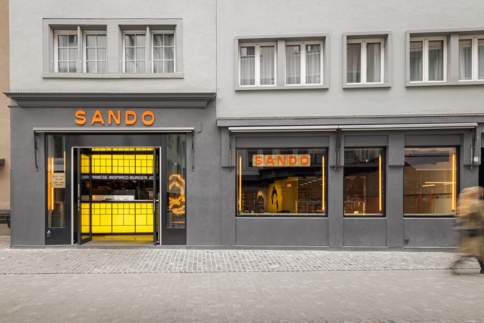
▼餐厅正立面与入口,Front facade and entrance of the restaurant © Marek Jarosz
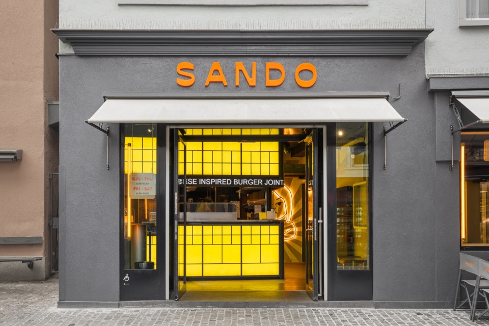
品牌标志性的黄色被解构并转译为建筑与空间元素;Logo不再只是一个图形符号,而成为占据、连接并“殖民”场地各区域的三维存在。墙面与地面上的涂鸦风格图形干预,补全了贯穿整个空间的视觉识别。
The yellow that characterises the brand is deconstructed and translated into architectural and spatial elements; the logo ceases to be a mere graphic element and becomes a three-dimensional presence that occupies, connects and colonises the different areas of the venue. Graffiti-style graphic interventions on walls and floors complete a visual identity that runs through the entire space.
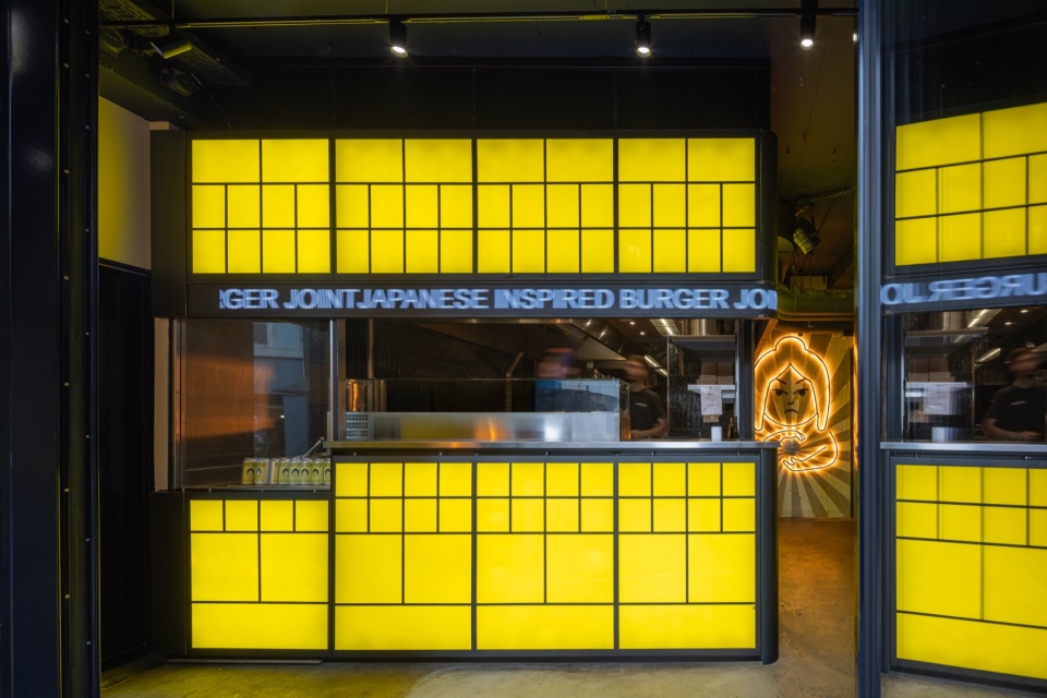
▼入口柜台,The entrance counter © Marek Jarosz
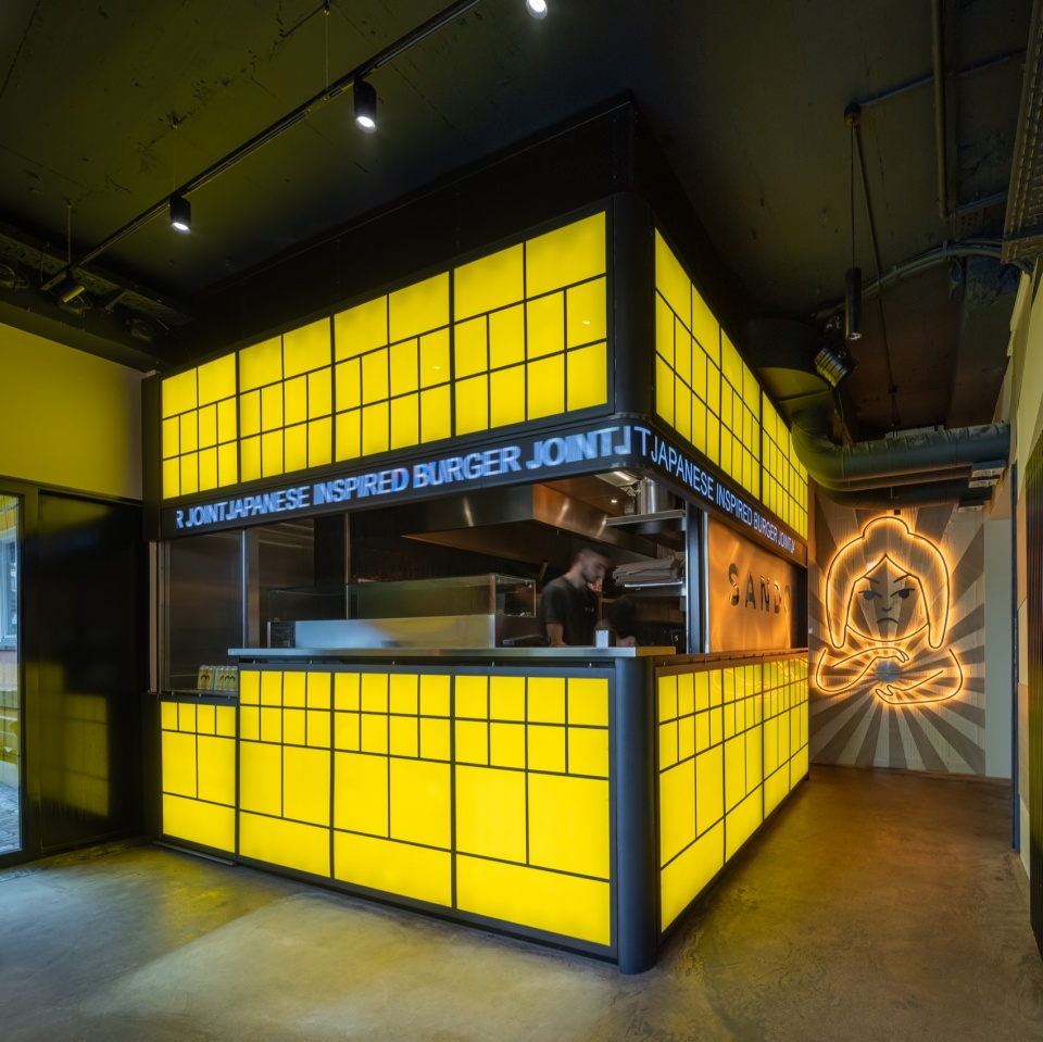
“Sando是一个玩转日式图像、街头文化与汉堡的项目,几乎成为了美食界的波普偶像,”External Reference创始人、主持建筑师Carmelo Zappulla解释说,“我们想要一种年轻、随性、略带‘天真’的氛围,带一点淳朴的日式气质。”
“Sando is a project that plays with Japanese iconography, street culture and the burger, to the point of becoming almost a pop icon of gastronomy —explains architect Carmelo Zappulla, founder and director of External Reference— We wanted a young, laid-back, slightly ‘naïve’ atmosphere, with an ingenuous, Japanese touch.”
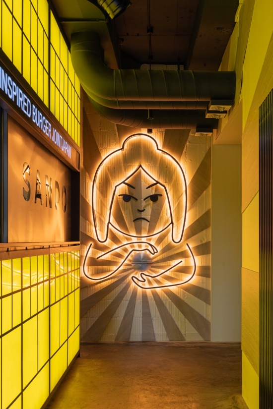
▼霓虹品牌吉祥物与黄色灯箱墙,
The neon brand mascot against the yellow lightbox wall © Marek Jarosz
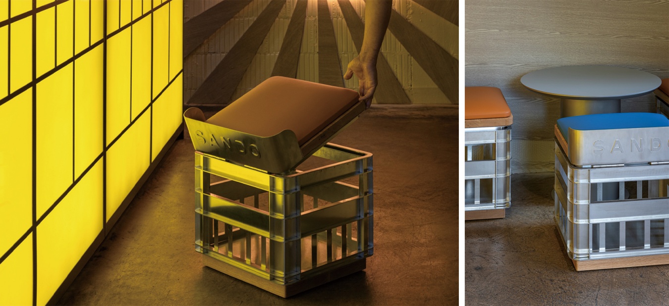
▼可储物座凳,Storable seat © Marek Jarosz
项目融入了波普艺术内在的实践方式:取品牌的日常元素——包装、运输周转箱、视觉符号——赋予它们新的尺度与功能。它们不再是被贴附的图像,而是获得了体积与用途,成为场地建筑与家具的一部分。体验在三个主要区域中展开。它从入口旁的柜台开始,柜台被构想为场地的中心元素:其形式重新诠释了日本街头小吃摊的美学——轻质结构与规则图案,并结合了工业美学的典型材料——裸露的黑铁、黄色灯箱以及一条连续的低分辨率LED屏,后者是有意之选,以强化与工业想象的联系。从这里,访客进入主餐厅,最终通向一间私人宴会厅,在那里,以半透明纸与木制成的传统日式拉门——障子,同样以工业材料与细部被重新诠释。
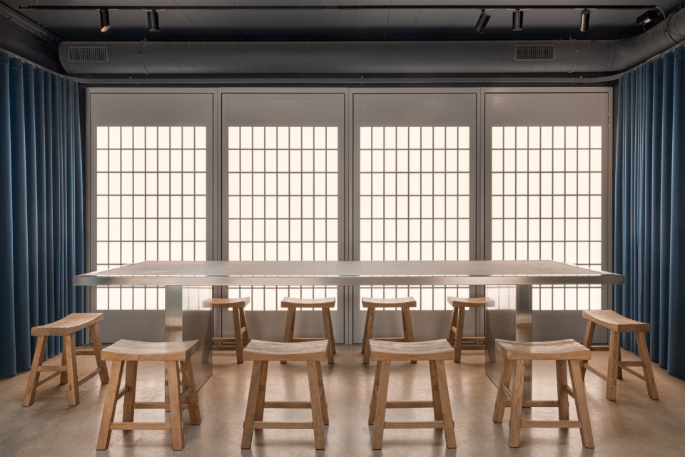
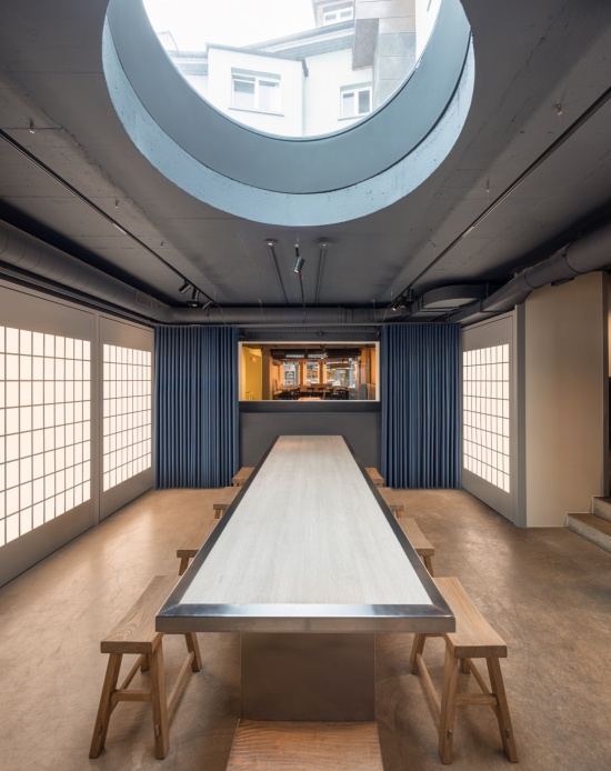
The project incorporates a practice inherent to Pop Art: taking everyday elements of the brand —the packaging, the transport crates, its visual codes— and bringing them to a new scale and function. They cease to be applied images, gaining volume and use, and become part of the venue’s architecture and furniture. The experience unfolds across three main areas. It begins at the counter by the entrance, conceived as the central element of the venue: its form reinterprets the aesthetics of Japanese street food stalls, with lightweight structures and regular patterns, combined with materials typical of the industrial aesthetic —exposed black iron, a yellow lightbox and a continuous low-resolution LED screen, deliberately chosen to reinforce the link with the industrial imaginary—. From here, visitors enter the main dining room, which finally leads to a private events room, where the shoji, traditional Japanese sliding doors made of translucent paper and wood, are also reinterpreted with industrial materials and details.
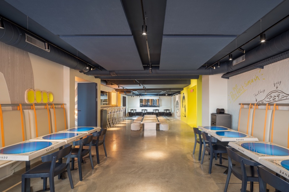
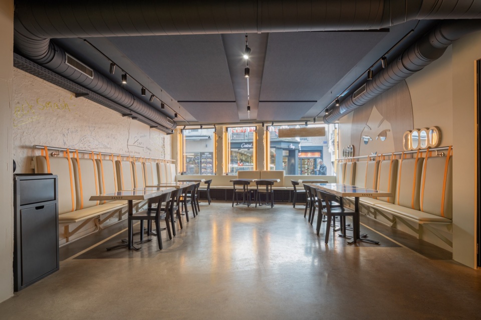
▼餐厅概览,Overview of the dining room © Marek Jarosz
▼私宴厅,The private events room © Marek Jarosz
▼私宴厅长桌与圆形天窗,
The long table and circular skylight of the private room © Marek Jarosz
▼高桌与木凳细部,High table with wooden stools detail © Marek Jarosz
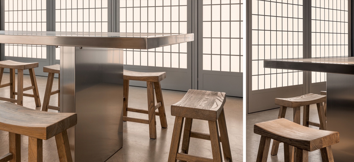
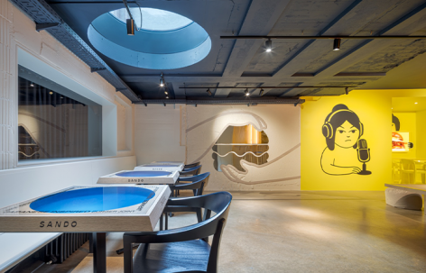
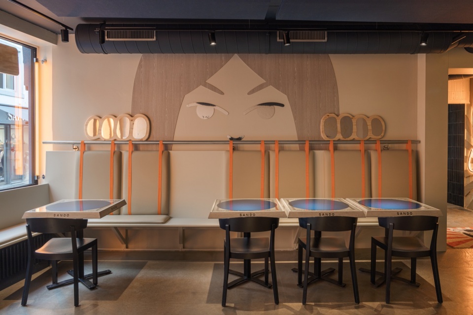
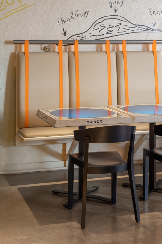
External Reference设计的家具在细部尺度上延续了同样的杂交原则。餐桌的灵感来自Sando的包装:木料上铣出的圆形,内衬不锈钢,以带蓝色贴膜的玻璃封口。高桌与低矮的、受座卓启发的矮桌,将日式极简主义与工业不锈钢的存在感结合在一起。不锈钢座椅同样源自一个具体参照:品牌自产的塑料啤酒箱——被当作现成品,一件保留原有身份的现成之物。加上新的覆面、木底座上的软垫,以及一个可掀开座面、将包袋收入其中的暗藏铰链,它们不再是物流器具,而成为实用的座椅。吧凳与椅子则为精选的成品家具。
The furniture designed by External Reference develops the same principle of hybridisation, but at the scale of detail. The dining tables are inspired by Sando’s packaging: a circle milled in wood, with a stainless steel interior, closed by glass with blue vinyl. The high tables and the low, zatsuzaku-inspired low tables combine Japanese minimalism with the presence of industrial stainless steel. The seats, in stainless steel, also stem from a specific reference: the plastic beer crates —which the brand produces itself—, treated as a ready-made, an existing object that retains its original identity. With a new covering, padding on a wooden base and a concealed hinge that allows the seat to be lifted and a bag to be stored inside, they cease to be a logistical element and become a functional seat. The stools and chairs, for their part, are selected furniture pieces.
▼涂鸦墙面与餐桌,Graffiti wall and dining tables © Marek Jarosz
▼餐桌椅细部,Dining table and chair detail © Marek Jarosz
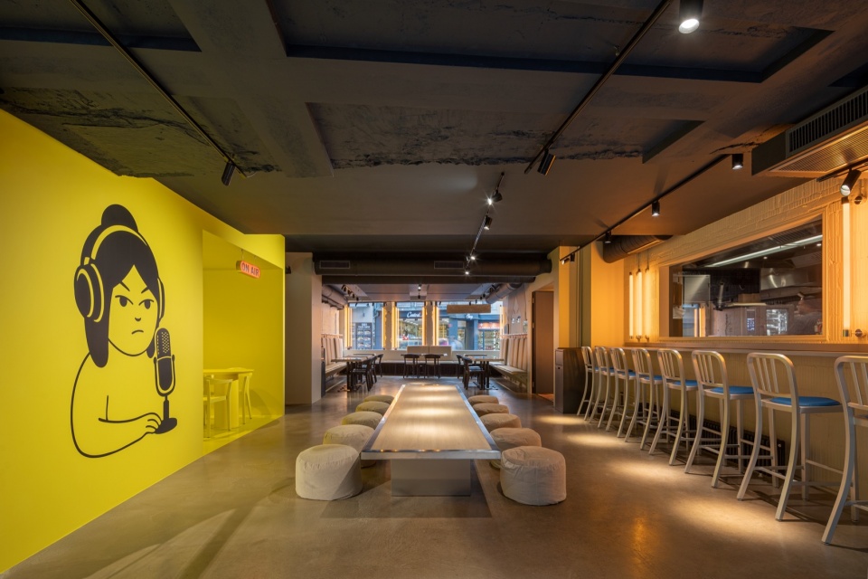
一个播客区同样以Sando的黄色标识,补全了整个空间。它被构想为一个混合区域,既可以为社交媒体录制内容,也可以作为一张共享桌,供顾客用餐与拍照。
A podcast area, is also identified by Sando’s yellow, and completes the space. Conceived as a hybrid area, it allows content to be recorded for social media and works as a shared table where customers can eat and take photos.
▼播客区,Podcast area © Marek Jarosz
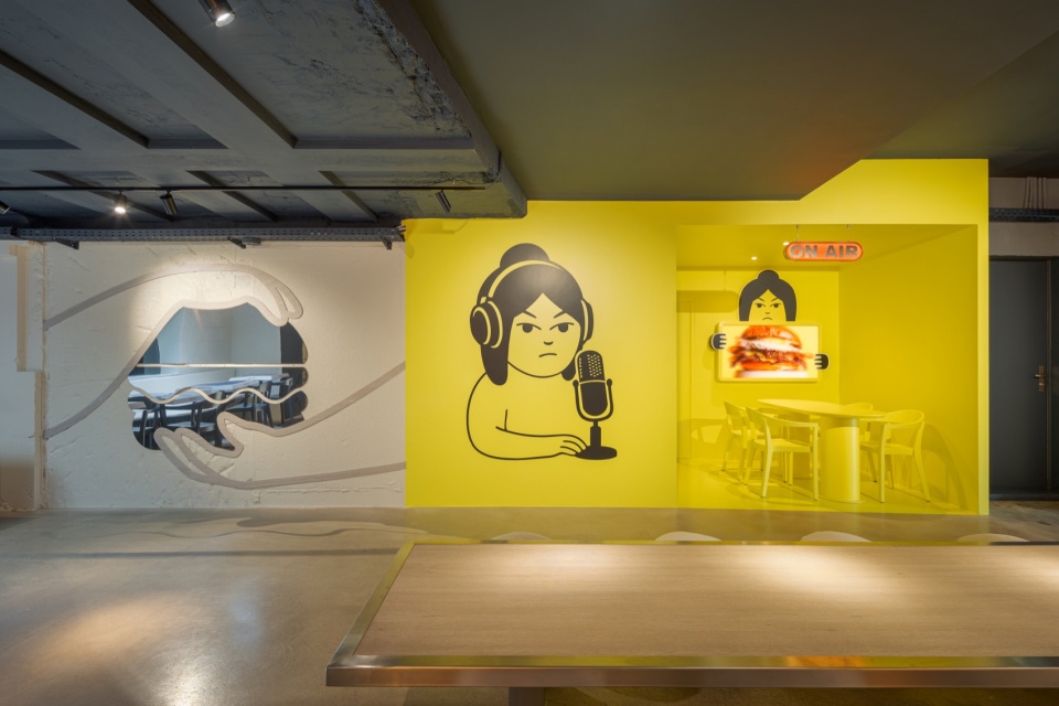
▼播客区旁餐区,Dining area beside the podcast area © Marek Jarosz
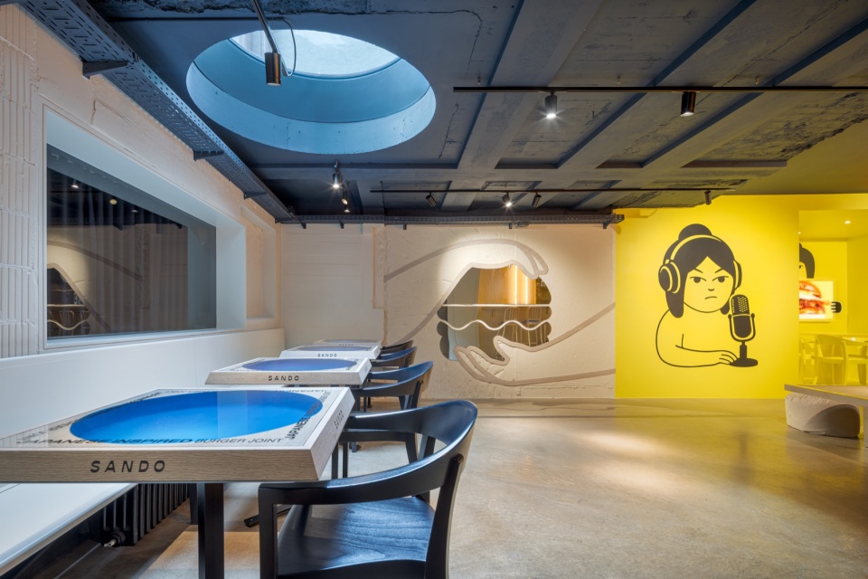
▼餐区近景,Dining area close view © Marek Jarosz
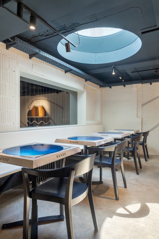
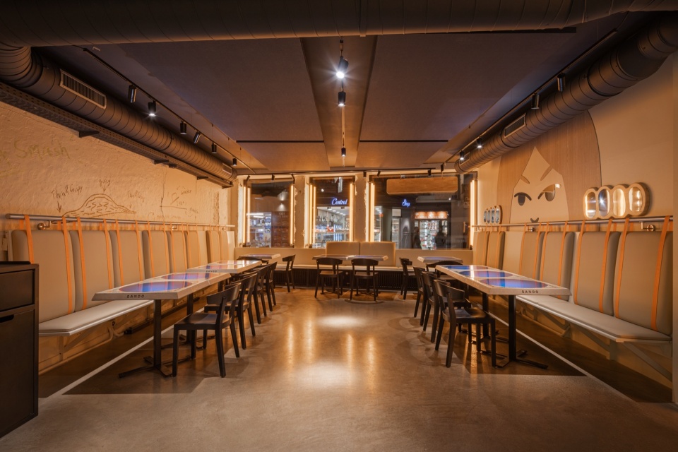
材料基调结合了不锈钢、黑铁、木材与黄色灯箱,橙色霓虹灯带贯穿空间,营造出温暖、夜间与地下的氛围,与日式几何的严谨形成非正式的对位。Sando苏黎世新旗舰餐厅由此将两种文化美学——日本极简主义与美国街头美食的工业美学——综合为一套贯穿建筑、室内设计与视觉传达的连贯语言,把场地转化为品牌受众可识别的体验。黄色、Logo与包装造型也共同构建出可识别的空间身份,波普参照既存在于场地的形象中,也存在于构成它的物件之中。
The material palette combines stainless steel, black iron, wood and a yellow lightbox, with orange neon lights running through the space to create a warm, nocturnal and underground atmosphere, an informal counterpoint to the rigour of Japanese geometries. Sando’s new flagship restaurant in Zurich thus synthesises two cultural aesthetics —Japanese minimalism and the industrial aesthetic of American street food— into a coherent language spanning architecture, interior design and visual communication, transforming the venue into a recognisable experience for the brand’s audience. The colour yellow, the logo and the packaging shapes also build a recognisable spatial identity in which the pop reference is present both in the image of the venue and in the objects that compose it.
▼餐厅室内夜景,Restaurant interior night view © Marek Jarosz
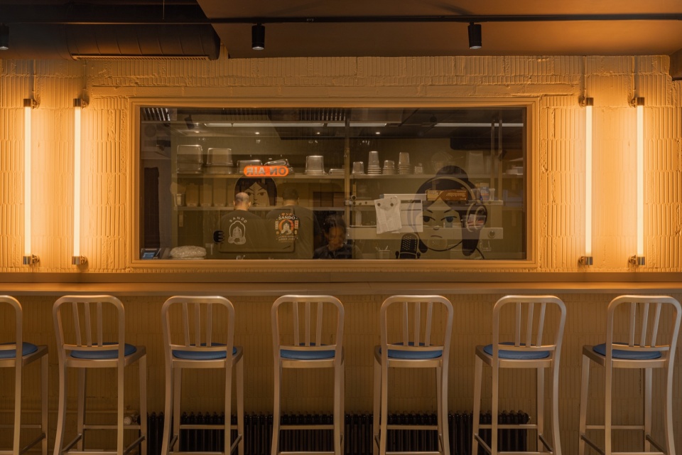
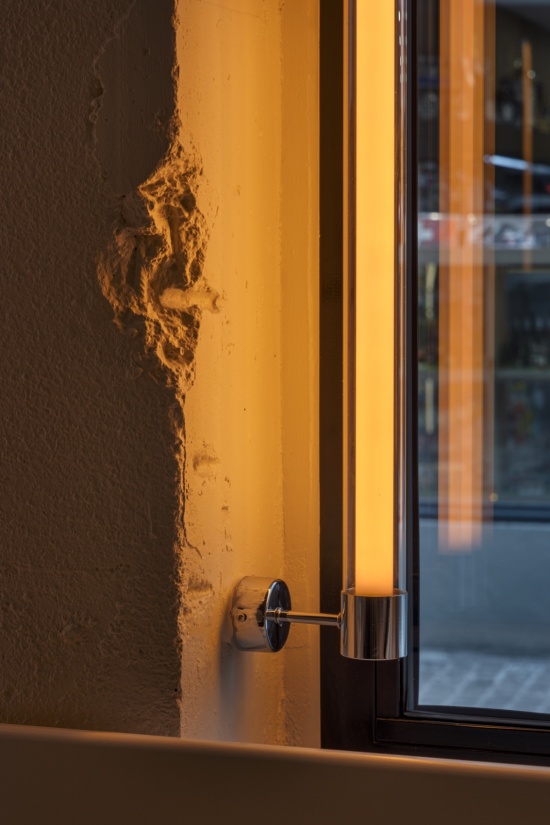
▼壁灯细部,Detail of the wall lamp © Marek Jarosz
项目名称:Sando餐厅旗舰店
设计:External Reference
创始人/主持建筑师:Carmelo Zappulla
地点:瑞士苏黎世 Niederdorfstrasse 60
面积:220 平方米
年份:2026
家具与制作:Metalcor
灯光(橙色灯):Comled
摄影:Marek Jarosz
网站:externalreference.com
邮箱:press@laboh.net
Project name: Sando’s new flagship restaurant
Design: External Reference
Founder & director: Carmelo Zappulla
Location: Niederdorfstrasse 60, Zurich, Switzerland
Area: 220 m²
Year: 2026
Furniture and fabrication: Metalcor
Lighting (orange lights): Comled
Photography: Marek Jarosz
Website: externalreference.com
Email: press@laboh.net



发表评论
你需要先 才能发表评论
社交登录