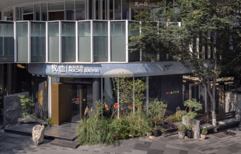
感谢 向生设计事务所 予gooood分享以下内容。更多关于:REBORN DESIGN on gooood.
Appreciations towards 向生设计事务所 for providing the following description:
一体两店的板前共生空间
Two Brands, One Space
这几年,城市里冒出越来越多巴掌大的精致小店。它们不追求庞大的体量,而是试图在方寸之间,通过极致的体验感来建立与食客的深度连接。这种对“小而美”的集体向往,不仅重塑了城市的餐饮地图,也让竞争变得更加微妙。消费者对“烟火气”与“仪式感”的双重渴望催生了板前料理、omakase这类小店的涌现。食客们迷恋那种坐在厨师面前、看着火焰或热油翻腾的现场感——烟火气和仪式感,原来可以在一张吧台上同时兑现。但另一方面,居高不下的租金与人力成本,让单一品类的独立门店越来越难以支撑盈亏平衡。于是,“一体两店”的模式应运而生——共享后厨、分摊成本、双品牌引流,成为不少餐饮品牌在存量市场中寻求增量的解题思路。
▼视频,video ©冉丽菁
In recent years, more and more tiny, exquisite shops have been popping up across the city. They don’t chase scale; instead, they try to build deep connections with diners through an intense experience within a limited footprint. This collective craving for “small but beautiful” has not only reshaped the city’s dining map but also made competition more nuanced. Consumers’ dual desire for “everyday warmth” and “ritualistic ceremony” has fueled the rise of counter-dining concepts like teppanyaki and omakase. Diners love sitting right in front of the chef, watching flames leap or oil sizzle — that live energy. It turns out you can have both warmth and ceremony at the same counter. But on the flip side, soaring rent and labor costs make it harder for single-category independent stores to break even. So the “one space, two brands” model emerged: shared back kitchen, split overheads, dual-brand footfall. It’s become a go-to strategy for many F&B players seeking growth in a saturated market.
▼项目全景,Project Overview ©穆彪
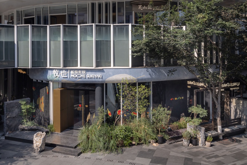
项目位于武汉华发中城商都,是一个典型的“共用厨房、独立前场”复合业态空间。一侧是主打板前炙烧的“牧也”,另一侧是极简酥脆的天妇罗专门店“鲨库”。面对结构特殊、入口小且内部深的原始场地,以及两个定位相近但气质迥异的品牌,我们的设计核心始终围绕一个命题:如何在同一屋檐下,让两个品牌各得其所,既不互相淹没,又能合力聚客?
The project is located in Wuhan Huafa Central City Mall — a typical mixed-use space with a shared kitchen and separate front-of-house areas. On one side is MOOYE, a counter-focused grill restaurant; on the other is SAKU, a minimalist tempura specialty shop. Facing an oddly shaped site with a narrow entrance and deep interior, plus two brands that are similar in positioning but distinct in character, our design revolved around one core question: how to let both brands thrive under the same roof, neither overshadowing the other while still drawing customers together?
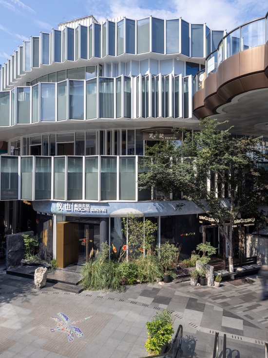
▼项目全景,Project Overview ©穆彪
总体策略:双首层与环形动线的构建
Overall Strategy: Dual Ground-Floor Entries and a Circular Circulation Path
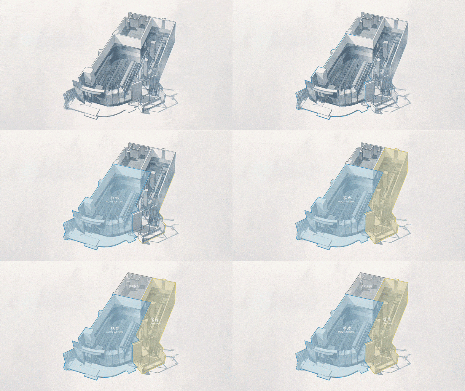
为了在视觉和体验上同时满足两个品牌,我们将原本单一的入口进行了“双首层”改造。利用自然的石墙与花径作为物理界定,将空间划分为两个独立的入户区域:牧也一侧相对开放,saku一侧则隐秘幽深。
To serve both brands visually and experientially, we transformed the original single entrance into a “dual-ground-floor” layout. Natural stone walls and a flower path act as physical dividers, splitting the space into two separate entry zones: MOOYE’s side is relatively open, while SAKU’s side feels hidden and deep.
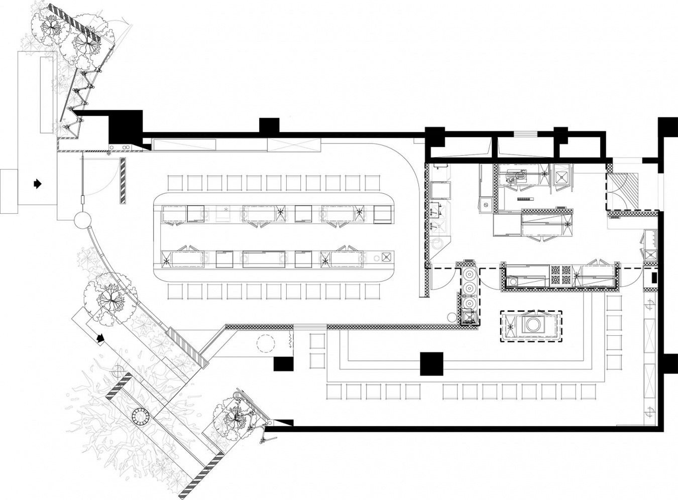
▼概念方案,Conceptual plan ©向生设计事务所
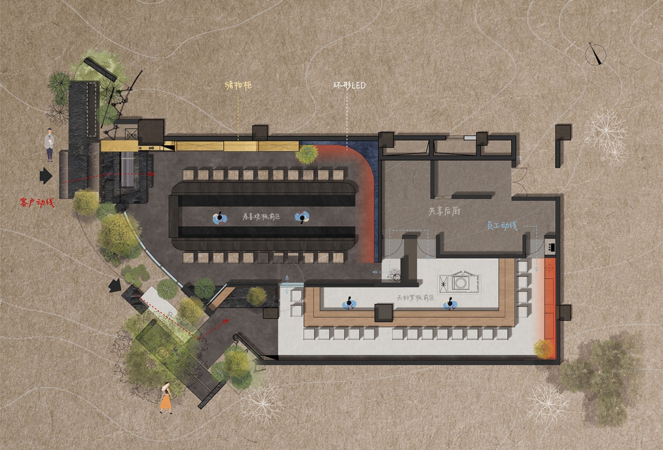
后厨区域被巧妙地整合在空间的深处,通过一个环形的纯板前空间将顾客动线完美串联。既保证了两个品牌运营上的互不干扰,又让顾客在进入板前核心区时,能感受到一种沉浸式的就餐仪式感。
The back kitchen is cleverly tucked into the rear of the space, with a circular pure-counter area seamlessly connecting the customer flow. This ensures zero operational interference between the two brands, while giving diners an immersive sense of ritual as they step into the core counter zone.
▼空间划分,Space division ©向生设计事务所
牧也:在极简中昭示丰盈
MOOYE: Abundance Revealed Through Minimalism
作为占据主导视觉的板前炙锅店,“牧也”的设计语言更偏向于“丰盈的自然力”。
As the dominant visual presence — a counter-style grill house — MOOYE’s design language leans toward “abundant natural force.”
▼门头,Facade ©穆彪
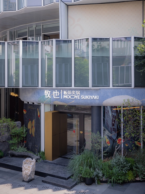
我们将门头的更多展示面交给了牧也,蓝色的艺术涂料附着于弧形门头之上,入口处下压一截黑山石墙拼接做隔断,自然的起伏纹理传递出浑厚的原生力量。细节上也藏了一些不经意的用心。门牌是一只同色系的扇形托盘,黄铜logo嵌在上面,小巧又不张扬。
We gave MOOYE the larger share of the facade. Blue art paint coats the curved storefront, and a low black stone wall sits at the entrance as a partition, its natural undulating texture conveying a rugged, primal strength. The details hide thoughtful touches too. The door sign is a fan-shaped tray in the same color, with a brass logo embedded — small and understated.
▼板前,Counter ©穆彪
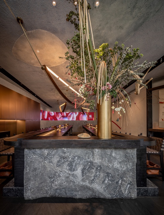
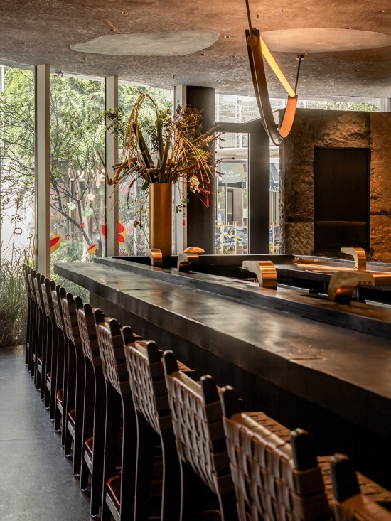
转折进室内就可以看到一个环形的纯板前空间,空间是极简的,花艺和吊灯让空间层次稍作平衡。板前我们用老的柏木保留了自然的纹理,交界处用蝴蝶隼,还是希望表达自然和野生。
Turning inside, you see a circular pure-counter space. The space is minimal, with floral arrangements and pendant lamps balancing the layers. The counter uses old cypress wood to preserve natural grain, joined with butterfly tenons — again, an expression of nature and wildness.
▼金色体块贯穿空间,Golden blocks run through the space ©穆彪
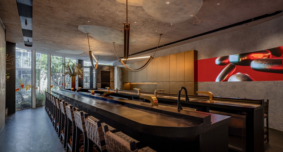
面对极小的操作空间,我们用一面极简的金色贯穿柜体从门头包裹至底部,巧妙隐藏了原有参差柱体和管道的同时,完美解决了备餐、挂衣、储物等琐碎功能,让视线回归到厨师一对一的操作上。
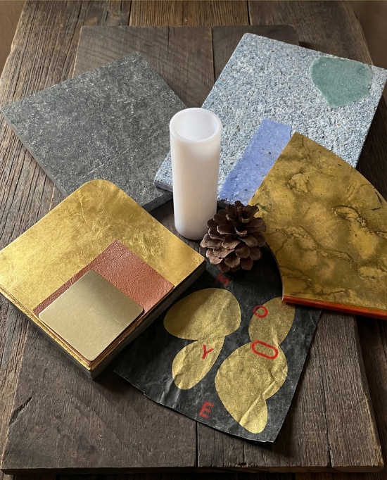
▼物料,Material ©向生设计事务所
Faced with a very tight workspace, we used a sleek gold cabinet running from the entrance all the way to the back. It cleverly conceals uneven columns and pipes while handling prep, coat hanging, storage, and other mundane needs — letting the eye return to the chef’s one-on-one performance.
▼环形屏幕,Material ©穆彪
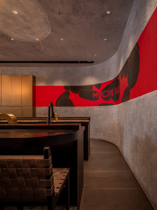
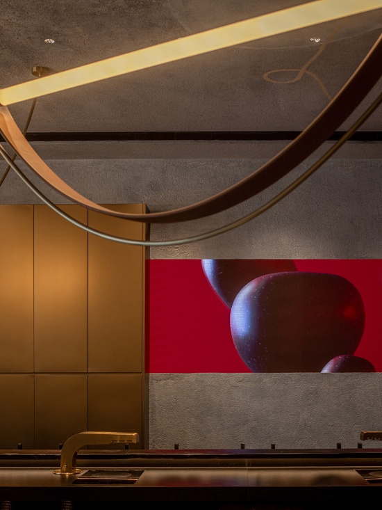
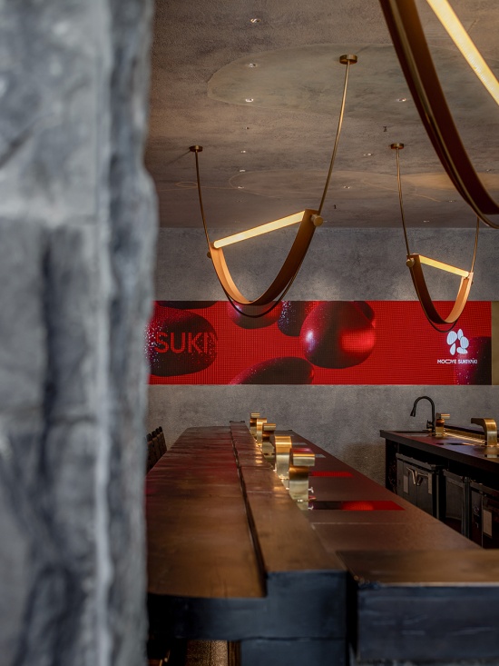
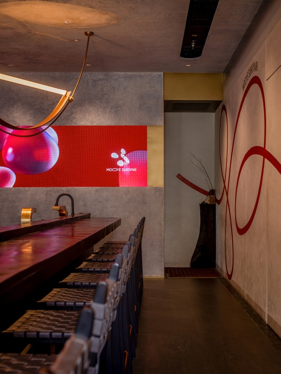
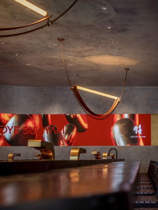
而空间尽头的弧形屏幕则是点睛之笔。我们将品牌VI图像做成动画持续滚动,不仅提供了视觉张力,更成为板前空间的视角落脚处。夜晚,外部行人可直接透过弧形幕墙看到室内的光影,实现了极强的昭示性。
And the curved screen at the far end of the space is the finishing touch. We turned the brand’s VI graphics into an animation that loops continuously — it not only adds visual tension but also becomes the focal point of the counter space. At night, pedestrians outside can see the light and shadows inside directly through the curved glass wall, giving the space a strong street presence.
▼空间一角,Corner of space ©穆彪
鲨库:深邃包裹下的白色轻盈
SAKU: White Lightness Wrapped in Depth
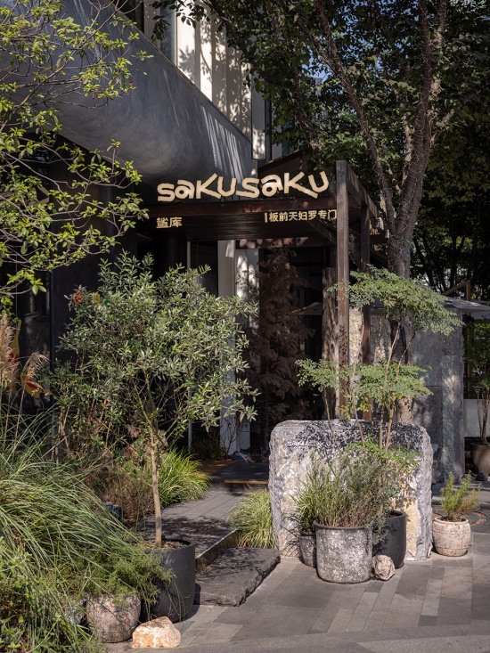
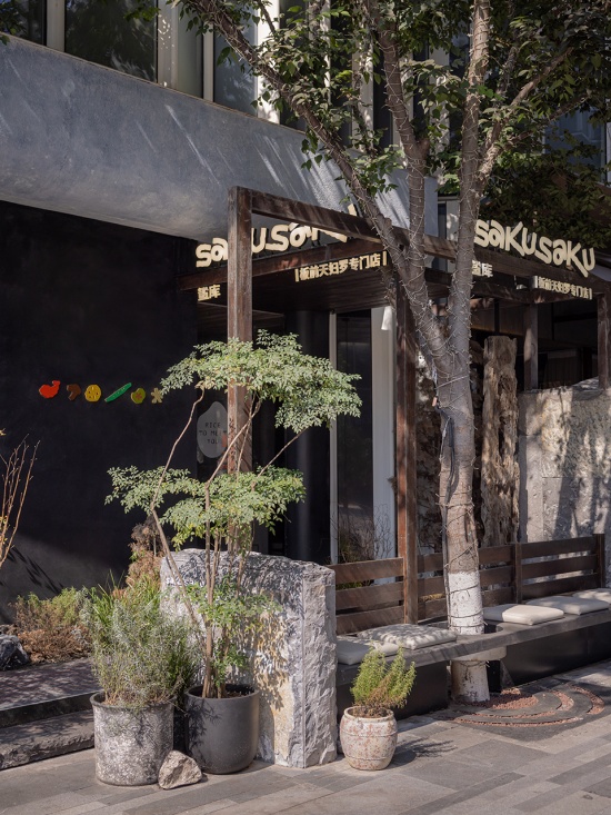
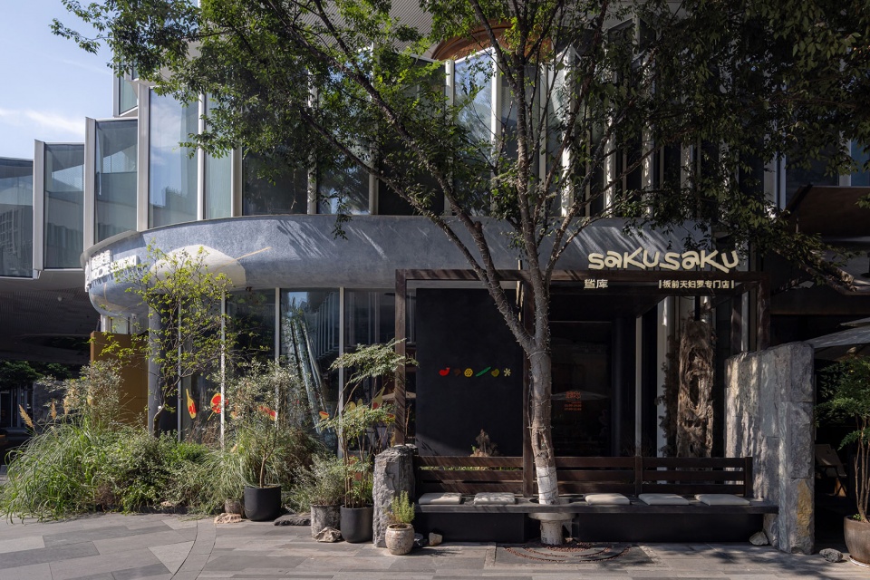
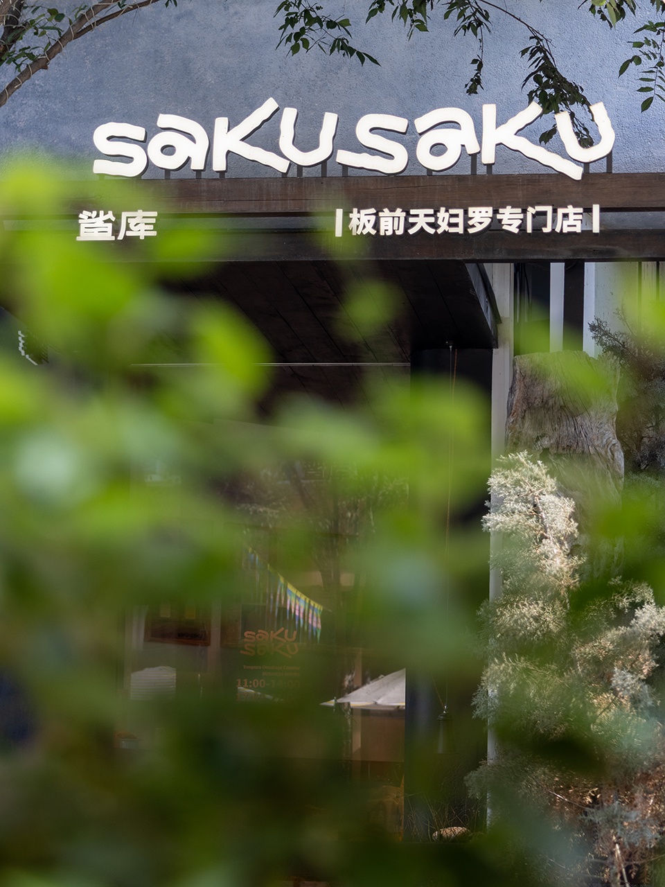
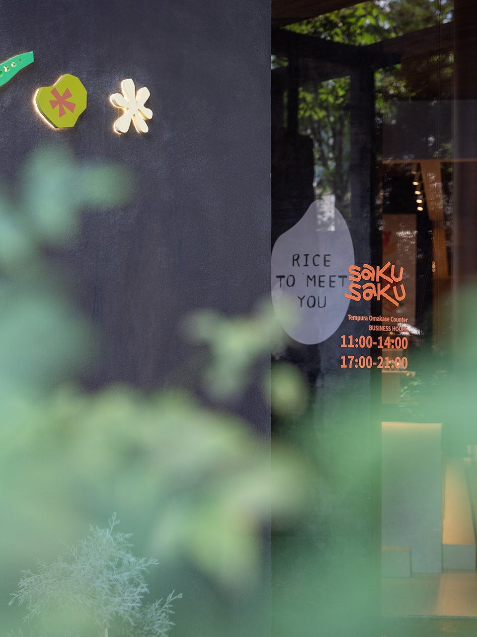
如果说牧也是向外扩张的张力,那么天妇罗品牌“鲨库”则是向内探索的深邃。为了在结构上不被隔壁淹没,鲨库的入口通过石墙、花径形成自然引导,并利用老木头搭建外挑屋檐,延长了进店路径,避开了树木遮挡。
If MOOYE is about outward-expanding energy, then the tempura brand SAKU is about inward-seeking depth. To avoid being visually overwhelmed by its neighbor, SAKU’s entrance is guided by stone walls and a flower path, with an old wooden overhanging eave that extends the entry sequence and dodges tree cover.
▼门头,Facade ©穆彪
▼光影,Shadow ©穆彪
▼门头细节,Facade ©穆彪
▼室内,Interior ©穆彪
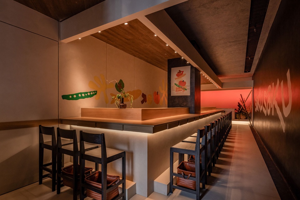
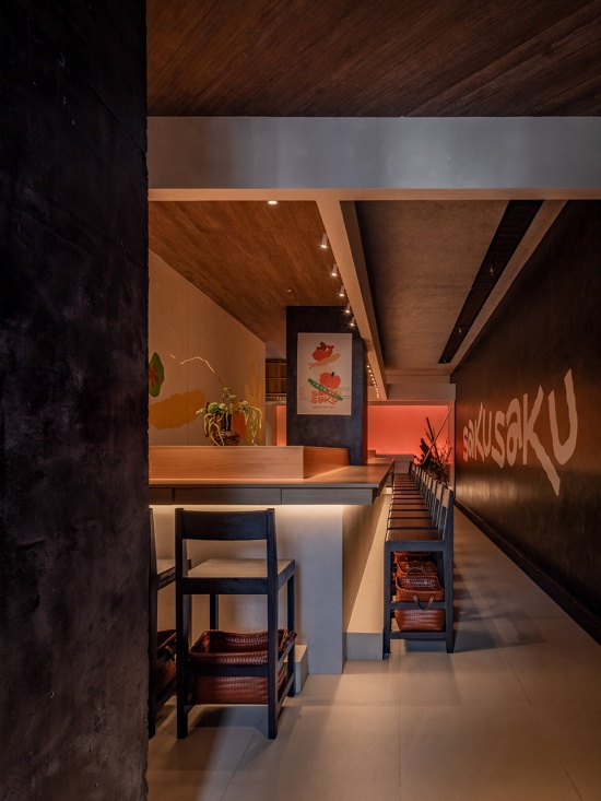
整个用餐区被设计为“嵌套在黑色空间内的白色板前”。四周采用略带反光的黑色涂料包裹,顶部不设主光源,营造出深邃悠长的空间感。
The entire dining area is designed as a“white counter nested inside a black space.” Slightly reflective black paint wraps the surroundings, with no main ceiling light — creating a deep, elongated spatial feel.
▼板前,Counter ©穆彪
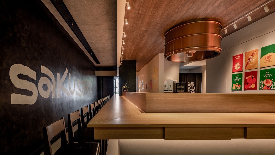
▼深邃悠长的空间感,Deep and elongated spatial feel ©穆彪
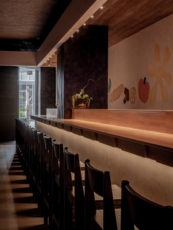
极简的白色吊顶、立面与地面在暗色环境中脱颖而出。照明被精准控制在操作区与餐盘位置,引导用户视线自然落在食物上。尽头的发光灯膜是空间中的核心点缀。这抹光不仅渲染了深色空间的情绪,传递出品牌年轻、轻松的日常感,更重要的是,它作为一个视觉诱饵,能让外围经过的行人远远被吸引,而非一带而过。这种轻松的日常感,也完美契合了其百元内客单的消费预期。
Minimalist white ceiling, walls, and floor stand out against the dark backdrop. Lighting is precisely aimed at the cooking station and plate positions, naturally guiding the eye to the food. At the far end, a luminous film panel serves as the space’s focal point. That glow not only sets the mood in the dark room, conveying a youthful, relaxed everyday vibe — more importantly, it acts as a visual lure, catching the attention of passersby from afar rather than letting them walk by unnoticed. This easygoing daily-ness perfectly matches its sub-hundred-yuan per-person price point.
▼发光灯膜,Luminous film ©穆彪
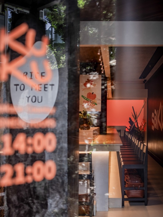
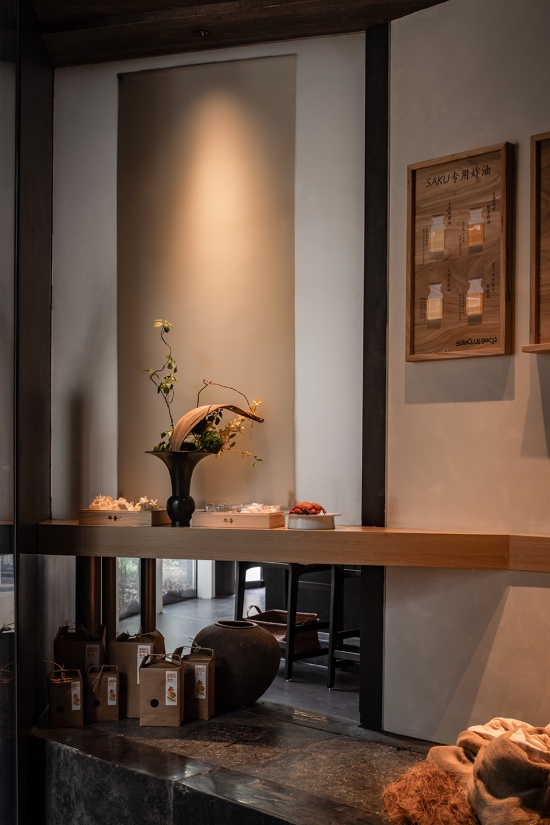
▼产品展示,Product display ©穆彪
在这个项目中,我们没有使用炫技的构造。牧也与鲨库,一个是向外张扬的自然野趣,一个是向内收敛的静谧深邃,它们共同构成了一个完整且富有戏剧张力的板前空间样本。希望这个“一店双品牌”的探索,能为未来的餐饮空间设计提供一些新的思路。
In this project, we didn’t rely on flashy construction techniques.MOOYE and SAKU — one extroverted with wild natural charm, the other introverted with quiet depth — together form a complete, dramatically charged counter-space prototype. We hope this “one-shop, two-brands” exploration offers fresh thinking for future restaurant design.
▼平面,Plan ©向生设计事务所
More:REBORN DESIGN ,更多关于:REBORN DESIGN on gooood







材料、细节不错