感谢 泛域设计 予gooood分享以下内容。更多关于:FUNUNIT DESIGN on gooood
Appreciation towards FUNUNIT DESIGN for providing the following description:
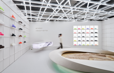
首先品牌的定位是没有变化的,还是3D打印鞋,但是在这个空间中会把空间弱化,重点在产品本身,所以整个空间是几乎纯白的,但是在每个细节中展现3D晶格结构以及产品的特性。
The brand’s positioning remains unchanged as 3D-printed shoes. However, within this space, the environment itself will be de-emphasized, with the focus placed on the products themselves. Thus, the entire space is almost entirely white, yet the 3D lattice structure and product characteristics are showcased in every detail.
▼俯瞰入口空间,Entrance space aerial view © 奥观建筑视觉AOGVISION
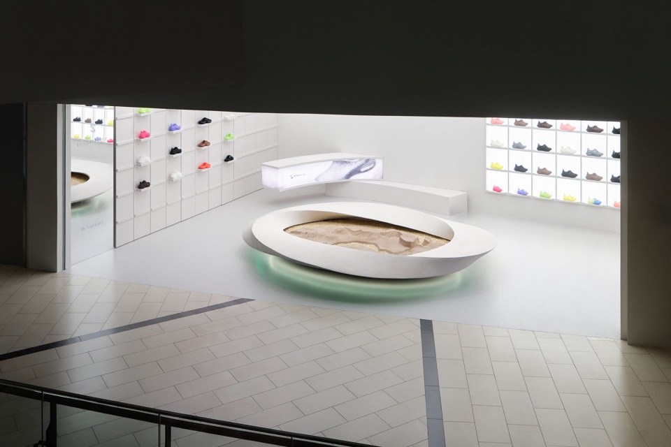
这是星世线STARAY的第一家专属旗舰店铺,有别于快闪店的“事件性”,与店中店的“商品性”,品牌空间的店铺更多展现的是品牌核心的基因。有别于传统柔软的“让步”与“包容”,星世线的柔软是“支撑”与“解放”,它源于3D打印技术带来的精准结构—— 既是中空轻盈的,又是无比强韧的。不是单纯的科技感,而是几何与科技赋予的“结构柔软”,这种“结构性的柔软”不是为了沉溺,而是为了在无感中被支撑, 从而获得身体活动的最大自由。
This is the first dedicated flagship store of STARAY. Unlike pop-up stores, which are event-driven, and shop-in-shops, which are product-focused, STARAY’s brand space store primarily showcases the core essence of the brand. Differing from the traditional softness of ‘concession’ and ‘tolerance’, STARAY’s softness is ‘support’ and ‘liberation’, stemming from the precise structures brought about by 3D printing technology — it is both hollow and lightweight, yet incredibly strong. It is not a pure sense of technology, but a ‘structural softness’ endowed by geometry and technology. This ‘structural softness’ is not for indulgence, but to provide support in an unobtrusive way, thereby enabling the maximum freedom of bodily movement.
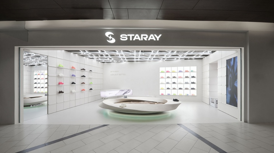
▼入口立面,Entrance facade © 奥观建筑视觉AOGVISION
一面墙,与两组柜子
A wall with two sets of cabinets
50m²,扁长的盒子,没有储藏间,没有后场。所有的销售、体验、收纳、品牌输出,都在这个盒子里完成。
A 50-square-meter, long and narrow box with no storage room and no backstage area.
▼整体空间概览,Overall space view © 奥观建筑视觉AOGVISION
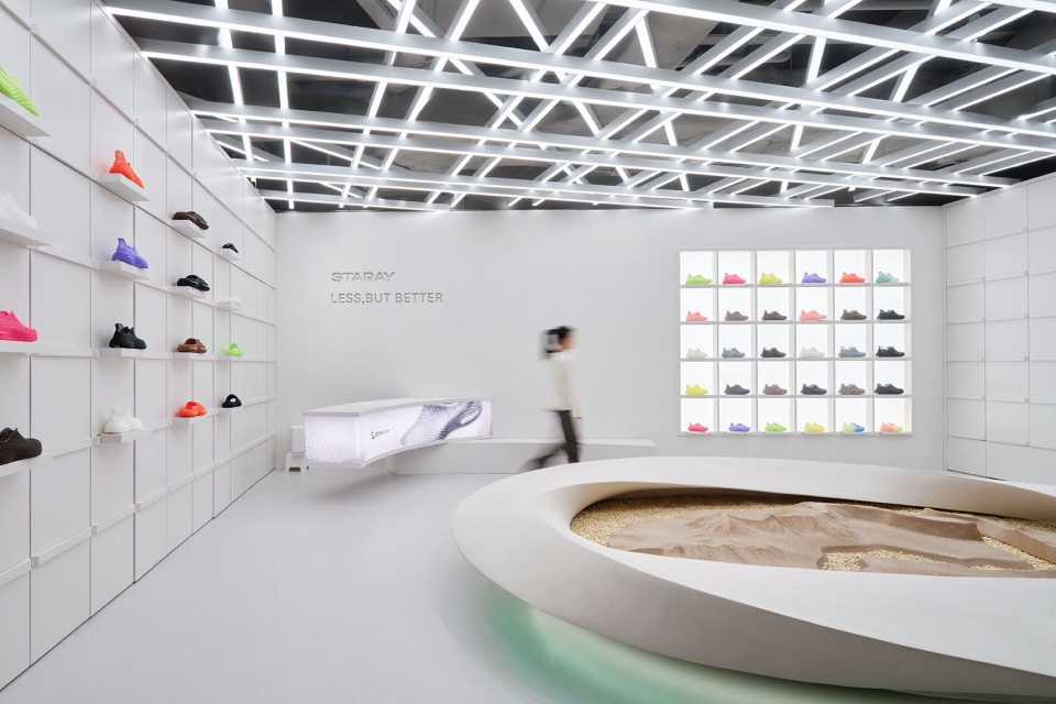
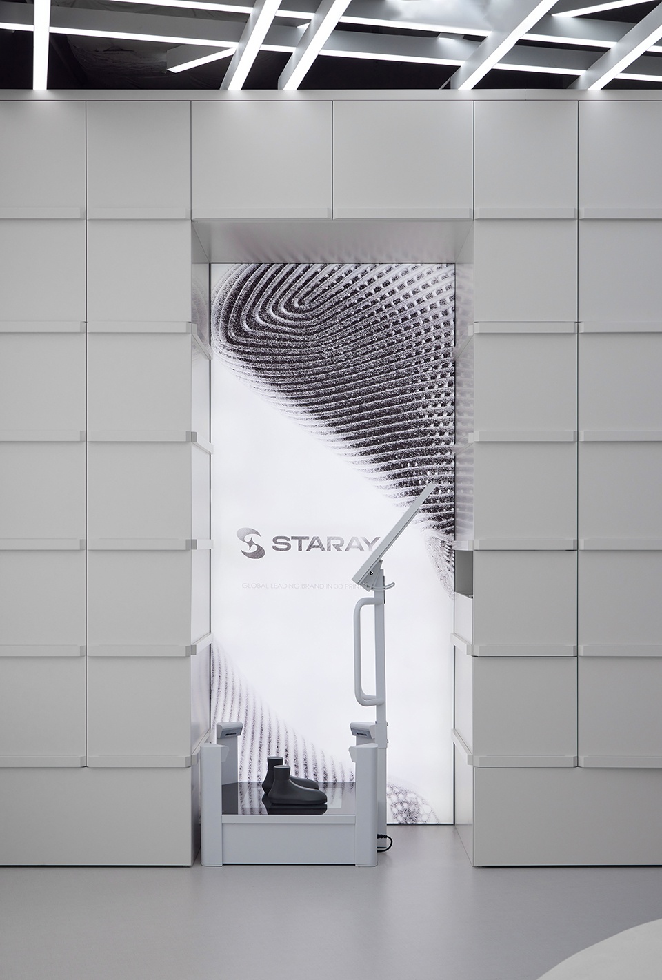
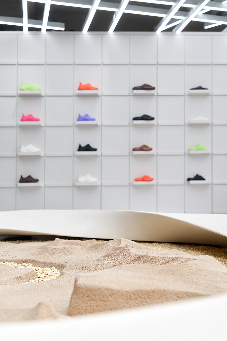
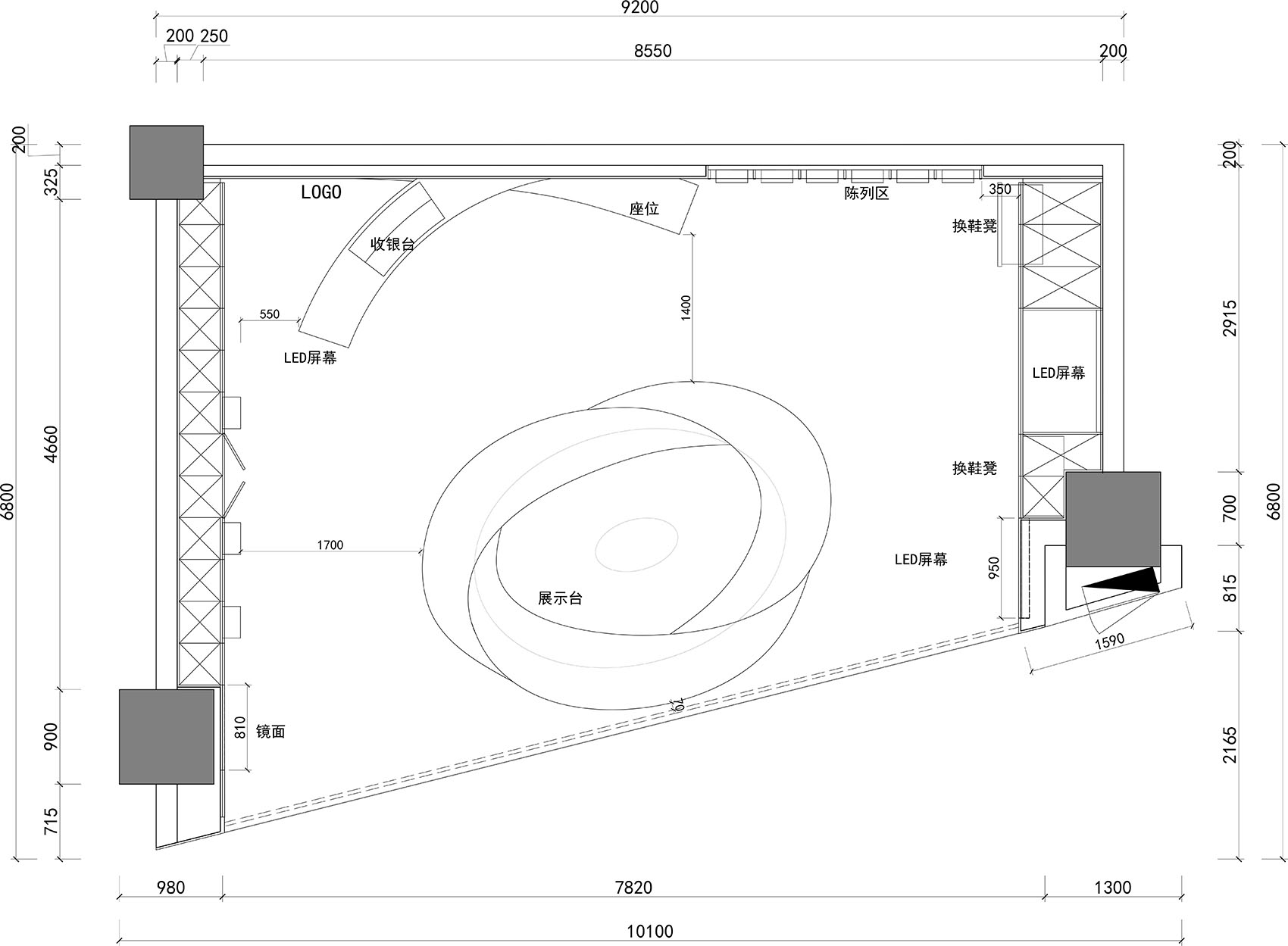
我们在左右两侧做了两排柜子。柜门关上时,它们就是完整的墙面,左侧柜子用来存放备货,店铺的备货都藏在里面;右侧柜子里放着试穿鞋,中间利用柜体深度挖了一个内凹区域,放了一台3D打印机做扫描体验,凹槽里还顺手收纳了备用的、拖鞋、纸巾的定制收纳。两组柜体之间,夹出了一个大约四十平米的有效活动区域。塔式模块垂直向上发展,收纳和陈列都挂在墙上,地面被完全释放出来。
All sales, experiences, storage, and brand communication are completed within this box. Installed two rows of cabinets on both the left and right sides. When the cabinet doors are closed, they form a seamless wall. The left cabinets are used for storing inventory, with all the store’s stock hidden inside; the right cabinets hold shoes for trying on. In the middle, we carved out an indented area using the depth of the cabinet bodies to place a 3D printer for scanning experiences, and the recess also conveniently stores custom organizers for slippers and tissues. Between the two sets of cabinets, there is an effective activity area of approximately forty square meters. The tower-style modules develop vertically upwards, with storage and displays mounted on the walls, completely freeing up the floor space.
▼结合收纳的墙面展示,Wall display with storage © 奥观建筑视觉AOGVISION
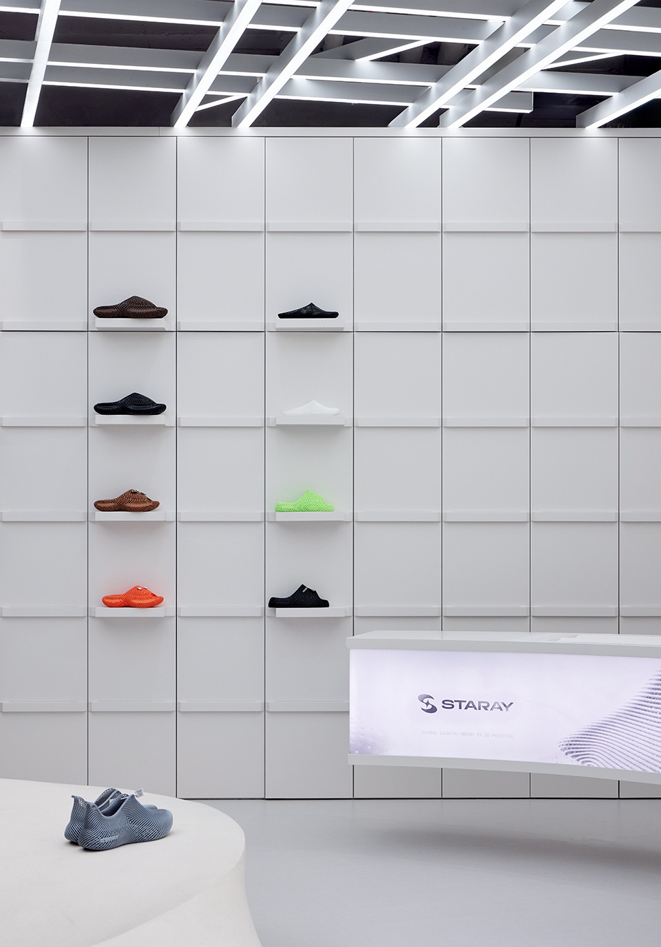
▼内凹区域,Indented area © 奥观建筑视觉AOGVISION
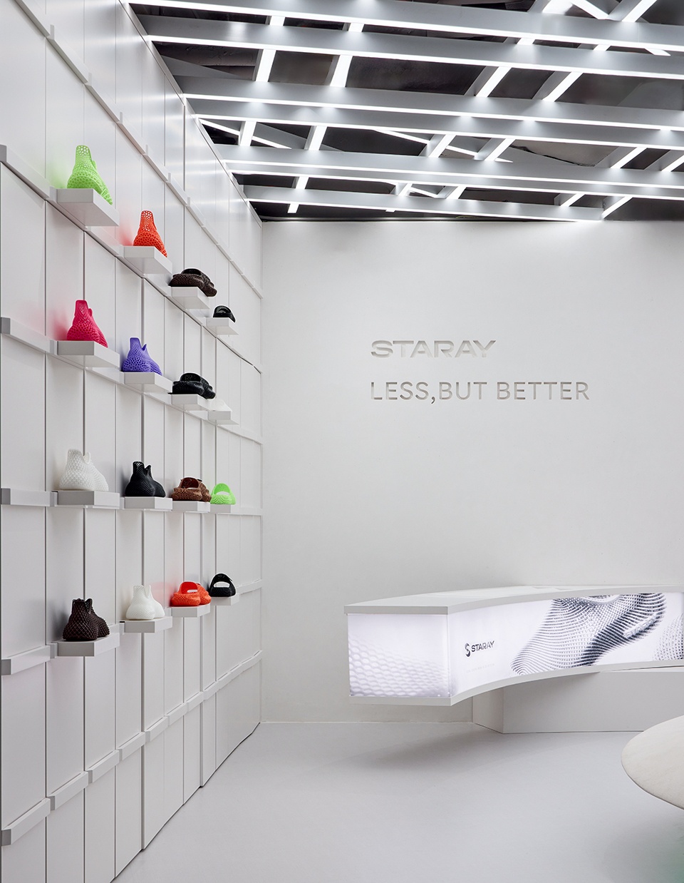
真正有趣的是那条凸起的导向条,它同时做了三件事:是柜门的拉手;是展陈板的卡槽;也是墙面上的线性节奏。展陈板的边缘可以卡进任意一条导向槽里。可以根据鞋款的多少、上新节奏,随时拔出展陈板,换个高度插进去。
What’s truly interesting is the raised guide strip, which serves three functions simultaneously: it acts as the cabinet door handle, the slot for the display panels, and the linear rhythm on the wall. The edges of the display panels can be inserted into any of the guide slots. Display panels can be pulled out and reinserted at different heights at any time, depending on the number of shoes and the restocking schedule.
▼墙面与导向条,Wall with raised guide strip © 奥观建筑视觉AOGVISION
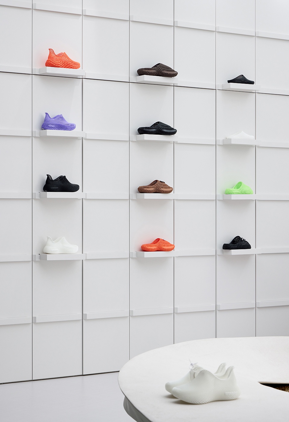
▼墙面细节,Wall detail © 奥观建筑视觉AOGVISION
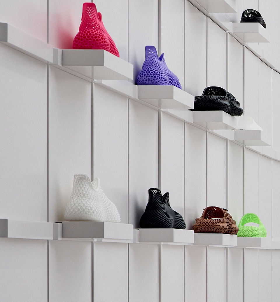
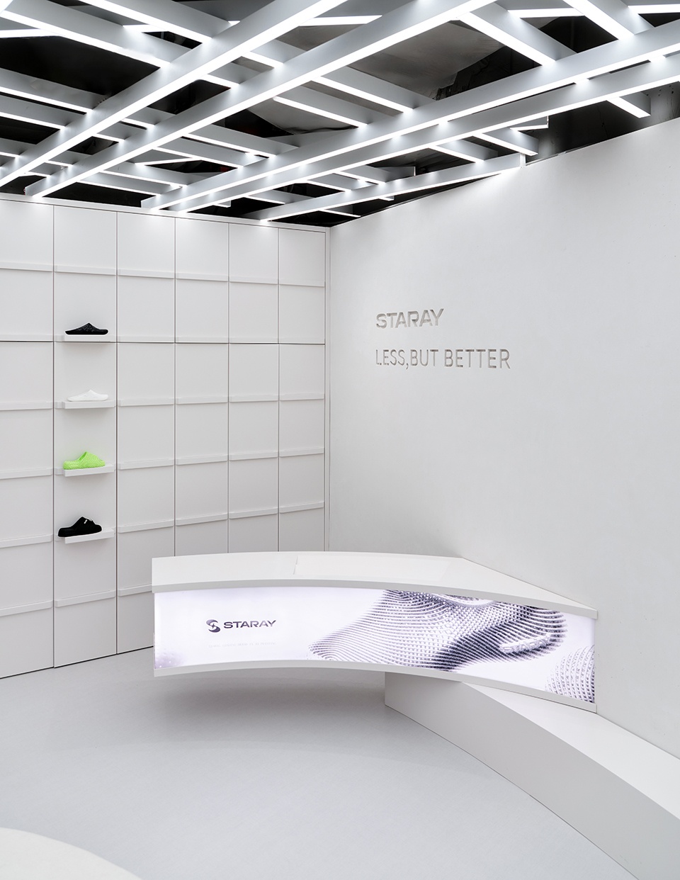
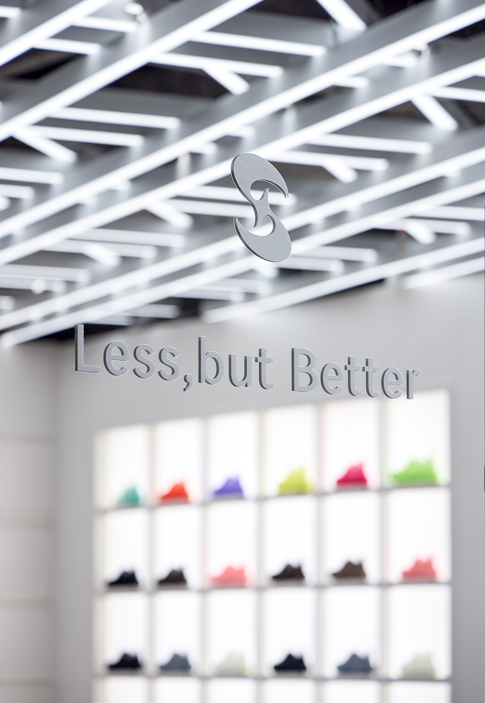
空间的主背景极其的简单,白色石膏质感的表面,和门头、背景连成一片,品牌LOGO只是浅浅地嵌进去。
The main background of the space is extremely simple, featuring a white plaster-like surface that seamlessly integrates with the door header and backdrop. The brand logo is subtly embedded into it.
▼墙面与品牌标识,Brand logo on the wall © 奥观建筑视觉AOGVISION
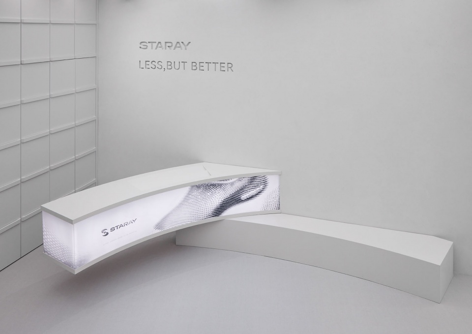
▼品牌标识细部,Brand logo detail © 奥观建筑视觉AOGVISION
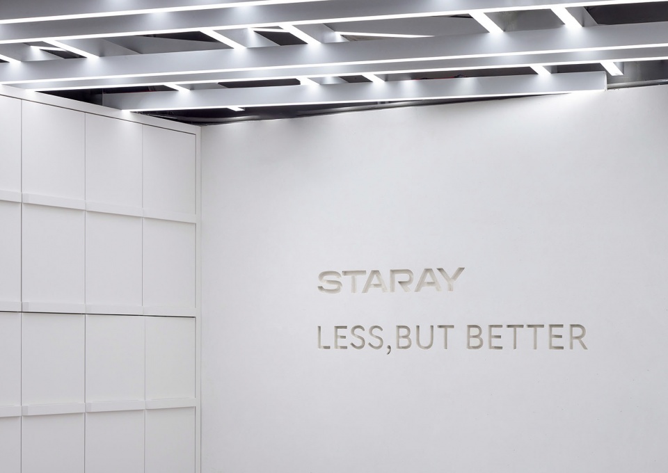
光的编织
Weaving of Light
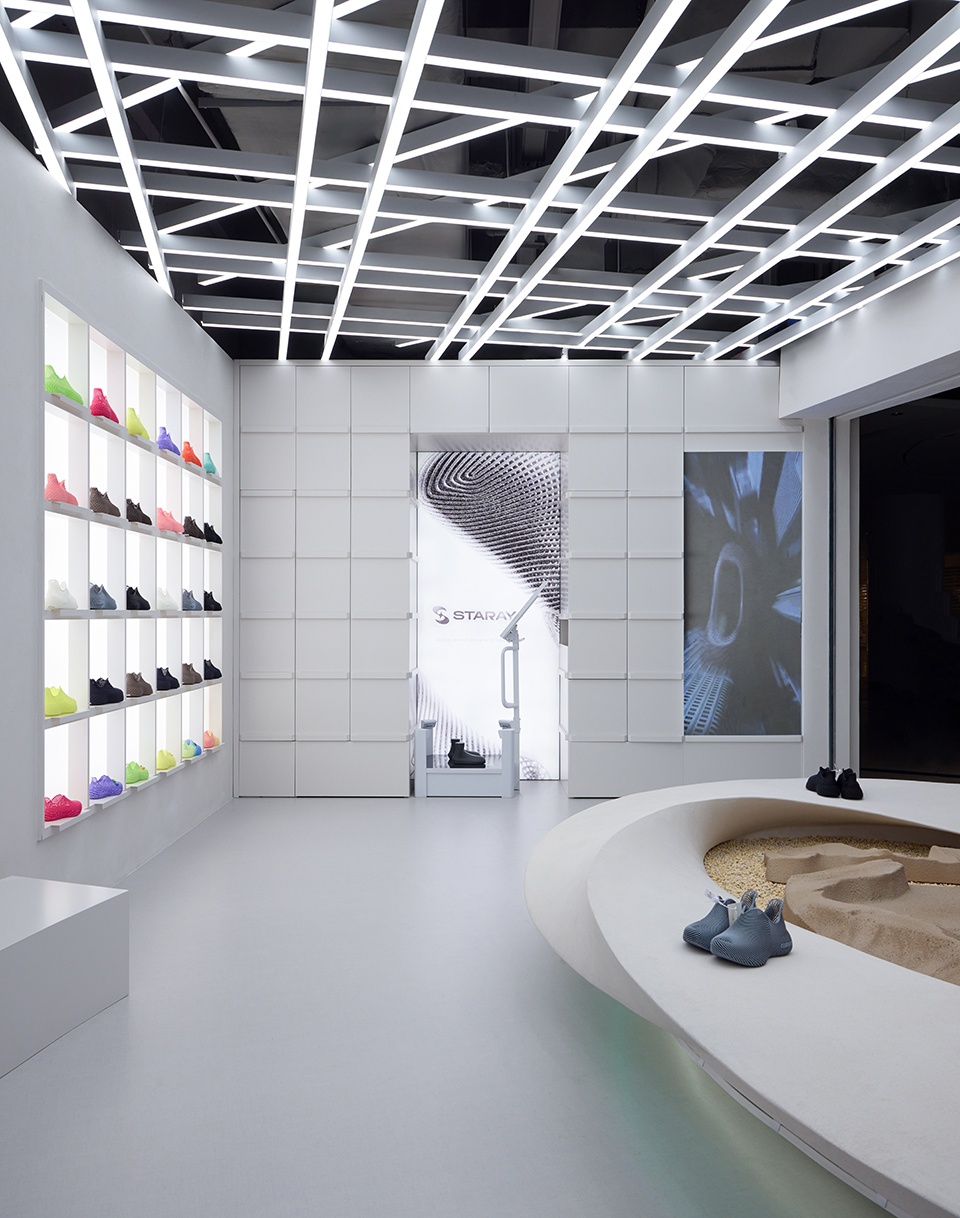
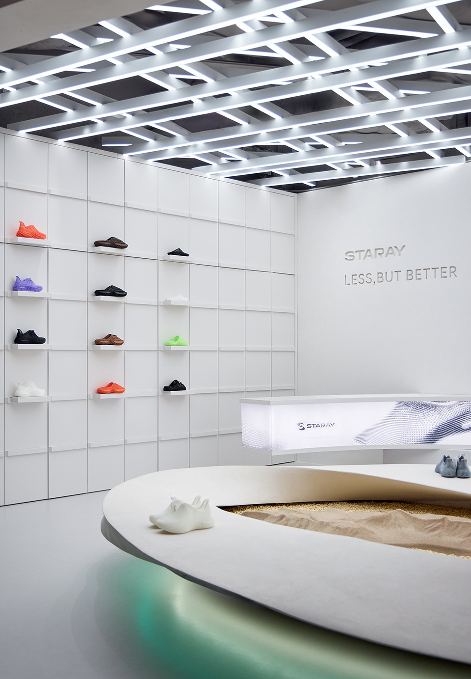
顶面做了三层错层的灯条,不是简单的平行光带,而是像织物的经纬线一样交错。灯条之间有前有后,光线在顶上形成一层薄薄的网格。网格光把视线自然引向中心展台与墙面陈列,人在其中行走,会被光的节奏轻轻牵引,空间因此更像一段被编排过的路径。地面用的是带有编织肌理的地面,选择编织肌理的原因很简单:3D打印的鞋底本身就是网格逻辑。我们把这种逻辑从产品延伸到地面,但不是直接复制图案,而是用编织的秩序感去呼应。地面不需要喧哗,它只是给整个空间铺了一层安静的基底。
The top surface features three-tiered staggered light strips. They are not simple parallel light bands but intersect like the warp and weft of fabric. The light strips overlap in front and behind each other, creating a thin grid of light on the ceiling. The grid of light naturally draws the eye toward the central display and wall arrangements. As people walk through, they are gently guided by the rhythm of the light, making the space feel like a carefully choreographed path. The ground uses a woven-textured surface. The reason for choosing this woven texture is simple: the sole of 3D-printed shoes itself follows a grid logic. We extend this logic from the product to the ground, but instead of directly replicating patterns, we respond with the orderliness of weaving. The ground does not need to be showy; it simply lays a quiet base layer for the entire space.
▼网格灯光与编织肌理地面,
Grid lighting and woven-textured ground © 奥观建筑视觉AOGVISION
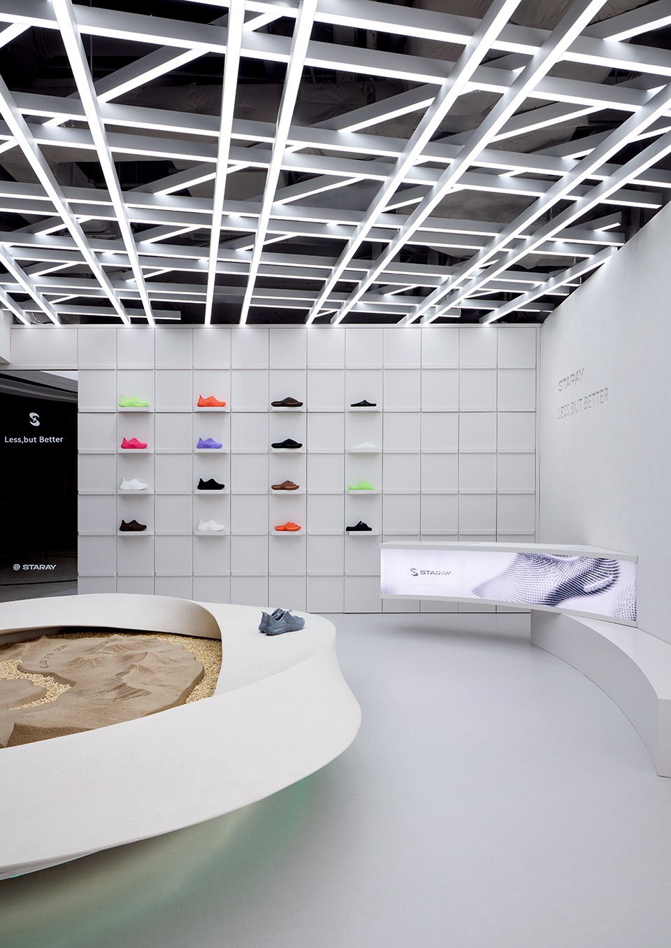
悬浮的莫比乌斯
Suspended Möbius
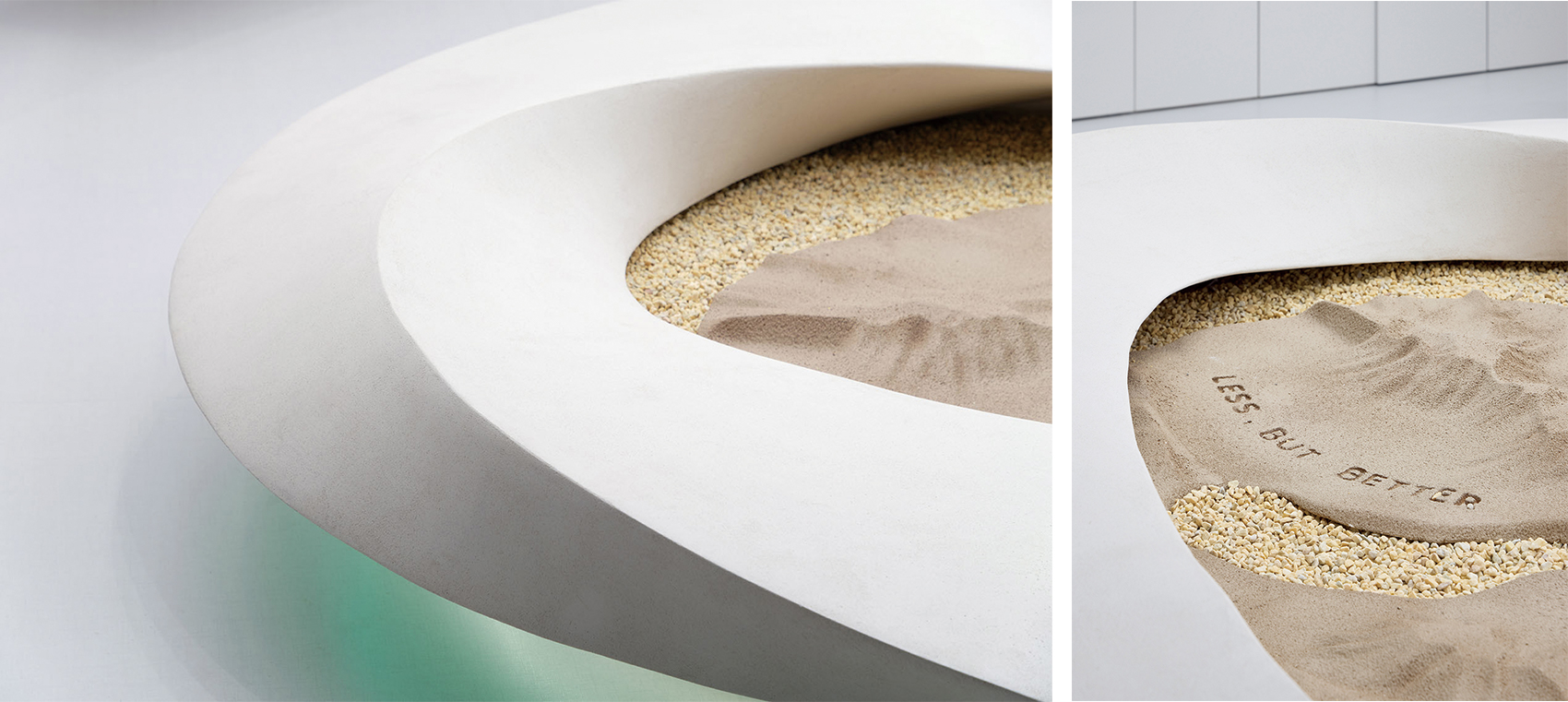
中心展台是一个莫比乌斯圆环,悬浮在空中。它的材质是哑光白色,和墙面统一,但底部有一圈暗藏的光带。瞬息的大地是会呼吸的动态光谱:当光色由亮到柔、由聚到散。我们设计了一段动态光效:模拟水珠落下的瞬间,光从一点亮起,迅速扩散,然后渐渐消散。“瞬时透水、干爽”的体验——3D打印的晶格结构可以让水珠在几秒内渗透到鞋面内部,表面只留下干爽。
The central exhibit stand is a Möbius ring, floating in the air. It is made of matte white material, matching the walls, but has a hidden light band at the bottom. The ever-changing earth is a dynamic, breathing spectrum of light: as light transitions from bright to soft, from concentrated to diffused. We have designed a dynamic light effect that simulates the moment water droplets fall—light ignites at a single point, spreads rapidly, and then gradually fades. The experience of ‘instant permeation and dryness’—3D-printed lattice structures allow water droplets to penetrate into the shoe’s interior within seconds, leaving only a dry surface.
▼俯瞰莫比乌斯展台,Mobius exhibit stand aerial view © 奥观建筑视觉AOGVISION
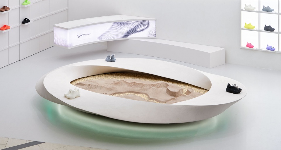
顾客可以站在圆环旁边试穿。鞋子放在环面上,低头就能看到光影变化。这个展台同时承担了展示、试穿、停留的功能,动线围绕它展开。莫比乌斯环的形态本身没有刻意解释什么。它就是一个悬浮的、没有起点和终点的曲面,安静地待在那里。
Customers can try on shoes while standing next to the circular platform. The shoes are placed on the ring surface, allowing one to look down and see the changing light and shadows. This display stand serves multiple functions, including showcasing, trying on, and providing a place to linger, with the flow of movement centered around it. The form of the Möbius strip itself does not intentionally explain anything. It is simply a suspended, surface with no beginning or end, quietly remaining there.
▼展台一角,Corner of exhibit stand © 奥观建筑视觉AOGVISION
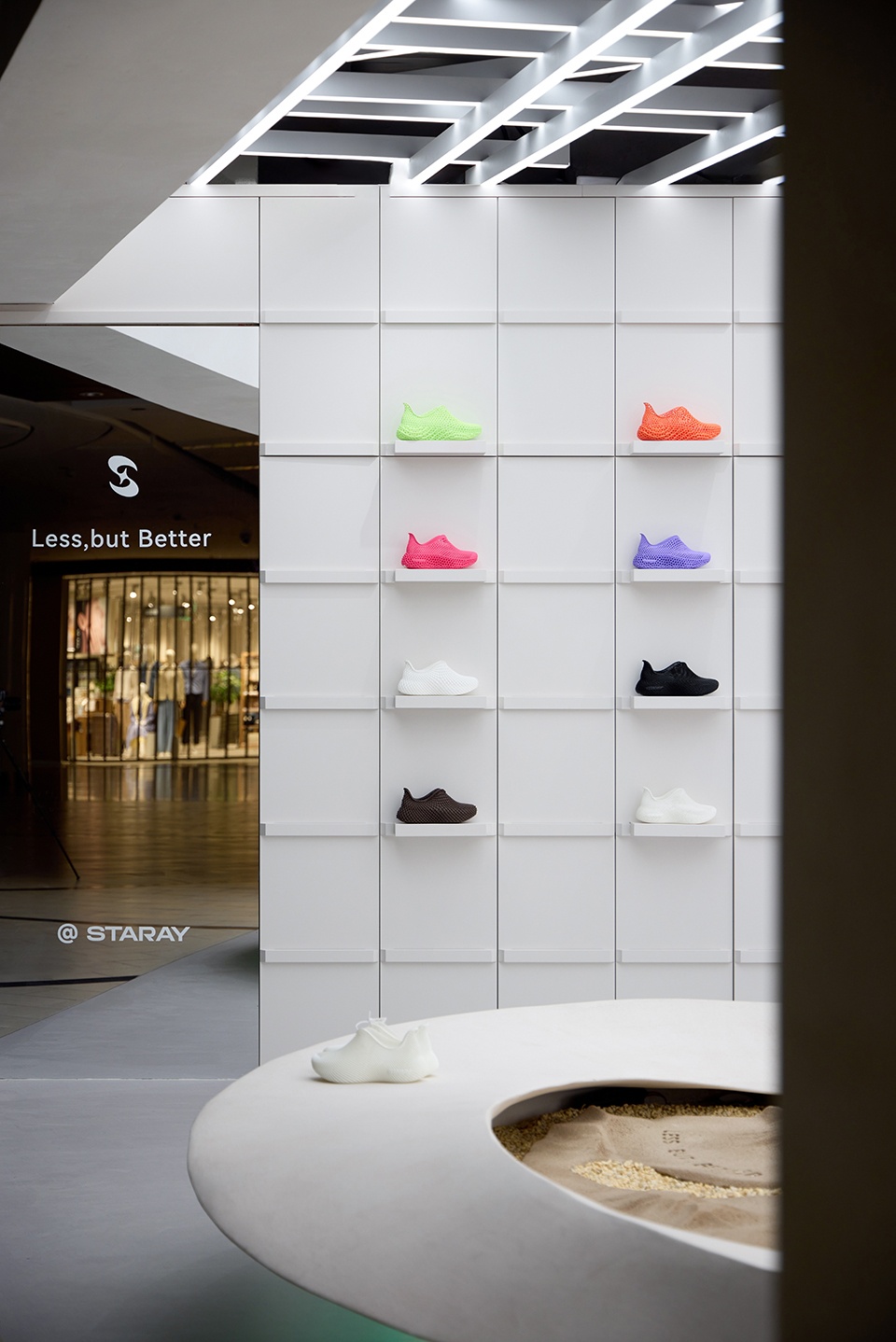
▼展台看向墙面展示,
Exhibit stand viewing towards wall display © 奥观建筑视觉AOGVISION
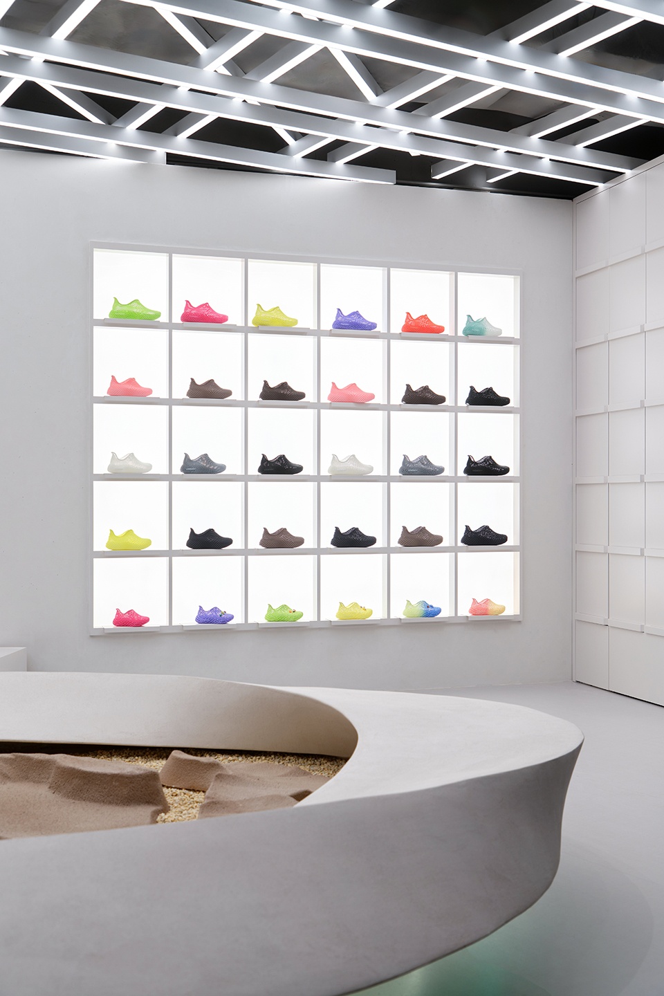
▼展台细部,Exhibit stand detail © 奥观建筑视觉AOGVISION
关于“结构柔软”
Regarding ‘structural softness
所有设计都在回答同一个问题:怎么让人感受到这双鞋的柔软,但不是那种陷进去的柔软。传统柔软是让步,是材料对你的身体妥协,把你包裹住,让你沉下去。星世线的柔软不一样。它来自3D打印的晶格结构,每一根细小的支柱都是计算过的,在受到压力时不会塌陷,而是均匀地分散受力,然后回弹。所以踩上去的感觉是“被托住”,不是“被埋住”。这种柔软是主动的、有支撑力的。它不纵容你瘫软,而是帮你保持身体的中立和自由。我们在空间里也试图传递这种感觉:墙面上的线性凸起是硬朗的,但手感圆润;柜门关上后整面墙是平整的,但横向的导向条又带来了节奏;顶面的灯光是温和的,但三层错层的结构清晰明确。没有多余的曲线去模仿“柔和”,也没有尖锐的棱角去炫耀“科技”。只有一些必要的、精确的构造,构成了一个可以安静待着的地方。
All the designs are answering the same question: how to make people feel the softness of these shoes, but not the kind of softness that makes you sink into them. Traditional softness is yielding, a compromise of materials to your body that wraps around you and lets you sink. The softness of Starry Thread is different. It comes from 3D-printed lattice structures, where each tiny pillar is calculated to not collapse under pressure but instead evenly distribute force and then rebound. So stepping on it feels like being ‘supported’ rather than ‘buried’. This softness is proactive and supportive. It does not indulge in limpness but helps maintain the body’s neutrality and freedom. We also aim to convey this feeling in the space: the linear protrusions on the walls are sturdy yet have a rounded touch; the entire wall is flat when the cabinet doors are closed, but horizontal guide strips introduce rhythm; the ceiling lighting is gentle, yet the three-tier stepped structure is clear and distinct. There are no extra curves to mimic ‘softness’ nor sharp edges to flaunt ‘technology’. Only some necessary, precise constructions form a place where one can rest quietly.
▼品牌空间一角,Corner of brand space © 奥观建筑视觉AOGVISION
小空间的完整
pleteness of small spaces
在这个极小的空间中,我们用柜体消化了功能需求,用墙面上的导向条创造了陈列的灵活性,用顶面的三层光定义了路径,用中心悬浮的圆环制造了一个可以凝视的焦点,用编织地面收拢了所有声音和脚步。最后剩下的,是一面白色的墙,一个漂浮的环,一双放在环上的鞋。墙上的LOGO很轻,几乎看不见。鞋子被光均匀地照亮,晶格结构在侧面投下细密的阴影。
In this extremely small space, we addressed functional needs with built-in cabinets, created flexible display options with guiding strips on the walls, defined pathways with three layers of lighting on the ceiling, generated a focal point for contemplation with a centrally suspended ring, and contained all sounds and footsteps with a woven floor. What remained in the end was a white wall, a floating ring, and a pair of shoes placed on the ring. The logo on the wall was very faint, almost invisible. The shoes were evenly illuminated by light, casting fine shadows from their lattice structure on the side.
▼镜面细部,mirror detail © 奥观建筑视觉AOGVISION
▼平面图,Plan © 泛域设计
项目名称:星世线STARAY·嘉里中心
项目类型:商店
设计方:泛域设计Fununit Design & More
公司网站:http://www.fununitdesign.com/
联系邮箱:fununitdesign@fununitdesign.com
项目设计:朱啸尘 胡晓娴
完成年份:2026.02
设计团队:谢宜臻 欧阳玉黠 尹欣怡
项目地址:杭州 中国
建筑面积:50㎡
摄影版权:奥观建筑视觉AOGVISION
客户:星世线STARAY
材料:烤漆板、艺术涂料、金属、灯管、亚克力
品牌:星世线STARAY
Project name: STARAY·Kerry Centre
Project type: Store
Design: Fununit Design & More
Website: http://www.fununitdesign.com/
Contact e-mail: fununitdesign@fununitdesign.com
Design year: 2026
Completion Year:2026
Leader designer & Team: Leader designer | Eason Zhu,Xiaoxian Hu;Design Team | Amber,Yuxia Ouyang,Xinyi Yin
Project location:Hang Zhou
Gross built area: 50㎡
Photo credit: AOGVISION
Clients: STARAY
Materials:Painted panels, artistic coatings, metal, fluorescent tubes, acrylic
Brands: STARAY
More:泛域设计。更多关于:FUNUNIT DESIGN on gooood







简单美