非常感谢 斗西设计 对gooood的分享。更多关于:Daylab Studio on gooood.
Appreciation towards Daylab Studio for providing the following description:
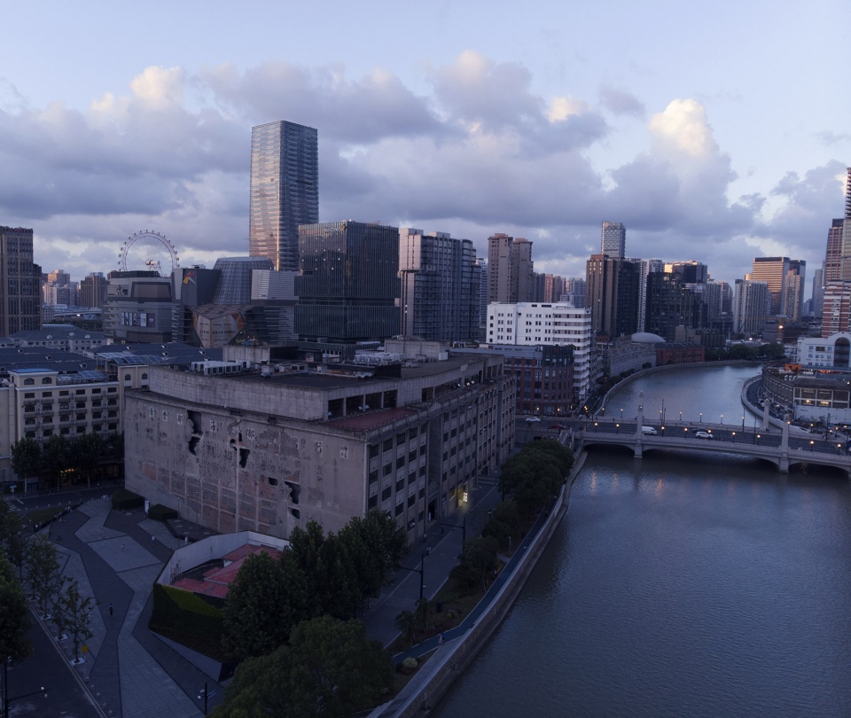
上海四行仓库,因为其独有的历史事件,成为一个承载着国人的民族自豪感和凝聚力的地方,加之文学电影等艺术塑造,被广为人知为红色爱国主义打卡地标。
Joint Savings Bank Warehouse, because of its unique historical events during the World War II, has become a place that carries the national pride and cohesion of the Chinese people, coupled with artistic shaping such as literature and movies, is widely known as a landmark of red patriotism.
▼鸟瞰四行仓库,aerial view of the Joint Savings Bank Warehouse ©YUUUUN STUDIO
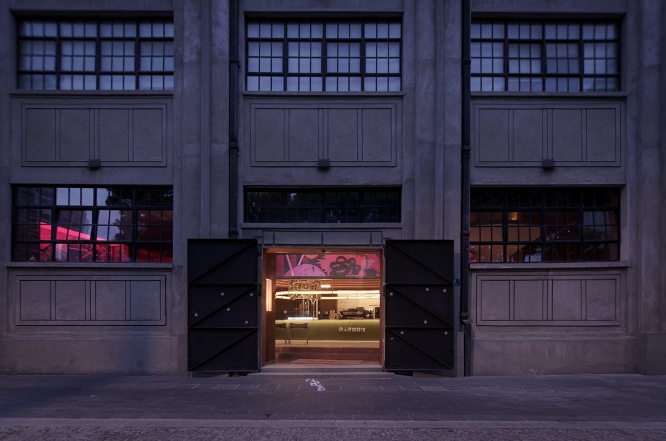
▼店铺外观,exterior view of the cafe ©YUUUUN STUDIO
本次斗西设计的项目「人民咖啡馆」就坐落在这栋建筑内,一个定位年轻人休闲的时髦餐饮空间。其独特的选址和定位给设计带来了一定的难度,也带来了更多的可能性:难度在于它既不能是片面追求流量的网红空间,也不能是俗套“老派印象”的爱国教育展厅;可能性在于如果我们能打造一个既有浓烈的”红色气息”,又能让年轻人”感到时髦”空间,那将是别具一格甚至独一无二的存在。
The project “People’s Cafe” designed by Daylab is located in this building, a fashionable dining space aimed at younger generation. Its unique location and positioning have brought a certain degree of difficulty to the design, while also brought more possibilities: the difficulty lies in that it can neither be an insta-famous space that only pursues network flow, nor can it be a patriotic educational exhibition hall; the possibility is that if we can create a space that has a strong “red atmosphere” and can also make young people “feel fashionable”, it will be a unique existence.
▼入口空间,the entrance ©YUUUUN STUDIO
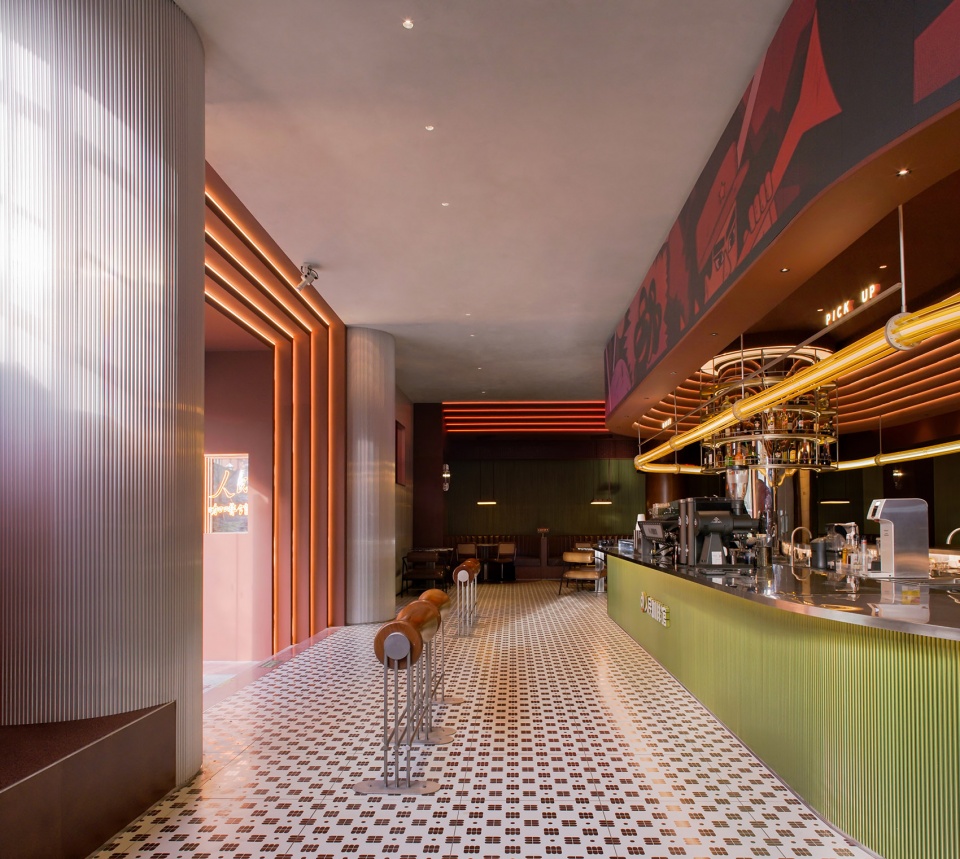
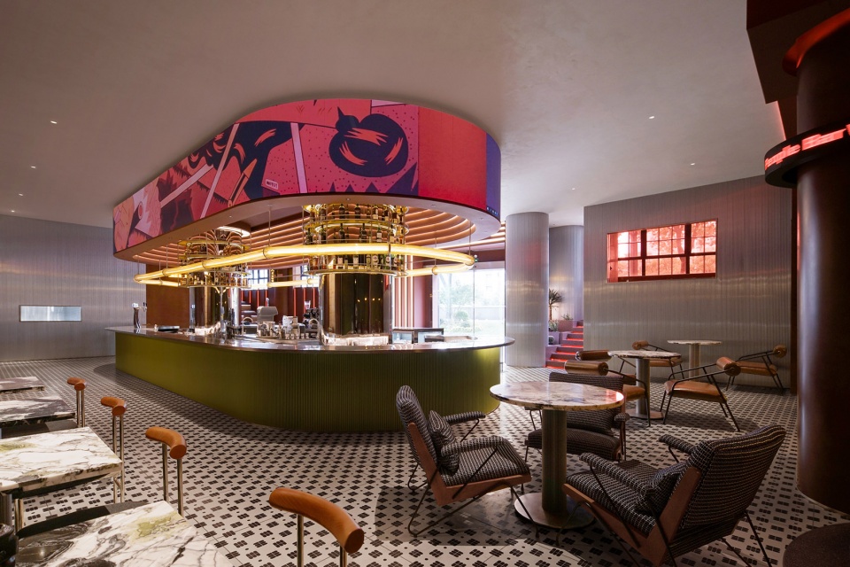
▼吧台区,the counter at the entrance ©YUUUUN STUDIO
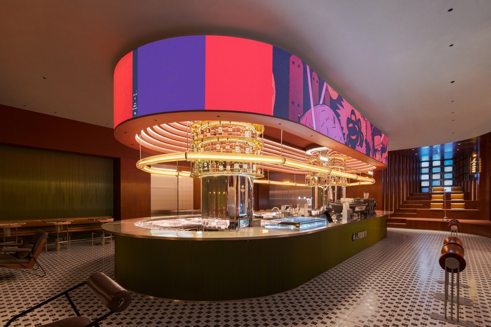
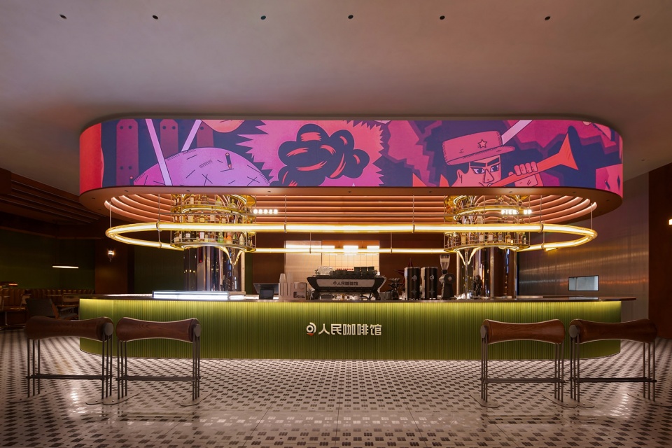
▼看向阶梯区,view of the steps on the other side ©YUUUUN STUDIO
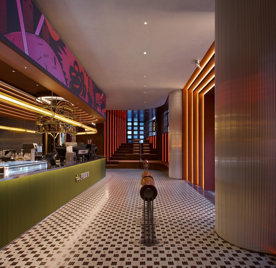
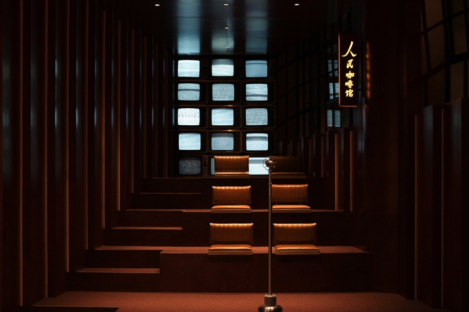
于是,我们大胆的运用了一些通常很难在年轻人喜好的空间里出现的色彩和元素,比如几乎「猪肝红」的带有强烈纹理的木质,比如来自于军旅的绿色,甚至和格格不入的红色做搭配,我们也融入了一些富有象征意义的元素,如阶梯、浮雕等,并通过设计处理让这些元素更容易让年轻人接受。我们希望消费者在这个空间里可以进行文化传播、情绪共鸣, 让这里成为一个既有历史感,又焕发着Z世代气息的设计。
Therefore, we boldly used some colors and elements that are usually difficult to appear in the space preferred by young people, such as “pig liver red” wood, such as the green from the army. We have also incorporated some symbolic elements, such as steps, reliefs, etc. Through design to make these elements easier to be accepted by young people. We hope that consumers in this space can carry out cultural dissemination, emotional resonance, to make it a place that has a sense of history as well as the feature of gen Z.
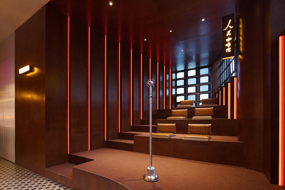
▼阶梯区内部,the steps area ©YUUUUN STUDIO
黑色大门背后的红色光辉
Red aesthetics behind the black iron gate
四行仓库是钢混框架结构,表面花岗岩条石砌墙,坚固异常,历史沧桑感扑面而来,而黑色大门背后则是呼之欲出的红色光辉。
The warehouse is a reinforced concrete pouring frame, with granite strips on the surface. The walls are unusually strong, so are the historical sensation it brings to us. While behind the black iron door is the red brilliance that is ready to emerge.
▼开放用餐区,the open dining area ©YUUUUN STUDIO
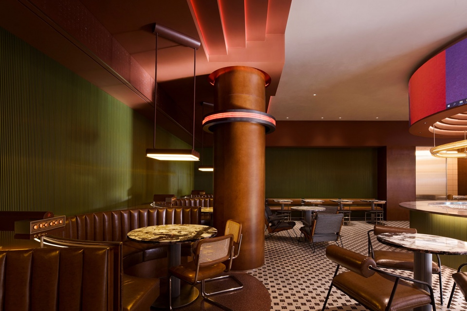
▼融入富有象征意义的元素,incorporated some symbolic elements ©YUUUUN STUDIO
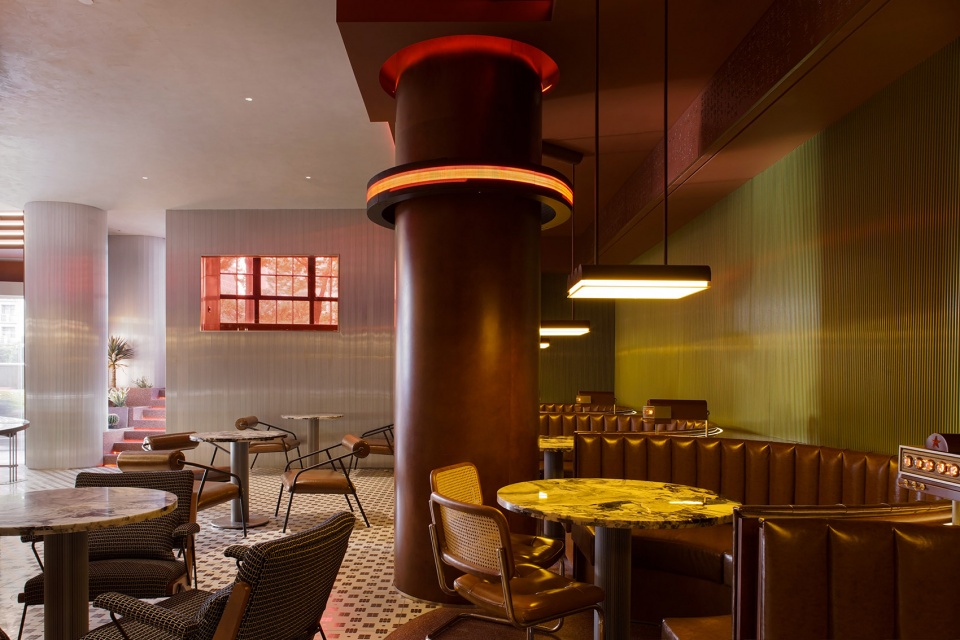
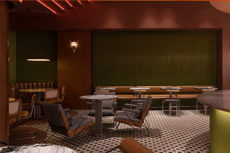
▼靠墙布置的用餐区,dining area along the wall ©YUUUUN STUDIO
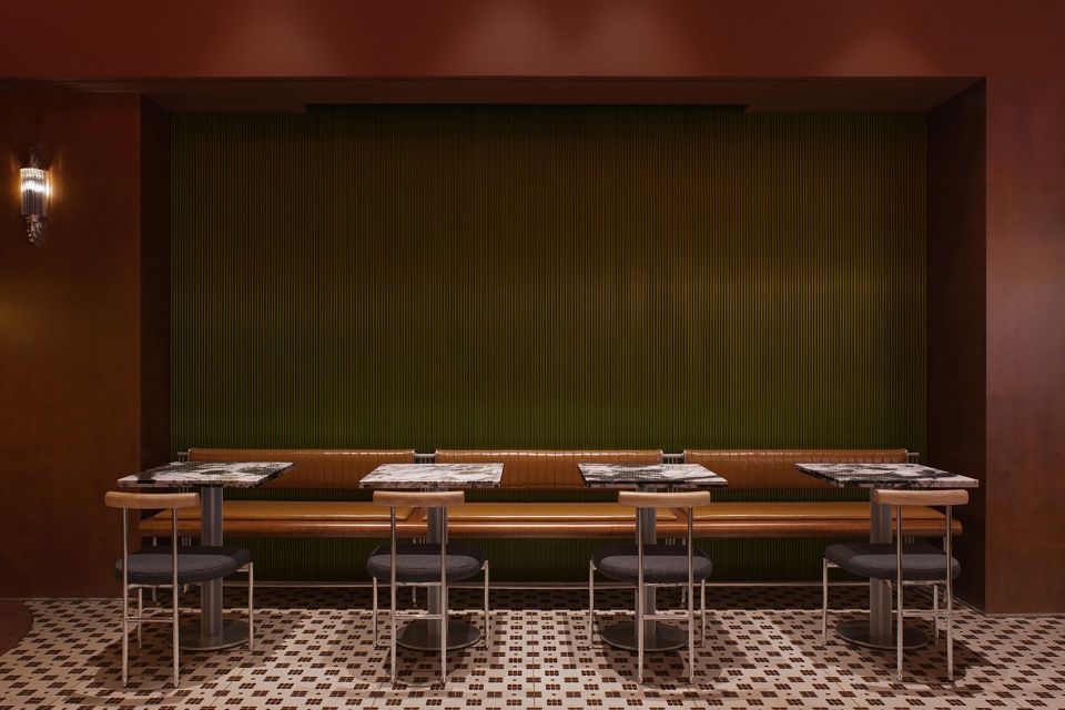
▼沙发卡座,the sofa booth ©YUUUUN STUDIO
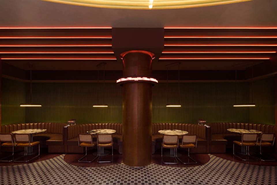
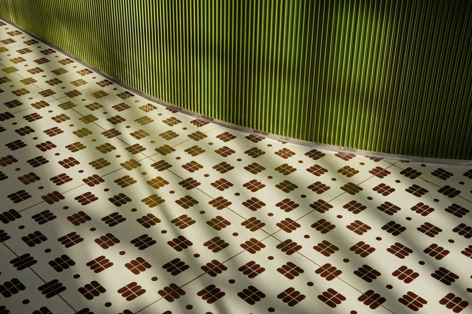
我们从“绿军装”上提炼出富有浪漫主义色彩的暗绿色,并为空间定制了专属的暗红色图案地砖,搭配肌理丰富的桦木纹,配合精心挑选的家具软装。视线所及之处是历史风情与现代金属感的碰撞融合。
We extracted the romantic dark green from the “green military uniform”, and customized the exclusive dark red patterned floor tiles for the space, matched with the rich birch wood grain, and carefully selected furniture and fixtures. The collision and fusion of the history and modern elements are everywhere.
▼历史风情与现代金属感的碰撞融合
the collision and fusion of the history and modern elements ©YUUUUN STUDIO
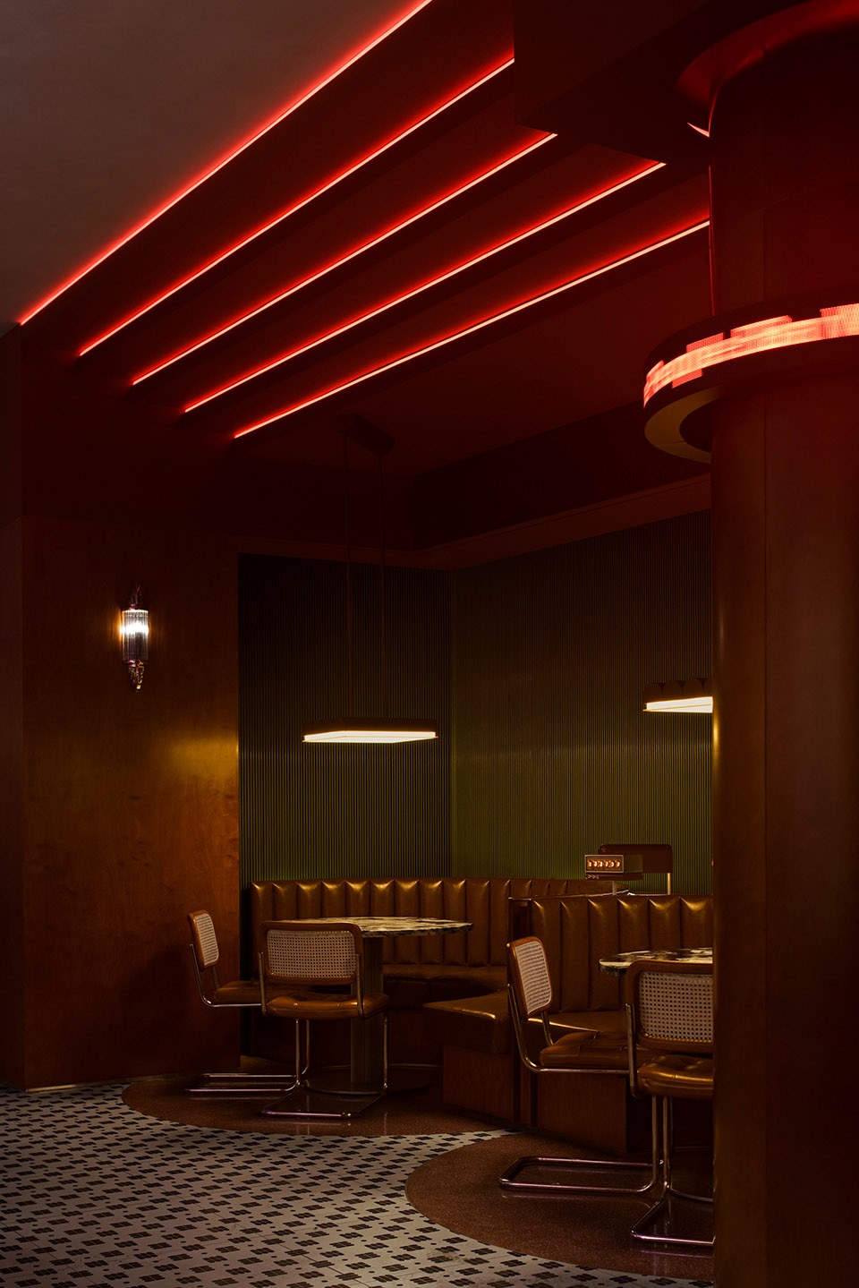
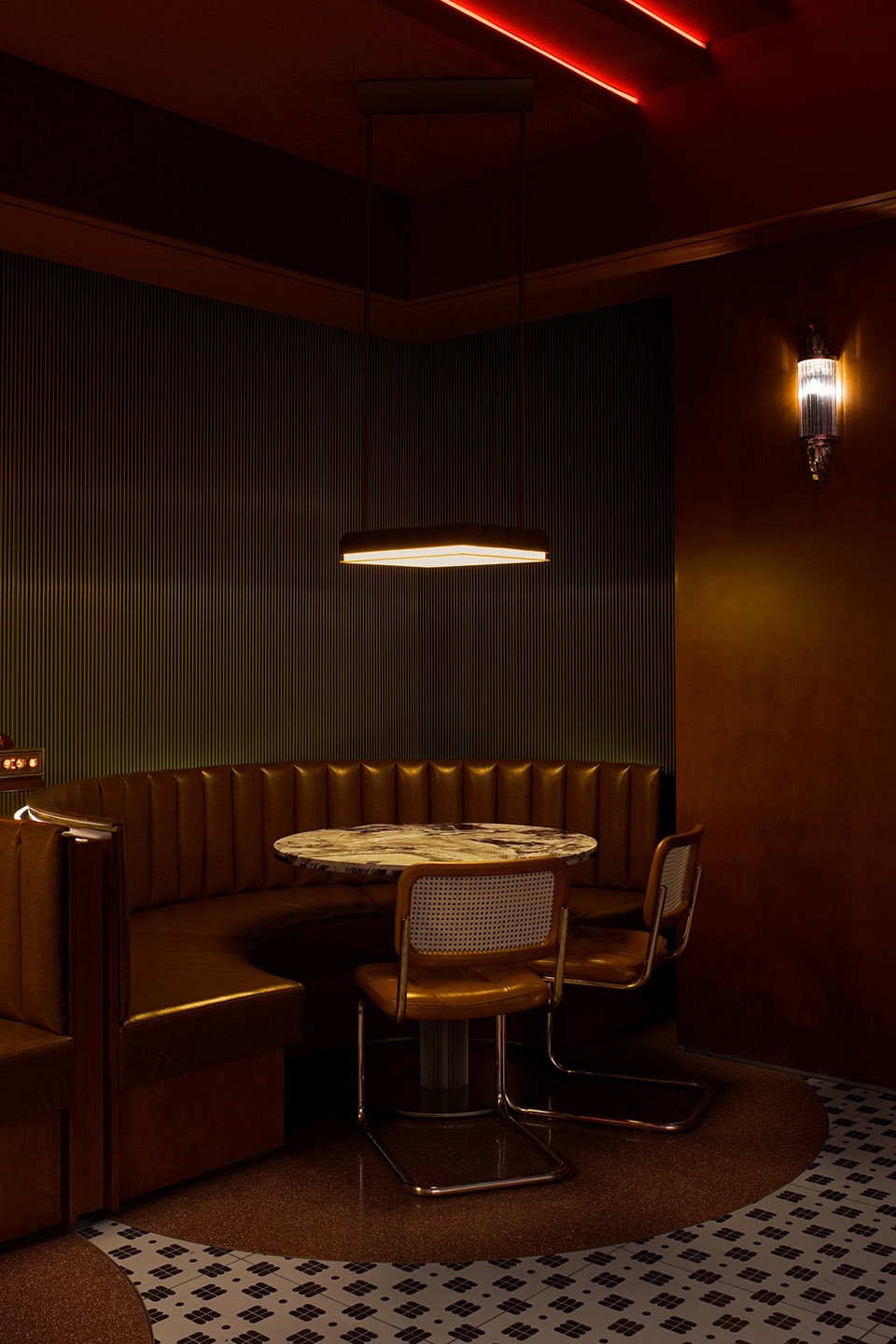
▼沙发卡座细部,details of the sofa booth ©YUUUUN STUDIO
人民的阶梯,灿灿红心
People steps, five-pointed star
由于空间的层高很高,阶梯的设计是我们有意为之,结合大面积的窗户,阳光洒进来,提升了空间的进深感,也强化了一点点的象征意义。
Due to the high space, the steps are intentionally added. Combined with the large windows, when the sun shines come in, it enhances the sense of depth as well as strengthens a little bit of symbolic meaning.
▼包间区,the private area ©YUUUUN STUDIO
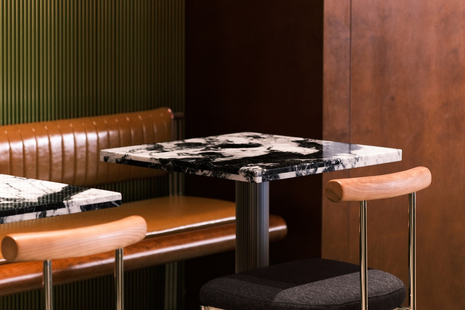
▼包间区家具,furnitures of the private area ©YUUUUN STUDIO
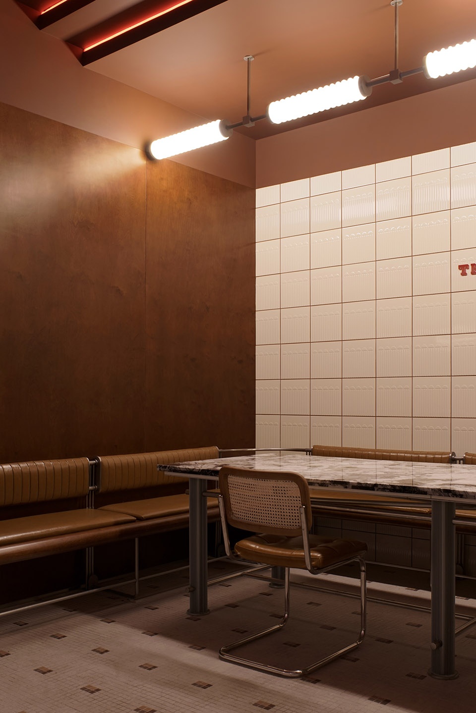
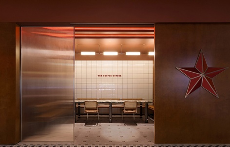
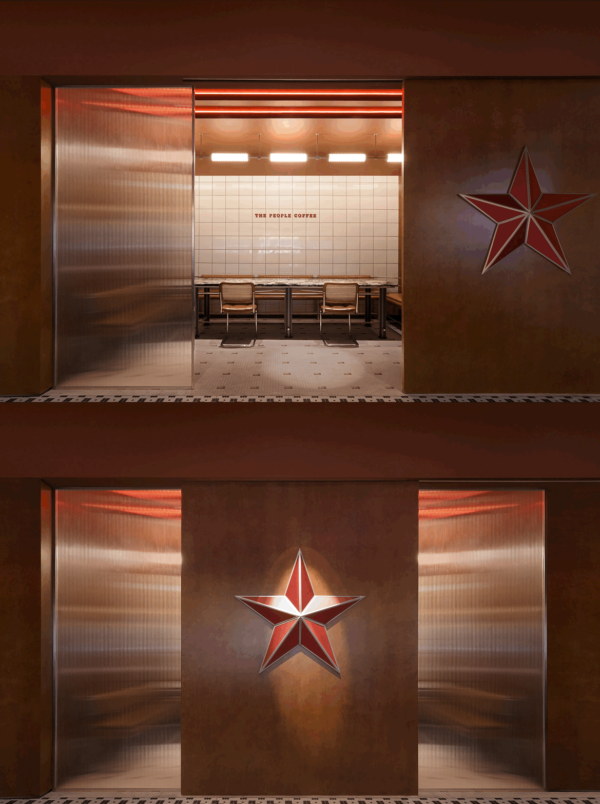
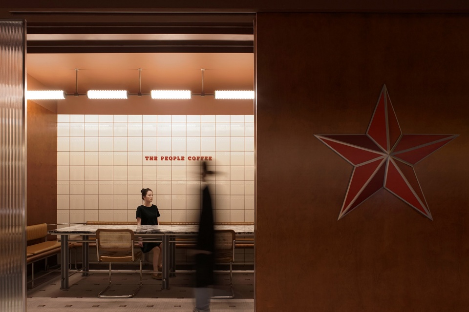
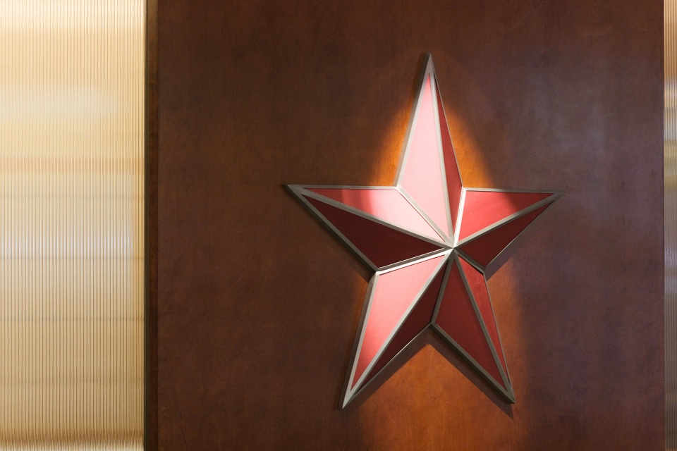
设计快结束时,业主希望我们在空间中融入一个五角星,我说没问题,但就不让它发光了吧,发光太高调,我们做一个在黑暗中也能熠熠生辉五角星,更有意义。
祖国万岁,人民万岁 —— 斗西设计
When the design is about to end, the owner wants to incorporate a five-pointed star into the space. I said it’s okay, but let’s not make it glows. The light is too high-profile. Let’s make a five-pointed star that can shine even in the dark.
▼细部,details ©YUUUUN STUDIO
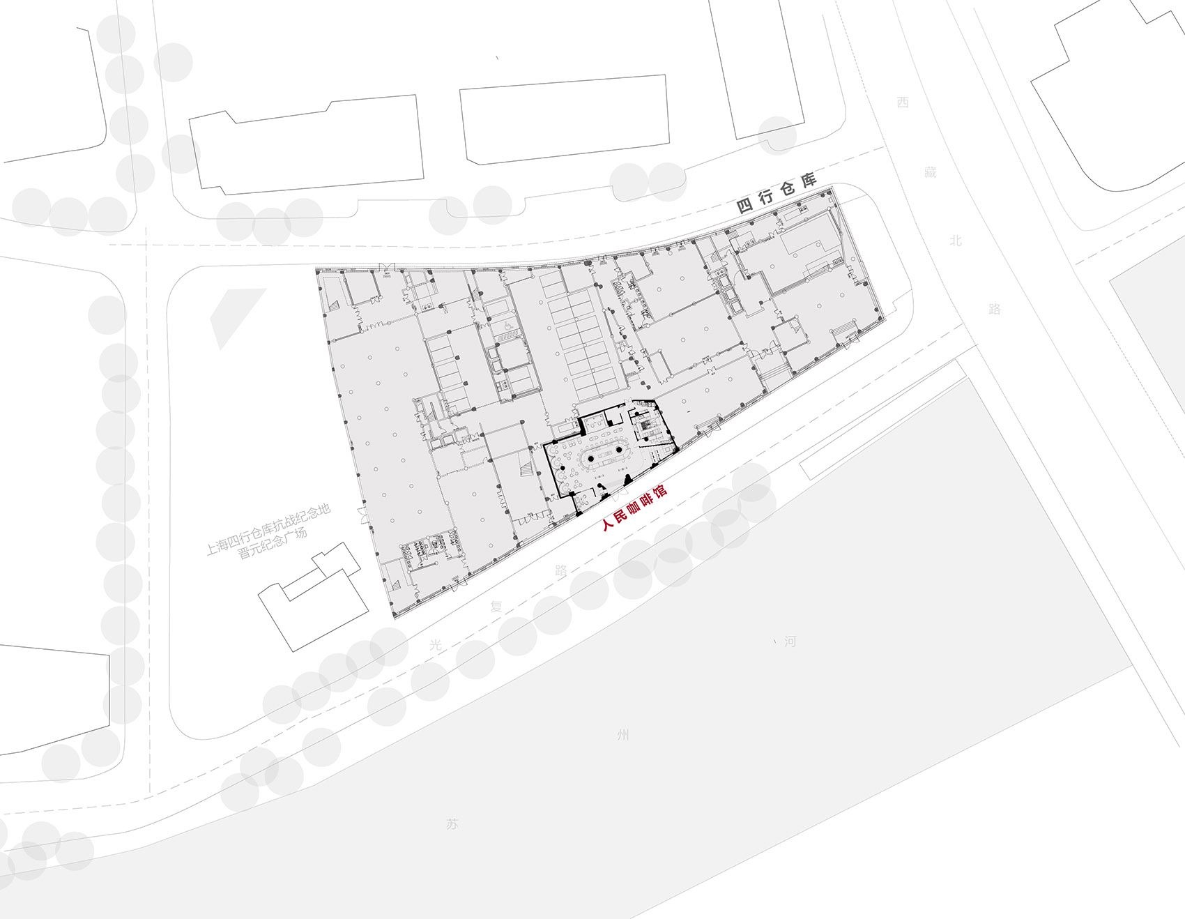
▼总平面,general plan ©斗西设计
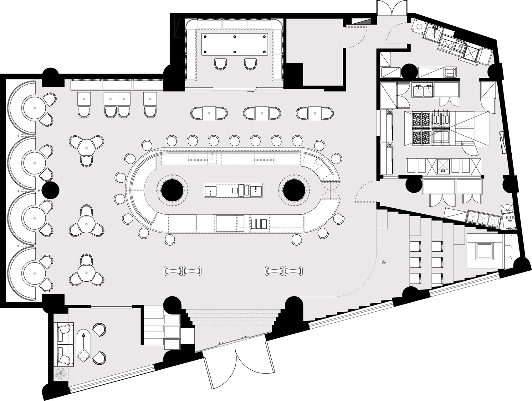
▼平面图,plan ©斗西设计
项目名称:人民咖啡馆
设计方:斗西设计
公司网站:www.daylab.cn
联系邮箱:info@daylab.cn liuyongpeng@live.com
项目设计 & 完成年份:2021
主创及设计团队:斗西、大头、阿聪、Aimee、二恒、阿姜、璐璐
项目地址:上海四行仓库
建筑面积:298㎡
摄影版权:YUUUUN STUDIO
客户:人民咖啡馆
Project name: THE PEOPLE COFFEE
Design: daylab studio
Website: www.daylab.cn
Contact e-mail: info@daylab.cn liuyongpeng@live.com
Design year & Completion Year: 2021
Leader designer & Team: Docee Dong, Lucx Lu, Cong, Aimee, ErHeng, Jiang, Lulu
Project location: Joint Savings Bank Warehouse, Shanghai
Gross Built Area: 298㎡
Photo credits: YUUUUN STUDIO
Clients: THE PEOPLE COFFEE
More: Daylab Studio 更多关于:Daylab Studio on gooood



设计得挺好的,像原子之心的那种毛子美学,但是和我国的人民连接得并不是很好。。。
哎,看这图片简直在XX我的意志
这个设计恰好是这个时代最真实的写照,从许多方面来说都是
什么都能理解,设计理念里的军绿感觉是真的扯,红配绿本就不搭嘎,比例又不协调,撞色也没撞出什么亮点感觉
红配绿很高级的
生意嘛,不寒碜
未免太讽刺了些
就如今而言更是讽刺
一言难尽的感受,设计师也挺为难的,在这名族苦难史的宏大叙事下,到底空间应该表现出什么样的情怀。。。。
总觉得这里的咖啡很小布尔乔亚啊
还在四行仓库
可以保守些,不妨碍设计能力可以,可惜是爱国打卡地标,很难权衡
有点不搭嘎了,人民,红色,抗战精神,波澜壮阔的时代,这些都是宏大元叙事,用来装饰什么咖啡馆这种富有小资情调的业态,牛头不对马嘴。
尬
人民豆浆馆,才符合共同富裕目标
既不“人民”,也不像个正经的咖啡厅,充斥着恶意而自以为是的揣测
为什么不能点赞
五角星还是去掉吧,顺便换个名字。虽然很期待出现一个红色餐厅之类的设计,但是细细揣摩,他们都承载不起。
非但没有人民当家的时代感,反而处处充斥着民国那种堕落腐朽糜烂调调!作为戴着红领巾长大的设计师,怎能接受!那个梅花状的麦克风想干嘛,是想唱一曲《花好月圆》,还是在怀念南方的小组织.
人民迪厅
被封面浓浓的苏味骗了进来,结果就是这?果然是 “披着布尔什维克皮的小布尔乔亚” 。可惜了这么个场地,这可是四行仓库。
https://www.gooood.cn/pink-mama-by-crosby-studios.htm
可以可以
妙啊
哦豁
👍
软弱的小资产阶级
灯带跟镜面反射的材质和皮质沙发和大理石材质一起用就像民国时期的小资调调,跟广大人民群众一点关系都不沾;而且从意义上讲就不应该有包间,还有门上的星星加上银色边线,看上去真的有苏修的感觉。这个项目要是不叫这个名字或者没有这个立意的话还好
浑身精致资本气质还要套共产主义外衣,实话实说我觉得街边的小摊档更适合人民这个头衔
难过的是小摊贩屡屡成为政府推动的城市改造中被驱逐的对象(当然也有很好的融合的例子,但是太少啦,不够多!)
有解体前那味儿了
披着布尔什维克皮的小布尔乔亚
有内味了
苏修:)
最精准的评价
原来那两个字只是设计符号啊
有点尴尬。。。 那里的烈士不是GCD的 搞那么多GCD元素干嘛。。。
不懂就读历史去
你先去查历史
你指国内的小学历史书?
比较封闭的空间 亮点不少 有故事的感觉 不是酒吧可惜了,,,
虽然不是很违和,但结合得也称不上绝
前面的哥们精分了吗
有一点吧
布尔什维克对小资发了点脾气
绝了
虎躯一震
这么小资还要叫人民咖啡馆。墙上的礼貌五角星:
很酷,很棒,很惹眼的设计