感谢 GDG 香港元新设计 予gooood分享以下内容。更多关于:Groundwork Architects on gooood
Appreciation towards Groundwork Design Group (GDG) for providing the following description:
一个密度极致的城区
A District of Extremes
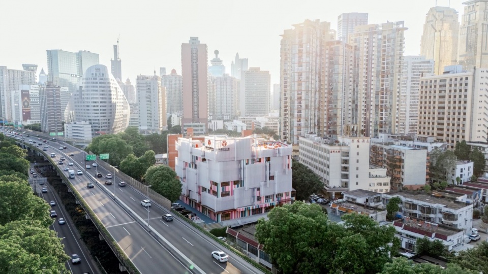
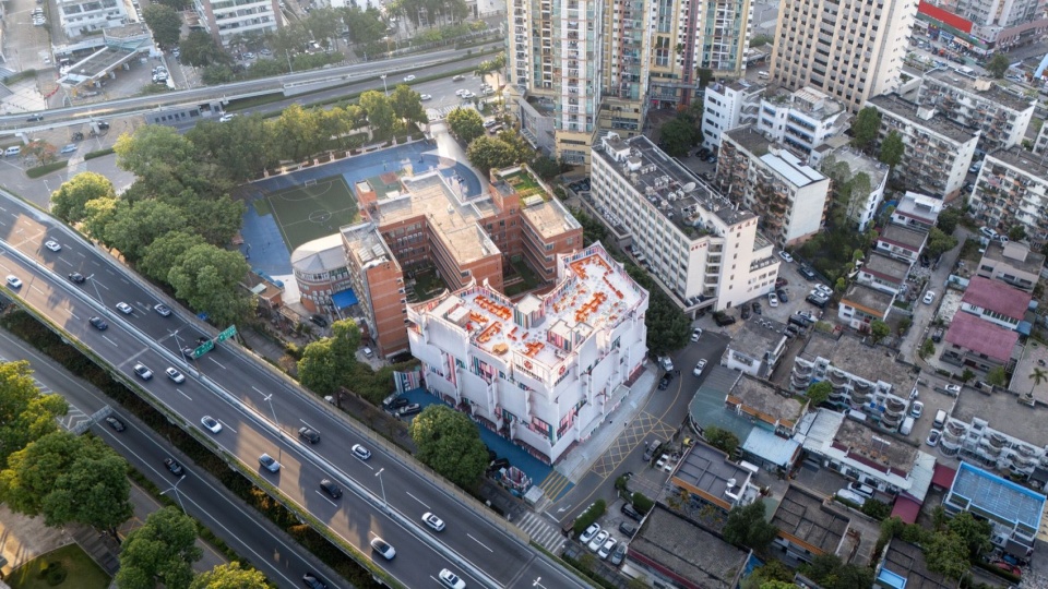
罗湖是深圳的先行城区,面积仅35平方公里,却住着超过一百万人。在这里,一座八层社区中心正在经历一场深刻的蜕变。项目由GDG(Groundwork Design Group)元新设计操刀,罗湖妇儿大厦不只是一次改造,更是一场关于城市温度、社会包容与空间诗意的实验。罗湖的人口密度约为每平方公里三万人,是世界上最拥挤的城市环境之一。在这样的地方建公共建筑,绕不开一个根本矛盾:城市肌理几乎不留余地,建筑要如何在其中为人开辟一方呼吸的空间——身体的,也是心理的。
▼项目视频,project video © GDG 香港元新设计
In Luohu, Shenzhen—a pioneering urban district of just 35 square kilometres yet home to over one million residents—an eight-storey community centre is undergoing a profound transformation. Designed by Groundwork Design Group, the Luohu Women & Children’s Building is more than a renovation; it is an experiment in urban empathy, social inclusion, and spatial poetics. Luohu’s density—roughly 30,000 people per square kilometre—makes it one of the most compressed urban environments in the world. Any public building here must negotiate a fundamental tension: how to carve out breathing room, both physical and psychological, within a fabric that offers almost none.
▼建筑与城市鸟瞰,aerial view of the building and the city © 王小晓
建筑的回应
The Building’s Answer
建筑的回应不是向外扩张,而是向内重新想象。它不追求更大的面积,而是追求更好的空间——让每一平方米身兼数职,让多种服务彼此折叠,让每个角落都成为关怀发生的地方。这是被逼出来的智慧,却也因此成了一种设计原则。
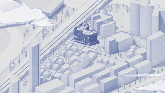
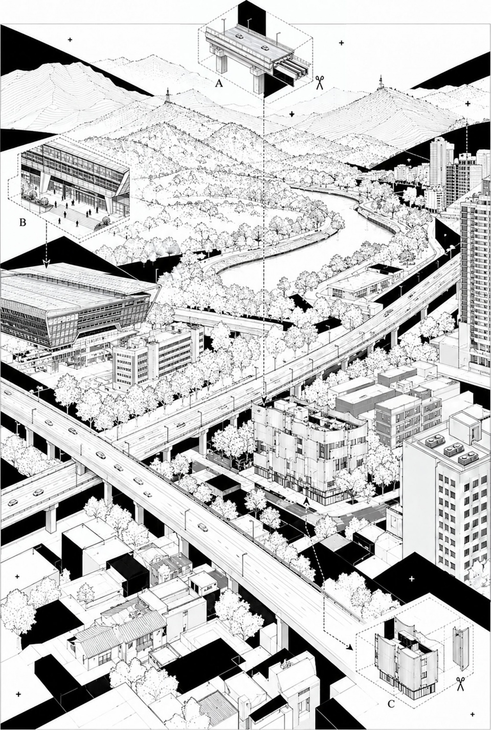
▼城市语境轴测图,urban context axonometric © GDG 香港元新设计
▼场地轴测分析图,site axonometric analysis © GDG 香港元新设计
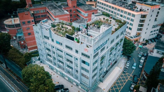
▼改造前的旧有状态,existing state before renovation © 王小晓
The building’s answer lies not in expansion but in reimagination. Rather than seeking more space, it seeks better space—space that performs multiple duties, that folds services together, that treats every square metre as an opportunity for care. This is architecture as resourcefulness, born of necessity but elevated into principle.
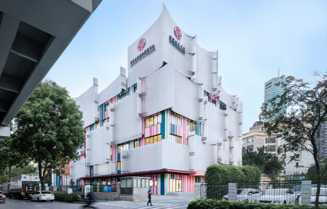
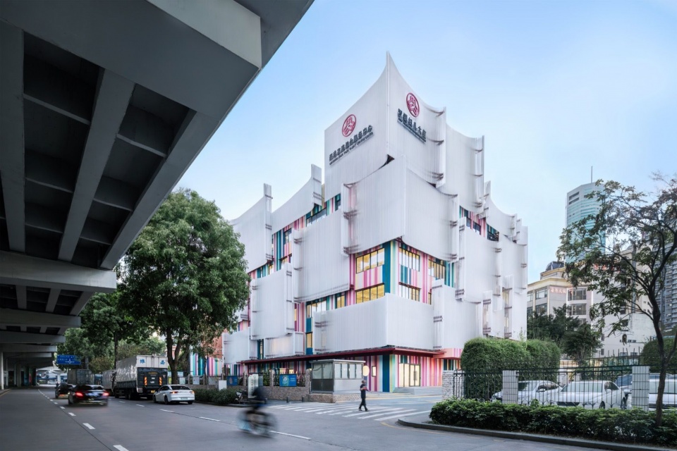
▼从高架桥下望向建筑,view of the building from beneath the elevated highway © 王小晓
用共同记忆织成的立面
A Façade Woven from Shared Memory
建筑最动人的故事,从立面开始。十六种颜色取自香港与深圳两地的日常街景——茶餐厅的暖黄、霓虹招牌的荧光粉、旧唐楼的赭石、城中村铁皮的锈橙——交织成一幅色彩的织锦,讲述着两座城市共享的记忆。
▼立面策略分析图,façade strategy diagrams © GDG 香港元新设计
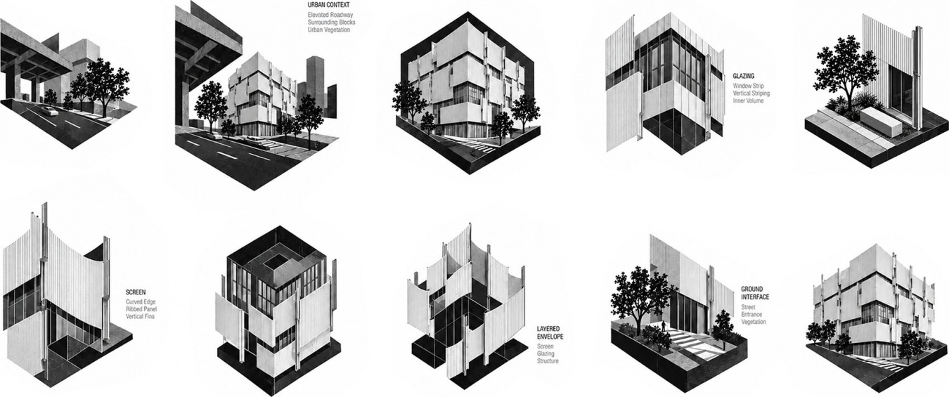
The building’s most compelling narrative begins with its façade. Sixteen colours drawn from the everyday streetscapes of both Hong Kong and Shenzhen—the warm yellows of cha chaan tengs, the neon pinks of night signs, the ochre of old tong lau buildings, the rusted oranges of urban village corrugated iron—are woven into a chromatic tapestry that speaks to the shared memory of the two cities.
▼白色铝百叶后的彩色立面,
colourful façade behind white aluminium louvers © 王小晓
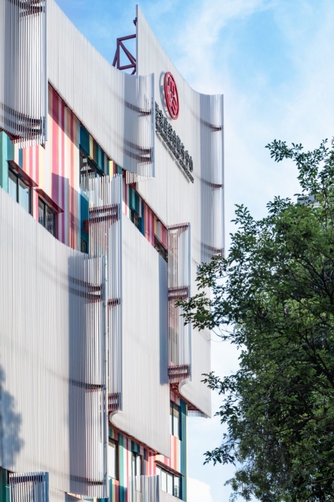
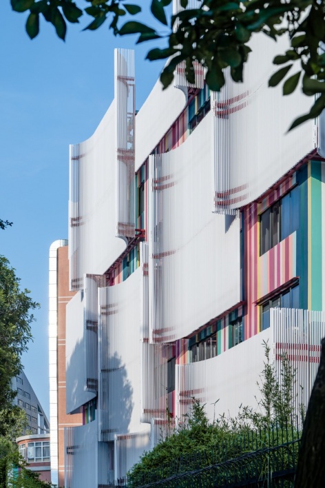
颜色是看来的,不是选来的
Colours Observed, Not Specified
这些颜色不是从色卡上挑的,而是从街头看来、记下的:香港咖啡馆瓷砖墙上的那一种色调,深圳村口牌坊褪去的颜料,雨后湿漉漉的人行道上漫开的荧光。每一种颜色都带着情绪,走过这两座城市街头的人,一眼就能认出来。
These are not colours selected from a design manual but colours observed, collected, and remembered: the particular shade of a Hong Kong café’s tiled wall, the fading pigment of a Shenzhen village gate, the fluorescent glow that spills onto wet pavements after rain. Each hue carries an emotional register, a sense of recognition for anyone who has walked the streets of either city.
▼立面细部:白色百叶后闪动的色彩,
façade detail: colours flickering behind white louvers © 王小晓
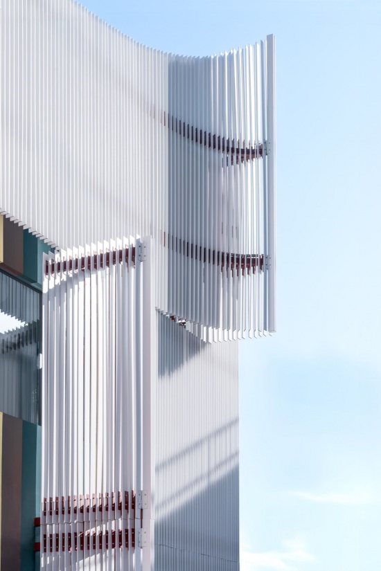
藏与露
Concealment and Revelation
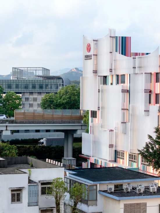
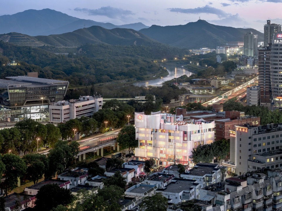
这些色彩藏在白色铝百叶之后,让建筑在高速公路的车流中几乎隐去身形。只有车辆驶过、视角变换时,这片色彩才慢慢浮现——公共空间就这样轻轻地露出来。远远望去,它是一个安静的白色体量,近乎无名,不打扰邻里,也不争抢城市的视线。
These hues are veiled behind a layer of white aluminium louvers, allowing the building to almost disappear amid the rush of highway traffic. Only as vehicles pass and perspectives shift does this spectrum gradually reveal itself—a gentle emergence of public space. From a distance, it reads as a quiet, almost anonymous white volume—respectful of its neighbours, unobtrusive in the urban grain.
▼屋顶标识与城市天际线,rooftop signage against the city skyline © 王小晓
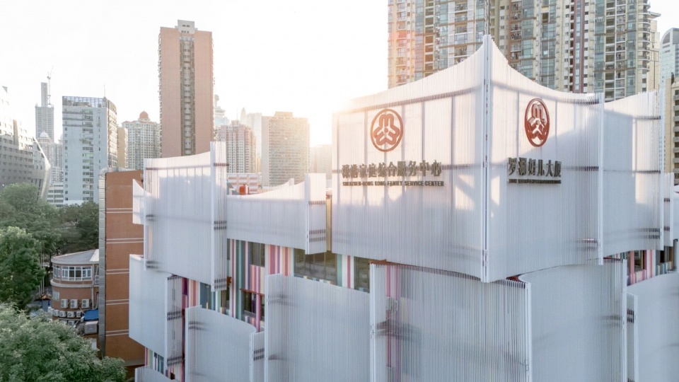
▼建筑与高架桥、远山,the building alongside the highway and hills © 王小晓
一种只有留心才懂的语言
A Private Language
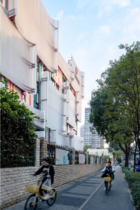
走近些,或者在疾驰之中,颜色会透过百叶闪动,像某种信号——这是建筑与愿意多看一眼的人之间的暗语。这种欲说还休、收放之间的分寸,恰恰也是它所服务的社区的写照:常常被忽视,可一旦被看见,自有其光彩。
At close range, or at speed, the colours flicker through the louvres like a signal, a private language shared between the building and those who bother to look. This oscillation between reticence and expressiveness mirrors the experience of the communities it serves: often overlooked, yet vibrant when given the chance to be seen.
▼沿街立面与骑行道,street façade and cycling path © 王小晓
曲线的语言
A Language of Curves
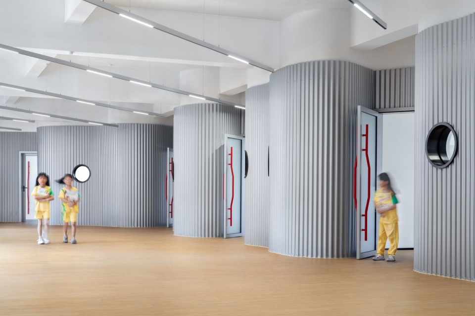
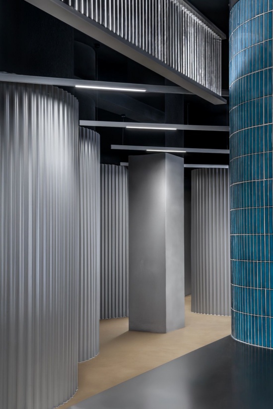
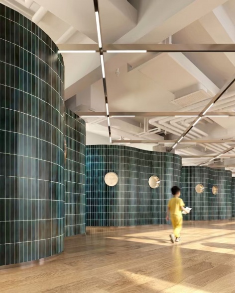
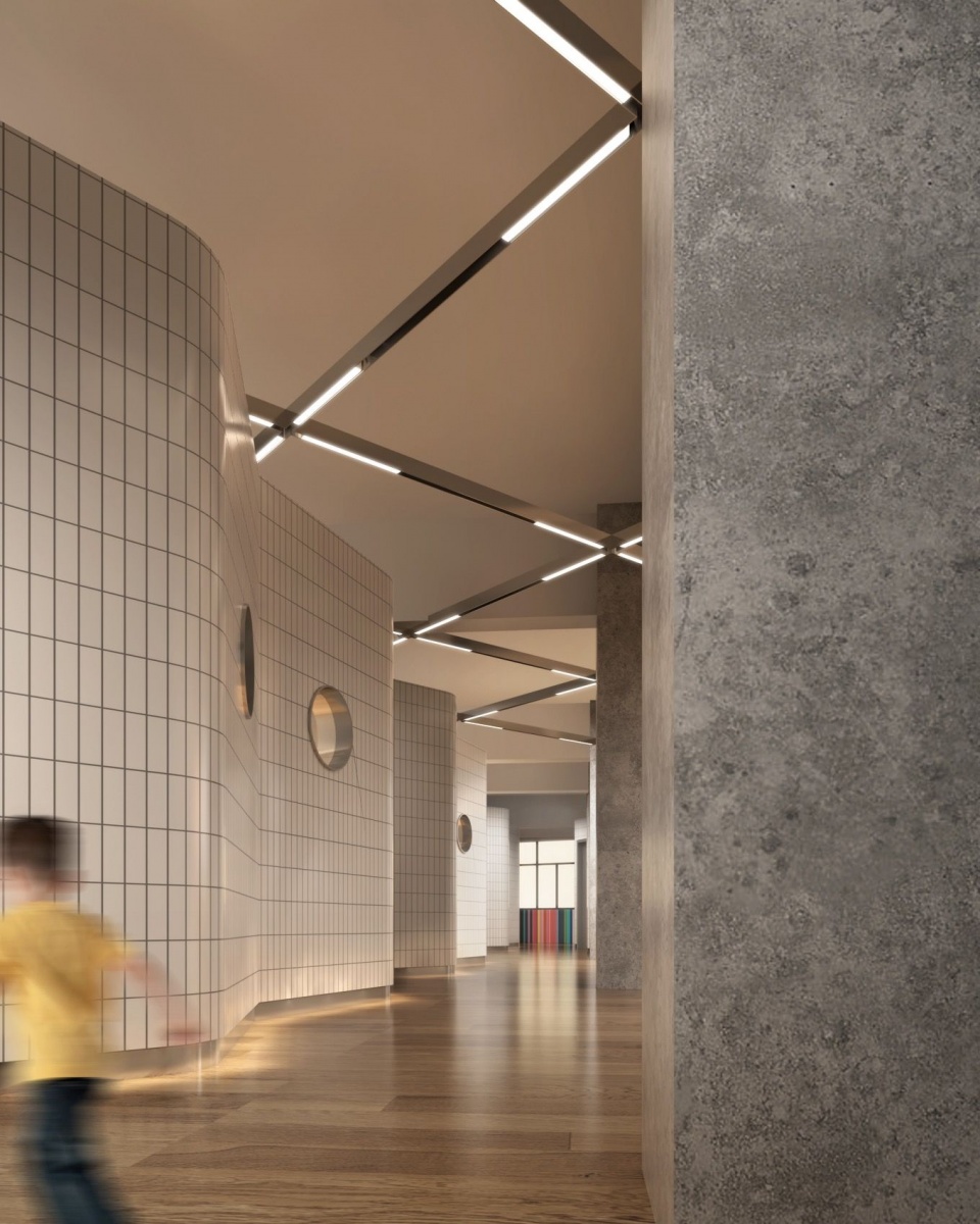
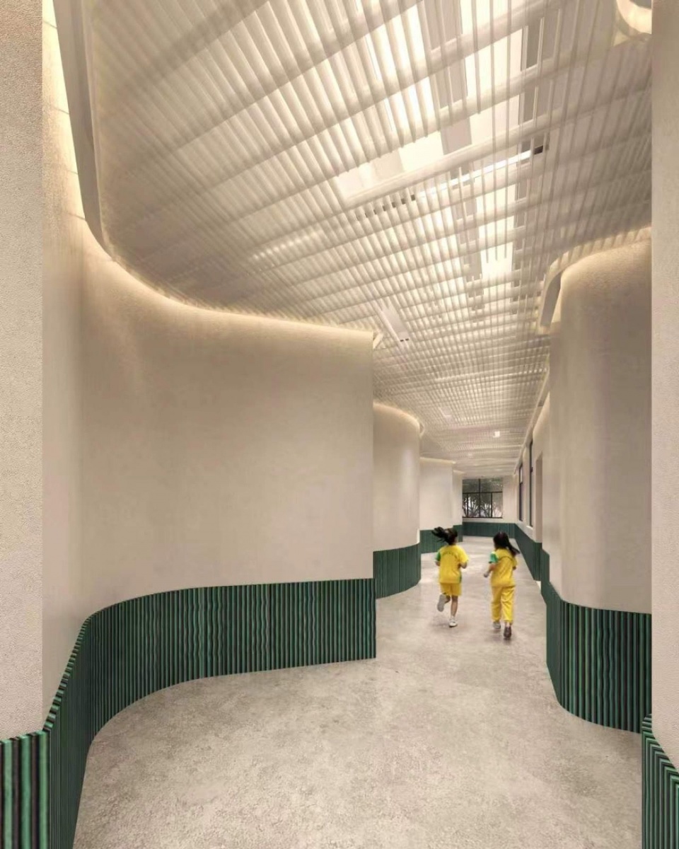
藏与露的张力,也延续到了室内。所有隔断都放弃了直角,改用连续的曲线,走廊与房间的界限随之消融。空间于是流动起来,没有固定的方向。孩子们在弧形走廊里奔跑,目光总被引向下一个转弯处。
This duality of concealment and disclosure extends indoors. All partitions abandon right angles in favour of a continuous curved language, dissolving the boundaries between corridor and room. The result is a fluid, directionless spatial experience. Children run through the arced hallways, their gaze always drawn toward the next hidden corner.
▼多功能活动厅,multifunctional activity hall © 王小晓
柔软几何的分量
The Politics of Soft Geometry
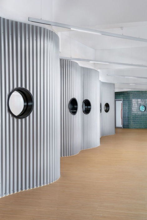
没有转角,既是实用考虑,也是一种隐喻:公共空间里那些让人不安的视线死角被消除了,公共服务建筑常有的机构感也被磨平了。一位来寻求咨询的母亲,和一个追着皮球跑的孩子,可能就在几步之内擦肩而过——墙壁的硬线条不再执意把他们隔开。
The absence of corners is both practical and metaphorical: it eliminates the blind spots that make communal spaces feel unsafe, and it softens the institutional edge that so often accompanies public service buildings. A mother seeking counselling and a toddler chasing a ball may pass within metres of each other without the hard geometry of walls insisting on their separation.
▼多功能活动厅一角,corner of multifunctional activity hall © 王小晓
一张关怀的清单
A Program of Care
作为扎根公共服务的社区设施,这座建筑的担当远不止于视觉。它是面向全年龄居民的活动枢纽:多功能音乐厅、社区食堂、女性创业孵化器、社工站、儿童游乐场、心理支持中心、屋顶花园、观景平台、礼堂,一应俱全。
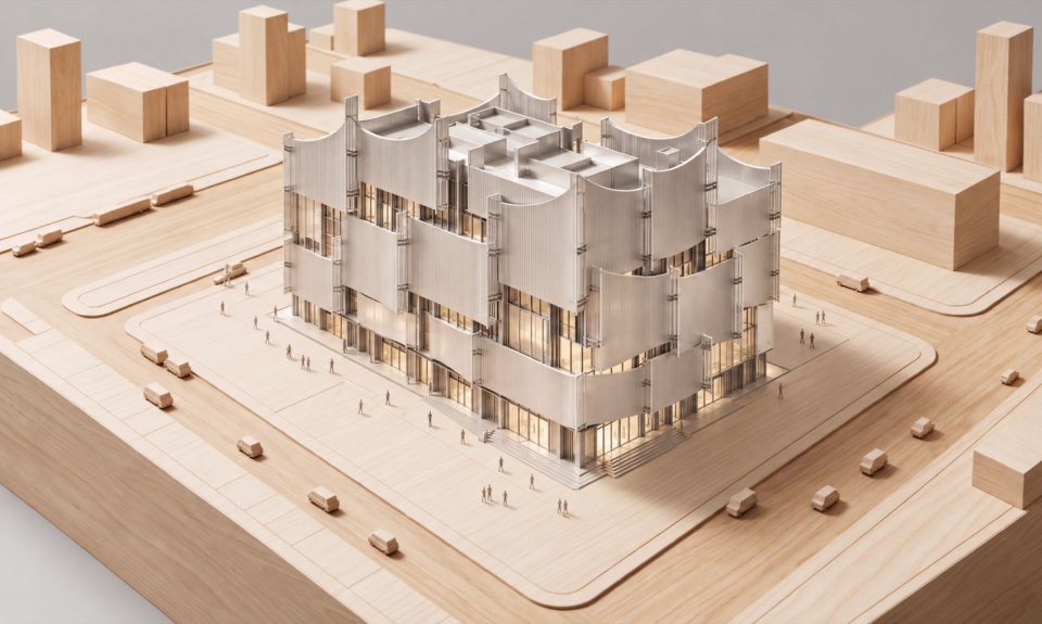
▼实体模型,physical model © GDG 香港元新设计
▼建筑轴测拆解图,exploded axonometric of the building © GDG 香港元新设计
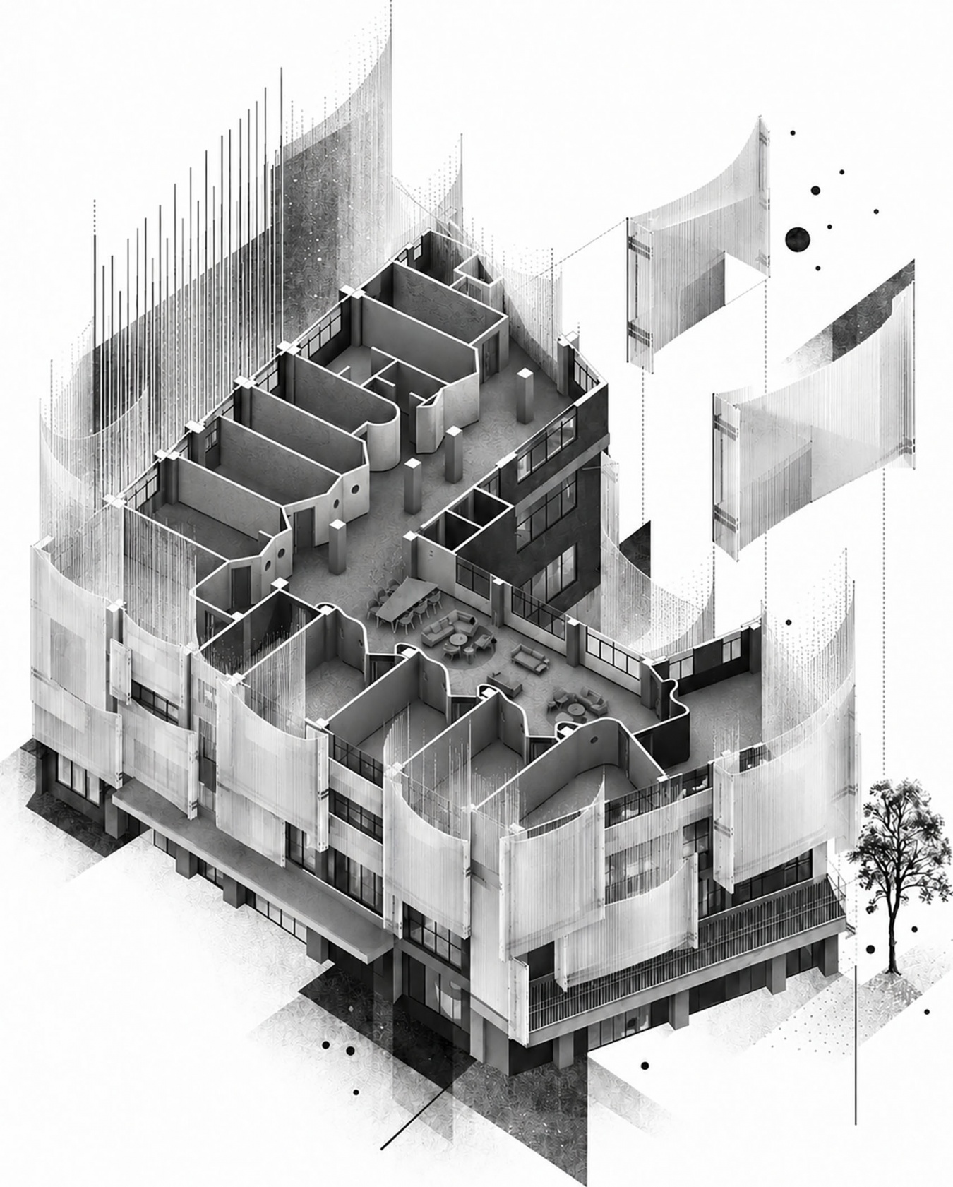
As a community facility rooted in public service, the building’s responsibilities far exceed visual impact. It is an activity hub for residents of all ages: a multifunctional music hall, a community canteen, a women’s entrepreneurship incubator, a social work station, a children’s playground, a psychological support centre, a rooftop garden, a viewing terrace, and an auditorium.
▼社区食堂,community canteen © 王小晓
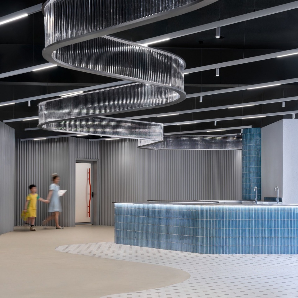
关怀是一个生态
Care as an Ecosystem
各项功能在八层楼里叠合交织,弧形流线让意想不到的相邻成为可能——安静的阅读角开向热闹的游戏区,屋顶花园从咨询室的窗口望得见。这座建筑不把关怀当作某一项服务,而当作一个生态:一位女性的福祉,与她的孩子、她的社区、她所在的城市,本就分不开。
▼楼层轴测堆叠图,stacked floor axonometric © GDG 香港元新设计
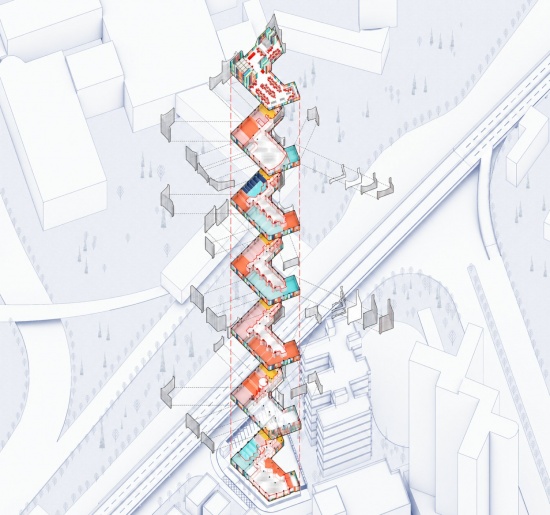
▼剖透视图,sectional perspective © GDG 香港元新设计
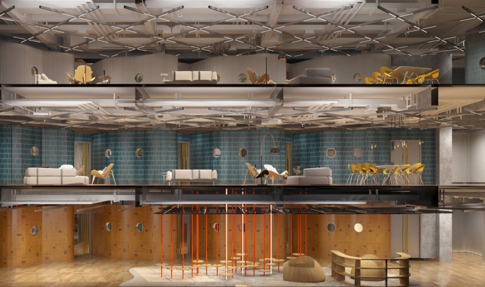
Each programme is stacked and interwoven across the eight storeys, with the curved circulation spine allowing unexpected adjacencies—a quiet reading nook opening onto a busy play area, a rooftop garden visible from a counselling room. The building treats care not as a single service but as an ecosystem, recognising that a woman’s wellbeing is inseparable from her children’s, her community’s, and her city’s.
▼绿色瓷砖曲面墙与游戏区,green tiled curved wall and play area © 王小晓
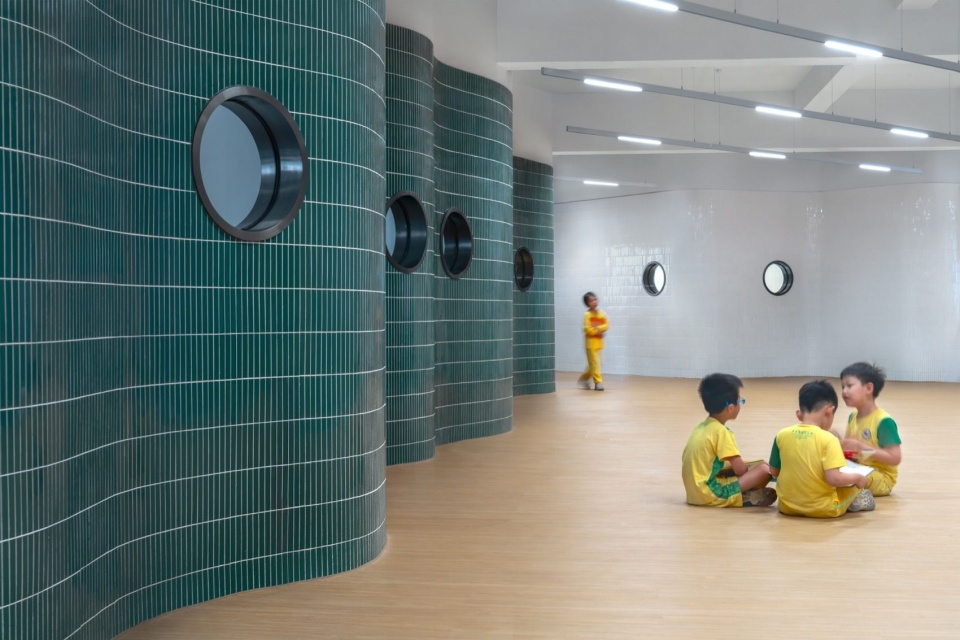
五分钟圈里的庇护所
A Shelter in the Five-Minute Circle
尤为关键的是,这里被指定为遭受家庭暴力的女性的临时庇护所——“五分钟救援服务圈”的核心节点。它提供一个安全的地方,让身处弱势的女性在最无助的时候,能喘一口气,能被听见,能得到支持。
Crucially, it is designated as a temporary shelter for women experiencing domestic violence—a core node in the “five-minute rescue service circle”—offering a safe space where vulnerable women can breathe, be heard, and receive support at their most helpless moments.
▼圆窗与互动座位,round windows with interactive seating © 王小晓
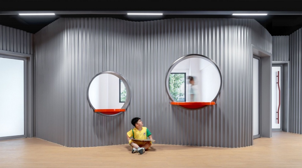
融合,而不是隔离
Integration, Not Segregation
庇护所是特意放进建筑里的,而不是单独隔开。它有一条低调可达的流线,又与更大的服务网络相连。这种贴近日常社区生活的安排本身就有疗愈作用:身处危机的女性不必被送到偏远的机构,她仍留在自己熟悉的街区里,耳边是孩子玩耍、邻里往来的寻常声响。
The shelter is deliberately integrated into the building rather than segregated, accessible through discreet circulation while remaining connected to the wider network of services. This proximity to everyday community life is itself therapeutic: a woman in crisis is not exiled to a remote facility but remains within the fabric of her neighbourhood, surrounded by the ordinary sounds of children playing and neighbours gathering.
▼暖色瓷砖大厅,terracotta tiled hall © 王小晓
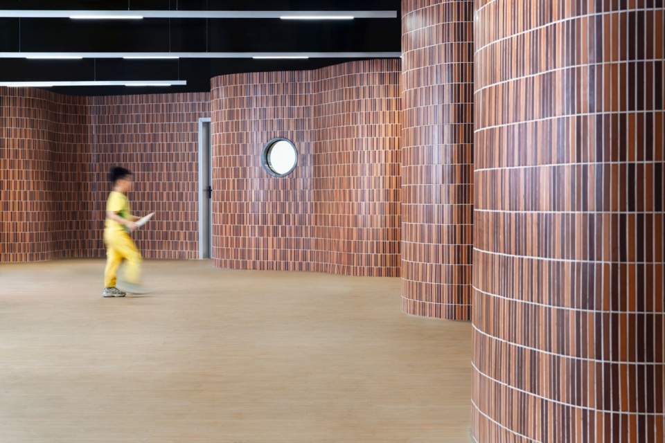
一份归属的承诺
A Promise of Belonging
五分钟圈不只是一个响应时间的指标,更是一份归属的承诺。它对身处危险的女性说:帮助不远,社区也不远。建筑的地理,成了一种声援。
The five-minute circle is not merely a response-time metric but a promise of belonging. It says to women in danger: help is not far away, and neither is community. The building’s geography becomes an act of solidarity.
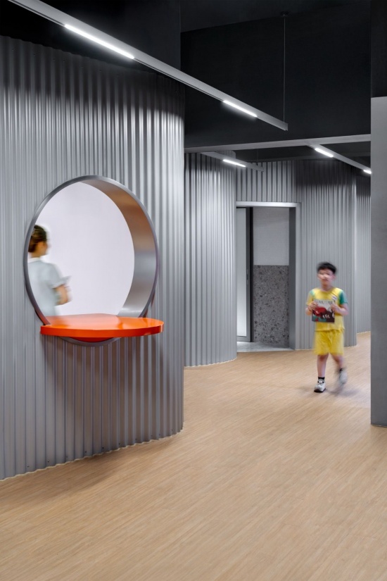
▼弧形走廊与圆窗,curved corridor with a round window © 王小晓
一座跨境的桥
A Bridge Across the Border
建筑也承载着深港融合的意味:深港“一家园”家庭综合服务中心设在这里,借毗邻文锦渡口岸之便,服务跨境家庭,推动两地在社会工作理念与资源上的深度合作。
The building also embodies Shenzhen-Hong Kong integration: the Shenzhen-Hong Kong “Yi Jia Yuan” Family Integrated Service Centre is housed here, leveraging its proximity to the Wenjindu Checkpoint to serve cross-border families and advance deeper collaboration between the two places in social service philosophy and resources.
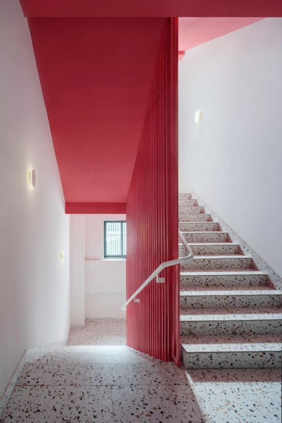
▼公共空间一角与红色楼梯,Corner of public space and red staircase © 王小晓
让孩子参与设计
Children as Co-Designers
定期的深港儿童议事会,邀请两地孩子从“一米高度”观察和参与塑造城市空间,为建筑注入真正儿童友好的灵魂。这些议事会不是做样子,而是实实在在的工作坊——孩子们对安全、可达、游戏与舒适的观察,会直接反馈到建筑的持续完善之中。从这个意义上说,这座建筑从未完工;它是它所服务的跨境社区里一个活着的参与者。
Regular Shenzhen-Hong Kong Children’s Councils invite children from both cities to observe and shape urban space from a “one-metre height,” injecting a truly child-friendly soul into the building. These councils are not symbolic gestures but working sessions where children’s observations—about safety, accessibility, play, and comfort—feed directly into the building’s ongoing evolution. In this sense, the building is never finished; it is a living participant in the cross-border community it serves.
▼活动空间效果图,renderings of activity spaces © GDG 香港元新设计
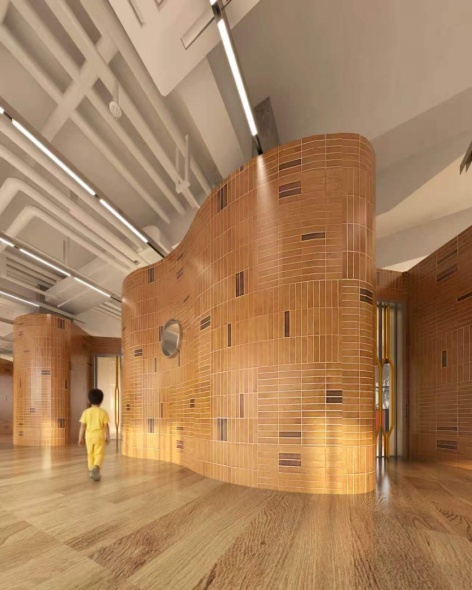
▼走廊效果图,renderings of corridor © GDG 香港元新设计
一座关于庇护与交融的纪念碑
A Monument to Shelter and Communion
罗湖妇儿大厦以克制而深沉的笔触,在深圳密集的城市肌理中,刻下一座关于庇护、成长与跨境交融的空间纪念碑。它证明关怀是可以被建造出来的——不是口号,不是牌匾,而是一个个具体的空间决定。
With restrained yet profound sensitivity, the Luohu Women & Children’s Building carves out a spatial monument to shelter, growth, and cross-border communion within Shenzhen’s dense urban fabric. It demonstrates that empathy can be built—not as a slogan or a plaque, but as a set of spatial decisions.
▼黄昏中的建筑与城市全景,dusk panorama of the building and the city © 王小晓
关怀,就是建筑本身
Empathy as Architecture
磨圆边缘的那道曲线,唤起认同的那种颜色,藏与露之间的那层百叶,那间等着需要它的人的屋子——这些才是建筑真正的材料。在一个被拥挤与速度定义的城区,罗湖妇儿大厦提供了某种稀有而可贵的东西:一个慢下来、愿意倾听、肯为人腾出地方的地方。
The curve that softens an edge, the colour that sparks recognition, the louvre that hides and reveals, the room that waits for someone who needs it—these are the building’s true materials. In a district defined by compression and speed, the Luohu Women & Children’s Building offers something rare and radical: a place that slows down, listens, and makes room.
项目名称:罗湖妇儿大厦 · 深港社区服务中心
项目类型:建筑改造及室内设计
客户:深圳市罗湖区人民政府
项目设计单位:Groundwork Design Group (GDG) 香港元新设计
主创设计师:阮文韬(Manfred Yuen),鲍静(Fiona Bao)
元新设计团队:杨伟明、邬美贤、常诗画、李秋灵
公司网站:www.groundworkarchitect.com
联系邮箱:fionabao@groundworkarchitect.com
完成年份:2026年
施工图设计单位:深圳市立方都市工程设计有限公司
摄影版权:王小晓
项目地址:深圳市罗湖区沿河南路2007号
建筑面积:6000㎡
Project name: Luohu Women & Children’s Building · Shenzhen-Hong Kong Community Hub
Project Type: Architectural Renovation and Interior Design
Client: People’s Government of Luohu District, Shenzhen
Design Firm: Groundwork Design Group (GDG), Hong Kong
Lead Designers: Manfred Yuen, Fiona Bao Jing
GDG Design Team: Yang Wai Ming, Wu Mei Xian, Chang Shi Hua, Li Qiu Ling
Website: www.groundworkarchitect.com
Email: fionabao@groundworkarchitect.com
Year of Completion: 2026
Construction Documentation: Shenzhen Lifang Urban Engineering Design Co., Ltd.
Photography: Wang Xiao Xiao
Project Address: No. 2007 Yanhe South Road, Luohu District, Shenzhen, China
Gross Floor Area: 6,000 m²
More:GDG 香港元新设计。更多关于他们:Groundwork Architects on gooood




立面改造后好看且充满活力