来自 PHENOMENA 对gooood的分享。更多关于他们:PHENOMENA on gooood
Appreciation towards PHENOMENA for providing the following description:
该项目的“RED”这一名称源于“reduction”,意为减法——一种去除与回归的姿态。通过重新配置最初的方案,该项目的设计最终呈现出一种极致简约的构成,仅保留核心要素。
The name RED derives from reduction a gesture of subtraction and return. Through a process of reconfiguring the initial plan, the design arrived at an extreme minimal composition, stripped down to its essentials.
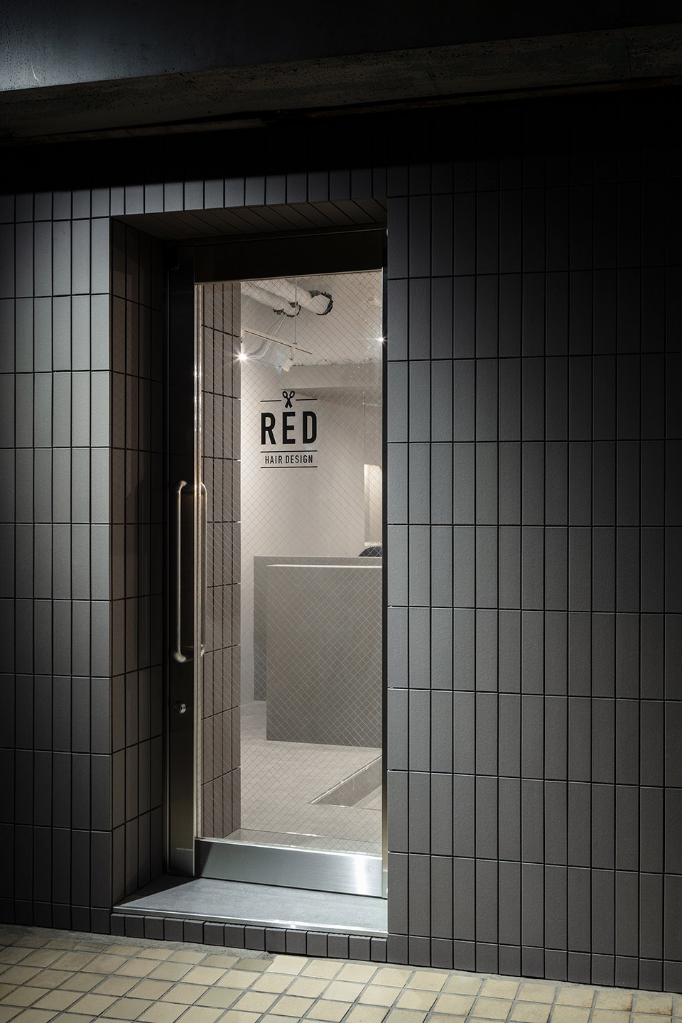
▼外观,exterior view © NORIHITO YAMAUCHI
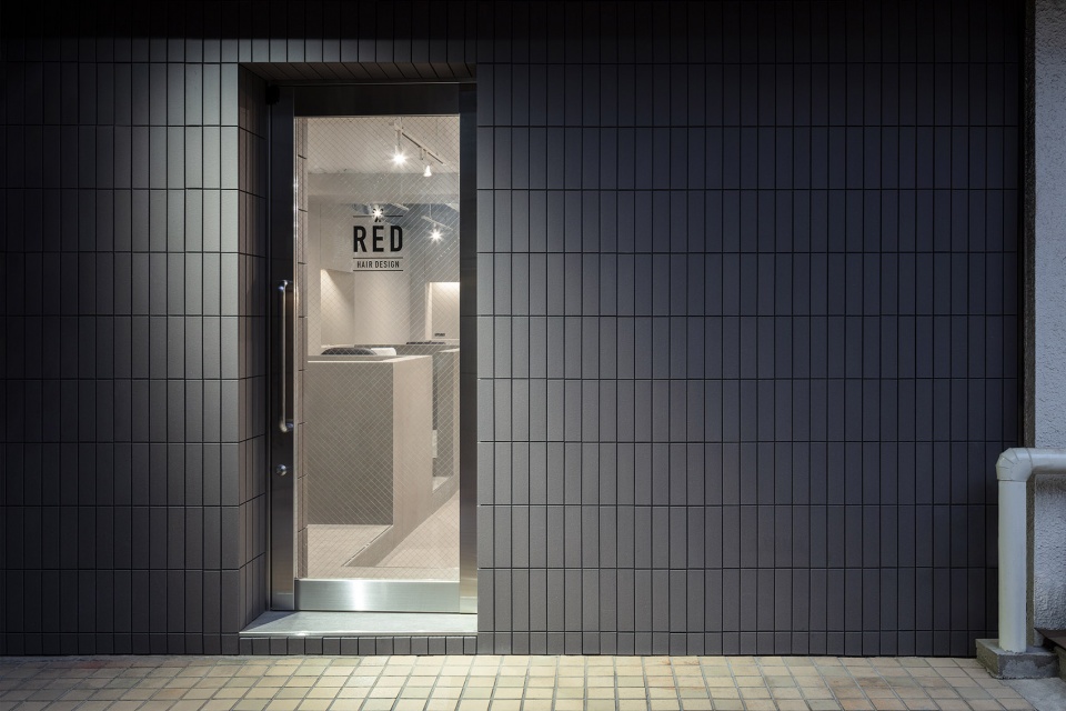
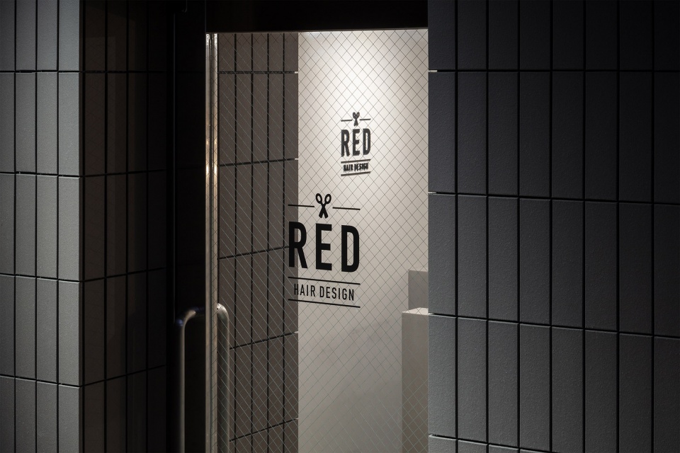
▼入口细部,entrance details © NORIHITO YAMAUCHI
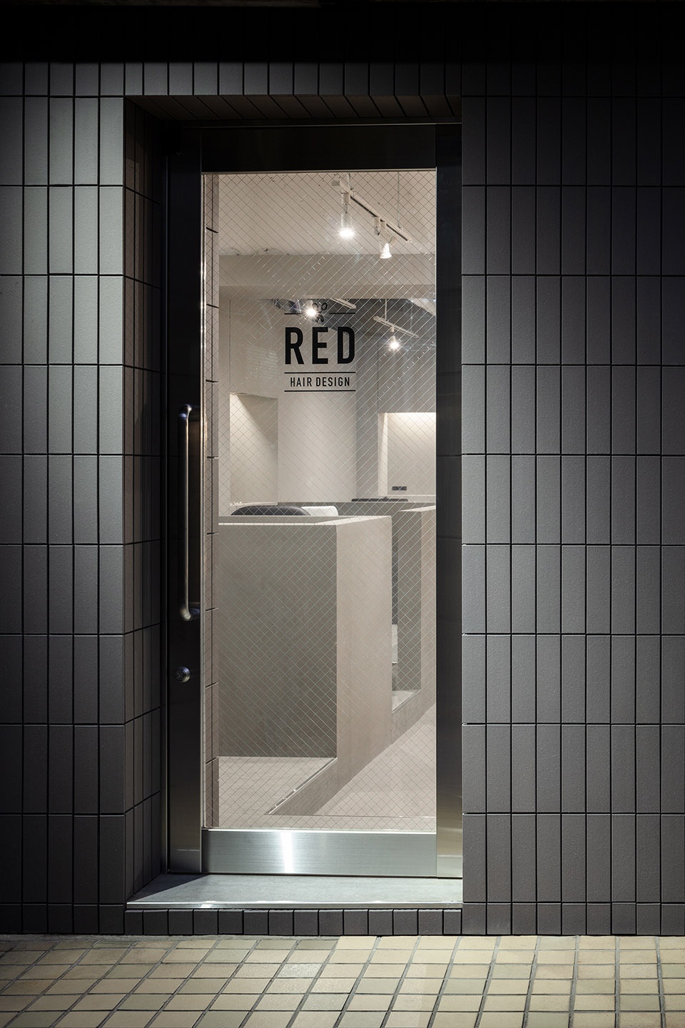
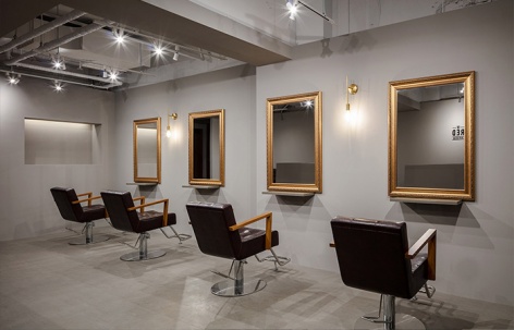
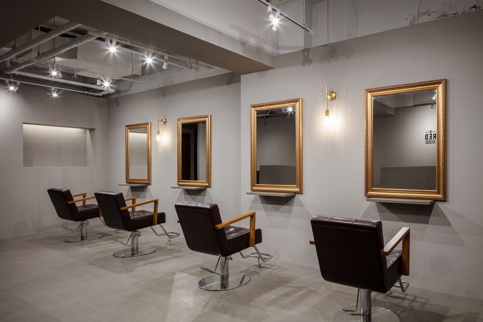
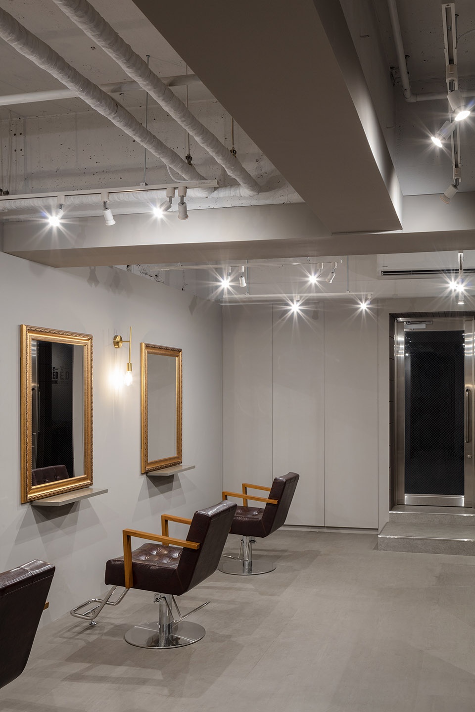
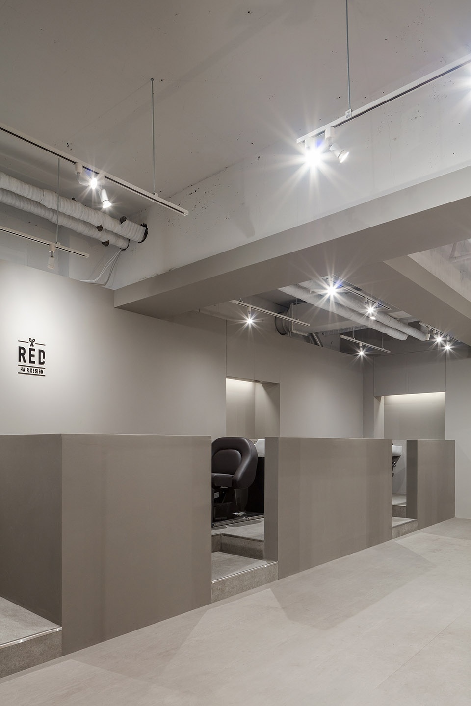
室内以简单的涂料完成,立面覆以瓷砖。照明由固定在基础轨道系统上的射灯组成。座椅与镜子的选择呼应了业主的个人喜好,建筑师的设计意图则凝练在平面布局与极简细节之中。
The interior is finished with simple paint; the façade, clad in tiles. Lighting is composed of spotlights fixed to a basic track system. Chairs and mirrors were selected in response to the owner’s preferences. The architect’s intent is distilled into the layout and minimalist detailing.
▼极简的布局,minimalist layout © NORIHITO YAMAUCHI
▼室内细部,interior details © NORIHITO YAMAUCHI
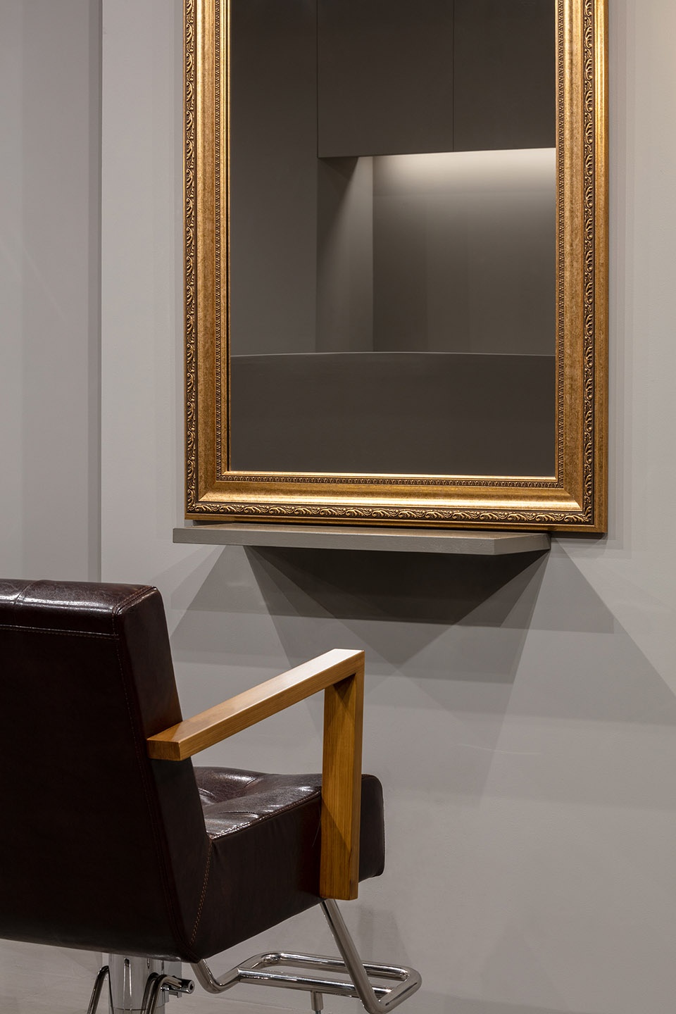
这个空间静静地停驻在微妙的“之间”状态——既非完全完工,也非未完成。随着时间推移,仅在必要时增添真正需要的部分,与业主不断演变的愿景保持和谐。
This space quietly dwells in the in-between neither fully complete nor unfinished. Only what is truly needed is added over time, in harmony with the owner’s evolving vision. Reduction is neither destruction nor loss.
▼“之间”状态,the in-between space © NORIHITO YAMAUCHI
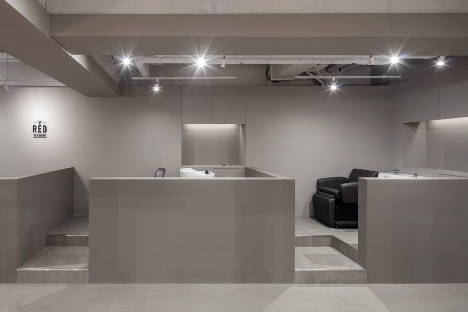
减法并非破坏或失去,而是只留下最本质的部分,从而揭示出场所的内核。RED在城市一隅静静地践行着这种哲学。
It is the act of leaving only what is essential uncovering the essence of place. RED quietly embodies that philosophy on a small corner of the city.
▼减法设计,the act of leaving © NORIHITO YAMAUCHI
PROJECT NAME:RED
HAIR SALON
MAR, 2025
CLIANT : RED
CONSTRUCTOR : KENZOU
PHOTOGRAPHY : NORIHITO YAMAUCHI
More: PHENOMENA 更多请至:PHENOMENA on gooood




没有一点红啊
DK
日本的沙龙是真的多