感谢 CTRL Space 予gooood分享以下内容。
Appreciation towards CTRL Space for providing the following description:
业主希望对其位于Remuera区的餐厅进行一些小的调整:其最初的定位是高档、以生海鲜为主打的当地特色酒馆,在鼎盛期一度受到当地人的好评;尽管最近该区域的竞争力有所下降,餐厅的回头客依然不少——主要是年纪较大的男士。设计的主要目的是扩大客户群体,吸引更多女性顾客和正在逐步迁往该区域的20多岁的年轻居民。餐厅主人希望为当地的居住者提供一个符合当下休闲趋势的餐饮场所。
Our clients bought Remuera’s Banque late last year, intending to make a few nips and tucks. Defined as an upmarket local bistro specialising in raw seafood, it was fairly well regarded by the locals in its prime. More recently, due to a lack of competition in the area and despite being a little tired, it still drew in its regulars – predominantly older men. The brief was to grow the customer base to appeal more to females to balance the male-dominated venue, and to become relevant to younger crowds in their late 20s and upwards who are moving into the area. The owners wanted to give the local demographic an eatery that’s relevant to the current hospitality climate.
▼餐厅概览,general view © Sarah Grace
设计理念主要源于三个关键词:亲密、聚集和居住。设计师的想法是创造一个温馨又舒适的当地酒吧+餐厅,并以不易察觉的“居住性”为线索来柔化商业与消费体验。Siso被构想为一个与Remuera区域有着不同氛围的隐蔽场所:柔和、自然且富有质感的空间细节营造出轻松惬意而又低调质朴的美感;灯光较暗的区域则提供了更加私密和具有情绪感染力的氛围。
The concept was essentially derived from three key words – intimate, collected, residential. The idea was to create an intimate and cosy local bar and eatery with subtle residential cues that soften the commercial hospitality experience. Siso was designed to be a refuge from the slick nature of Remuera. Soft, natural moments with texture and character deliver a casual, humble aesthetic, while darker complementary areas offer warmth and shadow to inject a sense of mood and intimacy.
▼用餐区,dining area © Sarah Grace
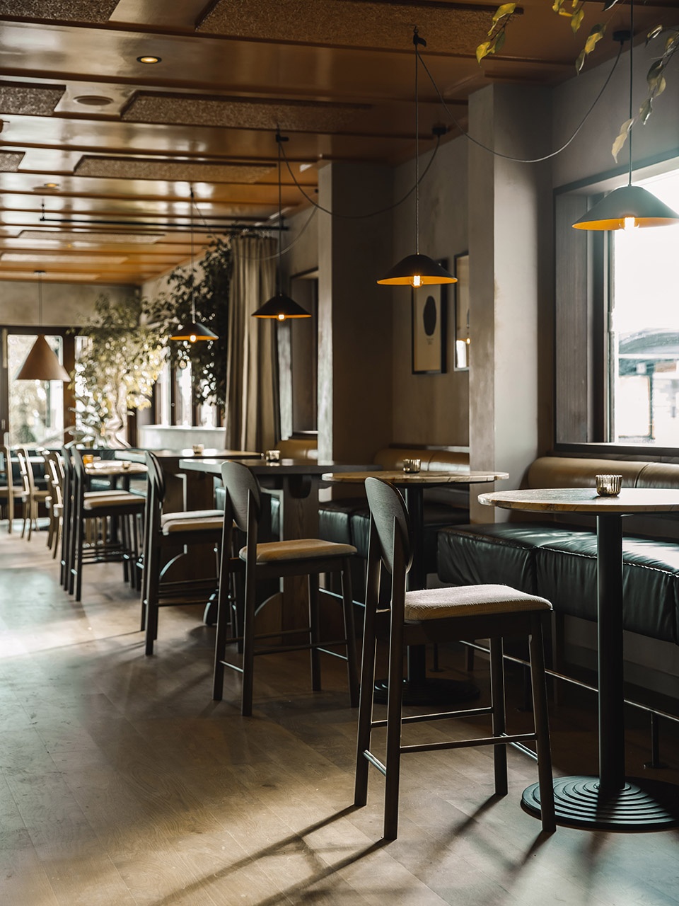
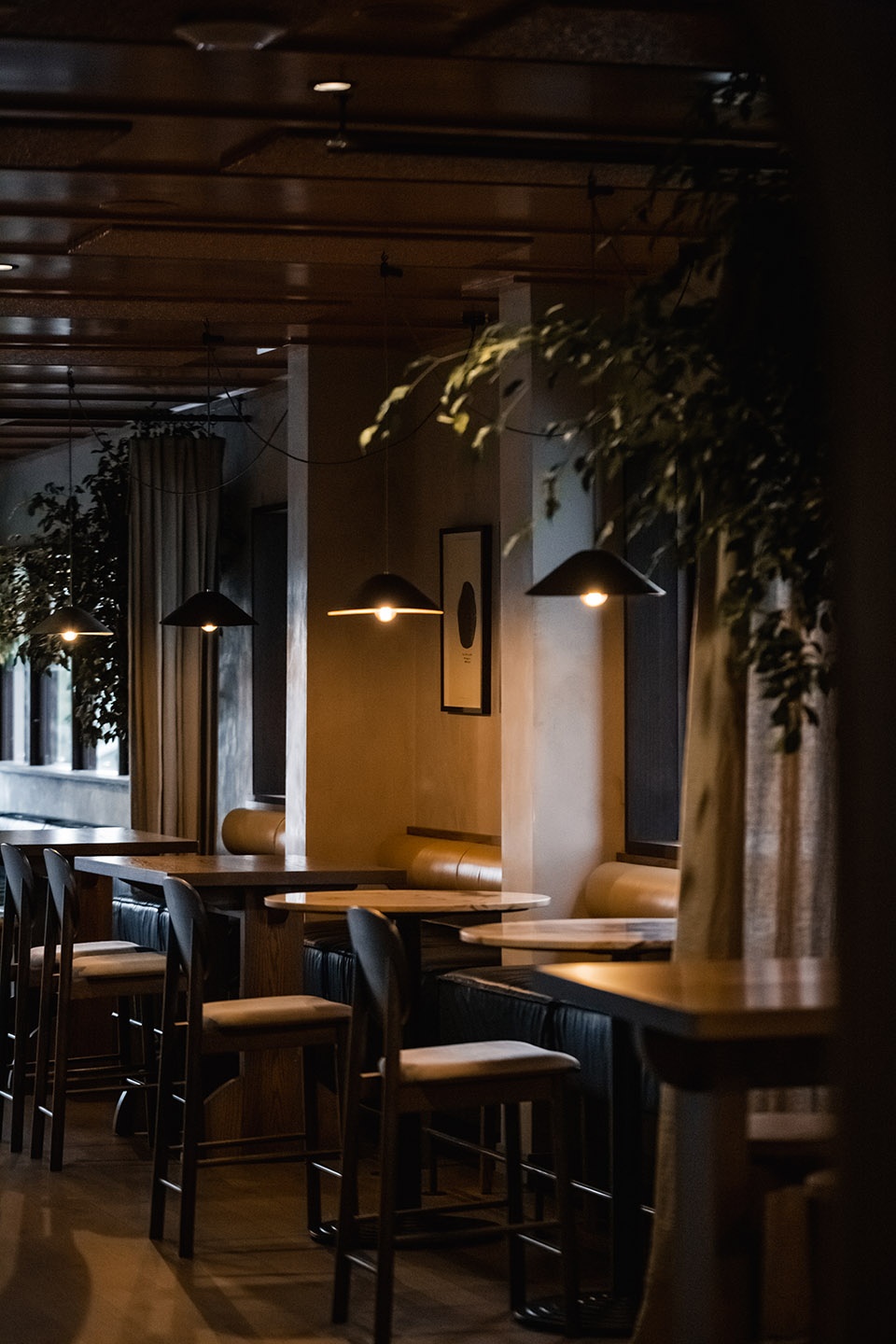
▼柔和、自然且富有质感的空间细节 © Sarah Grace
Soft, natural moments with texture and character
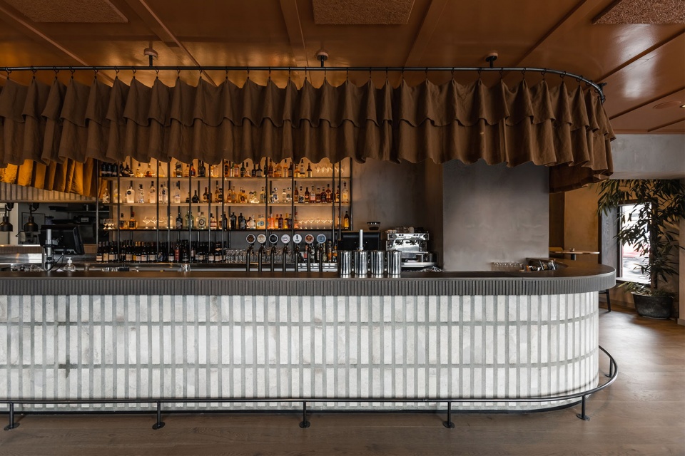
▼吧台区,bar area © Sarah Grace
▼座位细节
seating detailed view © Sarah Grace
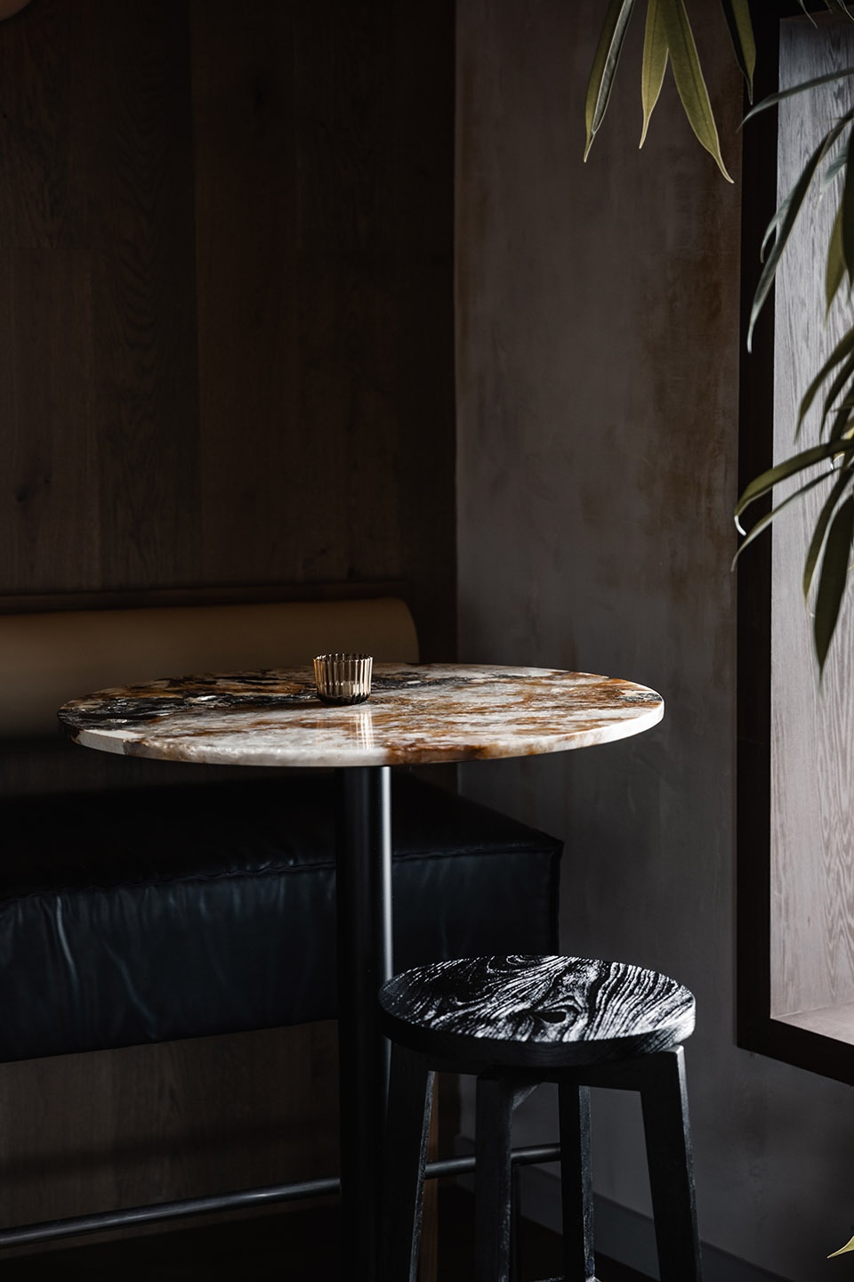
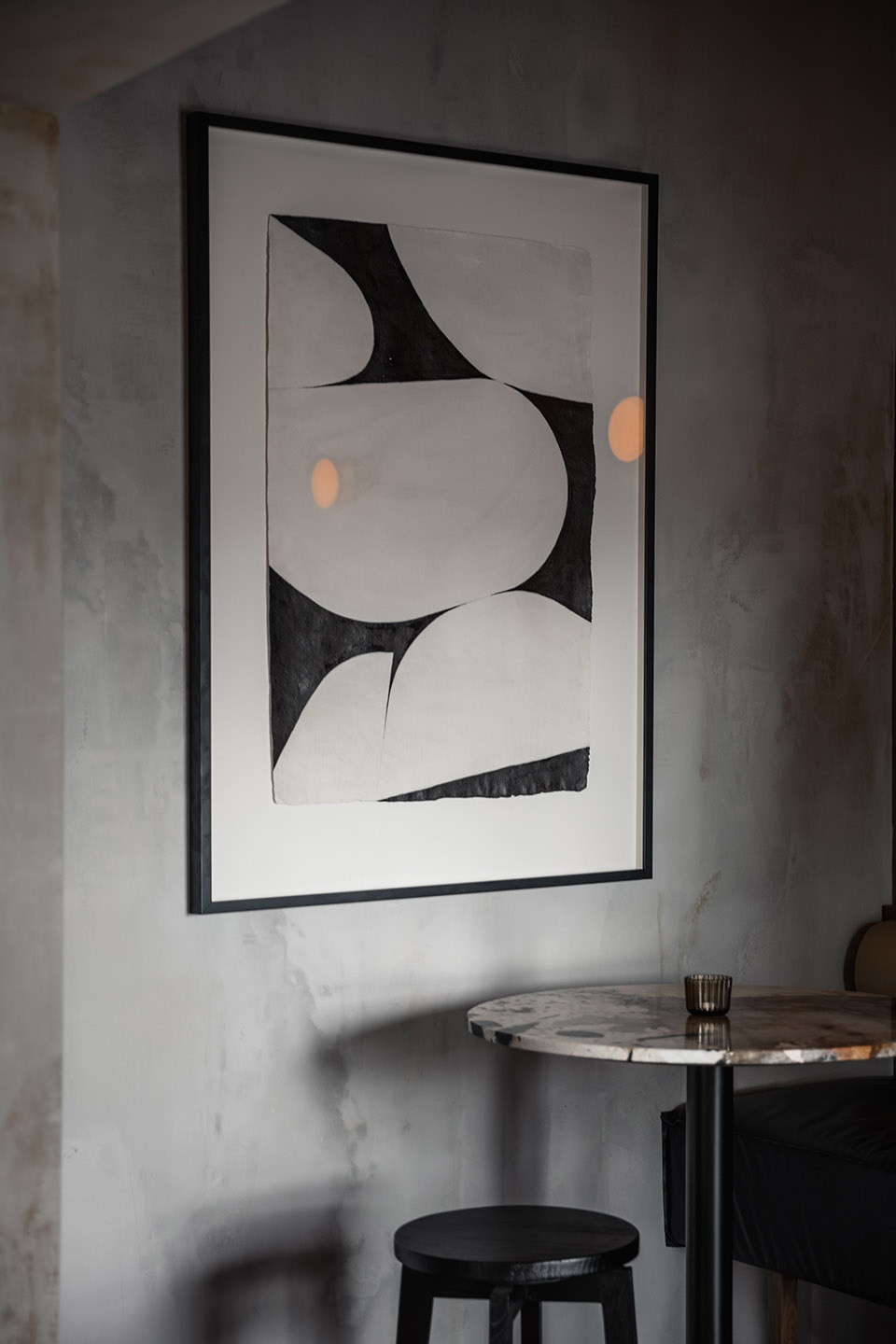
▼沿墙座位,seating area along the wall © Sarah Grace
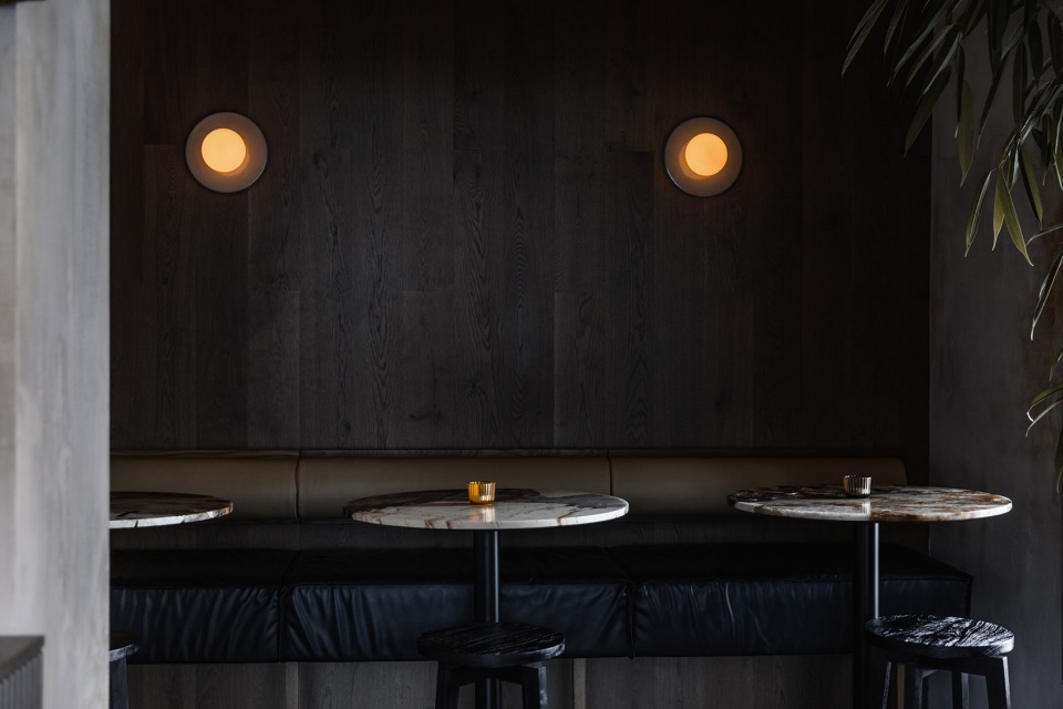
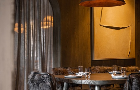
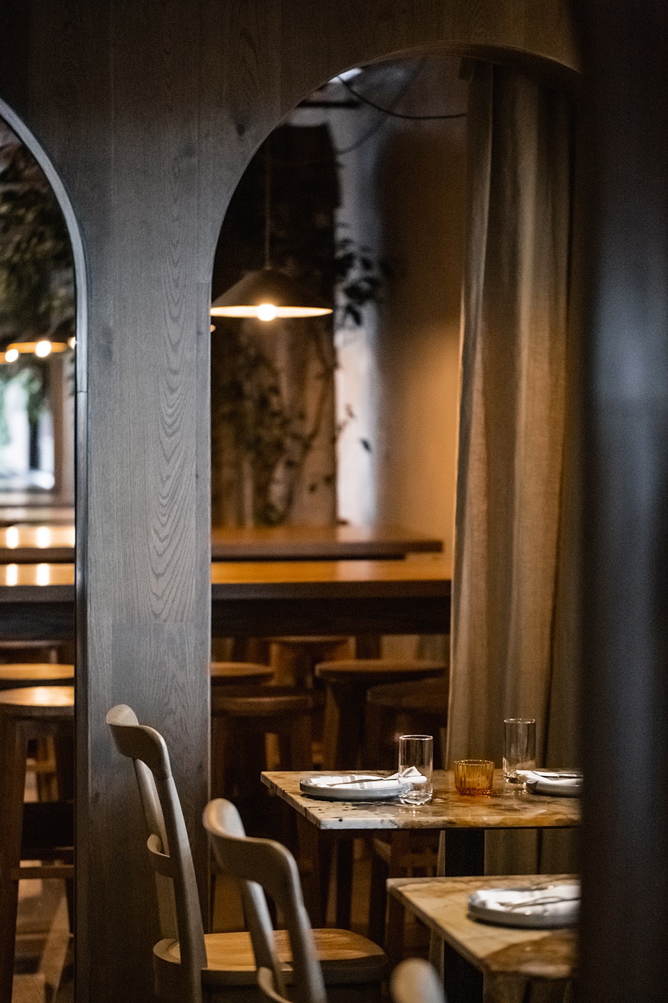
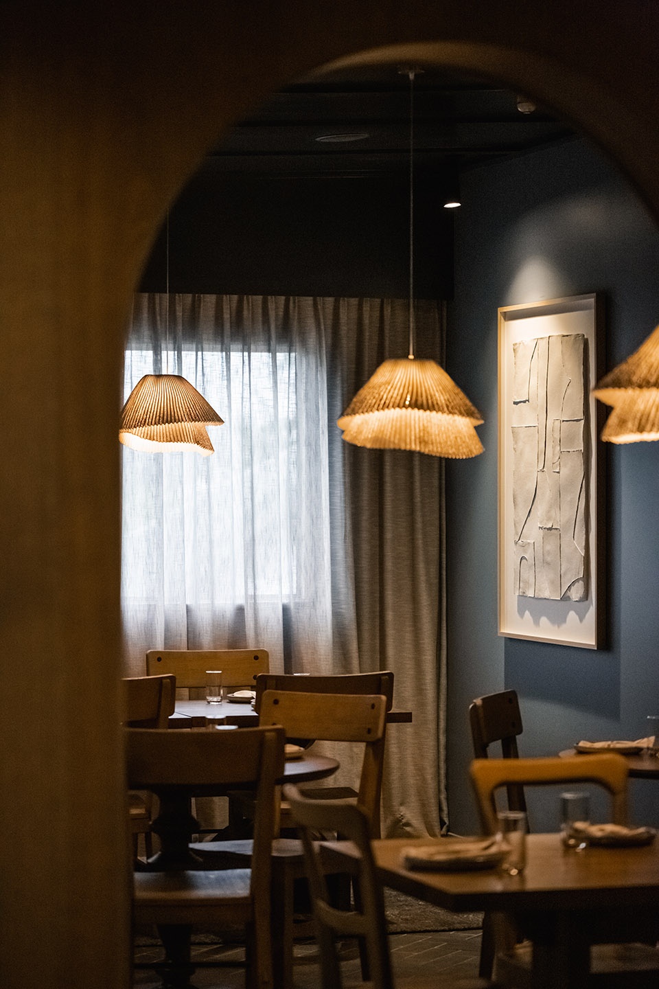
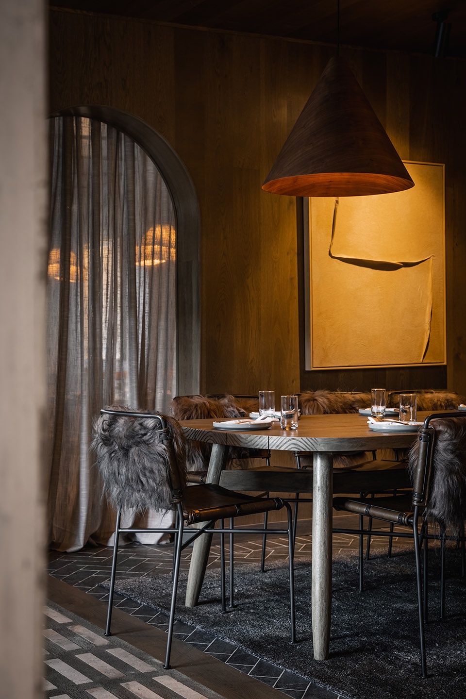
以不同方式摆放的桌椅定义出休闲且友好的用餐区域。窗帘分布在餐厅后方和其他区域,在提升柔和感的同时起到分隔空间的作用。置物架上摆放着一些古旧器物,与墙上裱框的艺术品共同营造出住宅般的体验。
The differing table settings create a casual, friendly dining area. Drapes saturate the rear room, and feature throughout the rest of the space to add softness and help separate spaces. We also layered artifacts and objects on the shelves and hung framed artwork, reinforcing the residential look and feel.
▼窗帘在提升柔和感的同时起到分隔空间的作用
Drapes add softness and help separate spaces © Sarah Grace
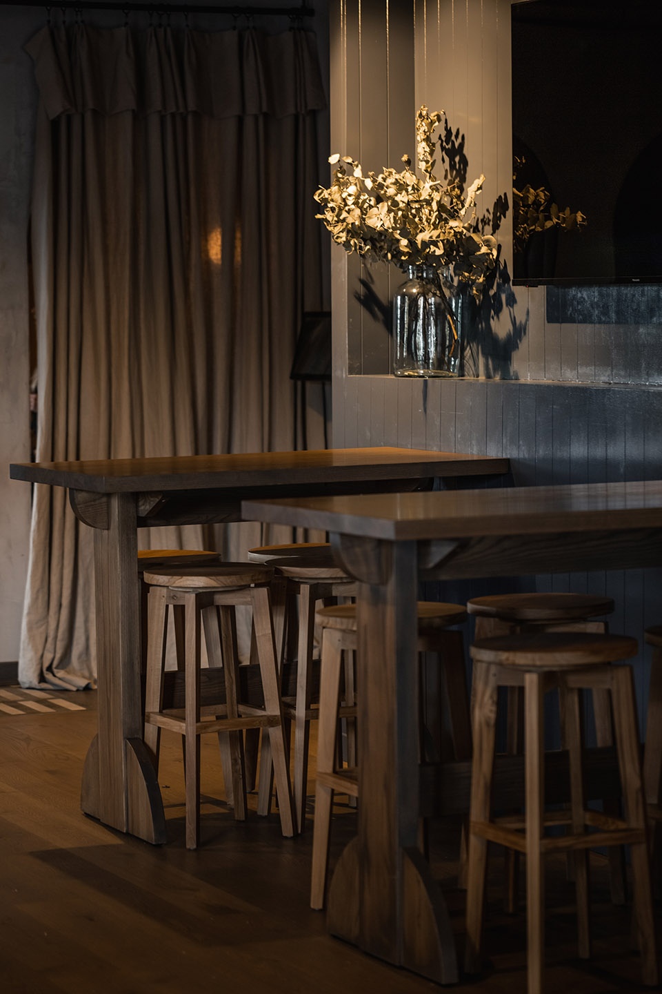
▼画作和装饰品细节,artifacts and objects © Sarah Grace
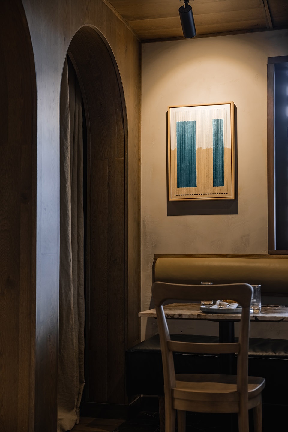
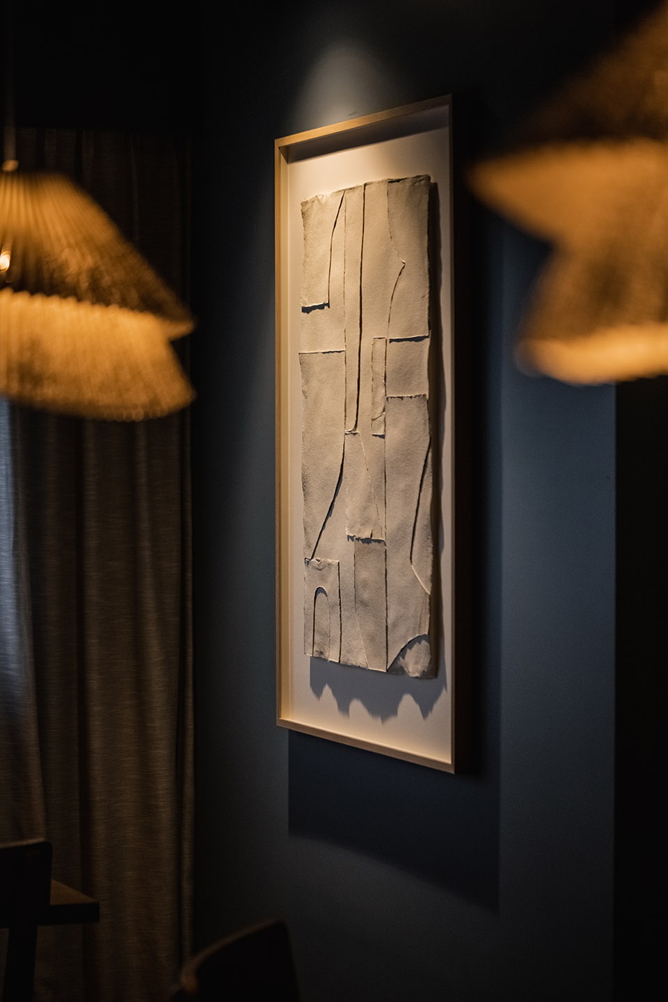
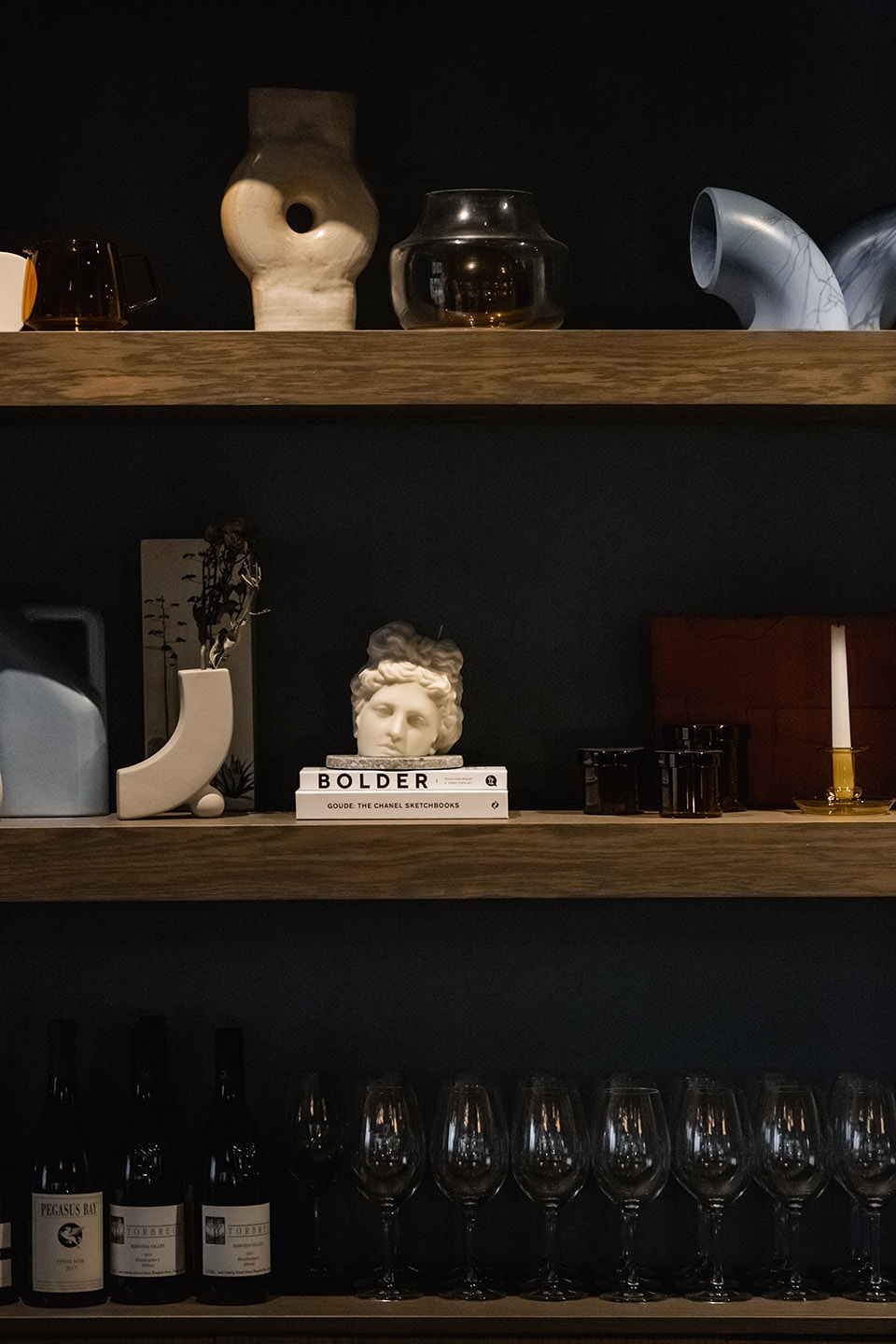
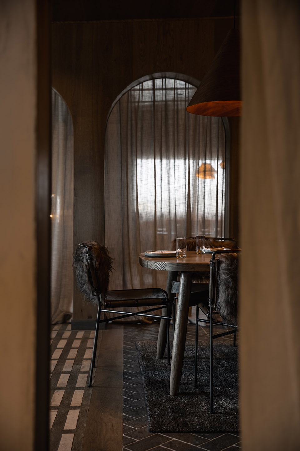
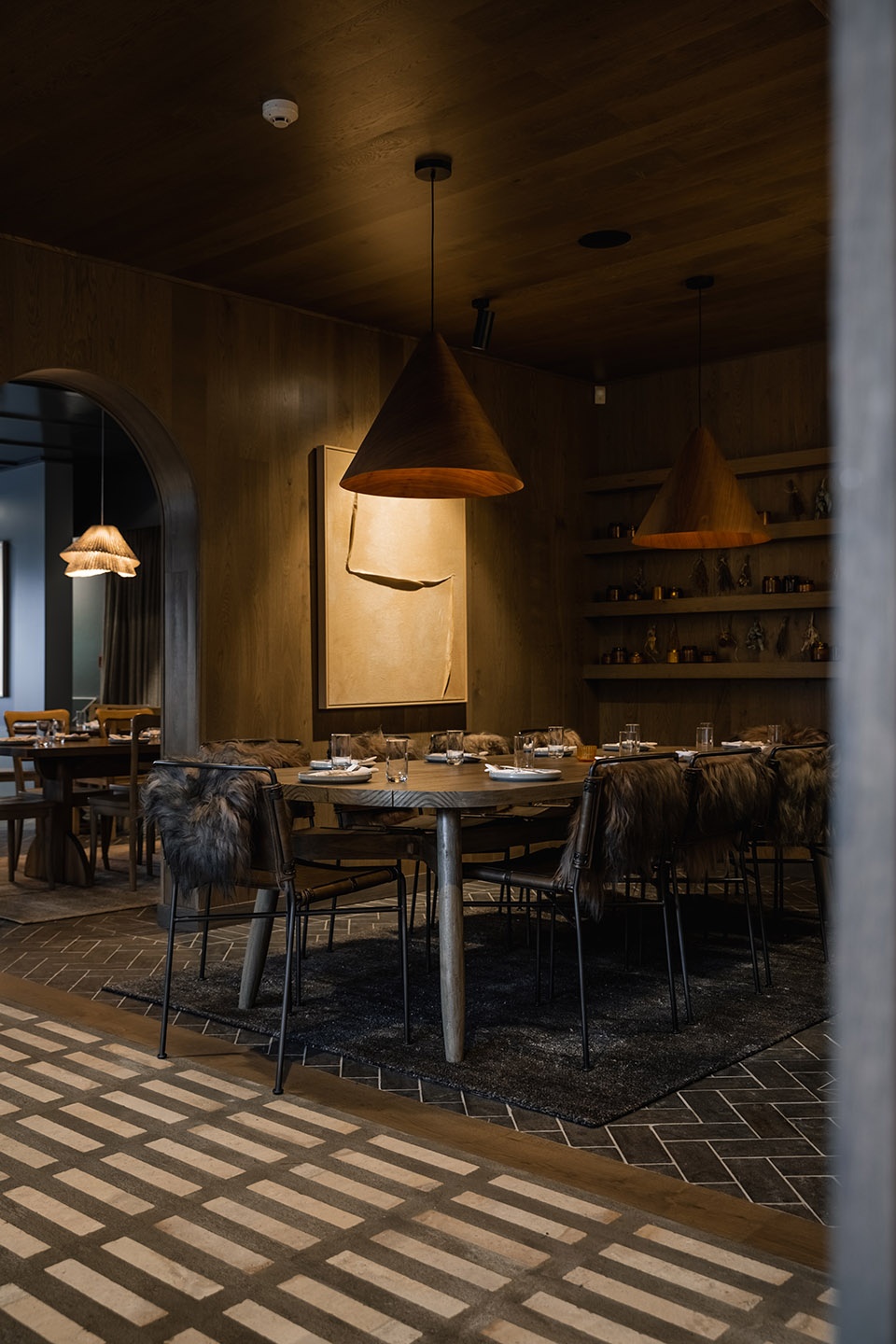
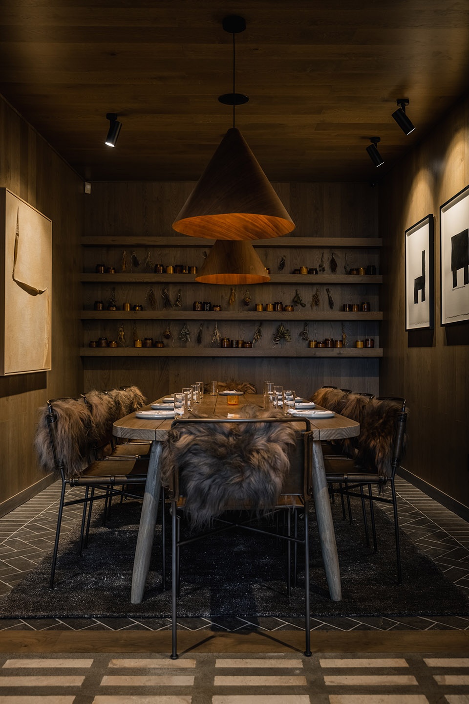
私人餐室装饰以大面积的木材,成为餐厅中的独特绿洲,在闪烁的烛光下形成一个简朴却诱人的空间。
The timber-soaked private dining room is a special oasis that’s lit by flickering candles, and forms a humble and inviting spot.
▼私人餐室,private dining room © Sarah Grace
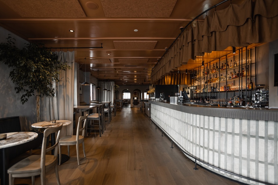
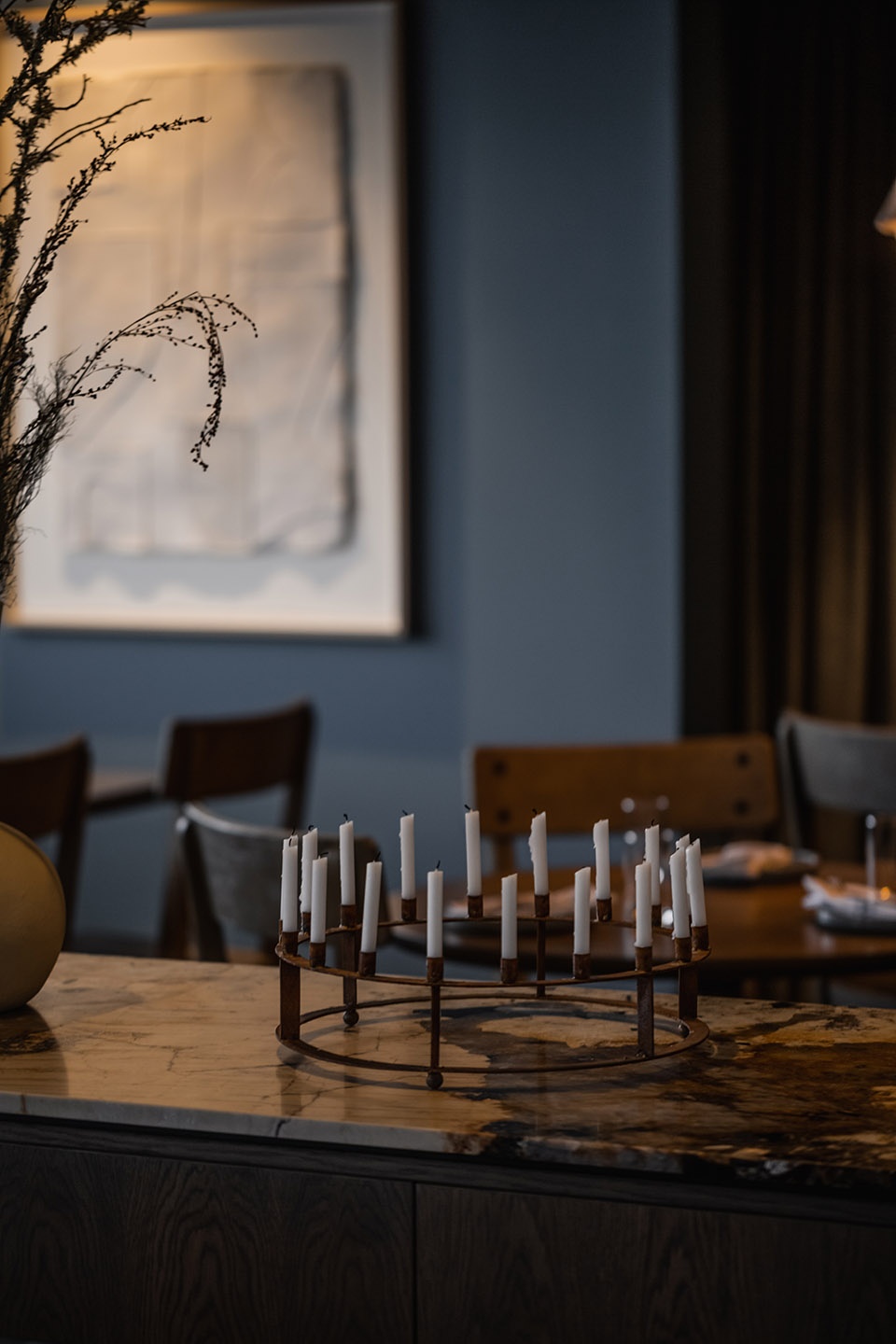
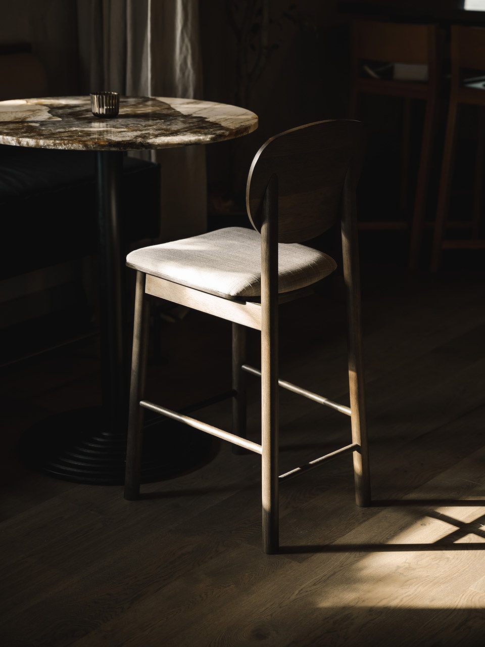
设计团队希望为Siso注入明显的色彩特征:光滑的赤陶土天花板有助于反射光线,使空间显得更加宽敞和明亮。在酒吧幕帘、桌布、地毯和艺术品的映衬下,赤陶土的色彩显得更加明艳。通过使用基础而又实惠的材料,设计团队得以在减少预算的同时创造出一个具有影响力的空间。标准的白色瓷砖搭配以独特的宽缝灌浆,带来一种华贵而又稳重的观感。
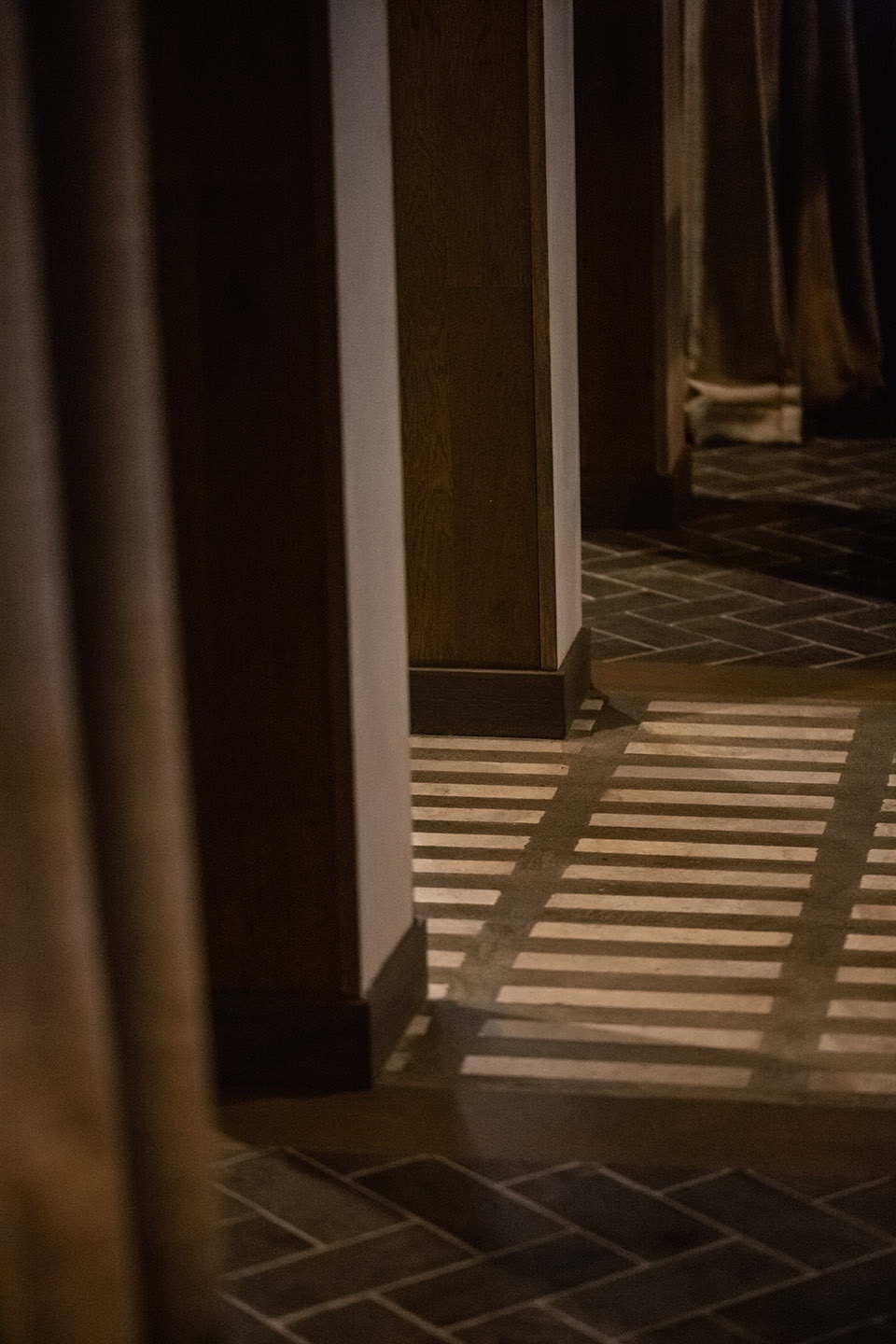
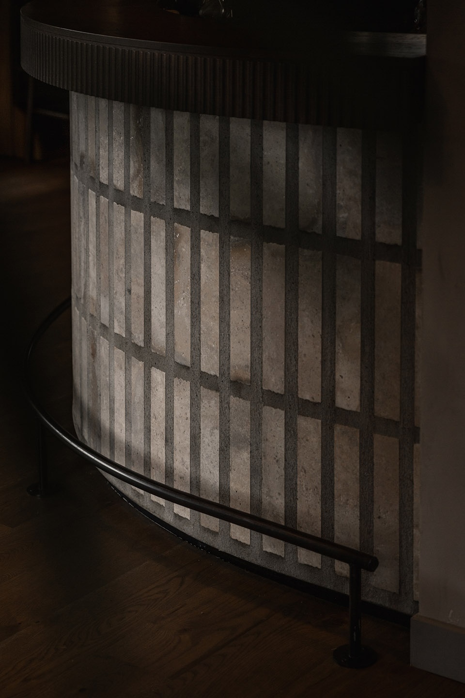
We wanted Siso to have a strong colour identity. The glossy terracotta ceiling brightens the space and helps reflect the light, creating a spacious feel. This colour is reinforced through the bar curtain, table cloths, rugs and artwork. Using basic, cost-effective materials in creative ways has helped us achieve an impactful space while coming in under budget. The unique application of standard white tiles with wide grouting achieves an elevated look.
▼室内装饰和家具细节,furnishing details © Sarah Grace
▼地面细节,floor details © Sarah Grace
▼吧台立面细节,facade of the bar © Sarah Grace
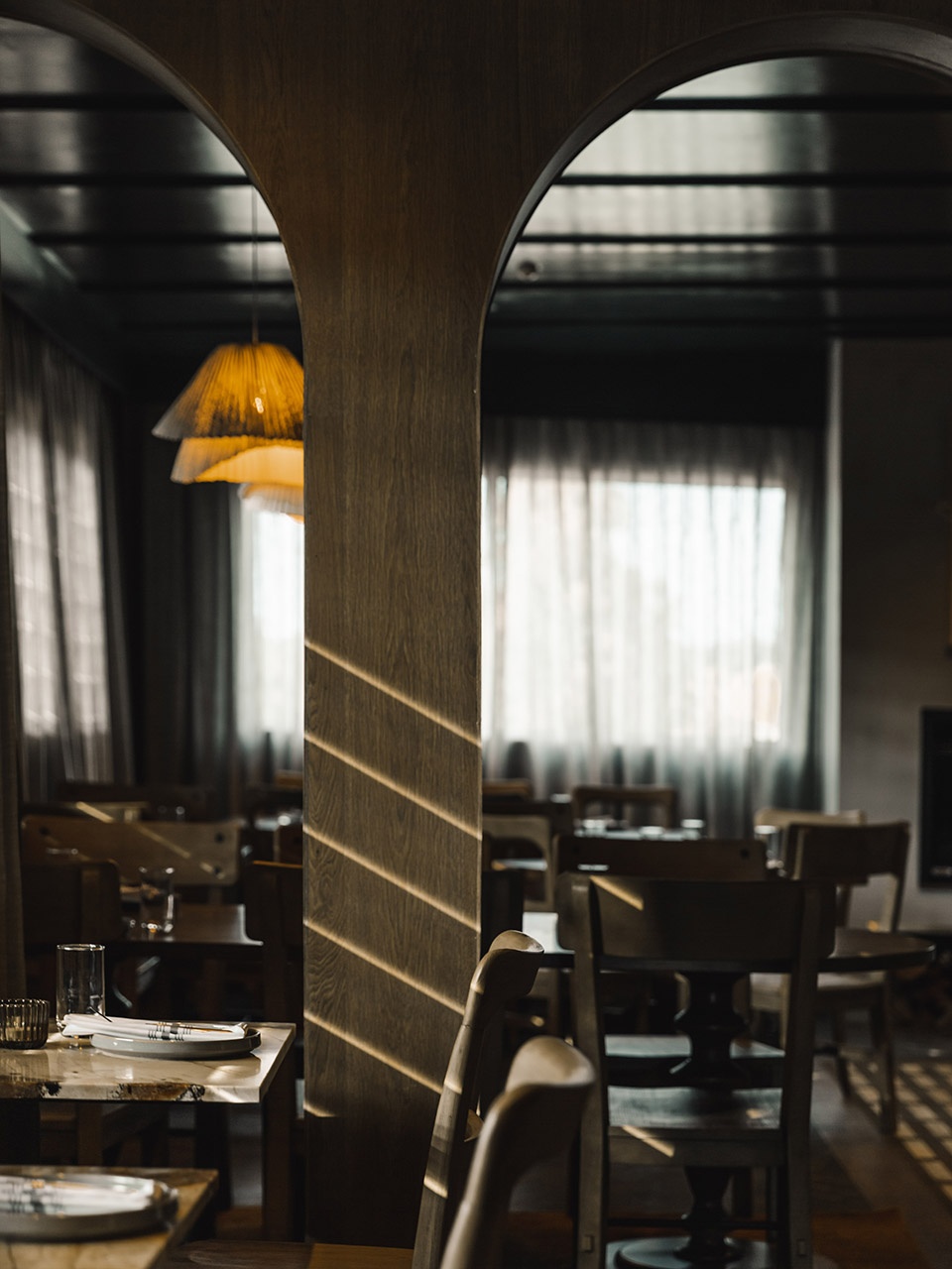
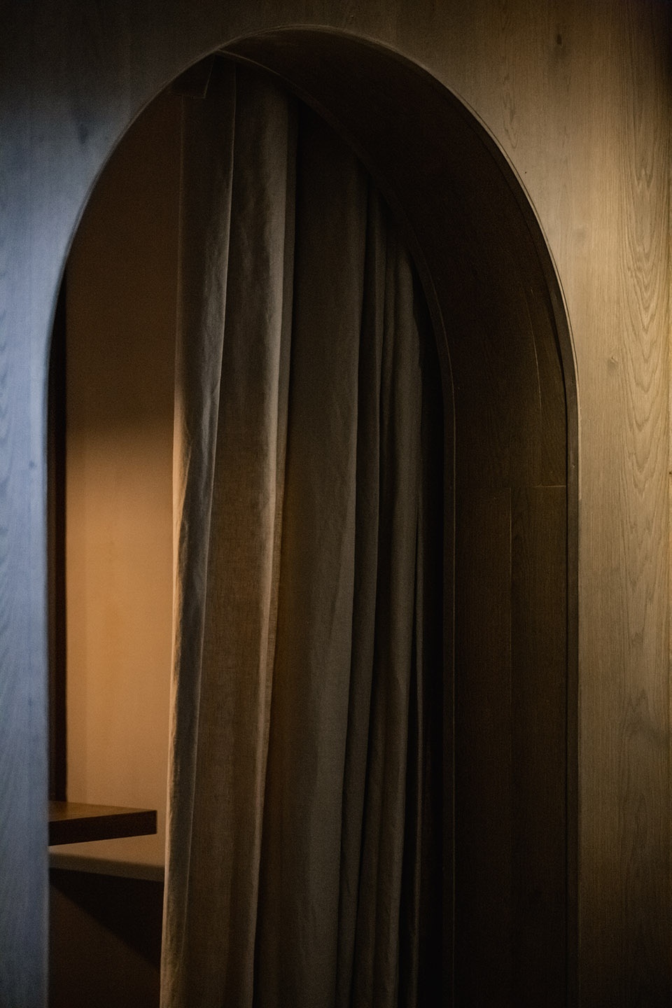
空间中还引入了一些拱形元素,用于掩盖天花板的高度变化,拱门所在的位置则隐藏了既有建筑的结构特征,同时消解了原先两个不太协调的门洞。设计团队还打掉了旧保险库的墙壁,从而创造出一个额外的空间。既有混凝土立面上的圆形开口处新置入了一扇窗户,掩盖了其原先的用途。
The arches were introduced to hide some architectural challenges, disguising a change in ceiling levels, while the placement of the archways hides structural building features and eliminates two awkward existing doorways. We also managed to create an extra space by knocking out the wall to the old bank vault. Adding a window within the circular opening in the concrete at the front of the building disguises its former purpose.
▼拱形元素消解了原先两个不太协调的门洞 © Sarah Grace
The placement of the archways eliminates two awkward existing doorways
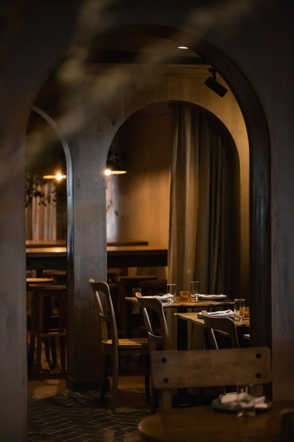
▼空间细节,detailed view © Sarah Grace
Space: 272m2
Location: Remuera, Auckland
Photo credit: Sarah Grace
More:CTRL Space


这种复古质感满分
低调 质朴 有味道
其实更希望看到一些改前改后的对比,尤其前文说到回头客主要是年纪较大的男士,后续的目标又是另外的群体,保留、取舍是如何权衡的。比如回头客可能更多的希望看到熟悉的物件或者某些元素等等。。。这样的图文有点设计师的一厢情愿了
氛围感不错