非常感谢B+H Architects将以下内容授权gooood发行。更多请至:B+H Architects on gooood
Appreciation towards B+H Architects for providing the following description:
form v2com
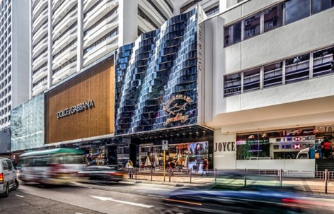
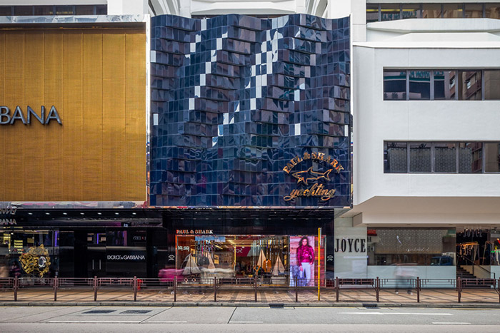
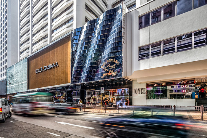
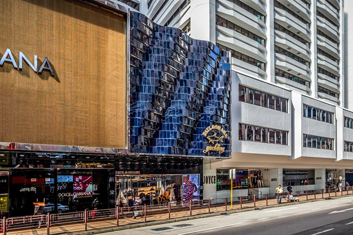
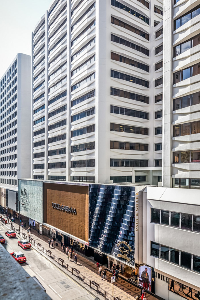
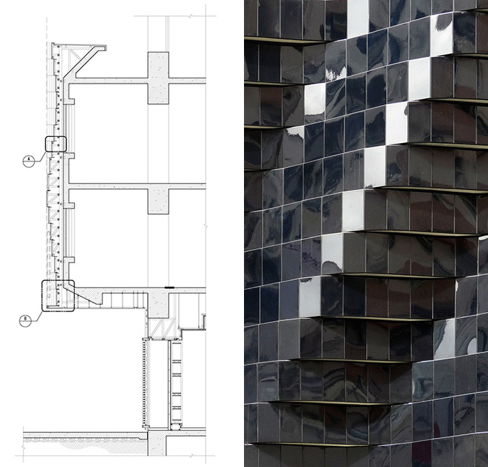
意大利奢饰品牌c希望进一步拓展亚洲市场,为此启动香港旗舰店。B+H建筑事务所亲自到意大利考察了米兰和瓦雷泽的PAUL & SHARK店,深刻领会品牌精神,采用钢材,木材,玻璃,皮革等现代装饰材料,将现代元素与意大利的经典结合。整个项目中最值得一提是如同波浪翻滚般的闪闪外立面,建筑师使用了深蓝光泽铝板,才得以打造出相当逼真的波光粼粼效果。内部家具皆为定制,精心营造的自然温馨氛围与外表皮相辅相成。

Rebranding with Design
Hong Kong, Hong Kong
B+H Architects
Looking to further expand into the Asian market, Italian luxury brand PAUL & SHARK embarked on a mission to renew its brand image. The first step: launch its Asian flagship store on Canton Road, Hong Kong. This would become the prototype for a new generation of PAUL & SHARK stores.
To better understand the personality of the brand, the B+H design team visited the PAUL & SHARK stores and workshops in Milan and Varese, Italy. Working closely with PAUL & SHARK CEO, Andrea Dini, B+H began work on a design that would reflect the fine craftsmanship and innovative spirit of the brand.
The iconic design concept of façade and interior of the flagship store was developed under the direction of Managing Principal Susanna Swee and Design Principal Jean Sebastien Bourdages.
Spread across 3,500 square feet, the store adopts classic Italian minimalist elegance blended with contemporary archetypical elements such as steel, wood, glass and leather. Inspired by the rolling waves, the navy blue aluminum sheet patchwork of the façade creates shimmering curves and glittering ripples, emphasizing the PAUL & SHARK logo ahead of the abundance of luxury brands along Canton Road.
The main entrance and windows lead the way through vertical blinds of wood and steel, whose double sides offer visual transparency into the store and flexibility for window setting, along with an LED screen on the side showcasing the latest collection.
The arches, clad in glass and eucalyptus wood, optimize the existing retail area and divide the space into sections of display shelves. Eucalyptus shelves and back-lit translucent glass walls offer a clean palette, keeping the focus on the merchandise. The natural and warm ambiance is complemented by a wavy wood feature wall that echoes the exterior blue metal façade.
To further deliver brand consistency, B+H custom designed the clothing hangers and all luxury lounge furniture.
Following this success, the B+H design was applied in PAUL & SHARK stores in Milan, Mexico and Istanbul. B+H recently completed the new stores in Macau and Hong Kong, and is now supervising the Shanghai and Chengdu stores.
Principal in charge: Susana Swee
Design Director: Jean Sebastien Bourdages
Design team: Filip Piwowarczyk, Shukri Atta, Justice Wang, Livia Sima, Jason
Gonzales
Lighting Design: AVA & Consultancy
Contractor, façade: Prorich Engineering Ltd.
Contractor, interior: Leung & Chang interiors Ltd.
Client: Paul&Shark and Imaginex
Completion: 2013
Project location: Shop G107, No.7-25 Canton Road, Tsim Sha Tsui, Kowloon, Hong
Kong
MORE: B+H Architects,更多请至:B+H Architects on gooood








that might be the worst branding and impression in Canton Road……………..
不好看
感觉水波的感觉似乎是有点过已有规律点!(PS:个人感觉)
远看波浪的效果还是呼之欲出,立体感很强,近几年立体感的设计不仅在立面上在家具等工业设计上也愈多的体现,但是近看的话阶梯的形状让人好有攀爬的欲望[害羞]