来自 图石设计 对gooood的分享。更多关于他们请至:ToThree on gooood.
Appreciation towards ToThree for providing the following description:
今天我看见,
两个月亮,
一个新的,
一个旧的,
我很相信新月,
可我猜它是旧的。—–【今天我看见】,奥拉夫·赫格[挪威]
Today I saw,
two moons,
one new,
and one old,
I have a lot of faith in the new moon,
But it’s probably just the old.—– [Today, I saw] Olav H. Hauge
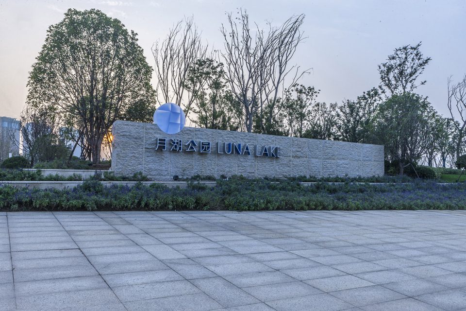
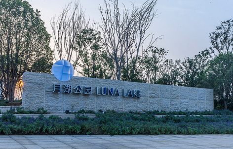
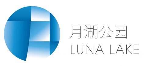
如同这首美丽的小诗,月湖公园就是这样一个浪漫、充满灵气的城中公园,它拥有一个月形湖湾,为城市增添了些许灵动,寄托着人们美好的憧憬。我们以汉字“月”为视觉核心,表现出城市中的这一弯月形湖水弥漫渐变的色彩,传递出皎洁晶莹的湖湾感受,这是能够打动人心的、具有启发性的设计。
Just as this beautiful poem, Luna Lake is a romantic and sentimental city park. It has a moon-shaped lake in the center of it, decorating the city with soft yet vivid aroma. The branding design of Luna Lake takes the Chinese character “月” (meaning luna) as the key visual element, and the diffusing and gradual colors reproduce the visual feeling of the lake, enhancing the romantic atmosphere in the park. It touches your inspiration.
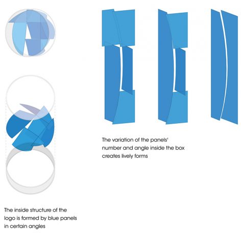
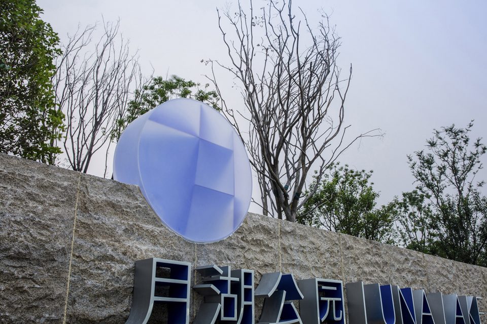
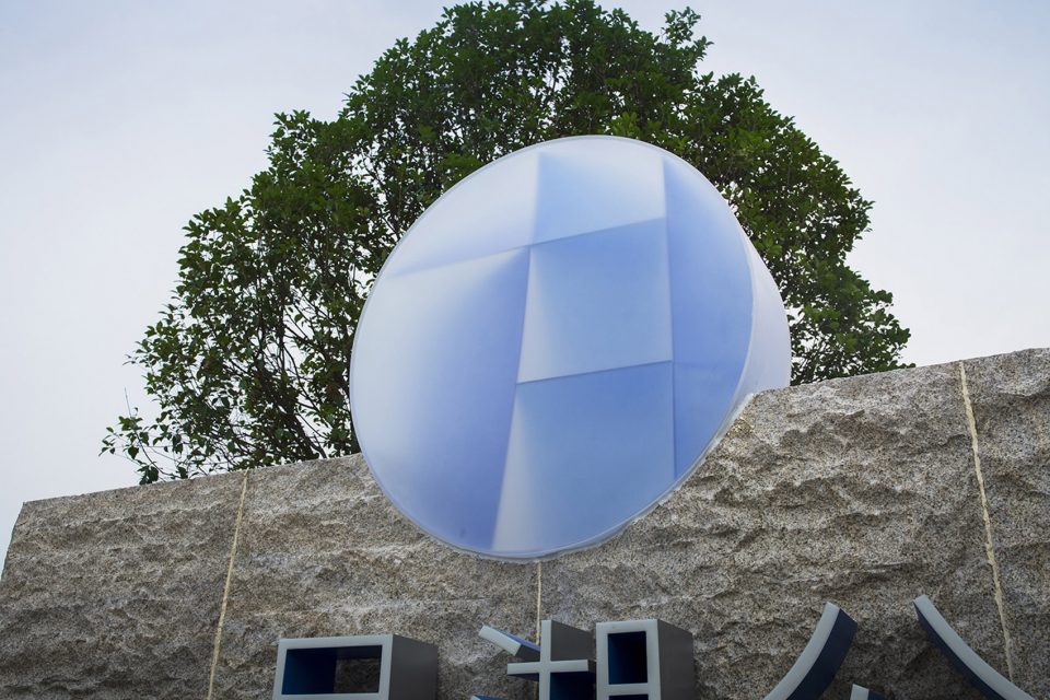
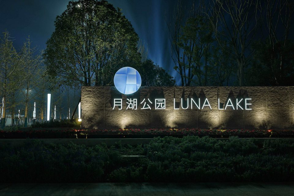
logo在公园里出现时,是通过磨砂树脂箱体内不同角度的色板组合构成的,均匀的蓝色板透过磨砂面呈现出丰富层次的变化效果,安静而美好。
When appearing in the park, the logo is a round box made of transparent frosted resin. What make the box standout are the blue panels inside of it that are installed in certain angles. The gradational lighting effect, created by the reaction of the box and boards inside, makes the logo a crystal moon, tranquil and beautiful.
▼均匀的蓝色板呈现出丰富层次的变化效果, the gradational lighting effect of the sign
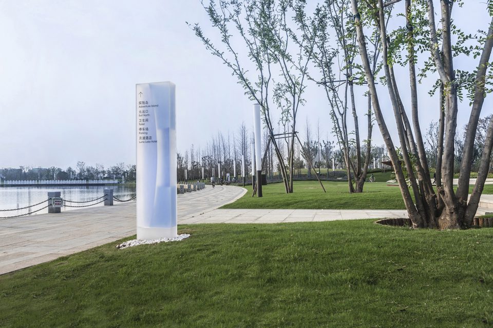
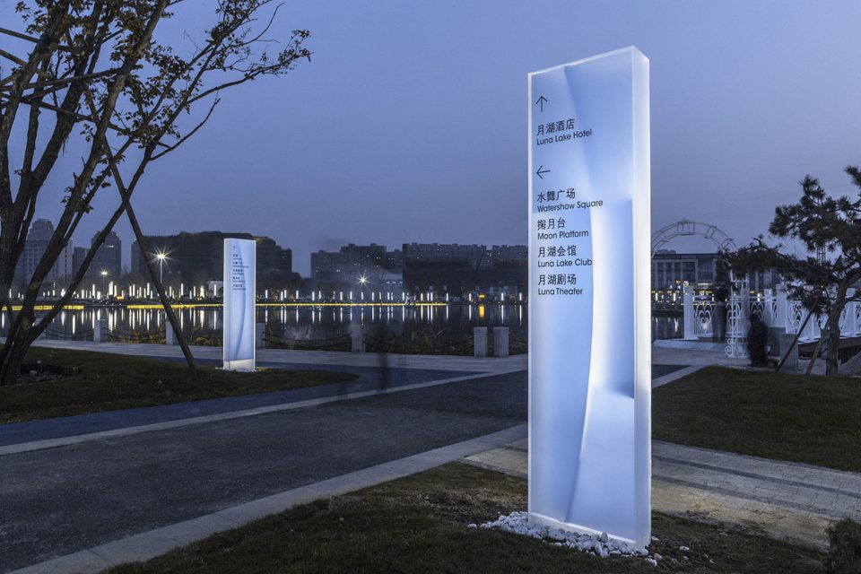
导示设计与logo一脉相承,色板的数量和角度变化形成了各种生动的状态,有的如月牙初生,有的则是logo中蕴含的汉字“月”。它通体轻盈,传递出具有弥漫感的视觉效果。如梦似幻,犹如精灵般散落在月湖公园。
Signage design inherits the above concept: the variation of the panels’ number and angle within the box creates lively forms: crescent, character “月” ect. , As a whole, the signage are like fairies dancing in the air lightly.
▼logo中蕴含“月”字设计,the logo design implies “月” character
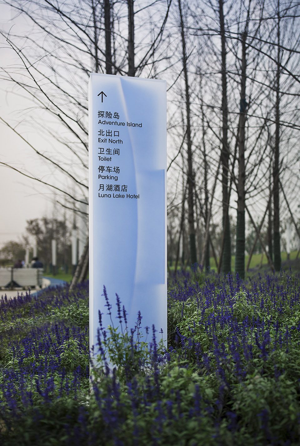
▼通体轻盈,弥漫感的视觉效果,the sign express a lively form
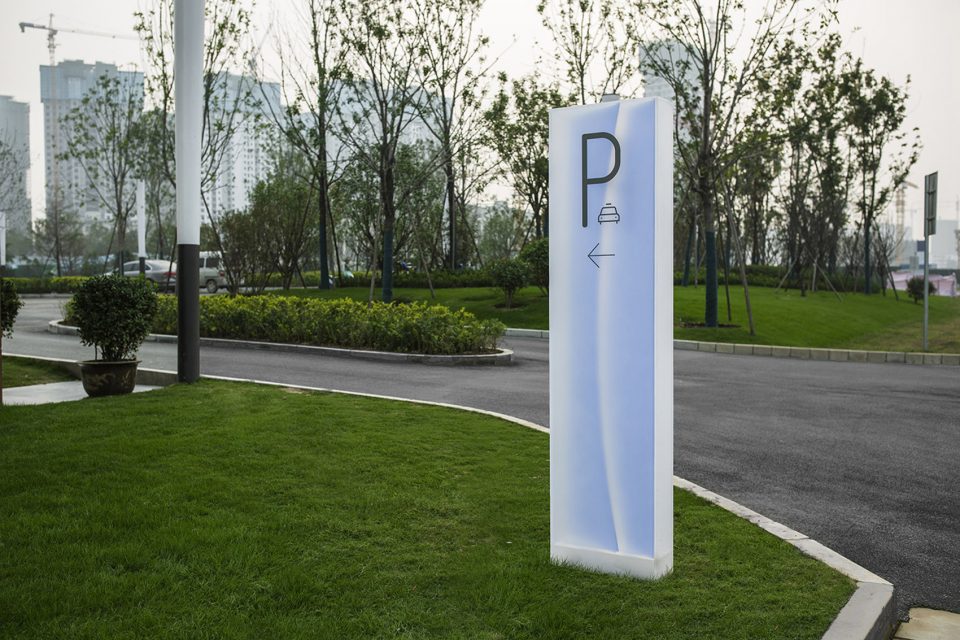
▼犹如精灵般散落在月湖公园,like fairies dancing in the air lightly
项目:郑州月湖公园
地址:郑州惠济区
客户:郑州碧源集团
设计管理:于洋
设计单位:图石设计
设计师:何杨、张睿、刘文波、张琳娜、高金笑、蒋旭慧
制作单位:广东卡乐板实业有限公司、深圳西正标识
设计时间:2016.08
摄影:廖尚勇、何杨
Project: Luna Lake
City: Huiji, Zhengzhou
Client: Beyuan Group
Project Management: Yu Yang
Agency: ToThree
Designer: He Yang, Zhang Rui, Liu Wenbo, Zhang Linna, Gao Jinxiao, Jiang Xuhui
Production: Color Panel Co., Ltd
Date: 08, 2016
Photography: Liao Shangyong, He Yang
More: ToThree,更多关于他们请至:ToThree on gooood.

好巧,作为景观从业者,正好这是我家楼下的月湖公园,而且最早看到的时候这个网页版导视牌,是2017年底,我在做杭州电竞馆及生态公园招投标的时候看到的;平时隔段时间就过来逛一逛;今天排景观方案的文本,找案例本子,突然出现了这个导视牌,就想来评价下。
好看的 有趣有意义
拍摄效果不错,可是经过风吹日晒,现场效果不及网页上的好看
虽然图不多,但是很好看,赞!!
这个真不错
logo对于中文“月”形象的应用太过生硬。现代中文起源于象形文,象形文就具有象征意义。此设计,而现代简体字则更多强调实用性、易用性,对于古汉字的美学元素其实是有一定程度剥离的。用这样一个工具来象征一个美好的事物是否有点不妥。会不会有一种想用一盒颜料来象征画中美丽少女的感觉。
你懂个球
嗯,也是一个启发!
我好想知道,不生硬的将月的形象反映在logo上是该怎么做。
怎么在个人主页里收藏?
清新的创意。
有启发……………
效果不错
夜景效果可以。