非常感谢 芝作室 予gooood分享以下内容。更多关于她们:LUKSTUDIO on gooood
Appreciation towards LUKSTUDIO for providing the following description:
在广州天河区的一个老住宅楼下,芝作室将空置的城市边角改头换面成为Atelier Peter Fong: 一个工作室与咖啡馆。一系列的白色体块将原本凌乱的场地净化,创造出引人驻足的宁静空间。
Located in a residential neighborhood next to the Tianhe district in central Guangzhou, Atelier Peter Fong by Lukstudio revives an empty corner lot into both an office and a cafe. Through a series of clean white volumes, the design purifies the existing chaotic site to create a calm yet inviting atmosphere.
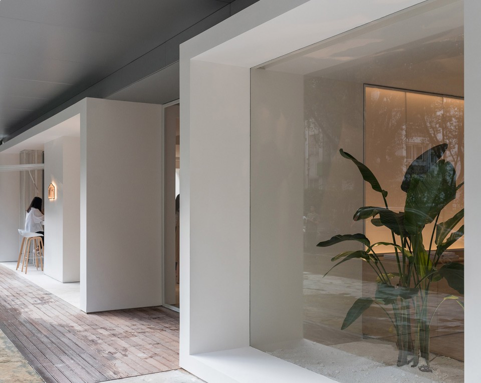
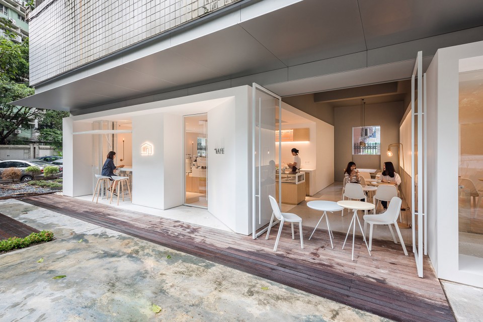
▼建筑外观,external view of the building
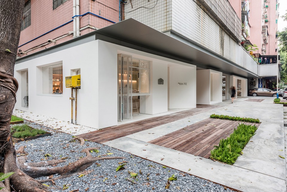
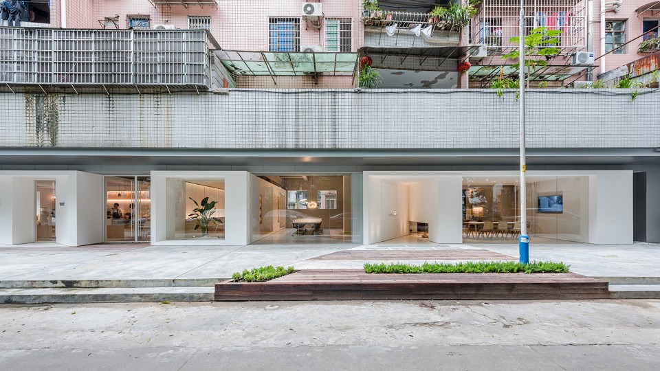
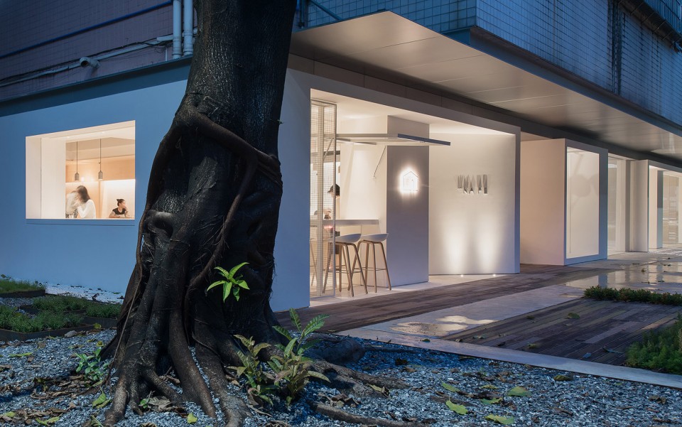
在建筑外部,漂浮的轻盈铝板将白色体块归于其下,又像一条线划出新旧的交界。三个并列的白色盒子由内穿出,构成统一的外立面。而盒子间留出的‘之间地带’如同城市街巷的延续,吸引着过路行人。每一个白色盒子都包含着不同的功能:咖啡厅,‘头脑风暴’区,会议室和休闲区。盒子‘之间’以暖灰色调处理,顶部呈现原有结构,与纯白的盒子形成对比。
From the outside, a floating aluminum canopy connects the volumes together, while delineating between the old and the new. Three boxes stick out from the interior, composing a coherent façade while creating areas in-between like urban alleys that draw people in from the street. Each box contains a distinct program; café, brainstorming area, meeting room and a break-out lounge. In contrast to the pristine forms, the voids are painted gray and left with the original structural ceiling.
▼建筑外观,三个并列的白色盒子,external view of the building, three boxes divide the space
▼咖啡厅入口,cafe entrance

▼工作室入口,office entrance
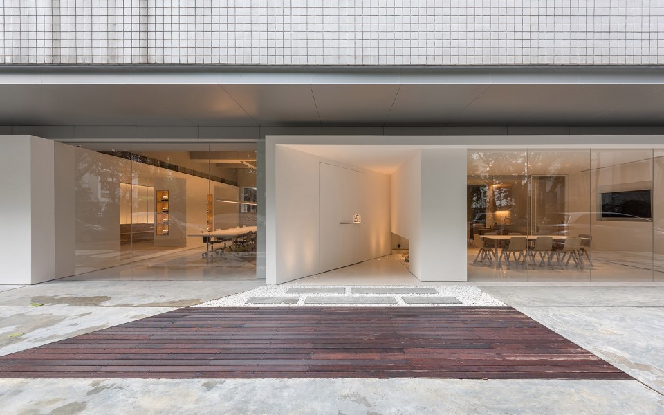
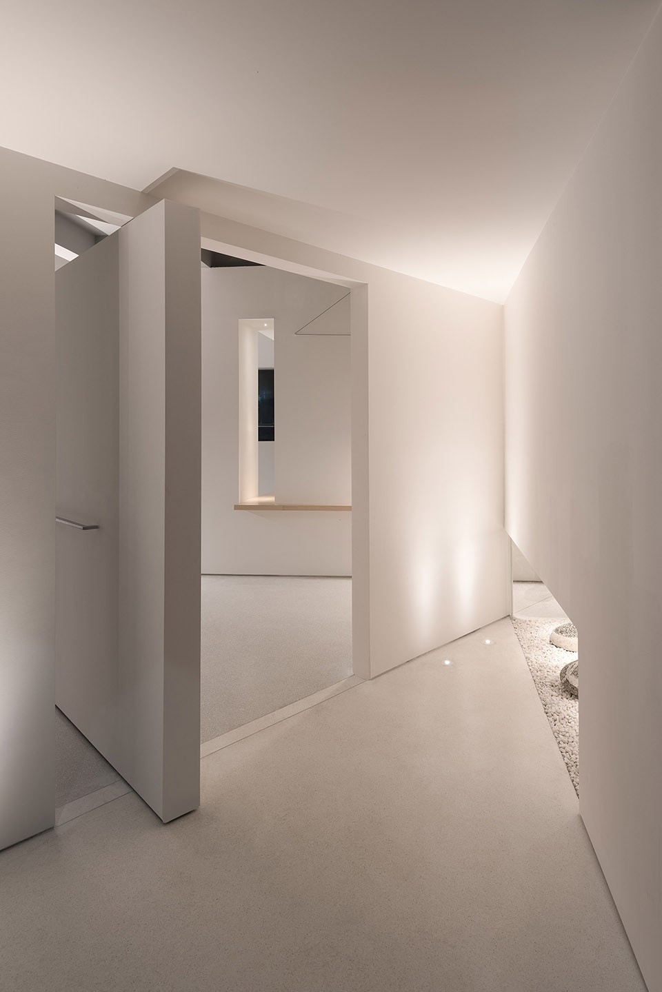
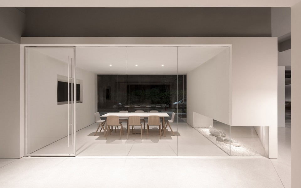
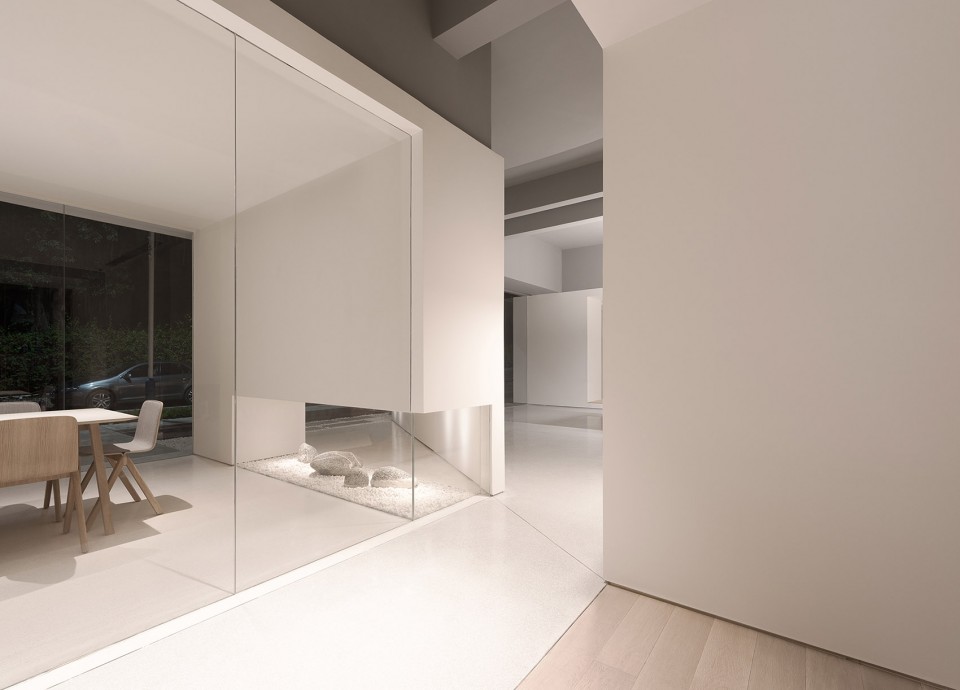
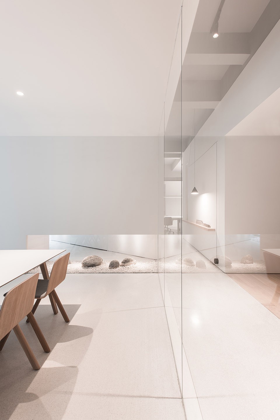
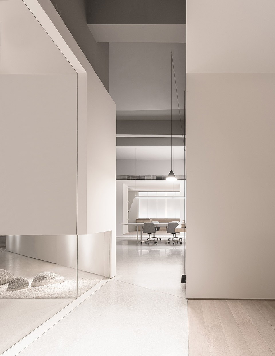
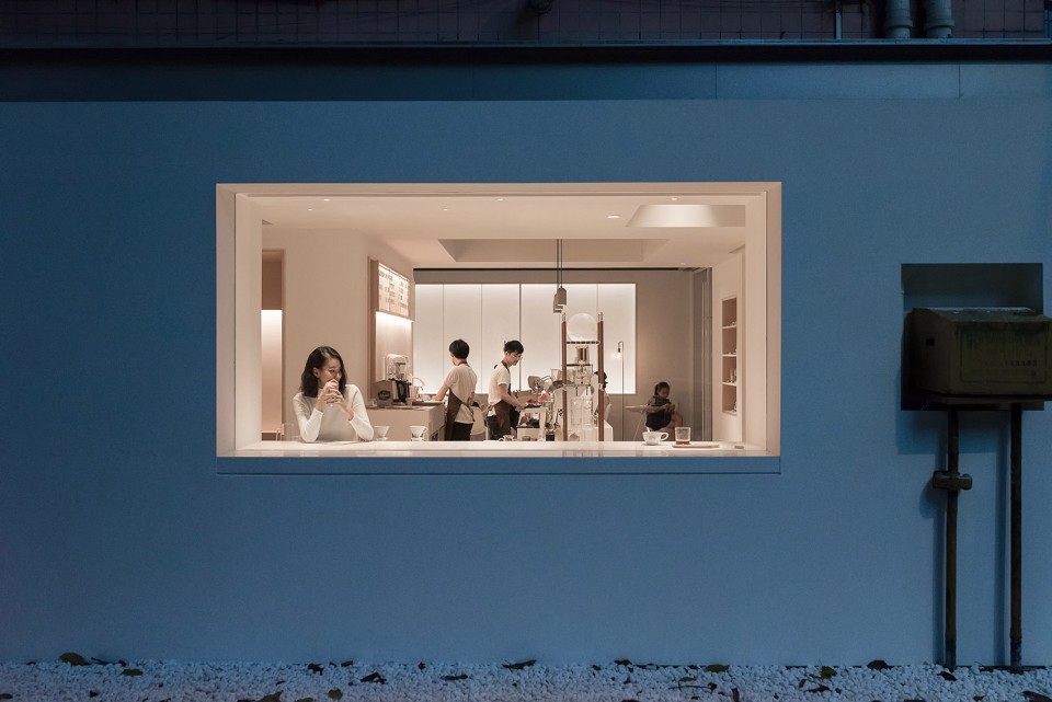
根据对功能需求和周边环境的细致推敲,芝作室在体块里外“雕刻”出不同的开口与凹凸。大的开口将咖啡厅里外贯通,并将窗外绿景框出。在室内,局部挖空的天花板与木饰面壁龛营造出亲近舒适的气氛。同样的手法也应用于办公空间入口,三角形门厅的底部留空而成一个静谧的禅意山水,它不但是内部办公的景观焦点,也在视觉上将室内外空间连接。
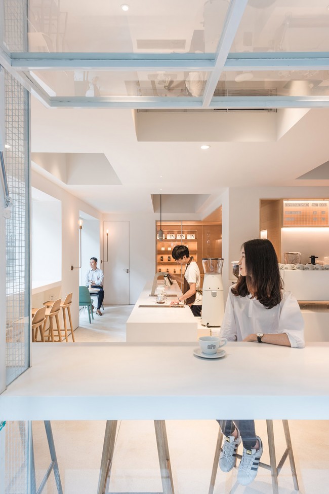
Following a process of meticulous spatial carving, openings and niches are shaped within the volumes. Large cut-outs connect the café to the exterior and frame the surrounding greenery. On the inside, white ceiling pockets and wooden niches create a sense of intimacy. The office entry is also carved at its edge to feature a peaceful Zen garden, which becomes a focal point and visually connects the different parts of the office together.
▼白色盒子上设有开口与凹凸,openings and niches are shaped within the white boxes
▼咖啡厅室内,木制凹室形成舒适的氛围,interior of the cafe, wooden niches create comfortable atmosphere
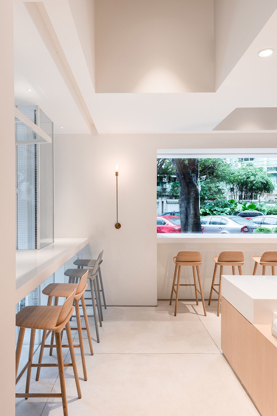
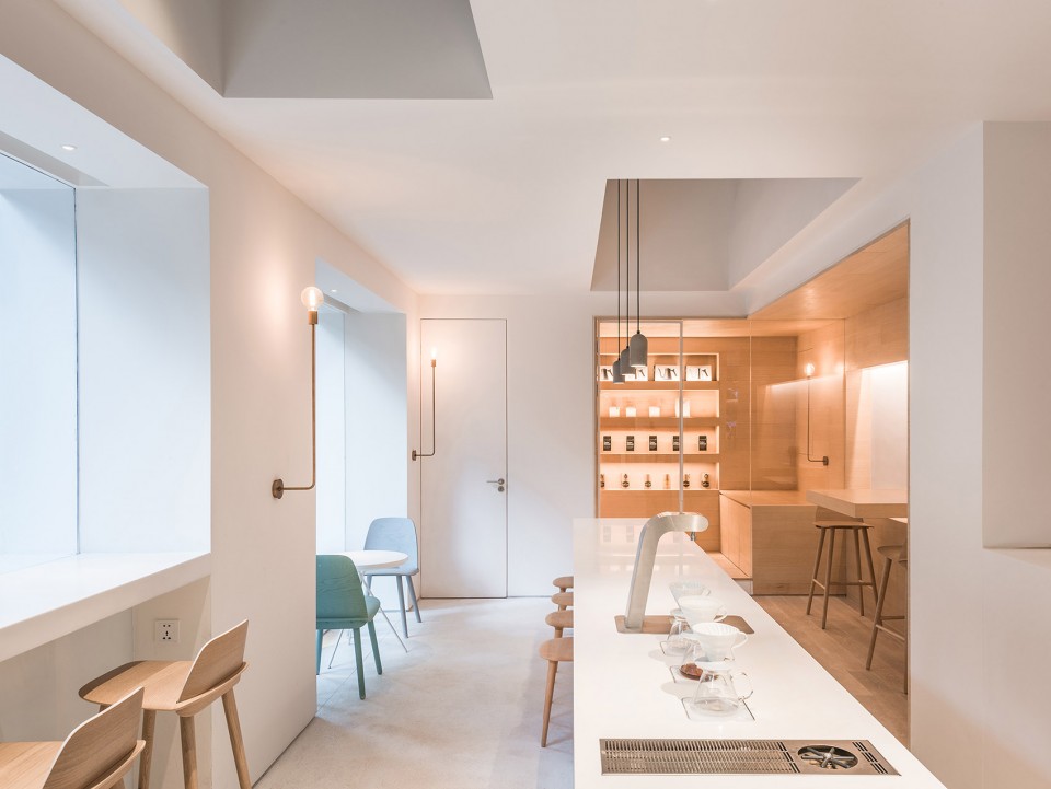
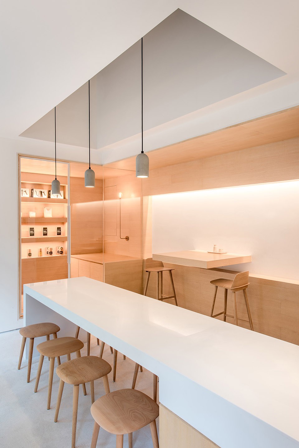
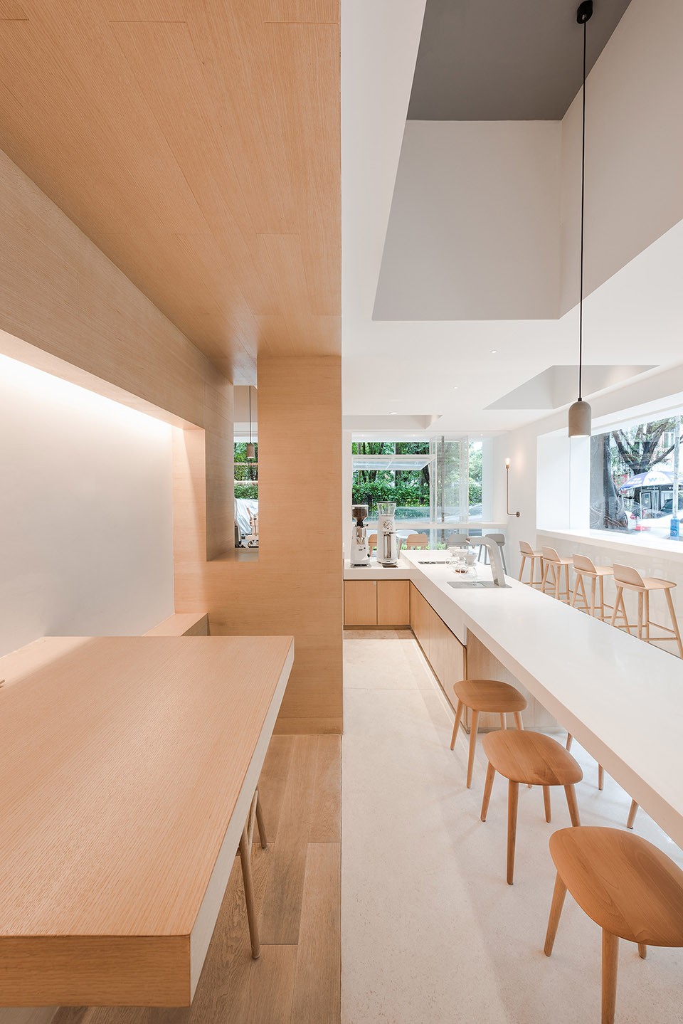
▼可以延伸的室外的餐饮区,the f&b area which could be extended to the outdoor space
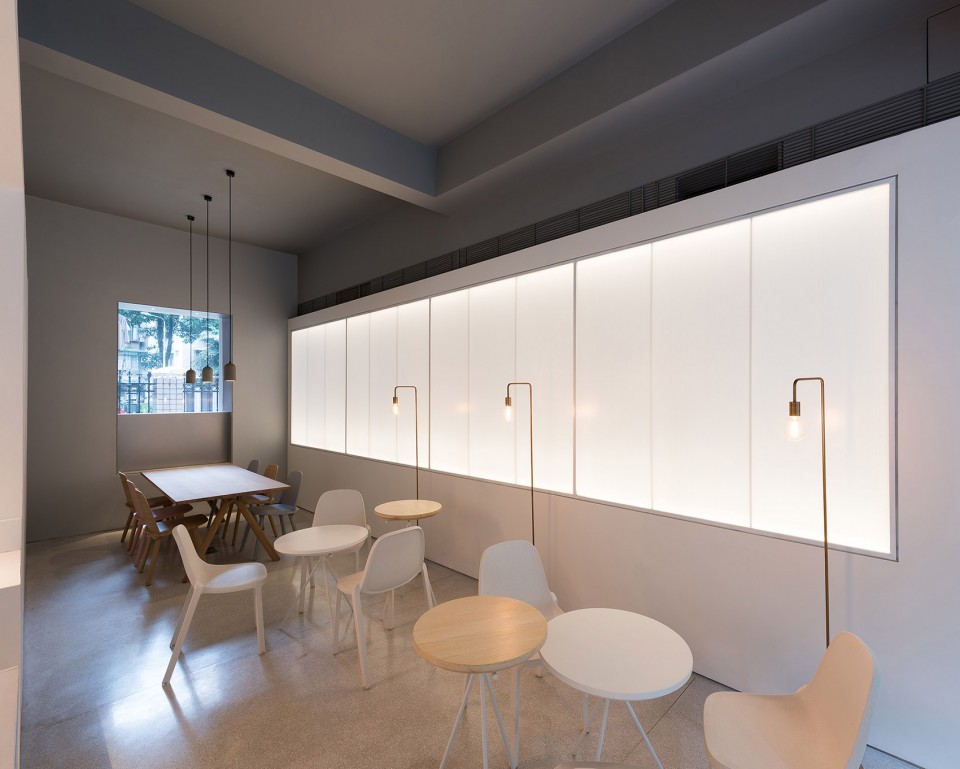
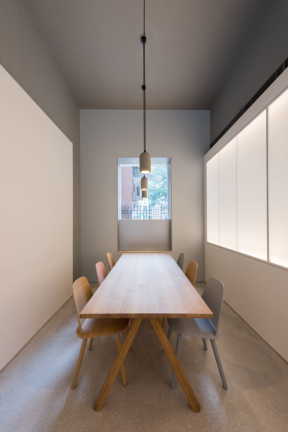
材质的运用进一步定义空间。平滑的白色墙壁与水磨石地板占据了主要的公共空间,如同画布捕获着光与影;半透明墙面在公共咖啡馆与工作场所间造成微妙联系;更私密的区域多选用自然原材,例如‘头脑风暴’区的连续木材表面以及休息区中的砖石墙面。
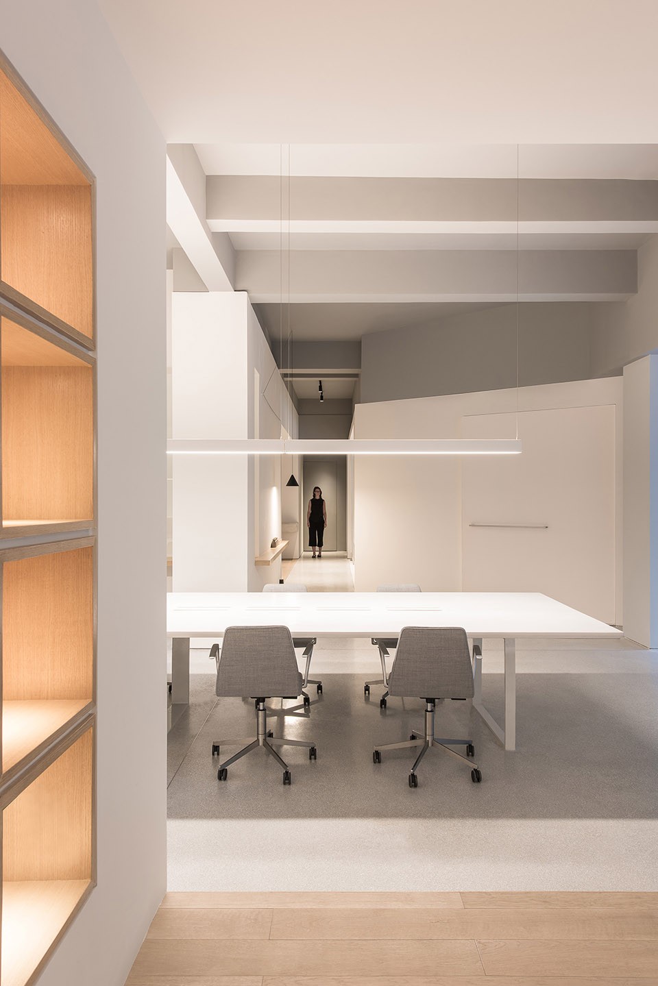
The selection of materials further enhances the pure definition of the spaces. Smooth surfaces such as white walls and terrazzo flooring dominate the main space, serving as a canvas to capture light and shadow. The brainstorming box is lined with polycarbonate panels that form a subtle visual connection between the café and the workplace. Intimate areas are characterized by organic elements; such as continuous timber panels in the brainstorming zone and remnants of an existing brick wall in the lounge.
▼办公空间三角形的入口和门厅,the triangular entrance and foyer space of the office
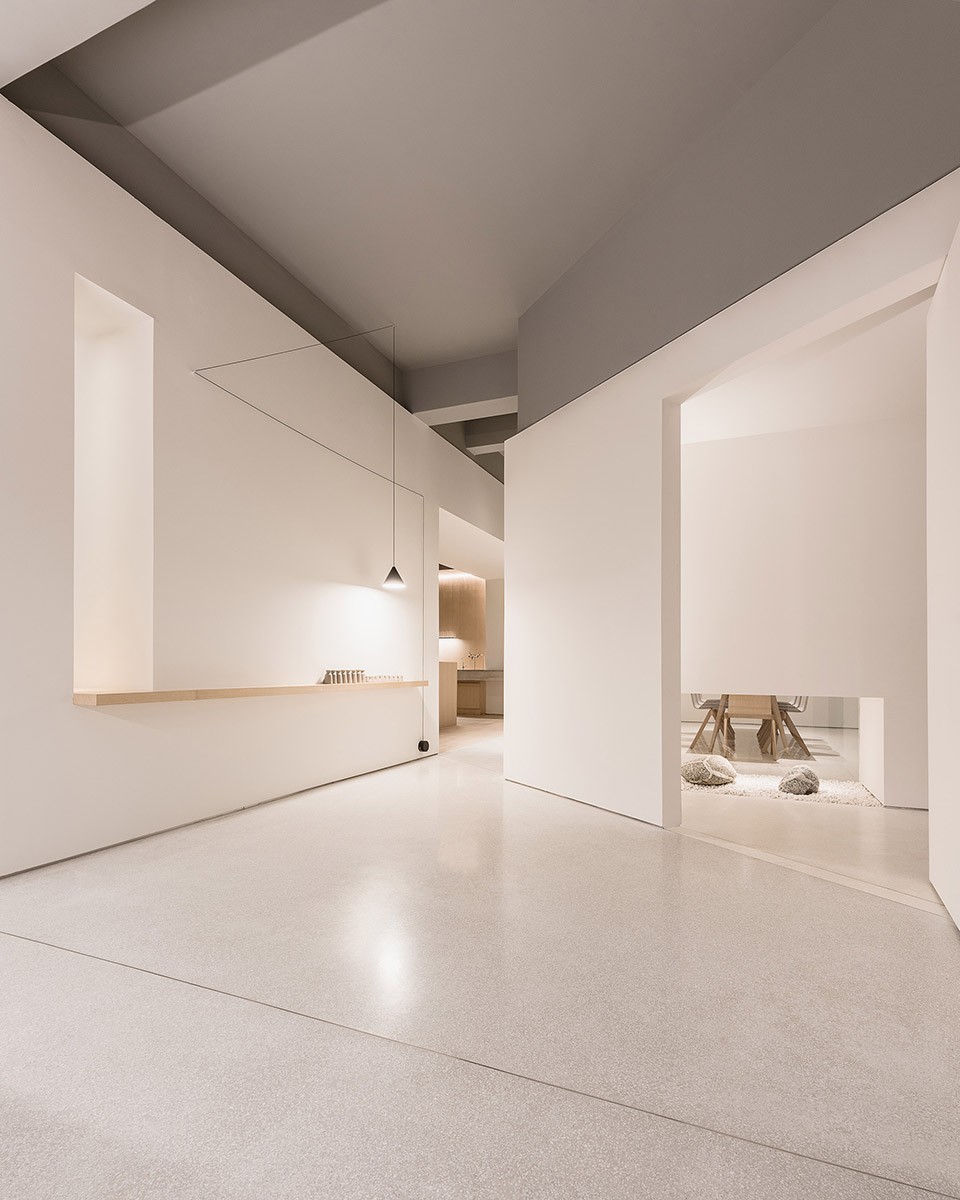
▼办公室和头脑风暴区,office and brain storming area
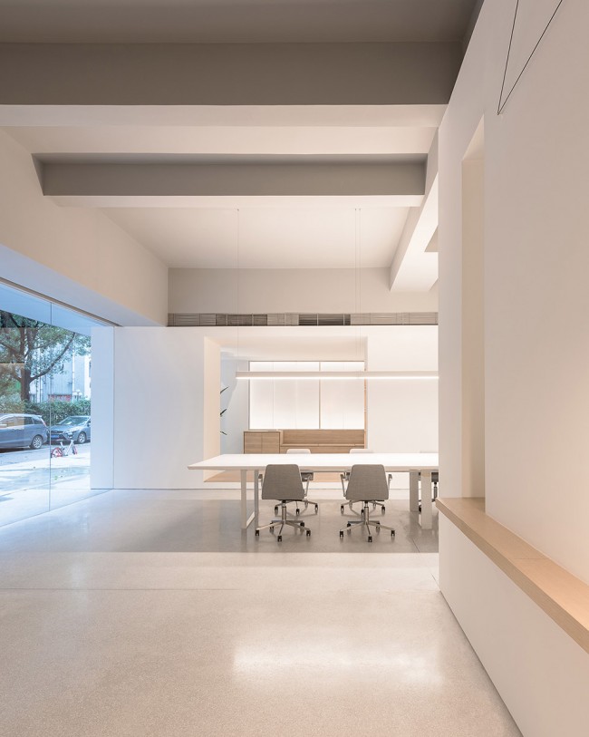
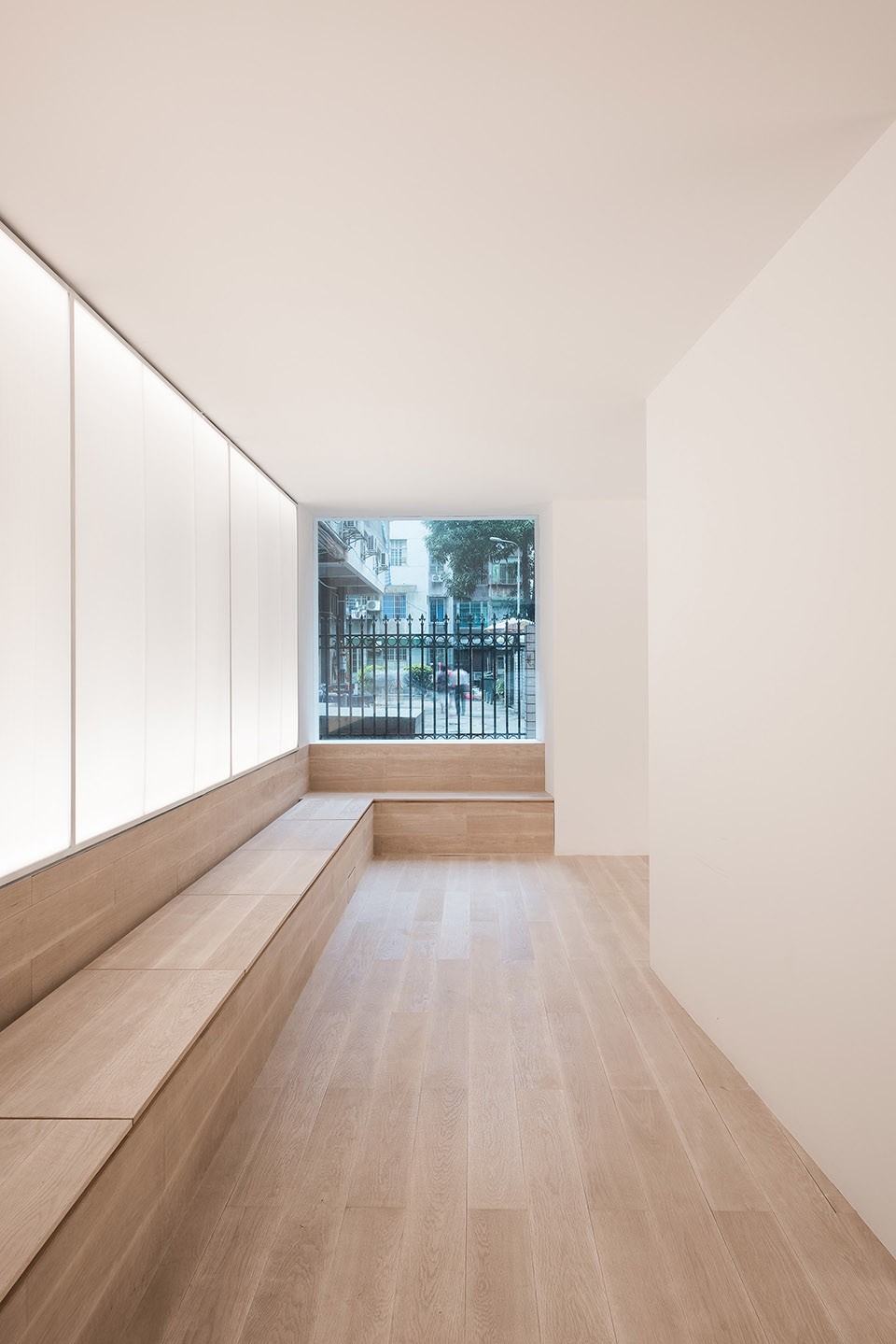
▼会议室,meeting room
▼空间在视觉上相互联系,the spaces are visually connected
通过咖啡文化与联合办公相结合的模式,Atelier Peter Fong将一个现代概念的社交模式融入到寻常邻里中。一个被遗忘的城市边角通过设计成为社交热点,这脱胎换骨的转变诠释了建筑的介入可以如何为城市注入新活力,激活社区再发展。
Combining artisanal café culture with a collaborative co-working space, Atelier Peter Fong adapts a contemporary social model to a local Chinese neighborhood. The complete transformation of a forgotten site into a destination demonstrates how architectural interventions can activate the streetscape and enhance nearby communities.
▼夜景,night view
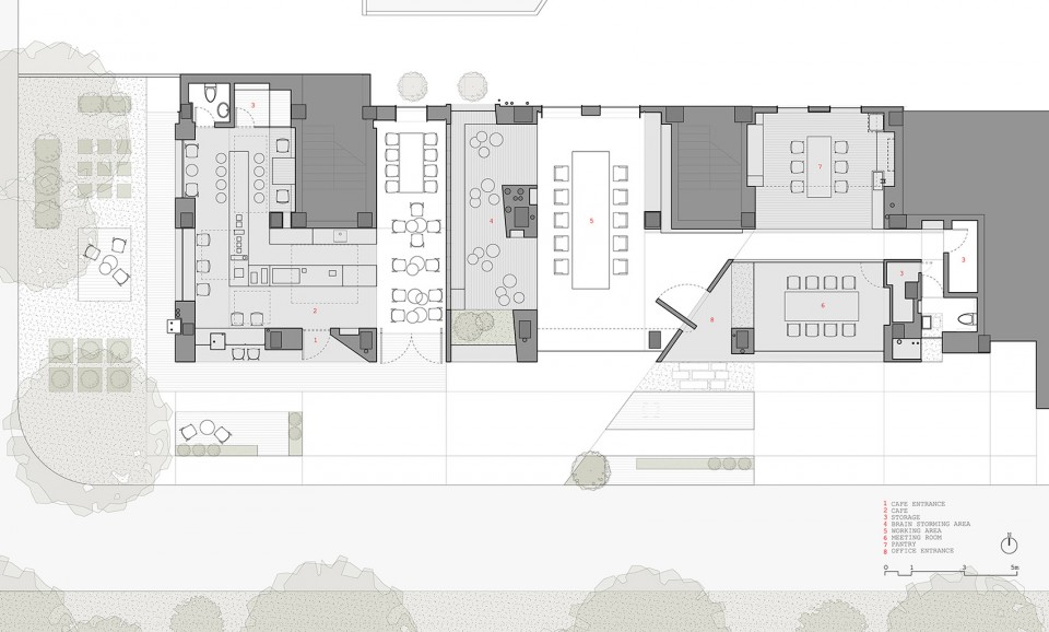
▼平面图,plan
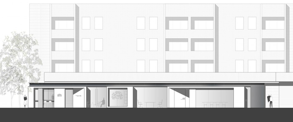
▼立面图,elevation
建筑与室内设计团队:Lukstudio芝作室(lukstudiodesign.com)
项目团队:陆颕芝, Alba Beroiz Blazquez,区智维,蔡金红,黄珊芸
平面设计:Evelyn Chiu
家具:Emeco, Hay, Muuto, Paustian, Peixin
灯具:Bentu, Flos, Tons
室内面积:250 平方米
地点:广州天河区华康街42号
设计期: 2015年7月-11月
施工期:2016年2月-9月
摄影:Dirk Weiblen
Architecture and Interior Design: LUKSTUDIO (lukstudiodesign.com)
Design team: Christina Luk, Alba Beroiz Blazquez, Ray Ou, Jin Hong Cai, Shanyun Huang
Graphic design: Evelyn Chiu
Furniture: Emeco, Hay, Muuto, Paustian, Peixin
Lighting: Bentu, Flos, Tons
Net area: 250 sqm
Location: No. 42 Huakang Street, Tianhe District, Guangzhou, China
Design: July – November 2015
Construction: Feb -September 2016
Photography: Dirk Weiblen
More: LUKSTUDIO,更多关于她们:LUKSTUDIO on gooood

屋檐不错
大神们,这铝板这么薄,知道怎么做的嘛
立面做的很棒
我不明白的就是大会议桌出口得那个门 为什么要做个斜切面 那个进门的空间好奇怪的存在 当然肯定是我不太明白这个设计意图 所以留言想看看有大神能解惑不
形式对比,凸出入口空间?
工作室门面相对于咖啡厅来说不那么需要对外,多一份隐秘更好,看第一张远景照片,一个大斜切巧妙地做出了区别
如果设计和美感都能被解释的,那就不会只有一个达芬奇,或者毕加索之类的了 。
室内空间是一种边界,是对人的一种虚构。斜面切割是一种情趣,改变了人对空间的视觉感受以及动线体验,设计不必非方即圆。
很喜歡外立面
就观者而言,是让人很想去亲近的空间。
今天去看过现场看过,白得真的很美好,冰淬咖啡很棒
三角门厅从外部看起来很不错,内部设计感觉太过追求设计感,而失去了人情味,仅仅只是色彩和视觉搭配,有点忽视主题—比如这是个咖啡厅。头脑风暴区的设计更是忽视了与嘈杂的外界仅隔了一幕玻璃门。若是将设计格局放小点会好很多
同感
同感
再这样的小区形成了很大的反差,总体几何设计效果很不错,简洁大方,不过有个问题就是保养了,小区的小孩不懂事,如果在墙上乱涂、乱画,这可咋办
我认为如果真是有小朋友在外立面涂画也是一种有意思的互动,你所设计的空间和人发生了关联,还有什么比这更有趣呢?
是啊
nice
做的相当不错啊 就是········就是感觉没啥人味儿
同感 冬天感觉好冷
咳 广州没有冬天··············
有冬天啊。。。例如今天。。
对无框玻璃的施工感兴趣
很棒的立面
我很喜欢这个设计
百度街景还是装修之前的样子
这个白色外墙部分是什么材质啊?
比较好奇这个产权怎么搞定的,毕竟是住宅楼
白得都怕进去跟人家弄脏了,不过真心做得干净,节点犀利
对雨棚节点感兴趣
下次去坐坐,太白的感觉不太真实
三百万的店,每张椅子都上千,土豪咖啡店
请问这样的店面晚上安保如何考虑,是不是要24小时有人值班?
很安静,很纯粹。直线条,白色,木纹,暖暖的光,很温馨。
每天都人满为患呀这里
有智慧 有品质 有生活 老街道一样可以高逼格 赞
这个确实很成功的案例了吧
大赞,有机会一定要去看一下
看地址详细,特意去搜了一下百度街景。。。的确做的很不错
咦,我用百度找不到街景
你也很厉害!
应该是说原建筑和现在的对比吧。
白的让人没安全感
每个人心中都有一万只哈姆雷特
一杯现磨的浓缩咖啡,在夕阳的余晖中营造了柔美、内敛、尊贵的生活氛围,难道还没法给您想要的安全感么?
hhhhhhhhhhh,厉害了word哥,这逼装的可以 =-=