非常感谢 芝作室 予gooood分享以下内容。更多关于他们:LUKSTUDIO on gooood
Appreciations towards LUKSTUDIO for providing the following description:
FUO是一个帽子集成店品牌,在国内各城市已有大量店铺。为了塑造品牌全新的店铺体验,芝作室采用了一系列的镜面装置,试图激发购物者的自赏欲。镜面的反射叠影让人不自觉地与空间产生互动,带来犹如身处艺术馆的别样体验。
FUO is a popular hat retailer with numerous locations in China. For the rebranding of their store, Lukstudio plays with mirrors and reflections to evoke the narcissistic nature of the shoppers. The result is a surrealist journey that conjures a gallery visit.
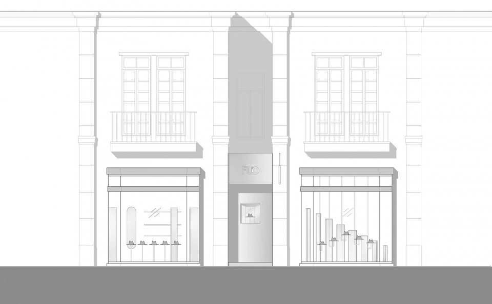
▼FUO店铺外观,the exterior
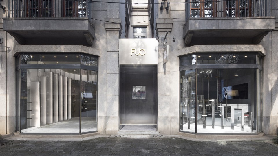
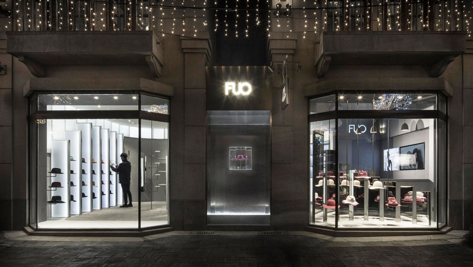
店面设计没有刻意张扬,左侧橱窗内的垂直阵列有序地展示帽子,另一侧镜柱形成梯状背景,作为室内镜影交响的前奏。
The storefront is composed of a calm array of vertical pillars in the window display: a prelude to the interior arrangement.
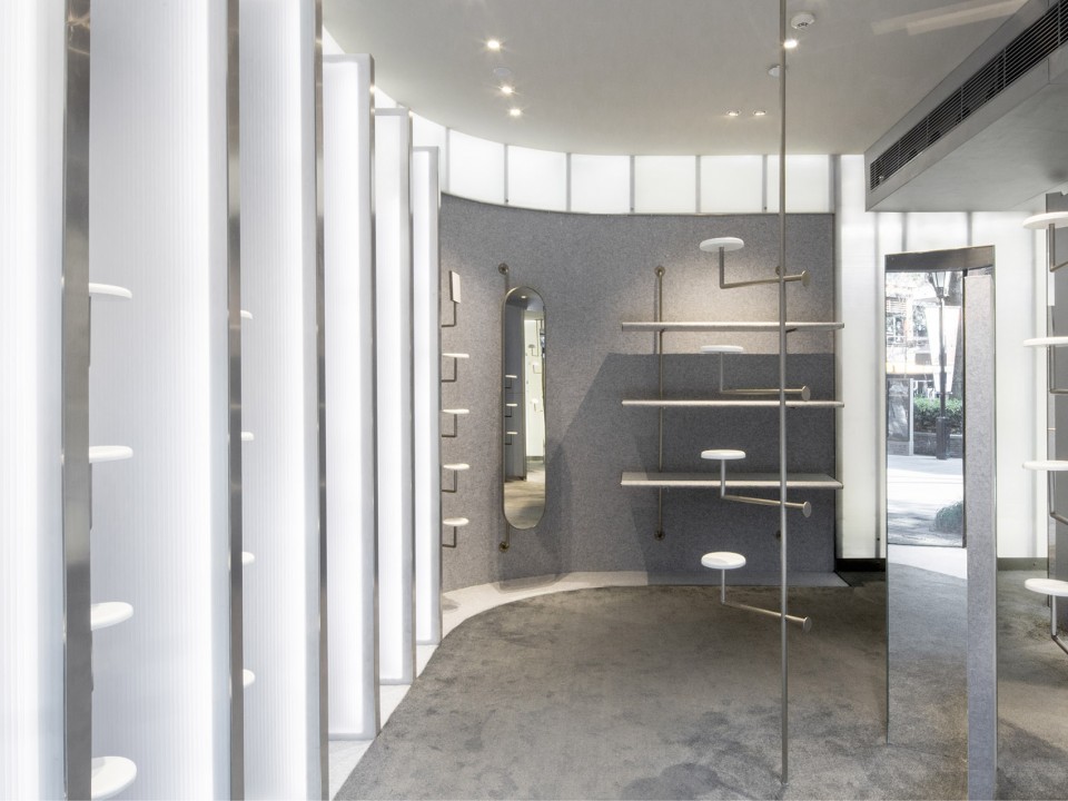
▼入口左侧的展示橱窗,the display place on the left side
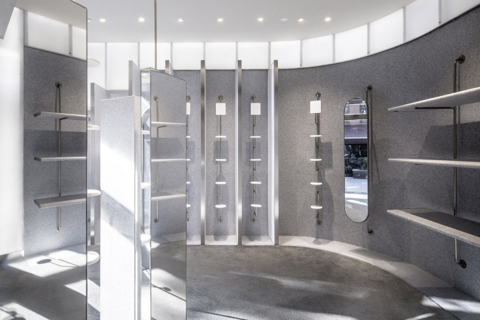
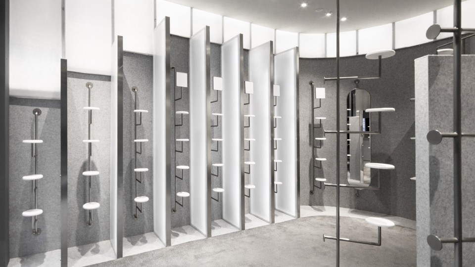
▼镜影交汇的展示空间,the display space
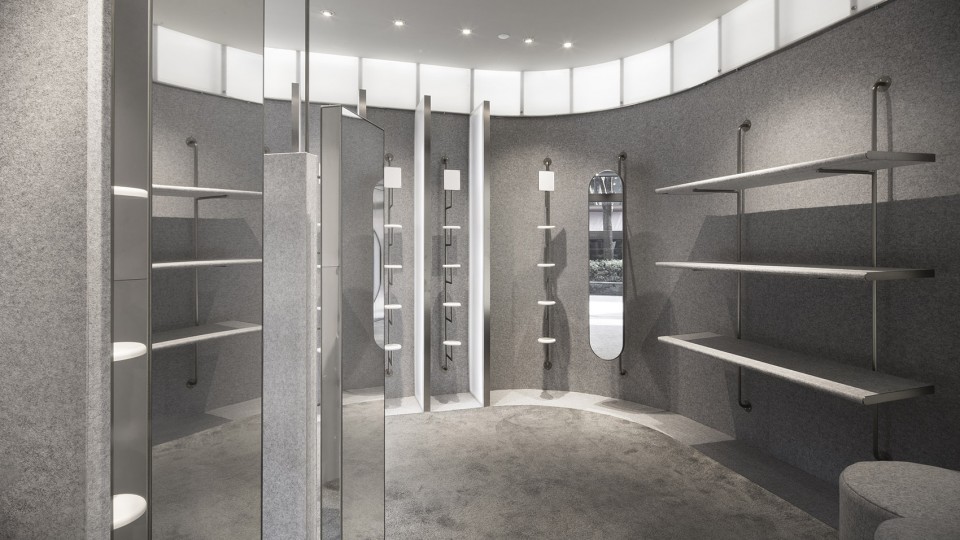
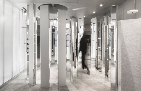
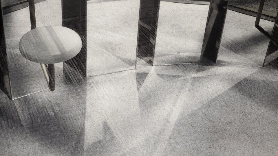
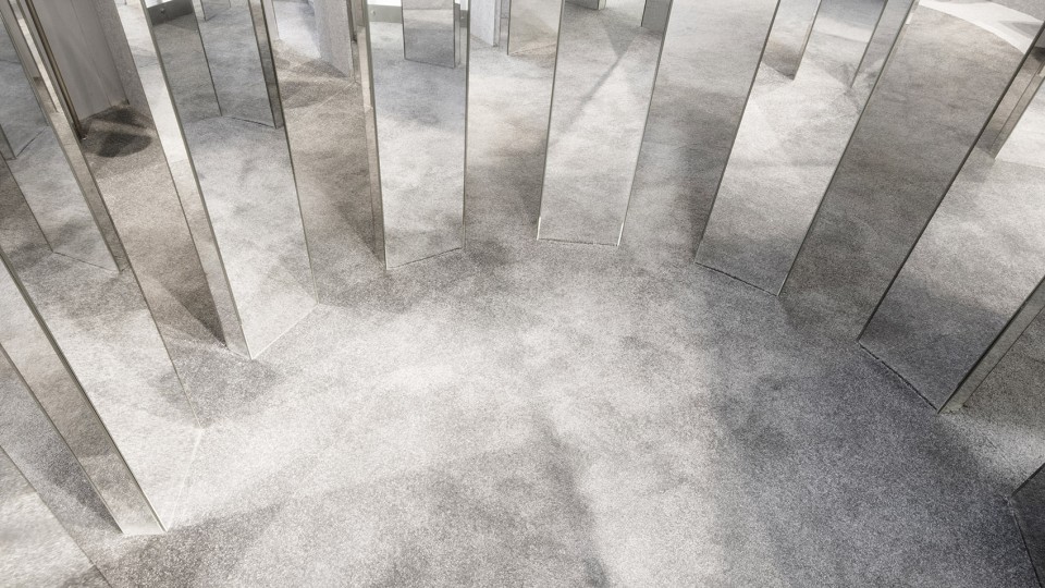
通过隐藏的入口后,弧形陈列墙将访客引入螺旋形的镜柱群,步移景易,人对空间的认知逐渐模糊,眼中世界随镜柱节奏时刻变幻。人形、帽影、光线在空间中自相映发,又随镜柱反射流转,融叠一体。
Upon entering through a set of side doors and past a curved display wall, one discovers a spiral of ascending mirrors. The journey follows the rhythmical pillars, as people’s spatial perception shifts between multiple reflections from various angles, the hats on display and their own reflection.
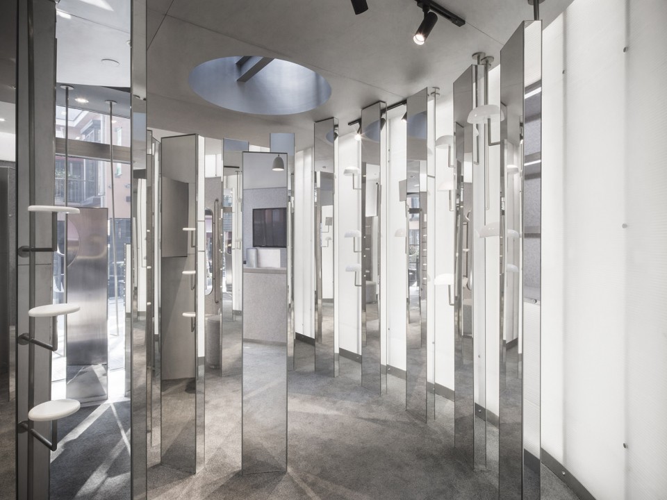
▼镜影交错,迷幻空间,get lost among the mirrors
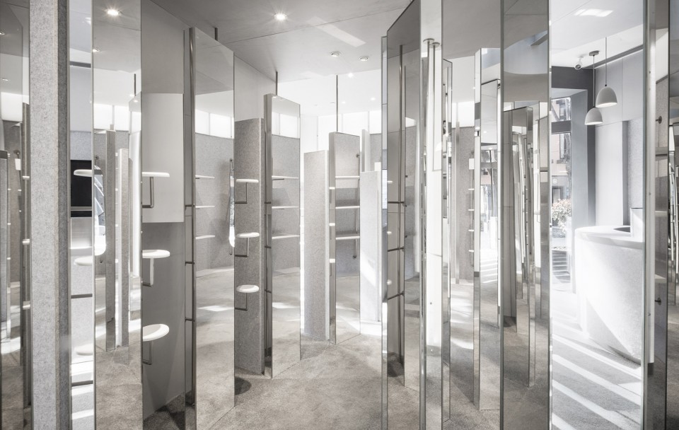
序曲的高潮位于终点正圆天光下,访客被多面镜群环绕,得以从不同角度看见自身。
The culminating moment reveals one’s reflection from different angles, while standing under a circular skylight.
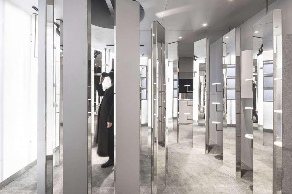
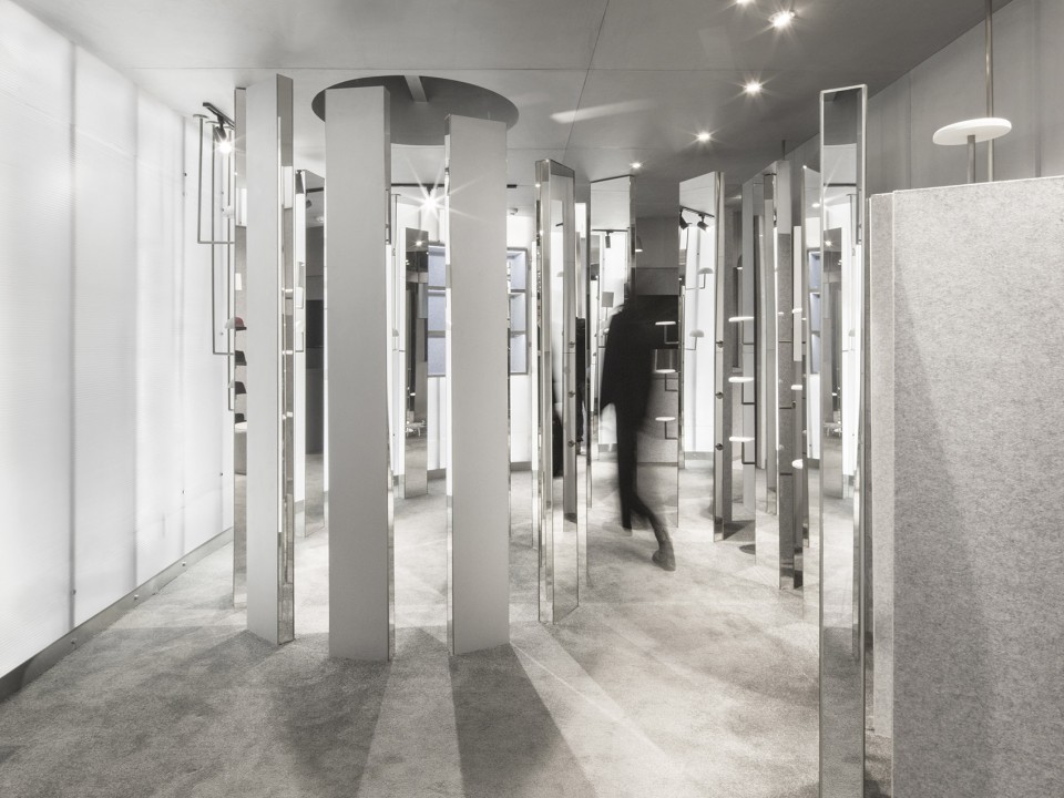
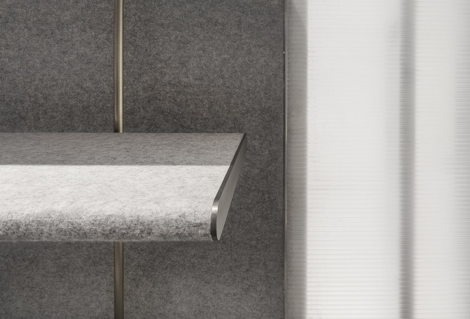
室内主要材料来源于帽子设计中常用的毛毡和皮革。柔性的浅灰色毛毡贴附于墙壁和层架上,弧线的转角让人轻易联想到布匹。
Chosen materials are similar to those used in textile design such as felt and leather. Soft, grey felt is wrapped around walls and shelves, with round edge details reminiscent of rolls of fabric.
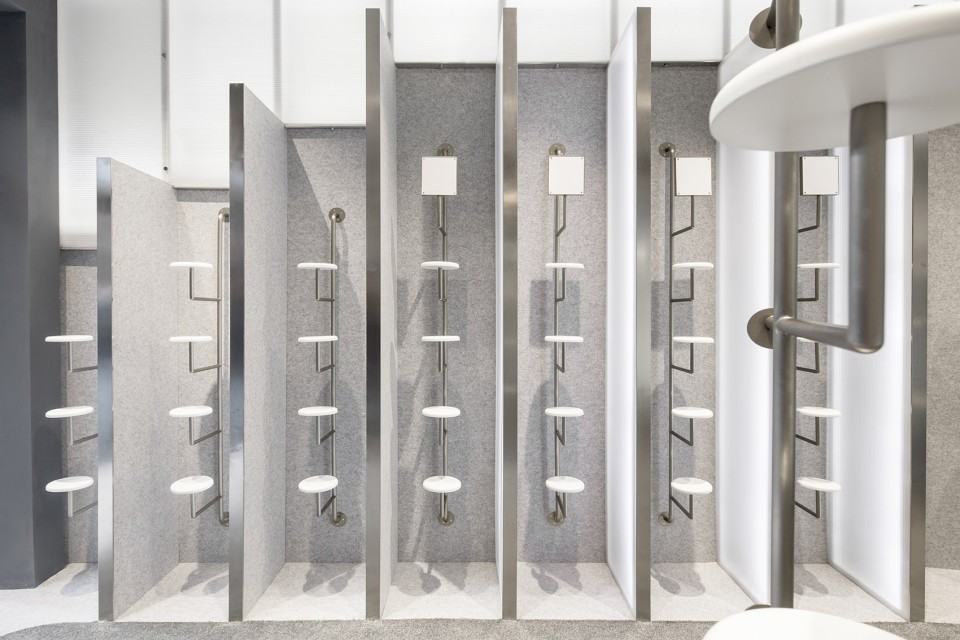
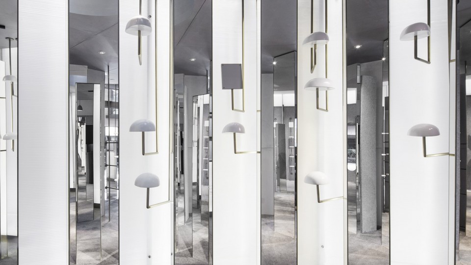
浅色不锈钢和白色背光的聚碳酸酯板创造了中性的展示背景,让黄铜杆架上的多彩帽子成为视觉焦点。
The stainless steel and backlit polycarbonate create a contemporary and neutral backdrop for the multi-colored hats, which are positioned atop freestanding brass rods.
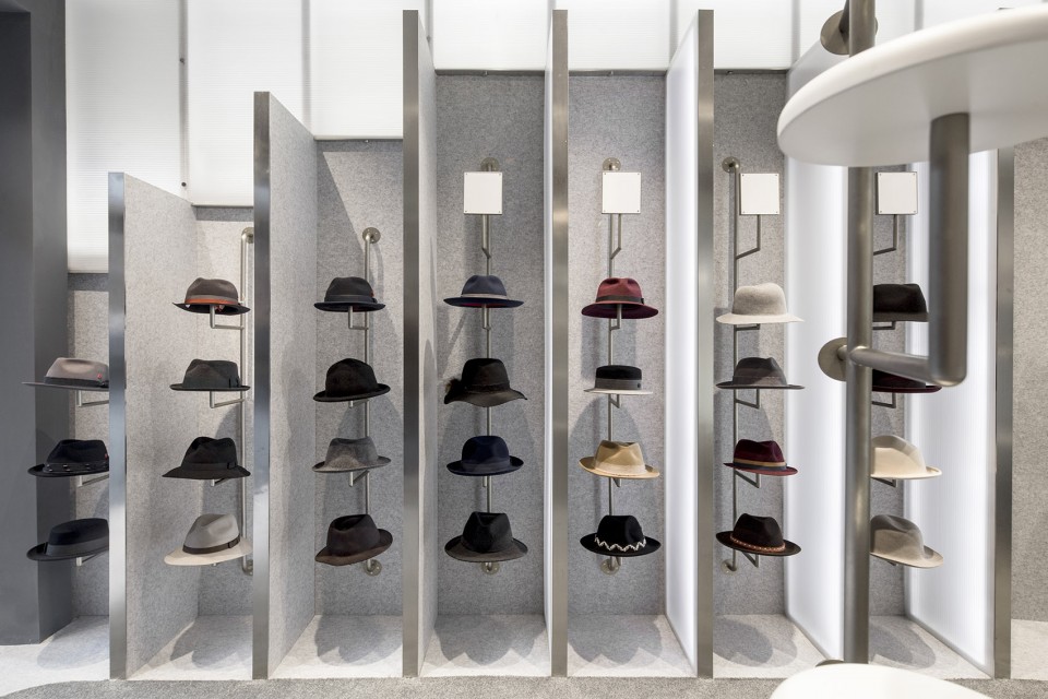
在一个55平的小空间内,芝作室跳离常规的商品展示方式,试图将零售空间雕琢成一个生动的艺术装置。不仅给品牌熟客带来了新惊喜,也令初次入店的路人留下深刻印象。在这个线上购物强势的时代,这个设计通过创造令人耳目一新的空间体验,展示了实体商铺的更多可能性。
Within a 55-sqm space, Lukstudio curates not only the items on display, but the entire retail experience by installing a dynamic array of sculptural pieces. This branding statement surprises intentional patrons, while also leaving an impression with casual passersby. Given the omnipresence of virtual shopping platforms, the design reminds us of the tremendous possibilities of a physical store.
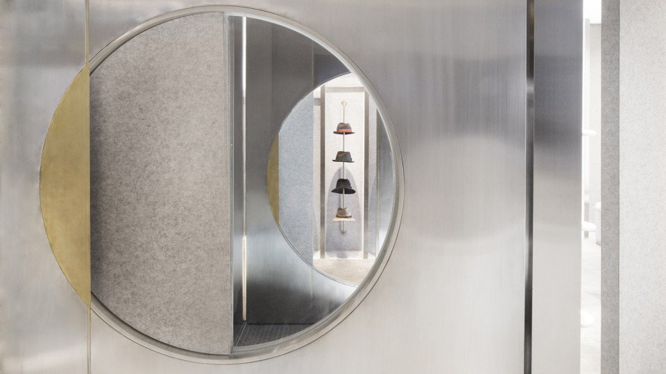
▼毛毡与皮革材质运用,interior design mostly use felt and leather
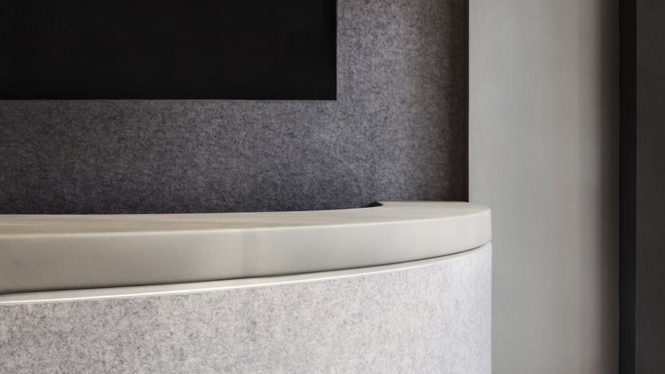
▼低调的颜色以突出被展示商品,drab colors are used to highlight the goods on display
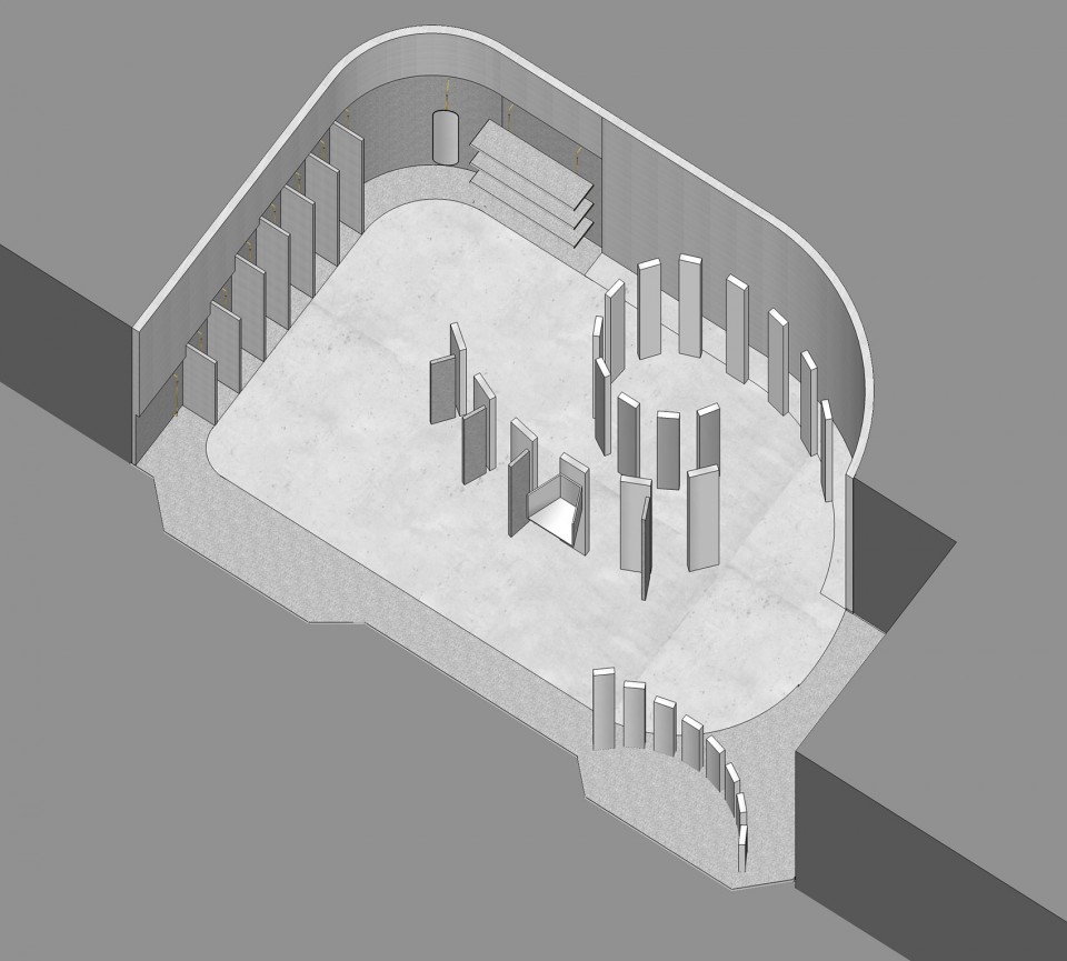
▼平面图,the plan
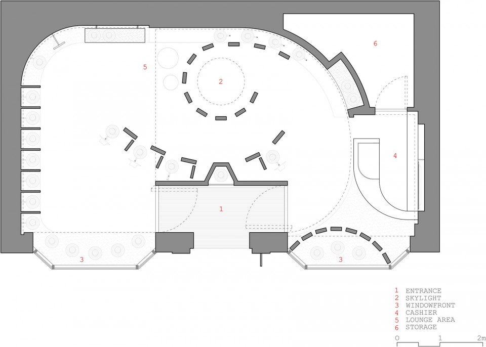
▼概念图,the concept
▼立面图,elevation
▼动态概念图,concept map

地点: 武汉天地5号楼S-1-4号铺
室内面积: 55 平方米
设计团队: LUKSTUDIO
设计总监:陆颕芝
项目团队: Alba Beroiz Blazquez,王峰,区智维,Marcello Chiado Rana
设计期: 2016年7月-10月
施工期: 2016年11月-12月
摄影与视频制作: 映社动态影像传媒
PROJECT DETAILS:
location: Store S-1-4, Block 5, Wuhantiandi, Wuhan, China
net area: 55 sqm
designer: LUKSTUDIO
director: Christina Luk
project team: Alba Beroiz Blazquez, Leo Wang, Ray Ou, Marcello Chiado Rana
design: July – October 2016
construction: November – December 2016
photography and video : PROJECT|ION| motion picture production
More:LUKSTUDIO,更多关于他们:LUKSTUDIO on gooood


落地性很强了
落地性很强了
总体还不错,手法有点太刻意,没突出主体,如果是奶茶店或者餐厅还不错。
这是一个很值得推敲的作品,有着完美的平面格局与外立面的造型,但是室内的立面把原平面的高格调一路拖下了神坛,树型的条块打乱了章法,繁杂的结构再加上镜面的错乱感,让商业的目的大打折扣。试想假如在条块之中利用网格或者透光的蒙砂玻璃来连贯一下条块之间的空隙,减少一下镜面对圈外空间的破坏性,聚焦效果直接在圈内,是否会有一种柳暗花明的空间效果?同时又保证圈内外效果的纯粹性,是否会更合理一些?个人愚见,不吐不快。
外立面很赞