非常感谢 自在Z-DOT设计事务所(联系邮箱:1315496145@qq.com)予gooood分享以下内容。
Appreciations towards Z-DOT Design (contact: 1315496145@qq.com) for providing the following description:
由全新「大胆出格」的「玩味感」设计理念出发,今年六月,成都自在Z-DOT设计事务所展开了与「Galaxy Coffe」品牌旗下的「W酒店——ZHAO COFFEE BAR(中文意为:曌咖啡吧)」的合作。
Starting from the new “bold and out of style” design concept of “playfulness”, in June this year, we launched a cooperation with “Zhao coffee bar” (W Hotel) under the “Galaxy coffee” brand.
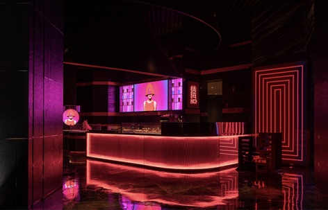
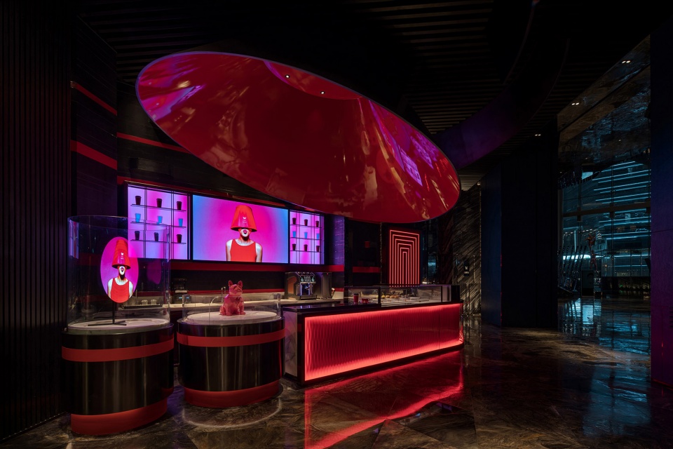
▼项目概览,overview ©光韵小龙
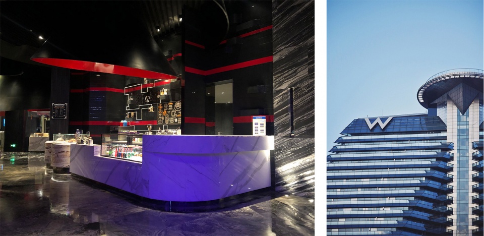
原有咖啡吧位于西安「W Hotel」接待大厅与餐厅入口处之间的位置,紧邻整个酒店大厅的主动线。项目原有吧台及主题背景墙延用了「W Hotel」的红黑色系,因而使整个业态完全隐藏在了公共区域的色彩配置中,继而无法彰显「ZHAO COFFEE BAR」本身的定位与品牌特色。
自在「Z-DOT Design Studio」决定将改造重心着眼于跳脱出原有的框架,在不破坏现有装饰结构的基础上(酒店方的硬性要求),重塑属于「ZHAO COFFEE BAR」品牌独有的氛围基调。
▼咖啡吧原貌(左);W酒店外观(右)
the existing site (left); W Hotel (right) ©光韵小龙
The original coffee bar is located between the reception hall of “W Hotel” in Xi’an and the entrance of the restaurant, adjacent to the main line of the whole hotel hall. The red and black color of “W Hotel” is used in the original bar and theme background wall of the project, so that the whole format is completely hidden in the color configuration of the public area, and then the positioning and brand characteristics of “Zhao coffee bar” can not be displayed.
ZiZai”z-dot design studio” decided to focus on the transformation from the original framework, without damaging the existing decorative structure (the hotel’s rigid requirements), to reshape the unique atmosphere tone of “Zhao coffee bar” brand.
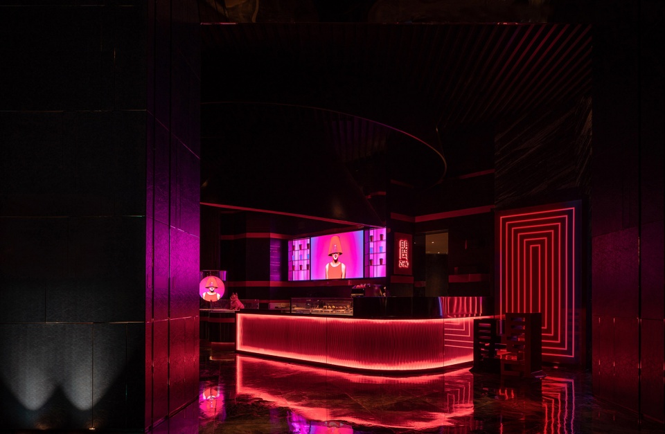
▼重塑后的咖啡吧,the redesigned Zhao coffee bar ©光韵小龙
「ZHAO COFFEE BAR」主题策划源于地缘特色,取自西安古都历史长河中的经典话题人物「武则天」,基于其原名武曌,由此命名为「ZHAO COFFEE BAR」,意味「Female Power」(新女性力量的崛起)。
The theme of “Zhao coffee bar” originates from the geographical characteristics. It is based on the classic topic character “Wu Zetian” in the long history of Xi’an ancient capital. Based on its original name Wu Zhao, it is named “Zhao coffee bar”, which means “female power”.
▼主题和标识设计,theme and store sign ©光韵小龙
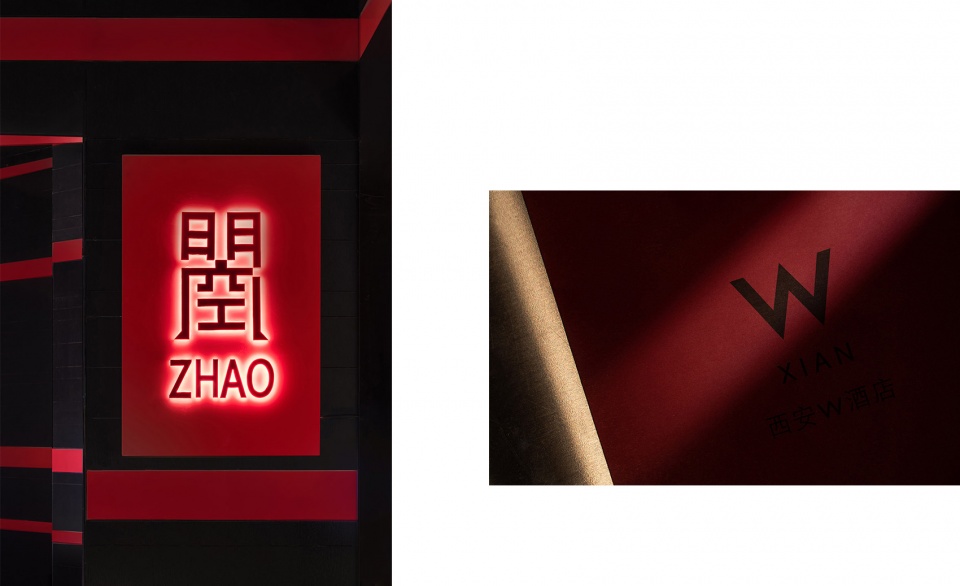
为结合「Female Power」和西安「W Hotel」本身既有的「时尚夜店风」,自在「Z-DOT Design Studio」渴望在空间设计的部分中准确传递「ZHAO COFFEE BAR」品牌所希望倡导的「独立女性之美」的调性。
In order to combine the “fashionable nightclub style” of “female power” and “W Hotel” in Xi’an, Z-DOT Design Studio is eager to accurately convey the “beauty of independent women” advocated by “Zhao coffee bar” brand in the space design part.
▼动态灯光,dynamic lighting ©光韵小龙
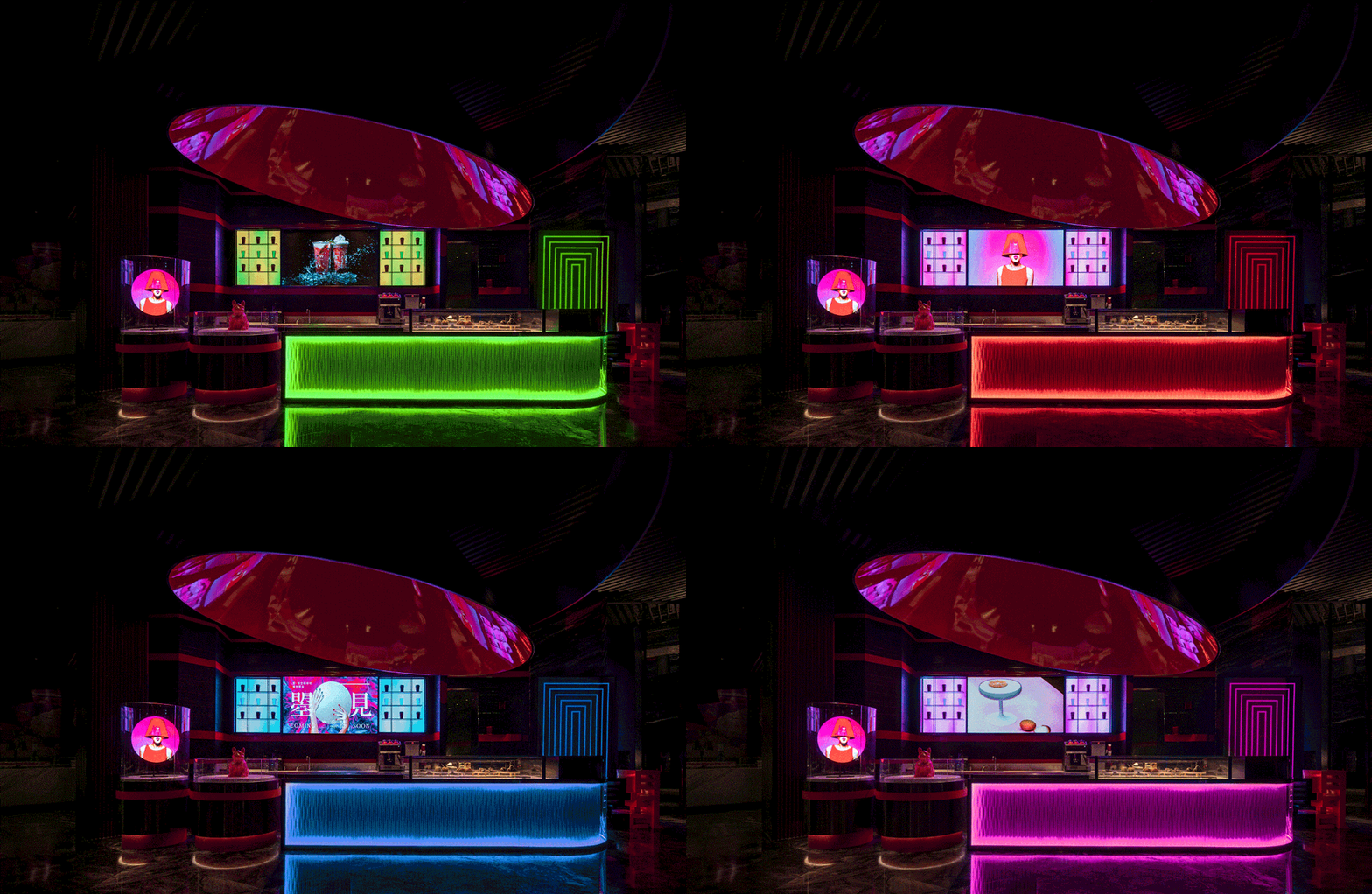
在材质上让RGB动态灯光结合高密度艺术板,打造出多层次却富有柔性气质的吧台外立面。将咖啡杯的不锈钢陈列展示架做悬浮处理,后背景墙上利用LED屏和呼吸灯等动态科技元素,在一到夜晚就「争奇斗艳」的酒店灯光设计中,独立出「ZHAO COFFEE BAR」的动态时尚元素,打造跳脱而精致的「焦点空间」。
In terms of material, RGB dynamic lighting is combined with high-density art board to create a multi-level but flexible bar facade. The stainless steel display shelf of the coffee cup is suspended, and the dynamic technological elements such as LED screen and breathing lamp are used on the back background wall. The dynamic fashion elements of “Zhao coffee bar” are independent of the “Zhao coffee bar” in the hotel lighting design to create a jumping off and exquisite “focus space”.
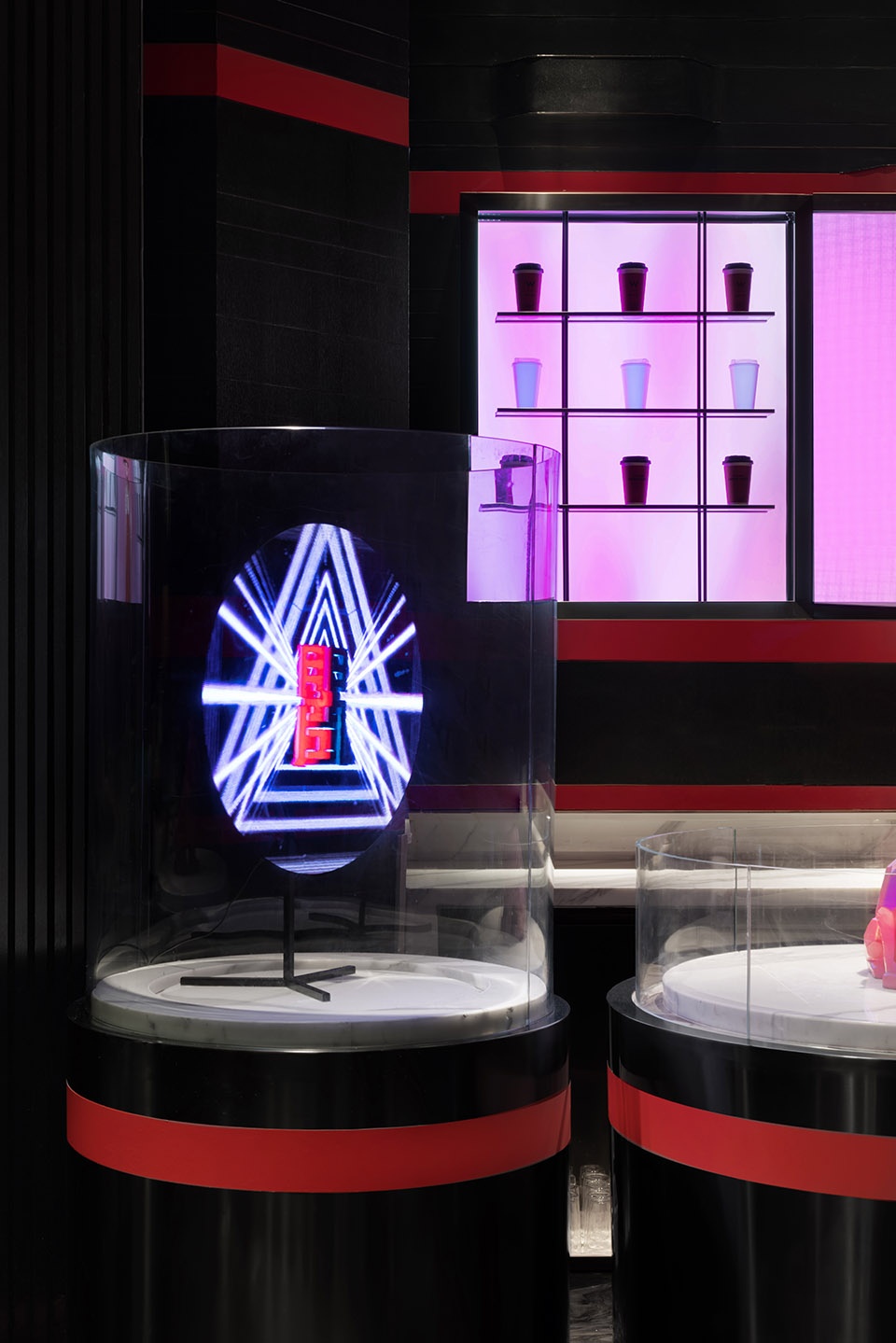
▼咖啡杯陈列架和灯光细节
coffee cup display shelf and lighting details ©光韵小龙
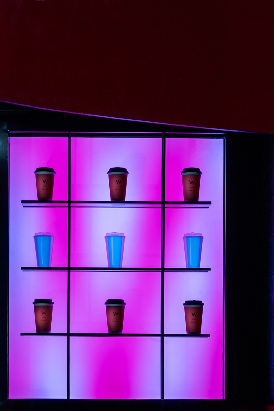
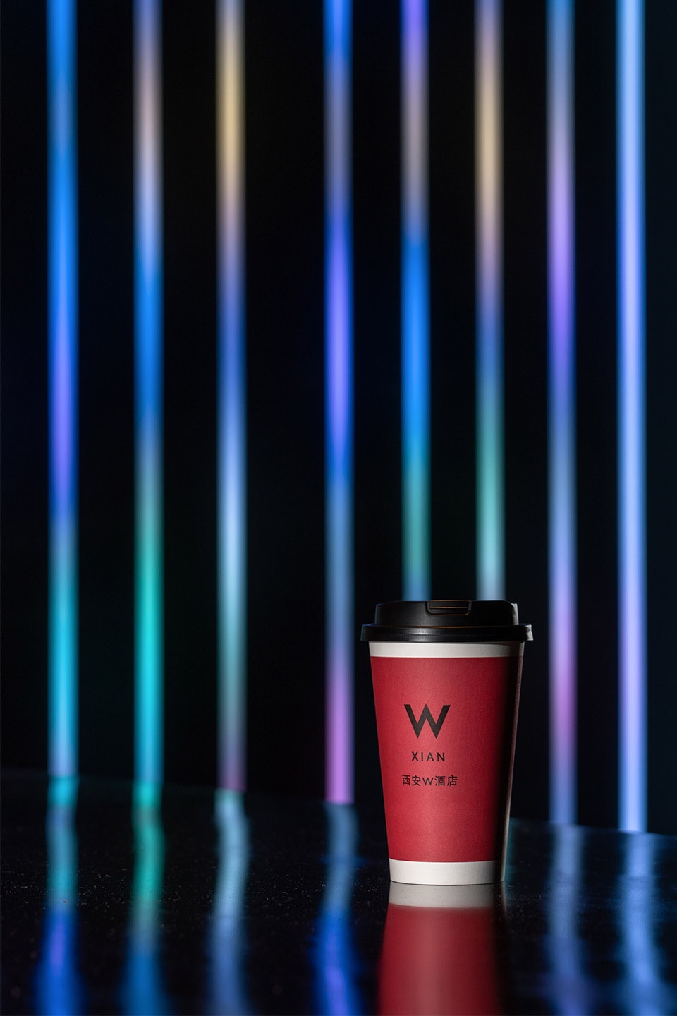
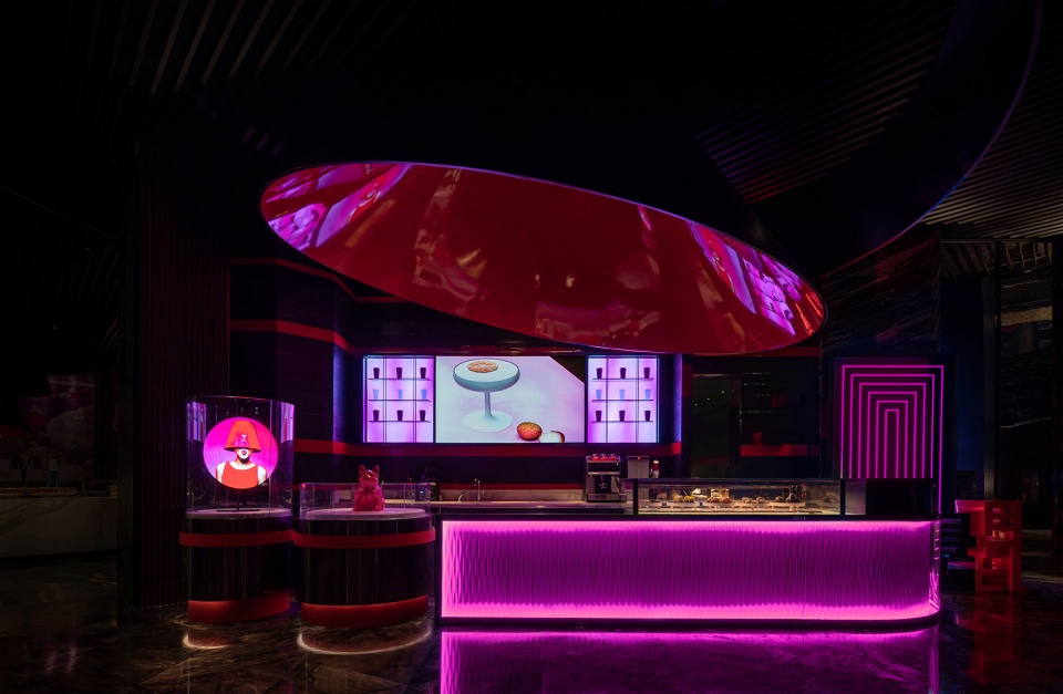
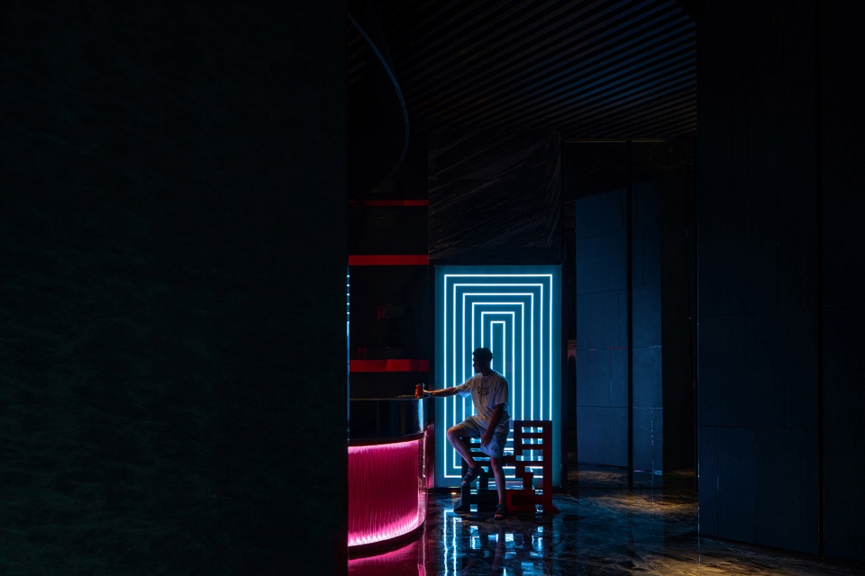
自在「Z-DOT Design Studio」为「ZHAO COFFEE BAR」在空间设计中策划了三个「创意彩蛋」。吧台一侧的圆柱形陈列台,用「全息投影」的方式呈现出不同主题需求的「3D演变效果」。另一侧墙面使用环形灯光铺设极具「纵深感」的拍照背景墙,打造出迷幻交错的「视线沼泽空间」。
We have planned three “creative eggs” for “Zhao coffee bar” in “z-dot design studio”. A kind of cylindrical display table on one side of the bar presents the “3D evolution effect” of different theme requirements in the form of “holographic projection”. A kind of On the other side of the wall, circular lighting is used to lay a photographic background wall with “deep feeling” to create a “swamp space of sight”.
▼吧台一侧设有圆柱形陈列台
a cylindrical display table was set beside the bar ©光韵小龙
▼环形灯光背景墙
background wall with light loop ©光韵小龙
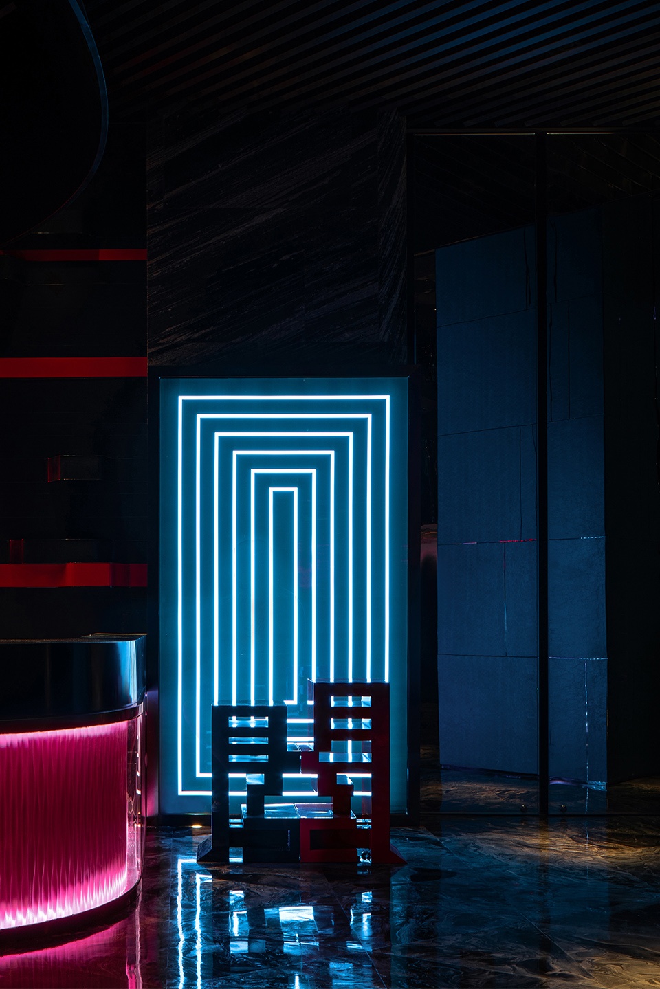
将「曌」字做「3D」变形LOGO,并拆分为「日」「月」两部分,分别对应性别中的「阴」与「阳」。将LOGO演变成立体并兼具实用性的座椅元素,巧妙的拉高了「月」座对应的「阴」意「Female Power(新女性力量的崛起)」,为整体空间暗设出「精妙的伏笔」,完美的融合了「Z-DOT Design Studio」品牌独有的「玩味感」设计中去。
A kind of The word “Zhao” is transformed into a “3D” logo and divided into “sun”, “moon” and “Yin” and “Yang” respectively. The logo is transformed into a three-dimensional and practical seat element, which skillfully heightens the Yin meaning of “female power” corresponding to the “Moon” and creates a “subtle foreshadowing” for the overall space, perfectly integrating the unique “playfulness” design of the “z-dot design studio” brand.
▼全息投影和logo座椅元素
holographic projection and the seat inspired from the logo ©光韵小龙
项目名称:曌咖啡吧
项目地址:西安W酒店·中国西安
完工时间:2020年6月
室内设计:成都自在Z-DOT设计事务所
设计主创:Ricci W 王锐
设计统筹:张宇
品牌文化室内陈列主创:Ricci W王锐
项目摄影:光韵小龙
Project name: ZHAO COFFEE BAR
Location:Xi An W Hotel, Xi An ,China
Project complete: Jun,2020
Project Design:自在Z-DOT design
Design in charge:Ricci W 王锐
Design coordination:张宇
Creation of brand culture display:Ricci W王锐
Photographer:光韵小龙
More: 自在Z-DOT设计事务所(联系邮箱:1315496145@qq.com)


新女性力量的崛起就是用踩低男性而来体现的吗?只是刻意抬高超越男性就是崛起?女性的崛起需要以男性来做参照?真是画虎不成反类犬,为了设计而设计的笑话。
“将「曌」字做「3D」变形LOGO,并拆分为「日」「月」两部分,分别对应性别中的「阴」与「阳」。将LOGO演变成立体并兼具实用性的座椅元素,巧妙的拉高了「月」座对应的「阴」意「Female Power(新女性力量的崛起)」,为整体空间暗设出「精妙的伏笔」,完美的融合了「Z-DOT Design Studio」品牌独有的「玩味感」设计中去。”
有点潮
。。。。。。2020了还有这么卡拉OK的画风,一言难尽,女性审美有被冒犯到,谢谢
则天大圣 草草草
感觉武则天变成妈妈桑。。。
说实在的,“在不破坏现有装饰结构的基础上(酒店方的硬性要求)”——甲方要求,这样的情况下做红黑色系咖啡吧,设计被牵着走了,咖啡bar的属性可以黑色,但是不是暗色,整体光线没走好,现在这个环境,只要把门口的coffee这一个字去掉,完全就是酒吧(确定不是挂着coffee的名字做酒吧??后面还有暗门吗??会员价多少??可以开发票吗??奇奇怪怪的知识增加了)
最尴尬的是和酒店的风格也不算搭,在服务台后面也有点突兀的,那个号称全息投影的电风扇有点过于廉价,装饰风格和酒店相比也感觉低了一级,在大堂中的感觉,像是在米其林三星餐厅里给你上了一盘好利来蛋糕一样。。。
一言难尽。。。吃藕。
顶着微信名来报到了!