非常感谢 吉冈德仁 予gooood分享以下内容。更多关于:Tokujin Yoshioka on gooood.
Appreciation towards Tokujin Yoshioka for providing the following description:
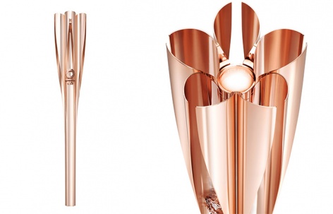
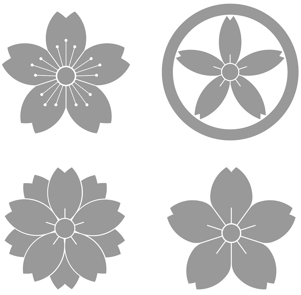
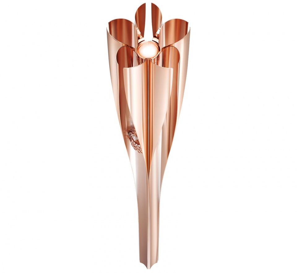
火炬作为奥运精神的象征,旨在将每一个人的感受具象化地表达出来。2020东京奥运会的火炬造型取自日本传统的樱花纹样(Sakuramon),融合了传统和现代科技。2020年东京残奥会的吉祥物SOMEITY的名称和设计也同样以樱花为原型。
The torch is a symbol designed to embody the feelings of everyone supporting the Olympic Games. Uniting tradition and modern technology, the shape of the torch for Tokyo 2020 Olympics resembles that of a Japanese traditional “Sakuramon” cherry blossom emblem. The name of Tokyo 2020 Paralympic Games mascot SOMEITY and its design also come from this flower.
▼视频,video
▼2020东京奥运会火炬,Tokyo 2020 Olympic Torch
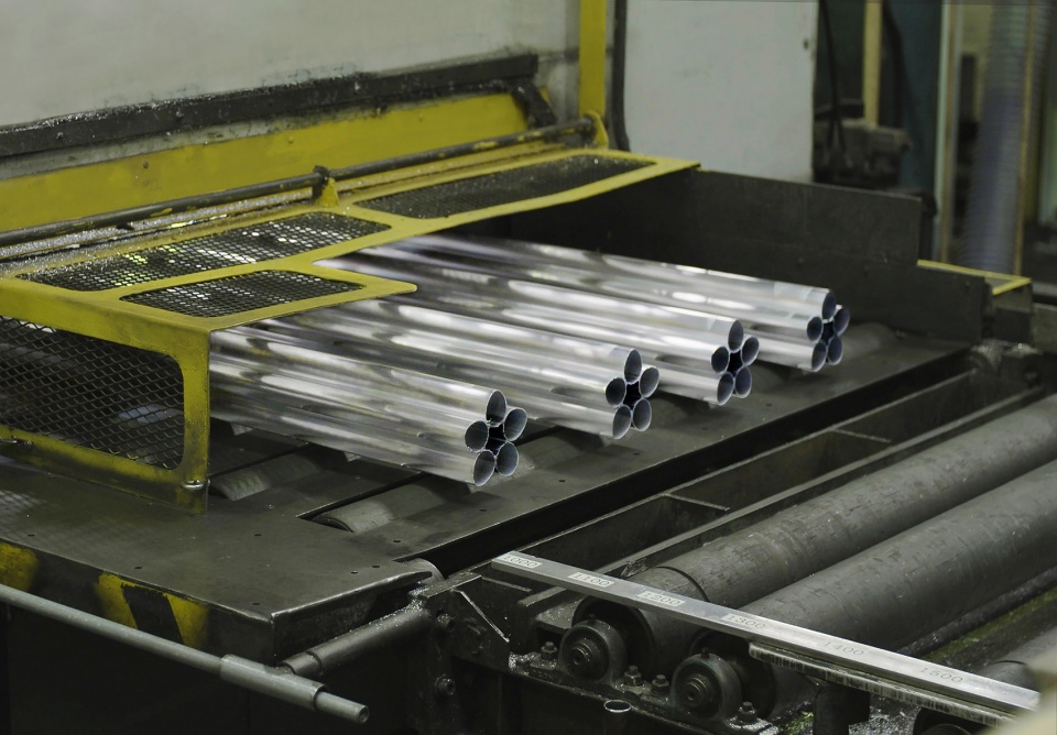
火炬的塑形使用了与新干线列车相同的铝挤压制造技术,实现了无缝式的单体构造。火炬的制作也体现了恢复和可持续的精神:火炬材料来源于东日本大地震后建造的临时住房留下的铝废料(30%),将目睹过城市重生的材料转变为和平的象征。这一做法将向世界讲述这些遭受灾难的地区一步一步逐渐恢复的过程。
▼樱花纹样,Sakuramon
▼火炬材料来源于东日本大地震震后重建留下的铝废料,aluminium construction from temporary housing built in the aftermath of the Great East Japan Earthquake waste was used to create the torch
It was shaped into this form using the same aluminium extrusion technology used in the manufacture of Shinkansen bullet trains. It forms a seamless, single piece in a form that symbolises the Tokyo 2020 Paralympic Torch Relay, created by fusing Japanese tradition and modern technology. The manufacture of the torch embodies the spirit of recovery and consideration for sustainability. Aluminium construction waste from temporary housing built in the aftermath of the Great East Japan Earthquake was used to create it, transforming materials that witnessed the rebuilding of shattered lives into a symbol of peace. This will convey to the world the extent to which the affected areas are recovering, one step at a time.
▼火炬细部,detailed view
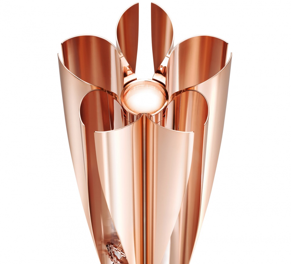
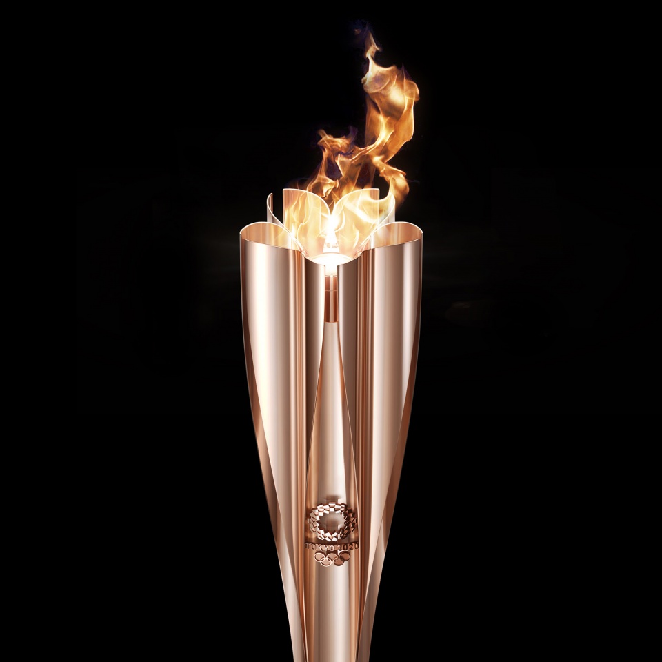
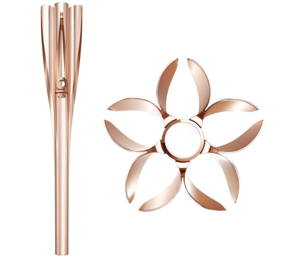
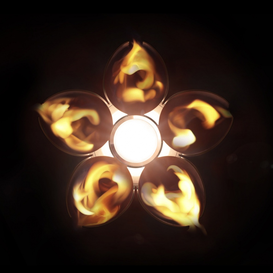
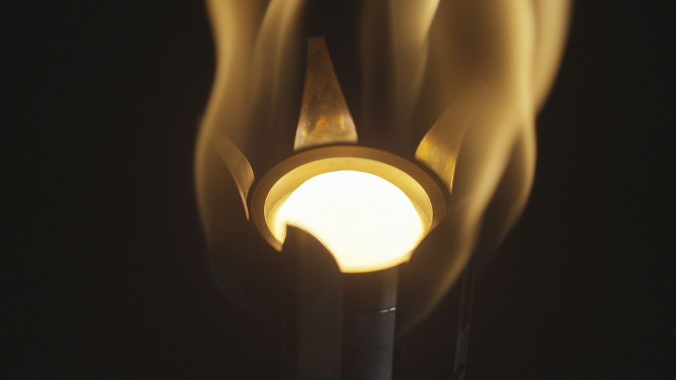
设计还考虑了火焰本身的形状。五朵“花瓣”形成的五束火光在中央汇聚成一束更大的火焰,用于燃烧的部分采用了多项技术创新,包括催化反应等。
The torch is also designed to depict the shape of a flame. The five flames generated from the petal unite at the centre of the torch, generating even greater brilliance. A number of technological innovations have been deployed in the combustion section that lights the torch, including catalytic reaction.
▼燃烧部分,the combustion section
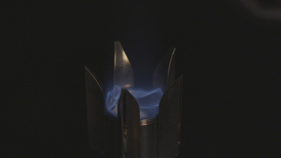
手柄部分的重量使任何人都可以轻松地将火炬举起。有视觉障碍的人士还可以通过手柄上的定位标记来确定火炬的前后方向。这是一个真正为所有人而做的设计。
The weight and shape of the torch grip is designed to make it easy for anyone to handle. It includes a positioning mark indicating the front of the torch designed for those with a visual impairment. The torch is simply created for everyone.
▼设计示意,design concept
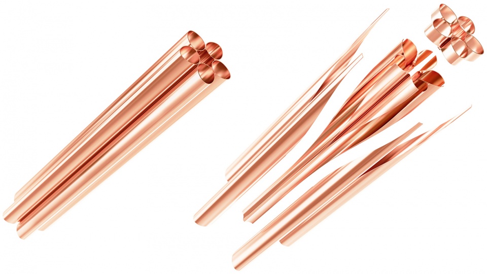
▼挤压铝,extruded aluminum

长度|Length: 710 mm
重量|Weight: 1.2 kg (approx. 1kg body plus 200g fuel cell)
颜色|Colour: Sakura Pink
Main material: Aluminium (30% of which is sourced from recycled aluminium recovered from temporary housing)
Design and Manufacture
Planning and design of the Torch: Tokujin Yoshioka Inc.
Case manufactured by: UACJ Extrusion Corporation
Materials supplied by: LIXIL Corporation
Combustion mechanism by: Shinfuji Burner Co., Ltd.
Fuel tank and fuel supply by: ENEOS GLOBE Corporation
More:吉冈德仁 予gooood分享以下内容。更多关于:Tokujin Yoshioka on gooood
非常喜好这个设计,很轻盈的感觉。
看到有些人的评论大感欣慰,原来中国还有那么多优秀的设计人才埋没于此
哈哈哈哈哈哈哈我懂了
运用单一材质和颜色会显得简洁含蓄,我觉得比起祥云火炬至少是同等水平。
漂亮啊,纯铝的会不会烫手?
细节不够看似不用心那些问题其实主要是因为不是每个国家会用那么多钱去搞这些,一次运动会的花费可是天文数字。而且本身是一次性物品,量还不少,重点突出就够了。
造型很干净,元素也选的很不错,但是还是缺乏了细节,火炬这个器械应该能承担起一个国家的气象,一雕一琢都应该有其根据,拿08年的火炬来看,不仅意向选得好,甚至连把手的弧度都有考究,而不是随意的设计,这个樱花火炬,除了材料跟樱花形的形状之外,其他的并没有看到有任何设计的元素,把手简陋,颜色随意。一个好的设计决不能单靠一个元素就能支撑起来,不能乍一看很漂亮,但是细看却很单薄,没东西可以看。简约但不简单虽然是件很难的事情,但身为一个发达国家,我相信也不会做不到。总的来说还是做的不够用心吧。
樱花,谁都能想到的创意,日本除了樱花还有什么我们不知道。当流线型遇到机械的弧形,再遇到直线,老套,普通,缺乏美感,总的来说:尴尬、难堪、勉强。这种不协调我只能打85分,像极了我的水平。
除了喷能不能有一点其他有建设性的想法 你还没具备去批评任何人作品的资格
非常美
哇这个和樱花结合的好棒,非常简洁干练
挺不错的,很棒,融入了樱花,很具日本特色
总感觉太单调了,没体现文化韵味
大师指点得有水平
毕竟这位大师的设计服务全宇宙的