非常感谢Torafu Architects将以下内容授权gooood发行。更多请至:Torafu Architects on gooood
Appreciation towards Torafu Architects for providing the following description:
Papabubble出售西班牙糖果,该品牌最近在JR新宿站的大堂内开设了一个面积约为10平米的小艺术糖果店。站内人流密集,有很多五颜六色夺人眼球的标示和店铺。设计师的任务是设计一个具有强烈品牌形象,在环境中脱颖而出的店铺。
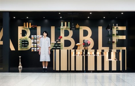
设计师将整个店铺围绕大型的LOGO进行设计。整面墙壁涂上大大的LOGO。黑色,白色,木色组成强烈的对比色。柜台上也印上LOGO。展品同LOGO组合放置。这是一个备具深度,吸引人又经得起第二眼的甜蜜但不腻人的糖果铺。
We performed the interior design for papabubble, a Spanish candy artisan, which opened a small art-candy-store on a tiny 10㎡ lot inside the concourse of the JR Shinjuku station. The inside of a station, with a high traffic volume, colorful signs and rows of stores lined up on a tiny strip of real estate, etc., is a peculiar environment in which we were tasked to create a store that would not only stand out, but also allow the brand image to be easily recognizable.
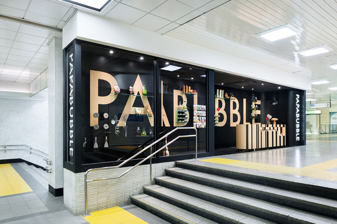
西班牙糖果Papabubble最近在JR新宿站的大堂内开了一个面积14平米的小艺术糖果店。
Using the lot’s lack of depth to our advantage, we planned to use the whole store as one big signboard by applying a large logotype over the entire back wall. Furthermore, we sought to set the space apart and direct clients to the storefront located at a traffic line junction by contrasting the black flooring, walls and ceiling against the white-based environment surrounding the premises. The wall serving as a wall-to-wall advertisement also functions as a merchandise display on which products are placed directly.
Moreover, we inlaid the papabubble logotype into the checkout counter, taking after the idea of a candy that reveals the same pattern no matter where it is cut.
By thoroughly applying a sense of depth onto the elevated plane borne from the peculiar specifications of the lot during the planning stage, we sought to create a store serving simultaneously as a signboard and a display for merchandise.
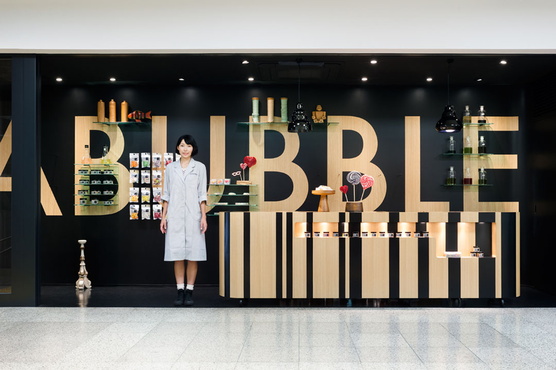
整个店铺围绕大型的LOGO进行设计
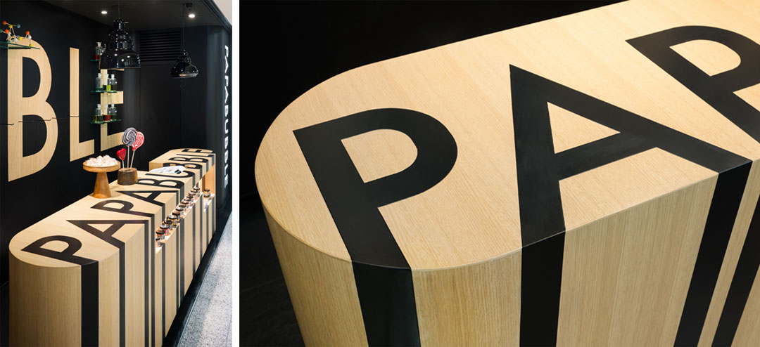
柜台上也印上LOGO,并从多维上呼应,加上黑色与木色是强烈的对比色,因此最终效果突出
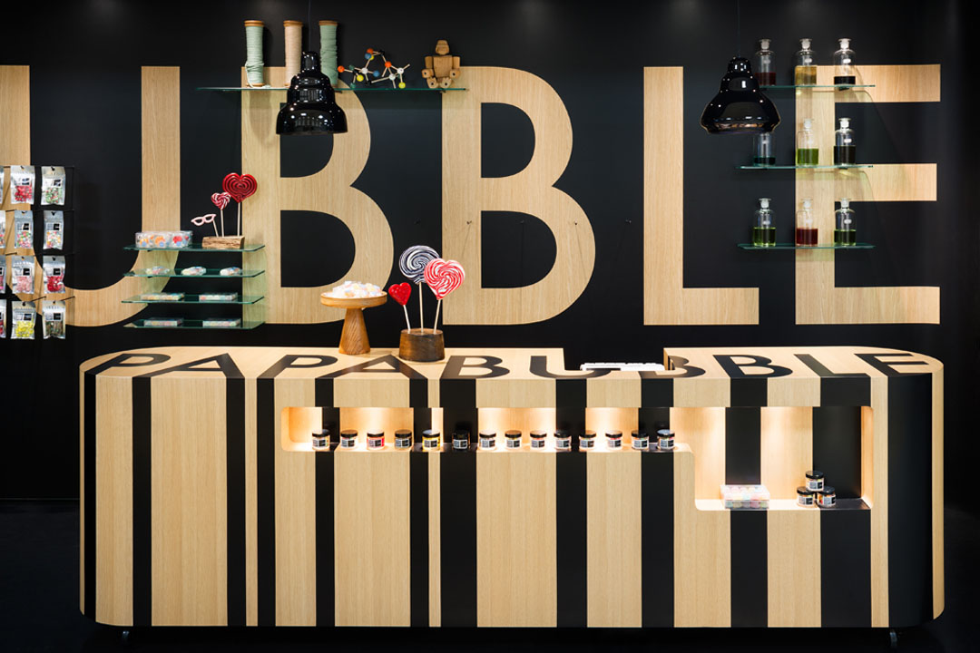
货品与LOGO之间的关系协调
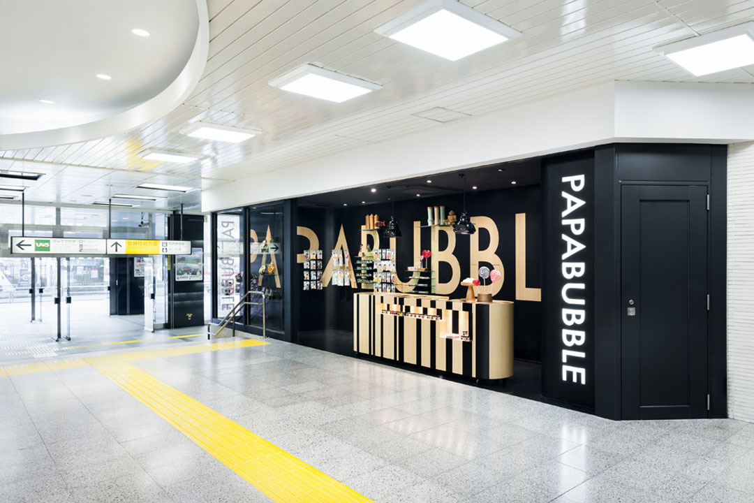
商店靠近出入口,位置好,人流大,设计师成功的设计了一个在喧杂环境中脱颖而出的店铺
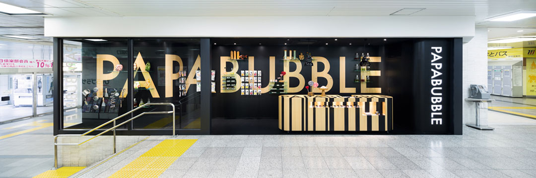
整个店铺拥有甜蜜但不腻人的清爽吸引力
Principle use: Shop
Production: Ishimaru
Building site: Shinjyuku Tokyo
Total floor area: 13.67m2
Design period: 2013.05-07
Construction period: 2013.07
Photo: Takumi Ota
Website: http://www.papabubble.jp/
MORE: Torafu Architects,更多请至:Torafu Architects on gooood





我觉得 色彩搭配的挺好的 好的设计不只是满足空间的使用要求 更重要的与产品的结合度 提升产品的附加值 有时候 只想着客户的要求 你可能也就做成那个样子了
卖棒棒糖会不会投资大了点?
甲方肯定会说陈列功能太少
完全铺不了货啊