来自啊嗯室内设计对gooood的分享。更多关于他们,请至:AN Interior Design on gooood
Appreciation towards AN Interior Design for providing the following description更多该公司招聘信息点此进入,more jobs related to this company click here
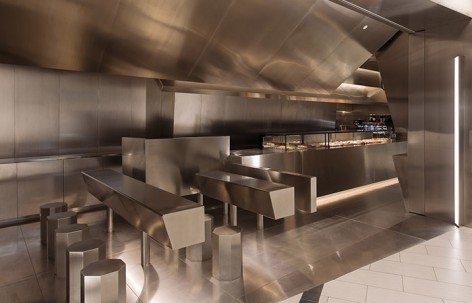
这是啊嗯设计公司为MR.MAIMAi麦丘梵在杭州新地标——嘉里中心设计的一个具有未来感的小空间。提拉、推伸的线性体块对空间进行包裹,巨大的倾斜面在不干扰功能的情况下,形成新的张力和景观。
在这个全部不锈钢打造的小空间里,存粹的质感成为体验的第一要素。人们迷失在大型购物中心里,这是一个与未来对话的休憩地。
AN design company designed a space which has the sense of the future for Mr. MAIMAi in Kerry Center, a new landmark of Hangzhou. We pulled and pushed the linear block to wrap the whole space up. The huge cant created a bran-new tension and landscape under the undisturbed circumstance.
The pure texture becomes the most important element for people to experience the small stainless steel space. People can have a rest here and feel the futuristic when they lost in the shopping mall.
▼ 有未来感的小空间,A space with the sense of the future
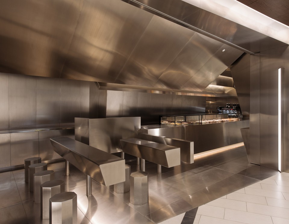
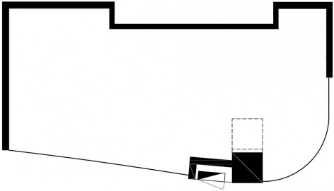
空间是半弧形开敞式的边厅,约45平米,不属于独立店铺。一侧的消防栓与承重柱体宽约2米,厚0.9米,倾斜插入顶部,正对大楼扶梯;空间的1/4被遮挡,固定在两个方向进出。
MR.MAIMAi设计的重点是在柱体的周边形成一种景观,对于柱体本身形成一种遮掩,对空间的表达没有那么直白。
The space is semi-arc, two sides of it is wide open, and it’s about 45 square meter. It’s not exactly a independent shop. The fire hydrant and load-bearing in one side is 2 meters wide and 0.9 meter long. The slant load-bearing stick in the top and facing the escalator directly. A quarter space is blocked, people have to pass the space by two fixed direction.
The key design points of MR.MAIMAi is to form a watching focus around the pillar. By covering the pillar to express the space implicitly.
▼ 消防栓与承重柱体分隔空间,The fire hydrant and load-bearing in one side separate the space
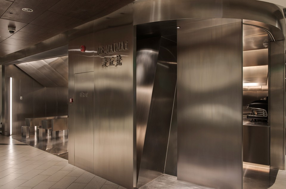
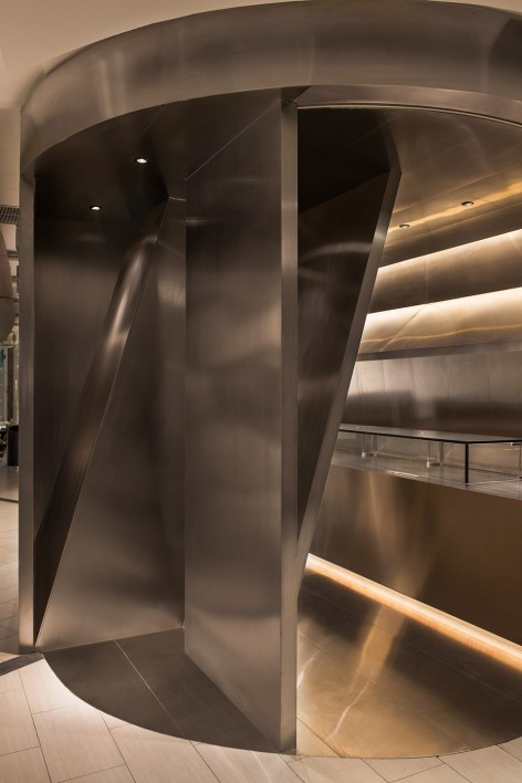
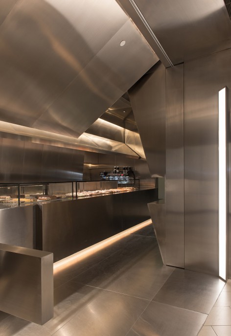
▼ 商店正面入口,The front facade
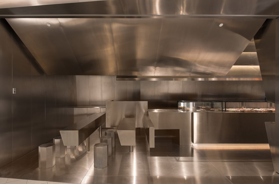
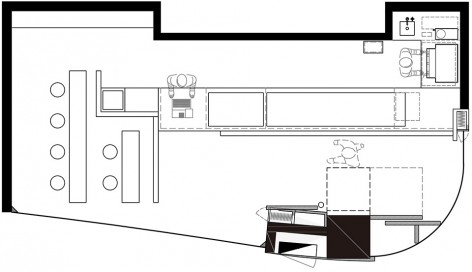
特制的吧台设计在柱体的背后,伸展至整个空间。存放面包蛋糕的单层玻璃盒体,截面采用黑色丝网印,让食物保持新鲜的同时,散发诱人的色泽。
The special counter hidden in the pillar extend to the whole space, developed a circuitous route. The section of the single-glass panetièrel adopted the black screen print to keep the bread fresh and keep it’s attractive color and lustre.
▼ 特制的吧台伸展至整个空间,The special counter hidden in the pillar extend to the whole space
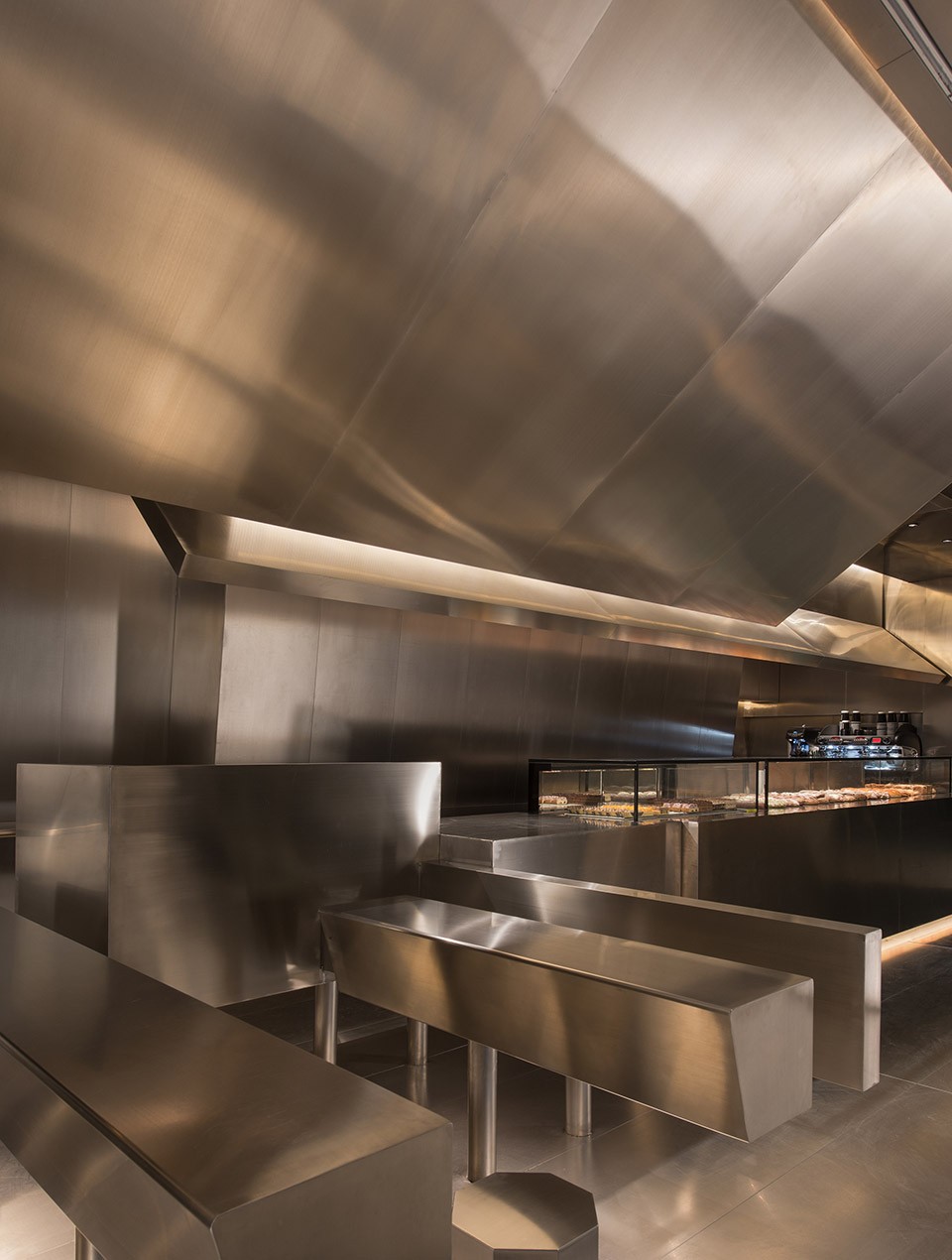
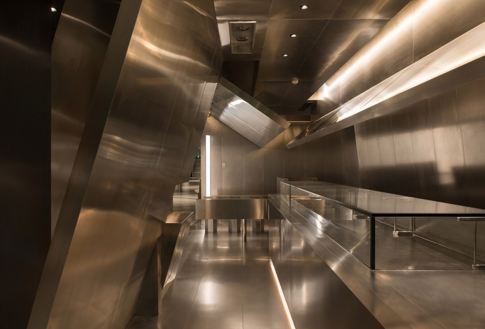
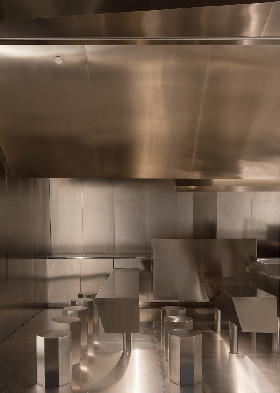
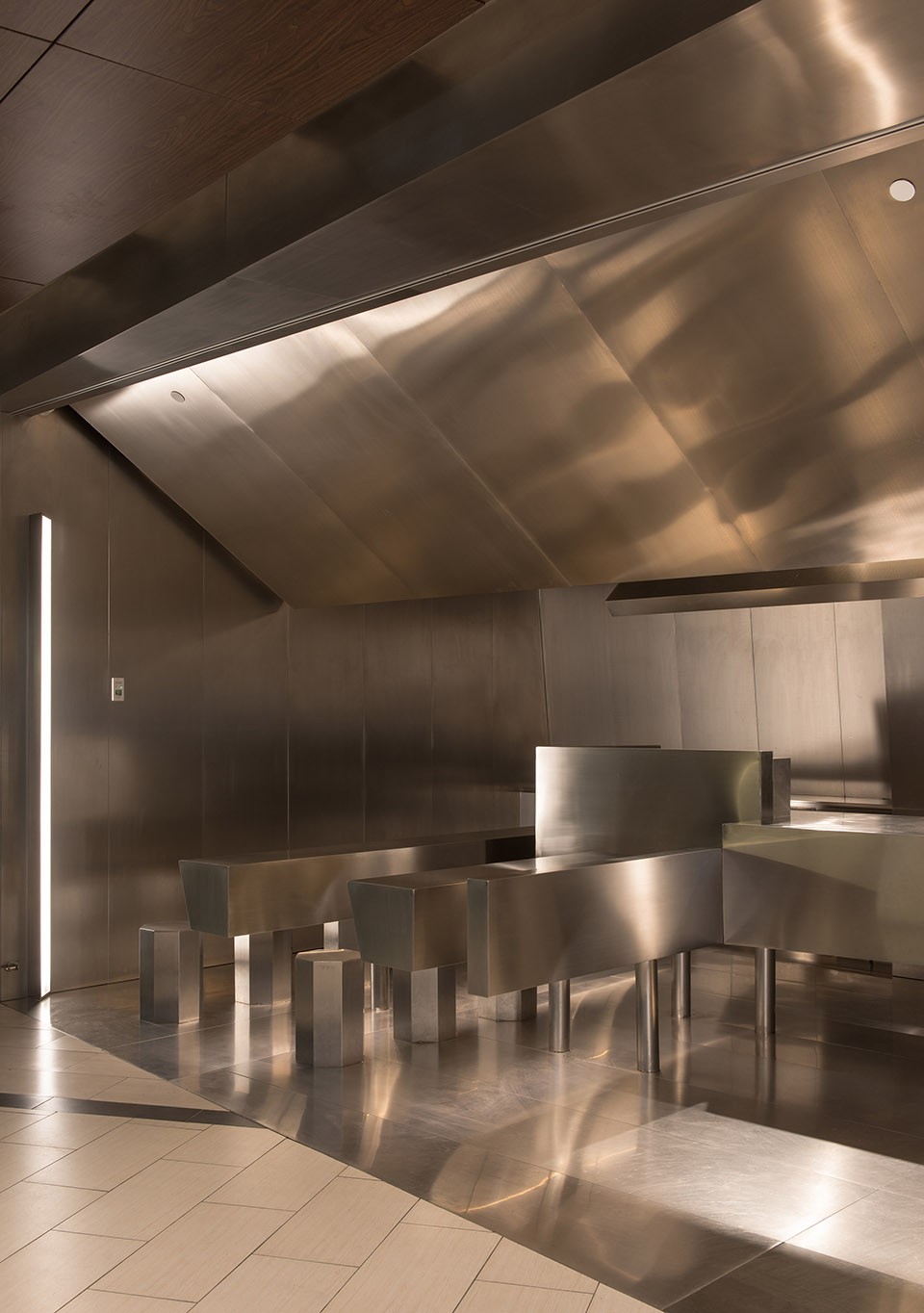
就餐区对外开敞,以课桌椅的形式排列,客人面向一个方向,增添就餐时的小趣味。
柱体侧面的V型复制,墙面采用直面和斜面的弱交错,所有的语言是利落的,直线条的,所有的直线条又是连续的,变化的。
The dining area is totally open and arranges like the school desk. All the guest face one direction, to keep the process of dining full of interest. The side of the pillar likes a V-shape. Thus, the wall is made by the upright and cant. All the expression is neat and straight, at the same time, all the straight line is continuous and metabolic.
▼ 就餐区对外开敞,以课桌椅的形式排列,The dining area is totally open and arranges like the school desk
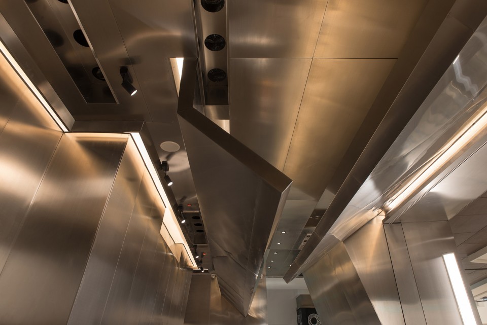
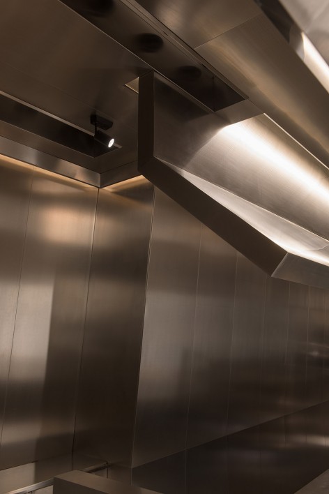
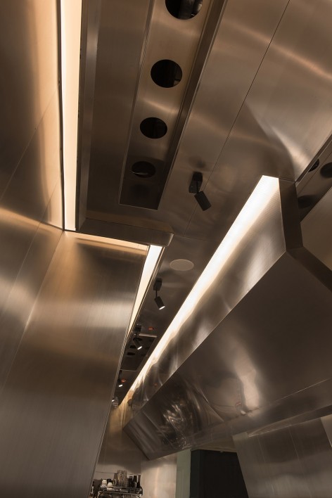
MR.MAIMAi的空间只使用了一种材质-拉丝不锈钢。主体灯光隐藏在结构里,局部用亚克力覆盖光源,让不锈钢产生柔和的光泽。
The whole space of MR.MAIMAi used the Brushed stainless steel only. The main light hidden in the construction and the light source covered by acrylic made the Brushed stainless steel possess a gentle luster.
▼ 主体灯光隐藏在不锈钢结构里,The main light hidden in the construction
▼ 设计前平面,Before / 设计后平面,After
完成:2016年12月
面积:45㎡
设计:杭州啊嗯设计公司
项目:MR.MAIMAi 麦丘梵面包店
属性:新的面包店铺类型、包含咖啡、西点
位置:中国,杭州
摄影:刘宇杰
Completion:Dec.2016
Area:45㎡
Design: Hangzhou AN Interior Design Co.,Ltd.
Project: Kerry Centre store of MR.MAIMAi
Properties: a new type of the bakery, including coffee and desserts
Place:Hangzhou,China
Photographer:Yujie Liu
More: 啊嗯室内设计 / AN Interior Design,更多关于他们,请至:AN Interior Design on gooood

你不说,我肯定以为这是生产车间。
感觉好极端
这不就是后厨吗…..
去现场看过,很冰冷。没有走进去更没有购买的欲望。 购物是要舒适、放松、愉悦的,这个想躲得远远的。 设计脱离了本质,就失去了它的意义。不是炫酷、好看就可以了!
噱头,我觉得路人不仅不会进店,以后路过可能还会回避
声音会不会很大啊
牛逼
弄的跟后厨是的。
看来不锈钢的提成不低啊。设计师拼了。
设计费花了几千一平方还在乎成本吗?有些高度你想象不到的
很冰冷
很性感。
路过好多次,每次都不想进店,太冰冷了,尤其是冬天,感觉这座位完全做不下去。
确实也是嘉里中心三楼人气不旺的店
夏天可以常去
色调太过冰冷,就餐不会感觉像走进生产车间吗。。。
把纯粹作为卖点实为哗众取宠,以不锈钢联系未来太过牵强附会。
可能座椅配上些软垫会好很多
我也这么考虑过哈哈