非常感谢Hou de Sousa将以下内容授权gooood发行。更多请至:Hou de Sousa on gooood
Appreciation towards Hou de Sousa for providing the following description:
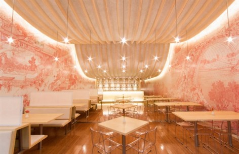
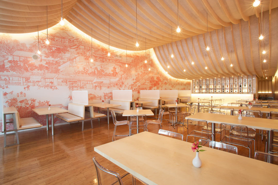
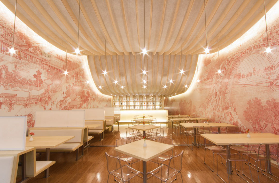
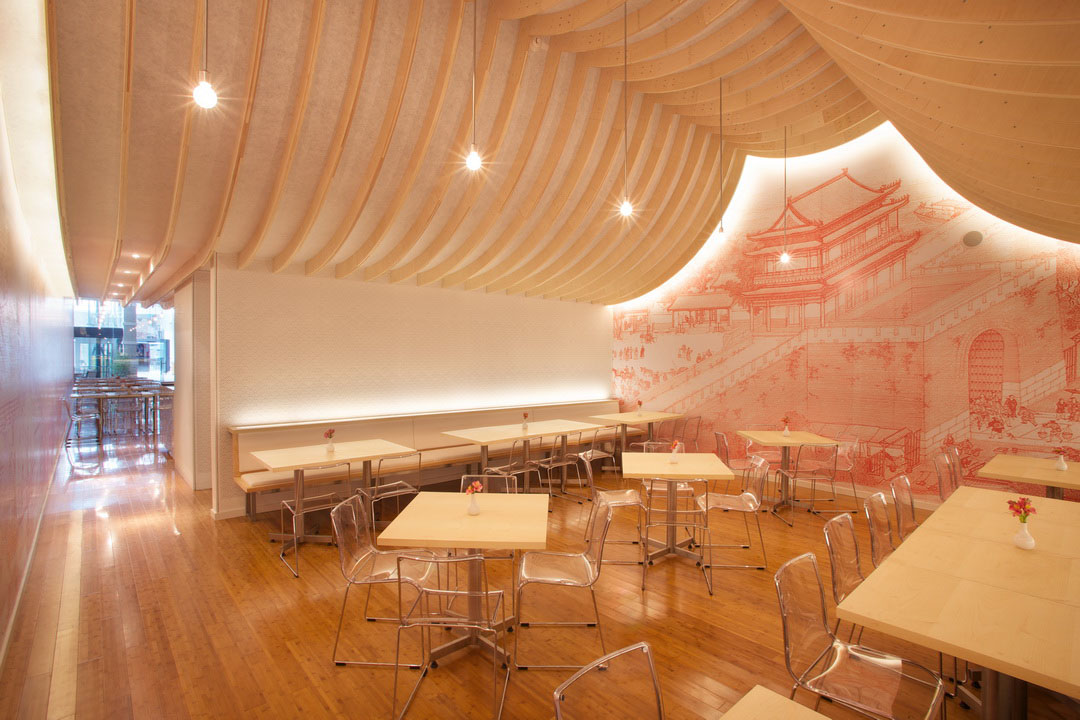
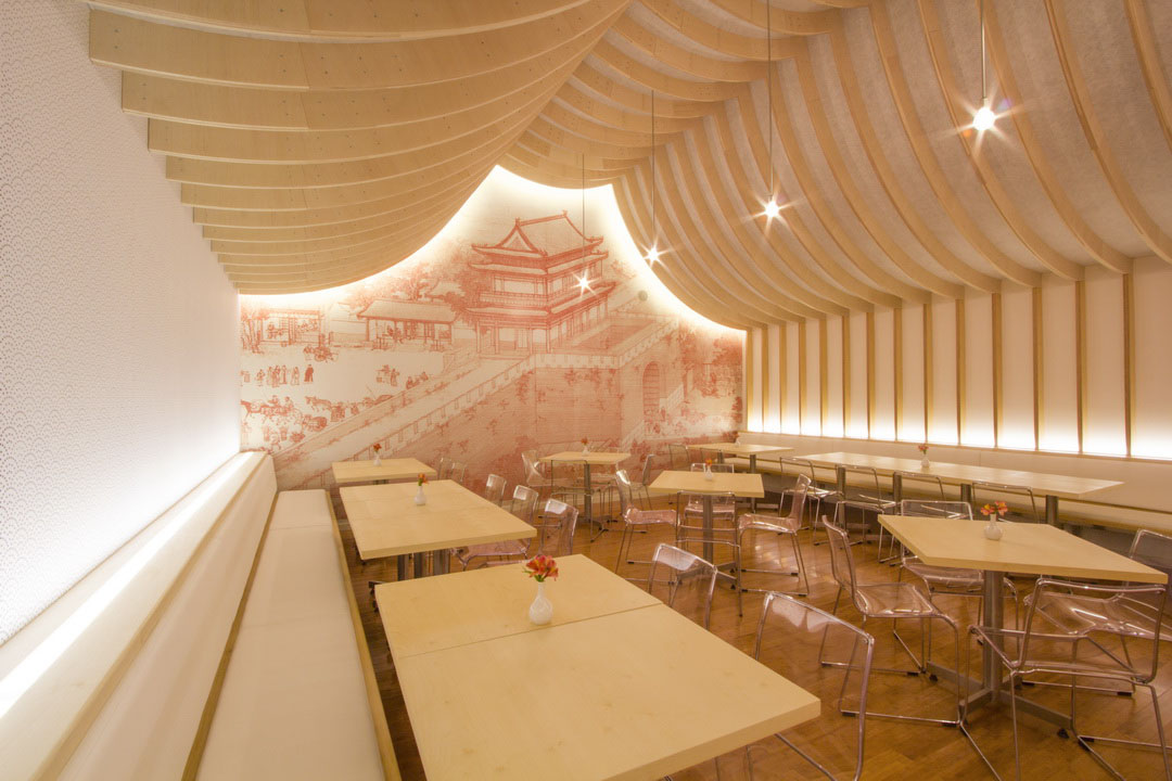
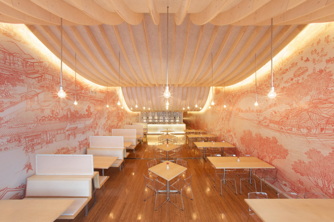
快乐熊猫是一家坐落在厄瓜多尔购物中心内的中国元素餐厅。餐厅原为直筒型布局, 设计在中部靠后放置了厨房和服务台,因此形成富有层次的前后两个用餐空间,甚至还成功留出了酒吧空间。餐厅的天花是抽象简化的中国古建筑试屋顶(钢架支撑的数控切割胶合板),墙面是简化的中国古画清明和上图,座位隔板上的穿孔是抽象简化的中国古代波浪纹。
Happy Panda is a newly built 2000 sq ft restaurant located in the Paseo San Francisco shopping center in Cumbaya, Quito, Ecuador. The project was designed and contracted by Hou de Sousa.
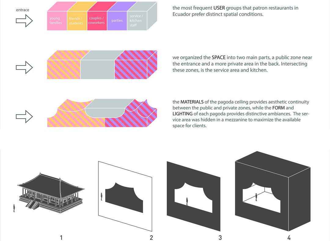
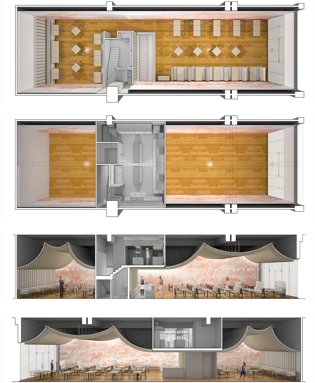
The existing site was a long and narrow shoe box shaped volume. Our analysis of the client’s needs revealed that in order to best serve different customer types, a private dining space was required in addition to a larger and more public dining area. We split the dining space in two by placing the service areas in between. The private space was placed in the back, while the public dining area faces the entrance. This had the added benefit of improving the overall proportions and feel of the space, which otherwise would have been overly stretched and corridor‐like. We also raised the kitchen onto a mezzanine level in order to free up more space for seating and a bar.
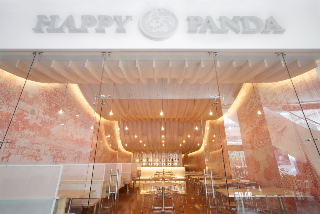
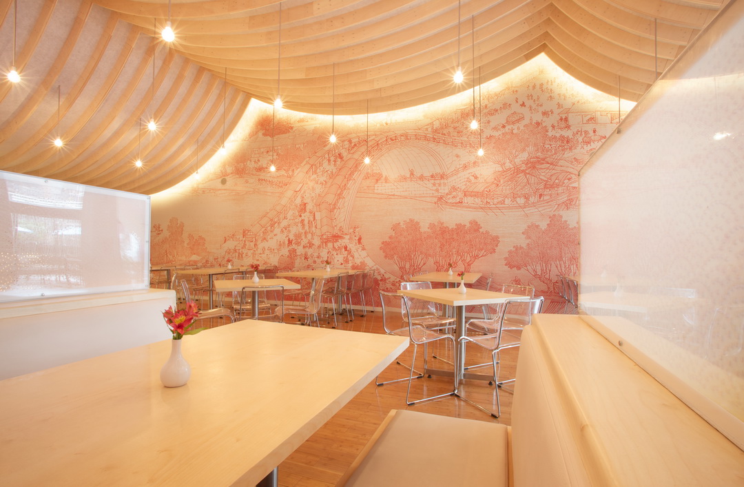
这是一个成功的中国元素现代餐厅。连续的屋顶使得高用餐空间与低服务空间得到自然的过渡,并让用户感受到空间的不同变化,诱导他们进入餐厅。天花与墙面之间留出空隙,光带照亮这里,完美的隐藏天花背后的结构。此外空间中多处精心的用光,打造出一个失重轻盈的氛围。红色的抽象清明和上图与其它元素一起,让这个餐厅倍感温馨舒适。
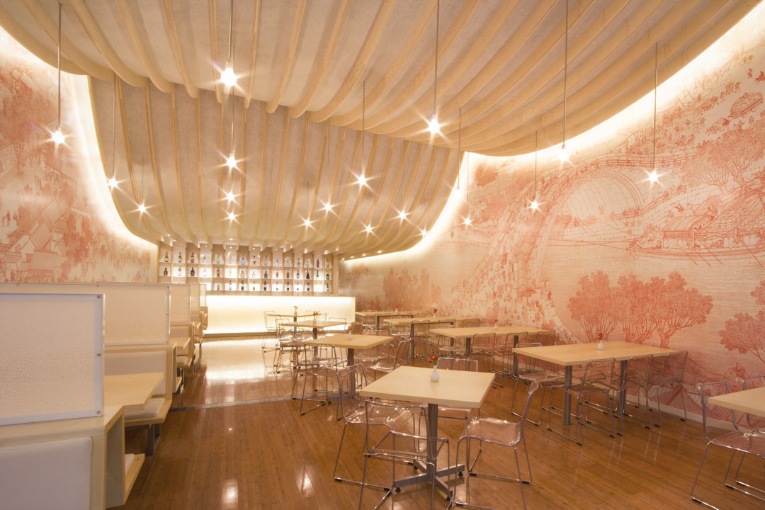
The project schedule was swift, and necessitated expedient methods of construction. While resources and materials for small scale construction is somewhat limited in Ecuador, the dramatic boom of the advertising and signage industries there has lead to a proliferation of CNC machines, laser cutters, and large scale printers. A key priority when designing the project was to make use of these technologies, so as to minimize the need for skilled labor and reduce construction time and cost.
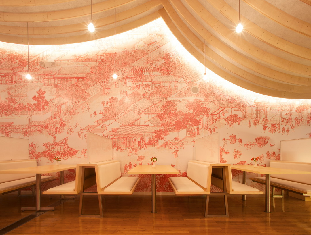
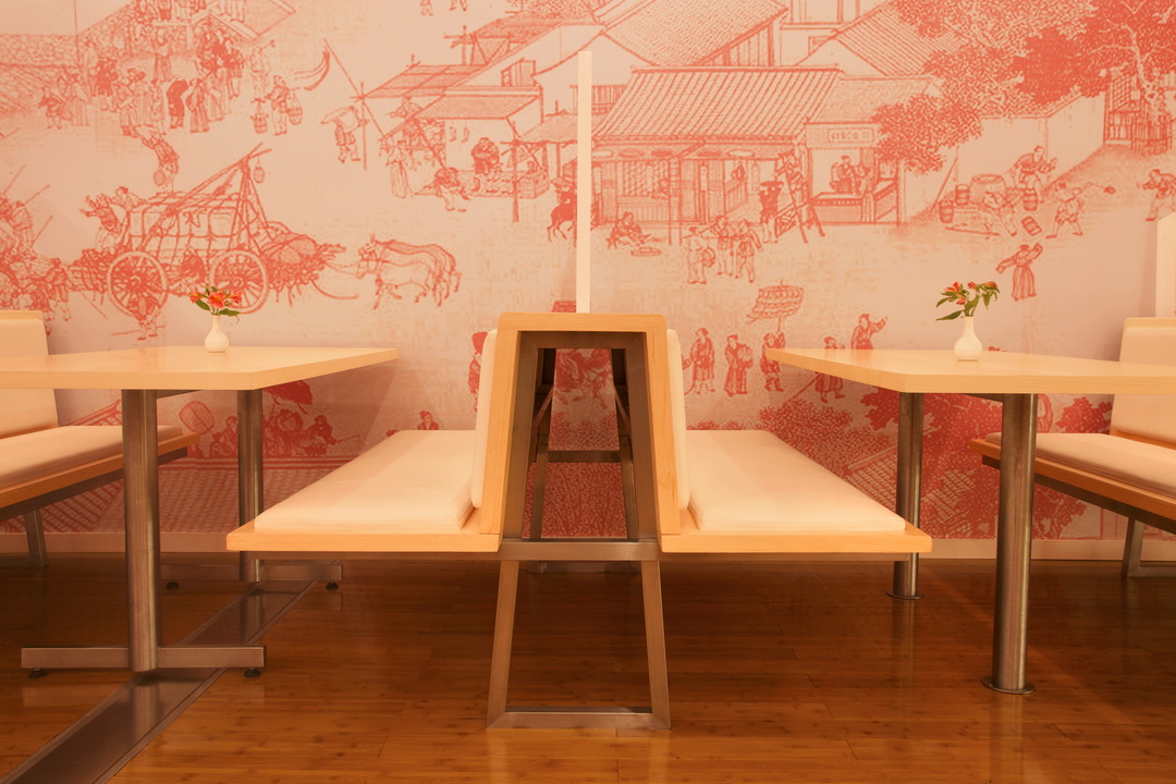
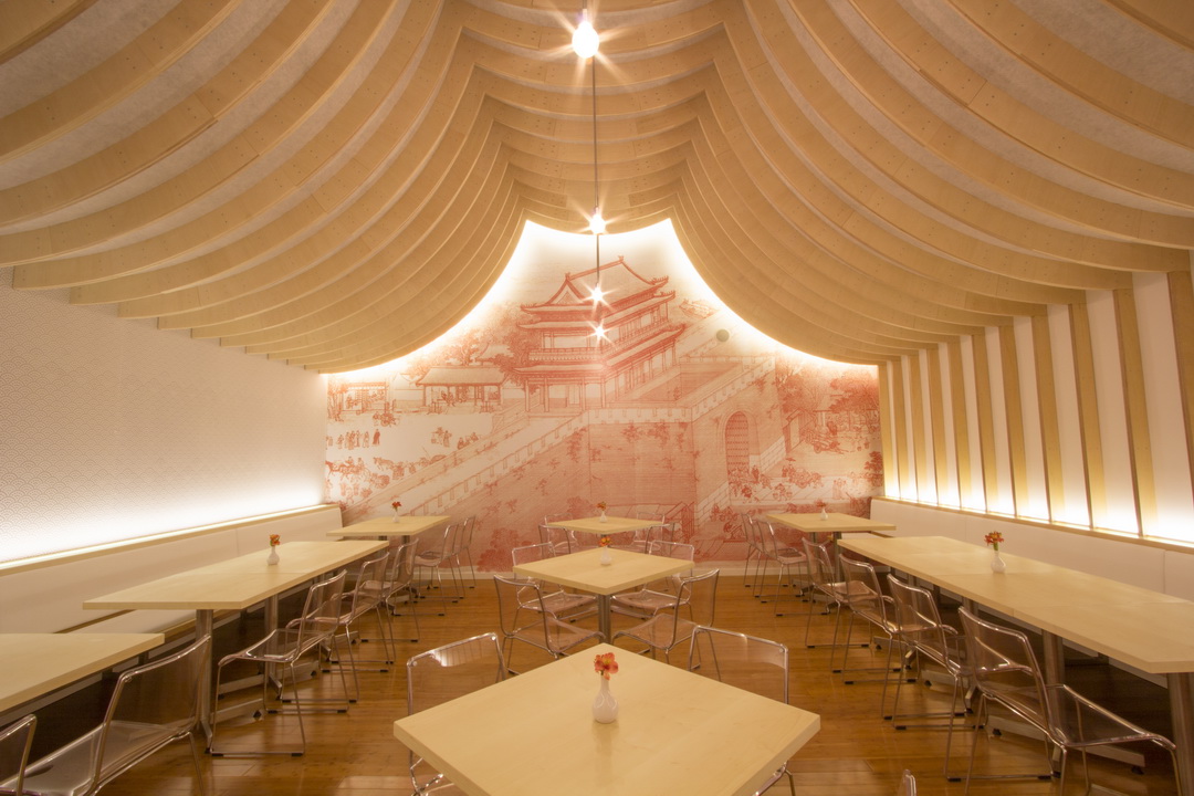
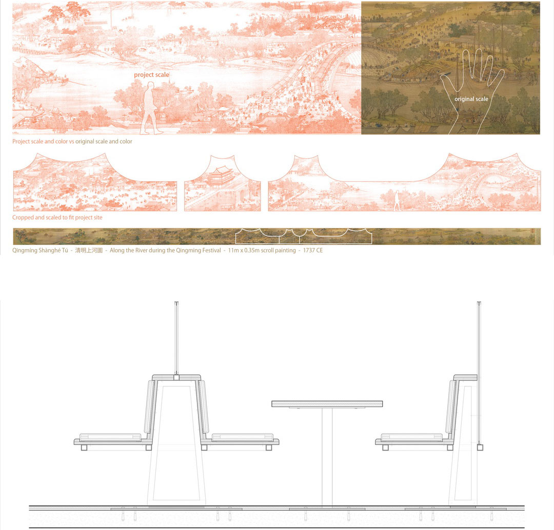
This strategy is most evident on the walls featuring the Chinese scroll painting, Qingming Shanghe Tu, or Along the River During the Qingming Festival. Originally painted by Zhang Zeduan during the Song Dynasty over 900 years ago, its acclaim led to many reinterpretations commissioned by subsequent dynasties. Our studio’s homage has been digitally altered, selectively cropped, blown up to the scale of wall paper, and then printed and installed by a billboard advertisement company.
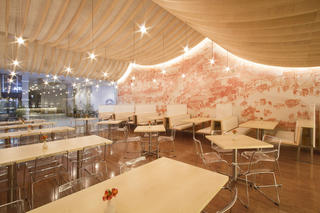
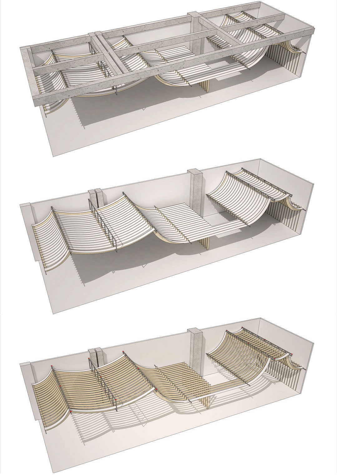
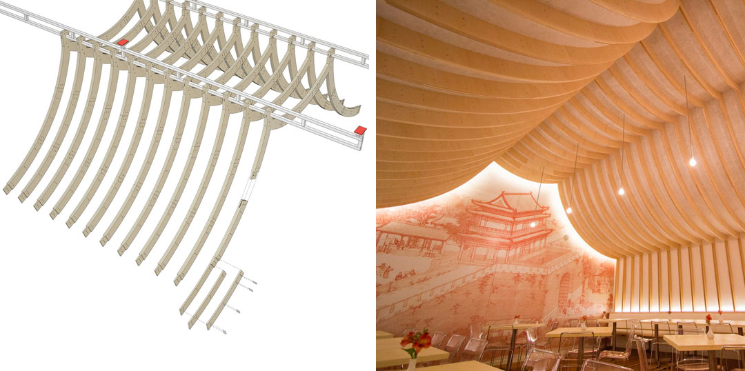
The ceiling is composed of CNC cut plywood and heavyweight interfacing (a fabric used to stiffen dresses and suits). The plywood was precisely cut to fit and suspend from a set of hidden steel trusses.
The form of the ceiling and the spaces it creates was inspired by Chinese temples. We simplified and flattened the geometry of these temples into silhouettes, which were extruded and then subtracted from a mass. Through this process, we reversed the condition of viewing a temple from its exterior as an object in space, to that of inhabiting a space defined by the mould or negative of a temple’s form. The ceiling is a continuous surface that smoothly transitions between the high dining room spaces and the low service area. This allows users to experience a fluid expansion and compression of space as they walk through the restaurant.
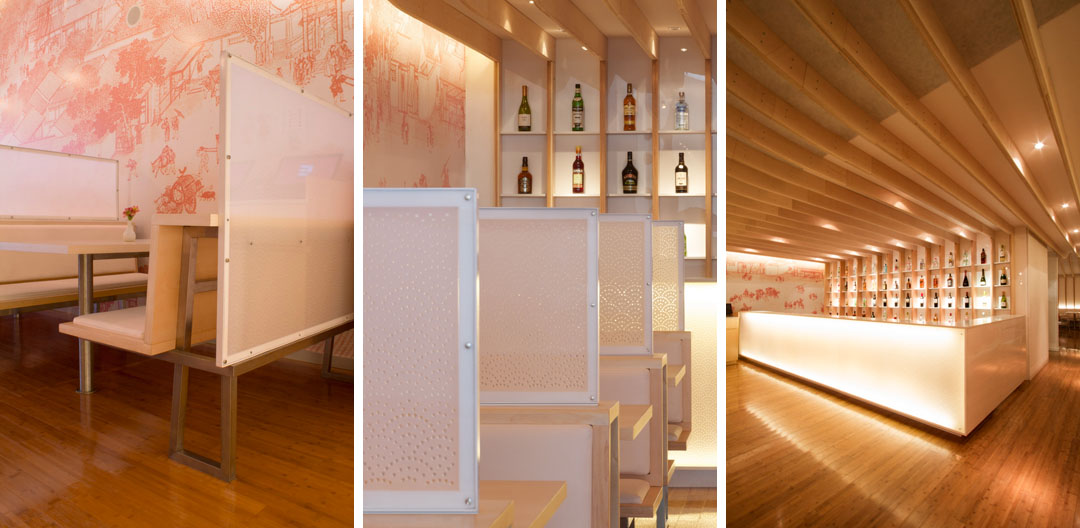
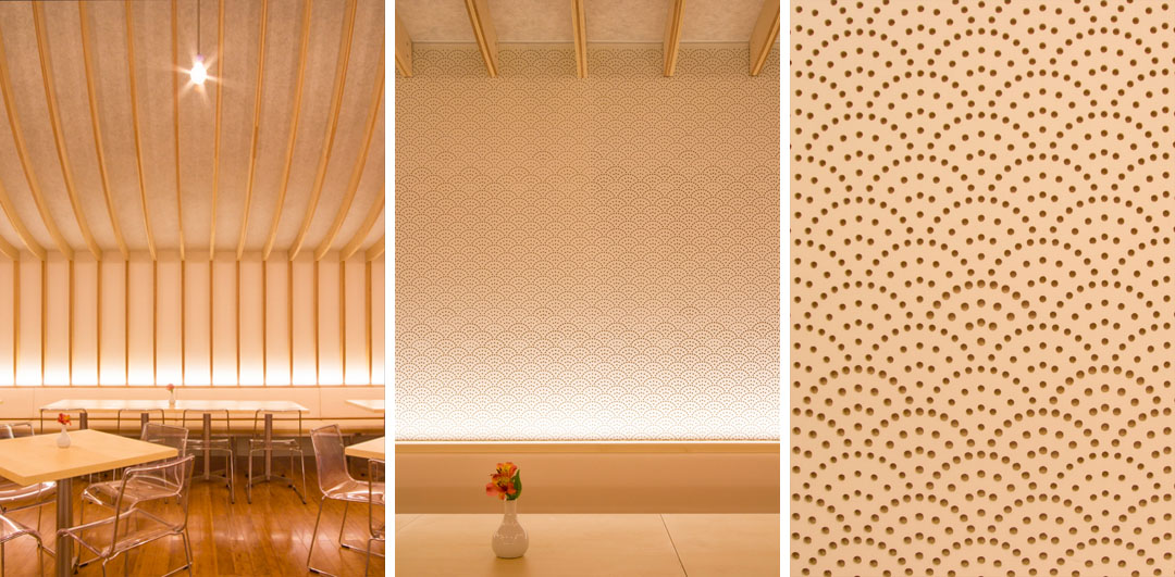
The influence of traditional Chinese design is also present at a much smaller scale. We modified a wave pattern, which is typically found on Chinese glazed pottery, into a polar array of dots. Making use of a variety of materials and techniques, the pattern was adapted to several purposes. Between booths, there are white acrylic privacy screens with the dots laser cut out of them. The holes are large enough that the figures of people on the other side of a screen are noticeable but small enough that their features and identities are obscured. On the glowing surface of the bar, the dot pattern provides a tonal contrast and casts faint shadows. In the private room, a wall is lined with MDF panels that were perforated with a CNC router over 50,000 times to carve a graphic pattern with depth and texture.
We aimed for the restaurant to be warm, inviting, and in a sense, weightless. LEDs were used along the edges of the ceiling to visually detach it from the walls. The steel trusses that suspend the ceiling below it are completely hidden. The intention was for the ceiling to appear as light as a sheet of fabric that has been pinched upwards to create a space below it. A point grid of custom lighting fixtures floats below the ceiling on chrome pipes. The built in booths and tables are detailed so that they appear to hover off the floor.


不压抑啊
空间好压抑呢
果然是一千个哈姆雷特啊,个人觉得天花很值得玩味,厨房的二层安排也很独到,为什么人家做中国风,就一定是我们想象中的中国风呢?中国风就只有一种?除了守,也许更需要多点这样开创。
然而反过来也吐个槽,这种建筑形状非中国特有,日本也有,这种粉红色也容易联想到樱花,酒柜设计也容易联想到居酒屋,所以最不搭调可能是清明上河图哈哈哈,这是中式吗,还是日式吗,有争议也不全是坏事~
有没有觉得想当时洛可可时期引入中国元素,然后变了另一个样子,但是别有一番风味,有的梦幻和浪漫
fen xi tu
后面的分析图很好。
分析做得很棒!
分析很到位![心动]
外国人在做中式风格的时候,总是从我们很难想到的方面入手
认为可以从更细节 更接近人的尺度的方面去融入中国元素,不只是视觉,更可以从使用,触感方面。。。。。。
感觉分析的切入点很赞·但是做出来的视觉效果感觉不太好··
厨师好孤独~
哈哈哈哈,原来不是我一个人这么想
外国人做的中国设计总是那么独特!另外貌似中文翻译的不是太认真啊“清明和上图”呵呵
外国人根本不了解中国的文化 做东西也只是照葫芦画瓢 就好像我们不懂他们的一样
不一样的中国风
狂赞
原谅我不能欣赏这所谓的审美~…..
看图的时候觉得丑 看到分析图觉得分析做的很棒 空间可以有更多改进 不是很喜欢红色的清明上河图 瘆的慌