感谢 F.O.G. 建筑事务所 予gooood分享以下内容。更多关于他们:F.O.G. Architecture on gooood
Appreciation towards F.O.G. Architecture for providing the following description:
高级时装品牌“小着”上海新店位于巨鹿路758号。作为一个诞生于后疫情时代兼容商业、公共、休闲属性的多重性空间,店铺位处繁华地带,为参与社区生活提供了有利条件。
改造过程中,我们保留了部分原始建筑结构,重新构图后它们成为了整个设计方案的逻辑支点。设计之初,我们从伯纳德·屈米所论述的“事件空间”概念中汲取灵感,摸索出一种含混、不定性的空间状态,激发店铺与街区之间行为和活动的发生。最后,我们尝试暂时“忘记”建筑本身,通过对品牌基因和服装的观察解构寻找能够明确建筑形态的元素,从而取得设计与品牌的一致性——以直截了当而不失细节的执行手法塑造一个兼具形式美、事件性和品牌辨识度的线下空间。
High-end fashion brand Xiaozhuo has opened a new boutique shop at 758 Julu Road in Shanghai. The shop combines multiple functions that extend from commercial space to public and leisure space, which allows itself to be seamlessly integrated into the local community.
We kept the original structure of the building that became the starting point of the design concept. Inspired by the “event space” theory from Bernard Tschumi, we tried to explore a state of space with ambiguity and uncertainty that would encourage the interaction between the shop and the street. Eventually we defined a few architectural elements through the deconstruction of the brand’s identity and the process of garment making, creating an eventful and identifiable space with aesthetic forms.
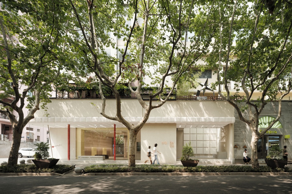
▼店面概览,storefront overview © INSPACE
事件空间:店铺和街区的“中间者”
Event space: the medium between shop and street
70年代中期,伯纳德·屈米 (Bernard Tschumi) 提出“事件空间” (event-space) 概念,寻找在建筑的预设功能和预设形式之间制造“分裂” (disjunction) 的可能。屈米认为建筑是空间和事件的混合物,事件具有打破甚至颠覆建筑预设功能与形式之间稳定对应关系的潜能,而这种冲突与“疏离” (de-familiarity) 自身具有美学价值。
案例中,我们通过“打开”店铺的前场空间激发其“事件性”,吸引更多人流、增加互动形式,本质上是在店铺主体和街区之间建立了一个事件空间,提供休憩区域的同时弱化室内外边界,以此激发人们的使用积极性,周围环境的活力也会随之增强。
In mid 70s, Bernard Tschumi released the concept of event-space, looking for the possibility of creating a “disjunction” between the predetermined function and the predetermined form of the building. Tschumi believes that architecture is a mixture of space and events, while events have the potential to break the balance between the architectural form and its preset functions, and this conflict and “de-familiarity” create a new aesthetic value.
In this project, we create “events” by opening up the front of the shop, attracting more traffic and interaction. The “event space” we created between the shop and the street provides a resting area for people while blurs the boundaries between interior and exterior of the shop. As a result, people more actively engage with the shop and create a more vibrate community.
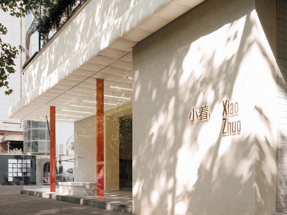
▼透明的沿街立面,Street front glass facade © INSPACE
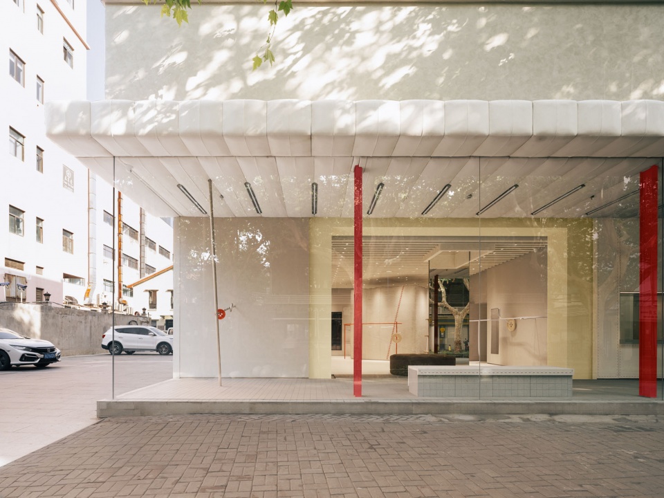
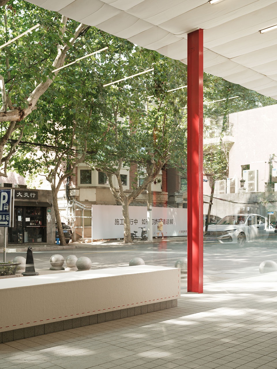
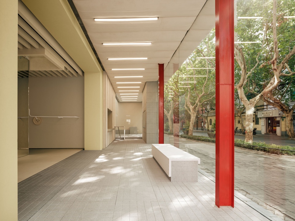
具体手法是将沿街立面更换为透明玻璃幕墙,突出光线、开阔感等元素;并在入口和窗边设置座椅。帆布材质的大屋顶从室外延伸至室内,将各种元素组织在一个开放的独块统一体中;形似一张床垫或若干个枕头紧贴在一起,给人柔软亲和的视觉感受。原始建筑结构中的梁柱(图中黄色、红色部分)也被保留下来。
The beams and columns from the original building structure are kept and painted yellow and red. The street front facade has been replaced with glass to allow plenty of natural light into the shop. Seatings are placed at the entrance and by the windows. The roof extends from inside to outside of the building, covered in canvas like material, as if a mattress or a series of pillows tightly pressed together, creating a soft and friendly visual experience.
▼商铺的入口,Entrance of the shop © INSPACE
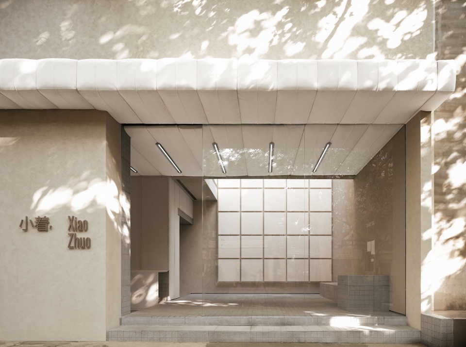
最终所呈现的外观像是一个“小亭子”,醒目的赭红色立柱、酷似瓦片搭接而成的平顶、造型仿古的小料石座椅都有助于这种空间意象的搭建。
The result is an exterior of the shop that looks like a “small pavilion”. The red columns, the flat roof resembling overlapping tiles, and the antique style stone seats all contribute to this spatial image.
▼拆解为屋盖与台基的观景亭,A pavilion comprised of a roof and a podium © INSPACE
▼观景亭内布,pavilion interior © INSPACE
行人可以同时看到简洁利落的外立面和层次鲜明、色彩跳跃的内部装潢,两种不平衡的力量相互对峙,与环境一起构成这座城市的表情之一。
The simple facade and the interior decoration with distinct layers and jumping colours create confronting forces that add to the expressions of the city.
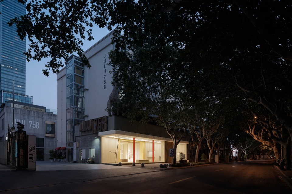
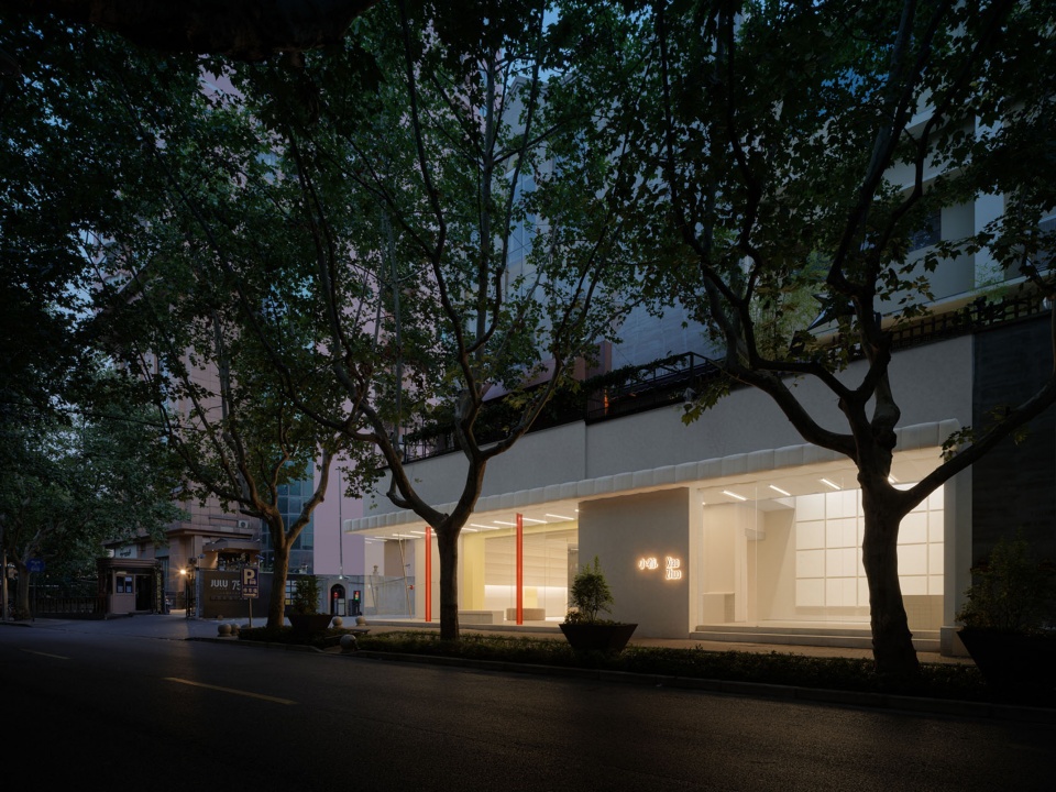
▼夜间效果,Nighttime effect © INSPACE
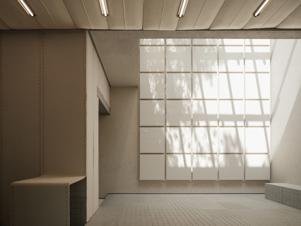
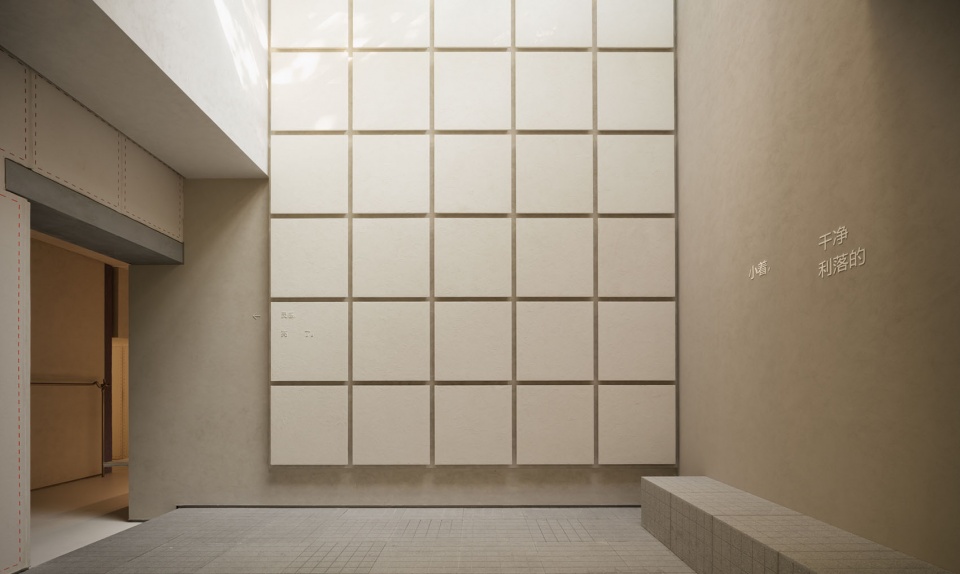
进店后,最先映入眼帘的是一面“格子墙”。我们在踏勘时发现这里上方有一扇天窗,阳光照射下,原本光秃的墙面会显现窗格的影子,便索性以此为灵感设计了这样一面更有辨识度和想象空间的幕墙。当阳光将自然景致投射在墙上时,墙体化身“窗口”,凭光影虚构出一个“窗外”世界。
We put up a grid wall at the entrance of the shop, inspired by the skylight from the original building site. When sunlight hits, a unique light and shadow effect that resembles a virtual window merging the inside and outside.
▼格子墙,The grid wall © INSPACE
▼细部,detail © INSPACE
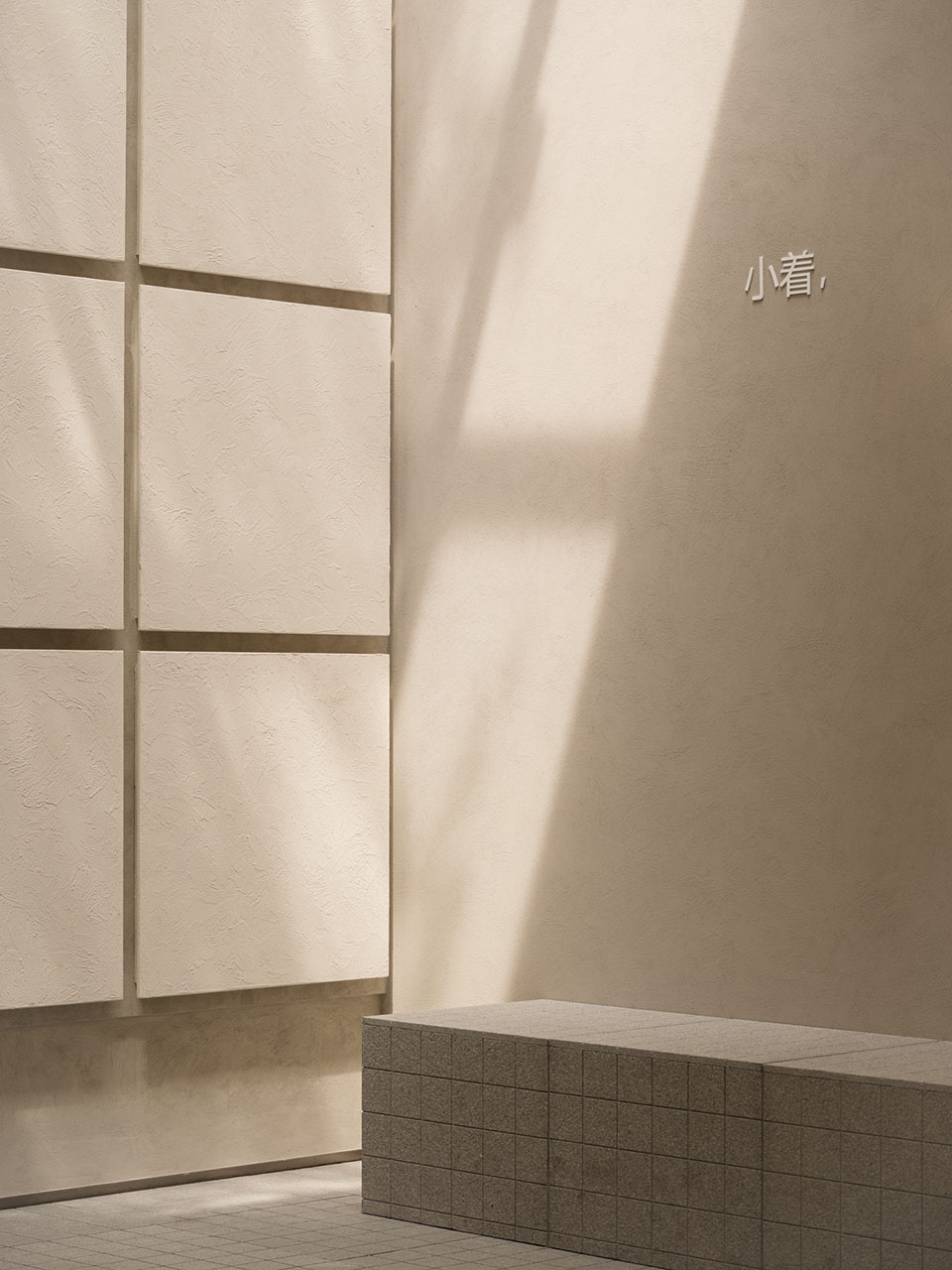
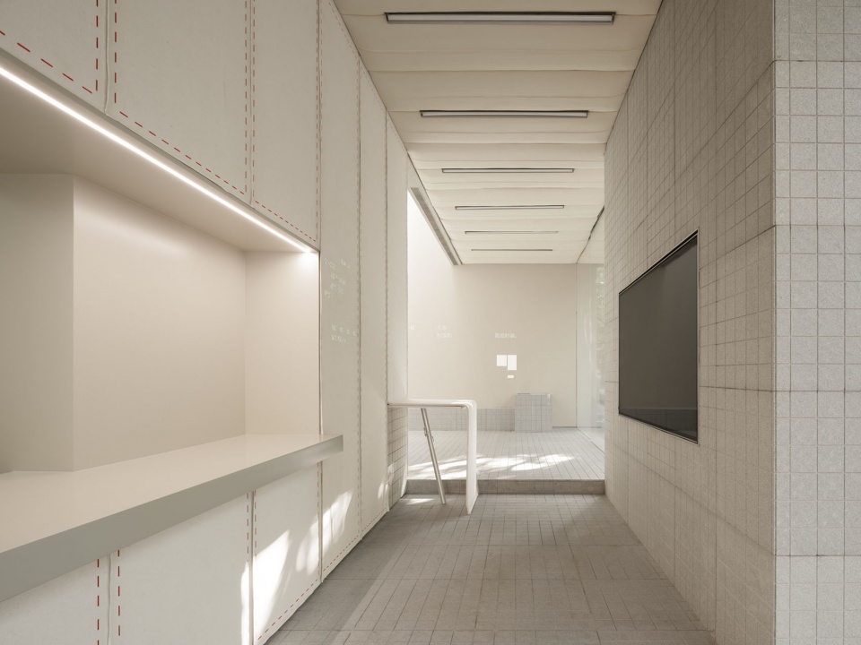
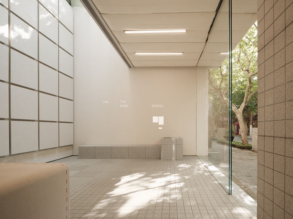
等位区起到过渡作用的同时强调秩序感,符合品牌产品干净利落的特征。地面和墙面的材质主要为小料石,与天花、格子墙形态相呼应。照明方面,我们在天花缝隙处安装了条形灯,维护“横平竖直”的视觉效果。
The waiting area is a transitional space while emphasizing the sense of order, which is in line with the clean and tidy characteristics of brand products. Small square stones are chosen as the main material of the floor and wall, in response to the grid wall. We installed strip lights in the gaps in the ceiling to maintain a consistent grid-like visual effect.
▼等位区,Waiting area © INSPACE
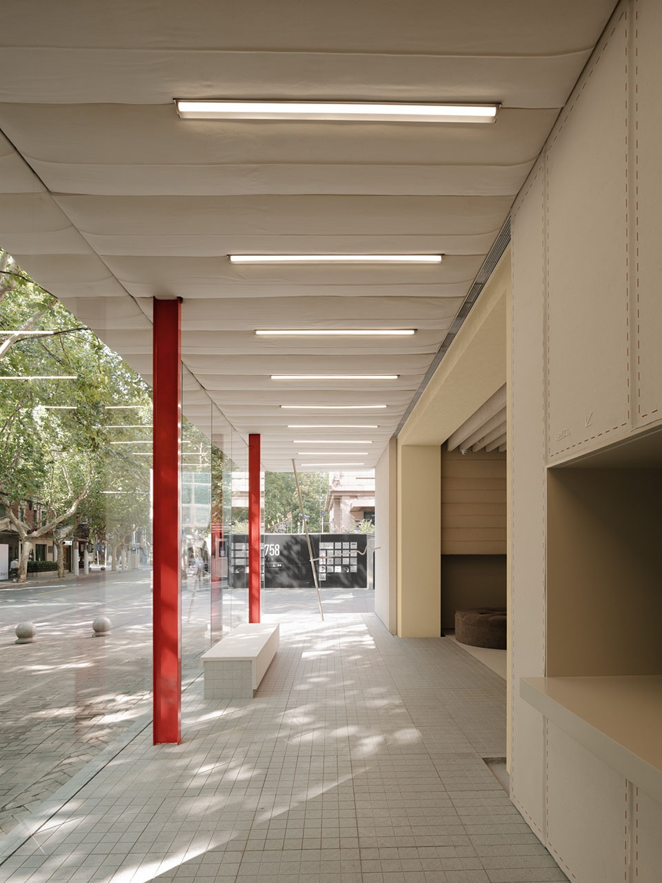
我们可以借用屈米所定义的“中间者” (in-between) 来描述这种空间模式。项目的预设功能主要为服装零售和展陈,而酷似凉亭的外观挑战了建筑的预设形式,附带地给与其休闲、娱乐、社交等更多使用上的可能性。因此,前场空间不仅是店铺主体和街区之间的间隙与联系,更是允许异质元素交汇、允许事件发生的实验性场所。
The space is best described by Tschumi as “in-between”. Retail display is the project’s preset function but the pavilion-like exterior challenges it and adds the possibility of leisure, entertainment and social. The front space not only serves as the connection between the shop and the street, but also creates an experimental space that allows contrasting events happen.
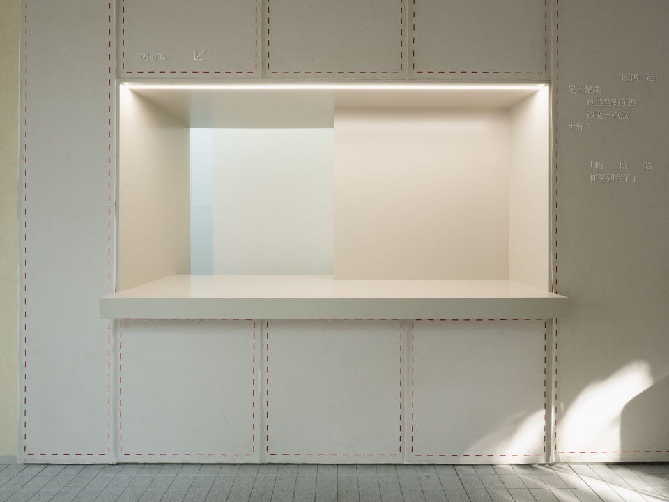
▼取货口, pick-up area © INSPACE
“缝合”空间:非线性设计叙事
A “Sowed-up” space: nonlinear design narrative
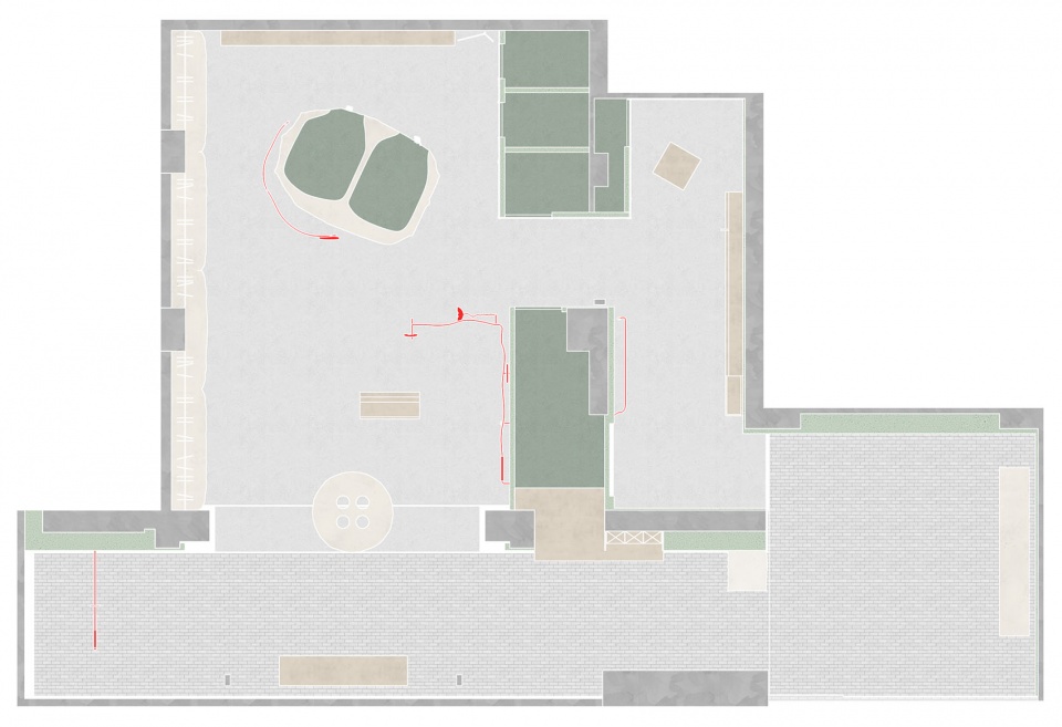
店铺主体布局将购买、提货、后勤三大常规动线纳入考量,除服装展陈区和试衣间外,取货口、打包台、仓库、员工休息室以及设备间等支持性设施被整合在同一纵线,将场地垂直分割为东西两侧。
The supporting functions of the shop including pick-up area, packaging counter, warehouse, staff resting area and equipment room are separated from the main product display area and fitting rooms, which are arranged on east and west side of the site.
▼平面图,Floorplan © F.O.G. Architecture
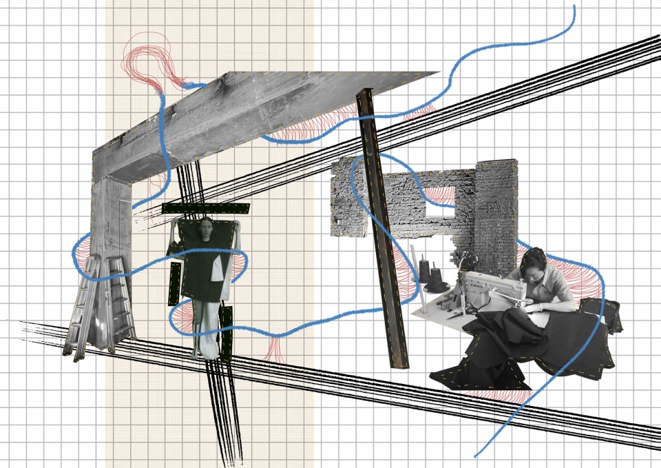
“建筑的叙事从不是以线性的方式进行。” 屈米指出,事件对空间的影响在于其非线性的展开方式;设计本身同样允许非线性思路的出现,甚至可以说,我们的初衷便是呈现一个“缝合”而成的空间,将形象或抽象的“缝线”元素作为贯穿场地的主要线索。
“The narrative of architecture never proceeds in a linear fashion,” Tschumi said. The event space unfolds in a nonlinear way, while the design itself allows a nonlinear approach, which we have decided from the very beginning to present a “sowed-up” space, with sowing elements the main narrative of the shop.
▼概念图:“缝合”而成的空间,Concept: Sowed up space © F.O.G. Architecture
为保证新置入元素和原有结构之间的亲和性,我们首先对墙面和梁柱表面样式进行重新打磨,使用帆布、长绒布料、肌理漆打造一种介于麻布和皮革、朴素质地与高级质感之间的特殊肌理将空间包裹起来。
We start by wrapping the space with canvas, plush fabric, and texture paint, creating a texture that sits between linen and leather, to ensure a close connection to the original structure of the building。
▼展示区概览,showroom overview © INSPACE
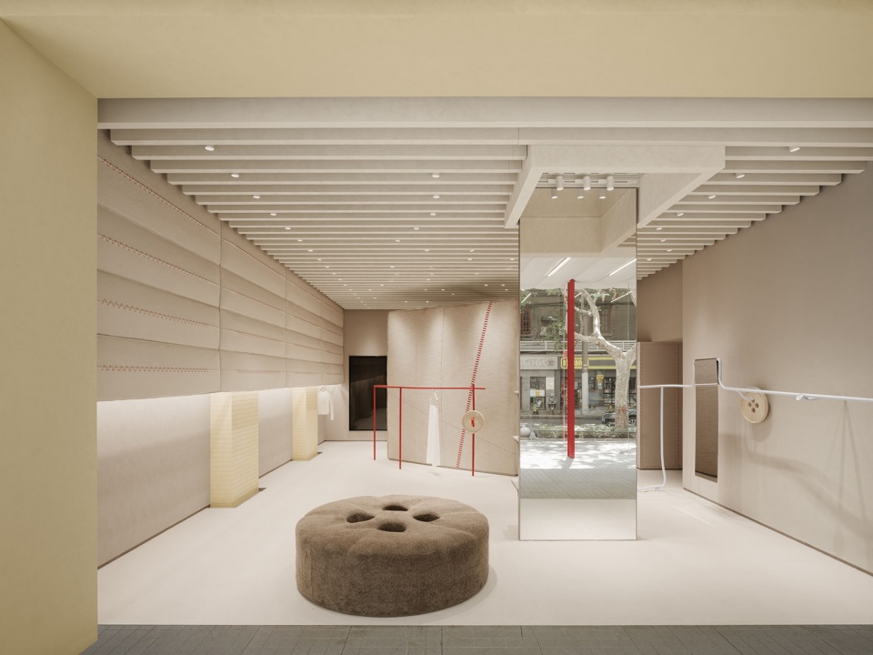
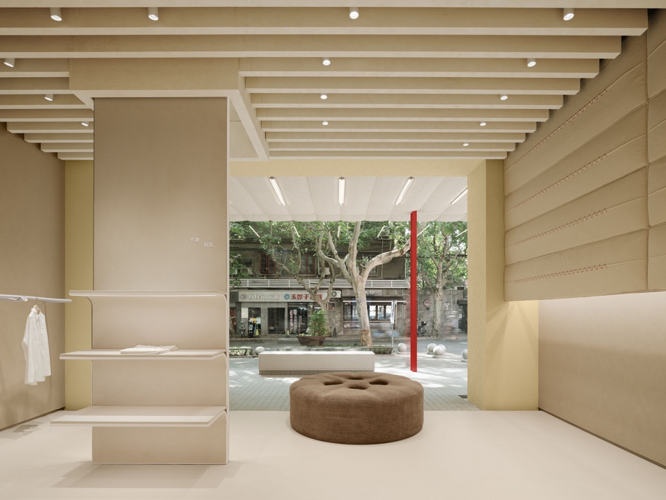
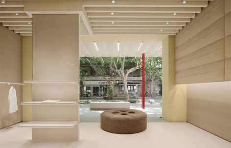
展陈区:镜子将环境场景引入室内,透明立面瓦解了视线障碍。两种观察角度都体现出室内外的自然贯通以及空间的开放性、流动性和呼吸感。
Product display area: transparent facade and interior mirrors invite the street view into the shop, creating an open and flowing space.
▼介于麻布和皮革、朴素质地与高级质感之间的特殊肌理, a texture that sits between linen and leather © INSPACE
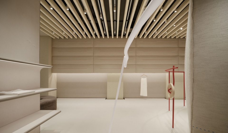
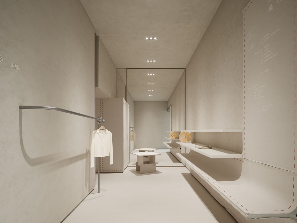
▼帆布材质,canvas texture © INSPACE
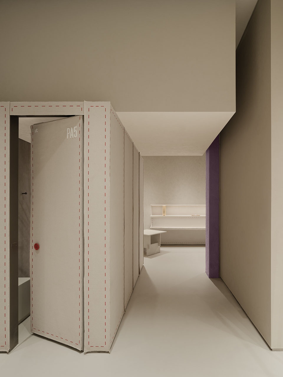
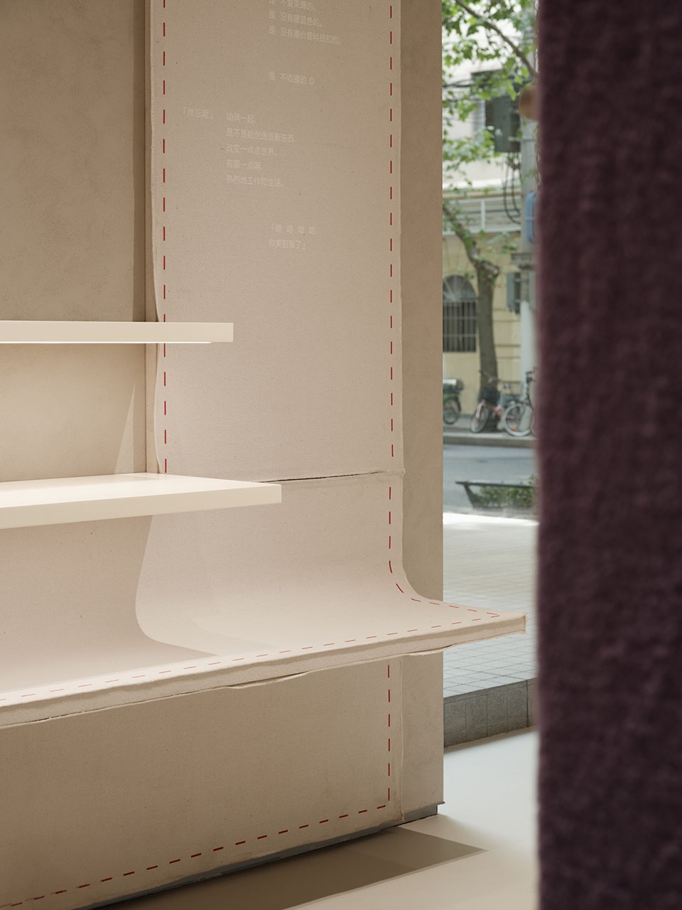
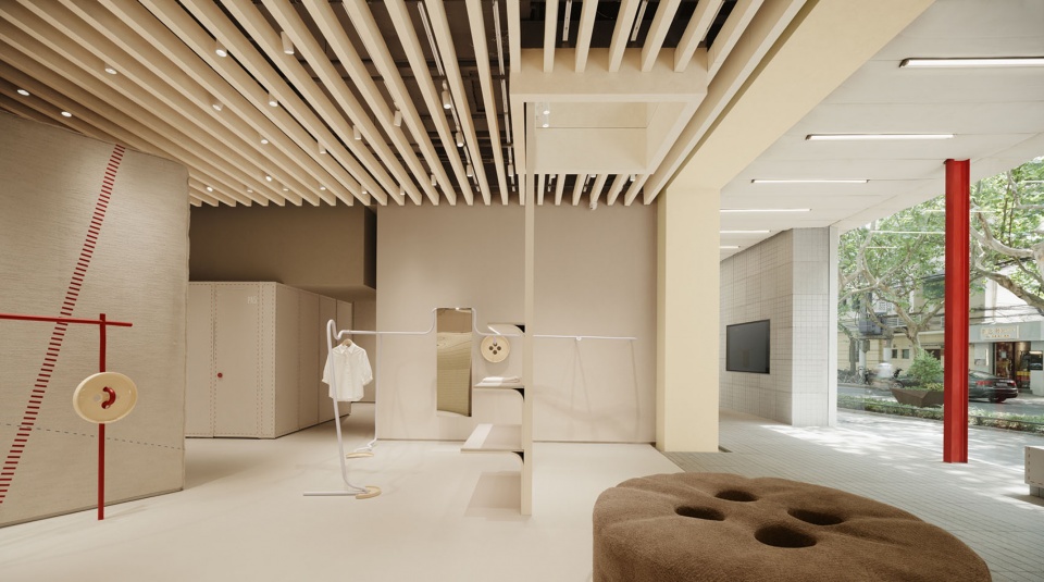
打破传统服装门店布局策略,我们将试衣间从场地边缘移至中央区域,使其成为视觉上具有决定性意义的互动装置。多边体帆布表面略带弧度,形似一个巨大的软垫。
We have moved the fitting rooms from the edge to the centre of the space, creating a defining interactive installation for customers. The slightly curved canvas surface of the fitting room resembles a giant soft cushion.
▼试衣间,Fitting rooms © INSPACE
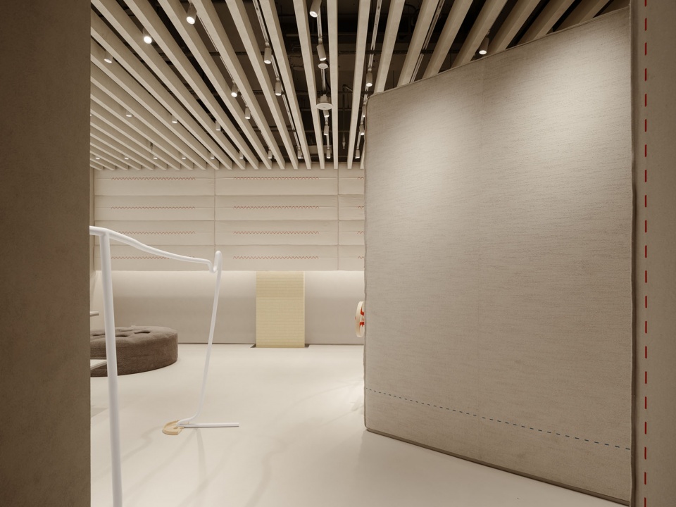
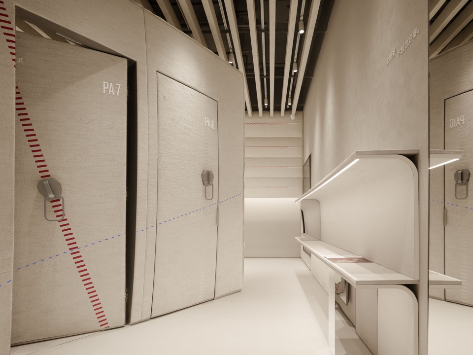
▼试衣间:帆布肌理,Fitting rooms: canvas surface © INSPACE
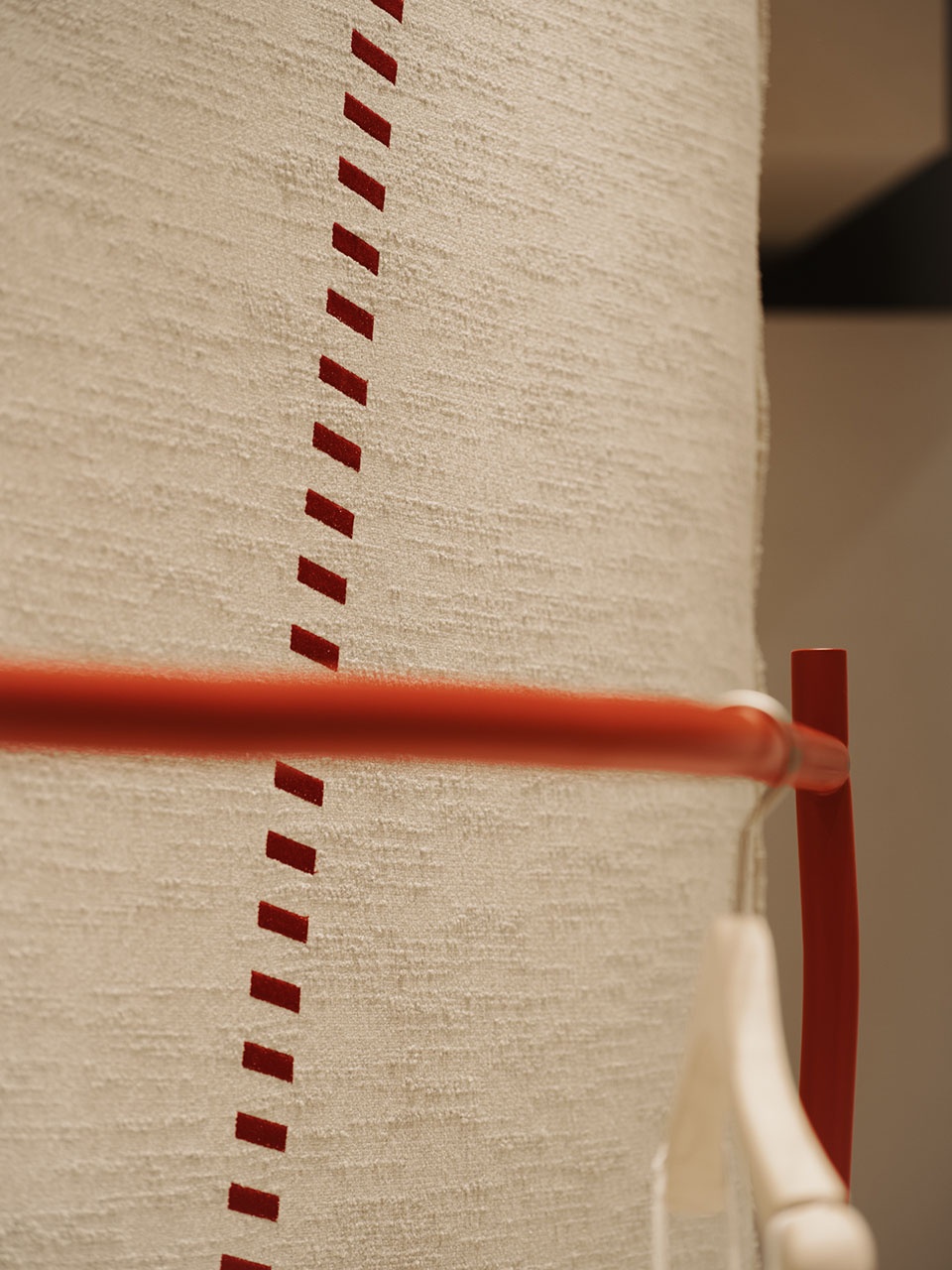
软装方面,我们撷取品牌服装中标志性的亮眼元素——例如袖口的彩色缝线、注重设计感的纽扣——“搬运”到空间中,以或强烈或隐晦的表达手法呈现,一如隐藏在工装和工作日常背后灵感与创造力交汇的瞬间。
We’ve selected the brand’s key fashion elements for the furnishings of the shop, such as the colorful stitching on the cuffs, and buttons. The blown-up yet subtle reinterpretation of these fashion elements sparks creativity from everyday office dressing the work style.
▼彩色缝线和纽扣装饰,Colorful stitching and button furnishing © INSPACE
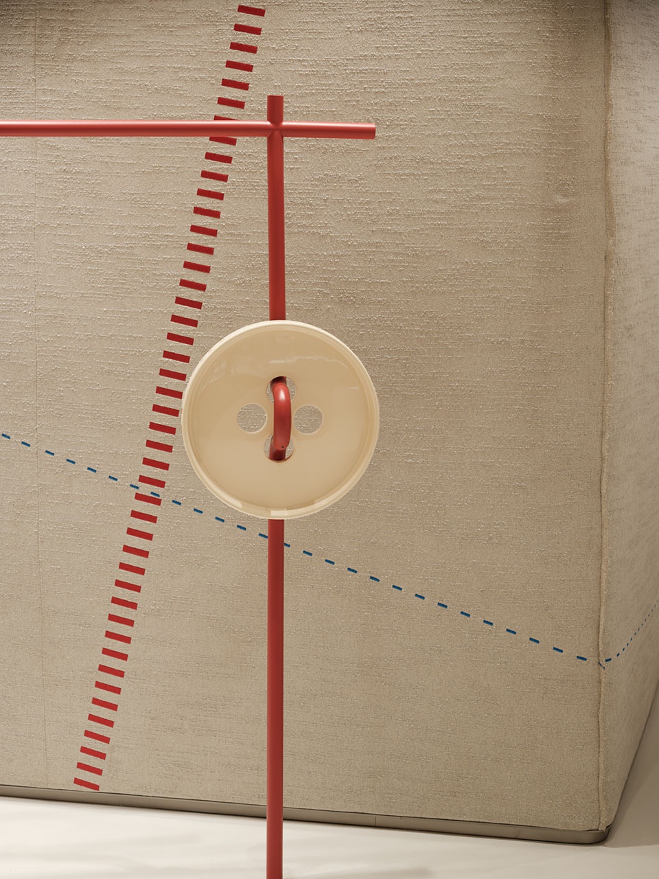
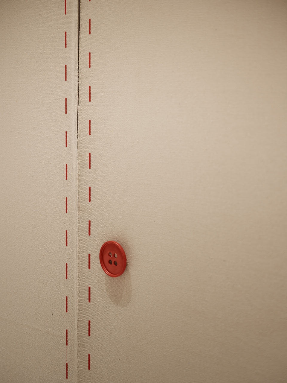
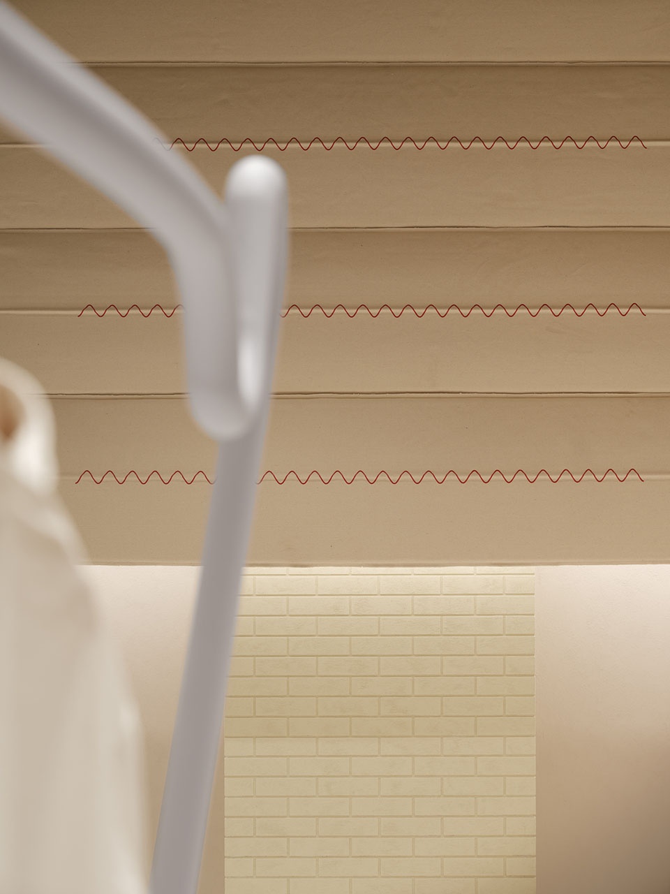
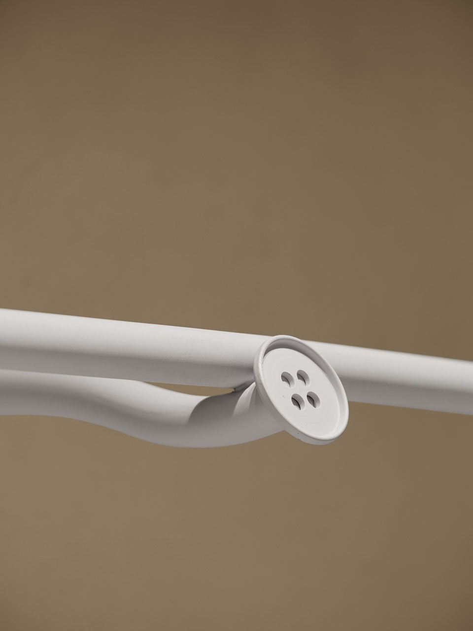
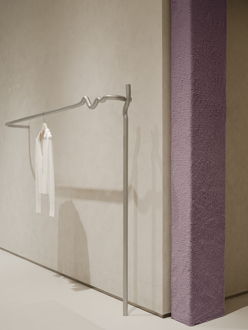
米白色为主的空间中出现红、黄、蓝、紫四种品牌色,彼此碰撞而相对独立,挑染出几分俏皮表情。我们一边在细节之处做文章——帆布“皮肤”上的毛边、四处穿插的彩色缝线、陡然弯曲的衣架——隐喻“穿针引线”将分散的设计元素“缝纫拼合”而得一个符号空间;一边以建筑师视角放大诠释服装上的各种设计巧思——拉锁形状的金属门把手、恶作剧般出现的巨大纽扣——又将店铺变成乐园般的游戏场地。不同方法的共同目的在于提升空间的可探索性,为善于观察的人制造惊喜和共鸣。
The brand’s signature colours of red, yellow, blue and purple contrast the backdrop of off-white, adding a fun expression to the space. The rough edges of the canvas “skin”, the flowing colouful sowing lines and the clothing racks with sudden curves sow together a space with unique brand identity; while zip-shaped metal door handles and giant buttons transform the space into a playground. Together they encourage customers to explore the space with an element of surprise.
▼造型奇特的衣杆和纽扣装饰 组1,Unique-shaped clothing racks and button furnishings © INSPACE
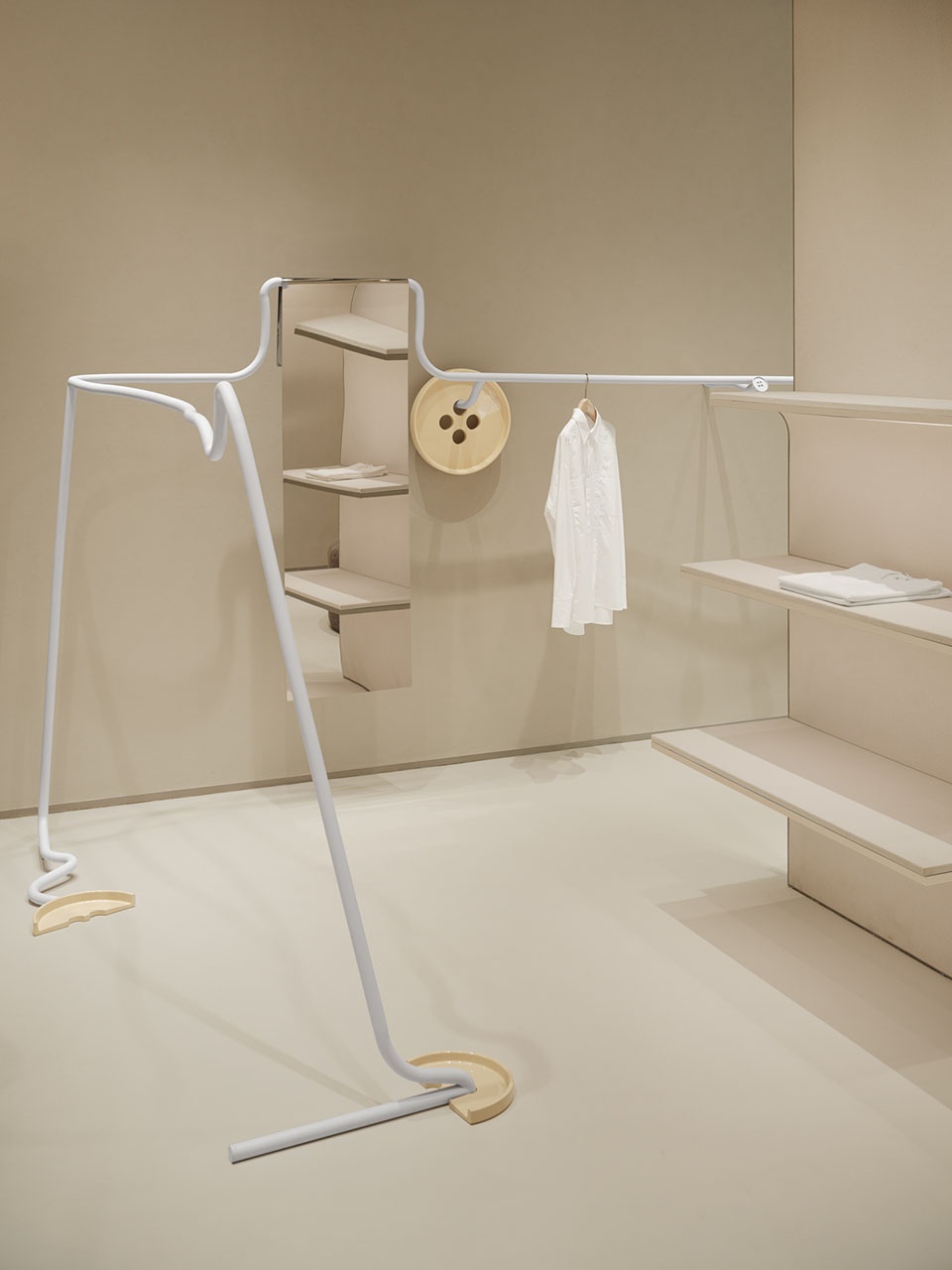
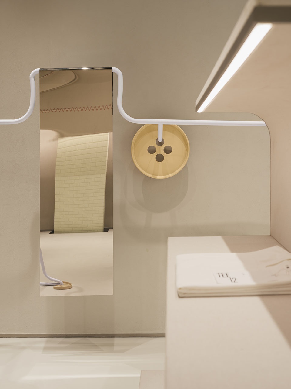
▼造型奇特的衣杆和纽扣装饰 组2,Unique-shaped clothing racks and button furnishings © INSPACE
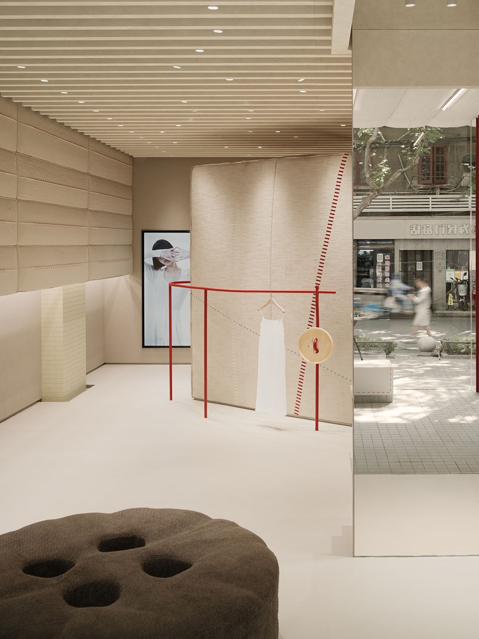
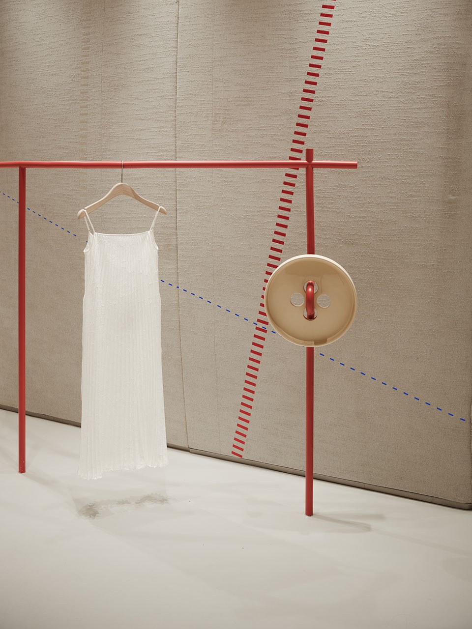
▼造型奇特的衣杆和装饰 组3,Unique-shaped clothing racks and button furnishings © INSPACE
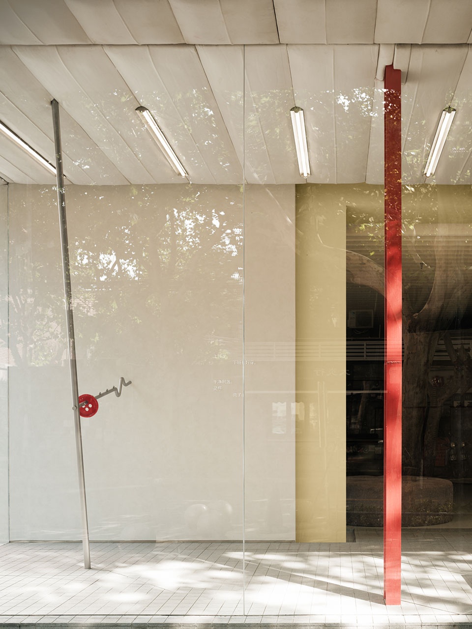
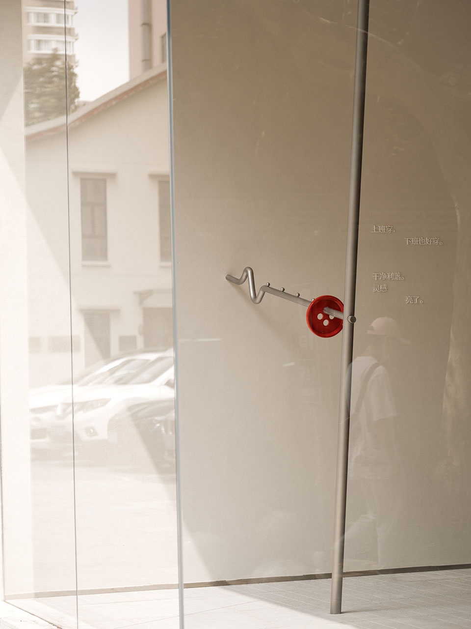
▼拉锁形状的试衣间门把手,Zip-shaped door handle for the fitting room © INSPACE
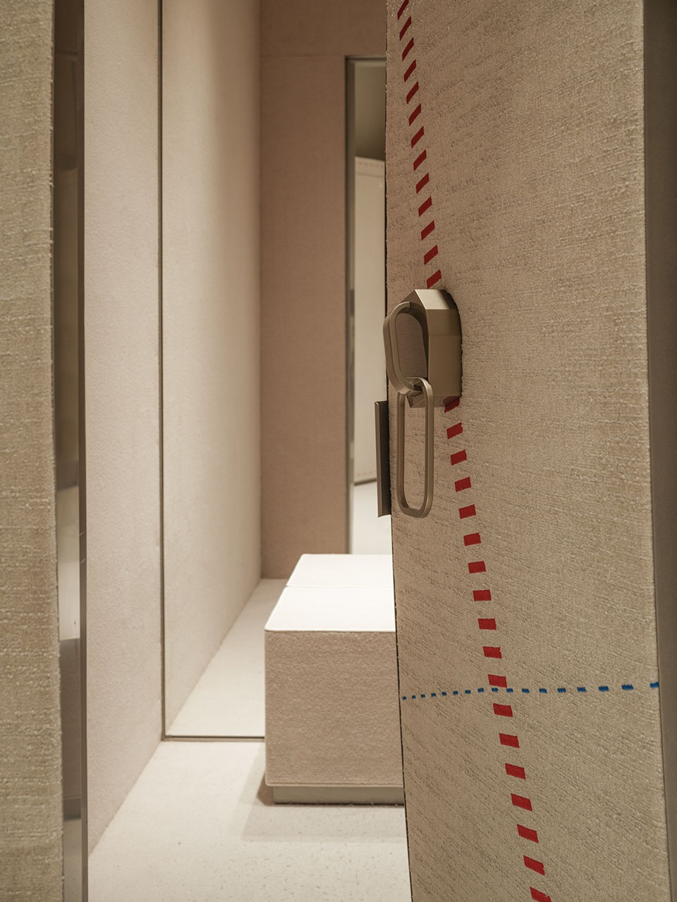
整体而言,等位区和展陈区在色调、材质、形态、尺度等方面形成鲜明对比:石材与布料、浅灰与米白、硬朗的线条与随性的曲面、规整的比例与迂回的动线,使前者成为功能、风格和主题三重层面意义的过渡区域,有效衔接起室内外活动的同时通过改变观感、触感和体感进而改变人的行动意向。
The waiting area and the product display area are in sharp contrast in terms of palette, material, shape, and scale — stone versus fabric, light grey versus off-white, straight lines versus curved surfaces — allowing the former to become a transitional area of functions and styles, connecting the interiors to the exteriors, while guide the customer behaviours by the shifting of views and touch.
▼展览区和等位区对比,Contrast between product display area and waiting area © INSPACE
重写本:旧物痕迹
Palimpsest: the traces of the past
利用看似不经意的设计巧思改变人们对传统职业装所持有的“廉价”、“粗糙”、“千篇一律”等刻板印象以及制服本身所暗含的强制性和约束性,是小着所致力探索的领域;店铺设计中的一系列趣味性元素正是为反映这一理念,激励人们自发地参与到空间当中。项目改造的过程同样充满惊喜,原本枯燥的踏勘工作也为我们带来了一些关于建筑的思考。
场地年龄较大,在反复拆改重建的过程中产生了一些奇怪的“交接点”,这让我们联想到由赤瀬川原平等日本艺术家开创、上世纪80年代风靡一时的概念艺术形式——“超艺术托马森” (超芸術トマソン hyperart Thomasson),意指“毫无用处、无法解释却真实存在的文物或结构被保留为建筑或已建成环境的一部分而成为艺术品”。
Xiaozhuo is committed to break the stereotypes of “cheap”, “rough” and “one-size-fits-all” on traditional business attire, as well as the mandatory and restrictive nature of business uniform itself, by using seemingly inadvertent design. A series of fun elements in the shop are direct response to this commitment and encourage people to interact with the space spontaneously. The process of project renovation is also full of surprises.
Due to repeated demolition and reconstruction throughout its history, strange “junction points” surface on the original old building, which remind us of the art form “hyperart Thomasson”, referring to “useless, unexplained but real artifacts or structures preserved as part of architecture or the built environment as works of art”, created by Japanese artist Genpei Akasegawa and popularized during the 80s.
▼施工过程中令我们联想到”超艺术托马森“的物品,Objects that remind us of “hyperart Thomasson” during the construction © INSPACE
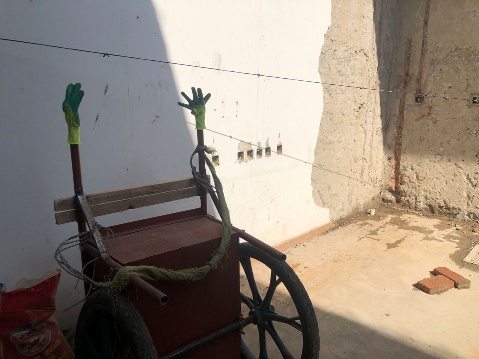
受此启发,我们的改造思路并不是最大程度清除老旧部件或刻意规避原始结构的露出,反而是通过改变颜色或材质让它们成为更加跳脱醒目的存在,为空间增添了不少趣味性。
Therefore, our idea of renovation is not to remove the old parts or deliberately avoid the exposure of the original structure, but to allow them to stand out by changing the colors or materials, adding a lot of fun factors to the space.
▼红色钢柱、黄色混凝土梁柱、紫色立柱、灰色过梁为场地原有结构,The original structure of the building is comprised of red steel columns, yellow concrete beams, purple columns, and grey lintels © INSPACE
任何改造建筑都可以被看作一部“重写本” (palimpsest) 或是拥有独立进化史的有机体,我们既希望参与书写其进程又敬畏地保留一些痕迹,借由这些在时间里二次曝光的建筑物件,与观者分享我们最初发现它们时所感受到的愉悦。
建筑功能与形式的分裂是“现代城市的根本特性”,“导致了现代城市以前所未有的速度和强度跃迁”。本案中,我们从改造策略、空间性质形态、功能分区、内外肌理、色彩搭配、细部装饰等多个节点起步,不同元素的混合并置形成衔接得当的设计闭环,帮助用户在空间的分层、扭转、拉伸、留白与反射之间获得动态的空间体感。对品牌所代表的生活方式做出回应的同时,我们希望设计能增强城市的活性,由“缝合处”分泌灵感。
Any renovation can be seen as a “palimpsest” or an organism with its own evolutionary history, we want to participate in the writing of its progress and retain some historical traces in awe, through which we share the joy of discovery.
The split between architectural function and form is “the fundamental characteristic of modern cities” and “leads to transformation of modern cities with unprecedented speed and intensity”. In this project, we started from renovation strategy, spatial nature and form, functional division, internal and external texture, color matching, and detailed furnishing, creating a dynamic sense of space with a mixture of elements connected with consistency. While we respond to the lifestyle championed by the brand, we hope that the design can enhance the vitality of the city and generate inspiration from the “seam”.
▼紫色立柱细部,detail of the purple columns © INSPACE
项目名称:小着高级体验店
项目位置:上海
项目状态:建成
建筑面积:300 m²
设计单位:F.O.G.建筑事务所
设计团队:邹德静、黄莺子、王圣淇、庄少凯、郑宇、詹迪
灯光设计:立本社,张旭
施工单位:上海固勤建筑工程装饰有限公司
道 具:东莞市联威家具有限公司
结构顾问:陶辛未
摄 影:言隅
撰 稿:白勺
Project name: Xiaozhuo Boutique
Project location: Shanghai
Project status: Completed
Size: 300 m²
Design firm: F.O.G. Architecture
Design team: Zou Dejing, Huang Yingzi, Wang Shengqi, Zhunag Shaokai, Zheng Yu, Zhan Di
Lighting design: Liben Design, Zhang Xu
Construction: Shanghai Guqin Construction Engineering Decoration Co., Ltd.
Furnishing: Dongguan Lianwei Furniture Co., Ltd.
Structure consultant: Tao Xinwei
Photography: INSPACE
More:F.O.G. 建筑事务所。更多关于他们:F.O.G. Architecture on gooood








虽然不喜欢这种质感表达,但不可否认很有创意
这醒目的红色很伯纳德·屈米
红色是贯穿的线吗
细节蛮个性化,红色元素的插入很棒
帆布作为界面材质很有意思。缝合空间的概念感觉有些牵强,看起来空间中只是有线型的衣架和巨大纽扣,作为糊弄业主的话语或许还算可以。
小细节很有意思
奶油色是甜美想象的首选
门头那个方布袋子发霉的一塌糊涂。
cancan
真的假的?给咱发一个现场照片
大众点评也能看到