非常感谢 B.L.U.E. Architecture Studio 予gooood分享以下内容。更多关于他们:B.L.U.E. Architecture Studio on gooood.
Appreciation towards B.L.U.E. Architecture Studio for providing the following description:
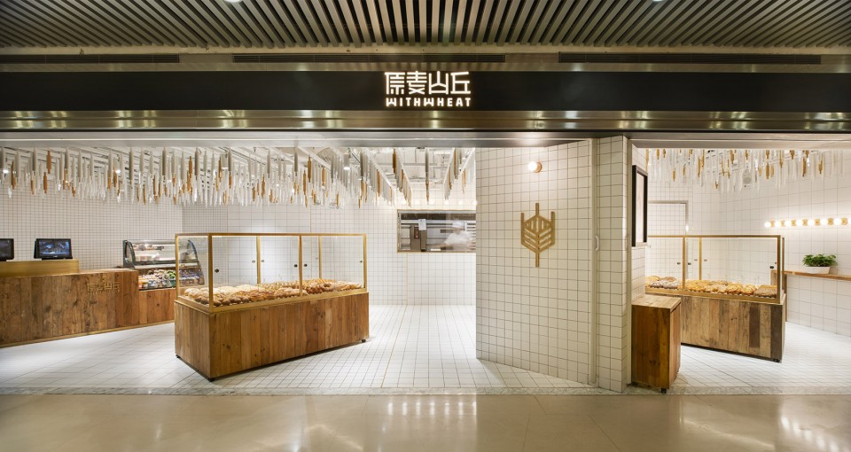
原麦山丘华贸店的设计突破了以往以木色为主的素雅古朴的格,通过白色瓷砖,白色擀面杖,金属黄铜与老木板,来营造出纯净明亮的白色空间。 六种规格的白色瓷砖将墙面划分为7块区域,地面与墙面相对应,使用相同规格的材质。而不同规格瓷砖之间的拼接缝使用了黄铜条进行收边处理。白色瓷砖的洁净与黄铜条的简约相得益彰。
To create pure and bright interior space, white tiles, white rolling pins, brass and old planks are chosen to be main materials of this project. This is a breakthrough of the original unsophiscated style with wooden color tune. Surfaces of the wall are divided into seven different zones with six different sizes of white tiles. The same measurement is used on the surface of ground. Brass is used on the margin of different kinds of tiles. The purity of white tile and simplicity of brass stripe works together to improve indoor atmosphere.
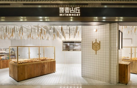
▼面包店入口,entrance of the bakery
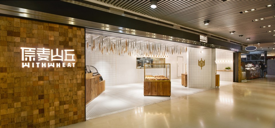
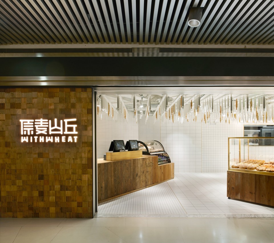
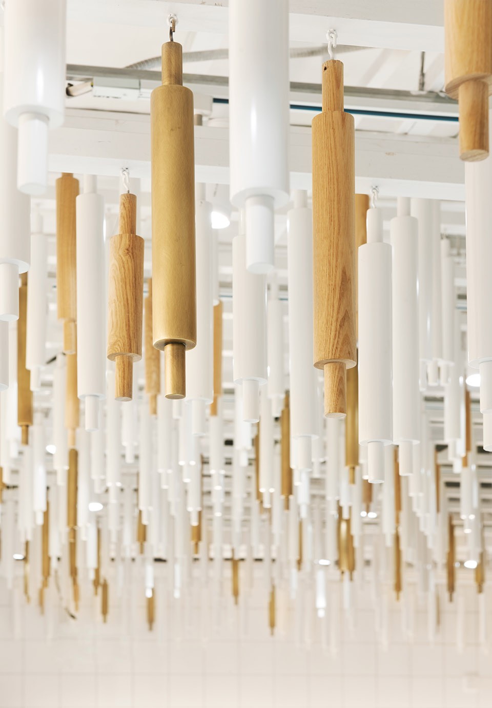
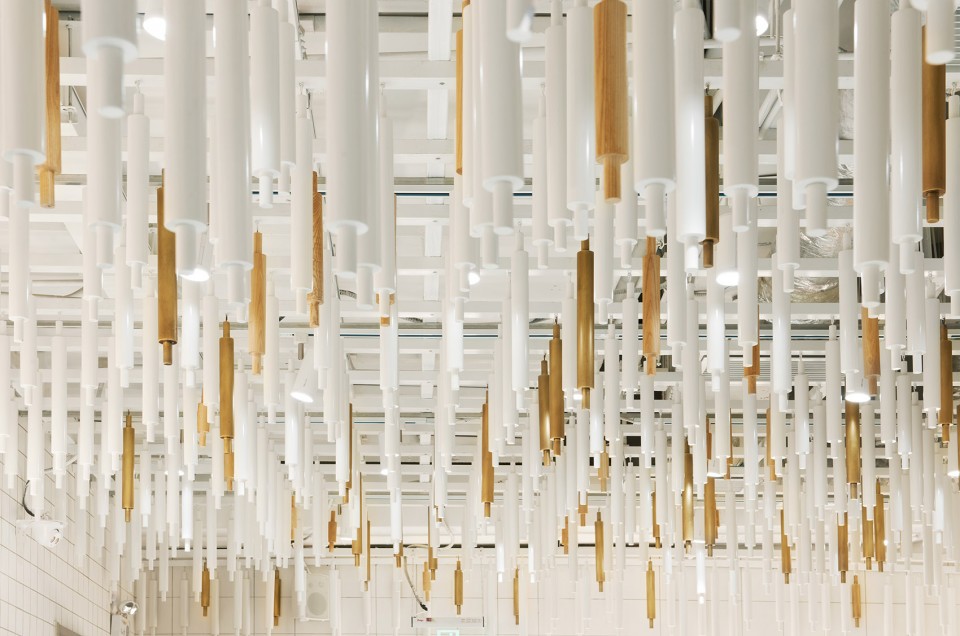
天花使用短不一的擀面杖进行悬挂,分三种不同的材质:白色,木色和金属黄铜的颜色,其中以白色擀面杖为主,以呼应室内明亮干净的整体氛围。而擀面杖作为设计元素,也从视觉上呼应了原麦山丘的烘焙文化。室内家具全部使用老木板作为主材,木板本身所具有的柔和色彩、特殊质感以及天然纹理非常自然地融入到空间中去,展现出一种纯粹、清新之美。 入口处的logo墙同样使用了相同大小的老木板进行拼接,利用凹凸去制造不平整表面,突出了老木板原生态的自然之美,也呼应了整个室内的设计风格。
Rolling pins with different length are hung from the ceiling as an element to reflect baking culture of WITHWHEAT visually. To be suited with the bright interior, most of the rolling pins are white well others are wooden colored and brass colored. All the indoor furniture is mainly made of old flanks. Gentle color tune, special texture and natural grain of old timber gives the space a feeling of purity and refreshing. Same old flanks are also used to make a logo near the entrance. The uneven surface of flanks gives a primitive atmosphere, which suits the design style.
▼三种材质的室内空间,interior space with three materials, rolling pins hung from the ceiling
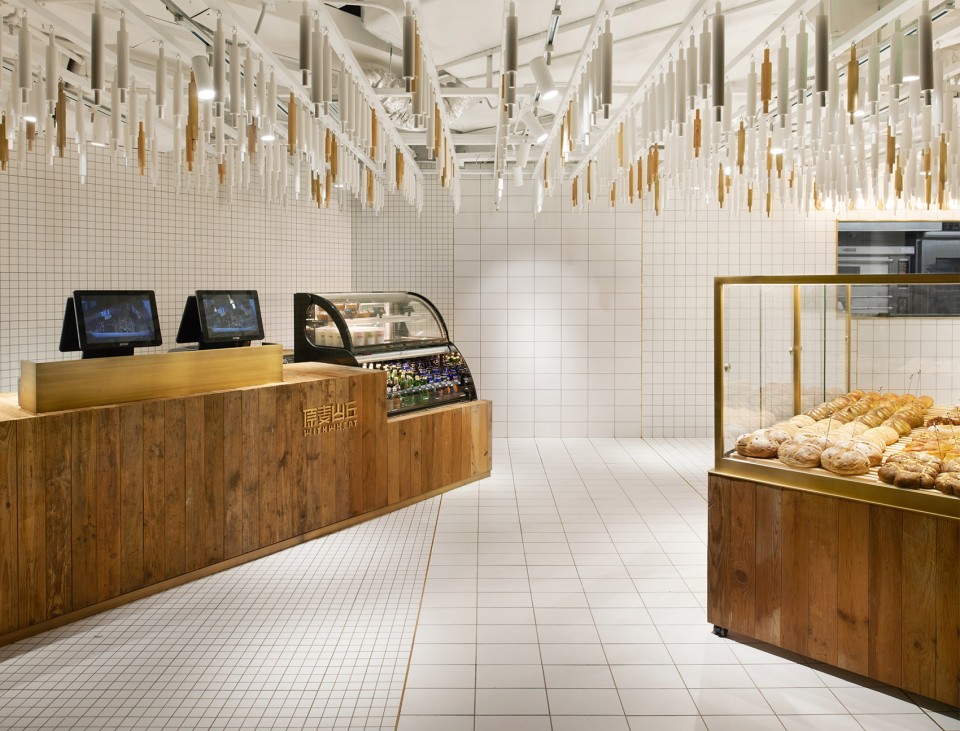
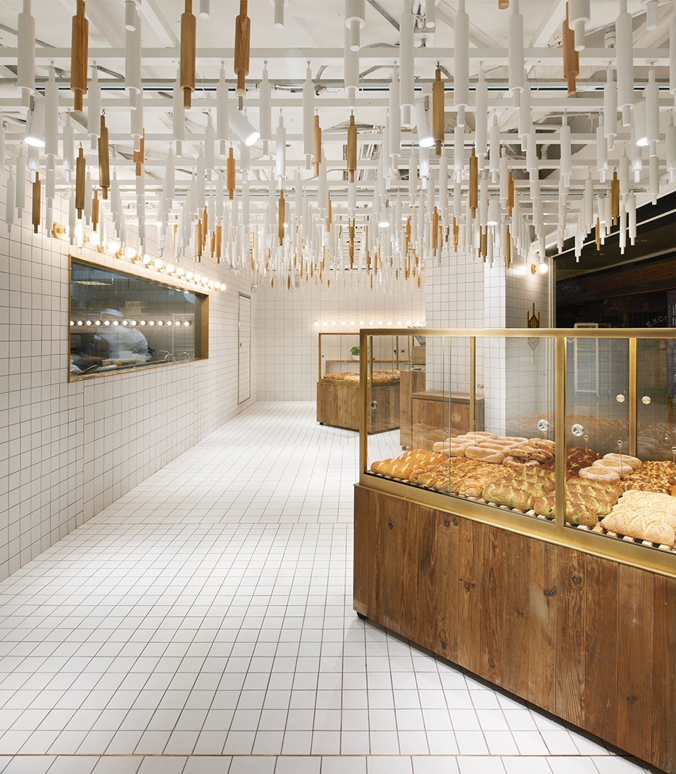
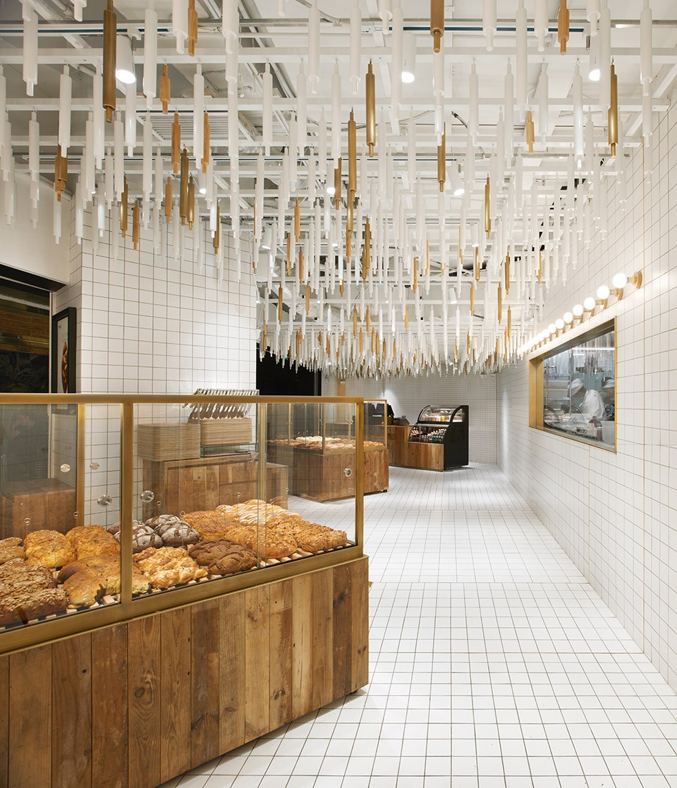
无论是简单的空间划分,还是折线形的空间布局,甚至到选材,都是 去除了多余的设计语言与装饰,着重表现材质本身的肌理,颜色和质 感,给顾客带来舒适自然的体验。
Redundant design languages and ornaments are eradicated in the aspect of division of space, layout and material. Different spaces are divided simply and located following a folded line. Stressing natural grain, color and texture of material is the main consideration. As a result, customers will have a comfort experience.
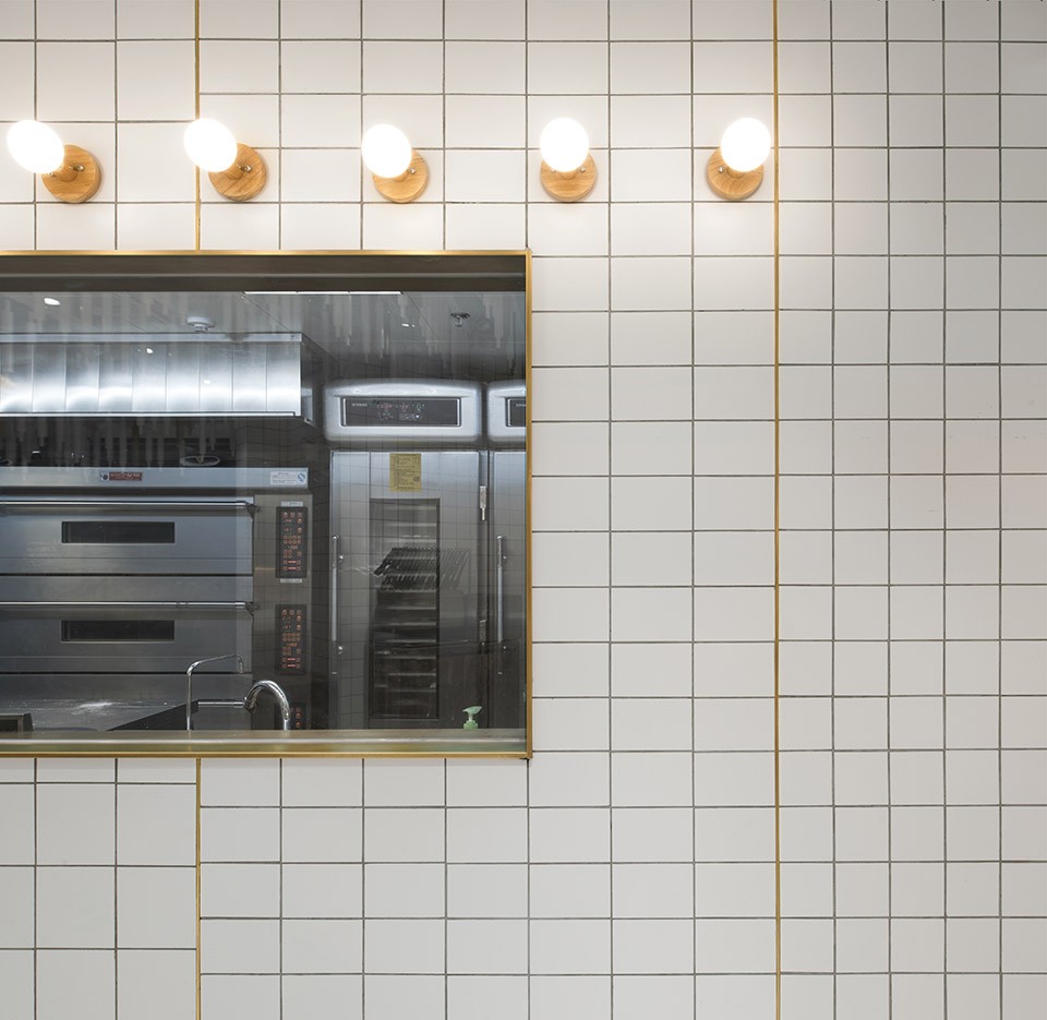
▼厨房,kitchen
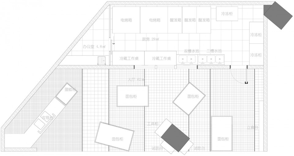
▼平面图,plan
项目名称:原麦山丘 北京华贸店
项目所在地:北京市华贸中心地下一层
项目类型:店铺
建筑师:青山周平,藤井洋子,杨易欣 / B.L.U.E.建筑设计事务所
业主:原麦山丘
建筑面积:98平米
设计周期:03.2016 – 05.2016
施工周期:06.2016 – 07.2016
摄影师:锐景摄影
Project name: UMASSIF/WITH Huamao Bakery in Beijing
Project location: Huamao Center, Beijing, China
Programme: Bakery
Architects: Shuhei Aoyama,Yoko Fujii, Yixin Yang / B.L.U.E. Architecture Studio
Client: UMASSIF/WITH
Building area: 98 m²
Design: 03.2016 – 05.2016
Construction: 06.2016 – 07.2016
Photographer: Ruijing Photo
MORE: B.L.U.E. 更多关于他们:B.L.U.E. Architecture Studio on gooood.



感觉用不同规格的瓷砖划分空间并不明显啊。。。还是白晃晃一片
擀面杖一挂显得层高有点低?
缝对的不太好
看见天井上的东西就知道是日本人设计的了
感觉为了展示效果而做的设计,有点忽略了项目本身的出发点?作为一个食品店,好像没能激发出对顾客的那种吸引。
全白色太晃眼了,地板用点木质混搭一下可能会更柔和
不过感觉展位不够,未来会在推发更多新产品上造成麻烦。
重要的是这个设计给人基本的干净整洁的整体感受,加上原麦山丘本身的相对的质量保证,所以这应该会吸引很多人去店里的。
感觉是为了做展示空间而作
很一般的设计,我感受不到食物的热情,也激发不出我对产品的渴望
平面功能上个人感觉不够周全,这样面积的面包店不算小,却没有接待客人的休闲区
店里有制作间挺好的,顾客买到的面包是新鲜的,不像有些连锁品牌,为了省房租面积,把面包生产线放在郊区哪个工厂里,然后配送到市区各个店面,这样子的面包肯定不是最好吃的状态了。
有种厕所的感觉
同感
最佳评论。。。
被你一说无法直视233
哈哈,我也觉得
为啥砖和砖之间对不上..