感谢 索拉设计 予gooood分享以下内容。更多关于他们:SORA on gooood。
Appreciation towards SORA for providing the following description:
美研航站,即刻启程
Beauty Station, Get Started
TWEEN-20是一家集医美产品研发、展览、直播、办公、咖啡等美业联合中心;2021年11月始SORA® 负责该品牌的空间导入与空间设计的项目服务,2022年6月TWEEN-20开始投入办公等业务发展使用。
TWEEN-20 is a cosmetic comprehensive center that incudes sections of medical cosmetic products R&D, artistic exhibition, live broadcasting, office area, coffee shop and so forth. Since November 2021, SOAR has been responsible for its spatial introduction and design projects, and in June 2022, TWEEN-20 officially commenced to provide services.
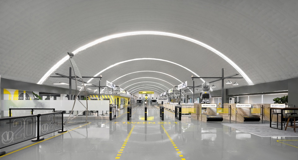
▼项目概览,overall of the project ©YUAN STUDIO
随自然光影变化的“传酶”空间
Communication Space Shifted by Natural Sunlight
在规划空间区域的功能性时,我们了解到TWEEN-20需要容纳集产品研发、展览、直播、办公等多业态于一体时,结合建筑着地25米宽,110米进深的原建筑环境,以及此空间最尤为特别的弧形天花结构,能将日光从各方面充分引进这环形空间,我们提出尽可能保留建筑的原来结构,并以此作为设计方向去进行,去享用由这弧形建筑引进的光影时刻。
▼分析图,axonometric diagram ©SORA
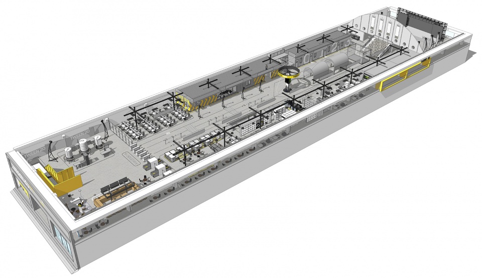
When designing the functional areas, we learnt that TWEEN-20 contained different sections like medical cosmetic products R&D, artistic exhibition, live broadcasting and office area. We reserved the original design as much as possible of this building – a construction with an area of 25m width, 110m length and an arched roof, which enabled us to make full use of the sunlight. We created a space where you could enjoy natural lighting.
▼入口闸机,entrance gate ©YUAN STUDIO
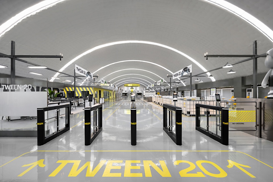
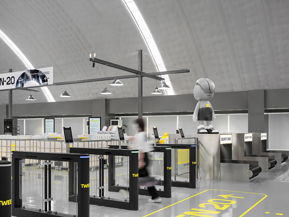
▼入口闸机细部,details of the entrance gate ©YUAN STUDIO
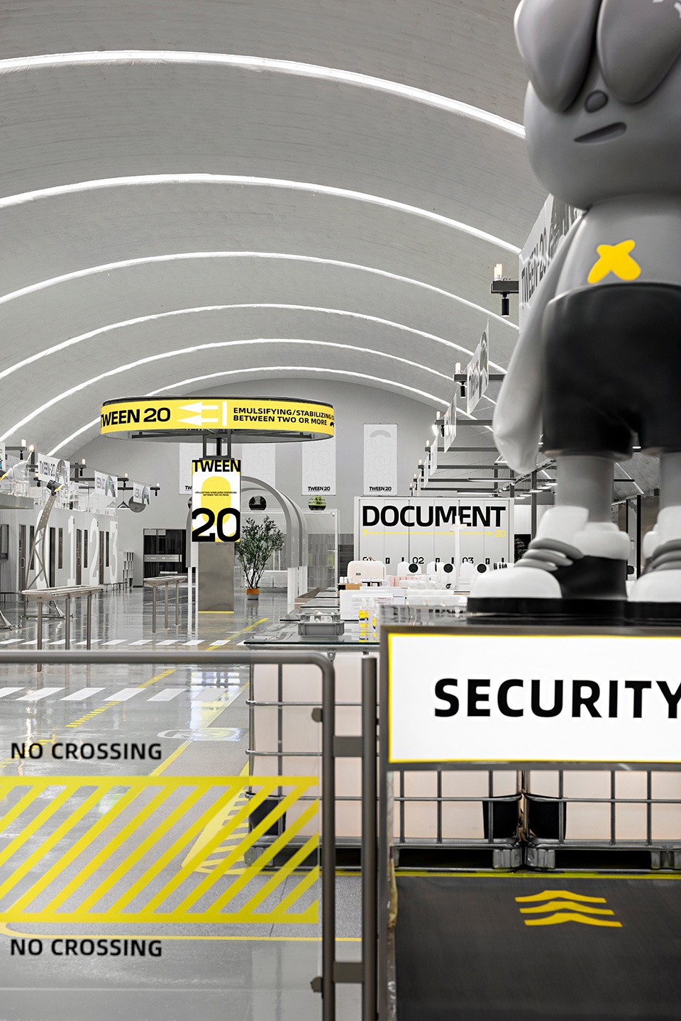
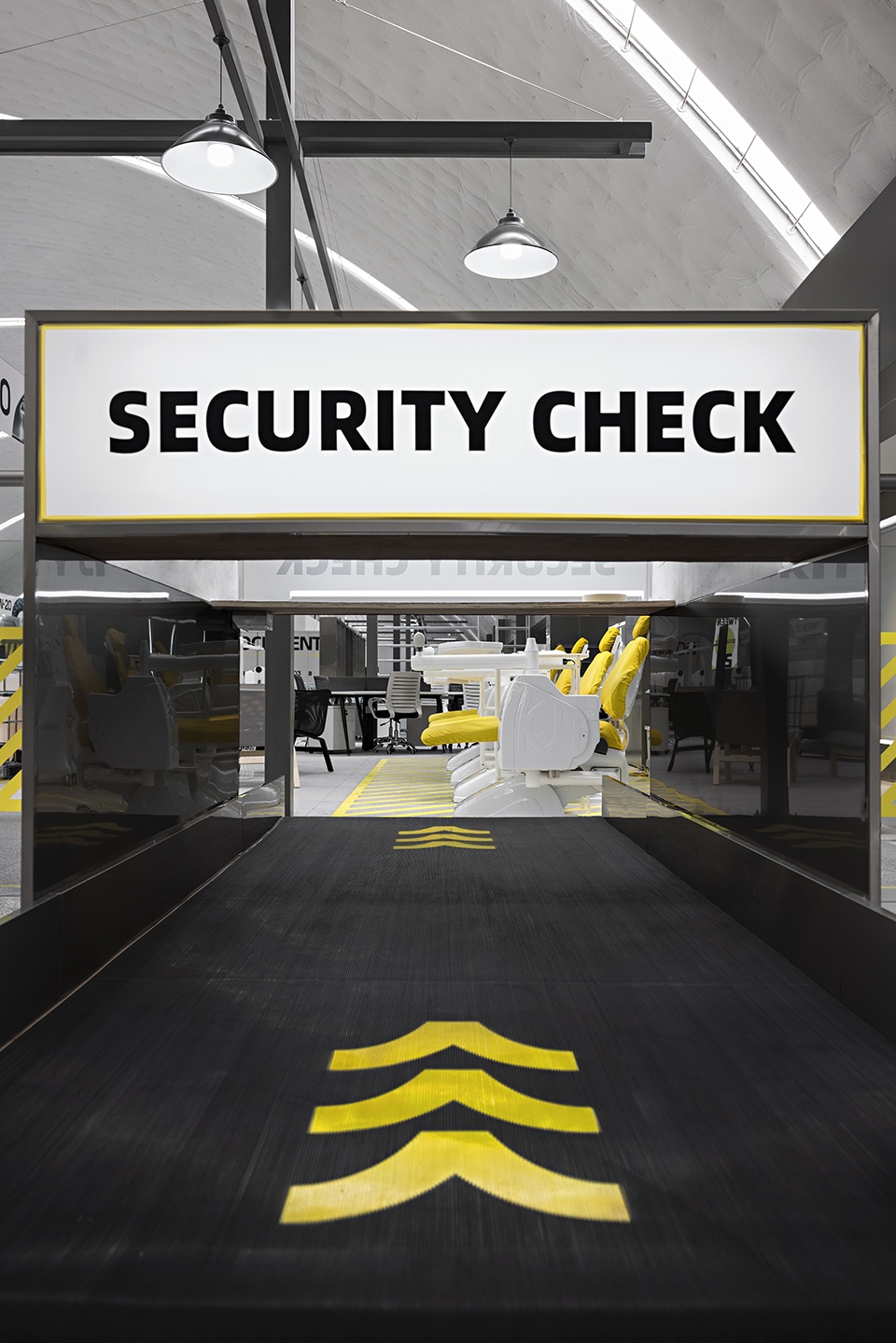
在设计过程中了解到品牌对于医美产品的研发如同航空工程般精细的专业态度,因而设计灵感提取自「航空登机站」,打造整洁有序与现代科技感的空间风格,以及能够承载建筑空间本身造型与体量的独特性。
We are inspired that the R&D process of medical cosmetic products are very meticulous and professional, just like aeronautical engineering, and came up with the concept of “aeronautical boarding station”. We believe a tidy and modern spatial design will stress the uniqueness and characteristics of this brand.
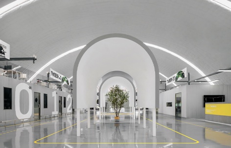
▼中庭,central area ©YUAN STUDIO
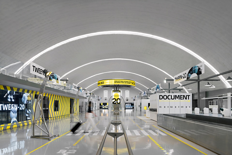
▼由文化长廊看灯柱与直播间,lampstand and broadcast room ©YUAN STUDIO
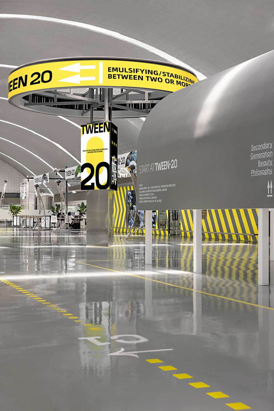
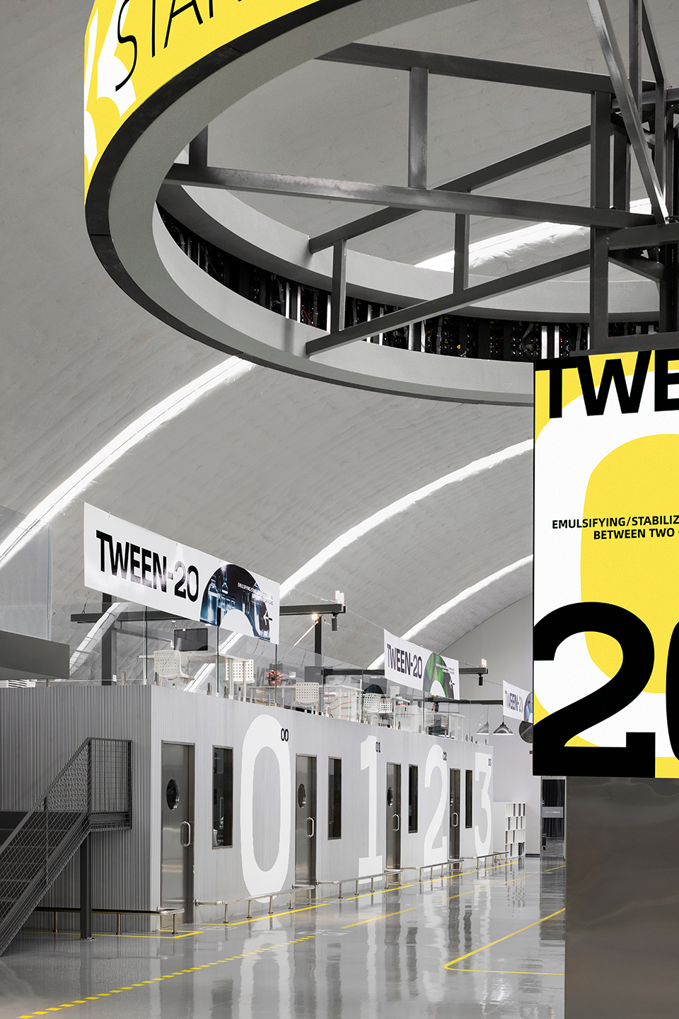
▼整洁有序与现代科技感的空间风格,tidy and modern spatial design ©YUAN STUDIO
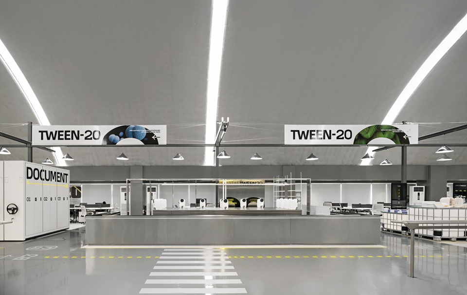
▼中庭一侧的收纳柜,storage cabinets ©YUAN STUDIO
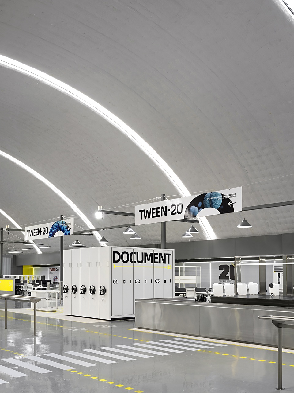
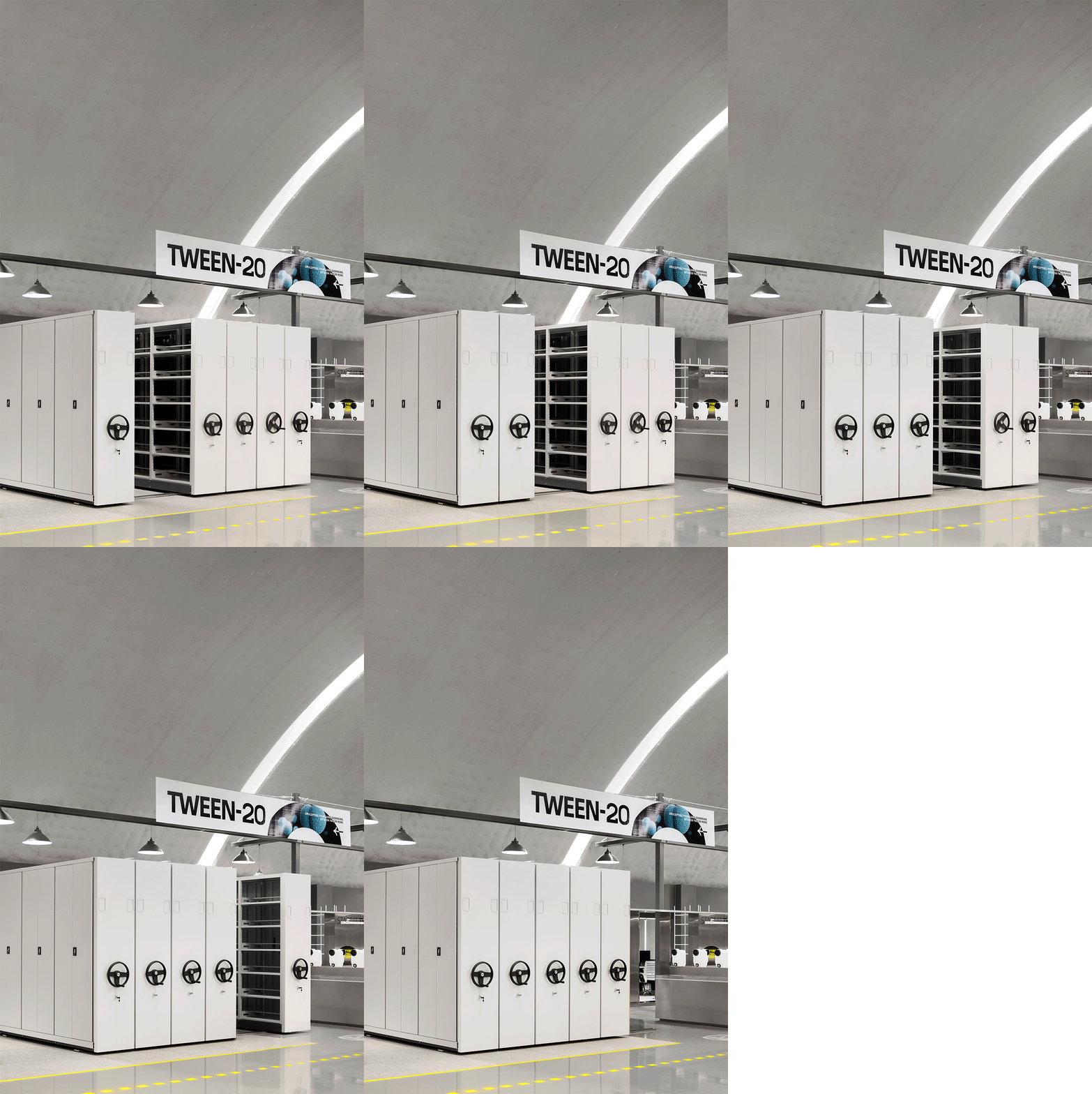
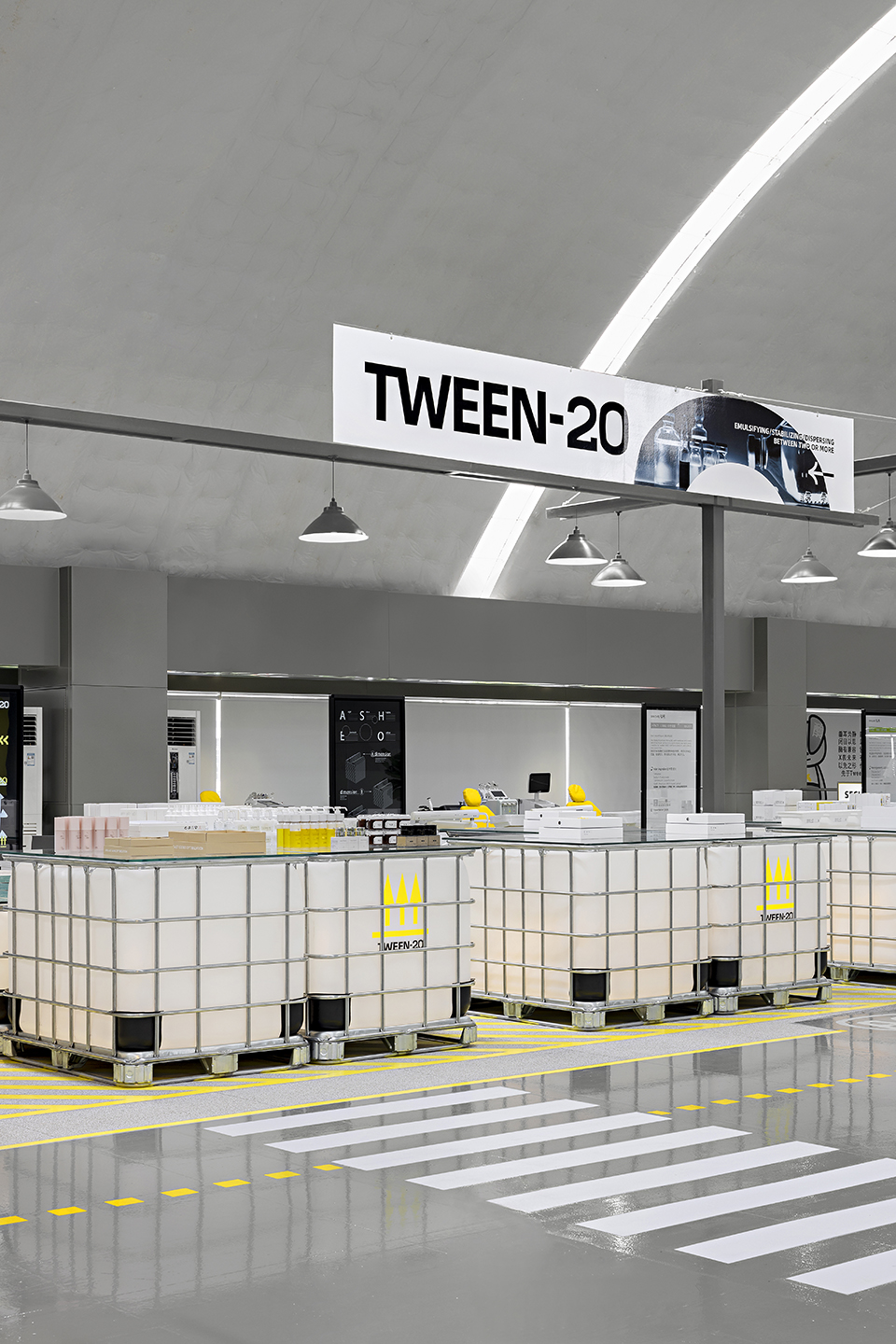
▼收纳与产品展示,storage and product display area ©YUAN STUDIO
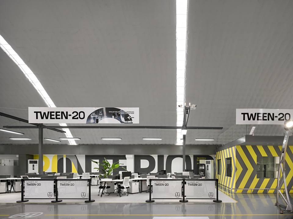
▼办公与会议区,office and meeting area ©YUAN STUDIO
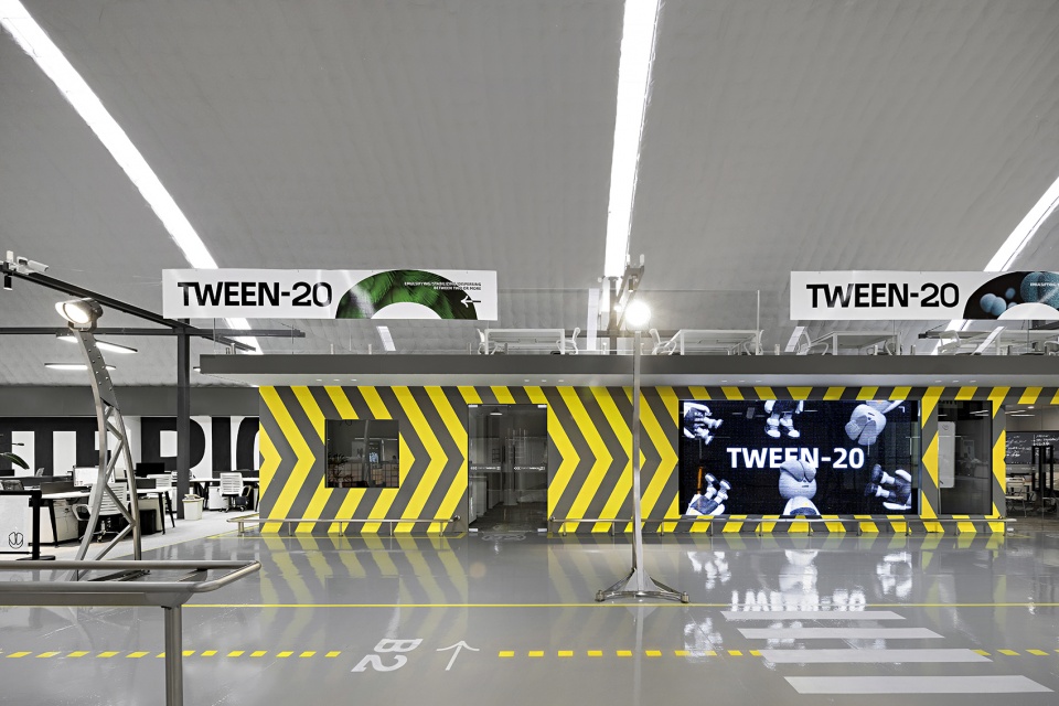
解构航站楼特有的区域功能去作为TWEEN-20的空间手法,例如:咖啡区对应的登机手续办理台与候机厅、中间软屏装置对应的航班信息播放装置等,希望让一众美业工作者在此能够开放的交流,合作与创造更美好的共享办公氛围。
We brought station-featured functional areas into the spatial design of TWEEN-20, for example, a coffee bar similar to check-in counter, and a LED board displaying flights information, etc. In this open space, cosmetics practitioners could gather, communicate, collaborate and together create beauty.
▼居于中央的美容室,beauty room in the center of the play ©YUAN STUDIO
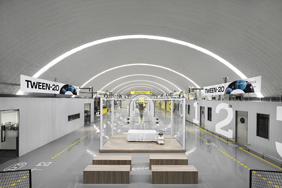
▼面对美容室的开放式直播间,open broadcast room facing the beauty room ©YUAN STUDIO
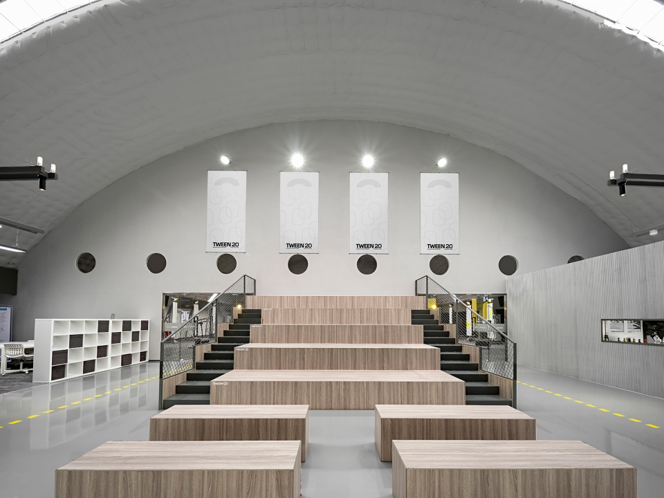
▼文化长廊,cultural corridor ©YUAN STUDIO
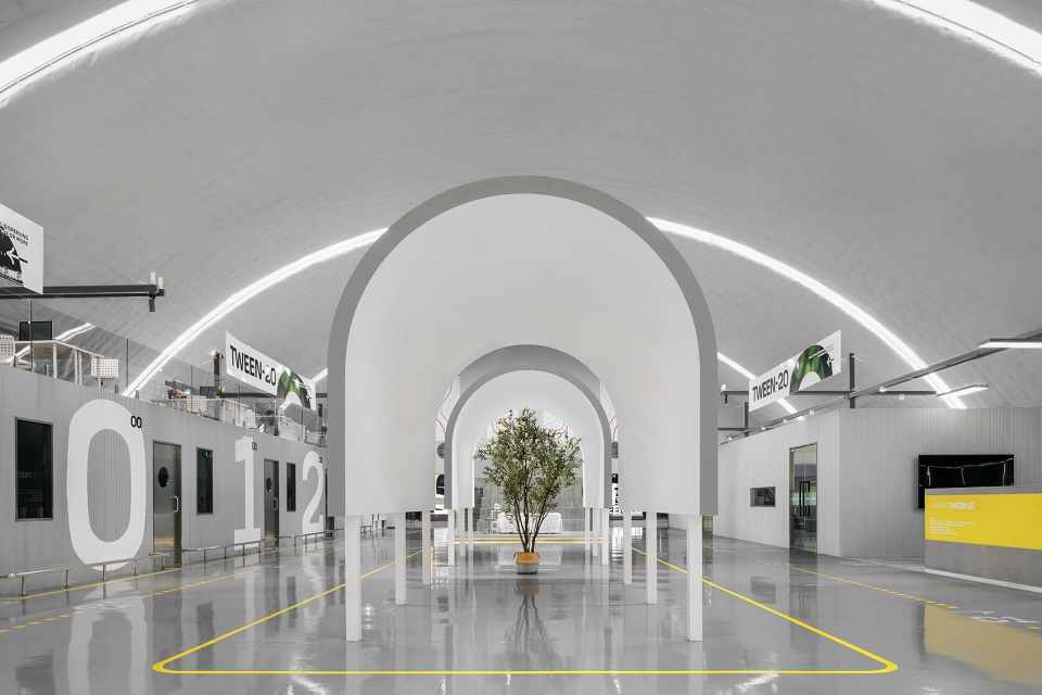
▼文化长廊细部,details of the cultural corridor ©YUAN STUDIO
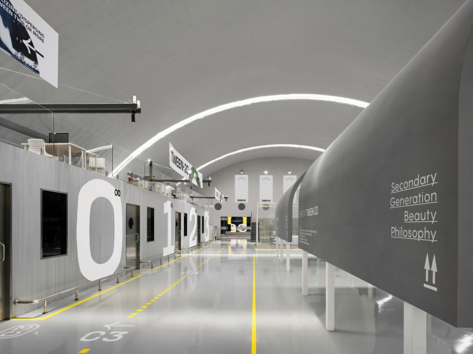
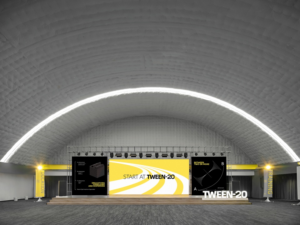
▼演播厅,studio ©YUAN STUDIO
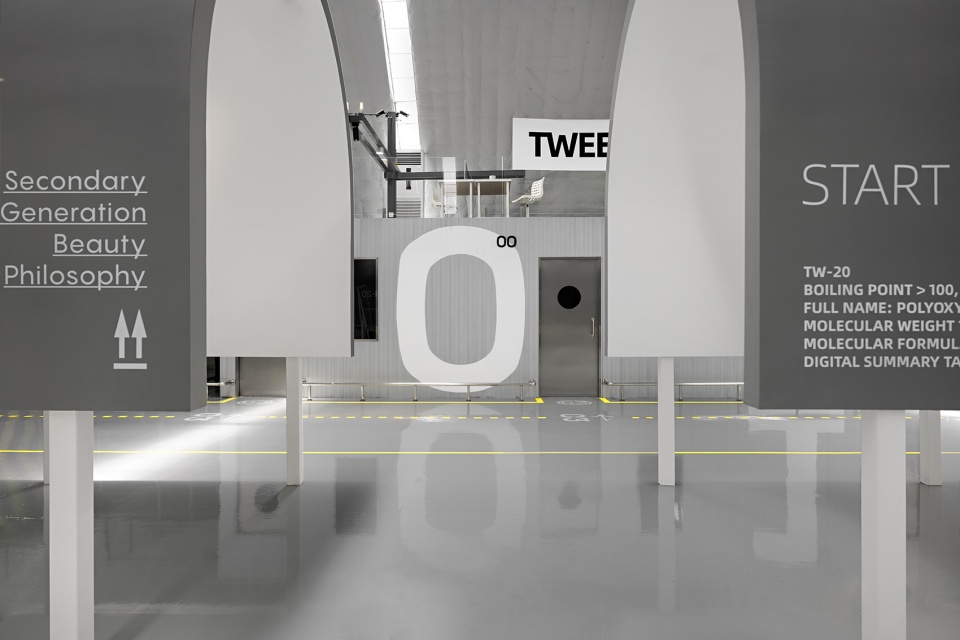
在空间导入的视觉呈现上,我们围绕空间设计的概念「航空登机站」进行构思,以机舱窗户亦方亦圆的型状特点作为灵感,转化成TWEEN-20字体与辅助图形的设计语言,同时也呼应回空间特有的弧形天花结构,增强空间—概念—视觉三者之间的关联性;另外在视觉设计中我们运用的箭头符号与数字编号,为其开阔的空间标示出明确的动线引导,进一步强调空间的秩序与科技感。
As for visual presentation of spatial introduction, our design was based on the concept of “aeronautical boarding station”. We transferred the shape feature of aircraft windows – could be both circular and quadrilateral, into the logo design of TWEEN-20, which responded its arched roof and further strengthened the relationship among space, concepts and visuality. In addition, we utilized symbols like arrows and numbers, which will both explicitly divide different functional areas and underpin the sense of technology as well as order in this space.
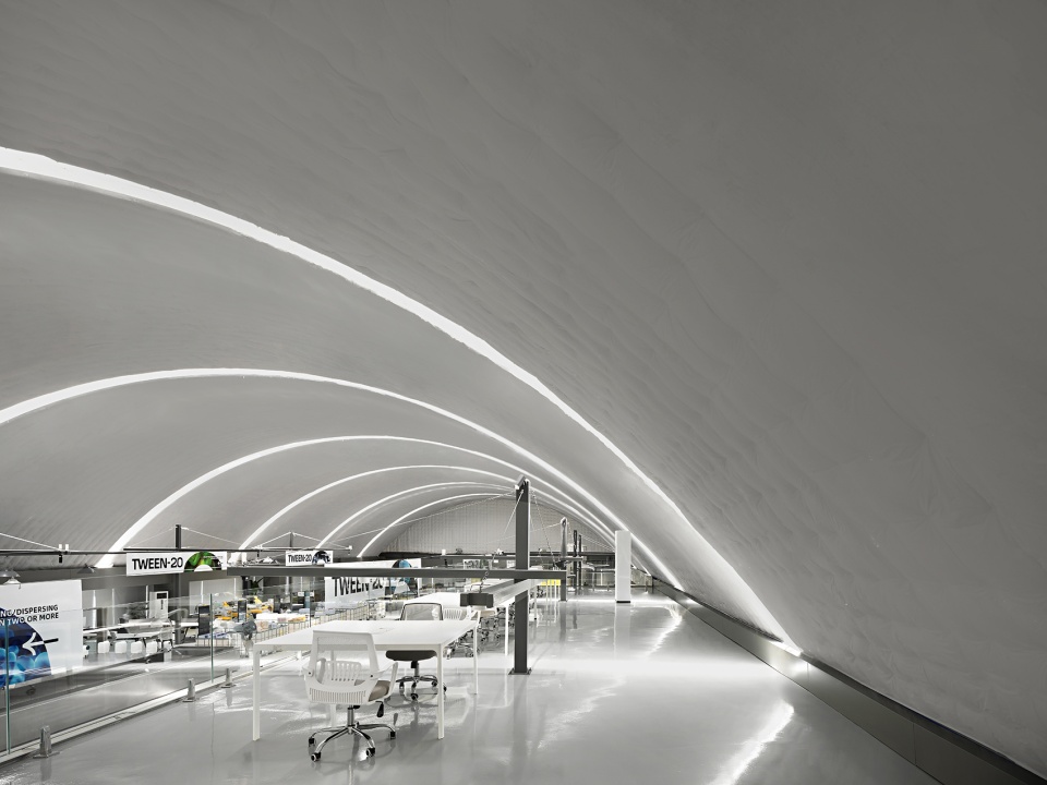
▼二层办公室,office on the upper floor ©YUAN STUDIO
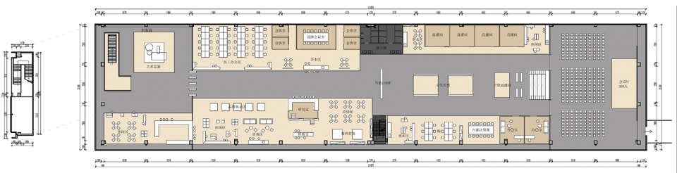
▼平面图,plan ©SORA
项目名称:TWEEN-20
项目类型:办公建筑
设计方:SORA
公司网站:www.sorabrand.com
联系邮箱:info@sorabrand.com
项目设计:2021
完成年份:2022
设计团队:SORA
项目地址:广东省广州市白云区
建筑面积:3000㎡
摄影版权:YUAN STUDIO
客户:TWEEN-20
材料:铝材、不锈钢、亚克力
More: 索拉设计 更多关于他们:SORA on gooood


我们围绕空间设计的概念「航空登机站」进行构思,以机舱窗户亦方亦圆的型状特点作为灵感,转化成TWEEN-20字体与辅助图形的设计语言,同时也呼应回空间特有的弧形天花结构,增强空间—概念—视觉三者之间的关联性;另外在视觉设计中我们运用的箭头符号与数字编号,为其开阔的空间标示出明确的动线引导,进一步强调空间的秩序与科技感。
不错,就是公司名字有点奔放的感觉(*/ω\*)
酷