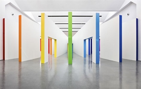
非常感谢Fabio Novembre将项目介绍和项目图片授权gooood发行。更多请至:Fabio Novembre on gooood
Appreciation towards Fabio Novembre for providing the following description:
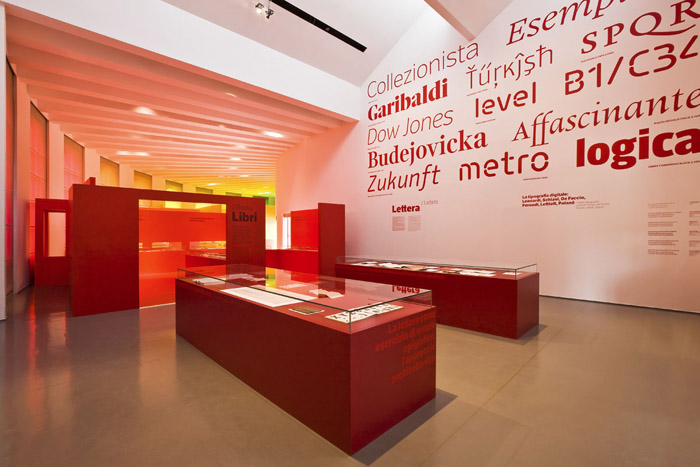
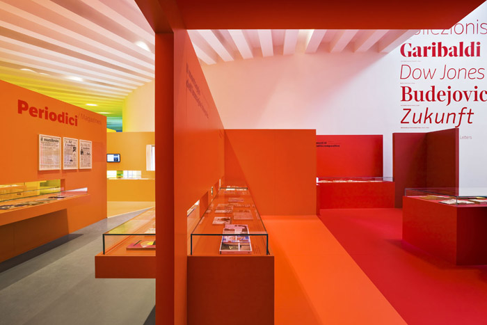
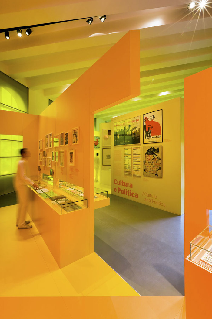
Fabio Novembre 工作室为米兰设计三年展设计了一个以色彩为主导引领游客参观的活动展览。展览一共分为9个部分:书籍,信件,杂志,文化和政治,包装,广告,视觉识别,视频和交通标识。这9个内容被分为9个区域在博物馆中进行展出。
缪斯是希腊神话中的9个女神,设计师的灵感也由此而来,希望创建一个神圣的场所,一条虹桥从人间连接到这个天堂圣地,这里有9个区域,和缪斯9女神的数量不谋而合。
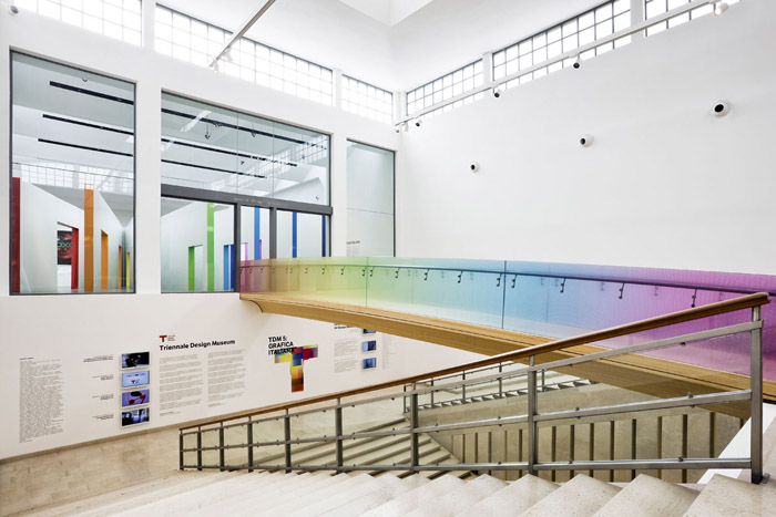
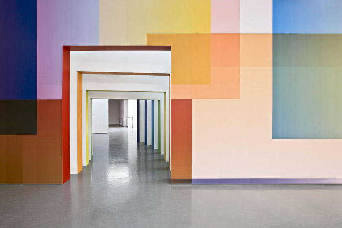
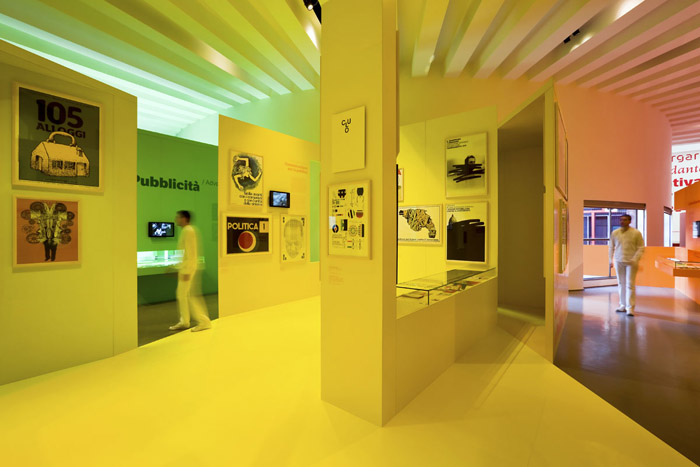
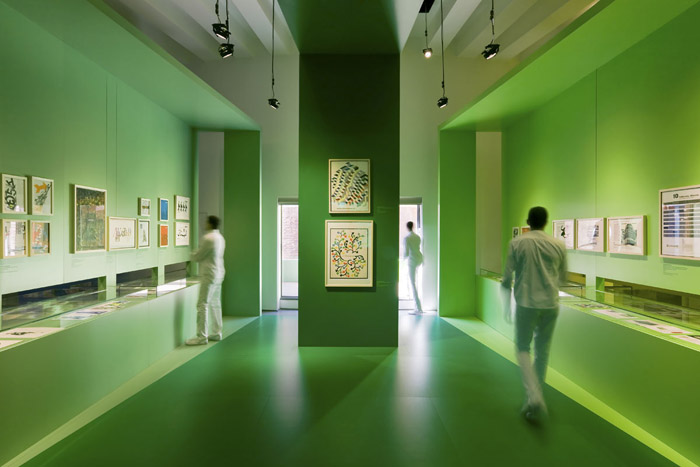
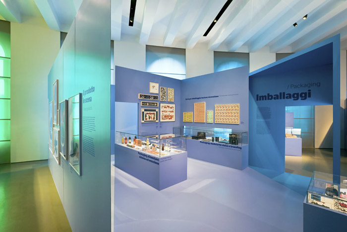
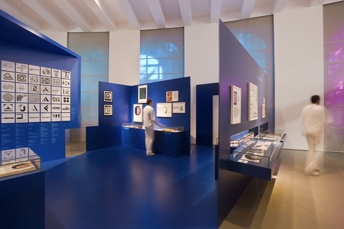
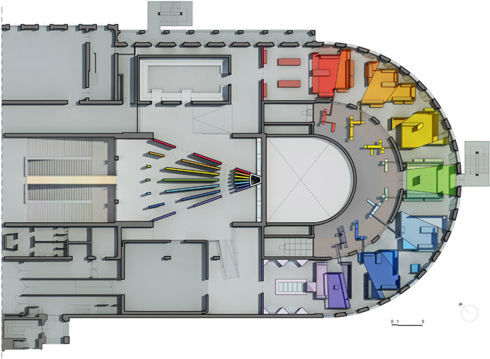
这样的展览概念无疑是创新,实现过程也异常艰辛。设计师从书页被翻状态作为入口主要空间,书页之间是相同的,同时也与主要展览空间联系,人们可以在这里选择要去的方向。从紫色到红色的彩虹象征涵盖生命和知识。展览空间的色彩也是彩虹式过渡。画一道连接天地的虹,我们依旧是我们,脚踏土地仰望星空。
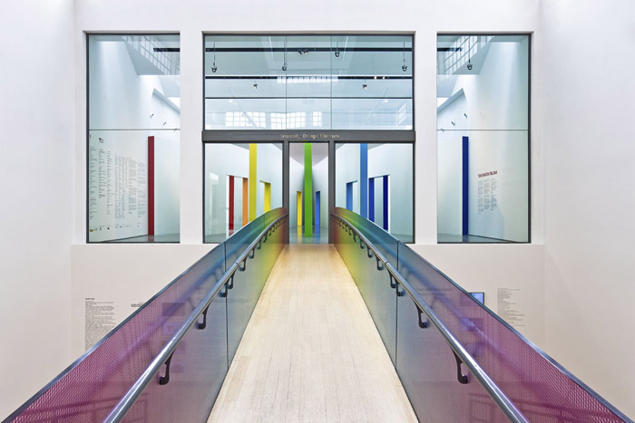
It takes wisdom and cunningness to construct a sacred place for the Muses: Heaven and Earth must be connected along an intangible pathway of the kind created by Iris and then book must be envisaged big enough to enclose the history of the world divided up into nine sections, the same number as the inspiring daughters of Zeus and Memory.
Protecting the arts and sciences in our times is no mean feat, so for this fifth edition of the Triennale Design Museum it has taken plenty of human endeavour alongside the intervention of the Muses.
In agreement with the curators, the Director originally opted for an authentic mythological figure to design the spaces for this edition, Enzo Mari, who was forced to decline due to an indisposition, leaving it up to yours truly to take on this Herculean task.
It involved exhibiting something absolutely new compared to previous editions, a selection of carefully chosen items confirming the theory that there is only one Italian school of graphics, even though it has no proper structure, hardly surprising since the same could be said about everything connected with our dear old unpredictable country.
I was asked to add a third dimension to what was almost completely two-dimensional material, construing while playing only a supporting role.
I decided to begin with the blank pages of a book, studying their physical structure and filling them with life in motion, setting their contents in various sections spread along a careful path.
Sections deriving from that Platonic solid associated with the Earth, the cube, cutting it up and breaking it down to trace a labyrinth, like some new Daedalus, conjuring up an initiatory as well as celebratory experience.
Arianna and Iris offered to help visitors by providing them with a coloured thread to follow, stretching from infrared to ultraviolet, so as to encompass the entire meaning of life and knowledge. Attempting to bring together a Newtonian approach, represented by the scientific side of curatorship, with my own personal passion for Goethe’s sentimental approach to the issue of colour. Using colour as an authentic graphic hypertext to support material, which, nevertheless, require more complex codes in order to be fully interpreted.
Drawing a rainbow to connect Heaven and Earth in that constant state of human balance we maintain with our feet in the mud and head up in the stars.
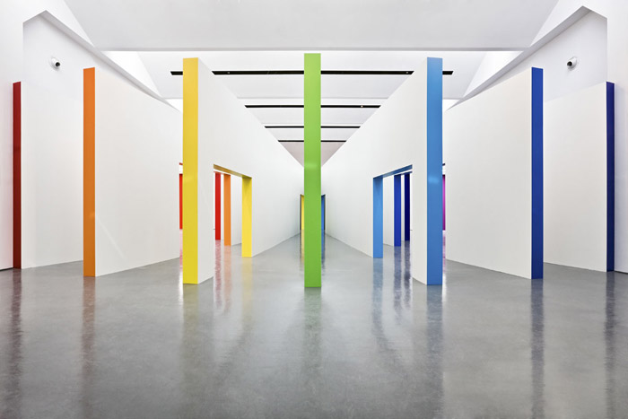
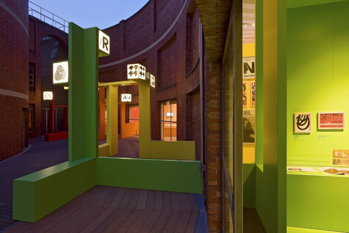
The rainbow labyrinth: seven sections made with a wooden structure covered with
high-pressure laminates in 21 different colours, from red to violet. All the
graphic materials are protected with tempered glass boxes. The aviary of the logos
(outside area): seven structures covered with high-pressure waterproof laminates
(Arpa industriale) in seven different colours, with 23 backlight logos each one
with a different sound.
project name : TDM5: GRAFICA ITALIANA
location : Triennale Design Museum
client : Triennale di Milano
exhibition design : Fabio Novembre
design team : Dino Cicchetti, Patrizio Mozzicafreddo, Giorgio Terraneo
scientific curator : Giorgio Camuffo, Mario Piazza, Carlo Vinti
graphic design : Leftloft
sound design : Saturnino, Sound Identity
photographer : Pasquale Formisano
contractor : Olgiati s.r.l.
total square : 1000 sqm
opening : 13April 2012 (until 24 February 2012)
special structures : Entrance, the big white book: seven structures (4 meters of height) covered with high-pressure laminates (Arpa industriale) in seven different colours.
MORE: Fabio Novembre,更多请至:Fabio Novembre on gooood





赞
漂亮
喜欢 漂亮
颜色的魅力
咱们网站的文稿能不能核对一下再登出来呢?