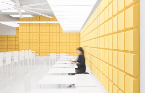
来自Prevalent对gooood的分享。更多请至:Prevalent on gooood
Appreciation towards Prevalent for providing the following description:
SUSURU拉面饺子馆位于一栋建造于1906年的重要建筑中,其设计为建筑立面和街道注入了新的活力。设计团队与纽卡斯尔市政府紧密合作,打造出一个与当地传统美学截然不同的空间。城市的发展吸引了越来越多的国外移民,他们其实与这里的采矿历史没有太多的联系。SUSURU餐厅不仅是为这些新来的居住者而设计,更是为希望见证城市发展与繁荣的长期居民而设计。
Situated in a prominent building from 1906, SUSURU Ramen and Gyoza bar enlivens the façade and street it rests on. Working closely with the City Council, the design breaks away from the traditional mining aesthetic typical of the area. As the city grows and develops, it attracts more foreign attention, whom don’t necessarily have the same rapport with what was largely a mining town many years ago. The SUSURU restaurant is for the newcomers, for those visiting, and most importantly, for those long term residents wanting to see the city develop and diversify.
▼餐厅外观,exterior view
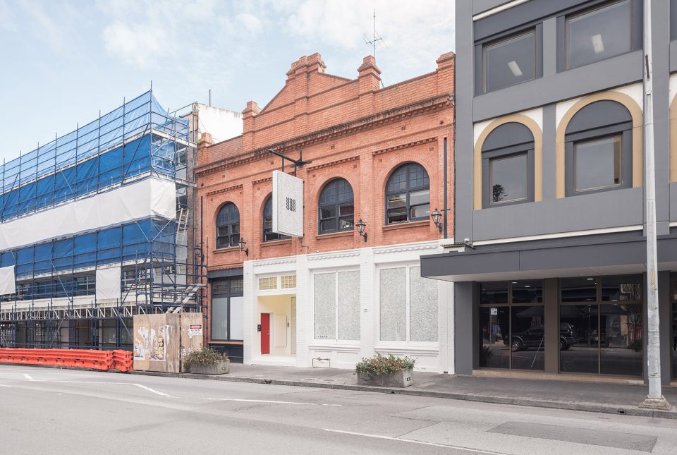
▼临街立面,street facade
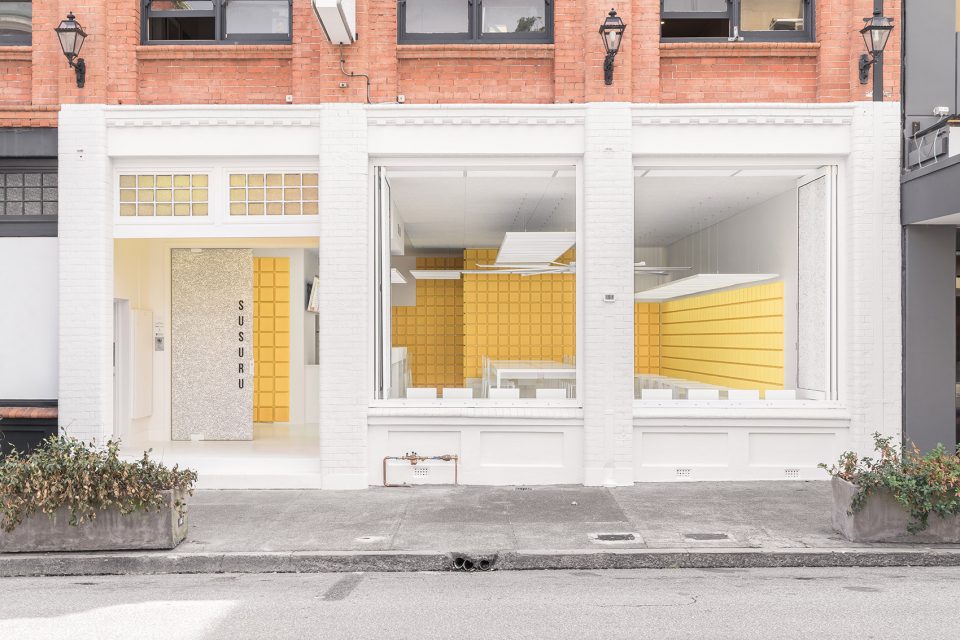
▼入口,entrance
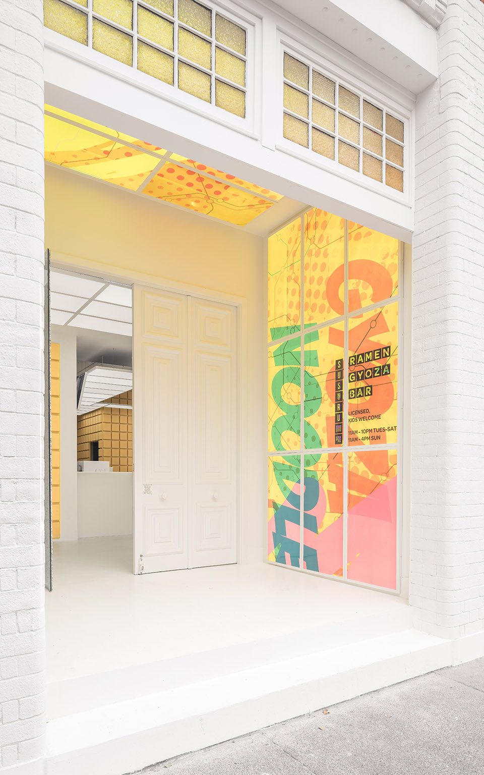
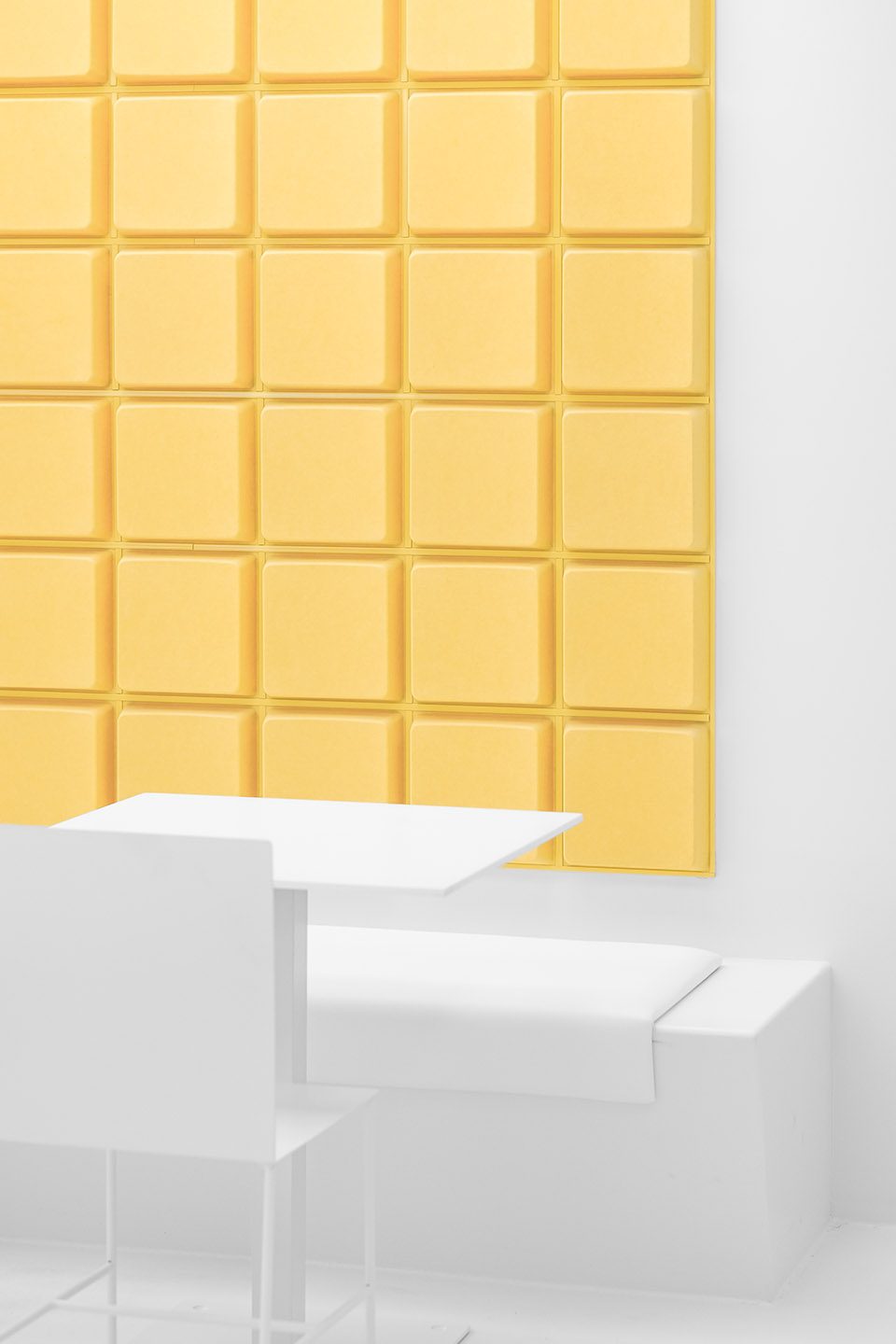
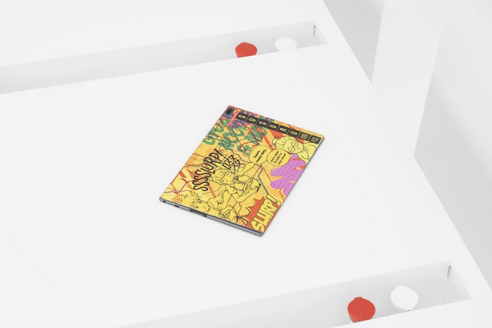
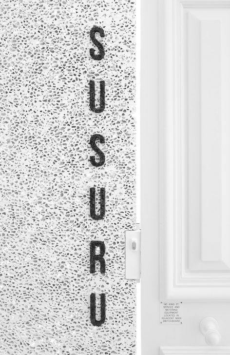
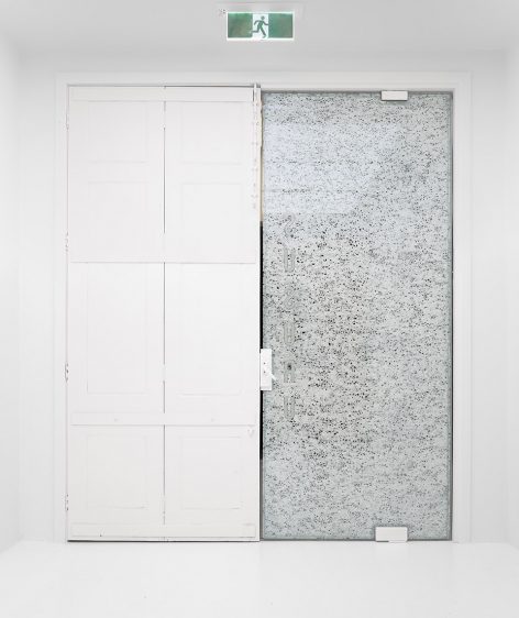
餐馆为城市带来了异国风味,这也使设计师有机会去做一些全新的尝试。方案以东京的地铁站和火车设计为灵感,将白色作为室内的主要基调,同时突显出代表品牌的黄色。在此基础上,设计师增加了一些具有现代感的平面设计元素,并搭配以相应的菜单、引导标识、方块板和大门,形成视觉的焦点。这些元素会像火车站和车厢里的广告牌一样,随着季节进行更换。
With the introduction of a new and foreign food type to the city, opportunity was afforded in this design for something completely fresh. Taking cues from Tokyo metro station and train design, a predominantly white interior acts as a backdrop to a yellow highlight, a signifier of the brand. To this base, we add in temporary graphic design elements, menu boards, signage, tablet covers and doors that are made to add focal points and to draw attention. These elements are cycled seasonally, much like advertisements adding life to the metro stations and train carriages.
▼白色用作室内的主要基调, a predominantly white interior acts as a backdrop
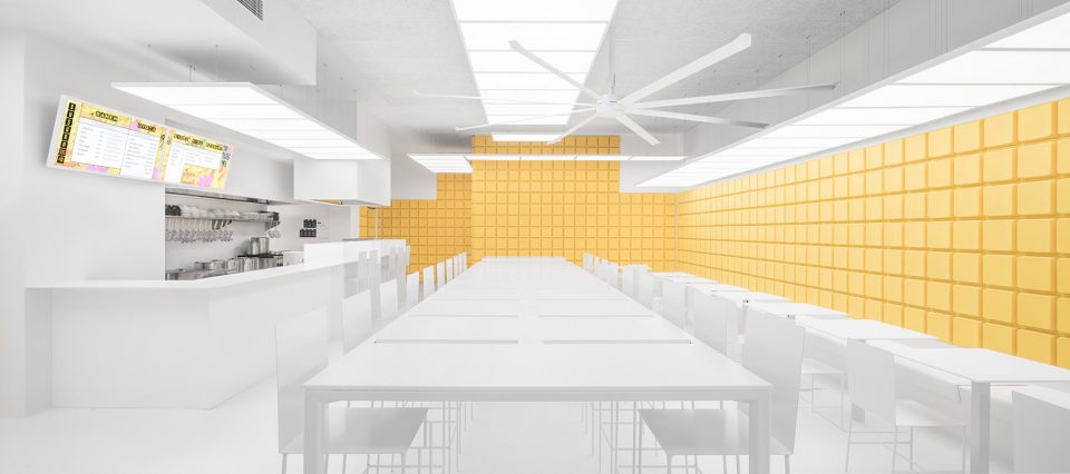
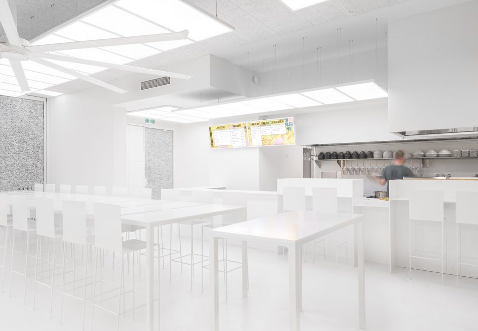
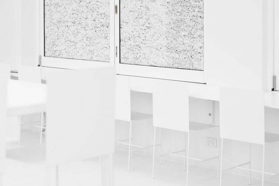
▼黄色作为品牌的代表色被突显出来,yellow is highlighted as a signifier of the brand
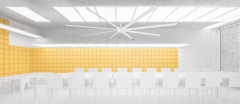
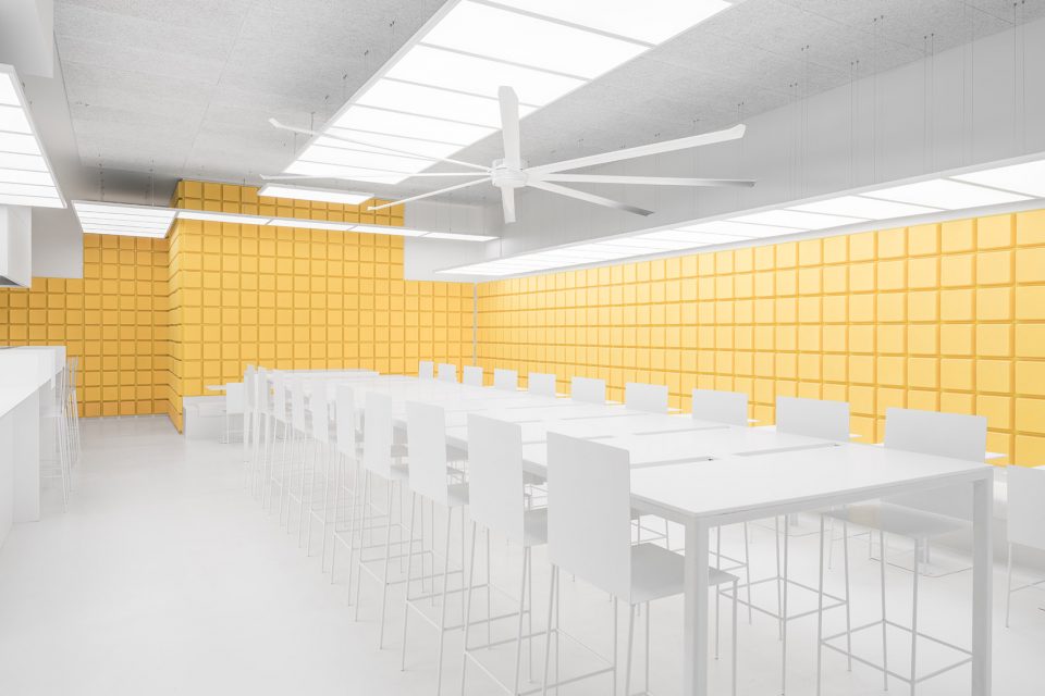
▼窗户开闭带来不同的空间氛围,the control of the openings offers different spatial experience
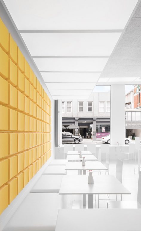
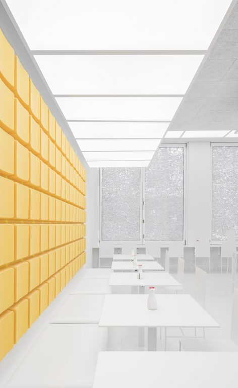
▼以方块版包覆的用餐区域,dining area with tablet covers
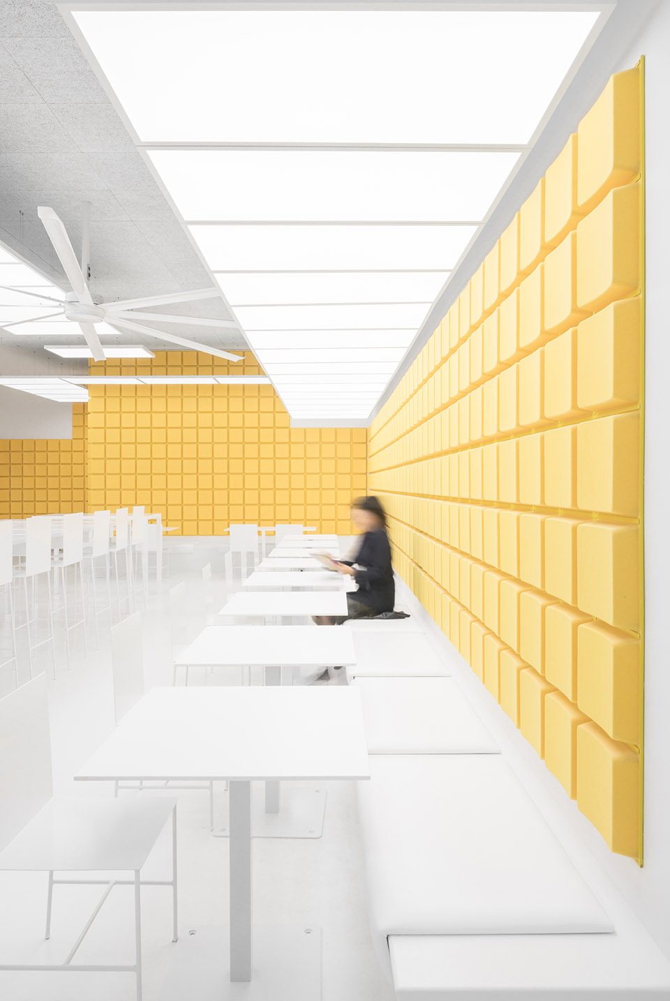
▼细部,detail
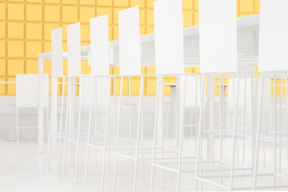
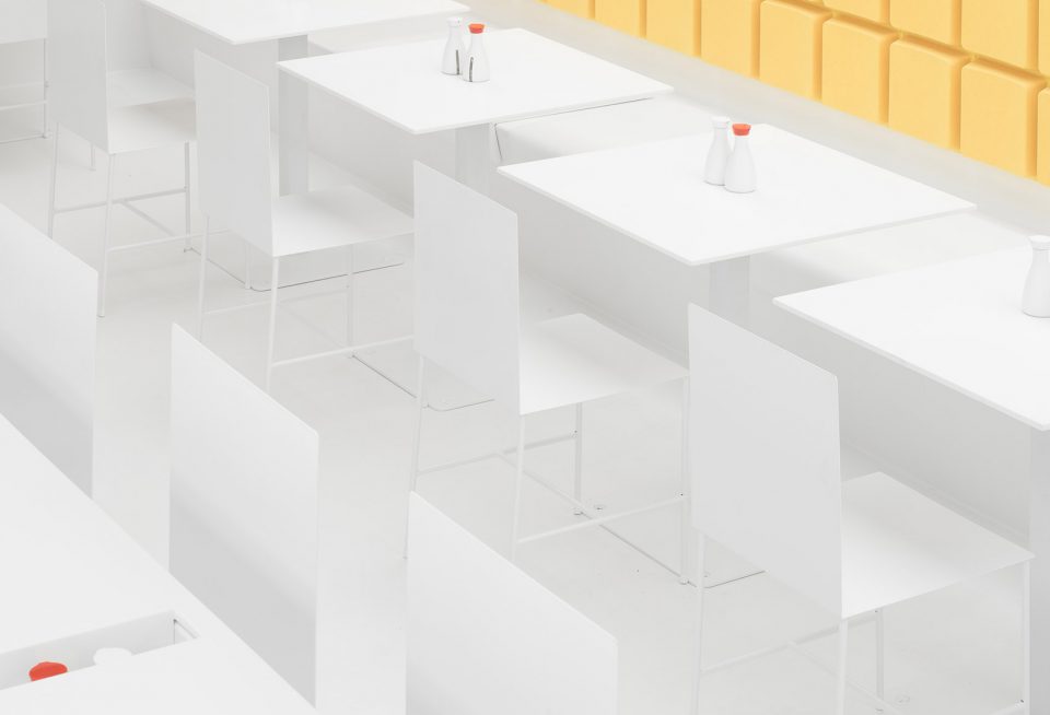
建筑师参与了概念构建、品牌发展、产品和材料选择、项目管理、市场和宣传以及点餐系统用户体验(UX)设计的全过程,从而实现了对整个项目的全面把控,如同完成一项整体艺术作品。在家具设计方面,设计师尽可能找当地的工厂完成,以重新激活城市的金属工业。能够批量生产的产品则是由中国的大型工厂进口。
As the architects, we oversaw the project from idea conception, brand development through to product and material sourcing, project management, marketing and advertising and User Experience (UX) inter-face design of the ordering systems. This gave us complete control over the entire process, similar in nature to Gesamtkunstwerk. Where we could, local fabricators were used, particularly to re-liven the metal industry in the city, with designs for furniture, as apposed to equipment for mining. Repetitive products that could be sourced in bulk were imported from larger factories in China.
▼家具设计尽可能找当地的工厂完成,local fabricators were used for furniture design
▼洗手间走廊,corridor leading to the wash room
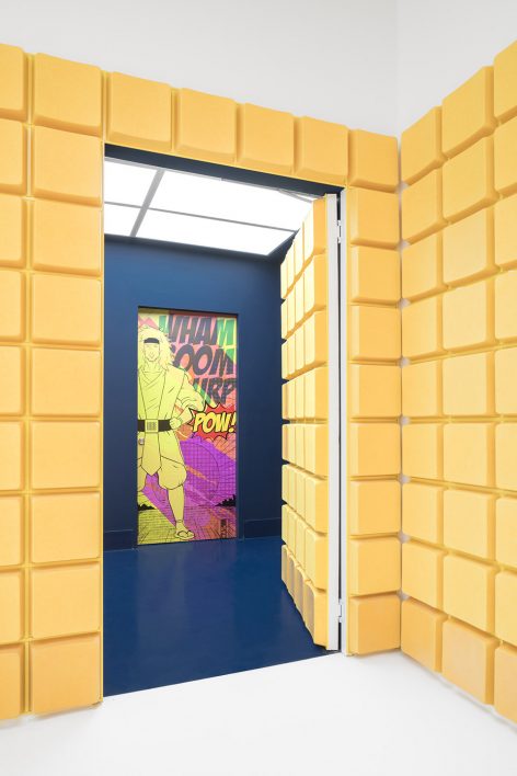
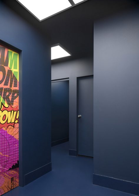
本次设计体现出一种与城市前所未有过的脱离感,它被形容为“纽卡斯尔城市化(终极版)”以及“2049虚拟城市的前奏”,为我们展示了一个与“精灵宝可梦”漫画中的咖啡厅一样的奇妙空间。
The response thus far from the city seems unprecedented, described as “Newcastle Urbanisation (finally)”, as a “prelude to the plausible future of 2049”, and resembles “what a hospital cafe might look like when drawn in a Pokémon graphic novel.”
▼团队还参与了菜单、引导标识等设计,the architects also oversaw the brand development and User Experience inter-face design of the ordering systems
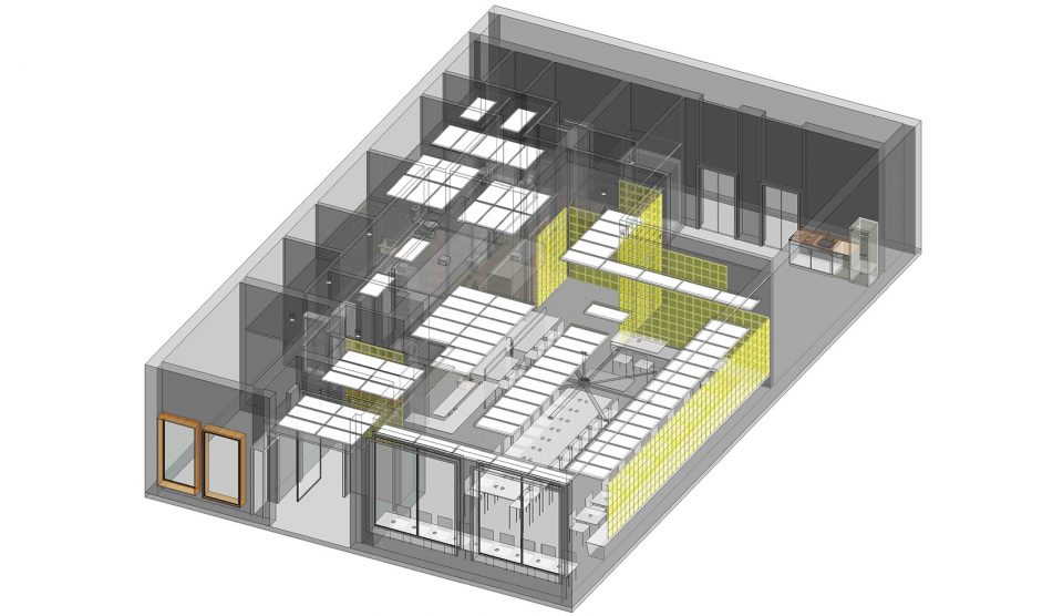
▼轴测图,axon
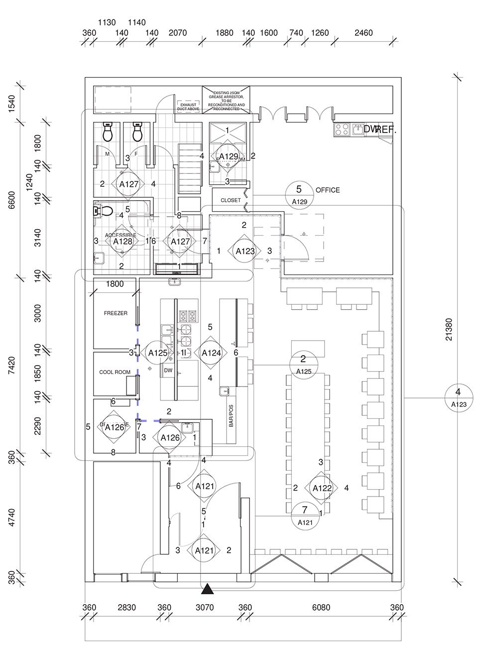
▼平面图,plan
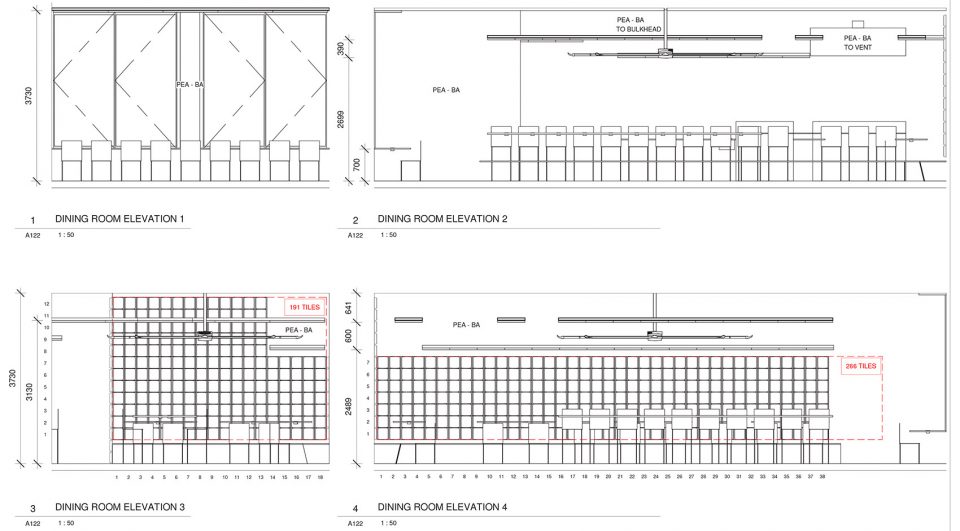
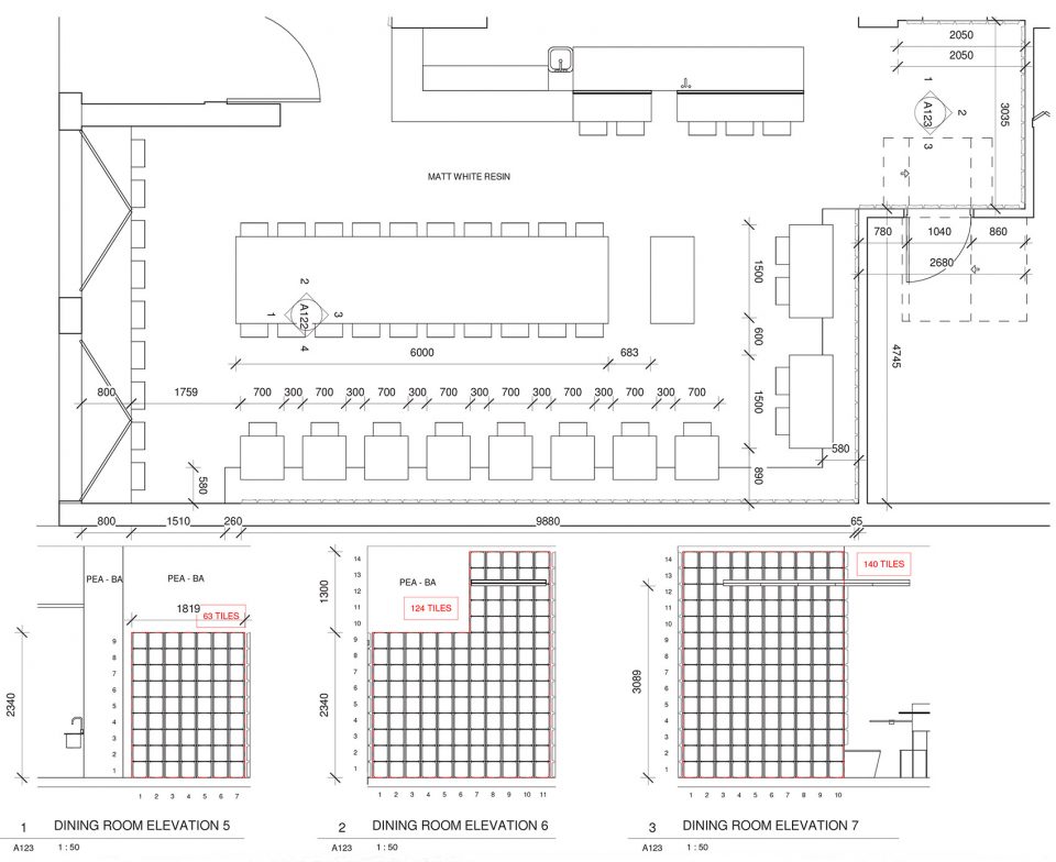
▼立面图,elevations
Project name: SUSURU
Architect’ Firm: Prevalent
Website: www.prevalent.archi
Contact e-mail:
ben@prevalent.archi
Lead Architects: Ben Berwick
Project location: 140 King Street, Newcastle, NSW, 2300, Australia
Completion Year: 2017
Gross Built Area (square meters or square foot):
250sqm
Photo credits: Jan Vranovsky
Photographer’s website: http://janvranovsky.tumblr.com
More:Prevalent,更多请至:Prevalent on gooood

标题下方写精灵宝可梦中的世界,我想你是不是对宝可梦有什么误解?????
想看开业一个月的照片
好像游泳馆的更衣间。。但是为什么不行呢,,
他妈破坏原有建筑的感觉
清洁阿姨看了想打人
神回复
哈哈哈哈哈哈
我快被白色闪瞎了
餐馆用几个月还能这么白么。。。
效果也是非常渲染图了