非常感谢 ASPECT Studios 将项目授权gooood发行。更多关于他们:ASPECT Studios on gooood
Appreciation towards ASPECT Studios for providing the following description:
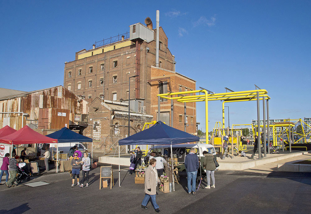
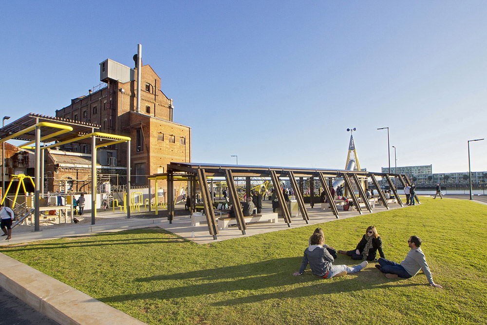
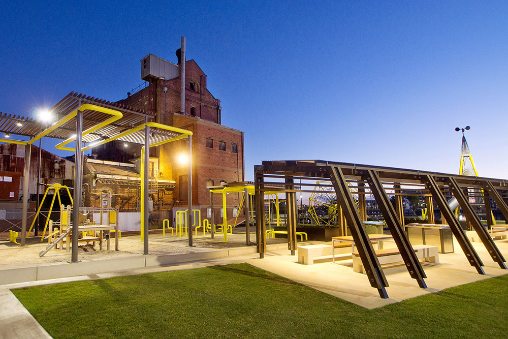
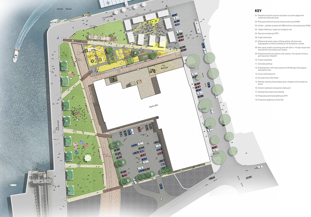
澳洲ASPECT工作室在阿德莱德港口的哈特磨坊周边设计了一个极富活力和吸引力的公共区域。该区域靠近码头,其背景为阿德莱德港口最有标志性的工业建筑遗产之一。新打造的空间包括树木点缀的开阔草坪区、野餐和烧烤区以及用于活动和商业的多功能区。
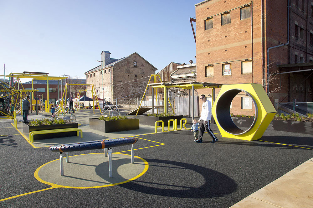
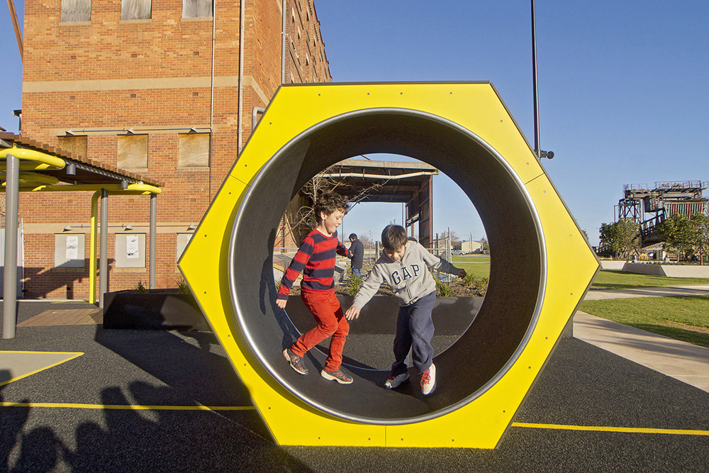
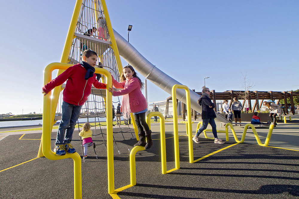
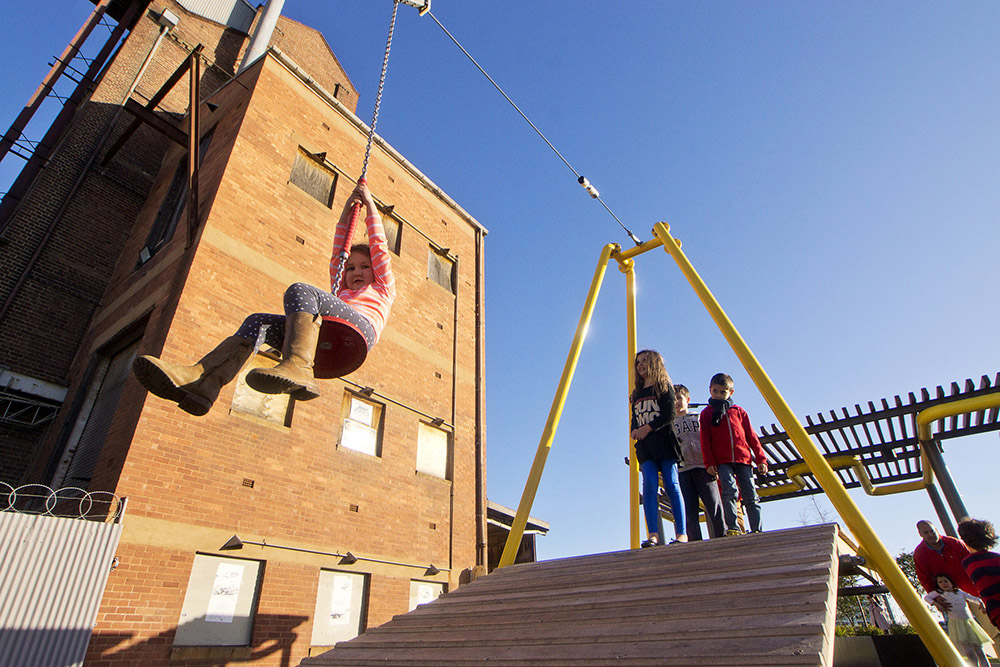
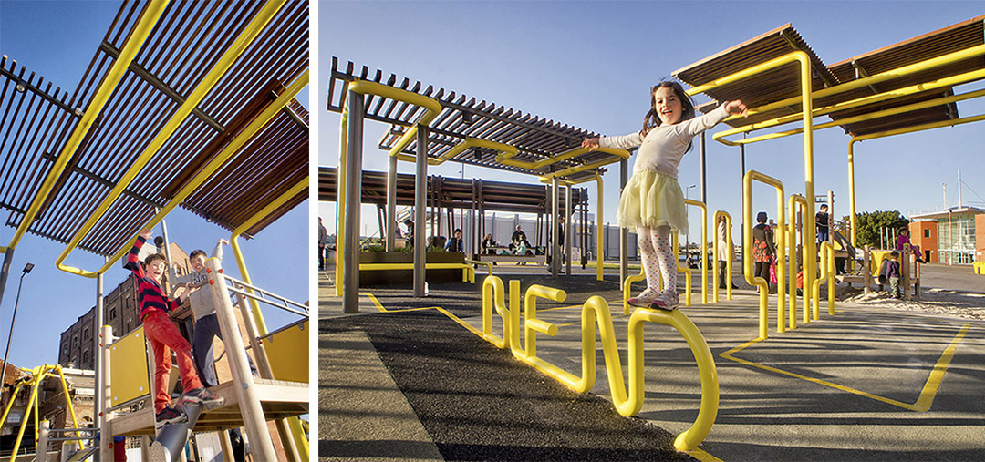
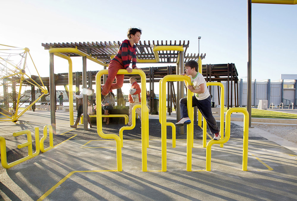
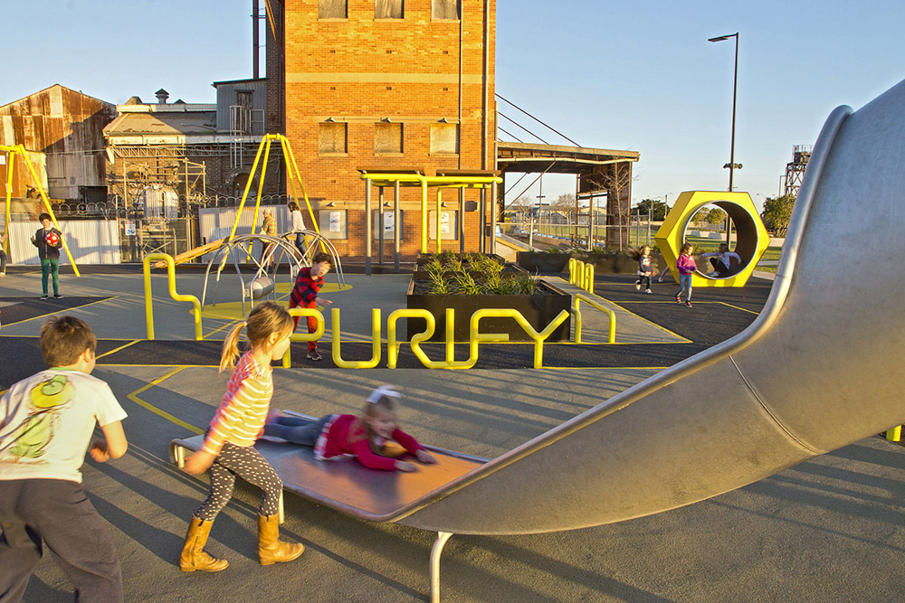
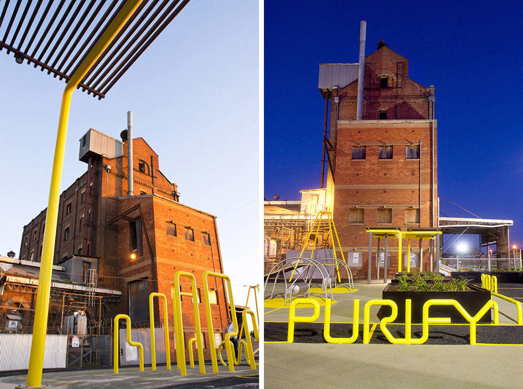
该公共景观是毗邻面粉磨坊、以娱乐为主题的创新空间。这也是该项目的重要特征。其设计参考了码头区丰富的港口贸易活动,旨在为市民提供多样的游玩设施,成为区域新的吸引点。铁路线保留原有状态,这不仅表达了对历史的尊重,同时帮助港口继续发挥其作为重要出口中心的功能性。铁路线两侧是升起的船形绿化平台,成为这个被大幅改造和污染的区域内的新公园空间。
发展过程中兴起的各种建筑项目遍布在港口周围,而该公共区域则是到达港口的第一个目的地。该项目旨在吸引市民,提高去往海滨的通行性,并营造舒适愉快的环境。
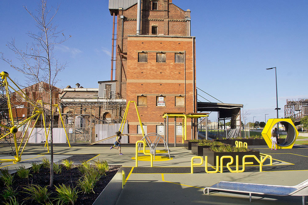
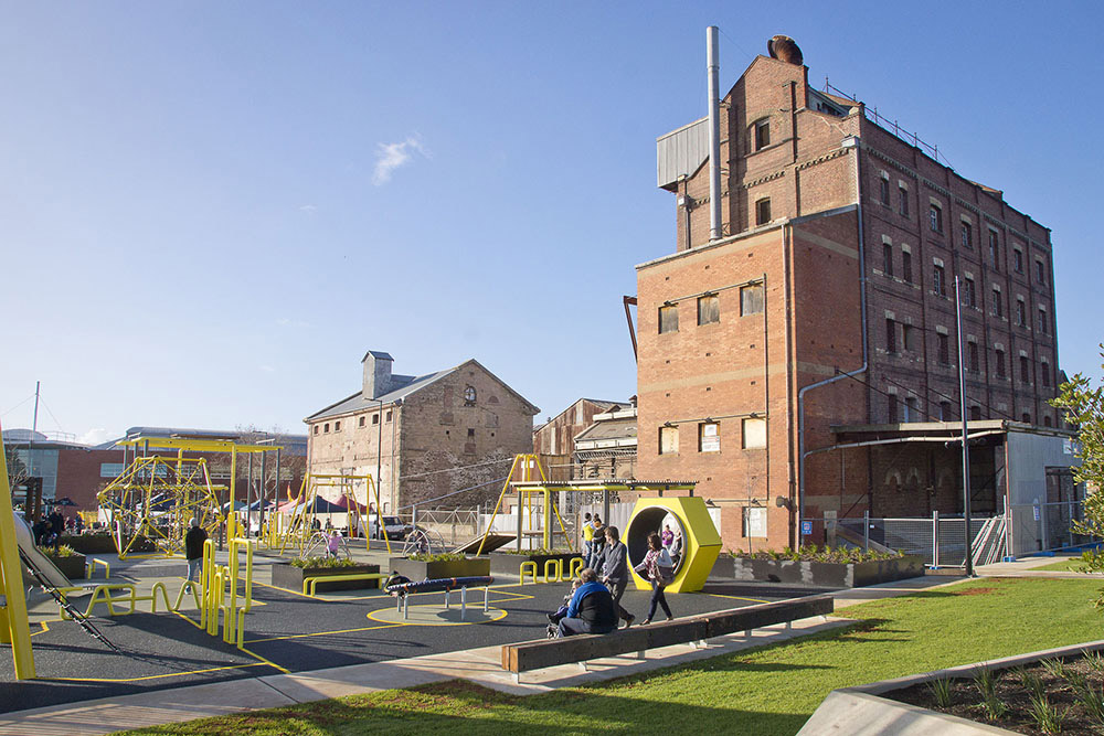
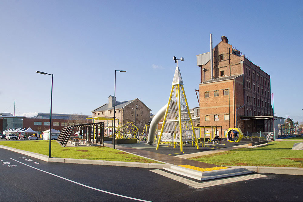
ASPECT Studios has delivered a new, vibrant and attractive public realm for the Hart’s Mill Surrounds in Port Adelaide. Located adjacent to the wharf and with the backdrop of one of Adelaide’s most iconic heritage listed industrial buildings, the new space includes extensive new grassed recreation areas with trees, picnic and BBQ areas as well as multifunctional spaces for events and markets.
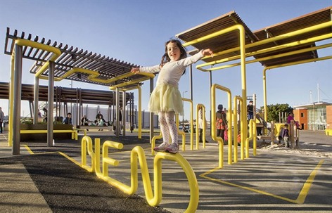
An innovative new play space themed around the site’s flour milling history is a key feature of the site. Its design draws on references of the numerous port trade activities in the wharf precinct and has been developed as a play facility aimed to have a regional level of attraction. The existing rail line has been retained and celebrated in its original state to maintain a reference to the past and the port’s important role as an export hub. The rail line is flanked by raised green platforms designed as vessels containing new park spaces within what is a highly modified and contaminated site.
The project has been delivered as a premier destination within a suite of ‘early win’ interventions that have been rolled out around the port with the aim of increasing visitation and providing greater access and amenity to the waterfront.
Client: Renewal SA
Location: Port Adelaide, SA, Australia
Landscape Architects/Lead Consultant: ASPECT Studios
Team: ASPECT Studios, Mulloway Studio, LUCID Consulting, SMEC Australia, HydroPlan
Year: 2014
Budget: $2.1 million
Photographer: Don Brice
More: ASPECT Studios ,更多关于他们:ASPECT Studios on gooood


封面上的小女孩,怕是摔得不轻吧
他们家还做过一个蓝色线 哈哈哈
这种图面表现风格的性冷淡风还怪美的
以连接体系为主导思想的游乐设施趣味性非常丰富,所用的材料和色彩符合儿童的心理特点,也与环境的整体色彩相协调。相对于许多所谓的大手笔设计来说,让人感觉是一个低调但是舒服的设计。
十分舒适、适用、清晰的设计,觉得不仅在趣味性上设计者花费了功夫,同时在于周边的协调不错,觉得可能在安全性上如再进一步考虑下,会更好~
有一种二次原PS进现实的违和感,但是平面布局还是很简洁合理的
这个做法貌似在某个幼儿园项目中见过,不知道是不是他们家的,鲜亮的色彩灵活的游艺设施给好动的孩子们更多自主游玩体验的吸引力~很喜欢这种干净舒适的彩平色调~