来自芝作室Lukstudio对gooood的分享。 更多关于他们:LUKSTUDIO on gooood
面条是中国随处可见的街头小吃。大部分面馆都仅在口味上费尽工夫以赢得客户,然而另一些品牌却已将优质的店铺设计视为不可或缺的成功秘方,隆小宝就是其中之一。这个新团队在长沙小试牛刀,力图把钻研多时的地道邵阳米粉推广到中国各地。芝作室受邀为其打造品牌创始店,为了将传统制面工艺引入到空间设计中,用现代语汇重新诠释了‘晾面架’这一元素。
Noodle soup is a common street food all over China. While most of these noodle joints spend tremendous effort to win customers with taste, some has started to add attractive store design into their branding recipe. A good example is LongXiaoBao, a newcomer who sets foot in Changsha with an ambition to spread the local ShaoYang style rice noodle to the rest of China. Commissioned to conceive a contemporary identity for their first restaurant, Lukstudio integrates the tradition of noodle making in the spatial design by reinterpreting a noodle rack.
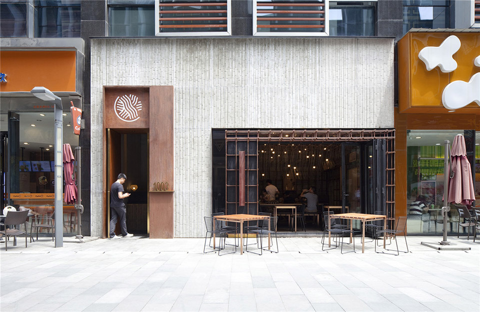
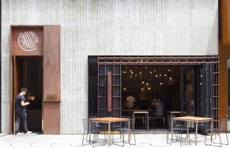
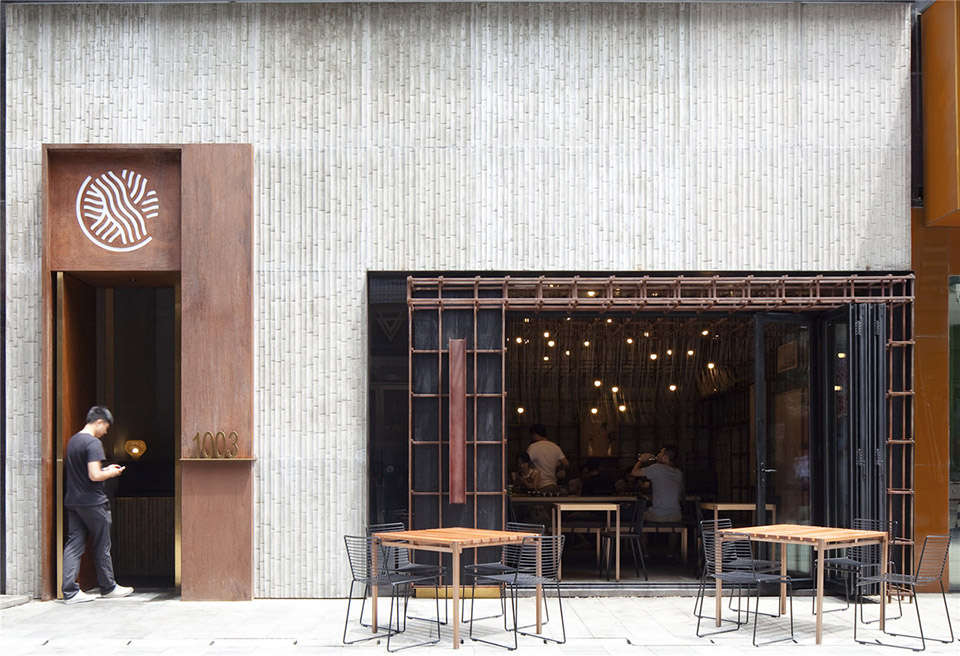
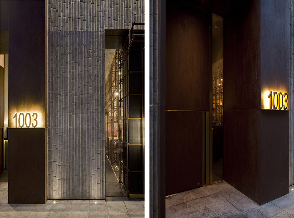
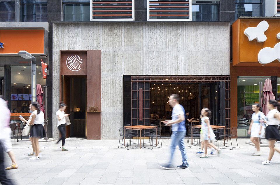
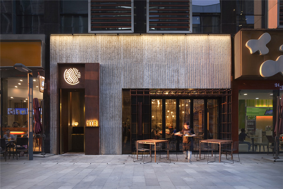
湘江畔的购物大道上,这间50平方米的面馆有一个宁静而引人入胜的店面。竹子倒模浇筑的混凝土外立面上,两个相映成趣的钢盒子穿墙而出:左边略高的一个看起来比较冷静封闭,右边的有脚手架一样繁复的面孔。三个元素并置在一起,为食客揭开入店探索的旅程。
Nestled along an outdoor shopping promenade nearby the Xiangjiang River, the 50-sqm noodle joint exudes a calm yet mysterious presence with its bamboo-cast concrete storefront. Two rustic steel boxes penetrate through the solemn exterior: the taller one is cladded with rusted steel panels and its shorter neighbor is built like a metal scaffold. These three elements together orchestrate a journey of discovery.
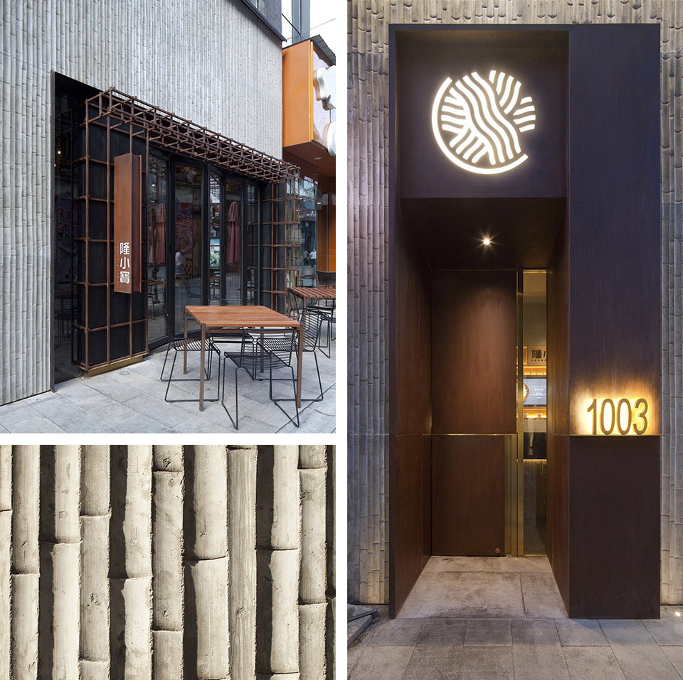
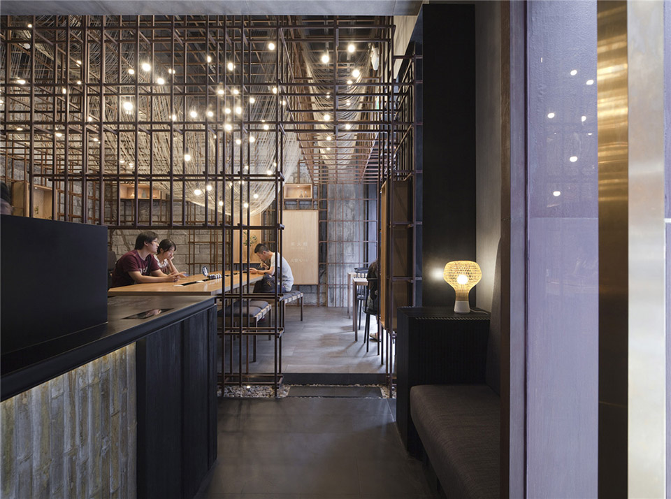
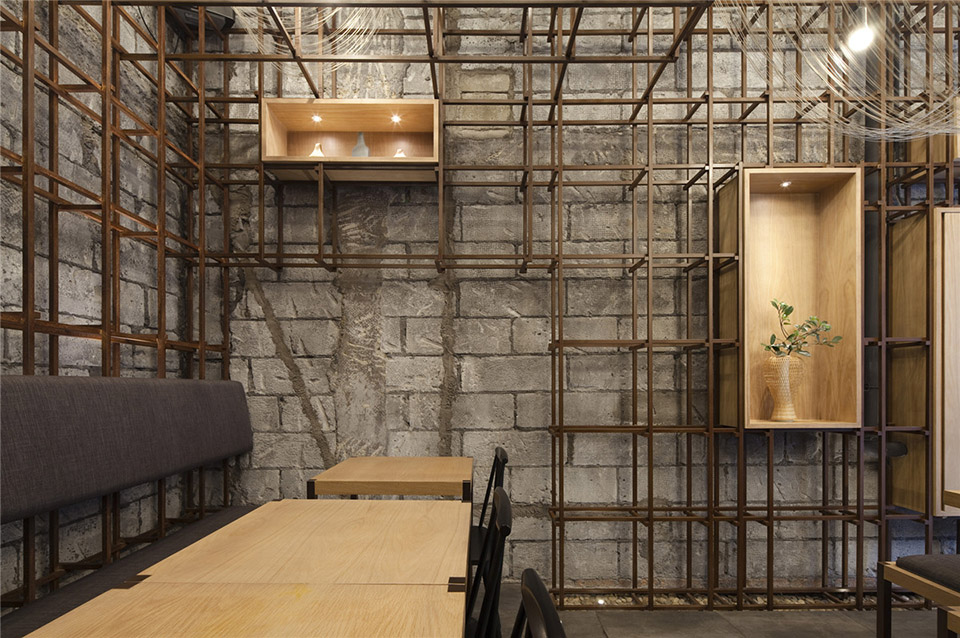
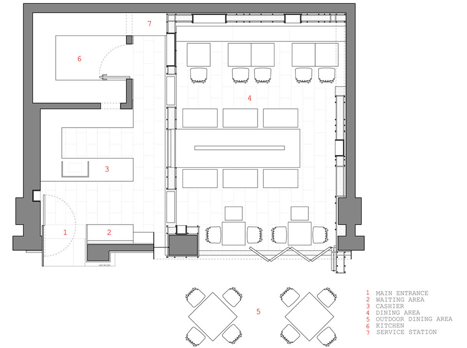
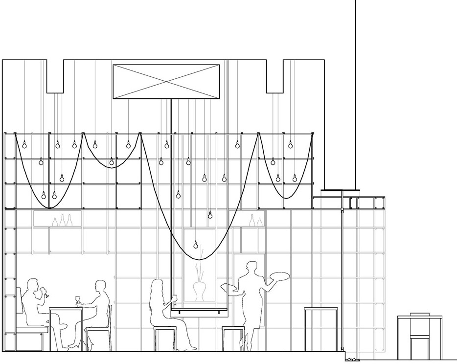
从左侧盒子进入店内,首先来到一个简约内敛的空间:前台嵌缀着曾用于浇筑混凝土的竹模,与外立面相呼应,水泥素墙衬托着由橡木盒子和点单屏幕组成的背景墙。转身步入用餐区,围绕着铁架子的光晕将空间的丰富层次展开:墙体原本的砖块与水泥结构得以露出,与铁架子共同营造粗矿的背景;层层叠叠的铁架子中,精心布置的木盒子展示着光洁的瓷器;一束束细密的钢丝‘面条’优雅地垂挂着,微微映着灯泡的暖光,成为整个空间的亮点。每一处的细微用心都是为了引起客人在晾面架下进餐的诗意联想。
Walking past the entry box, a customer is greeted by a composed counter design lined with the bamboo mold used for casting the exteriors. As one proceeds towards the halo surrounding the grid structure, the interior layers start revealing themselves. Firstly, the original wall is stripped down to its structural blocks to resonate with the rustic metal grid. Secondly, wooden boxes are carefully placed within the rack to showcase selected porcelains. Finally, a series of metal wires are draped across the dining room to create the lighting feature with hanging bulbs. Balancing the rustic interiors, these reflective strands create a poetic notion of dining under a noodle rack.
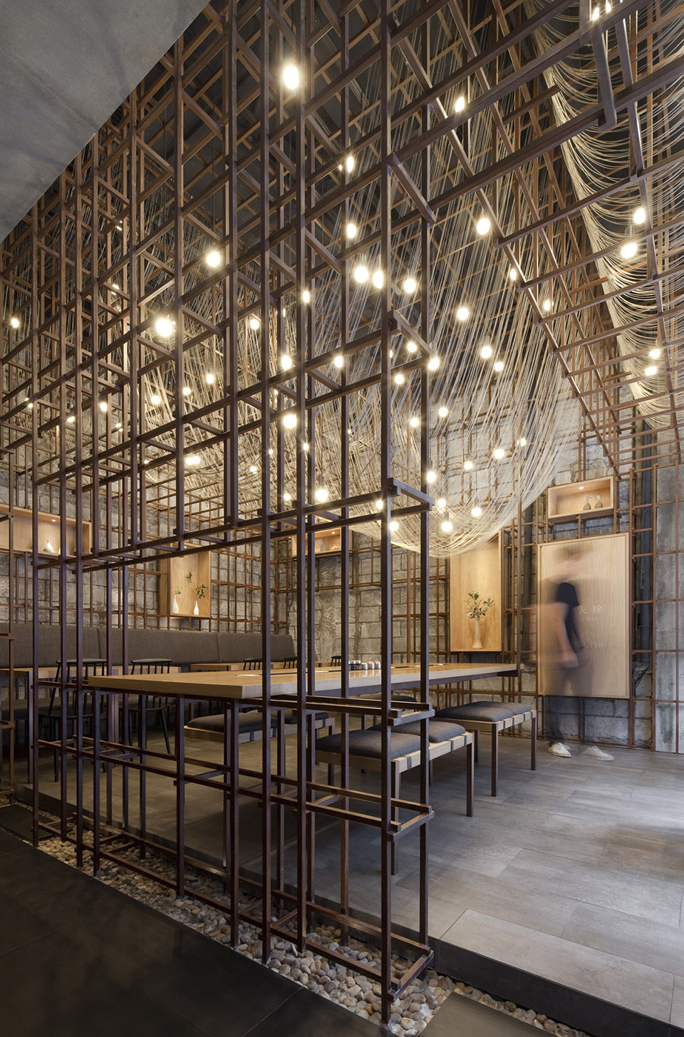
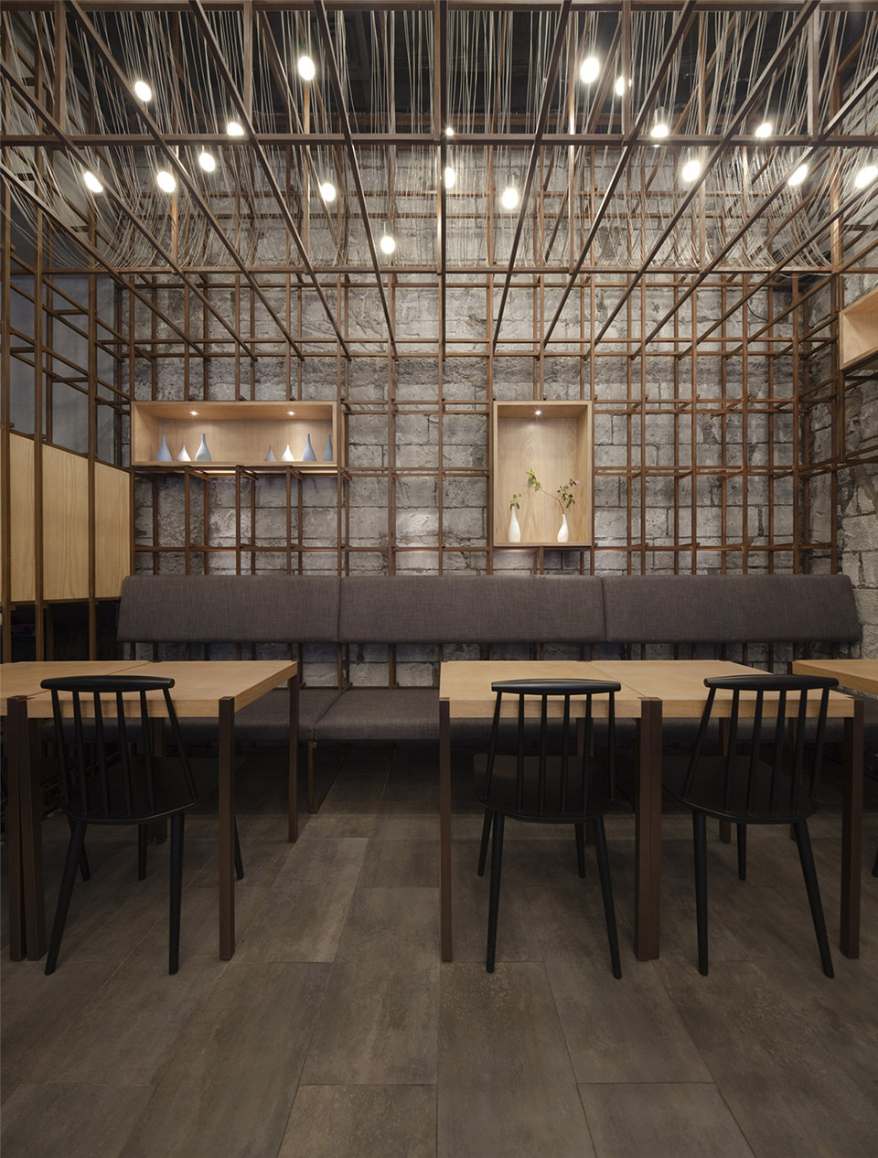
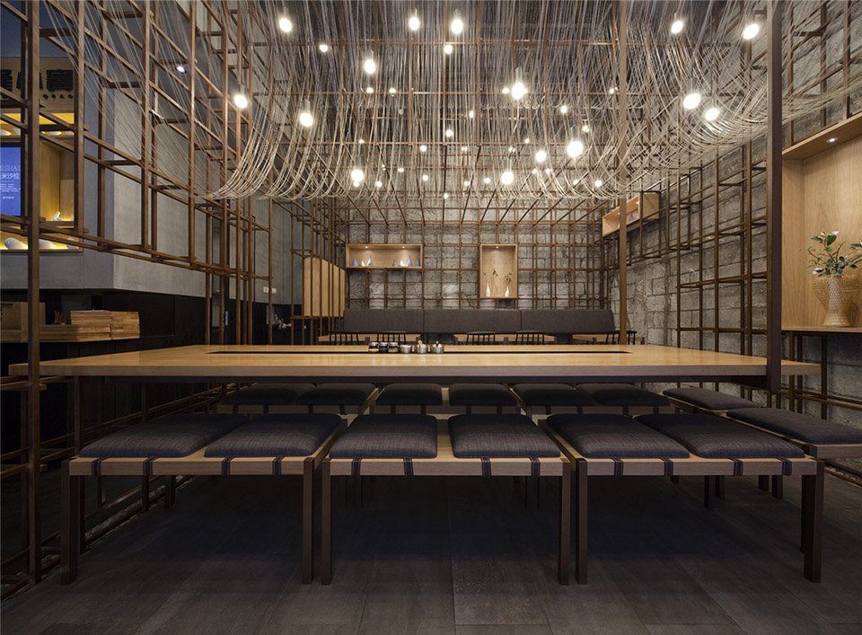
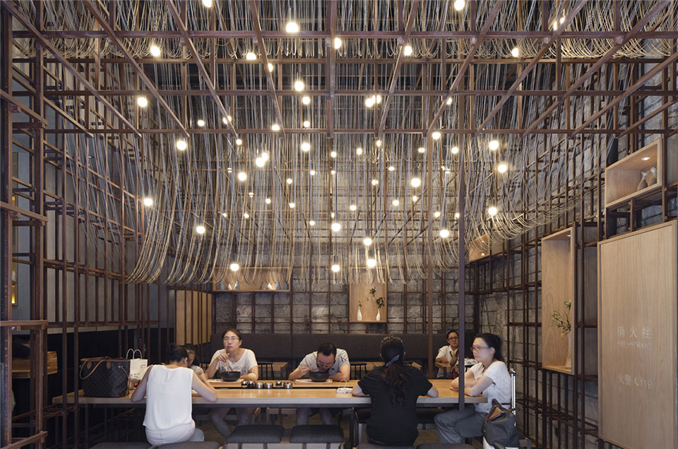
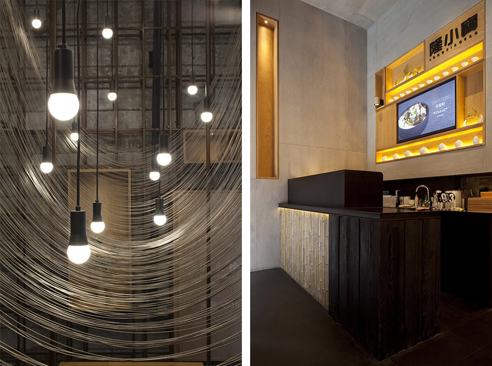
粗糙质朴和细腻精致,东方传统和现代诠释,芝作室通过这样的融合让店铺成为连锁快餐和高档餐厅的混合体。这个项目改变大众对平常面馆环境简陋低劣的偏见,展示传统中式美食店也有潜质成为像咖啡厅一样令人流连忘返的场所。
Playing with the duality between rustic and refined, eastern tradition and western representation, Lukstudio introduces a crossover between fast food chain and upscale diner. The Noodle Rack differentiates itself from the stigma of kitsch fast food “hole in the wall” on every street of China. It demonstrates how Chinese eateries have the potentials to be reborn into hip gathering spots comparable to the new trend of cafés.
晾面架
室内面积: 50 平方米
设计范围:店面设计,室内设计,家具设计,灯光设计
设计期: 2015年2月至4 月
施工期: 2015年5月至7 月
项目团队: 陆頴芝, Alba Beroiz Blazquez, 蔡金红,林宝意
施工团队:上海迈昌建设工程有限公司
摄影: Peter Dixie 洛唐建筑摄影
The Noodle Rack
net area: 50 sqm
scope: storefront design, interior design, custom furniture & lighting design
design: Feb – April 2015
construction: May– July 2015
project team: Christina Luk, Alba Beroiz Blazquez, Cai Jin Hong, Pao Yee Lim
general contractor: Shanghai MaiChang Construction Project Co., Ltd.
photography: Peter Dixie for LOTAN Architectural Photography
MORE: 芝作室Lukstudio,更多关于他们:LUKSTUDIO on gooood
外面太像脚手架,内部看着还好。不如 做串串店比较抽象
室外立面肌理恰到好处,室内使用手法过度,不知道设计师是要表达什么
这店在上海?是长沙吧
为什么不用竹字代替那些可恶的钢材料
竹子能过消防么
更像咖啡店,毫无进食欲望
很有创意,但是这架子,确实,太像脚手架了,不舒服啊
做得很好,很有感觉。平面来说,过于追求设计感而牺牲了一点功能性,厨房估计不够用,座位数也可能不够。装修花那么多钱,怕是成本回笼时间就更长了。
细节如女人般细腻,整体控制再提升一下就更好了
没有那些架子会很好多把!! 然后内部装饰的线条可以更乱一些。。入口处理的很棒啊!
面馆空间做这么繁琐,裸露的墙面和“凉面架”看着就没食欲,没有吃面条的感觉
感觉不错哦,而且是米粉不是面,很好,关键味道要好,不然设计再美也没客~
外立面和入口处理都很喜欢,室内设计略显浮夸了啊
吃的不是面,是逼格
外立面和钢丝“面”的感觉都很好,只是室内空间觉得太逼仄,墙面本就粗糙,在加上那么多钢架,给人感觉很脏
这仅仅是文艺
外立面和构图感觉很好,细看之下个感觉右上方竹模略空,可能需要一个洋气简约的店招。室内设计架子本来可以,不过空间尺度略怪,没有太大的表现感,石材和架子颜色粘在一起,建议再参考老畏的星巴克、榆舍的用色,空间方向感等,还有感觉进门那个大桌子有点不舒服啊。。
外立面还可圈可点,室内气氛色调 压抑的 我是不愿意经常去吃的