来自 mode:lina 对gooood的分享。更多关于他们,请至: mode:lina on gooood.
Appreciation towards mode:lina for providing the following description:
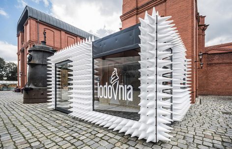
LODOVNIA是一个外形独特的移动冰淇淋店,它位于繁华的波兹南Stary Browar购物中心。
LODOVNIA, a new mobile ice cream shop with a unique facade, found its place right in the heart of Poznań’s Stary Browar
▼冰淇淋店外观,external view of the ice cream shop
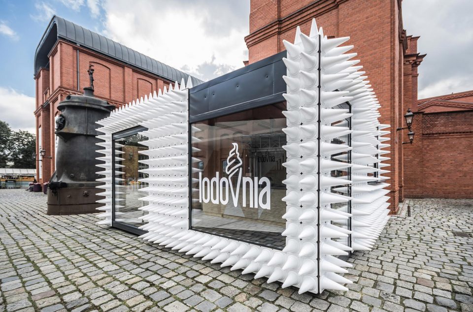
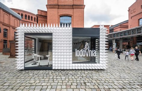
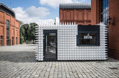
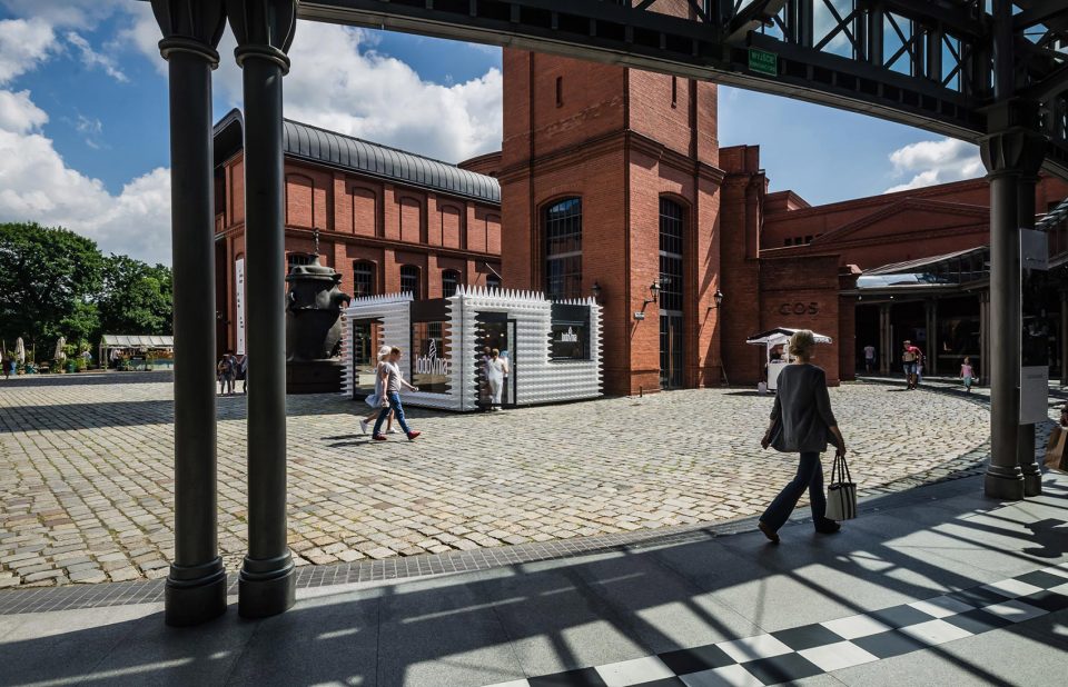
建筑占据了艺术庭院的中心位置,因此mode:linaTM设计事务所为其设计了一个极具艺术感的立面。将近1000个白色圆筒从深色的墙面上竞相伸出,代表了LODOVNIA最具人气的天然圆筒冰淇淋。巨大的玻璃立面不仅让行人可以一窥店内的风景,还很好地映衬出了周围的建筑。
Since the building took a central spot in the Courtyard of Art, mode:linaTM studio designers approached its façade as if it was a piece of art. Dark walls were extended with the use of almost one thousand white sport cones, referring to LODOVNIA’s fagship product – natural ice cream in a cone. Large glazed panels not only allow to peek in, but they also reflect the surrounding Stary Browar’s architecture.
▼冰淇淋店位于艺术庭院中,周围为古典的红砖建筑,ice cream shop in the center of the Courtyard of Art, surrounded by buildings made of bricks
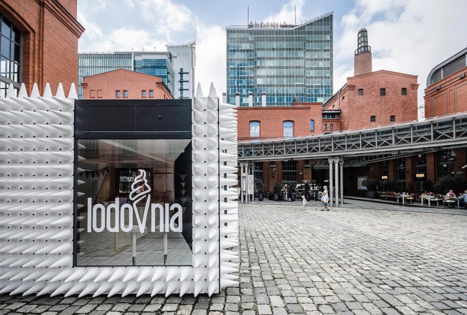
▼玻璃映衬出周围建筑,glass panels reflect the surrounding architectures
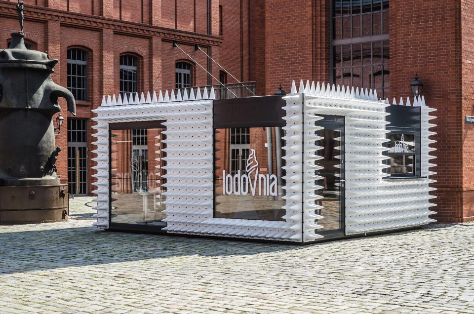
▼白色圆筒从深色表皮上伸出,形成独特的立面,white sport cones extended from the dark surface, creating a unique facade
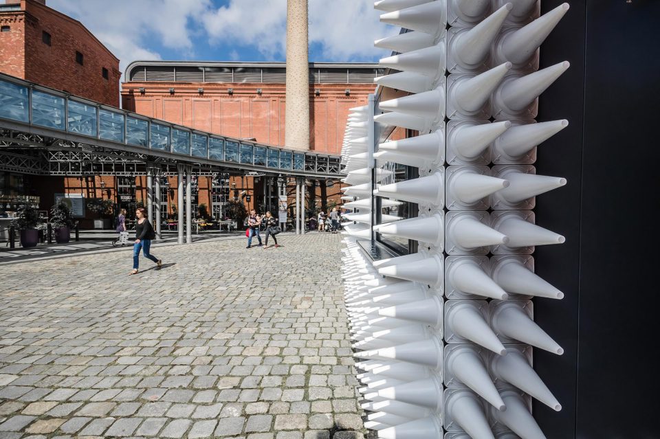
▼立面细部,facade details
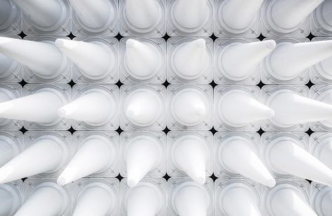
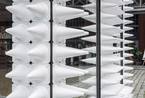
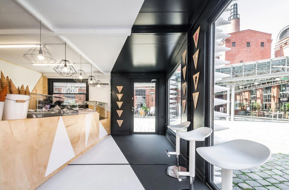
室内也是由黑白两色组成,天然复合木材制成的三角形元素为空间增添了一些暖意。无论是三角形装饰还是冰淇淋圆筒,都和LODOVNIA的logo字母V相联系,使建筑与店铺本身的视觉识别系统达成和谐统一。
The interior is a black and white composition as well, warmed by triangle-shaped elements made of natural plywood. Both the triangles and the shape of a sport cone further connect with the letter V in LODOVNIA’s logo, which makes the architectural result consistent with the ice cream shop’s visual identity system.
▼由黑色,白色和木材组成的室内,interior space composed of black, white and wood
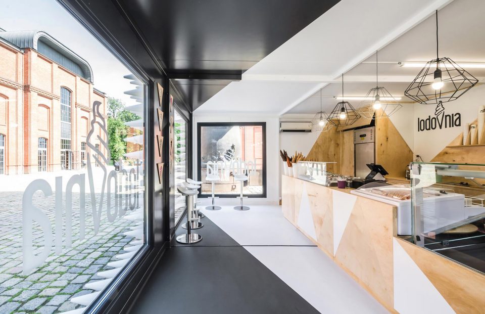
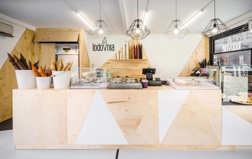
▼室内采用三角形元素,triangle elements used in the interior
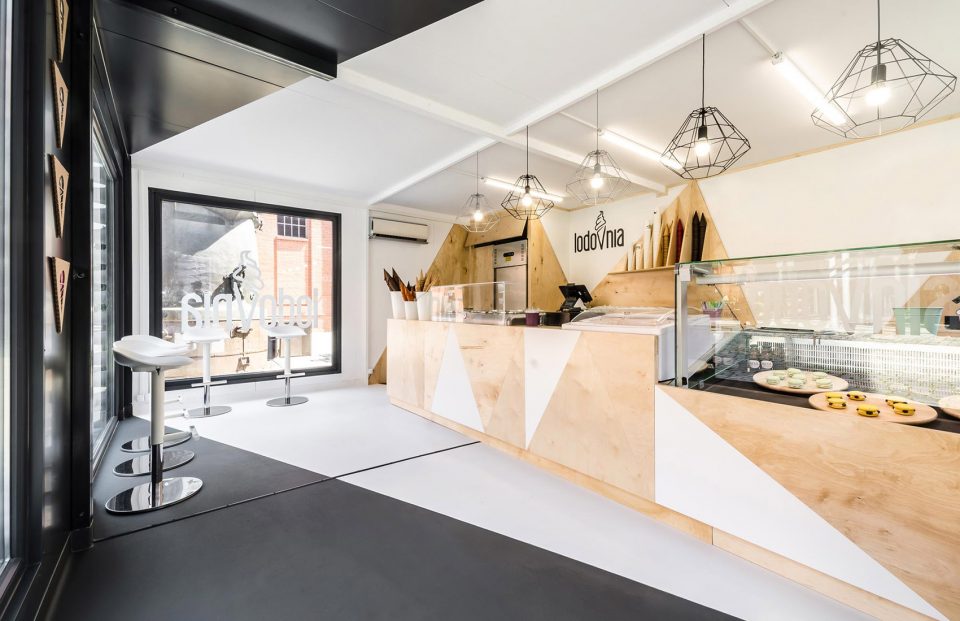
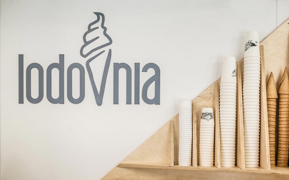
▼三角形元素和圆筒与店内logo联系在一起,the triangle elements and sport cones connected with the shop’s logo
▼细部,details
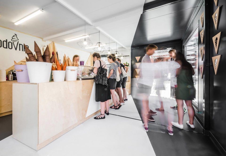
▼繁忙的冰淇淋店,the busy ice cream shop
▼立面图,elevations
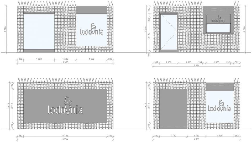
PROJECT: LODOVNIA Ice Cream Shop
Lodziarnia LODOVNIA
DESIGN: mode:linaTM
PROJECT TEAM: Paweł Garus, Jerzy Woźniak, Anna Kazecka
COMPLETION: June 2017 / Czerwiec 2017
LOCATION: Poznań, Stary Browar
AREA: 35 m2
PHOTOS: Patryk Lewiński
More: mode:lina,更多关于他们,请至: mode:lina on gooood.






呃可是看着外面我真的不会觉得这是个冰淇淋店(我只觉得是卖什么尖锐物品的)(而且如果涂料是黄色的,真的会很像卖榴莲的)
小孩跑过来撞上去怎么办
看着点呗,还非得撞上啊
路障店…
对于视觉上不喜欢尖锐角的人来说很痛苦
这不就是….还没上色的交通标志锥形桶么…
哈哈哈,要是香肠店的话····
挺有趣哒
乍一看标图我以为是移动理发店来着,why….