
非常感谢思图意象工作室予gooood分享以下内容。更多请至:STI Studio on gooood
Appreciation towards STI Studio for providing the following description:
图书馆对一个大学来讲的重要性不言而喻,它往往是一所大学的核心建筑,学校的标志与精神象征,浙江科技学院(安吉)校区图书馆对于新校区也同样有着举足轻重的地位,所以在设计的最开始,我们就选择了校园里最重要的地块给图书馆,同时在设计中,设计师希望用最单纯与干净的色彩与设计手法,自内而外来表现与塑造这个核心建筑。
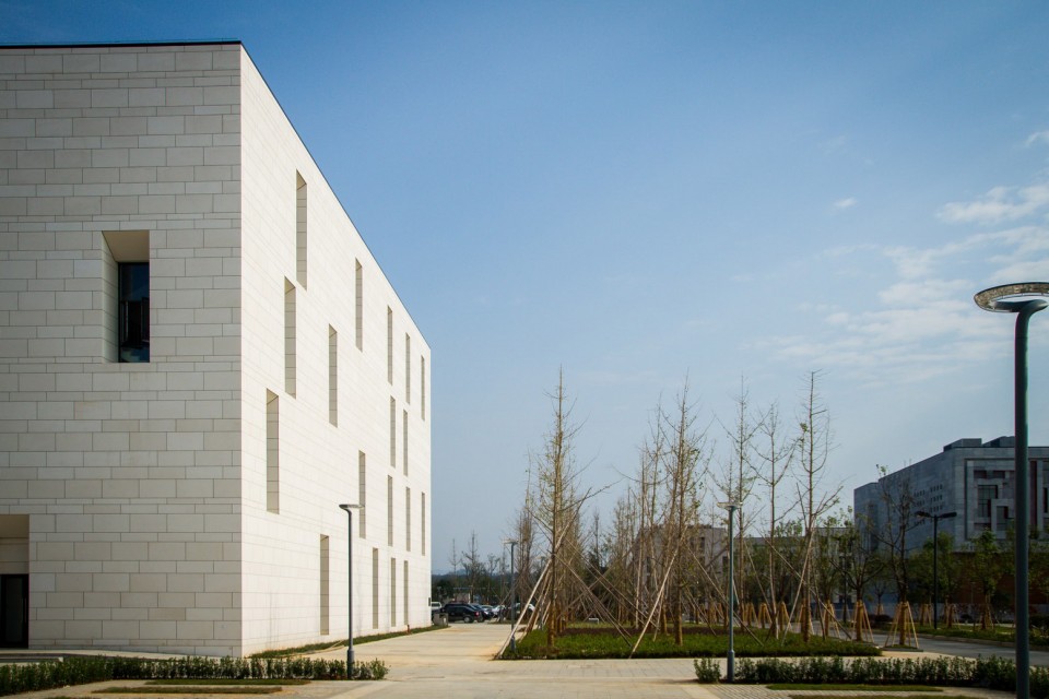
The Library for a university is so self-evidently important that It is often the core, the symbol and spirit symbol of a university building. It also has a pivotal position for the new campus, Zhejiang University of Science and Technology, Anji campus, so at the first begining of the design, we choose the most important land in the campus for the library. And in the meanwhile, architects hope to perform and shape the core construction from inside to outside, with the most pure colors and design skills.
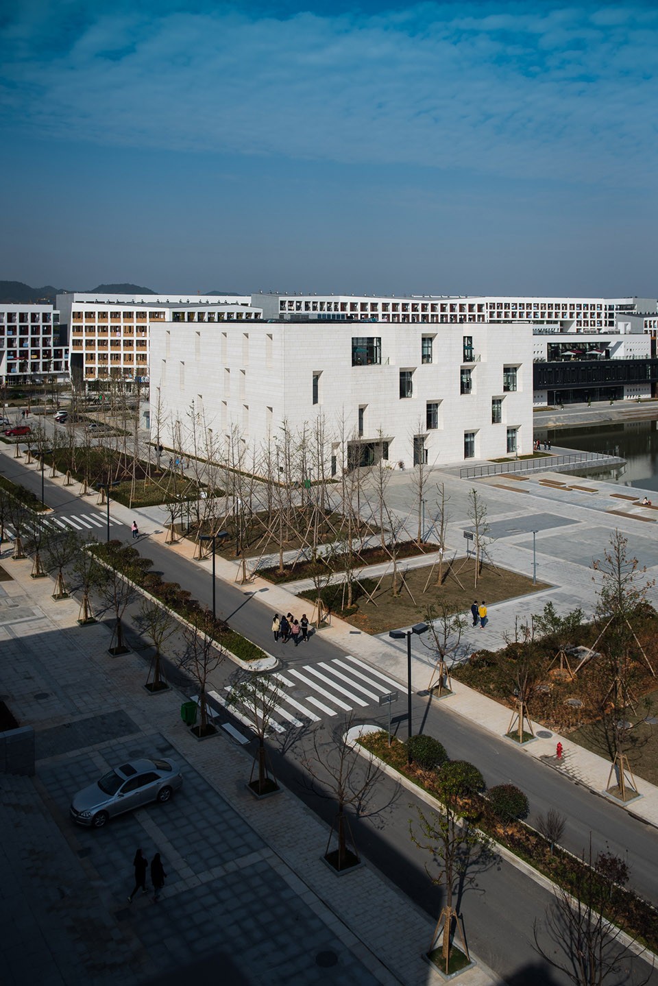
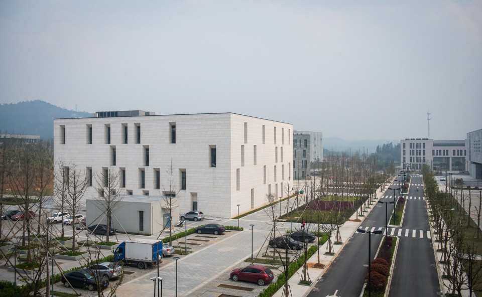
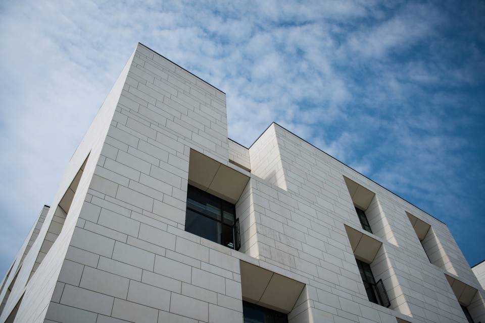
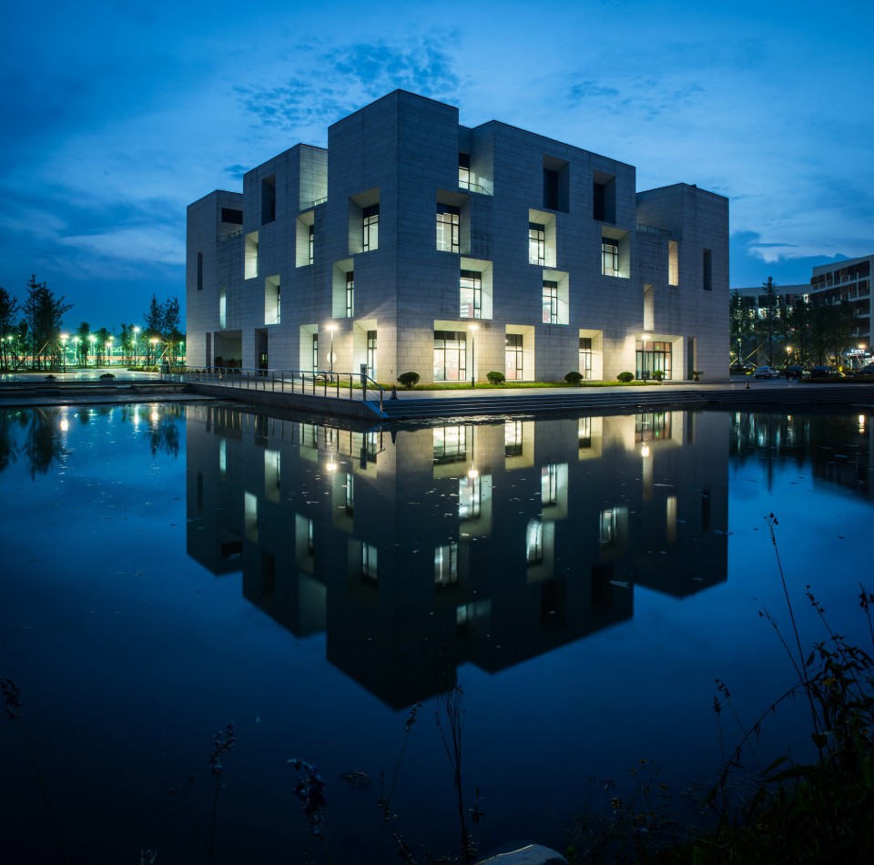
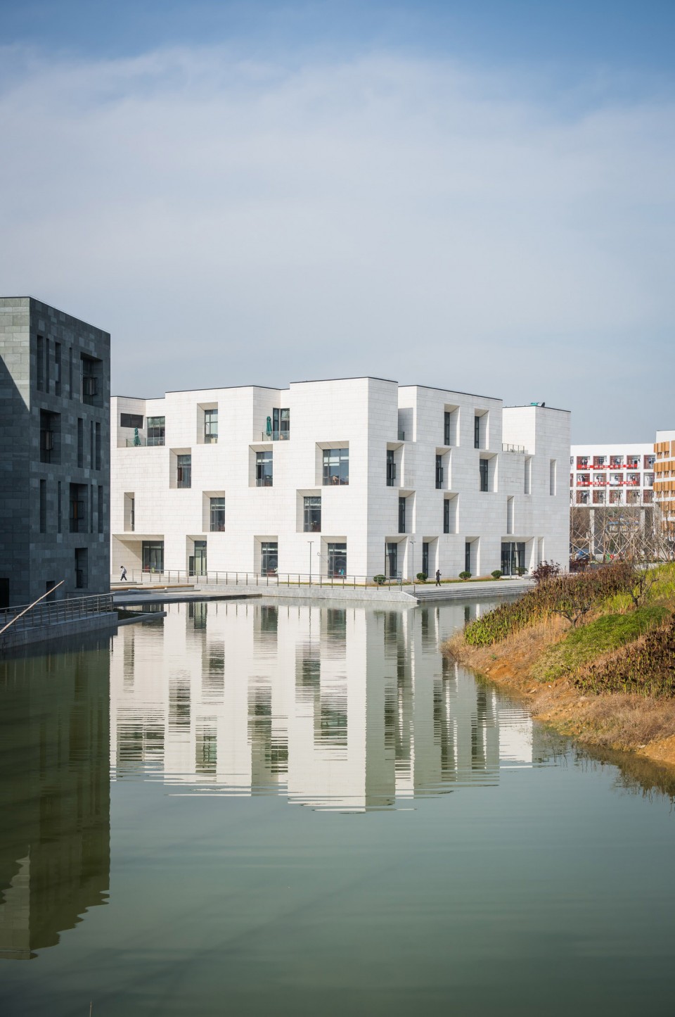
白色优雅高贵,选用白色为立面的主题,是设计师给这个建筑作出的重要选择。这个图书馆只有约4200平方的建筑面积,体量不大,所以设计师采用一座极其纯粹简约立方体设计,浅白色大理石立外墙材料与简约方正的建筑形体和谐搭配,使整座建筑都透露着稳重、纯粹的白色调的优雅性格。
White is elegant and noble, so the architects make an important decision to choose white as the theme of the facade. As The library is only about 4200 square of construction area and the volume is not large, architects design a very pure and simple cube for it. Light white marble of external wall material goes so well with the simple and square building body, which creates an elegant and pure white tone character for the whole building.
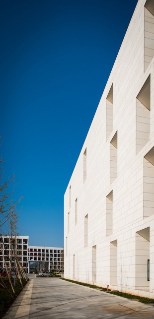
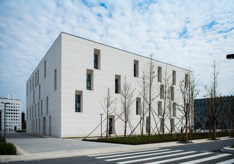
立面在满足内部采光的前提下,尽可能在超南向与东向水面的阅览厅区域开大窗,以及大进深的竖向窗洞和倾斜的上侧墙,形成强烈的光影对比和体量感,也为使用者提供了舒适与自然融合的阅读空间,而在建筑的西面与北面的书库与办公部分的竖向开窗则适当减小,形成和谐的组合与对比。
On the premise of meeting the internal daylighting need, architects try to open large windows, great depth of vertical window apertures and upper inclined walls as far as possible in the facades of the reading room area which are towards southern and eastern water, which can make strong contrast between light and shadow and strengthen dimension sense, and provide a comfortable reading space for the readers as well, Merging with nature. While the vertical windows in the western and the northern facades of the stack room and offices are reduced appropriately. These two kinds of facades form harmonious combination and contrast.
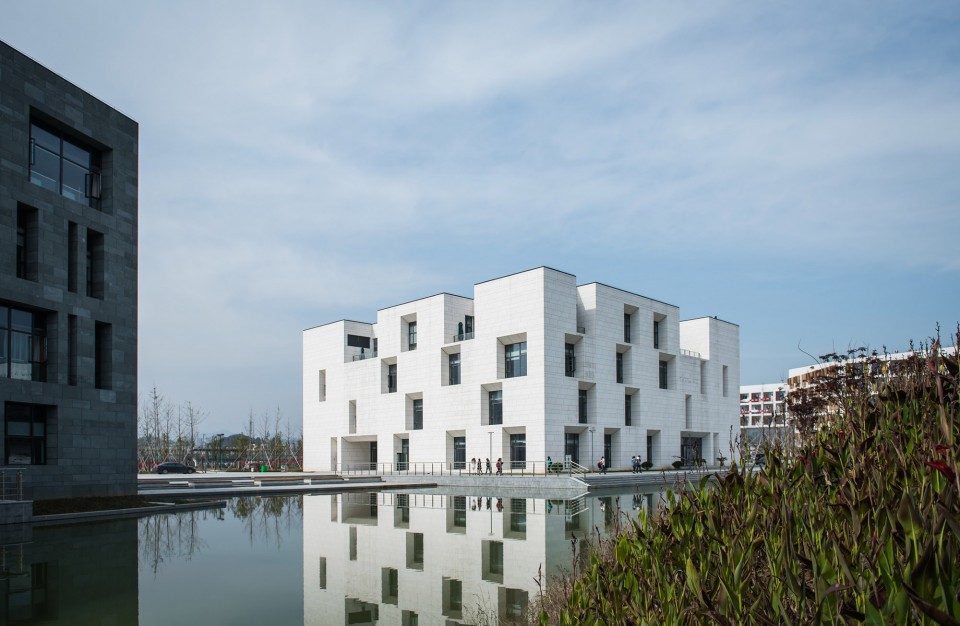
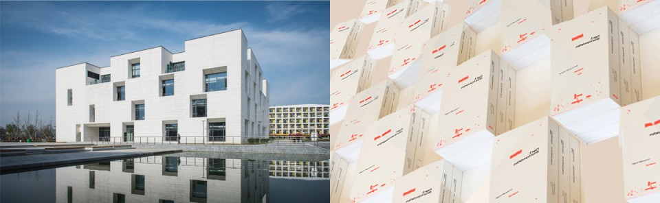
整个建筑滨水设计,真实的建筑与水中虚幻的倒影相互延伸,对接与呼应,水面就像一面魔镜,白色的图书馆在水中更显得优雅与纯粹,真实地与水中的倒影产生了一幅飘渺变幻的建筑图画,这也是设计师没有想到的一个意外的惊喜。
The whole building is designed in the waterfront. The real building and the illusory reflection in the water are mutually extending, docking and echoing. The surface of the water is like a mirror which makes the white library more graceful and pure. The white library produces a ethereal and changable building picture with the reflection, which surprises the architects and is beyond the architects’ imagination.
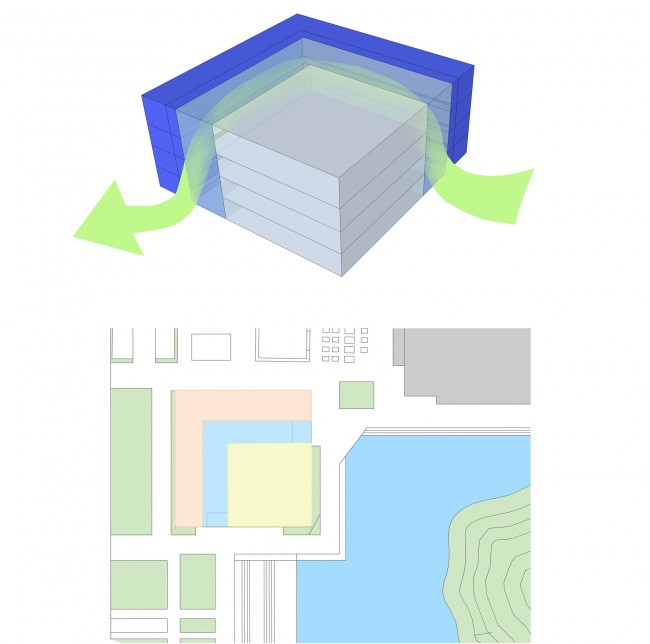
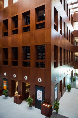
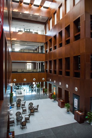
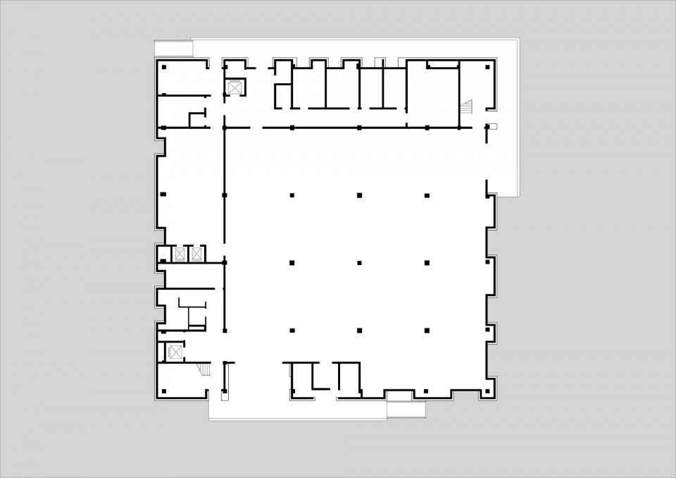
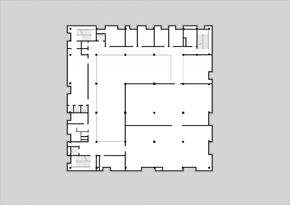
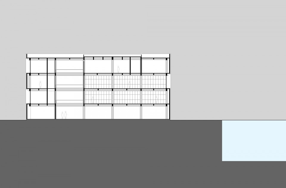
光与室内空间的关系也是本设计的一个重要要素,图书馆的内部是一个与外立面呼应连通的“L”形通高中庭,玻璃屋顶下的中庭将顶部自然光引入了整座建筑,光线通过中庭的调节而更加柔和,通过室内立面空间的竖向开洞,为四周各层的书库、走道以及首层的阅览空间提供了充足的光线,矩阵化的内立面划分模数与书库中书架的排列间距相对应,也将来自中庭的光线“划分”为一个个光线单元并投射进书库内。整座图书馆正是这样一个容纳光线并引导光线的容器。
The relationship of Light and interior space is also an important element of the design. The interior of the library is a L- shaped high court which connects exterior facade and leads the natural light at the top to the entire buildings. The light becomes softer through the adjustment of the atrium, and provides ample light for the stacks of each layer, corridors, and reading space of the first floor through the vertical holes of the indoor space. The matrix of the interior facade divided modulus corresponds to the arrangement spacing of the shelves in the stacks, and also “divides” the atrium light into each unit projected into the library. The entire library is such a container accommodating and guiding light.

1F
2F
SECTION
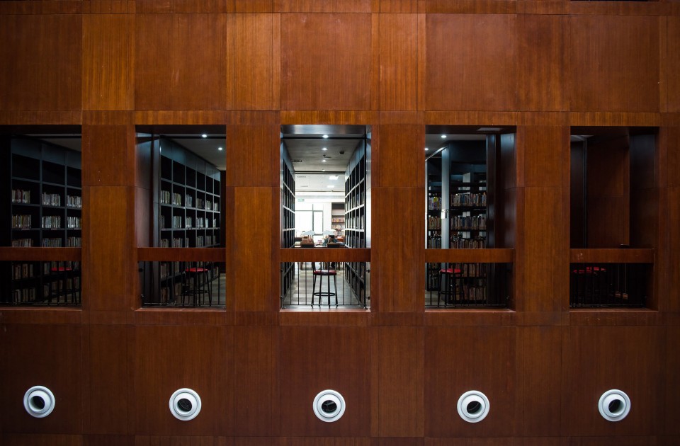
材料与色彩的设计与选择也是一个重要的设计内容,和优雅的白色外立面形成对比。室内空间采用稳重的深色调,材料选则安吉当地的竹木内立面与家具为主,深色的木材质感提供了朴实亲切的触摸感,同时与木质书架、书桌以及图书的色彩与质感形成了一种和谐的完美搭配,混合产生图书馆室内空间特殊的氛围与艺术感染力。
The selection of materials and colors indoor contrast with the elegant white facade is also an important content of the design. The interior space is sedate brunet attune, and the material is local bamboo of Anji. The dark wood texture provides a simple friendly touch, and forms a kind of harmonious perfect collocation simultaneously with wooden bookshelves, desks, and the color and texture of books. All of them mixed produce a special library interior space atmosphere and a kind of artistic appeal.
主设计师: 秦洛峰
设计团队: Sascha Ellenberg 戚爱飞 程璐 等
建筑面积: 4200平方米
项目来源: 公共竞赛第一名 中标
设计机构: 浙江大学建筑系
浙江大学建筑设计研究院 – STI (思图意象)工作室
国美设计 (室内合作)
摄 影: 俞淳流
Main Designer: Luofeng Qin
Design Team: Sascha Ellenberg, Aifei Qi, Lu Cheng, Etc.
Construction Area: 4200m2
Project Source: the first prize of Public competition, won the bid
Design Agency:
Department Of Architecture, Zhejiang University
The Architectural Design & Research Institute Of Zhejiang University — STI Studio
GMAID (Interior design cooperation)
Photography: Chunliu Yu
MORE: 思图意象工作室 STI Studio,更多请至:STI Studio on gooood



室内有点像Max Dudlerde做的两个图书馆,但是室内通风口做的不太好,有点糊弄
室内空间十分乏味
有点路易斯康的感觉。
白色石材感觉分缝应该简洁大气一些,现在这个有点繁琐了。显得小气。
既然建筑做了,为什么不把建筑周边景观细细处理一下,不要总是简单的布一片水,栽几棵树。
浙江地区多雨水,顶层的凹陷区域(室外阳台)的散水会对下层墙面造成影响,这个问题没有解决好,长时间使用,干净的立面效果就不存在了,看图片已经产生了影响。
个人比较喜欢这种简洁的立面,但这个项目体块组合稍显平淡,并且四个立面做法重复性太强,略觉失分
立面使人想起西扎的作品。但是多层缺少二层建筑的灵动。
这个估计是立面设计一个公司室内一个公司那种—现在很多公司专业做立面