感谢 Raul Sánchez Architects 予 gooood 分享以下内容。更多关于他们:Raúl Sánchez Architects on gooood。
Appreciation towards Raul Sánchez Architects for providing the following description:
IMPRESS青少年牙科诊所位于马德里Carranza大街的繁忙角落,一排巨大的花岗岩石柱沿着街道划分出室内外的边界,而在诊所内部,精致纤长的铁柱则与石柱形成了鲜明的对比。
This new clinic for Impress in Madrid is located on a busy corner of Carranza street, where a line of huge granite ashlars delimits the perimeter towards the street, while inside, slender and refined wrought iron columns make the counterpoint to the ashlars.
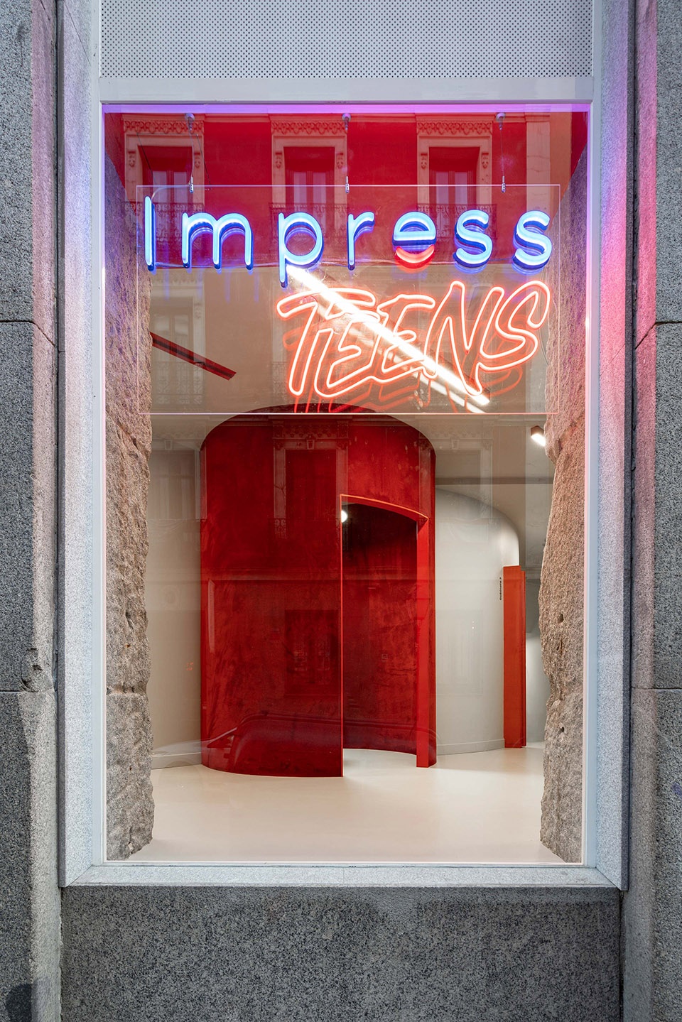
▼诊所外观,
exterior appearance of the clinic ©Luis Asin
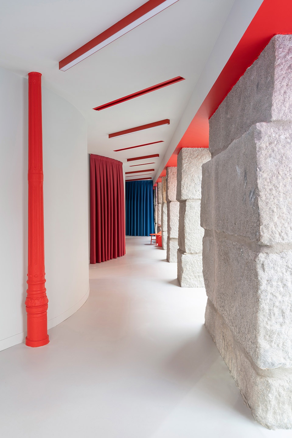
石柱廊与铁柱廊的强烈对比同时也是本项目设计的灵感来源:一系列圆柱与曲线墙面形成空间的游戏,柱子或在墙内或在墙外,同时为沿石材外立面一侧的区域留出空间,将诊所大堂、等候区与街道紧密地联系在一起。通过这种方式,巨大的石柱与纤细的铁柱以及曲面墙之间形成了具有趣味性的视觉关系,在曲面的遮挡下,圆铁柱在空间中时隐时现,以“点”与“面”的形式接近或远离石材外立面。而铁柱也被漆成了亮眼的红色,再次与严肃的花岗岩形成对比,赋予了空间独特的性格。
▼分析图,diagram ©Raúl Sánchez
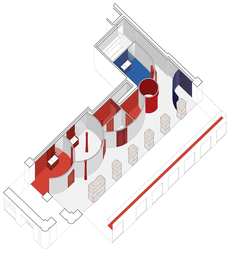
This striking contrast between these two porticoes guided the design process: a series of curves in the form of cylinders crowd the interior party wall and play with the wrought iron columns, leaving them inside or outside them, while leaving an empty space towards the stone ashlars, where the lobby and the waiting area are resolved, always in close contact with the street. In this way, a dialectic game is created between the enormous stone pillars, which are given space to be seen, and the curves and iron pillars, which appear, in contrast, as fragile planes and lines that approach and move away from the ashlars. Even the iron columns themselves have been painted red, giving them a more playful character compared to the stony seriousness of the granite.
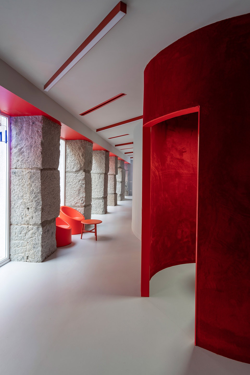
▼大厅/等待区域,lobby/waiting area ©Raúl Sánchez
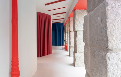
▼厚重的石材外立面暴露在室内空间中,
Heavy stone facades are exposed to the interior Spaces ©Raúl Sánchez
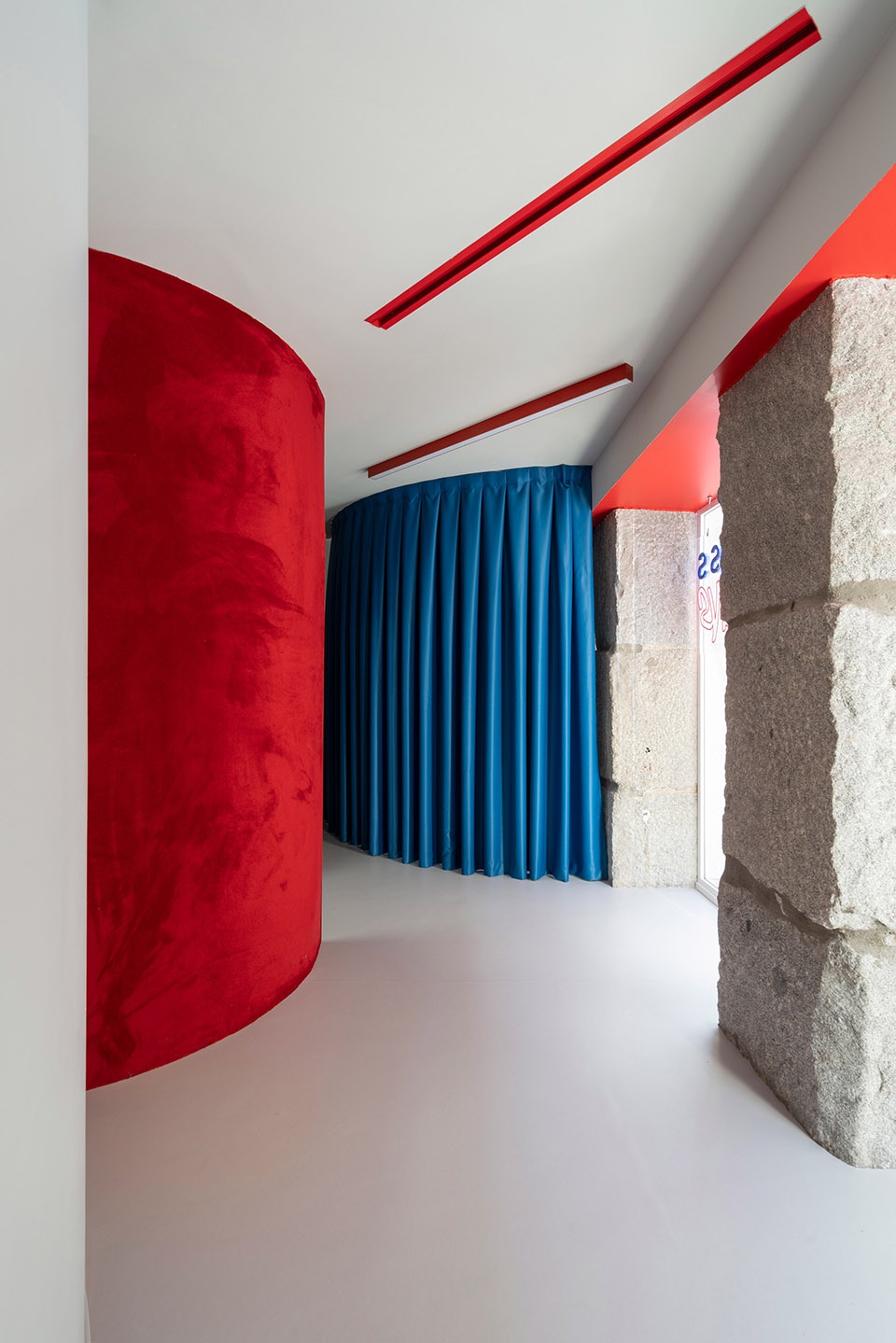
▼室内饰面与石材形成鲜明对比,
The interior finishes contrast with the stone ©Raúl Sánchez
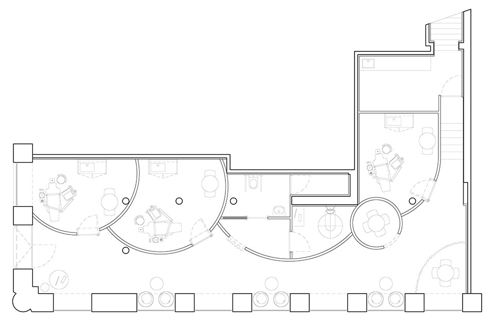
在本项目中,“曲线”元素反复出现在设计中,这种设置来源于IMPRESS自身独特的品牌标识,而从功能上来讲,“曲线”也是优化小面积空间的利器。因此,所有的公共空间都由圆柱界定并串联在一起的,空间的大小也可以根据功能的需求灵活调整。相反,曲线墙围合出的功能空间外侧则形成“负空间”,“负空间”面向大堂,充盈的自然光线、不断变化的边界为大堂赋予了丰富的空间体验,满足了复杂的功能需求。诊所中其余的私密功能空间则位于地下层中。
The use of curves is a recurring design element in the projects we carry out for Impress, based on its own logo, and functionally, it has been revealed as an optimizer of spaces on small footprints. Thus, all public rooms are resolved by concatenated cylinders, varying their size according to need; in turn, the space in negative, towards the lobby, achieves a very rich and complex spatial quality, with an ever-changing perimeter, flooded with natural light. For the rest, all the private functions of the clinic are solved in the basement.
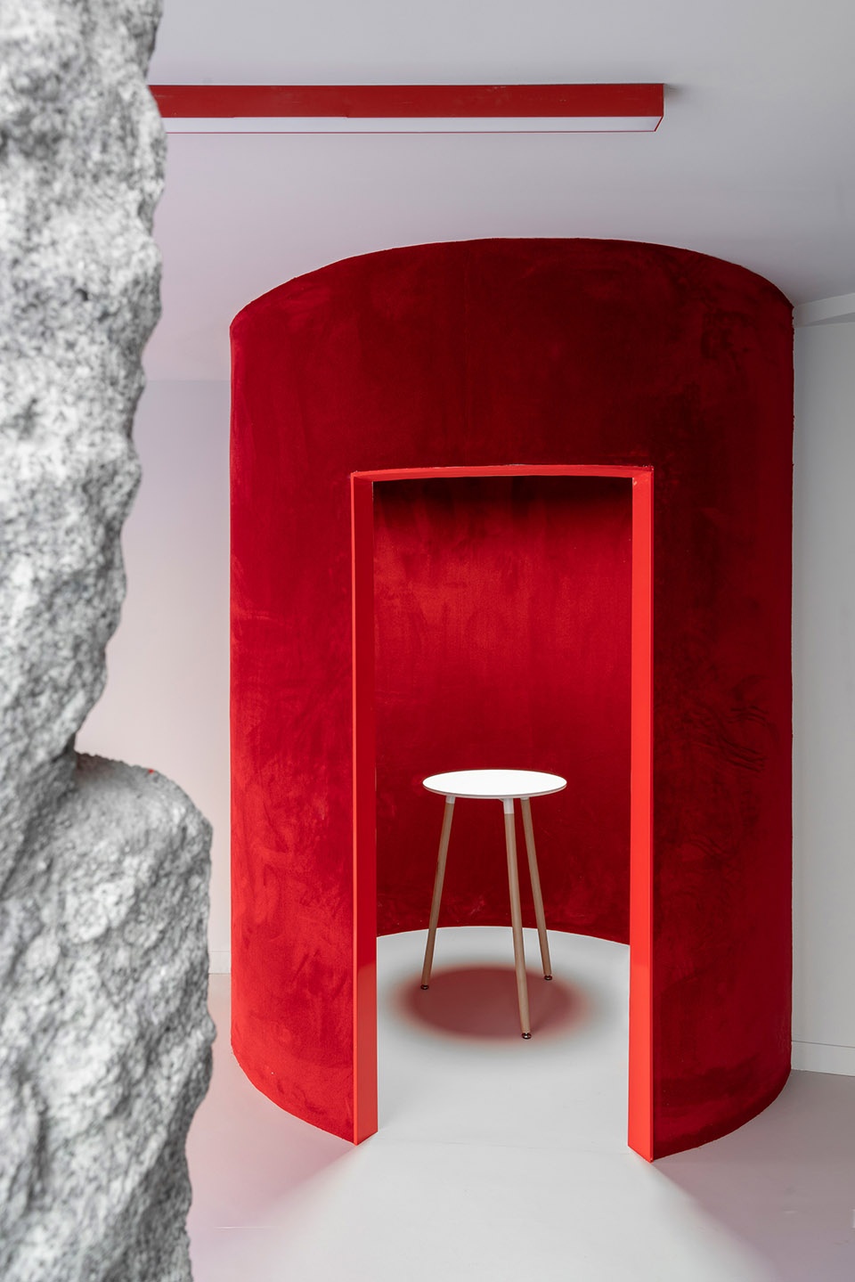
▼销售空间的外立面采用了植绒的材质,
The exterior of the sales point is flocking ©Raúl Sánchez
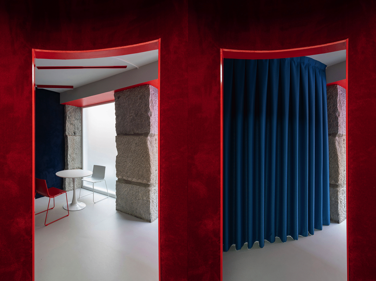
▼布帘成为临时性的空间分界,
cloth curtain become temporary spatial boundaries ©Raúl Sánchez
在纵向上,大厅/等候区域与外部保持着紧密的联系,油毡地板与墙面涂料均采用了灰色色调,红色的边框与饰面则清晰地勾勒出外立面的石材,进一步突出了石材的巨大体量。木制的门与门框也被粉刷为红色,使通往诊室、x光片室,以及卫生间等其他房间的通道入口更加清晰明显,不同空间的室内配色根据功能而有所不同。IMPRESS logo中的红、灰、蓝三种颜色也因此在诊所空间中得到了巧妙地诠释。
The hall/waiting area, developed longitudinally in close contact with the outside, is stained gray, both on the linoleum floor and on the lacquered walls, where the ashlars, clearly outlined by a red soffit, stand out for their massiveness. The doors, blocks of wood tinted red, announce the passage to other rooms (dental boxes, X-ray and toilets), where the color codes change in each one of them. Thus, the three corporate colors of Impress, red, gray and blue, star in each of the three boxes, applied indistinctly.
▼室内色彩与曲线元素灵感来源于品牌logo,Interior color and curve elements are inspired by the brand logo ©Raúl Sánchez
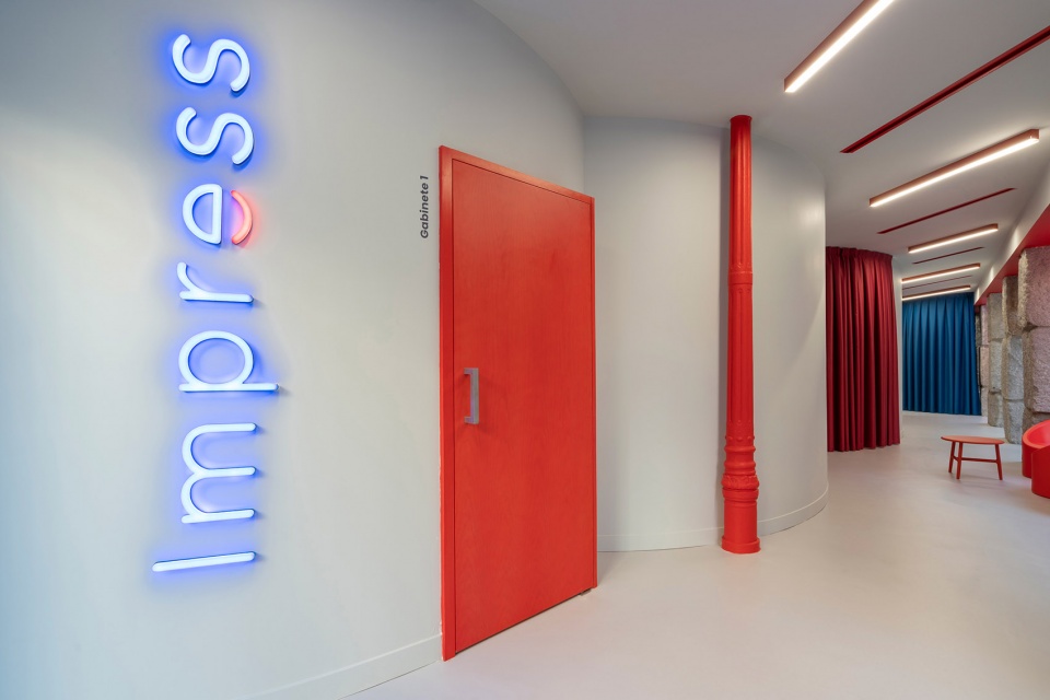
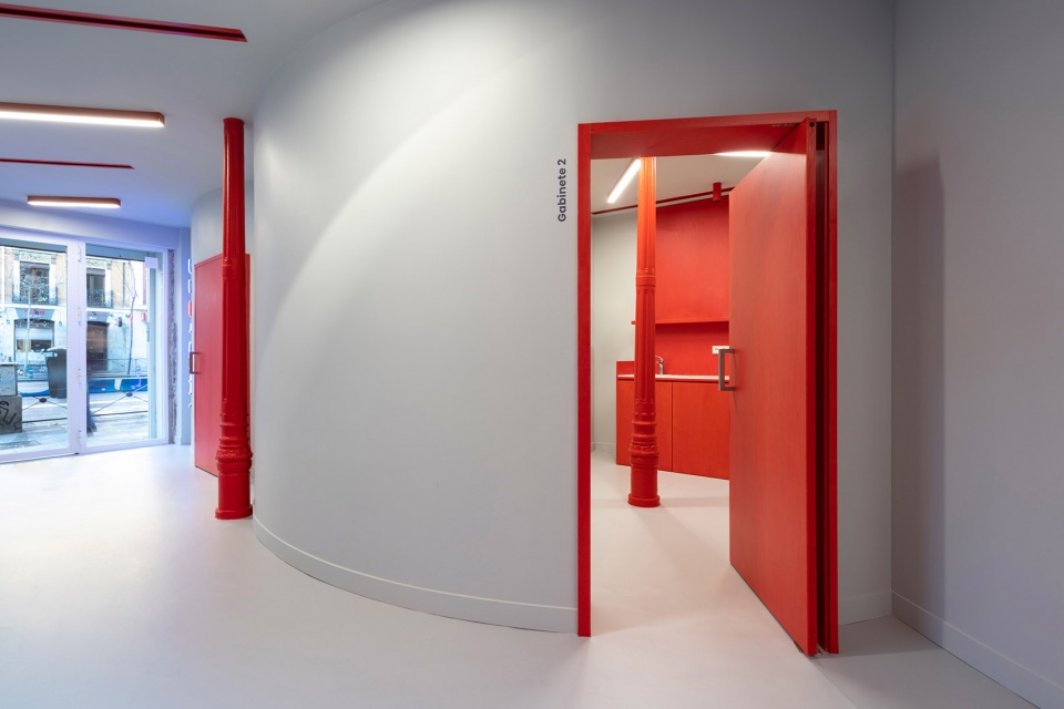
▼红色的门框与门使入口显得格外清晰,
The red door frame and door make the entrance appear particularly clear ©Raúl Sánchez
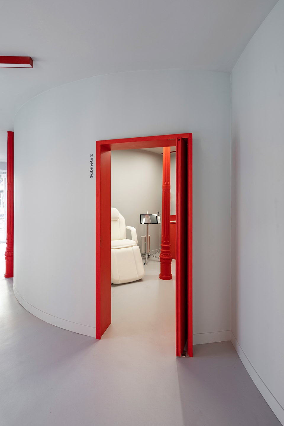
▼临时性分隔布帘与门的对比,
The contrast between temporary separation curtains and doors ©Raúl Sánchez
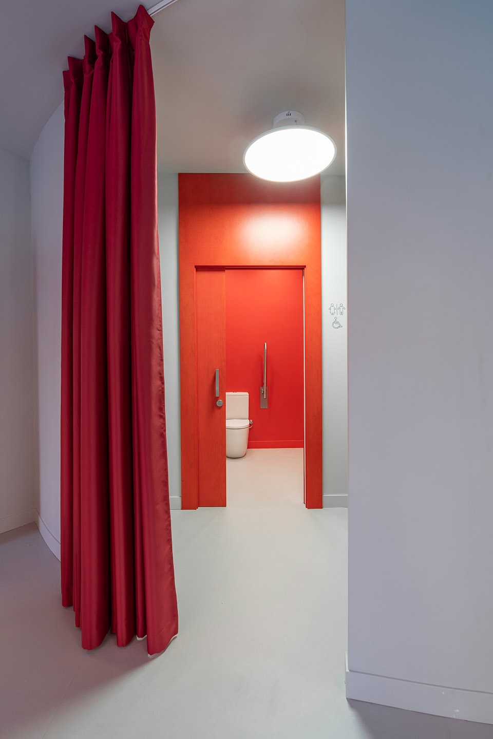
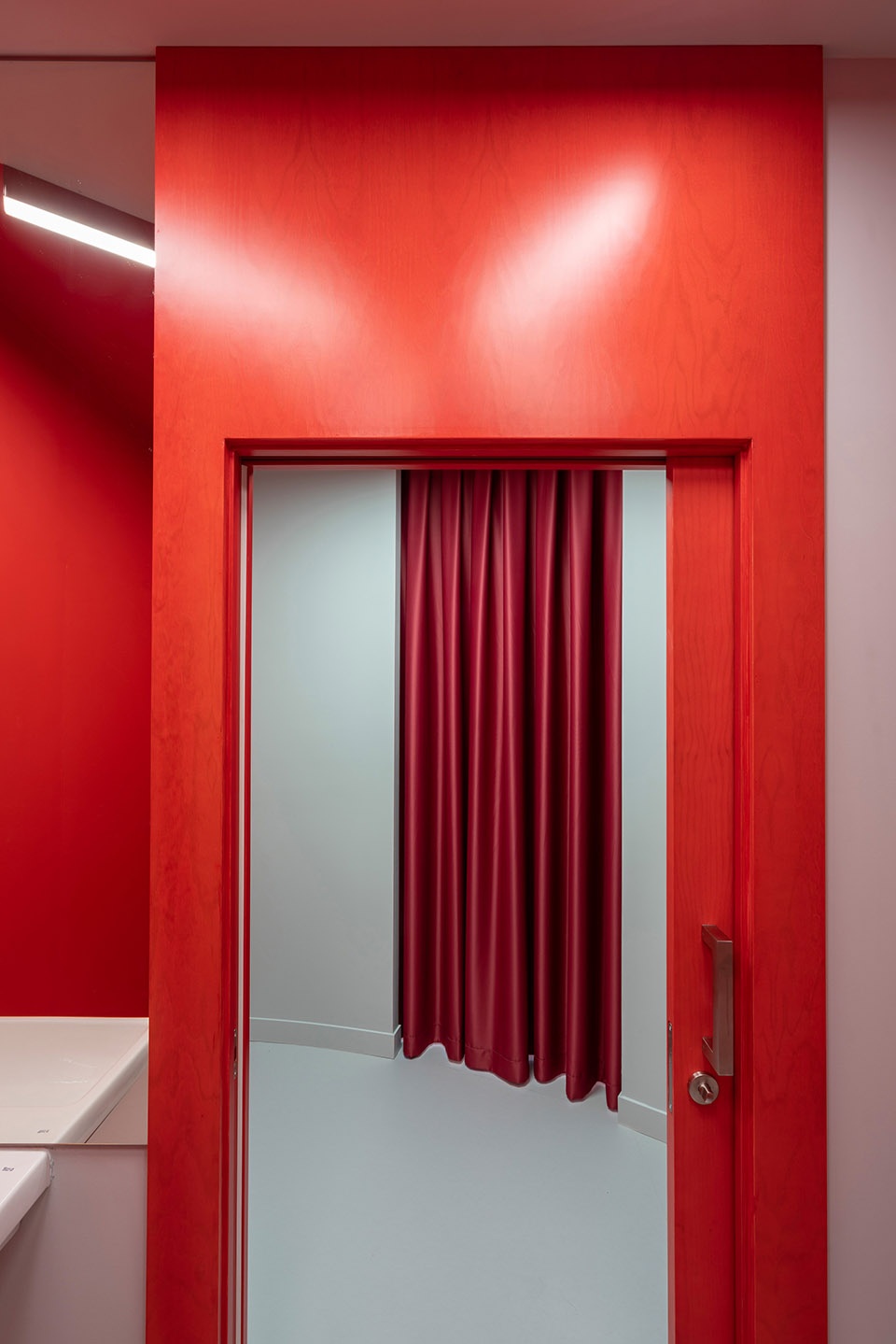
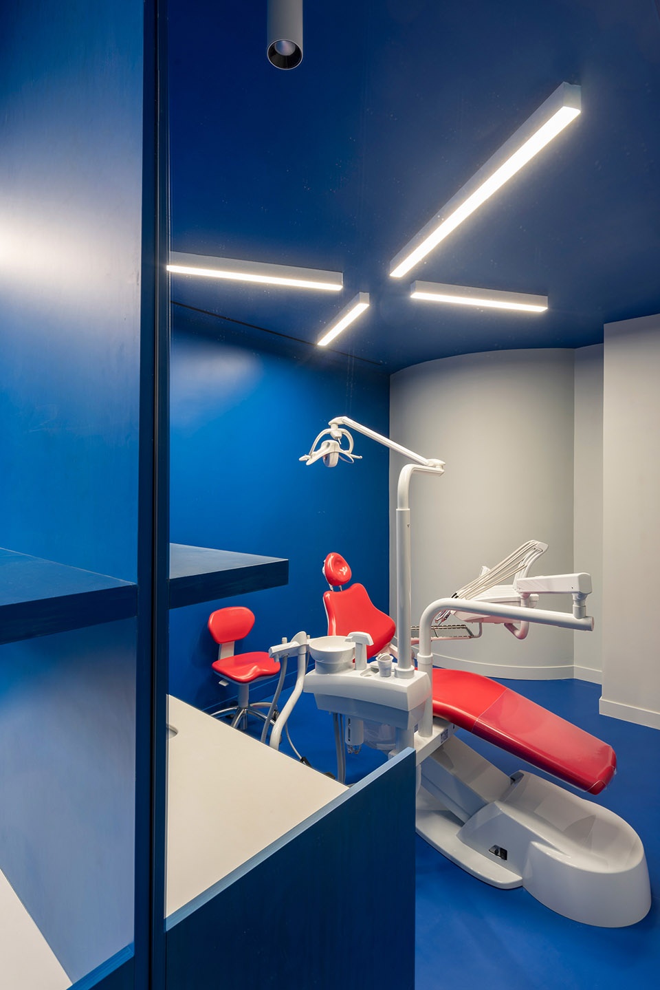
天花板上的所有元素都旋转了45度,与诊所街角的地理位置形成呼应;诊室的外侧墙壁贴有天鹅绒饰面,不仅美观舒适且具有良好的吸音功能;窗帘用来封闭临时使用的空间;木材元素则在保留原始纹理的基础上粉刷成红色,使传统的材料焕然一新;每个诊室以及空间最内侧的镜面则加深了空间的纵深感,营造出宽敞的视觉氛围。
All ceiling elements are rotated 45º, again echoing the corner position; the points of sale are covered with carpet on their vertical surfaces (a resource with an acoustic and comfort objective); curtains close spaces for temporary use; the dye of the wood allows to preserve its texture, turning a traditional material into something fresher; the use of mirrors inside the boxes creates illusions of depth…
▼诊室内部空间 – 天花板上的灯带旋转了45度,All ceiling elements are rotated 45º ©Raúl Sánchez
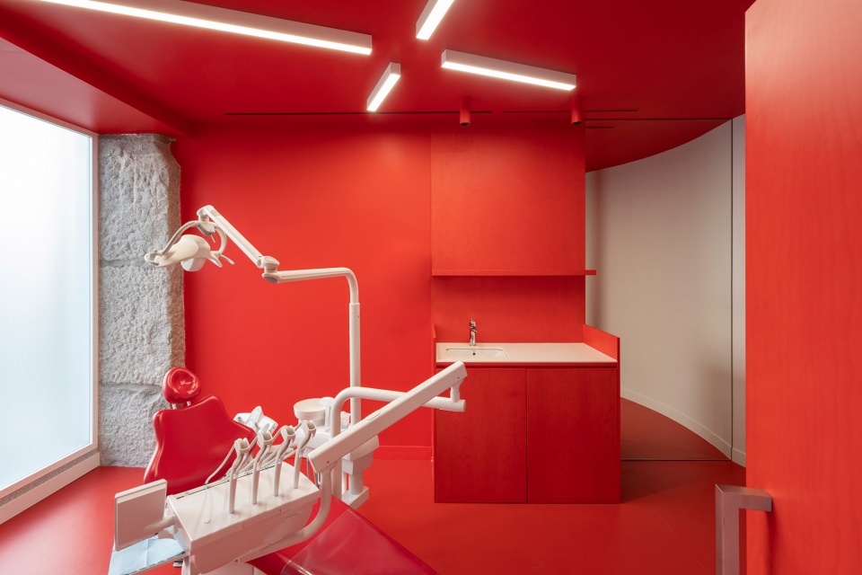
▼镜面扩大了空间的视觉体积,
Mirrors expand the visual volume of the space ©Raúl Sánchez
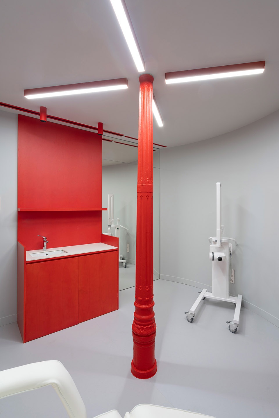
▼铁柱细部,detail of the iron column ©Raúl Sánchez
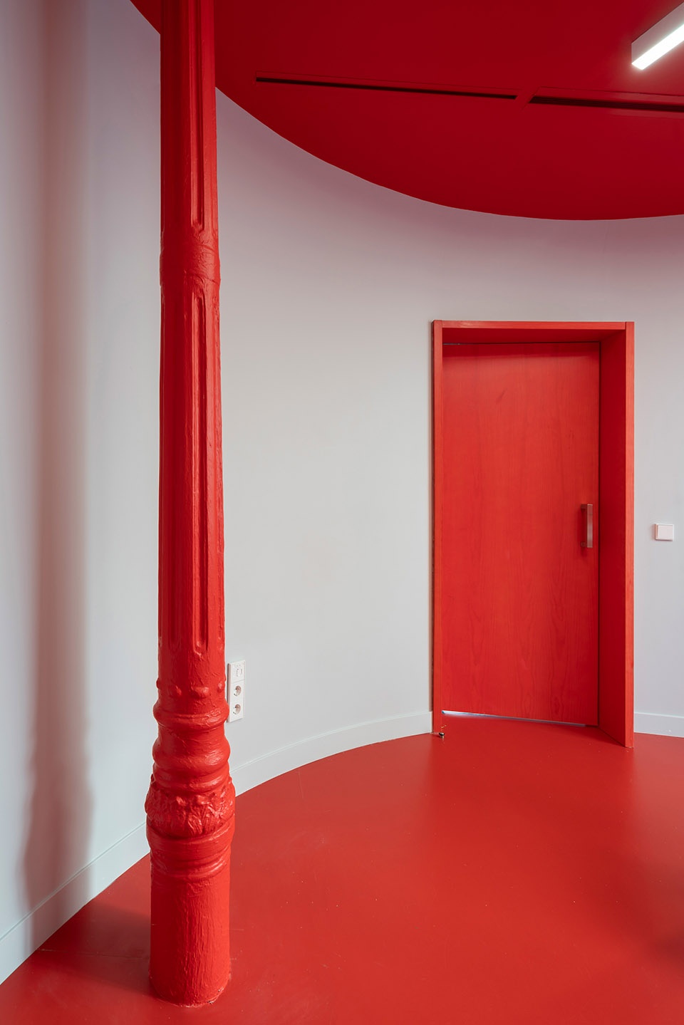
本项目中,空间、材料以及标识设计都源于IMPRESS的独特品牌理念,作为一个面向年轻人群的牙科诊所,它颠覆了传统牙科诊所单调的白色、无菌环境的概念。IMPRESS品牌所追求的设计不仅包括视觉,还包括触觉与感官,本项目成功地诠释出这种理念,将人们带入宛如大卫·林奇(David Lynch)的《双峰》(Twin Peaks)世界中。
All these spatial, material and figurative resources are due to the communication of the Impress brand, aimed at a young audience, and allegedly far from the traditional concept of a dental clinic (white colors, aseptic environment), while pursuing a design that encompasses not only visual conditions, but also tactile and sensory ones, where the reference to David Lynch’s ‘Twin Peaks’ universe inevitably reappears.
▼不同的诊室采用不同的配色方案,
Different rooms use different color schemes ©Raúl Sánchez
▼平面图,plan ©Raúl Sánchez
Architecture: Raúl Sánchez
Web: www.raulsanchezarchitects.com
instagram:@raulsanchezarchitects
facebook: https://www.facebook.com/raulsanchezarchitects/
Name of Project: IMPRESS MADRID TEENS
Location: Carranza 7. Madrid (Spain)
Team:
Architecture: Anna Villaroya (project leader); Dimitris Louizos
Engineering: Mares enginyers
Photography: Luis Asin (@ainluis)
Project: May-July 2021
Construction: Septiembre – Noviembre 2021
Client: Smile2Impress
Built area: 200 m2
Budget <300.000€
More: Raul Sánchez Architects,更多关于他们:Raúl Sánchez Architects on gooood







看见拔牙的椅子就很怕
刺激,哈哈哈哈,就像拔牙飙血那种刺激
WOO!!
很喜欢厚重的石材在空间中呈现出的力量感