非常感谢 西涛设计工作室 (联系邮箱:info@ateliertaoc.com)予gooood的分享。更多关于他们请至:Atelier tao+c on gooood
Appreciation towards Atelier tao+c (contact:info@ateliertaoc.com) for providing the following description:
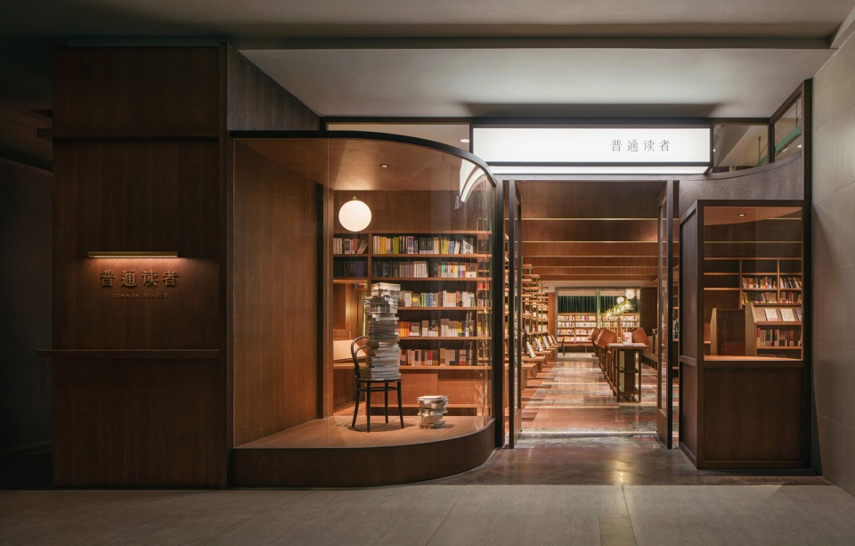
Atelier tao+c 西涛设计工作室为“普通读者” 设计了一间提供传统的阅读体验的书店。普通读者书店的名字来源于 Virginia Woolf 那本关于阅读的小书《普通读者》。设计师和书店主人有着共识,作为一家独立书店书店不应只是书的储藏室展示室,也有必要是社会记忆的保存处、经验和知识的提供场所。
Atelier tao+c has designed a bookstore to provide a traditional reading experience for Common Reader, of which the name originated from the book [The Common Reader] by Virginia Woolf. The designer and the owner reached a common understanding that the bookstore should not only be a storage room for books, but also a place for collecting social memories, experience and for knowledge absorbing.
▼书店外观,appearance of the project ©Wen Studio
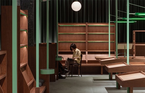
通过对阅读行为的体贴入微的考虑,书店的内部设计提供了静默的让读者重拾专注力的空间体验。 除了书架、展书台、座位和阅读灯、窗帘,就没有别的要素了。深色调的木板,镶以明亮的绿色边缘,唤起老图书馆的记忆,创造出一个鼓励读者逗留其中、坐下来阅读和写作的氛围。
Atelier tao+c seized the opportunity to probe into human’s reading behaviors, as that our interior design for the bookstore aims to curate the immersed experience for readers to re-concentrate. The strategy was to omit unnecessary elements, by enhancing the expressions of book shelves, display tables, seats, reading lights and the curtains. To strengthen the undefined ambiance, which encourages readers to wander within, to sit down and write, the dark-tone woods lined with bright green were introduced to evoke people’s memories of the old-time libraries.
▼书店概览,overall of the project ©Wen Studio
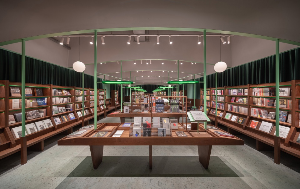
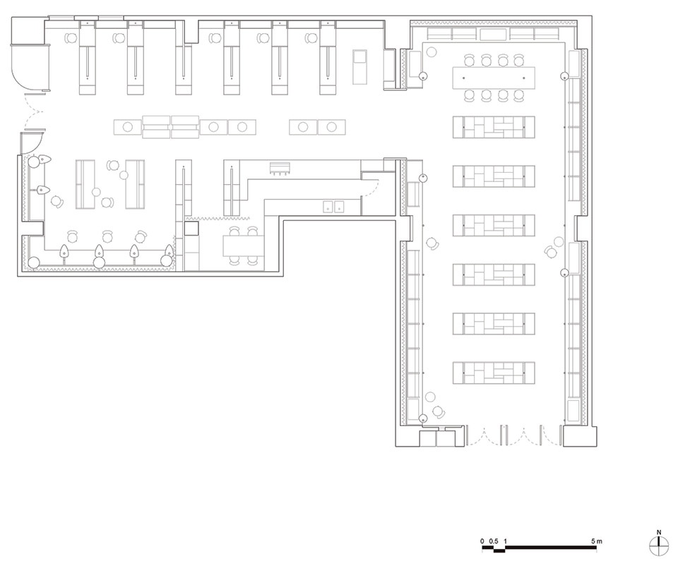
原场地是 L 型的,分成了相对隔离、面积相近的两个矩形房间。设计师以书架的排布作为组织空间的手段,用座位提供停留的可能性,规划出两个氛围不同的空间。临近街面的一间,四周悬挂着墨绿色的窗帘让墙壁消隐,形成了弱化的边界,围合出一个内向的公共大厅,开敞通透。环绕场地的樱桃木板座椅,产生了一个连续的水平界面。
The L-shaped site has been break down into two rectangular rooms, relatively isolated yet with similar floor area. The first hints of the interior are suggested to the individual by the circulation of the book shelves, dividing the frontage room into two different spaces, each with distinctive ambiance. Here the carefully placed seats were employed to present more possibilities of staying within the store. The dark green curtains that hanging around the frontage room have blurred the boundaries of the walls, enclosing an introverted public space, open and transparent.
▼四周悬挂着墨绿色的窗帘让墙壁消隐,The dark green curtains that hanging around the frontage room have blurred the boundaries of the walls ©Wen Studio
▼以书架的排布作为组织空间的手段,
the interior are suggested to the individual by the circulation of the book shelves ©Wen Studio
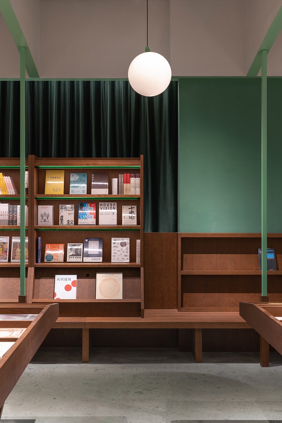
一座座的书架像活动家具一样放置在椅面上,不到顶也不落地,每一本书都是够得着的。几组书架间的空隙会形成几个深座,当浏览到喜欢的书时可以顺势坐在一旁开始细读。这一区域以艺术类书籍为主,座位提供了与普通读者产生共鸣的时间。
The cherry wood seats form a continuous horizontal interface, and all the loose bookshelves hovering above are at a suitable level to showcase all the books within people’s reach. The gap between several groups of bookshelves are used for a few sunken seats, when the customer can sit on one side and start to read a favorite book. This area is mainly for displaying art books and the seats designed within active a time zone to resonate with ordinary readers.
▼书架像活动家具一样放置在椅面上,
the loose bookshelves hovering above the cherry wood seats ©Wen Studio
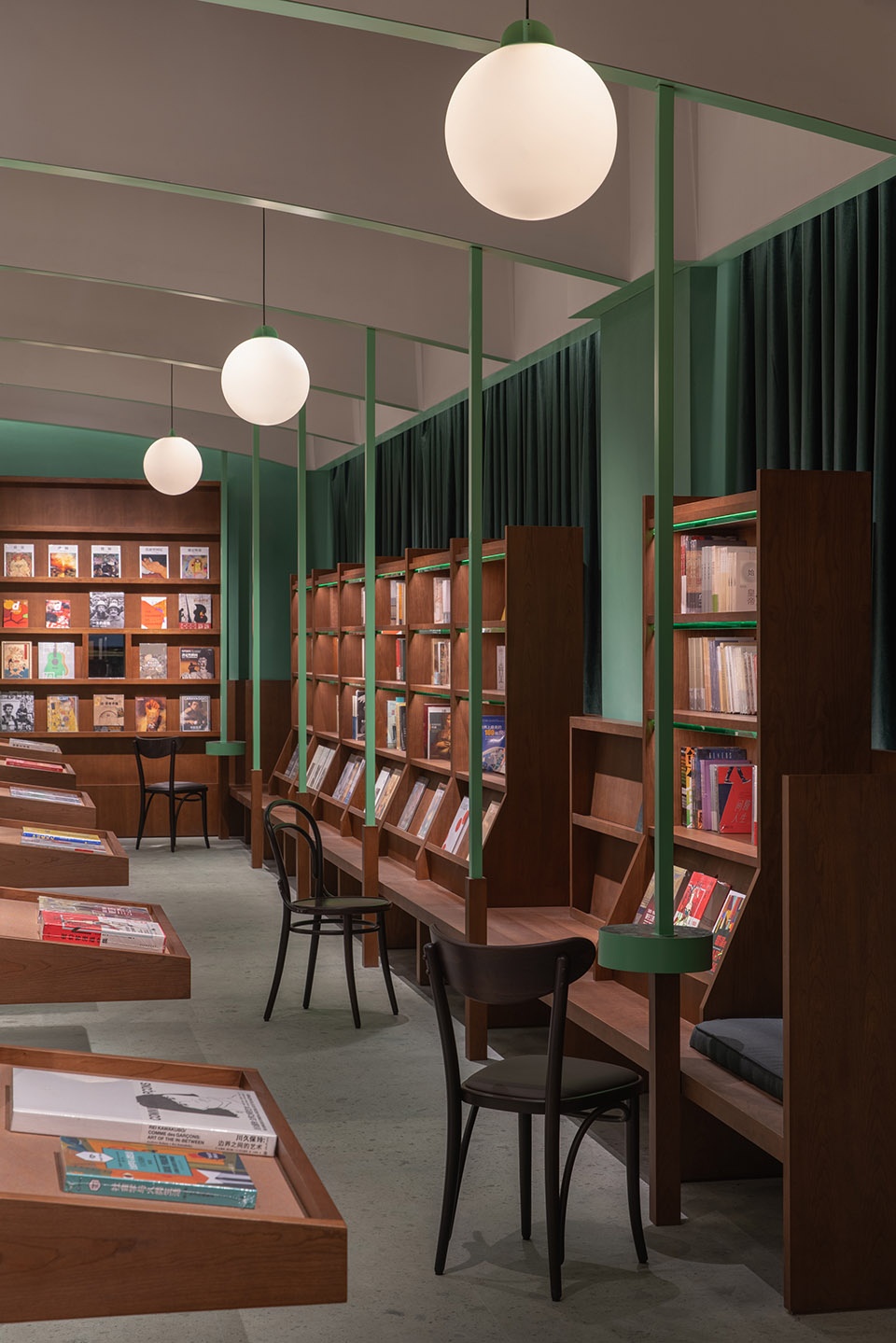
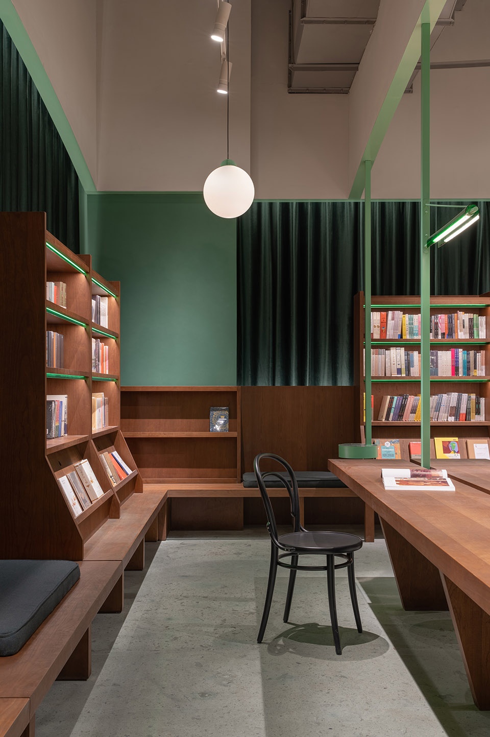
▼几组书架间的空隙会形成几个深座,
the gap between several groups of bookshelves are used for a few sunken seats ©Wen Studio
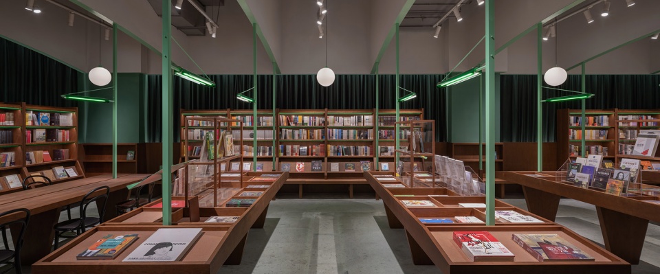
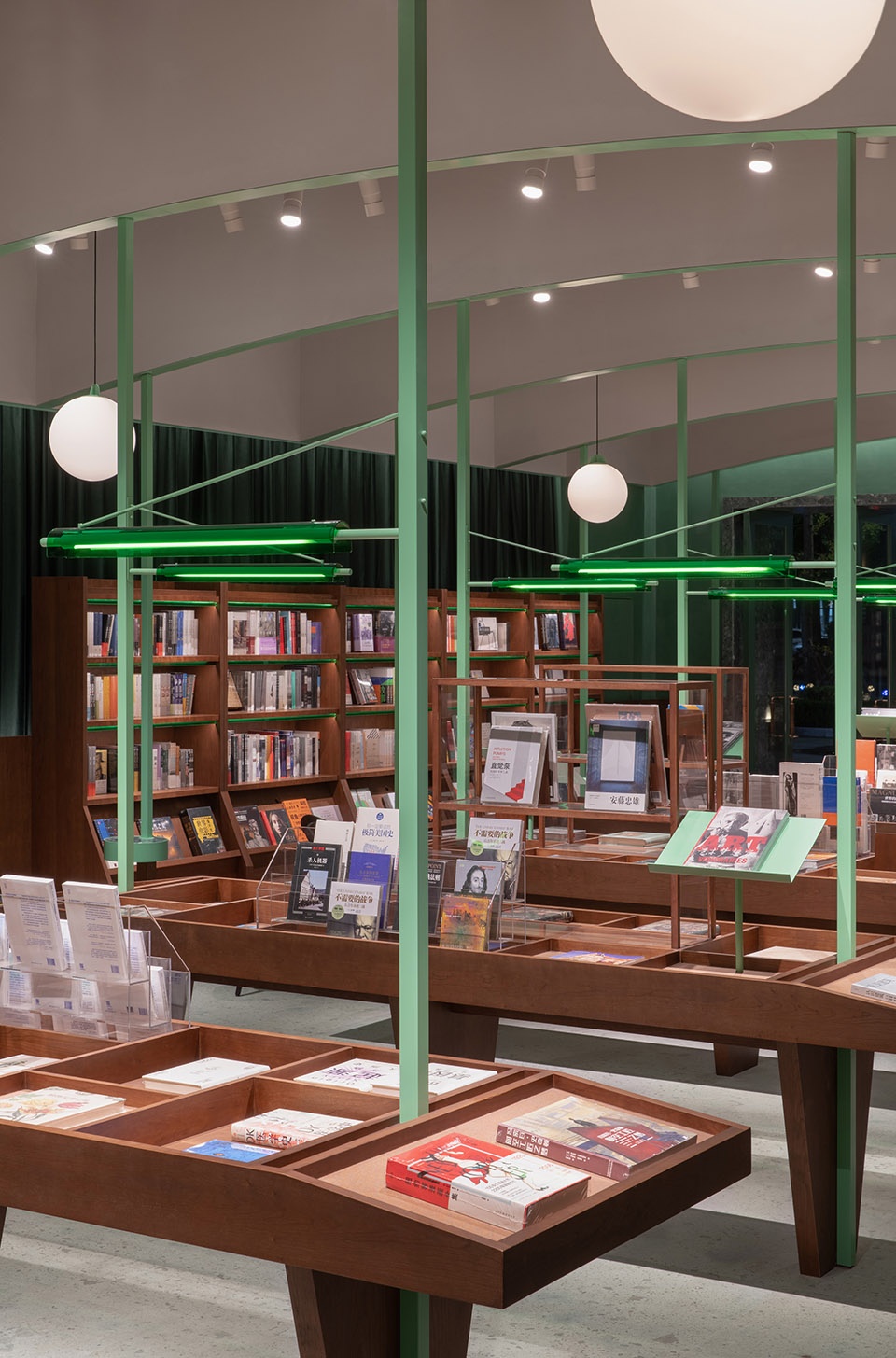
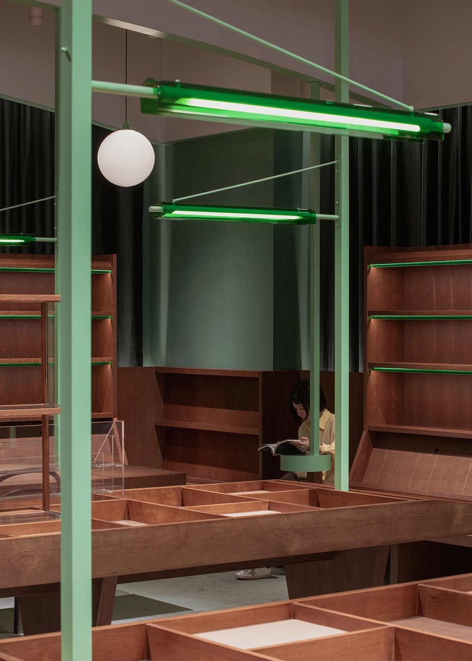
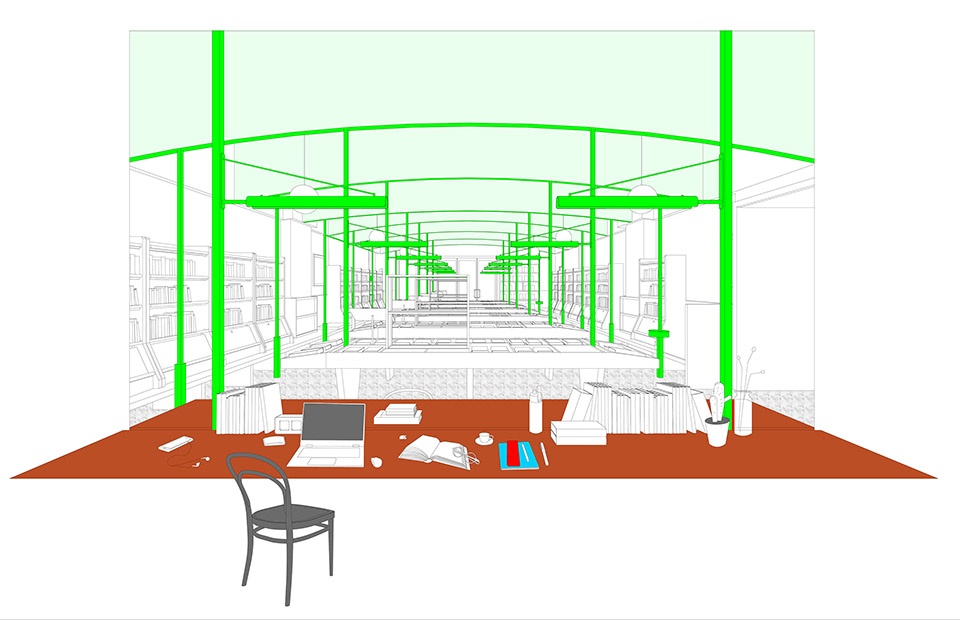
大厅内 7 个大平台的桌面,根据特定书籍的尺寸进行划分,配以定制的玻璃书架和杂志架,增加了序列感和丰富度。水平阵列的展台、竖向的绿色金属柱列配合拱形的帐板形成的通廊,加强了空间的纵深感,让人回想起记忆中的久远的阅览室。
The seven display tables in the hall, equipped with customized glass bookshelves and magazine shelves are parted according to the size of specific books to deliver a sense of sequence and abundance. The horizontal array of exhibition stands, the vertical green metal columns, juxtaposed with arched tent boards are designed to generate the corridor, which enhances the depth of the interior spatially and reminds people of the old- time reading rooms in one’s memory.
▼大厅内 7 个大平台的桌面, seven display tables in the hall ©Wen Studio
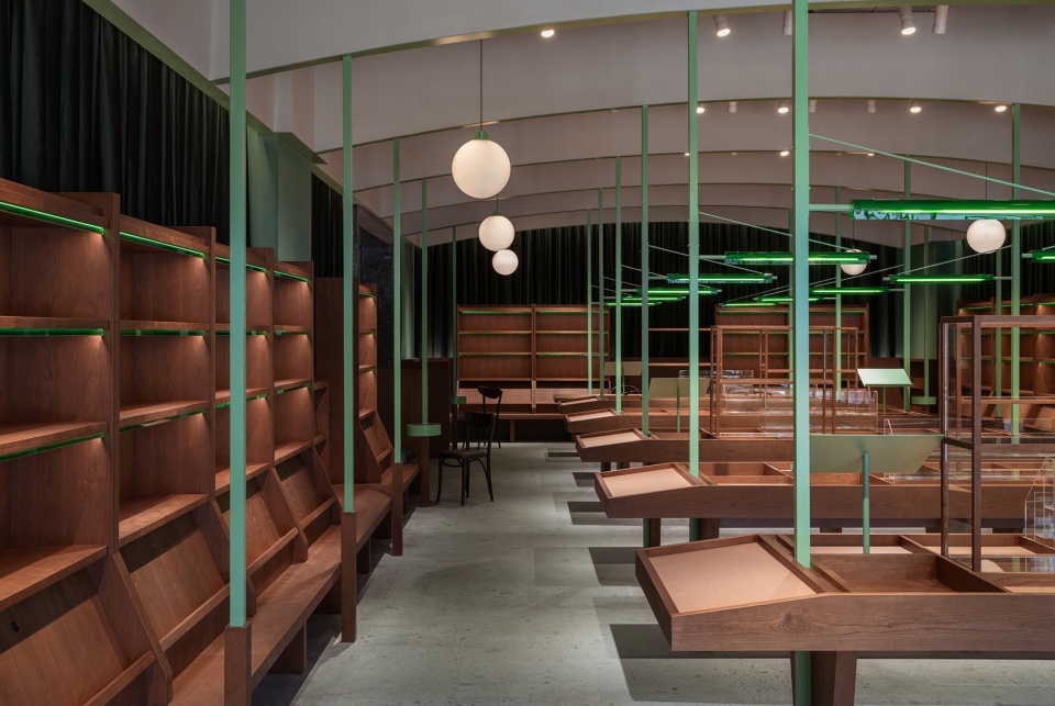
▼类似阅览室的书店氛围,ambiance of the old- time reading rooms in one’s memory ©Wen Studio
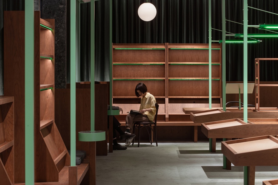
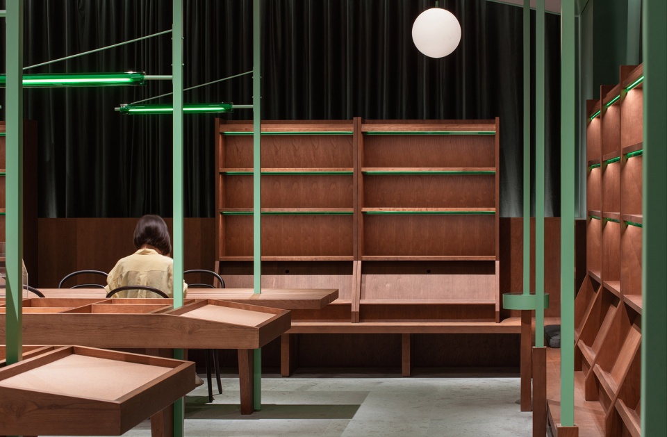
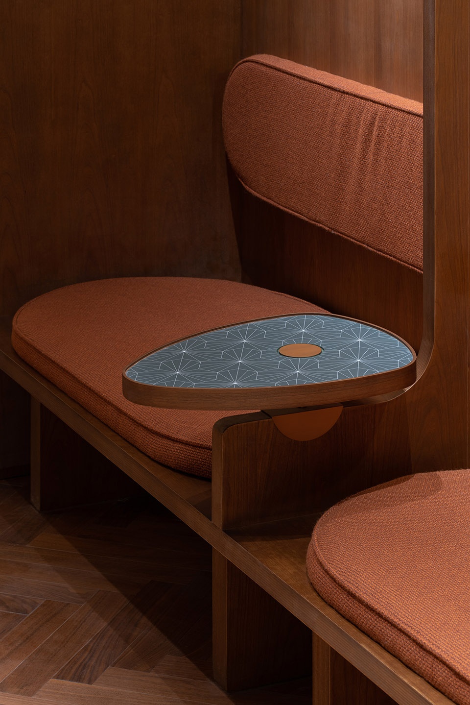
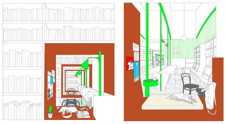
一个绿色石材的门洞连接向更深处的那个房间,转化为私人图书室的氛围。层层阵列的双面书架, 划分出多重的层次和区域。书架与书架间的距离、通道的尺度被有意的压缩,产生精确控制的视觉密度,形成更有私密感的空间构架。每一列书架的尽头都嵌入一个四面围合的洞口,作为单人书桌的功能,是一个相对封闭的阅览空间。这个座位是独立疏离的,营造出一种公共空间里的安全感。在另一边设有咖啡吧,咖啡区的卡座有高高的木板靠背和中间隔板,读者可以在这里安静地看书喝咖啡,与邻座的人互不干扰。书架间的小中岛,像是图书馆里孤品展示书架或是木制推车,被绿色玻璃台灯照亮。
Exploring deeper into the bookstore through a door, detailed in green stones, one enters the more-private reading room. A set of bespoke double-sided shelves presents the store with ample layers and display spaces. The distance of the bookshelves, the dimension of the walkway have been deliberately compressed, endowing the space with precisely controlled visual density and a more intimate spatial framework. A four-sides enclosed hole was embedded at the end of each bookshelf, of which function as a single desk within a relatively private reading space. The associated seat is rather isolated, conveying a sense of security in public space. While a coffee bar was set up on the other side, the banquettes here features high wooden back and inserting partition boards. Readers can read and enjoy a cup of coffee in tranquility, without interfering with people sitting. The space between the bookshelves conceptualized as a tiny “island”, the solitary display bookshelves or the wooden carts here are illuminated by the green glass lamp.
▼双面书架划分出多重的层次和区域,A set of bespoke double-sided shelves presents the store with ample layers and display spaces ©Wen Studio
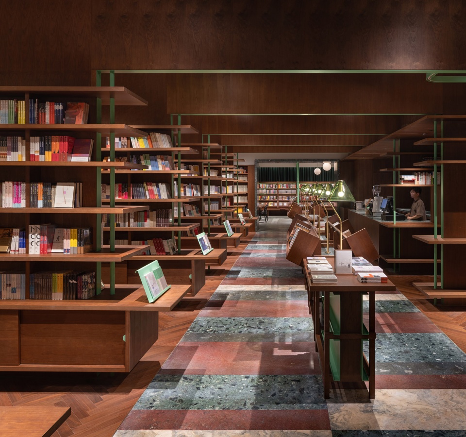
▼书架的尽头都嵌入洞口,作为单人书桌,A four-sides enclosed hole was embedded at the end of each bookshelf as a single desk ©Wen Studio
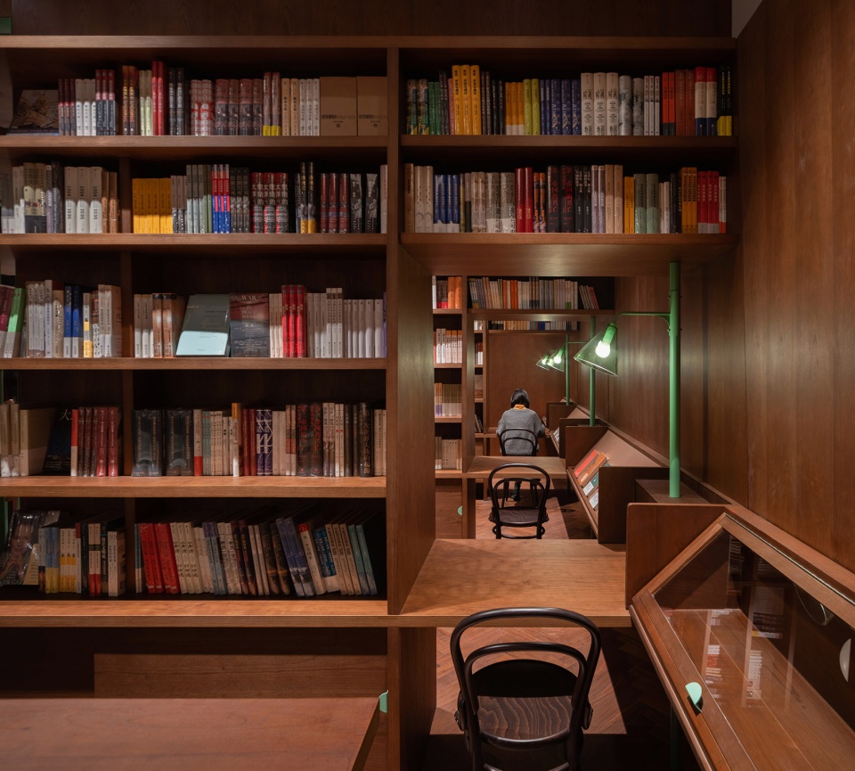
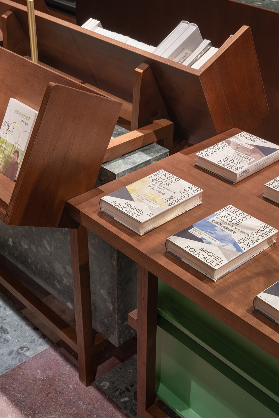
书店里的每一个书架、座位和灯具都是为特定的书籍和阅读行为设计定制的。书架上的不常规的斜角,恰恰是对于书籍取放手势的迎合;不同的座位设计,提供了多种坐下来阅读的方式选择。 就在这些书架的排列组合中,在座位的关系中,形成一处通往回归日常阅读和诗意的场所。
Every bookshelf, seat and lamp in the Common Reader Bookstore are designed for specific books or human’s reading behaviors. The unconventional oblique angles on the bookshelves cater to our gesture of grasping and putting down books; different seat designs provide a variety of ways to sit down and read. In the light of the arrangements of the bookshelves, together with the relationship applied in the seats, a place advocating to the renaissance of daily reading and poetry is quietly growing in the metropolis.
▼灯具与书架座位细部,details of the bookshelf, seat and lamp ©Wen Studio
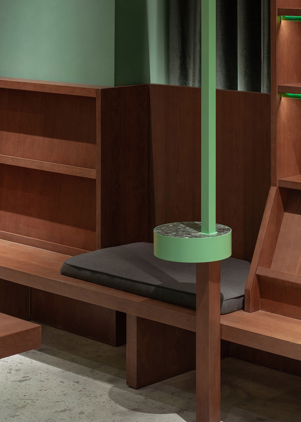
▼站台与咖啡厅座椅细部,details of the display counter and the cafe seats ©Wen Studio
▼场景插画,illustration ©西涛设计工作室
▼平面图,plan ©西涛设计工作室
项目名称:普通读者书店
设计师:atelier tao+c 西涛设计工作室
项目类型:书店,公共空间
联系信息:info@ateliertaoc.com
媒体联络:press@ateliertaoc.com
场地地址:中国杭州
完工日期:2020.11
室内面积:330 sqm
设计团队:刘涛 / 蔡春燕 / 王唯鹿 / 宋浩嘉
主要材料:樱桃木 / 绿色油漆 / 天鹅绒窗帘 / 大理石 FF&E:TON – 椅子 / JOLOR – 扶手椅 / HAY – 休闲椅&边几
灯具制作 – 体物之作
摄影师:Wen Studio
Project Name: Common Reader Bookstore
Architect: atelier tao+c
General Enquiry: info@ateliertaoc.com
Press Enquiry: press@ateliertaoc.com
Project Type: bookstore, public space
Location: Hangzhou, Zhejiang Province, China
Completion Date: November, 2020
GFA: 300 sqm
Design Team: Tao Liu, Chunyan Cai, Weilu Wang, Haojia Song
Materials: cherry wood, green paint, velvet curtain,marble
FF&E: TON – chairs / JOLOR – armchairs / HAY – leisure chairs & side tables Lighting Produce – Tiwu Works
Photographer: Wen Studio
More: 西涛设计工作室 (联系邮箱:info@ateliertaoc.com。更多关于:Atelier tao+c on gooood






绿色是不是再深一点会更耐看
整齐有序的场景
单纯考虑阅读的话,我倒是喜欢这样的空间,起码坐得住人
比很多网红书店好,起码除了打卡拍照外还是真正为读者有所考虑
候车厅
就怕书乱
绿色是起提亮空间的作用吧
放书的桌面做成凹下去的格子让人紧张,平面不好吗?如果能考虑放些绿植估计更有感觉!
要不是门头写着“普通读者”,我还以为是西西弗书店。
和西西弗很像
眼神不好就低调一点
入口处的感觉蛮不错