非常感谢JinSik Kim将以下内容授权gooood发行。更多请至:JinSik Kim on gooood
Appreciation towards JinSik Kim for providing the following description:
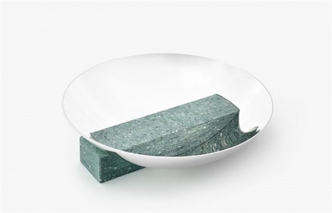
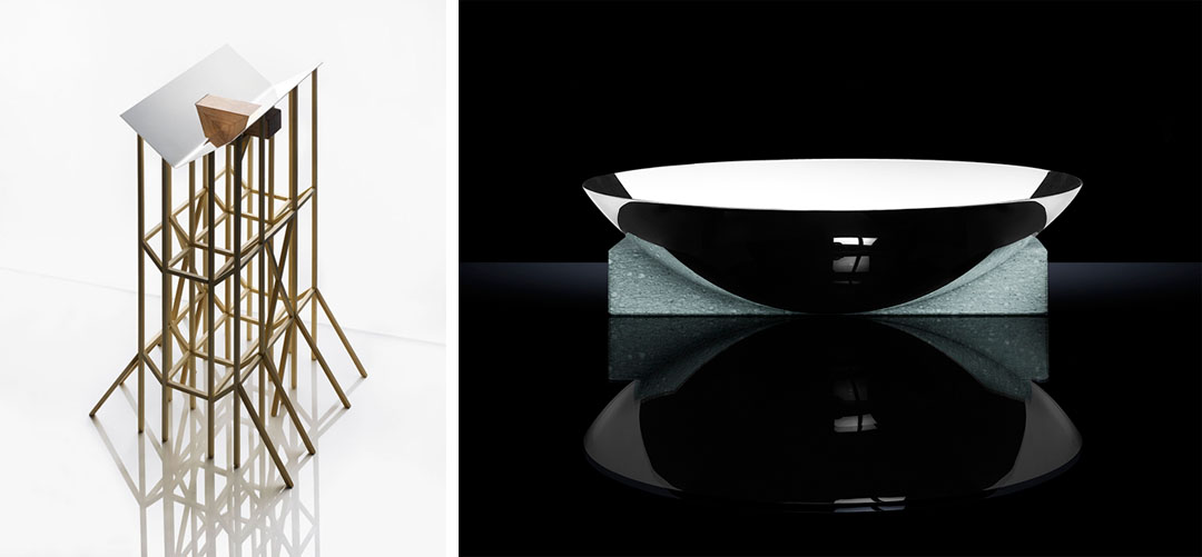
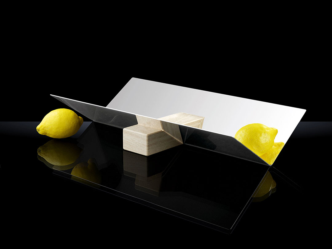
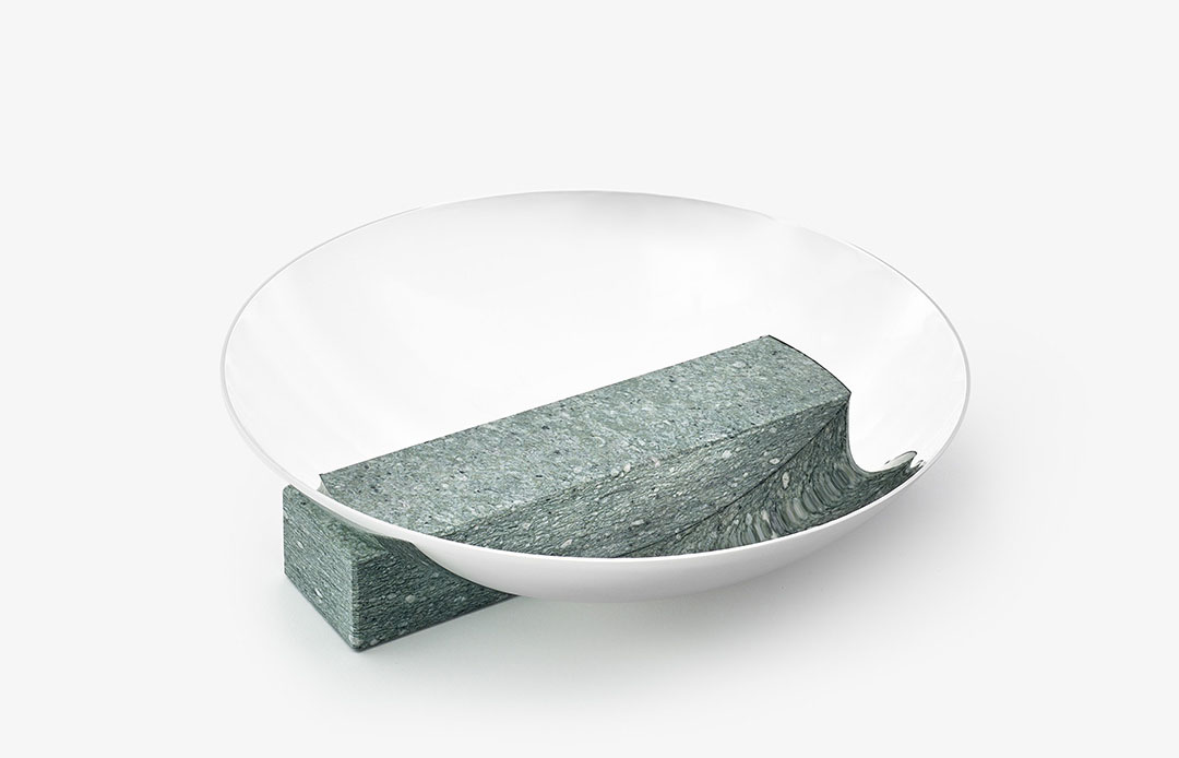
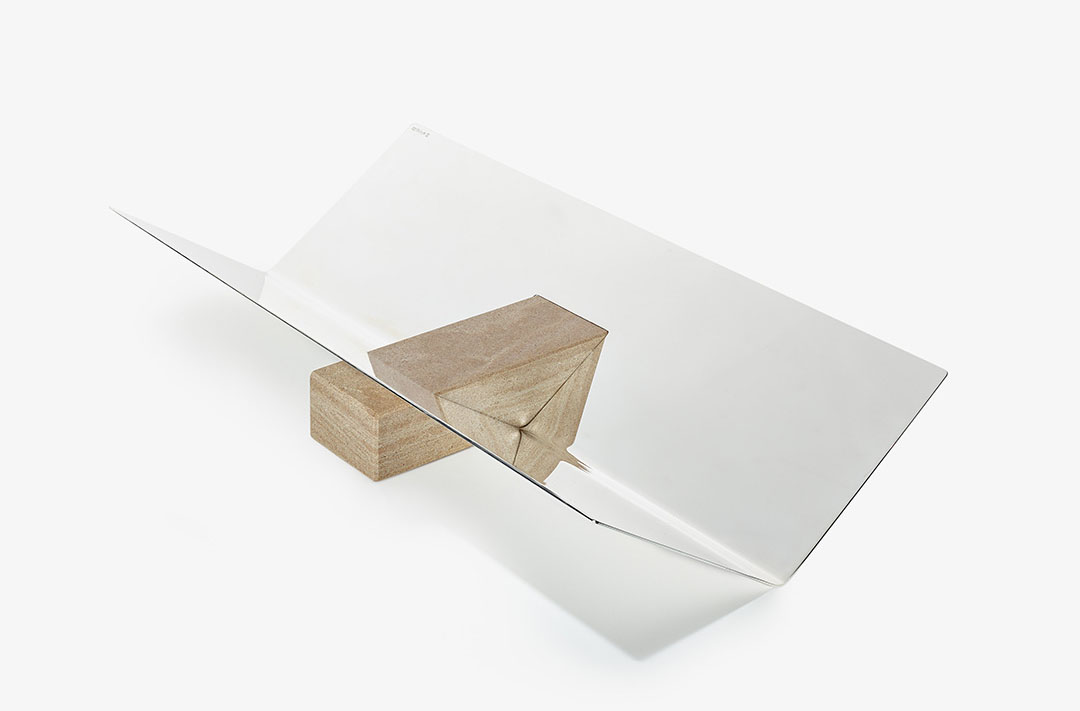
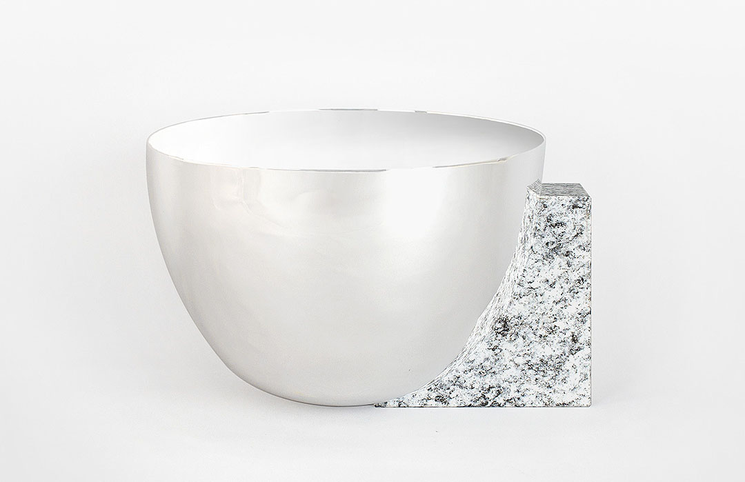
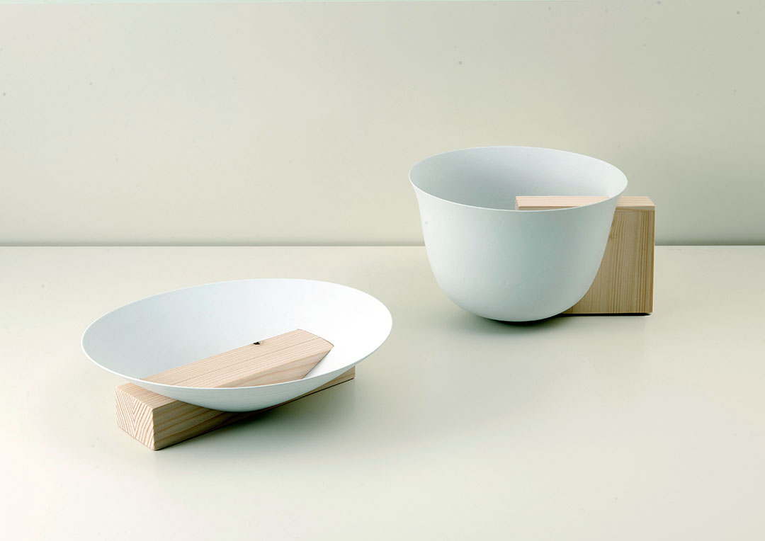
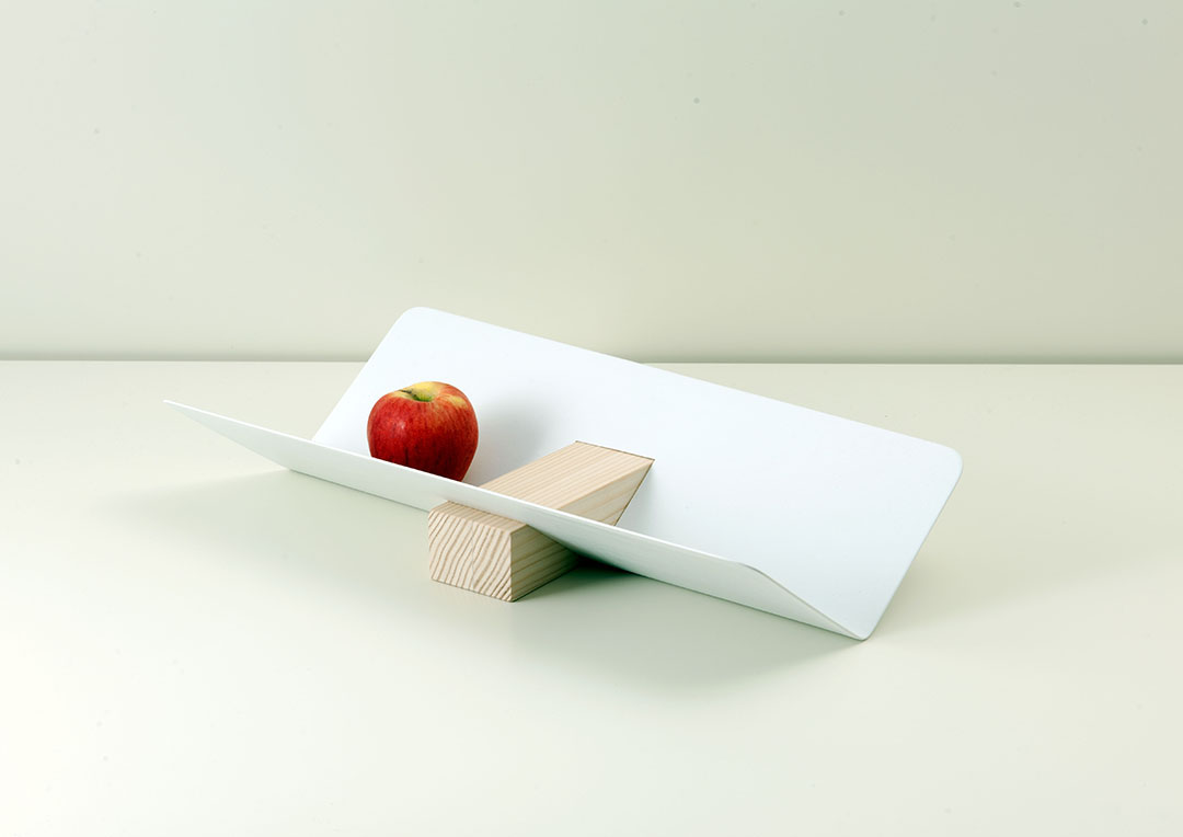
这个设计的出发点是 “反差”。银色光亮容器与沉重材料的反差与对比被淋漓精致的体现。选择简单基本的形状有利于人们认知,同时也有利于生产加工。“面”与“体”碰撞,简单造就的多元结果。
Collaboration with brand Christofle
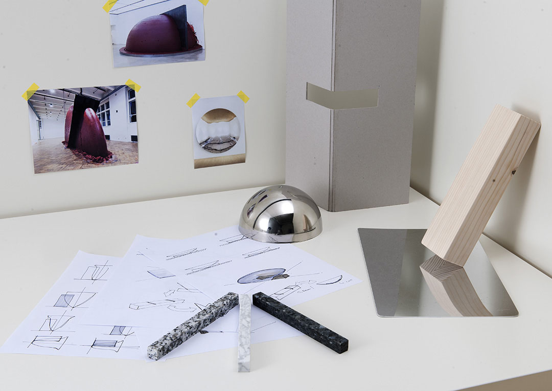
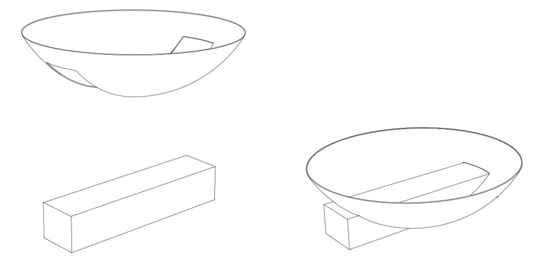
The starting point is to have a strong contrast between silver and another material. So I tried to find out how to stand the simple silver container folded. I decided to use a geometrical structure like crossing a heavy material over the folded silver. And then it’s able to function as a container with a good contrast between a light material and heavy one. It can be recognized easily by people because of using the basic shapes like triangle, circle and square. And I want to show the possibility of the materiality with various stones. It can be produced conveniently. First is to build up the simple ordinary shapes and to cut the silver container following the size of the stone. Second is also to make a rectangle in a heavy stone with an intagliated part to fit the edge of the silver. Finally, the main advantage of the design is that it’s possible to use simple shapes and structures diversely.
This products will be on sale soon as 2014 home collection.
Material_Silver, Granite and Marble
Photo by Cedric Widmer and Nicolas Genta
MORE: JinSik Kim,更多请至:JinSik Kim on gooood




感觉这样了反而不大好用
是个出发点
简练直率的甚至有点唐突,但又让人回味
要保证盛放的物体不掉落,设计才合理
有设计感,但是实用性感觉弱了点