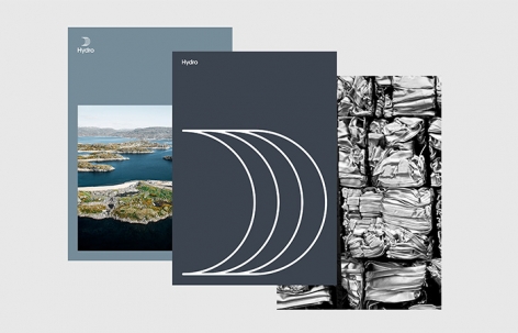
非常感谢 Snøhetta 予gooood的分享以下内容。更多关于他们: Snøhetta on gooood.
Appreciation towards Snøhetta for providing the following description:
2017年,挪威公司Hydro对Sapa进行了历史性的收购,这一重大转折将Hydro进一步推入了全球铝工业的领先地位,公司的员工数量也将增长至原来的三倍。Snøhetta的设计旨在为Hydro传达其全新的国际市场地位,同时将遍布全球的35000名员工团结起来。100多位来自Hydro的各个层级的员工亲自来到Snøhetta位于奥斯陆的工作室参与了视觉形象的概念研讨会,其中包括董事会和众多行业专家。这一系列研讨会产生出12个潜在概念,均传达了Hydro长达112年的发展历史以及公司未来的愿景。在经过一番细致考量之后,Hydro的公司代表最终选择了“Unite”这一概念方案。
In 2017, the Norwegian company Hydro acquired Sapa though a historically significant acquisition that would place Hydro at the front of the global aluminum industry and triple the company’s employee base. Snøhetta’s design is developed to communicate Hydro’s new global market position while also uniting the company’s 35 000 employees worldwide. Over 100 employees from all levels of the Hydro organization, from board level to industry specialists, were involved in conceptual workshops at Snøhetta’s offices in Oslo, Innsbruck and New York to develop the new visual identity. The workshops resulted in twelve potential concepts that would convey Hydro’s 112-year history, legacy and communicates the company’s vision for the future. After careful consideration among Hydro representatives, the concept “Unite” was chosen.
▼设计灵感来源于“圆环”符号,the new visual identity was inspired by the ultimate unifying symbol – circle
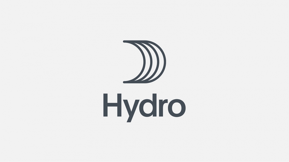
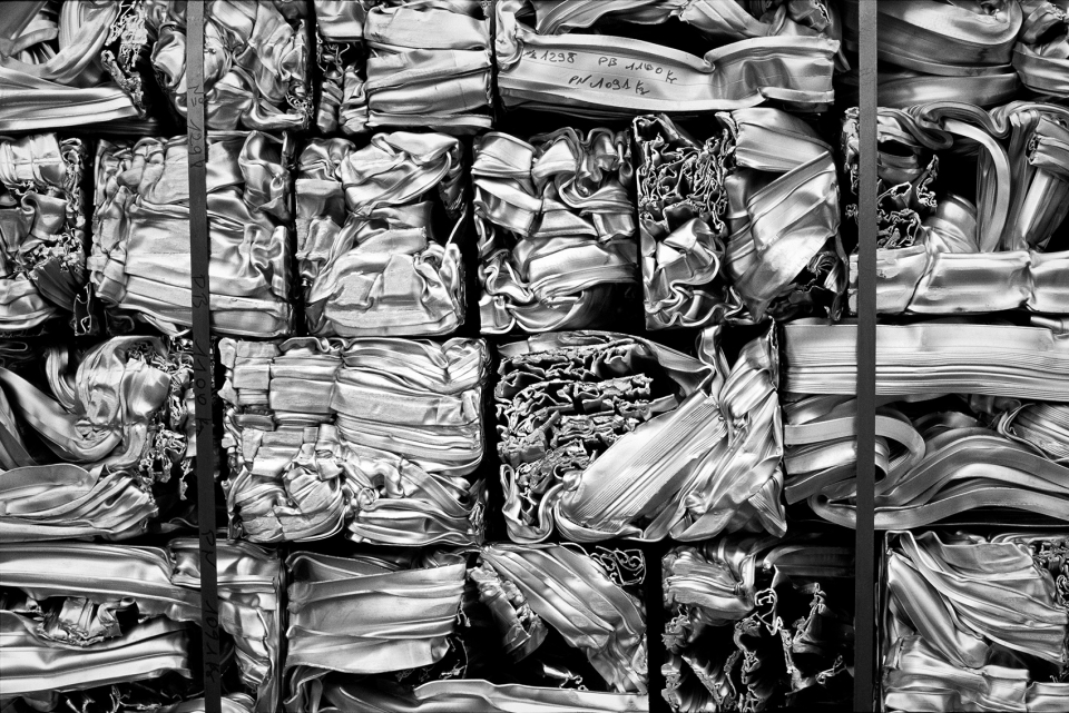
“Unite”起源于拉丁文的ūnīre一词,其含义是“连接起来”。这一概念所讲述的是为共同的目标或行动而团结起来的故事,旨在为Hydro这一以跨界团队合作为业务核心的公司赋予更强的凝聚力。“Unite”还反映了Hydro如何将铝元素与其他金属材料结合在一起,在提高材料性能的同时还能够保持材料的轻盈感,从而成为受各行业欢迎的理想原材料,例如食品业、饮料业、IT及航空产业等。Snøhetta的设计灵感来源于“圆环”这一终极圆满的符号,并将其与Hydro的公司历史结合起来。数个圆环形状能够与铝坏形成视觉上的关联,同时又与Hydro独特而现代的船帆标识形象有所呼应。总体上看,这一新的形象为Hydro的过去、现在和未来赋予了强烈的视觉特征。
Unite stems from the Latin word ūnīre, which means “to join together”. The concept tells the story of coming together for a common purpose or action, and to unify a company where teamwork across borders lies at the heart of every operation. The concept also reflects how Hydro unites aluminum with other metals, enhancing the material properties while retaining lightness, making it the perfect raw material for a wide range of industries – from the food and beverage industry to IT and aviation. Snøhetta created the new visual identity inspired by the ultimate unifying symbol; the circle, while simultaneously referencing Hydro’s history. The circular shapes can be associated to aluminum billets or a more distinctive and modern Hydro sail symbol. Altogether, the new visual identity creates a strong symbol of Hydro’s past, present and future.
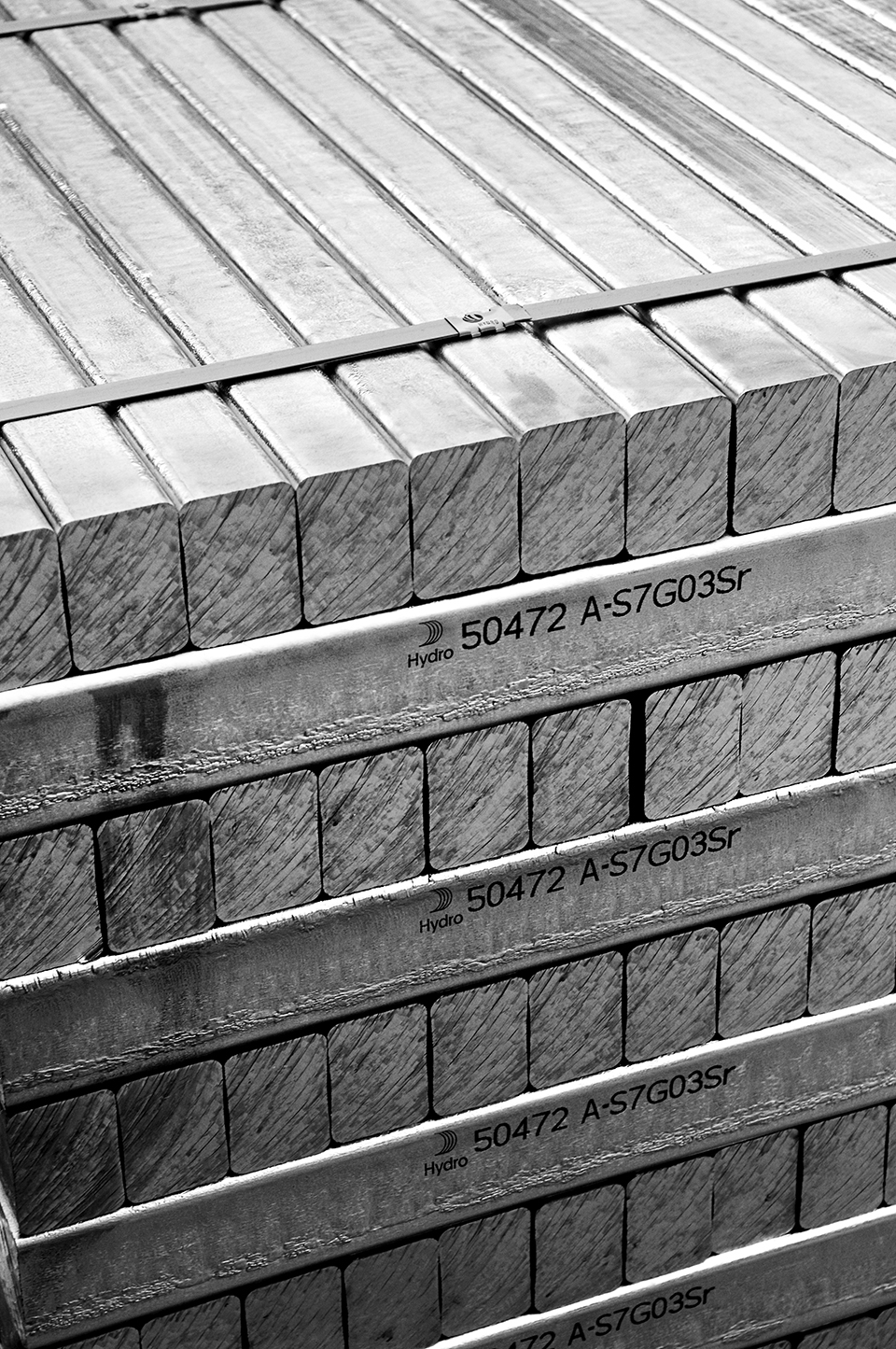
▼数个圆环形状能够与铝坯形成视觉上的关联,同时又与Hydro独特而现代的船帆标识形象有所呼应,the circular shapes can be associated to aluminum billets or a more distinctive and modern Hydro sail symbol
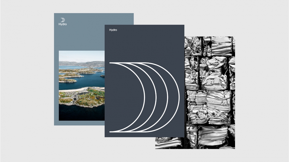
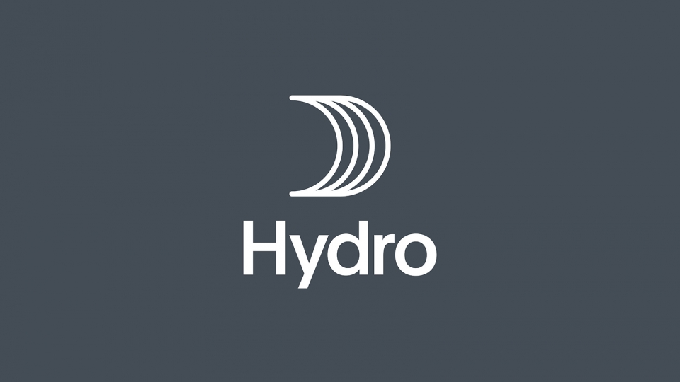
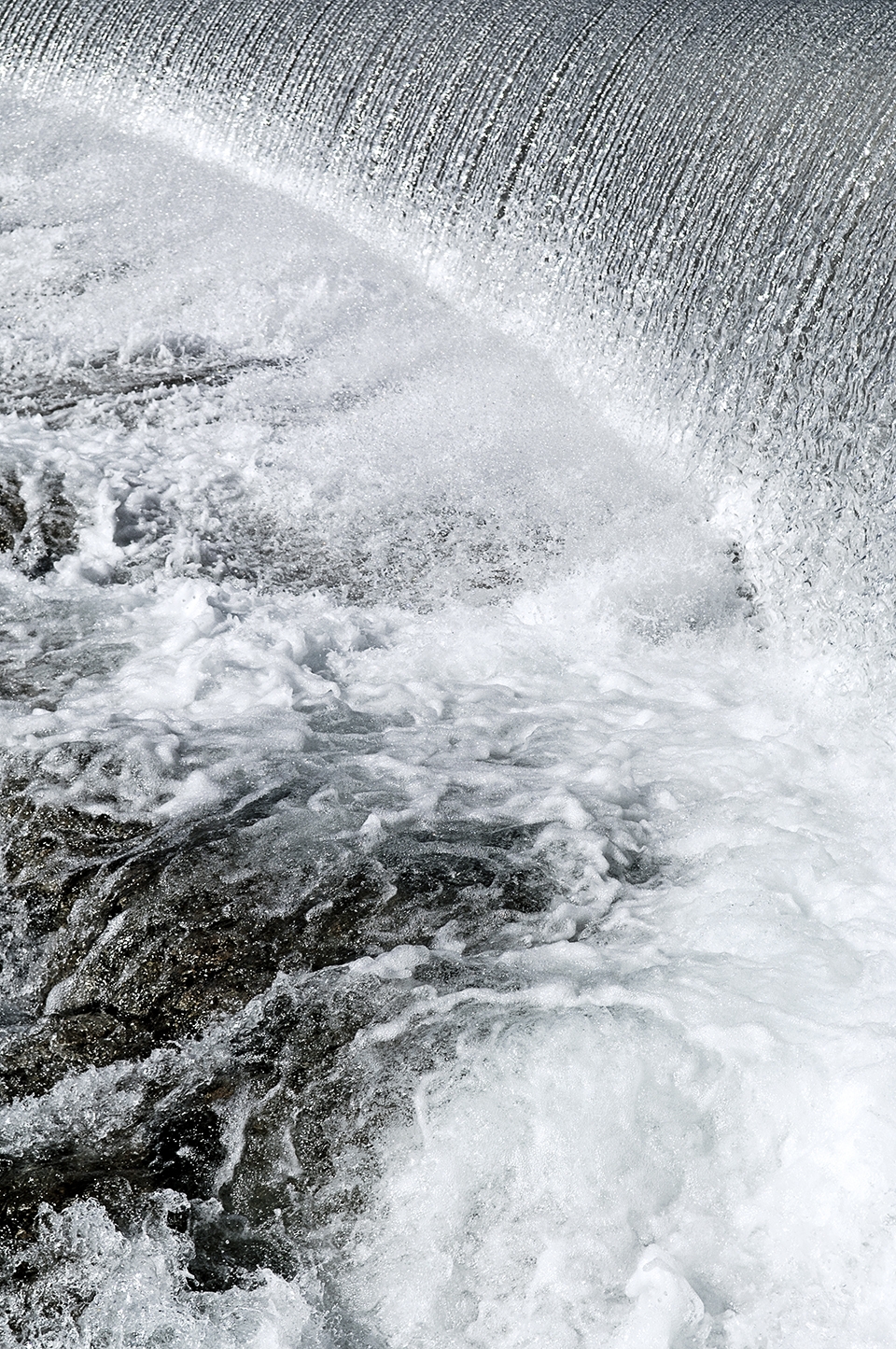
配色方案采用铝灰色、铝矾土红色来反映出Hydro的核心业务,并通过蓝色色调来突显水元素在Hydro水力发电业务中的重要地位。
The color palette is chosen to reflect Hydro’s core business, through the use of aluminum grey, bauxite red, and shades of blue that emphasizes the importance of water in Hydro’s hydroelectric power business.
▼配色方案反映了Hydro的核心业务,the color palette is chosen to reflect Hydro’s core business
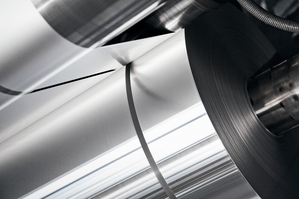
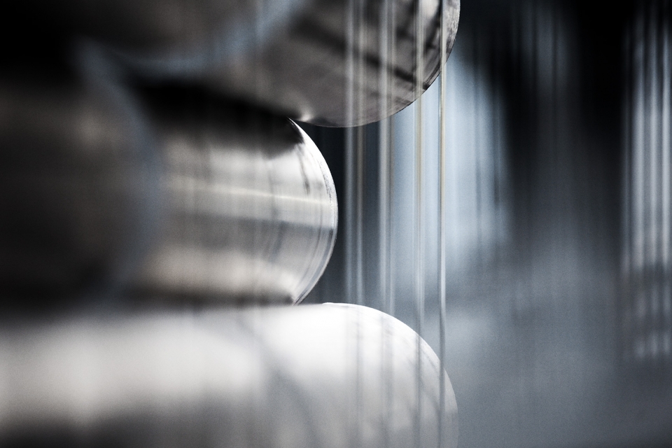
▼蓝色色调被用于突显水元素在Hydro水力发电业务中的重要地位,shades of blue that emphasizes the importance of water in Hydro’s hydroelectric power business
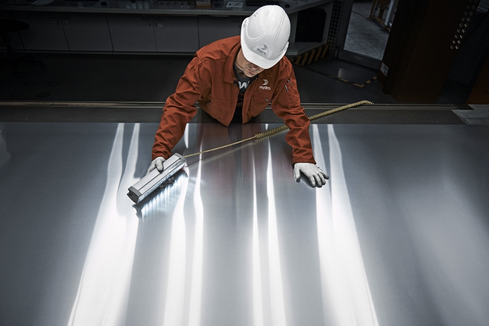
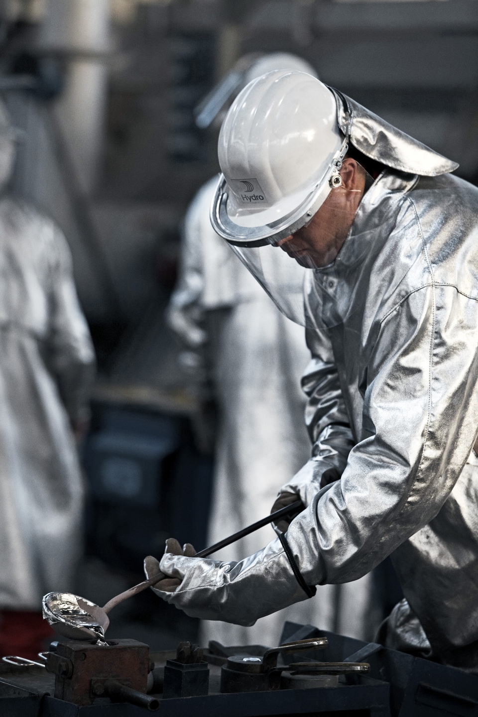
新旧元素的结合带来更加现代的观感,昭示着Hydro公司在未来的崭新旅程。这一视觉形象将被运用在Hydro的所有官方材料当中,包括名片、引导标识、工作制服、网站、年度报告单和一系列其他平台。
The combination of old and new, mantled in a more modern look, acknowledges the renewal of Hydro as a company and marks the beginning of the journey ahead. The new visual identity will manifest itself in all official Hydro material, such a business cards, signage, workwear, website, annual reports and a range of other platforms.
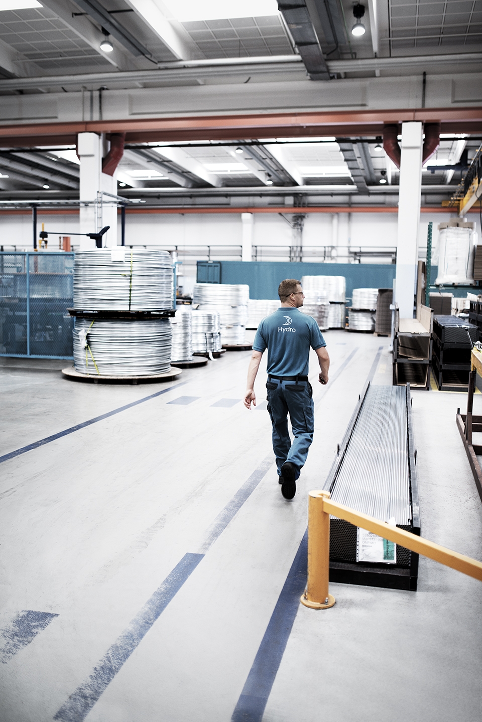
▼新的视觉形象将被运用在Hydro的所有官方材料当中,包括工作制服等,the new visual identity will manifest itself in all official Hydro material

More: Snøhetta。更多关于: Snøhetta on gooood.
发表评论
你需要先 才能发表评论
社交登录