感谢 G ARCHITECTS STUDIO 予gooood分享以下内容。更多关于:G ARCHITECTS STUDIO on gooood。
Appreciation towards G ARCHITECTS STUDIO for providing the following description:
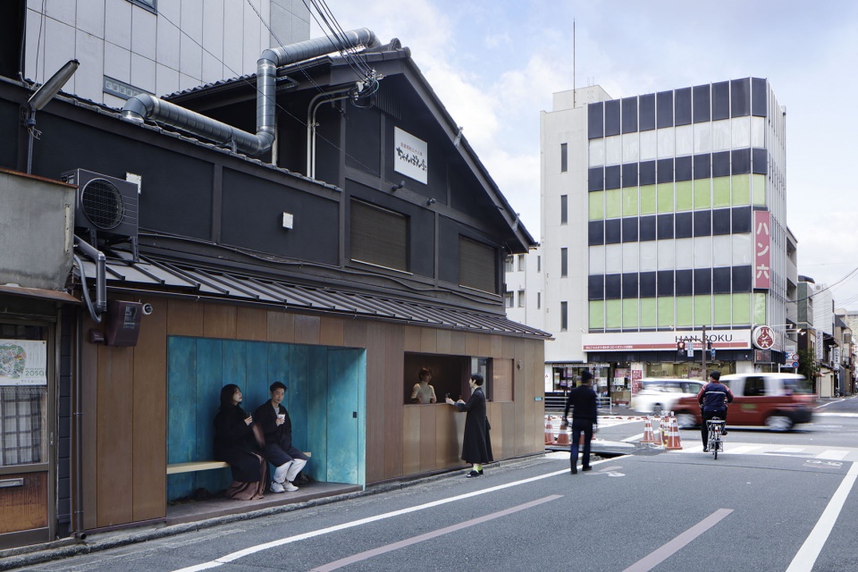
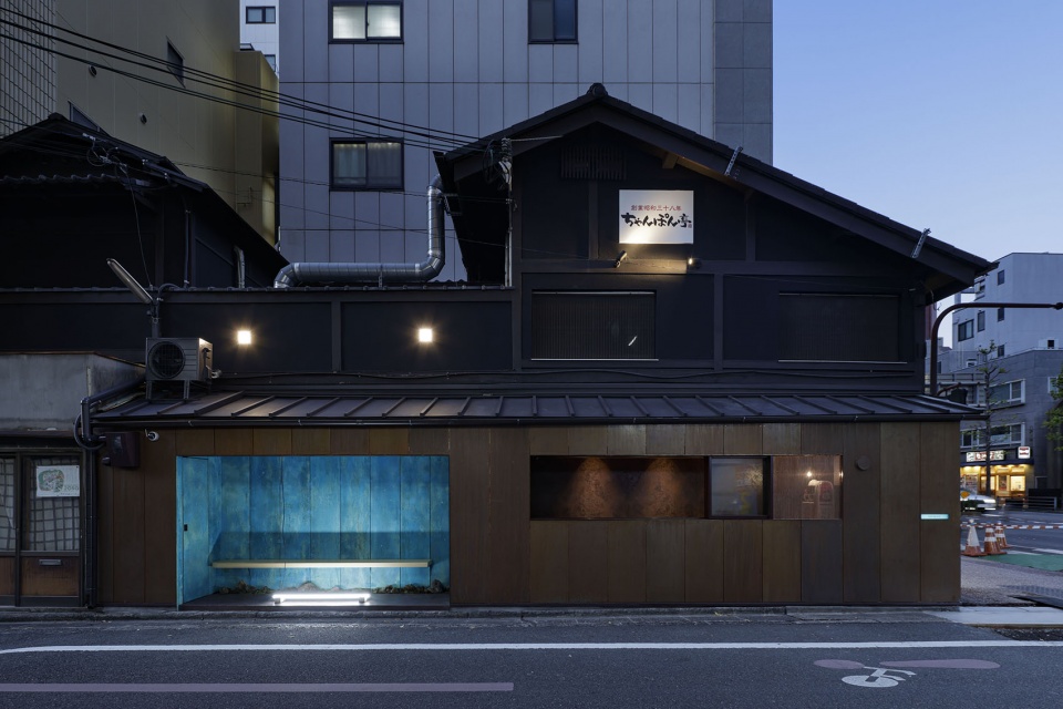
本项目为京都著名点心店SUETOMI所创立的新品牌AoQ旗下的咖啡档口。这个咖啡档口于京都火车站延伸出来的乌丸大道上,在十字路口处移动两层木结构建筑的底部,这附近都是酒店和办公楼建筑。
This is a coffee stand belonging to AoQ, a new brand established by SUETOMI, the renowned confectionery shop in Kyoto. The stand is on Karasuma-dori street which runs from the Kyoto trainstation, and is located on the ground floor of a two-story wooden building at an intersection surrounded by hotels and office buildings.
▼项目概览,Overall view © Daisuke Shima
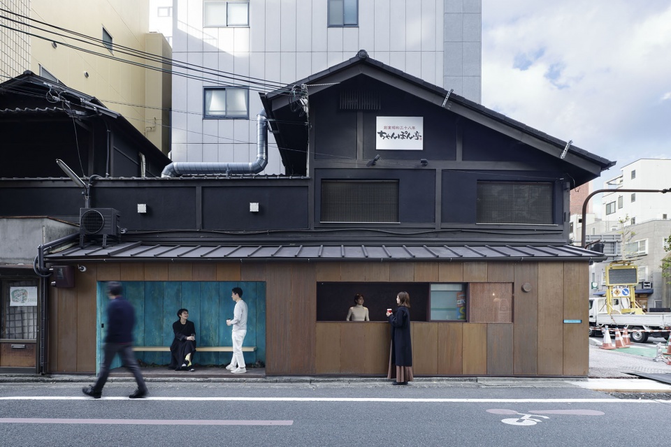
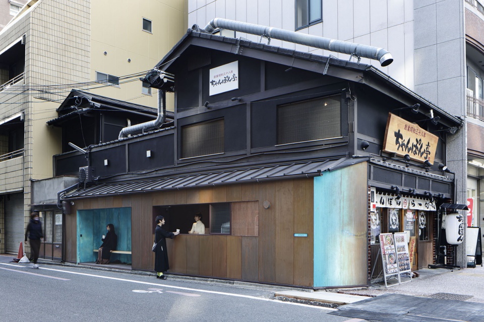
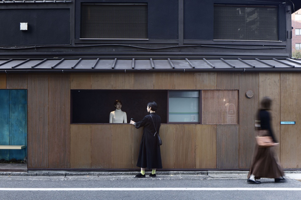
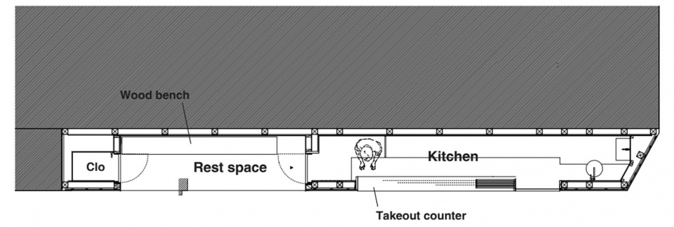
咖啡档口的柜台深度只有1米左右,小而朴素的店面在繁忙的街道上几乎可以被忽略。由于店面的深度很浅,设计者在设计过程中很快就确定了平面图,他们将厨房和休息区沿着街道面并列布置。
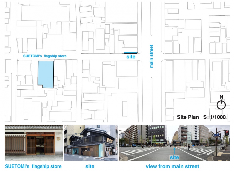
▼咖啡摊与旗舰店的关系,site plan and surrounding context © G ARCHITECTS STUDIO

The depth of the coffee stand is only about 1 meter and is so small and modest that it can almost be missed in the busy street. Since the depth of it is so shallow, we were quickly able to decide on the floor plan. The kitchen and the resting area were installed side by side, along the street in the front.
▼周边环境,Surrounding context © Daisuke Shima
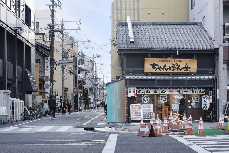
尽管咖啡档口的平面图很快就确定了,但是设计者花了很多时间来处理立面设计,他们对这个垂直面进行研究——忽略柜台内外部空间——并努力通过化学手段来控制铜制品的老化。
Although the floor plan was decided upon almost automatically, we had to spend more time on what to do with the elevations. We decided to study the vertical side – regardless of the interior and exterior of the stand – and made an effort to chemically try to control the aging of the copper.
▼柜台处,Counter © Daisuke Shima
▼休息区,Resting area © Daisuke Shima
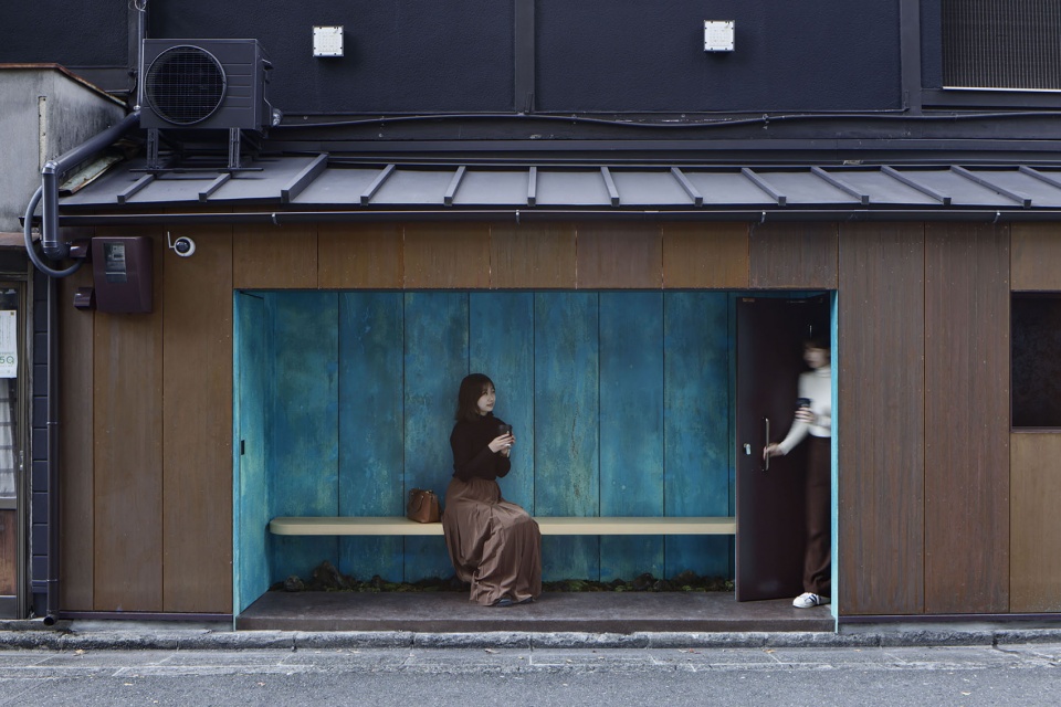
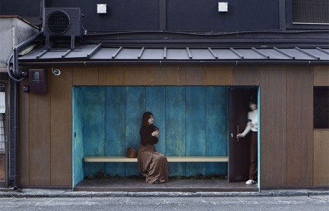
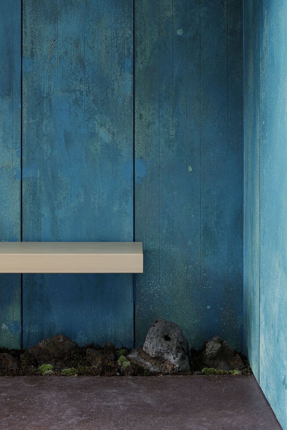
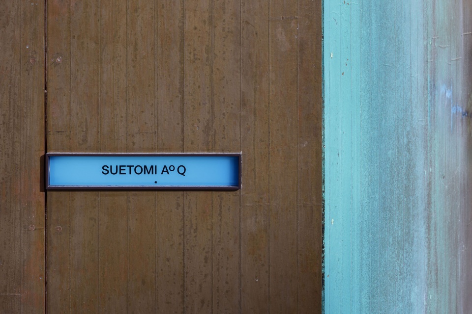
设计者将铜箔贴在里面的墙上,并使用酱油和化学品将其氧化,他们这样做的目的是希望店铺的外墙看起来能够适配SUETOMI这个在京都历史已久的点心店,并将里面装饰为锈铜色,能够让人们联想到SUETOMI的品牌专属颜色“Suetomi蓝”。事实上,SUETOMI旗舰店距离这里仅有3分钟步行的路程,所以设计者希望这个咖啡档口能够利用1米厚的招牌,起到引导顾客光临旗舰店的作用。古铜色被用在了两个区域:面向交叉路口且引人注目的一侧,以及休息区域。
▼利用酱油和氯化铵腐蚀铜箔,Using soy sauce and ammonium chloride to corrode copper foil © G ARCHITECTS STUDIO
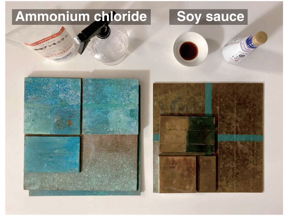
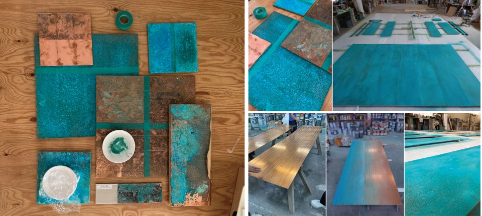
We taped copper foil on the wall, and oxidized it with soy sauce and chemicals. We did this because we wanted the facade to look like something that would be suitable for SUETOMI’s since long established confectionery shop in Kyoto, and also to give it a rusty patina color, which is reminiscent of “Suetomi blue”, SUETOMI’s corporate color for the past seventy years. In fact, SUETOMI’s flagship store is located just three minutes away on foot. So we wanted the whole stand to function as a signboard, 1 meter thick, with the color, leading customers to the main store from the busy street. The patina color was used in two areas: the eye-catching side facing the intersection, as well as in the resting area.
▼氧化后的铜箔立面,Oxidized copper foil facade © Daisuke Shima
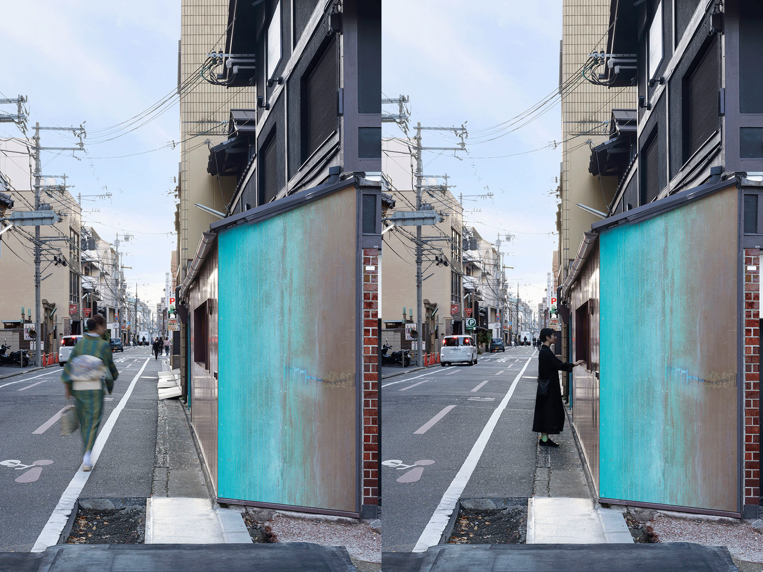
当地城市景观法规对沿街立面的颜色使用,除了天然材料之外均有明确要求。本项目所使用的颜色得到了当地政府的许可,应为这里使用的不是油漆涂料,而是通过铜制品氧化而形成的。
Cityscape regulations control the use of facade colors except for on natural materials. The use of the colors was permitted by the local government as it was not painted but was created by the oxidation of copper.
▼休息区细部,Details of resting area © Daisuke Shima
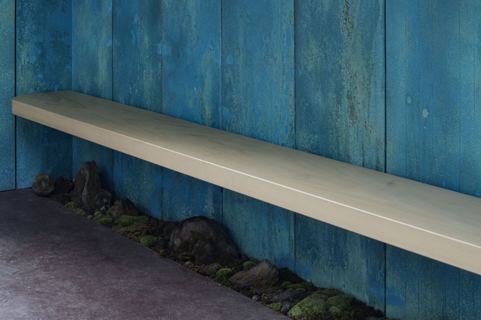
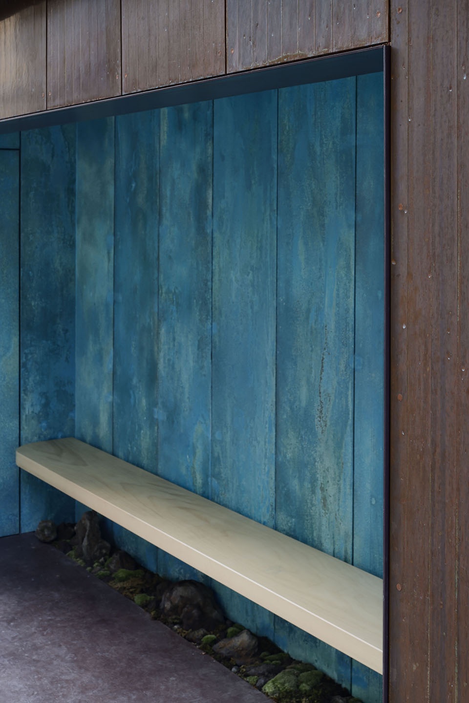
▼立面细部,Details of the facade © Daisuke Shima
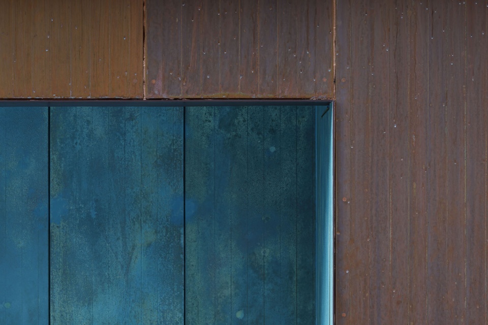
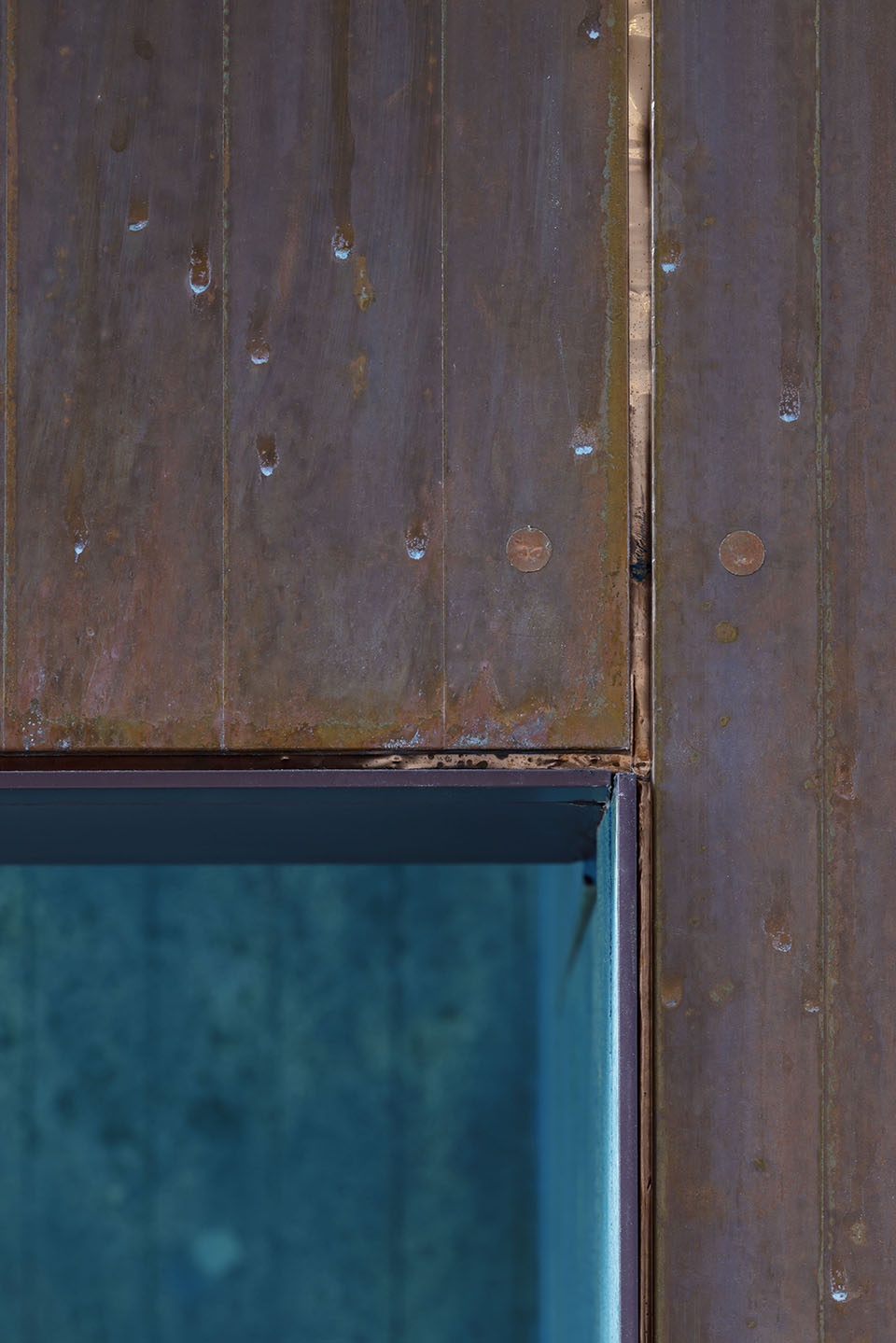
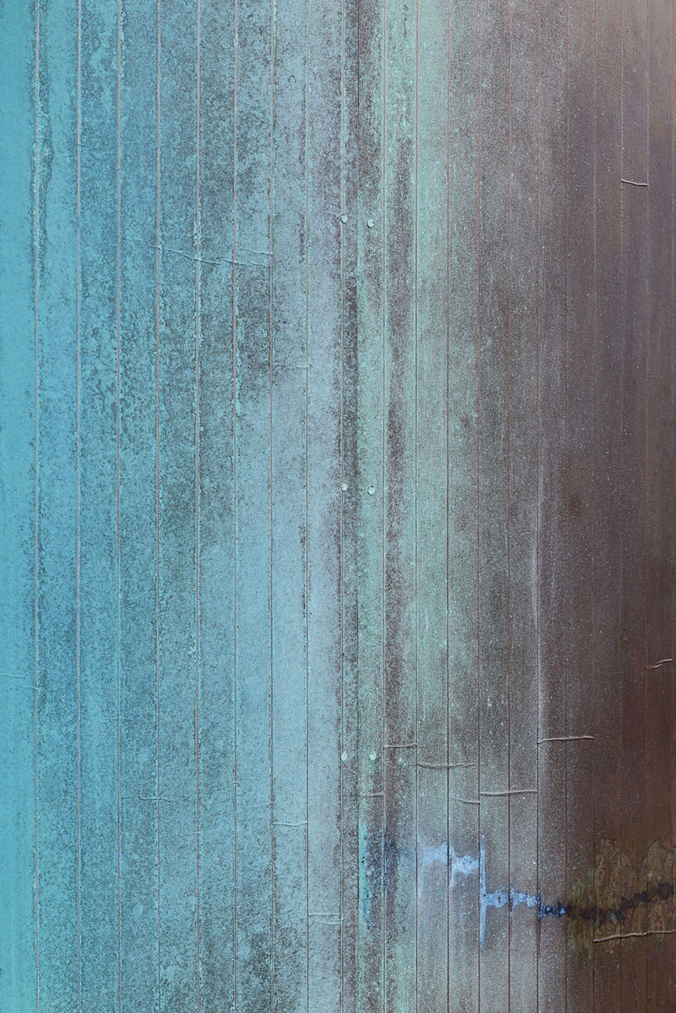
设计者利用酱油将铜慢慢腐蚀,形成红棕色,又利用氯化铵将铜快速腐蚀,产生铜绿色。若非使用这些物质,仅由自然条件腐蚀铜,则大概需要三个月的时间才能出现红棕色,十年时间才能出现铜绿色。
▼“Suetomi蓝”, “Suetomi blue” © Daisuke Shima
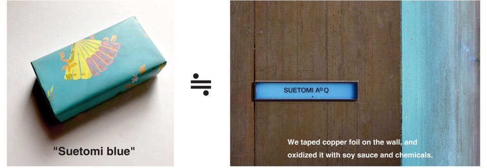
We adequately used soy sauce to slowly let the copper corrode, generating the reddish brown color, as well as ammonium chloride to quickly let the copper corrode, generating the patina color. Without these substances, and if the copper had only been exposed to wind and rain, it would have taken about three months to achieve this reddish brown color, and ten years to get the patina color.
▼品牌标志专属颜色“Suetomi蓝”,Brand logo “Suetomi blue” © Daisuke Shima
当咖啡档口晚间关门时,休息区的卷帘将被放下来,这个卷帘是由用于建筑临时脚手架的网孔板制作而成的。当夜间灯光点亮时,卷帘就像历史上日本贵族家庭使用的竹帘,人们能清晰地看到墙壁上的铜绿色,既充当行人的“路灯”,又作为商店的广告牌。
When the cafe is closed, the resting area is covered with a roll screen made of a mesh sheet originally used for the temporary scaffold of a building construction. When it is lit at night, it resembles a bamboo blind historically used by Japanese noble families, which lets you see through to the patina color on the wall. It functions as a “street lamp” for pedestrians, but also as a billboard for the store.
▼夜览,Night view © Daisuke Shima
▼项目区位,site plan © G ARCHITECTS STUDIO
▼平面图,plan © G ARCHITECTS STUDIO
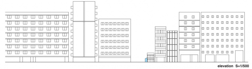
▼立面图,elevation © G ARCHITECTS STUDIO
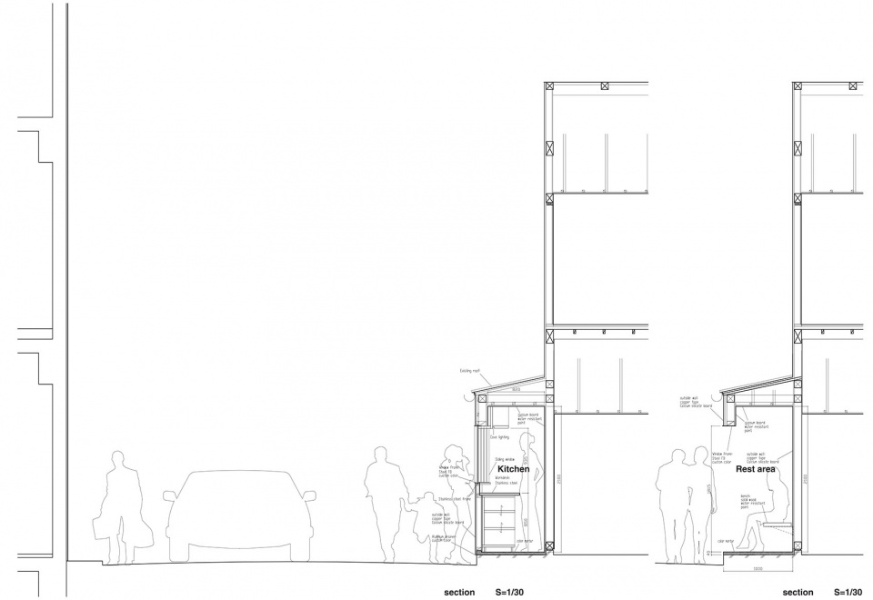
▼剖面图,section © G ARCHITECTS STUDIO
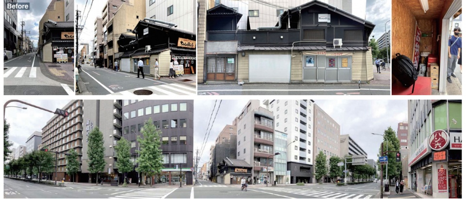
▼改造前,before renovation © G ARCHITECTS STUDIO
Title: SUETOMI AOQ CAFE STAND
Client: SUETOMI
Location: Kyoto, Japan
Floor area: 10 ㎡
Completion: 2022
Design credit: Ryohei Tanaka + G ARCHITECTS STUDIO
Architect: Ryohei Tanaka, Kazuki Nishimura/ G ARCHITECTS STUDIO
Derection: Issay Kitagawa / GRAPH Co. Ltd
Branding: Issay Kitagawa, Masayoshi Zenigame / GRAPH Co. Ltd
Graphic Design: Issay Kitagawa, Masatoshi Yoshimoto / GRAPH Co. Ltd
Garden: Shota Ogino/ Ogino Landscape Design
Fabric design: Makino Horiguchi/ fab-
Construct: Ryo Yoshida, Shinpei Yoshida, Takanori Yoshida/ YOSHIDA INTERIOR CO.,LTD
Lighting design: Mariko Hayashi/ ModuleX Inc.
Photo: Daisuke Shima
More: G ARCHITECTS STUDIO 。更多关于:G ARCHITECTS STUDIO on gooood






这个蓝色真是很特别,会蹭衣服上么?
DK
改变街角、改变城市空间的设计
有思考也有温度
思路很清晰,颜色很特别,设计到位。
逻辑清晰
牌匾不错,休息区颜色不错