非常感谢 TAILOR WEY(联系邮箱:weetsuak@126.com) 予gooood分享以下内容 。更多请至:TAILOR WEY on gooood
Appreciation towards TAILOR WEY (contact: weetsuak@126.com) for providing the following description:
Single Patch咖啡馆位于苏州老城区十全街中段,距离著名的沧浪亭和网师园也不过数百米之遥。优质的地理位置给小店带来大量客流,但如何清晰描绘全新的咖啡馆和老街之间的对话关系将成为重要的挑战。
Single Patch Coffee is situated at the middle of Shiquan Street in Suzhou old city, which is only a few hundred meters away from the renowned Canglang Pavilion and the Master of the Nets garden. The extremely good location not only bring up masses of consumers but also cause the significant challenge that how to clearly delineate the dialogue relationship between the pristine cafe and the old street.
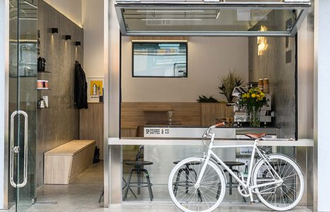
▼门面,front view
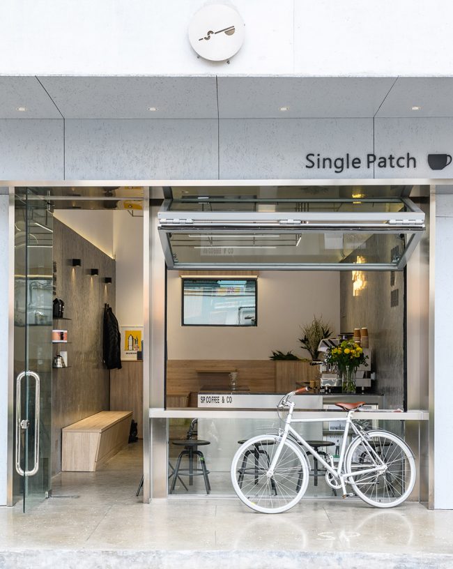
嵌入城市的一枚补丁
A patch embedded into the city
“Single Patch”的字面意思是“单个补丁”,也是店主的咖啡哲学。作为咖啡师和烘焙师,店主曾经长期居住在墨尔本,他一直希望能将这种街巷咖啡文化以某种方式介入苏州人的日常生活,犹如一枚嵌入城市的补丁,把咖啡习惯植入人们的生活。所以,他很希望设计上能更多地体现参与感。
“Single Patch” has the literal meaning of one piece of stuff to stick over something, which is also the philosophy of the café owner. As a barista and coffee roaster, he used to live in Melbourne for a long time. He always keeps thinking how to make this kind of street coffee culture become Suzhou lifestyle somehow as a designed intervention, just like a single patch embedding the city in order to implant the habit into people’s daily life. Therefore, the sense of participation is much in greater need refer to the design.
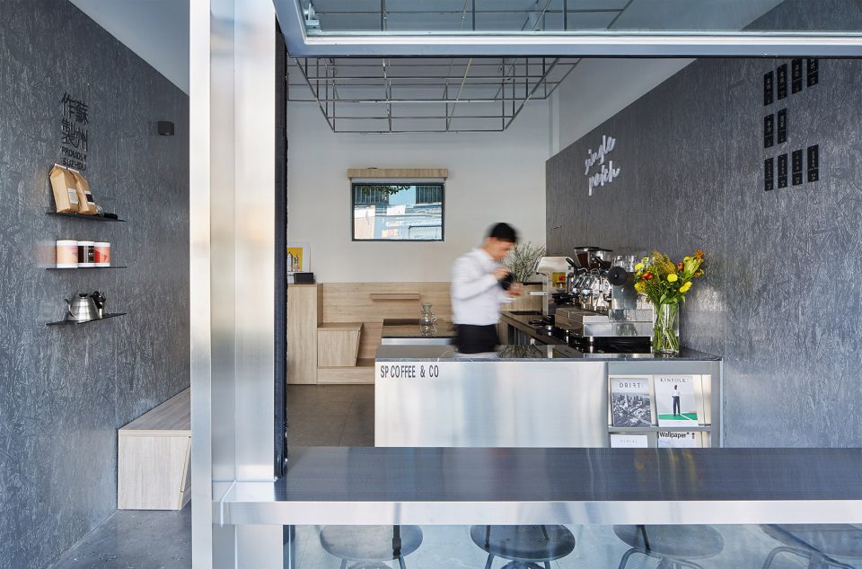
▼店铺内景,interior view
被观赏的渴望
A longing for being watched
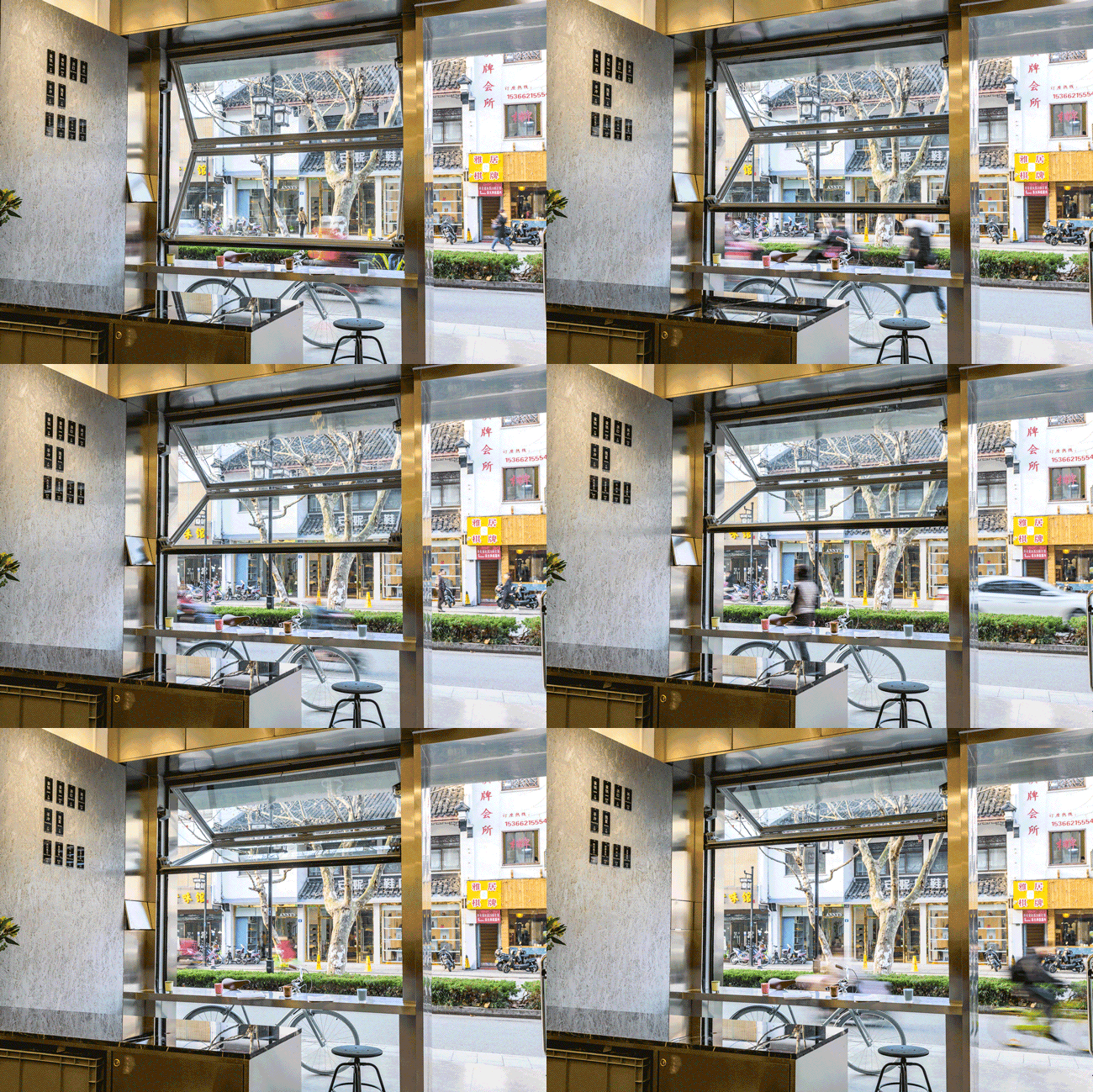
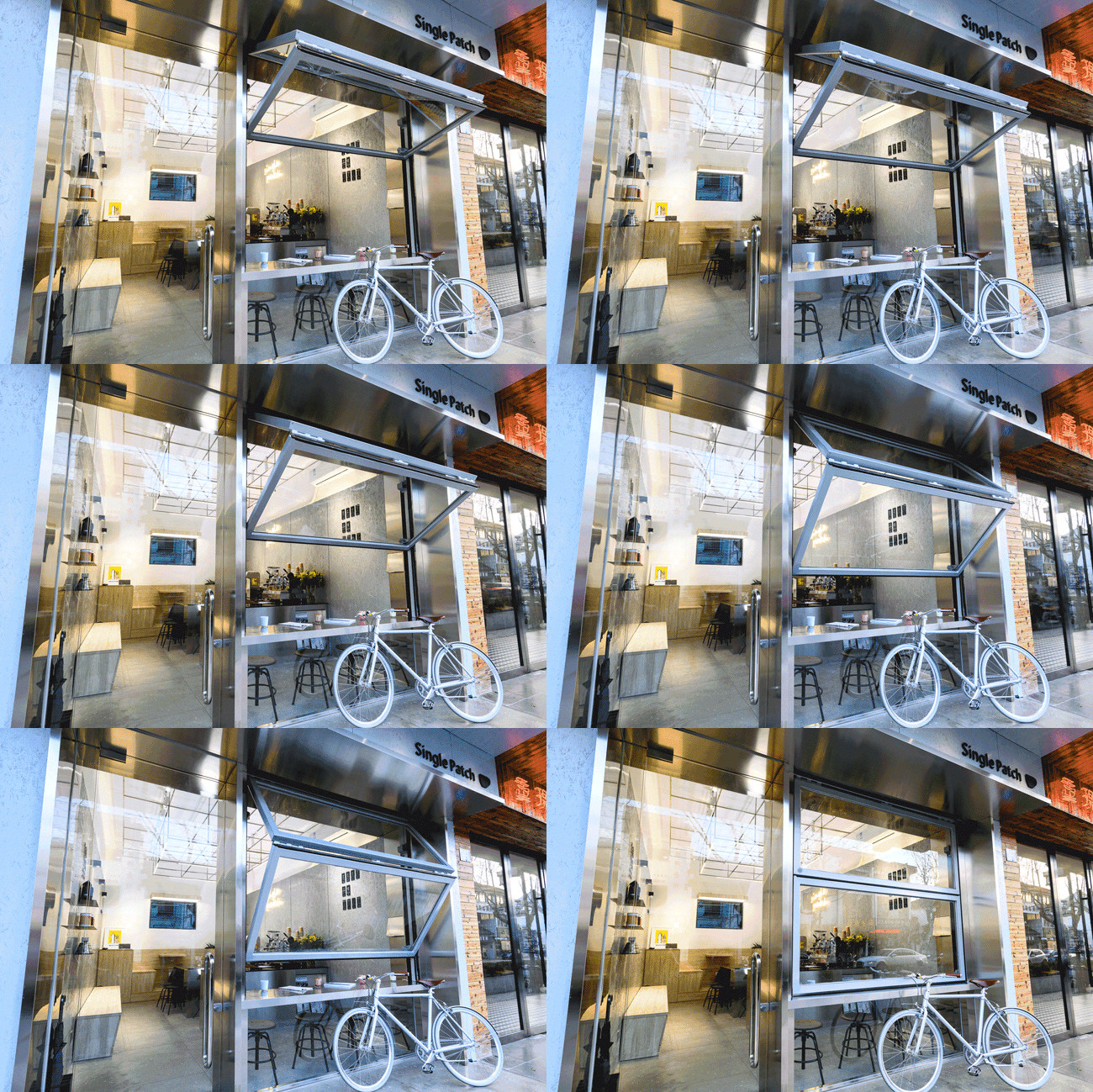
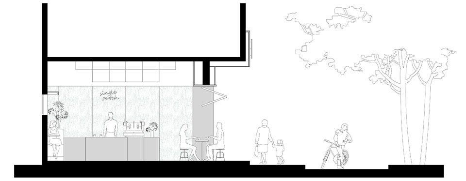
咖啡馆的入口正好位于一段建筑檐廊之下,因而如何使它成为抓人眼球的亮点异常重要。我们设置了一扇可折叠开启的窗扇,沿窗台的客人可以里外对坐。社交很容易发生在此。当人们选择抚窗而座观赏外景时,他们内心里渴望被观赏的社交倾向也被激活了。咖啡的香气主动向街道弥漫,让来客都愿意加入这个空间。
The entrance of the café is just under the overhanging corridor of a building, thereby how to highlight it to grab the attention of the public would be extremely significant. A holding window has been set up so that people can just sit by the sill both on the inside and outside. It is the right space to have the socializing. When people choose the sill seats framing the external street view, their inclination of socializing are activated as well. The aroma of the coffee permeates towards the street to easily draw the diners in with strong delight.
▼可折叠开启的窗扇让沿窗台的客人可以里外对坐,a holding window has been set up so that people can just sit by the sill both on the inside and outside
中性的背景
Neutral Background
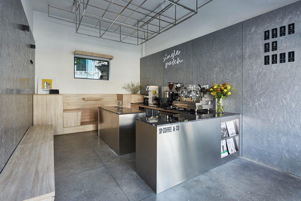
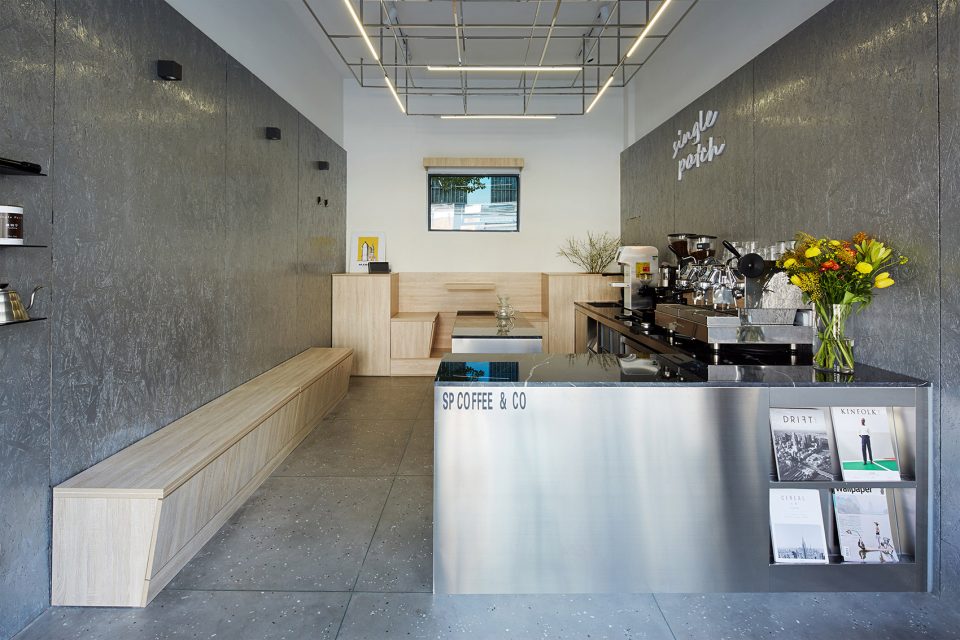
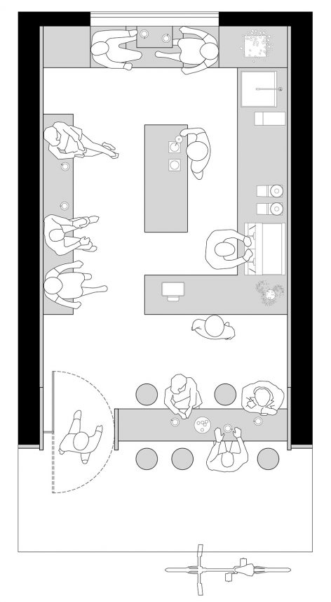
咖啡店的主角是咖啡。因而我们倾向创造一个中性、纯粹的背景,避免过度装饰的空间。室内主要的色调是银白色。墙面以常见的定向刨花板衬面,表面处理成类似金属般的银色,反射的光线因为板材粗糙的肌理而变得更加柔和,加之工作区黑色大理石台面的映衬,空间带有一点未来感。吊顶是垂挂的钢架格网,像一座倒置的城市轮廓,逐层退进叠落,指向房间正中的操作区,暗示咖啡吧台是空间的核心。地面是一张用色很克制的基地,素色水泥地坪点缀着黑白的石子, 创造一种沉静又不失优雅的气氛。
Coffee plays the main role in the coffee shop. So we tend to create a neutral and pure background space without any over-decorating. The primary palette for the interior space is silvery. The walls are cladded in oriented strand board (OSB) with metallic silver coating which provides much more gentle reflection due to its rough surface. Additionally, the barista station with the black marble countertop plays off the texture of the walls to bring up a bit futuristic. A set of metal grid is suspended from the ceiling which seems like an urban skyline hung upside down. The spatial grids figure towards the central working space to imply that it is the core of the room. A pain cement floor with monochrome aggregates has been provided as a base which is restrainedly colored to create a calm yet elegant atmosphere.
▼中性、纯粹的环境背景,避免过度修饰,to create a neutral and pure background space without any over-decorating
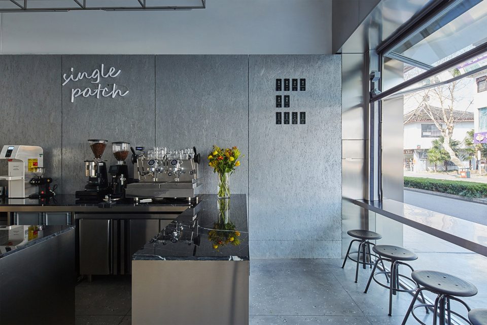
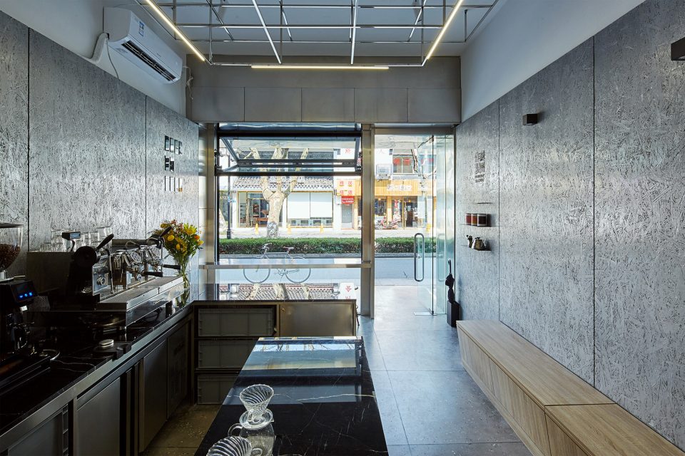
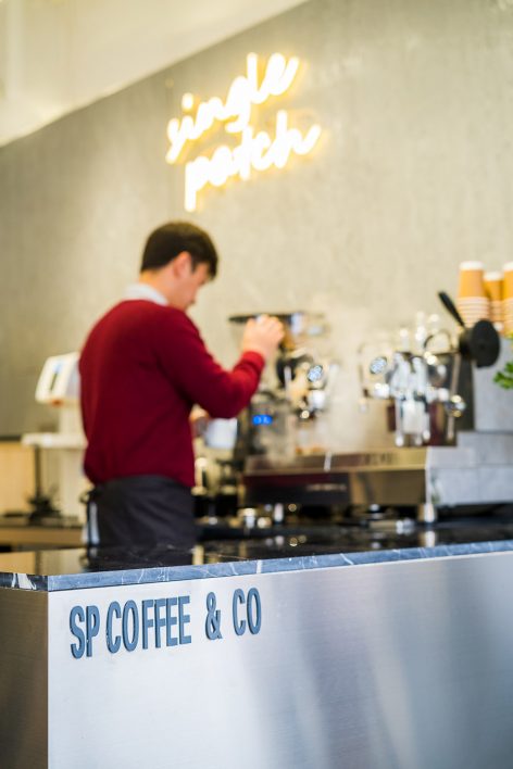
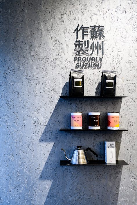
▼装饰细节,detail
对话
Dialogue
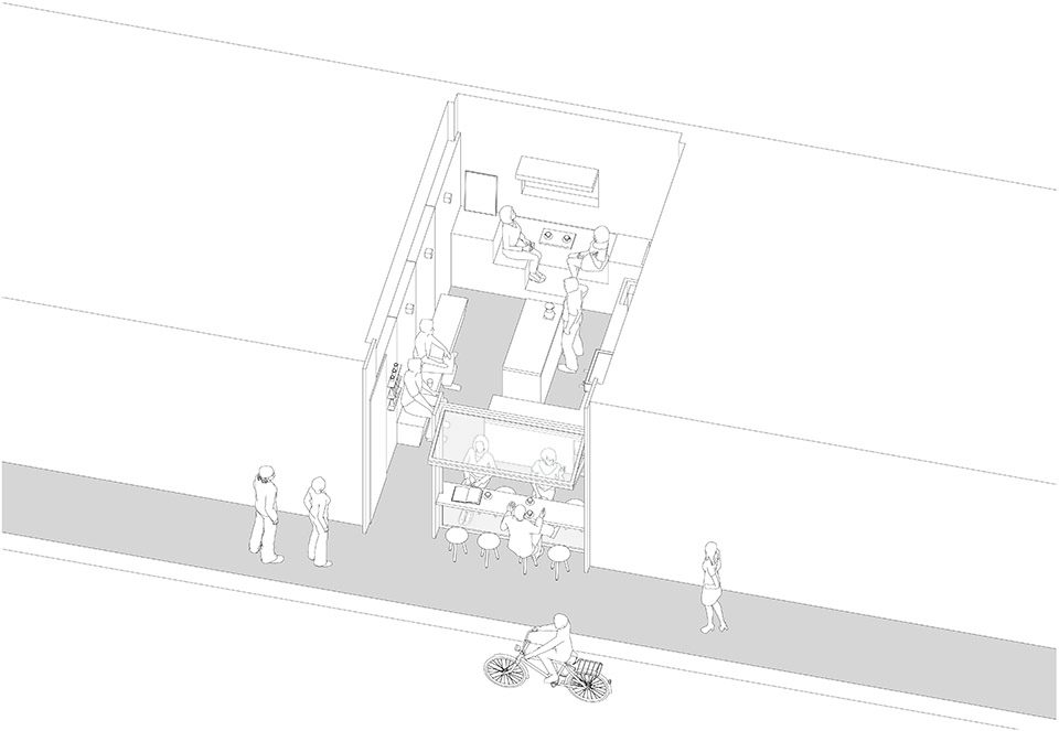
店内布置有私密的卡座、线性的长凳和折叠窗下的散座三种座位类型。所有的座席和吧台呈U字形围绕布局,手冲分享台在正中央。所有有碍视线的设备都靠墙摆放,让吧台正面完全开放。这样布局的好处是,来客既可以即时观看咖啡师的技艺表演,又能欣赏咖啡机充满机械美学的操作面。此时,操作台不再是咖啡制作的后台,而更像是咖啡师和来客对话的舞台。
Three types of seats are set up including intimate car seats, linear benches and movable stools along the sill. All the seats surround the barista station as the U shape with the hand drip desk set right in the center. Any stuff which might be the visible obstacle has been placed against the wall in order to get the continuous view through the counter. It benefits that people will not only instantly watch the skilled performance of the baristas, but also see the operating elevation of the coffee maker which is full of mechanical aesthetics. It seems as if the working surface becomes a stage of dialogue between the baristas and the consumers rather than just the back of house.
▼操作台成为咖啡师和来客对话的舞台,the working surface becomes a stage of dialogue between the baristas and the consumers
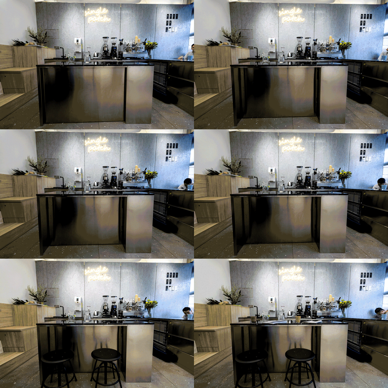
▼轴测图,axonometric diagram
▼平面图 / 材料,plan and material
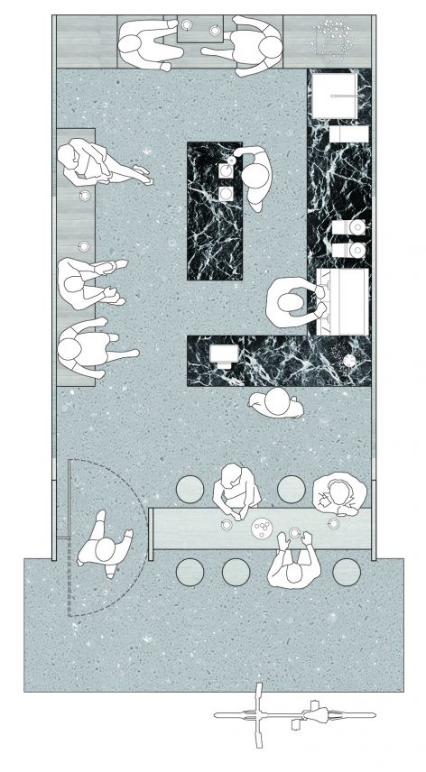
▼剖面图,section
Project name: Single Patch Coffee
Architect’s Firm: TAILOR WEY
Contact e-mail: weetsuak@126.com
Project location: No.875, Shiquan Street, Suzhou, China
苏州市十全街875号
Completion Year: 2017
Gross Built Area (square meters or square foot): 22 sqm
Lead Architects: Ginny Wey
Other participants Weeley Hwang, Lawrence Li
(eg. collaborators, clients, consultants, etc):
Photo credits: Yunpu Cai, Lay Jiang
More: TAILOR WEY (contact: weetsuak@126.com),更多请至:TAILOR WEY on gooood



不是做的挺好的么?评论区各位画图的大师麻烦把落地作品发一下看看。
最近去过好几次十全街,恕我直言,实在没有注意到这家小店,也许路过很多次,但没有引人注目。感觉这里更像是个一个金属感十足的奶茶店,和很多商城里的网红奶茶店相比,多了份清高,少了份温暖。
有意思
何必呢,越小的项目评论区越苛刻,越是国内的项目评论区越是不饶人。
single patch这个想法挺具有吸引力的,但是最终结果有些无趣
确实普普通通~
同问图中的刨花板,做成那种银色的效果,是怎么做的,效果感觉蛮棒的!
请教下墙面欧松板是喷灰色乳胶漆?还是?具体做法是?
挺普通的咖啡馆,灰色加木色,泛滥的网红品相搭配,要啥自行车,摆拍的痕迹太重,还有最里面靠墙的相对的座位,也是“摆拍”的设计,在这个地方人更愿意背靠墙面朝街道,但是却做了一个对望的狭小座位,设计师意图做出一幅“我做了设计”的样子,但是却不合理。不合理的地方还有,把磨豆机咖啡机主要设备都靠墙,结果咖啡师在操作的时候是背对两个方向的观众的,值得商榷。另外,这种气动窗这种做法也不少见了,上海就几家。“嵌入城市的一枚补丁”“被观赏的渴望”……其实就是一家普通开放的咖啡馆,为什么要描述得这么高深……
对于您说的摆拍这个问题,可能就在于个人的理解了,我想可能您在这个网站看到的大部分案例都是摆拍,因为实际使用时肯定不会是图片中的所放的物品或者不仅仅是这些;而靠墙的面对的对面卡座设计在我认为可能空间略显局促,但是我更偏向于面对面就坐,我想每个人喜欢的坐法都是不同的,而面对窗外的设计,本方案中也已经做到对空间的最佳运用了,这部分卡座只是额外的装点作用;第三点,您说咖啡机此类设备不因靠墙,这点我不认同,如果您做过咖啡,就应该知道,除了手冲之外的咖啡,最佳观赏角度是在侧面,而不是看咖啡师的背影或者是正面越过机器去观察,本方案也将最佳观赏角度留给了过路的路人来吸引注意,同时也留给了最里面有时间静静品尝咖啡的不急着离开的客户,而左侧靠墙的卡座,我相信也只有急着拿着外卖离开的客户才会选择入座,所以这类人群也不会愿意去静静欣赏制作咖啡的流程;而对于您说的最后一点运用气动窗的设计,确实可能您见的多了,那您见过石膏板吊顶么?您会因为人家做了石膏板吊顶而批判别人么?每一个设计优势有自己的想法的,而通过美好的语言将自己的意图表现出来就是设计师需要具备了另一个素养,所以可能您是一个不需要跟客户沟通的设计师吧
阿3真的很严格
啊用真的很严格2333
我觉得说的很中肯,也并不是都没道理,建筑这个行当我感觉也无非专业不专业,每个人都有各自对建筑的看法和感受,说出自己的感受与批评不一定就是不行啊,反而,我感觉每个人都讲出对这个建筑的真实看法才能促进进步呢。
不懂装懂,要专业人面前略显可笑
他讲的没错,至少布局上面里面的那个小卡座确实是失败的地方。整体布局可以在往里面退一点,让出走廊那块面可以做活动的桌面,空间更灵活。反倒是你,说不出所以然就批判别人
你这么认为,那不好意思,我倒是认为他比你专业,最起码空间与功能上面
想法不错,不过如果我是店家肯定要这稿方案,因为你没有为我考虑储物空间,他却把我需要的储物结合了卡座,让我必须牺牲的一部分空间也可以利用起来(虽然空间略显局促),一家营业型的店面,难道只靠吧台的操作空间储物么
颜值很高
比“大小”大,比“大小”小
这家店叫“中!中!中!”