感谢 McGregor Westlake Architecture 予gooood分享以下内容 。更多关于:McGregor Westlake Architecture on gooood. Appreciation towards McGregor Westlake Architecture for providing the following description:
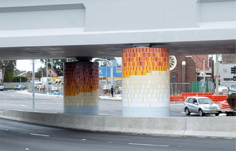
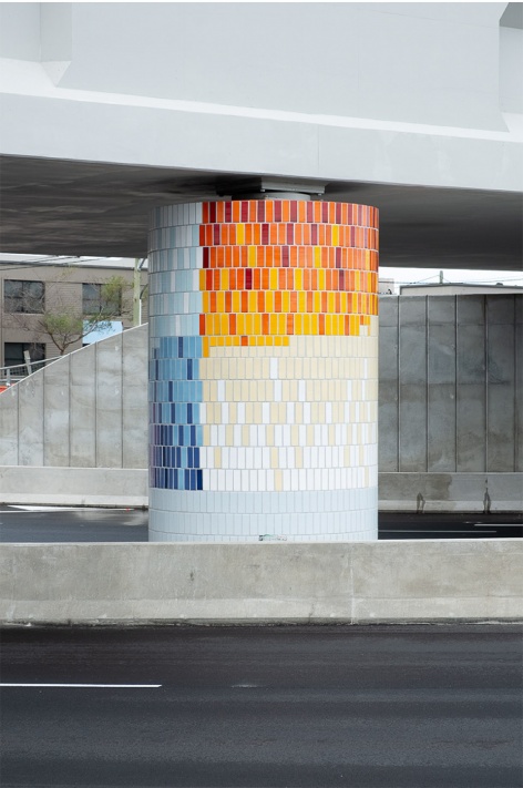
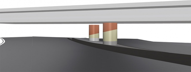
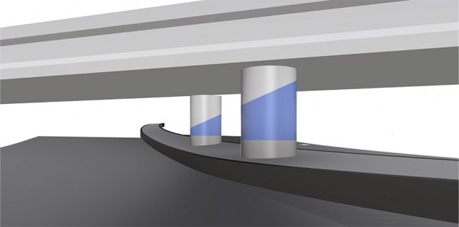
本项目旨在改善Mascot铁路桥的基础设施,建立本地区特有的身份感。在紧迫的设计周期内,MWA将大桥的两个柱子重新包装,打造成为简单而有设计感的“方向标”。两个柱子上着色区域的图案形成了一种动态的透视关系,起到引导人流的作用。在颜色的选择上,蓝色呼应了当地的海湾以及天际线;红色则体现了城市的烟火气。
▼铁路桥及周围环境,Mascot Rail Bridge and the surroundings
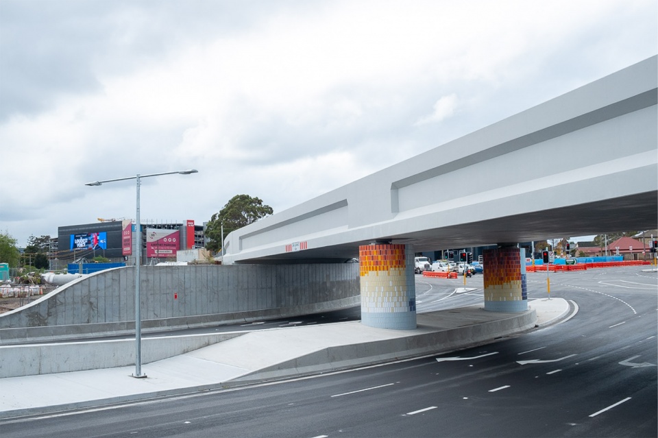
This new infrastructure project by RMS required augmentation and punctuation to help create a sense of identity and place. Working to tight deadlines and a limited canvas MWA created a very simple “coming and going”, directional based colourfield over the surface of the 2 primary columns. A momentary perspective is created from each approach, that becomes more abstract upon approach. Blues evoke the approach to the bays and wide horizon, reds the approach to the city and urbanity.
▼简单而有设计感的“方向标”,a very simple “coming and going”
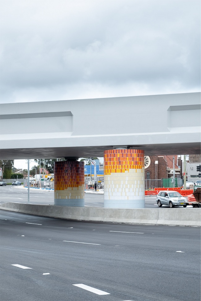
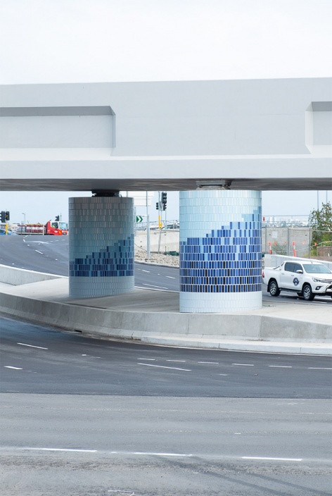
▼蓝色呼应了当地的海湾以及天际线;红色则体现了城市的烟火气,blues evoke the approach to the bays and wide horizon, reds the approach to the city and urbanity
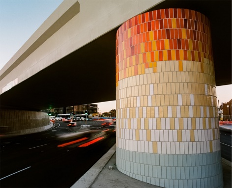
▼黄昏下的柱子,sunset view of the columns
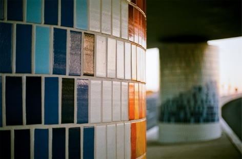
▼材料细部,material details
▼设计草图,sketches
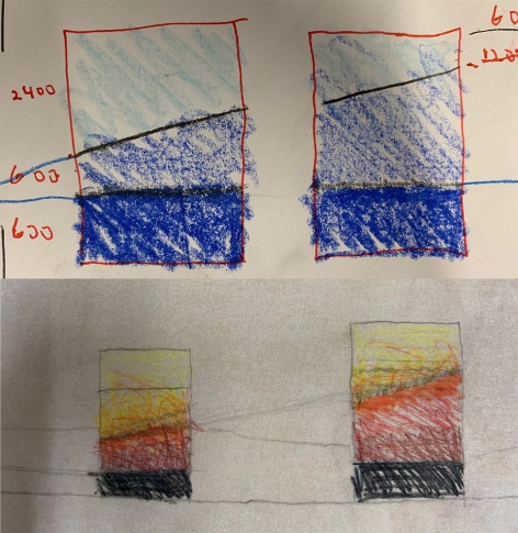
▼模型,digital model
Completion date: 2019
Project team: McGregor Westlake Architecture
More:McGregor Westlake Architecture。更多关于:McGregor Westlake Architecture on gooood





两个柱子都要设计一下,可见国外行情。
两个柱子都要设计一下,看来国外景观行情不行啊。
实景图真没看出方向标,不过是很好看没错
做过很多类似的项目,但是都没有这么沉下来做
这种尺度在国内可能就是一个项目里没人注意的小角落,国内的项目都太大,太急了,真想找几个这样的小项目好好研究下