非常感谢Tato Architects将以下内容授权gooood发行。更多请至:Tato Architects on gooood
Appreciation towards Tato Architects for providing the following description:
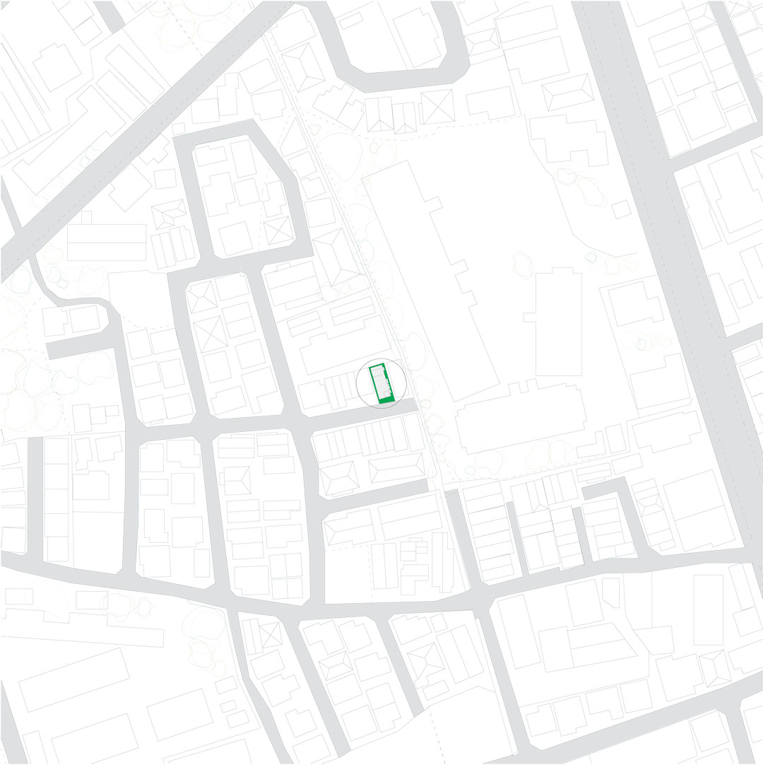
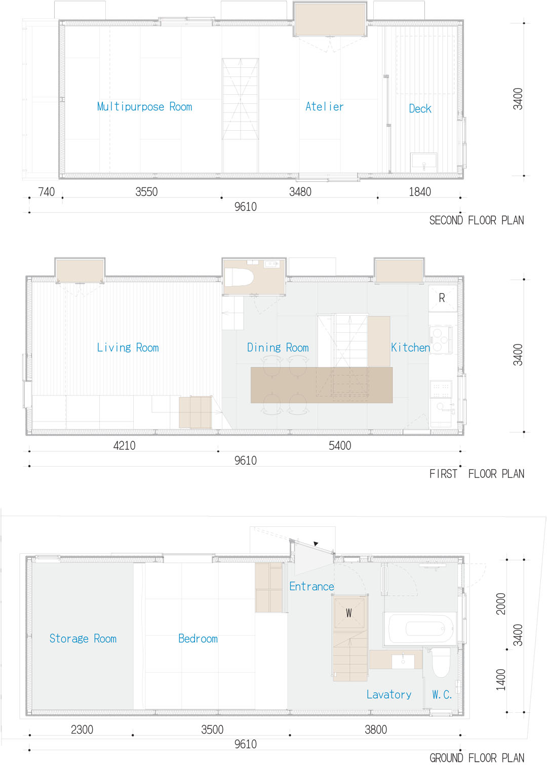
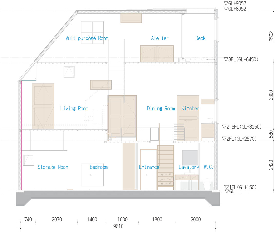
这栋房子的基地超窄,根据律法规定,基地内的建筑还必须距离四周紧邻的建筑一米以上(所有建筑距离红线500毫米,两栋之间距离为一米)。建筑师在一侧留出900毫米的通道,无形中占用了邻居的500毫米后退距离,形成1米4的通道,将入口设置在狭长建筑的中部。实现了最小的交通空间消耗面积。在有900毫米通道一侧的非结构墙部分向外推出橱柜空间。建筑师为建筑争取了最大的室内空间。
Widening interspace to utilize
Many of the requests to us for designing a house are accompanied with a prerequisite of ensuring a house for a nuclear family at an extremely subdivided lot, to which we cannot easily apply the manners of architecture having been accumulated for long time in Japan. We repeated trials and errors while designing as we think we are in the formative period for a new manner.
This time was not the exception as well. For this level of density of urban houses, where outer walls of the adjoining houses do not touch each other, the civil law demands 500 mm setbacks of outer walls to form interspace of 1,000 mm in width in-between those.
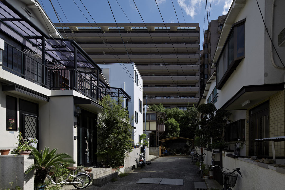
▲(上图)位于密集住宅区中的住宅
We have kept thinking if it is used more effectively. In this project, we gave 400mm more setbacks from the boundary line of the north eastern adjacent land. As a result, there was 1,400mm wide interspace as a passage, which was 900mm in width from the border of the adjacent plot, utilized by placed an entrance in the middle of the side wall faced to the interspace, which realized to minimize space for routing in the house.
The setback ensured the eave as high as about 9 m avoiding the north side slant line. Non-structural walls were pushed out outward providing space for closets,etc. Accordingly, it provided bigger space containing facilities such as a toilet than as it looked from interior space like furniture, which brought ambiguity in perception of space.
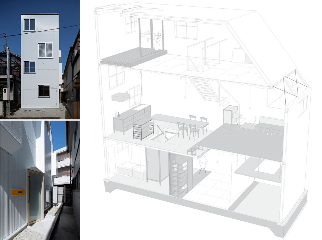
▲(上图)基地超窄。一侧留出900毫米的通道,占用邻居500毫米后退距离,总计1.4米宽,入口设置在狭长建筑中部,减少交通损耗。通道一侧的非结构墙部分向外推出作为橱柜空间。建筑争取了最大的空间。内部层次丰富,家具是建筑师为这栋建筑量身打造
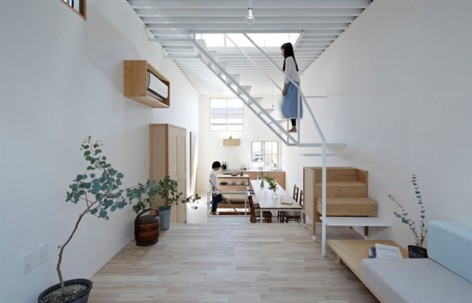
建筑师认为建筑中的家具应该尊重空间,不带来任何多余的东西,让空间更自由。为此,建筑创建了楼梯,壁柜,扶手,稍微的错层,桌面等等只属于这栋建筑的独一无二的构件,解放空间,让空间更自由,能挥发潜力。 建筑师觉得在小建筑当中楼梯是一个相当重要的元素,人们上上下下的体验丰富性和楼梯密不可分。进入玄关,可以看见一个柜子,这个柜子就是楼梯间,人们顺着这个楼梯可以到达二层,因为楼层间的层高因为错层和宽度的限制,十分紧张,建筑师在一层到二层的楼梯梯段部分上方放置一个桌面,这个桌面的高度不会影响到楼梯中人的运动,同时能为楼上提供使用空间。接着人们通过小错层楼梯上到起居室,然后踩着起居室的沙发面,有楼梯功效的柜子,上到通往三层的白色轻透楼梯。家具是空间,空间也是家具。交叉的,交互的,丰富的体验。
坚固的轻钢结构,控制了成本最后造价等同相同体量的木结构建筑造价。
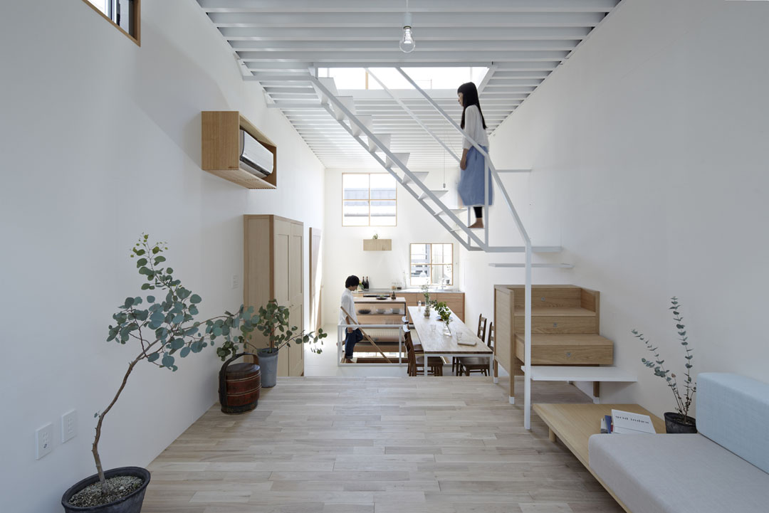
▲(上图)二层起居室与餐厅
Architecture and furniture
When I have the honor of seeing an architect-designed house, I sometimes feel as if design furniture is telling messages. I wonder if it is right to summarize by saying “respect the original space and don’t bring any unnecessary things”, but it seems almost like a strong desire as much as to say not to fill the space with anything does not deserve it. Although I cannot say I don’t have such desire at all, I still aim to create space where a variety of things can be brought in and used in everyday life much more freely.
In this house, architectural elements such as stairs, a laundry space, closets, hand rails and toilets are made as if those are furniture. Except for those, there are only floors. As such, architecture and furniture are mingled and those meanings become relative each other, in which way I keep trying to create freedom in rooms as if all of those are just randomly placed and used by chance.
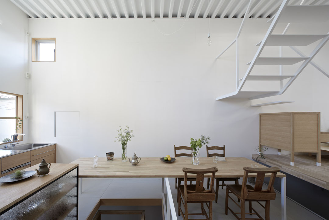
▲(上图)餐厅,餐桌的一部分延伸至楼梯上方。不影响楼梯运行,同时扩展桌面使用面积。起居室与餐厅的高差部分用玻璃封上,能为下层空间带来更多的明亮。
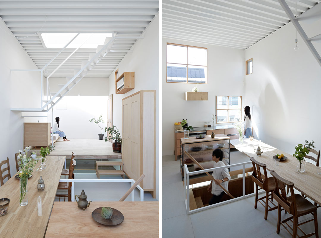
▲(左)厨房看起居室,天光从天窗洒下。(右)起居室看厨房。层高较高的墙面上,迎着太阳开了足够的照明窗户。
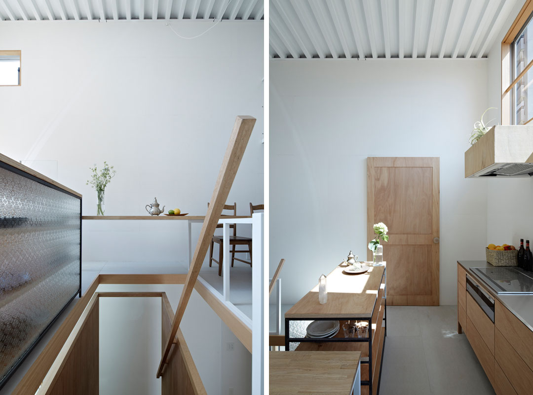
▲(左)一二层楼梯,简约考究的栏杆和细部设计(右)厨房,尽端的门打开后是向外推出去的壁柜
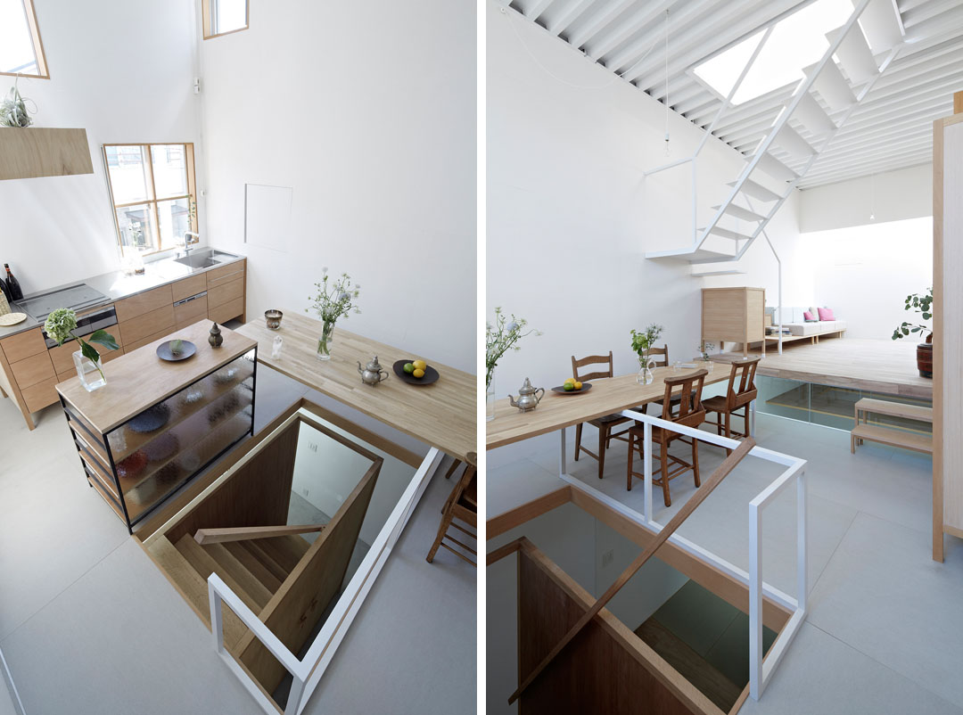
▲(上图)楼梯与空间
Like choreography notes
I always think the way of dealing with stairs is important in houses, especially in small ones. One of the general methods is to place a stair at the middle of one room allocating functions on both sides. Although it maximizes usable area, it leaves the question if it brings rich spatial experience to live seeing every inch of the house and a stair all the time.
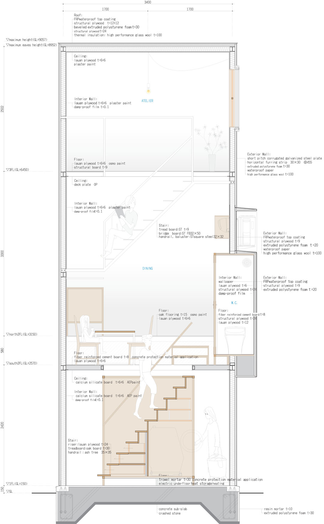
The ceiling of the dining room in this house is 3,776 mm in height, which is determined to make the space under the staircase landing usable as routing. By making it extremely thin, the rest of the height was divided into 1880mm downward and 1850mm upward. Although those are tight dimensions, you can go through between two layers minding your head.
I think it is favorable for a house to have such a scale of physical bodies. Therefore, the dining table was placed over the stair between the ground floor and the first floor leaving space for residents to pass under it. Bodies appear and disappear under the table as residents go up and down the stair.
Once you slide the entrance door and slip into inside of furniture, you reach under the dining table, where faced to a big wall receiving sun light coming through the south window. You see the white wall softly lit from the north as you step on the small stool. To the second floor, you step on the sofa, furniture like a drawer, and the thin stair. At every steps toward upstairs, light conditions change as the direction and the size of space change. Stairs as choreography for spatial experience of this small, thin space.
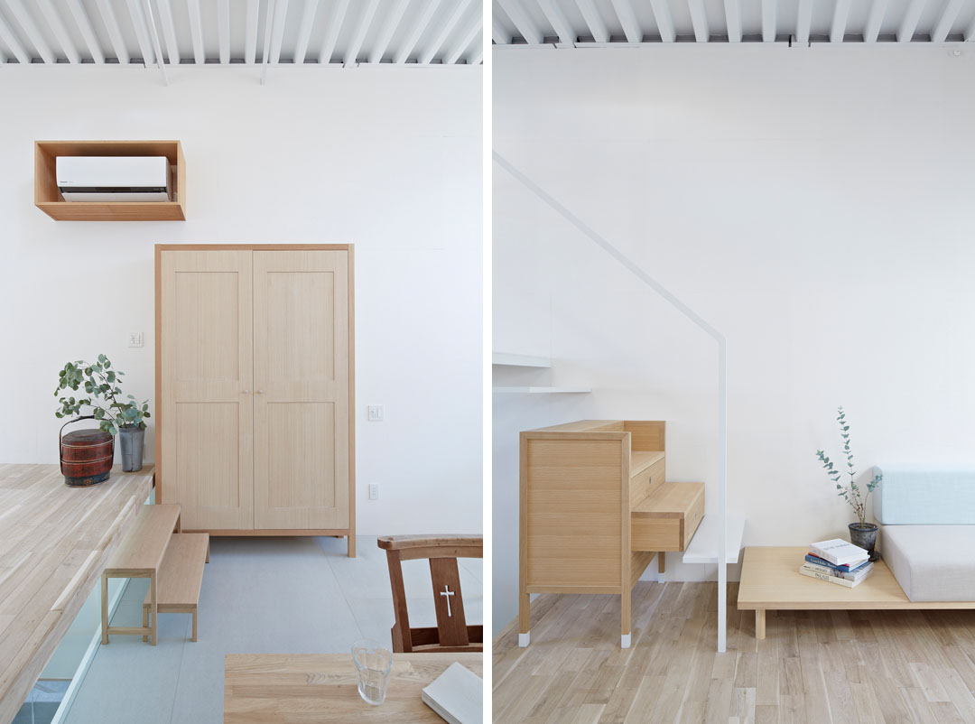
▲(左)错层梯段(右)沙发,柜子也成为梯段的一部分
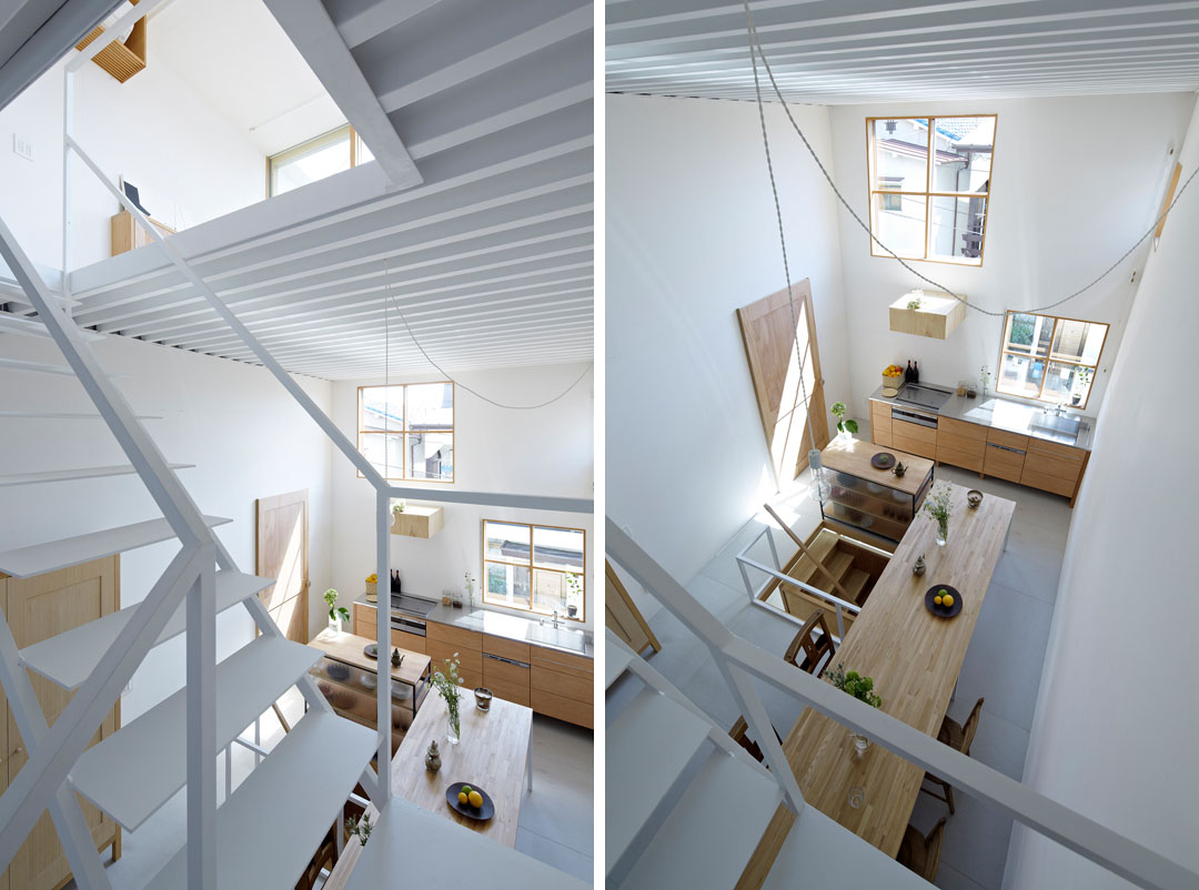
▲通往三层的楼梯,步移景移
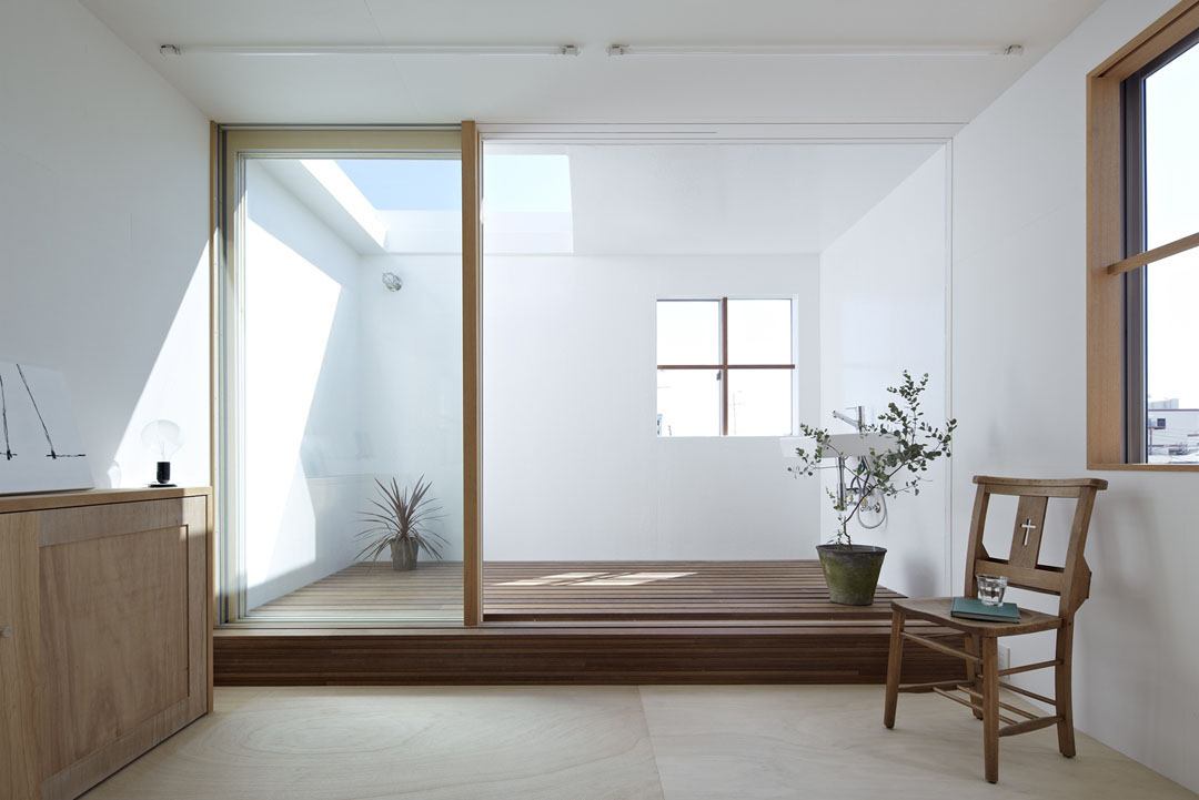
▲ 露台
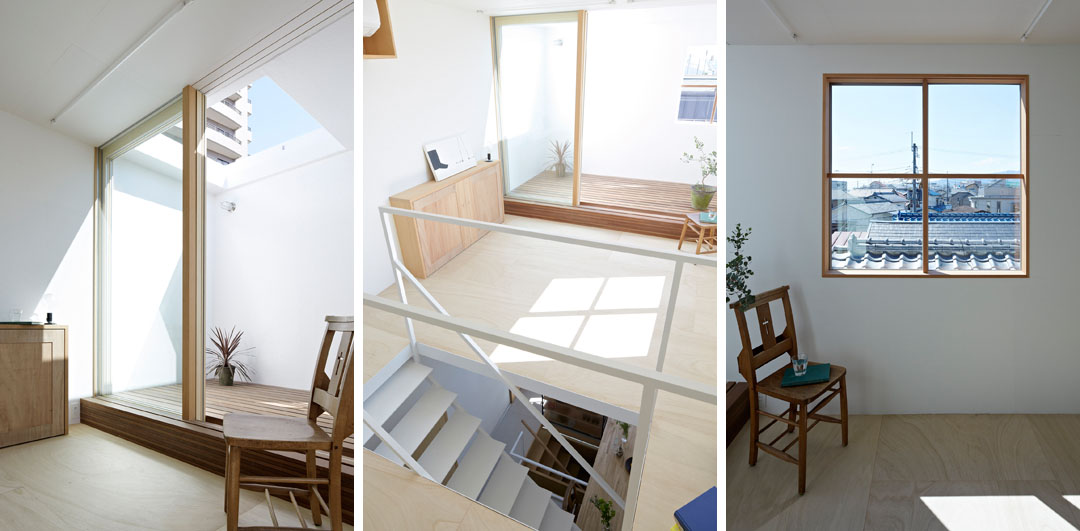
▲ 明亮的三层多功能室和工作房
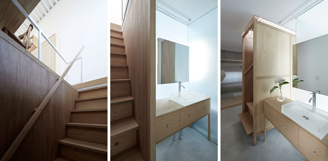
▲(左)在一层楼梯看二层以及餐厅桌面(中)楼梯与涮洗室(右)站在涮洗室看楼梯
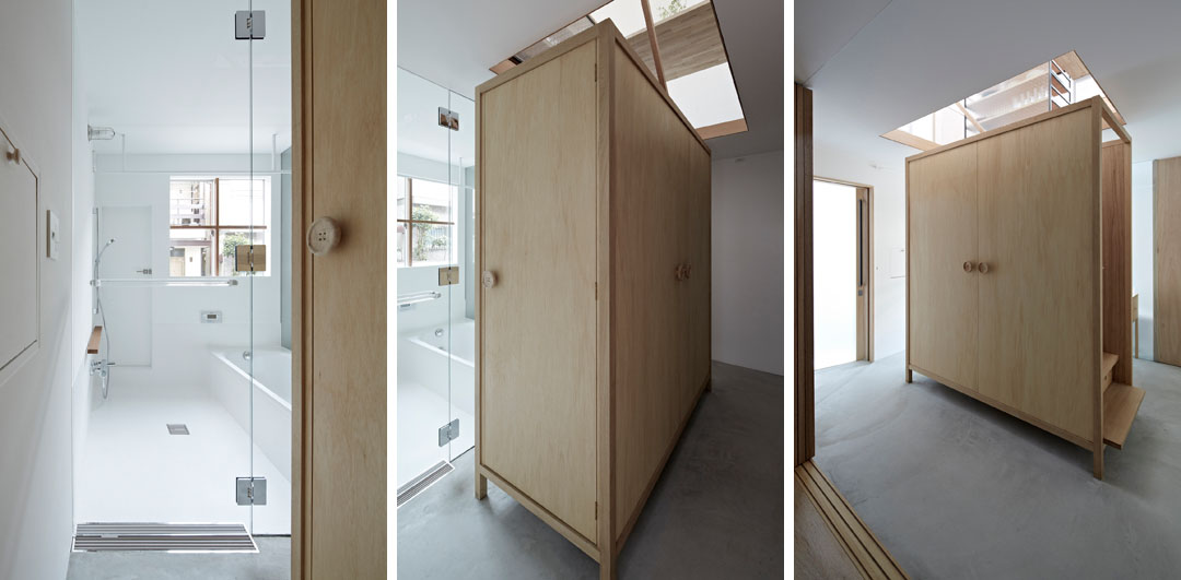
▲(左)浴室(中)站在玄关看浴室和楼梯柜(右)站在卧室看楼梯柜与玄关
Structure
As the site is located in the back of a narrow cul-de-sac and carrying-in by vehicle was limited, the structure with light materials such as 100mm×100m H steel sections for columns and beams, braces with round bars,75mm deck plates for the floor construction was applied. Those resulted in reducing the amount of steel materials, and the total construction cost to about as same as that of a wooden house.
The horizontal stiffness of floors was acquired with horizontal bracings of 6mm flat bars and 50mm squared tie beams beneath concave parts of the deck plates. Floors on different levels were fixed to the columns at both ends so that the continuity of stiffness between those was still kept.
Project information
Project name: House in Itami
Location of site:Itami Japan
Site area: 59.16m2
Building area: 34.95m2
Total floor area: 95.79m2
Type of Construction: Steel
Program:House
Project by :Tato architects
Principal designer:Yo shimada
Design period : Jun. 2010 – Oct. 2011
Construction period : May. 2012 – Sep. 2012
MORE: Tato Architects,更多请至:Tato Architects on gooood







天哪,二楼那个设计和动线,好喜欢,就是人太高上楼会撞头。
很厉害,就是感觉楼梯太飘了。
到负一层的楼梯很漂亮
-_-
设计巧妙欸,看着就蛮不错的,竟然也不觉得窄小了
功能空间光影结合得天衣无缝
拥挤狭窄的日本居住环境催生出的精致设计
赞!
不错
棒极了
整个建筑空间看起来简洁明了,内部家具设计成多功能,通过抽拉完成不同空间高差的衔接。但感觉这样设计会动线的使用过于强势,侵占了其它功能空间;此外内部的空间略显单薄,尤其是楼板地面凸显的波纹板肌理,容易联想到国内的工地简易工棚,看这个方案的剖面,就知道是钢结构的。
都是很有意思的空间,物尽其用
真的是把空间利用到了极致
看着就很舒服···
这两个小人好诡异[害羞]