感谢 GRAS arquitectos , MVRDV 对gooood的分享。更多关于:GRAS arquitectos on gooood, MVRDV on gooood
Appreciation towards GRAS arquitectos , MVRDV for providing the following description:
项目坐落于马洛坎著名休闲鞋品牌Camper旗下的第二家酒店Casa Camper Berlin的底层,是一家集酒店大堂、餐厅以及零售橱窗为一体的咖啡厅。项目由GRAS Reynés Arquitectos事务所、MVRDV,以及柏林建筑师Laura V. Rave合作设计,精心的选材、精致的细节与渐变的色彩,为室内营造出富有强烈视觉冲击力的空间效果。
GRAS Reynés Arquitectos and MVRDV, together with Berlin-based co-architect Laura V. Rave, celebrate the completion of Café Camaleon, combining a hotel lobby, restaurant, and retail showcase in the same space. Occupying the ground floor of the Casa Camper Berlin – the second hotel developed by Mallorcan shoe brand Camper – the design uses carefully selected material details to create a colour gradient, which serves as a strong visual motif to organise the interior.
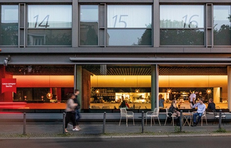
▼项目外观,exterior view of the project © Daria Scagliola
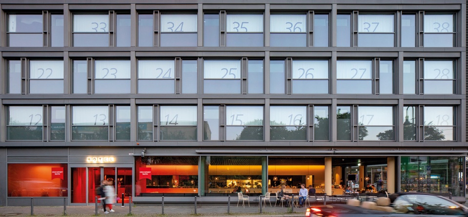
▼从红到棕的色彩渐变,A color gradient from red to brown © Daria Scagliola
Casa Camper Berlin于2009年开业,酒店位于柏林米特最具活力的商业区附近,建筑的底层除了设有酒店大堂外,在大堂旁边还有一处独立的商业空间。为了更好地向大众展示出品牌独特的魅力与强大的设计审美,Camper与MVRDV和GRAS Arquitectos合作,为这个具有零售陈列功能的咖啡餐厅打造了一个全新的设计概念。
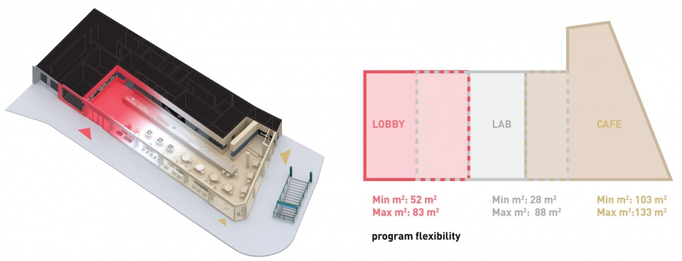
▼分析图,diagram © YUKIKO
Casa Camper Berlin opened in 2009, situated in Berlin Mitte, close to a vibrant shopping area. Alongside the hotel lobby, the ground floor of the building originally included a separate commercial space. Camper approached MVRDV and GRAS Arquitectos to design a new concept for a lobby, retail showcase for Camper shoes, and restaurant that would better align with the brand’s strong design reputation.
▼酒店大堂区域入口,entrance of the hotel lobby © Daria Scagliola
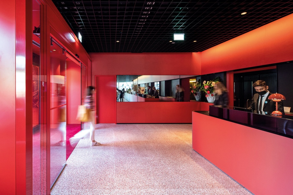
▼酒店大堂,hotel lobby © Daria Scagliola
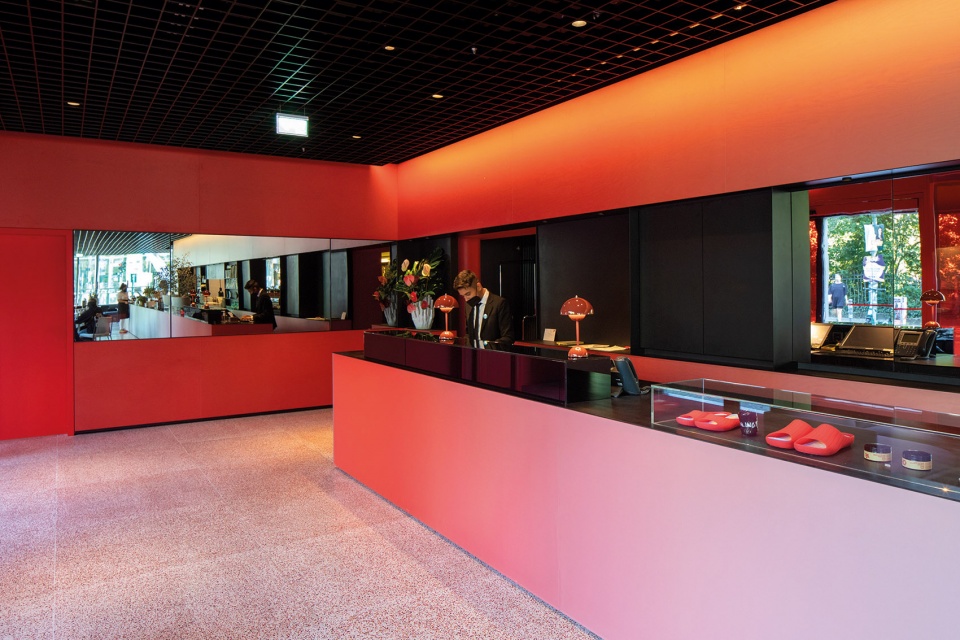
▼红色吧台部分为酒店接待台,the red part of the counter is the hotel reception area © Daria Scagliola
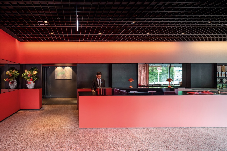
项目所包含的陈列、酒店大堂与餐厅三种服务功能具有鲜明的时间差,这意味着为顾客们提供相应服务的时间会相互错开,不会造成繁忙拥挤的状况。因此,三种功能才能有机会被整合在同一个空间内,灵活的空间布局满足了全天候的需求,同时通过巧妙利用不同功能之间的协同作用,为满足未来的空间需求打下基础。虽然这三种服务功能的运作方式非常不同,但是它们都有一个相同必要的元素,即与顾客们互动的服务吧台,因此,空间中设置了一个长达18米、集三种功能为一体的吧台,同时这个吧台也成为了整个空间的主要特征。
The occupancy patterns of the three programmes are very different, meaning they are unlikely to be busy at the same time. There was therefore an opportunity to combine all three programmes in a single room, creating a flexible space that could adapt throughout the day, as well as for future needs, taking advantage of synergies between the different functions. Though the three areas operate very differently, they all share one necessary element: a counter for interacting with customers. The main feature of the space is therefore a single, 18-metre-long counter serving all three functions.
▼由酒店大堂区看零售区与餐厅区,viewing the showroom lab and restaurant area from the lobby © Daria Scagliola
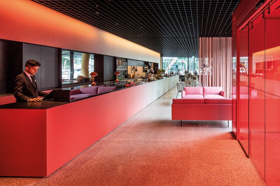
▼实验零售区与休息空间,the showroom lab area © Daria Scagliola
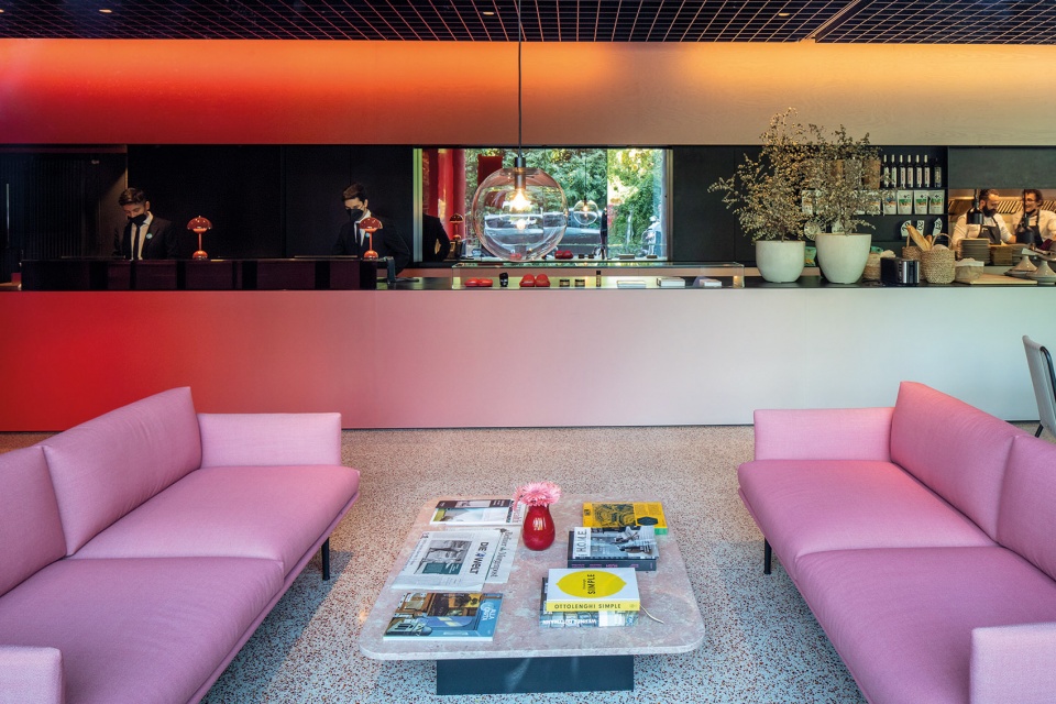
▼由红转白的吧台部分为零售区,The red to white part of the counter is the retail area © Daria Scagliola
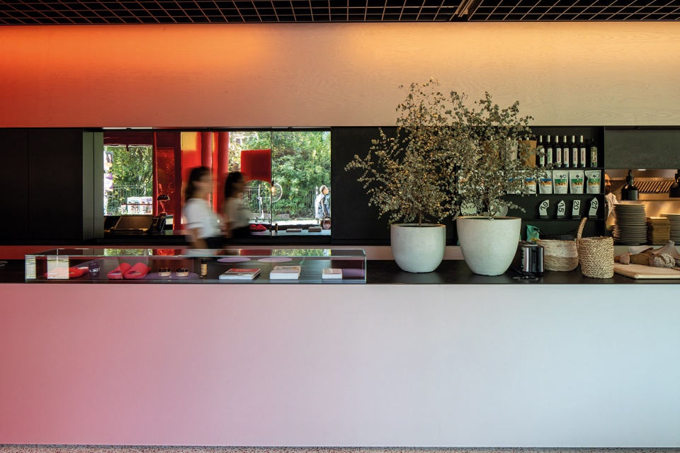
每种功能都拥有独特的色彩:红色代表酒店大堂;Camper品牌实验店特有的白色在本项目中则代表了零售橱窗;餐厅主色调为棕色,灵感源自德国的Milchkaffee。为了展示出不同功能之间的互动,不同的色彩在空间中相互融合,形成一种渐变的色彩梯度,在地板、墙壁与吧台中都可以观察到。这些充满活力的颜色是项目名称“Camaleon”的灵感来源,根据视角与位置的不同,每个人对空间色彩的感知也不尽相同。此外,“Camaleon”一词还呼应了该品牌1975年推出的首款鞋Camaleón。
▼餐厅与大堂和零售区之间由布帘分隔,The restaurant is separated from the lobby and retail areas by curtains © Daria Scagliola
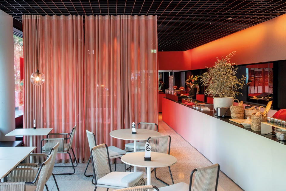
▼白色的吧台部分为餐厅-咖啡厅的点餐台,The white part of counter is the bar of the restaurant – cafe © Daria Scagliola
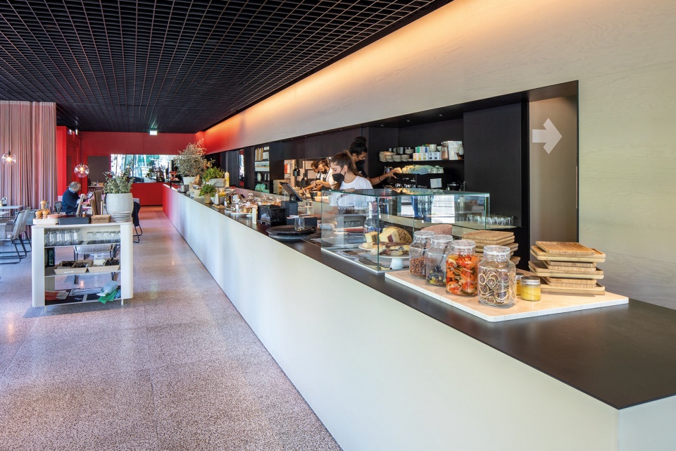
Each function was given its own colour: red for the hotel lobby; white for the retail showcase, following the specifications for Camper Lab stores; and brown for the restaurant, inspired by the colour of German Milchkaffee. To show the interaction between the different programs, the colours merge into each other, creating a colour gradient throughout the length of the space that is visible in the floors, walls, and counter. These vibrant colours were the inspiration for the project’s name, Camaleon, as the appearance of the space will be very different depending on one’s vantage point. Camaleon also references the brand’s first shoe from 1975, the Camaleón.
▼餐厅区域,restaurant area © Daria Scagliola
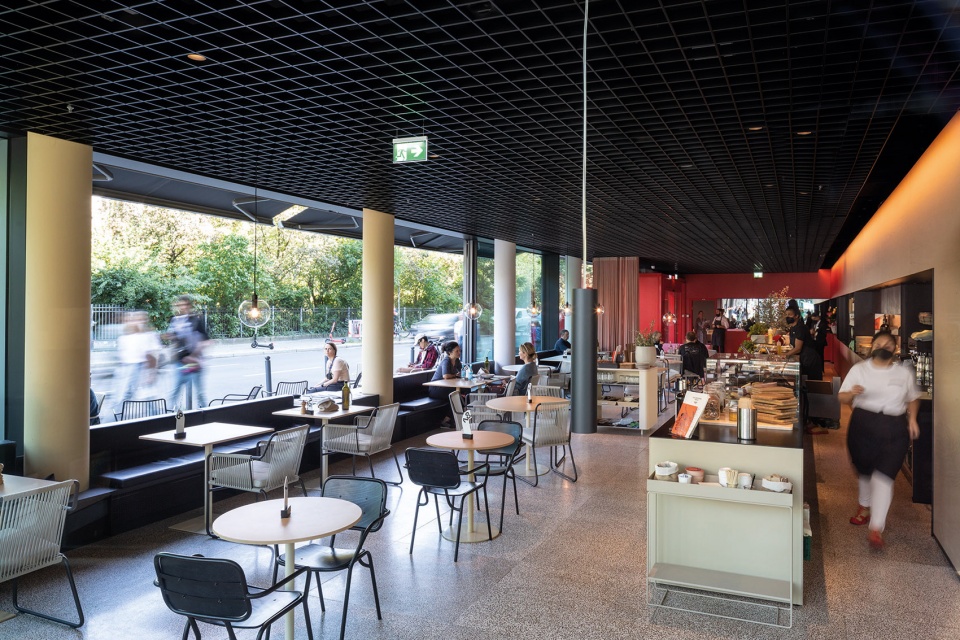
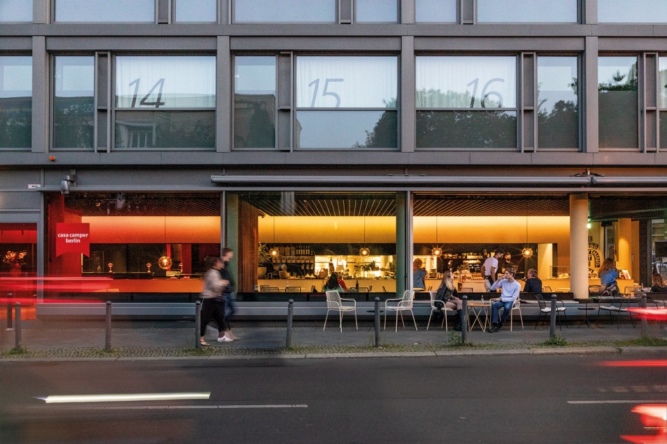
▼可打开的玻璃幕墙立面模糊了室内外的界限,建立了视觉联系,The open glass facade blurs the boundary between inside and outside and creates visual connection © Daria Scagliola
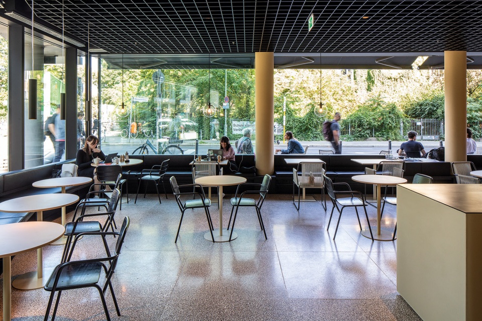
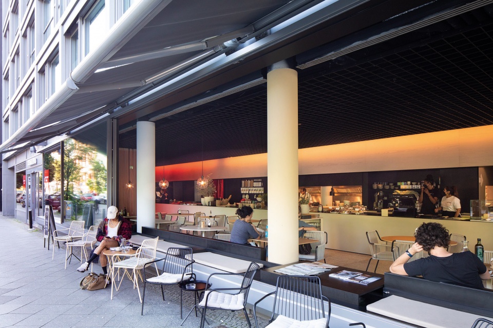
从外部看,长达12米的可开启玻璃幕墙营造出通透的空间氛围,创造出室内空间与街道景观的联系,为咖啡厅塑造起热情好客的形象。室内空间中,渐变的色彩梯度以不同材料不同方式展示在人们眼前,从吧台上的树脂彩绘板,到印刷木材墙面以及水泥地砖,不同比例的红色与透明的棕色回收玻璃组合在一起,将Camper品牌发源地马略卡岛的传统工艺以现代的方式诠释在空间中。
Outside, a 12-metre-long openable glass façade creates a clear, welcoming connection to the street. Inside, the colour gradient is achieved with different materials and in different manners: from resin colour panels in the counter to printed wood for the walls and cement-based floor tiles, mixed with different ratios of red, clear and brown recycled glass – making use of a traditional technique from Mallorca, Camper’s hometown.
▼室外露台区,terrace area © Daria Scagliola
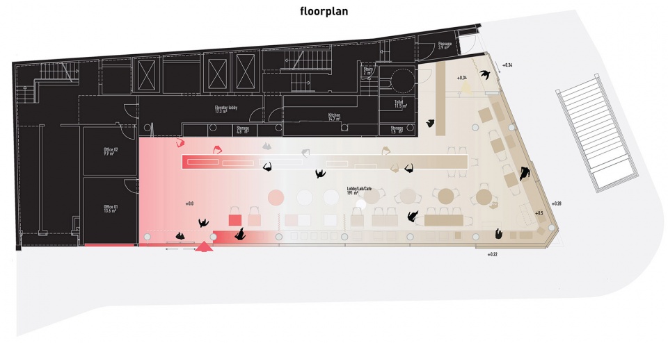
▼平面图,plan © YUKIKO
LOCATION: Berlin, Germany
CLIENT: Casa Camper
PROGRAM: Hotel, retail, bar-restaurant
SIZE: 500 m2
TEAM: GRAS Reynés Arquitectos + MVRDV + Laura V. Rave
Contractor: Artis GmbH
Construction Management: MKP
MEP: IB Brandes
GRAPHYC DESIGN: YUKIKO
PHOTOGRAPHY: Daria Scagliola
More:GRAS arquitectos, MVRDV 。更多关于:GRAS arquitectos on gooood, MVRDV on gooood










多功能一体 很赞
空间整体色调黑红黄,德国国旗色
渐变还是比较惊艳,地面的水磨石不太喜欢
这算是夜店风么
口红色号
想问一下二楼的隔音怎么样
色调真不戳
渐变色的感觉蛮不错